Places & Spaces: Mapping Science
advertisement
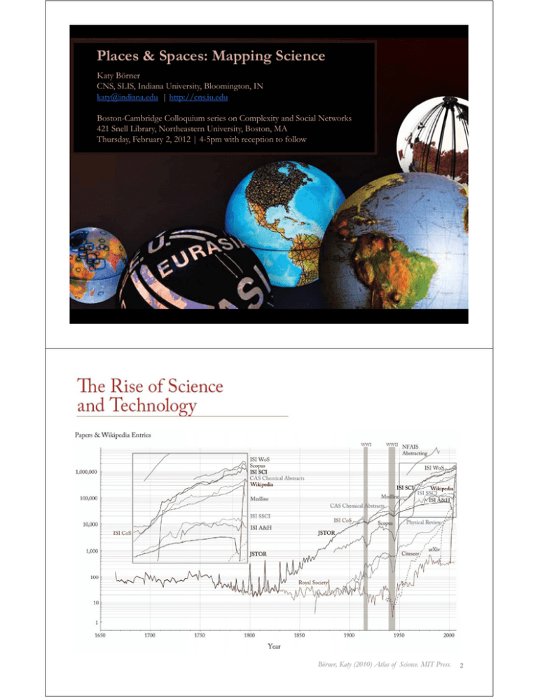
Places & Spaces: Mapping Science Katy Börner CNS, SLIS, Indiana University, Bloomington, IN katy@indiana.edu | http://cns.iu.edu Boston-Cambridge Colloquium series on Complexity and Social Networks 421 Snell Library, Northeastern University, Boston, MA Thursday, February 2, 2012 | 4-5pm with reception to follow Börner, Katy (2010) Atlas of Science. MIT Press. 2 Börner, Katy (2010) Atlas of Science. MIT Press. 3 Börner, Katy (2010) Atlas of Science. MIT Press. 4 2000 Night on Earth This image shows city lights at night. It was composed from hundreds of pictures made by orbiting satellites. The seaboards of Europe, the eastern United States, and Japan are particularly well lit. Many cities exist near rivers or oceans so that goods can be exchanged cheaply by boat. The central parts of South America, Africa, Asia, and Australia are rather dark despite their high population density, see map to the left. Börner, Katy (2010) Atlas of Science. MIT Press. 5 2005 World Population The population map uses a quarter degree box resolution. Boxes with zero people are given in white. Darker shades of red indicate higher population counts per box using a logarithmic interpolation. The highest density boxes appear in Mumbai, with 11,687,850 people in the quarter degree block, Calcutta (10,816,010), and Shanghai (8,628,088). Börner, Katy (2010) Atlas of Science. MIT Press. 6 2007 IP Address Ownership This map shows IP address ownership by location. Each owner is represented by a circle and the area size of the circle corresponds to the number of IP addresses owned. The larges circle denotes MIT’s holdings of an entire class A subnet, which equates to 16,581,375 IP addresses. The countries that own the most IP addresses are US (560 million), Japan (130 million), Great Britain (47 million). Börner, Katy (2010) Atlas of Science. MIT Press. 7 2003 Scientific Productivity Shown is where science is performed today. Each circle indicates a geographic location at which scholarly papers are published. The larger the circle the more papers are produced. Boston, MA, London, England, and New York, NY are the top three paper production areas. Note the strong resemblance with the Night on Earth and the IP Ownership maps and the striking differences to the world population map. Börner, Katy (2010) Atlas of Science. MIT Press. 8 Find your way Black Box Find collaborators, friends Take terra bytes of data Identify trends Early Maps of the World VERSUS 3D Physically-based Accuracy is measurable Trade-offs have more to do with granularity 2-D projections are very accurate at local levels Centuries of experience Geo-maps can be a template for other data 9 Early Maps of Science n-D Abstract space Accuracy is difficult Trade-offs indirectly affect accuracy 2-D projections neglect a great deal of data Decades of experience Science maps can be a template for other data Kevin W. Boyack, UCGIS Summer Meeting, June, 2009 10 … … … 11 Legal Citation Index, 1873 Citation Indexes for Science, 1955 Google, 1998 12 1934 2007 13 Börner, Katy (2010) Atlas of Science. MIT Press. 14 15 16 22 27 33 Illuminated Diagram Display W. Bradford Paley, Kevin W. Boyack, Richard Kalvans, and Katy Börner (2007) Mapping, Illuminating, and Interacting with Science. SIGGRAPH 2007. Questions: Who is doing research on what topic and where? What is the ‘footprint’ of interdisciplinary research fields? What impact have scientists? Large-scale, high resolution prints illuminated via projector or screen. Interactive touch panel. Contributions: Interactive, high resolution interface to access and make sense of data about scholarly activity. 34 35 36 Science Maps in “Expedition Zukunft” science train visiting 62 cities in 7 months 12 coaches, 300 m long Opening was on April 23rd, 2009 by German Chancellor Merkel http://www.expedition-zukunft.de 37 Mapping Science Exhibit – 10 Iterations in 10 years http://scimaps.org/ The Power of Maps (2005) Science Maps for Economic Decision Makers (2008) The Power of Reference Systems (2006) Science Maps for Science Policy Makers (2009) The Power of Forecasts (2007) Science Maps for Scholars (2010) Science Maps as Visual Interfaces to Digital Libraries (2011) Science Maps for Kids (2012) Science Forecasts (2013) How to Lie with Science Maps (2014) Exhibit has been shown in 72 venues on four continents. Currently at - NSF, 10th Floor, 4201 Wilson Boulevard, Arlington, VA - Center of Advanced European Studies and Research, Bonn, Germany - Science Train, Germany - Cultural Dimensions of Innovation, UCD Conference, Dublin, Ireland 38 Debut of 5th Iteration of Mapping Science Exhibit at MEDIA X was on May 18, 2009 at Wallenberg Hall, Stanford University, http://mediax.stanford.edu, http://scaleindependentthought.typepad.com/photos/scimaps 39 Science Maps for Economic Decision Making Four Existing Maps VERSUS Six Science Maps (4th Iteration of Places & Spaces Exhibit - 2008) Joseph Minard, Title: Europe Raw Cotton Imports in 1858, 1864 and 1865 (1866) What insight needs to economic decision makers have? What data views are most useful? Science Maps for Science Policy Making Four Existing Maps VERSUS Six Science Maps (5th Iteration of Places & Spaces Exhibit - 2009) Bollen, Johan, Herbert Van de Sompel, Aric Hagberg, Luis M.A. Bettencourt, Ryan Chute, Marko A. Rodriquez, Lyudmila Balakireva. 2008. A Clickstream Map of Science. 49 Council for Chemical Research. 2009. Chemical R&D Powers the U.S. Innovation Engine. Washington, DC. Courtesy of the Council for Chemical Research. 50 Science Maps for Scholars Four Existing Maps VERSUS Six Science Maps (6th Iteration of Places & Spaces Exhibit – 2010) John A. Walsh, Devin Becker, Bradford Demarest, Jonathan Tweedy, Theodora Michaelidou, and Laura Pence (2010) Map of Literary Empires: Mapping Temporal and Spatial Settings of Victorian Poetry. 53 Loet Leydesdorff, Thomas Schank and the Journal of the American Society for Information Science and Technology. 2010. The Emergence of Nanoscience & Technology. 54 Science Maps as Visual Interfaces to Digital Libraries Four Existing Maps VERSUS Six Science Maps (7th Iteration of Places & Spaces Exhibit – 2011) Paul Otlet (1936/37) Mondothèque. Multimedia Desk in a Global Internet. H.J.T. Ellingham (1948) A Chart Illustrating Some of the Relations between the Branches of Natural Science and Technology. Almila Akdag Salah, Cheng Gao, Krzysztof Suchecki, and Andrea Scharnhorst (2011) Design vs. Emergence: Visualization of Knowledge Orders. Ward Shelley. 2011. History of Science Fiction. We would like to thank the map makers Related Research: Digging by Debating: Linking Massive Datasets to Specific Arguments Digging into Data Award with Colin Allen, Indiana University, Chris Reed, University of Dundee, and Andrew Ravenscroft, London Metropolitan University, David Bourget, University of London. Project Description • Develop and implement a multi-scale online workbench, called “InterDebates” that provides easy access to hundreds of thousands, eventually millions, of digitized books, journal articles, and comprehensive reference works written by experts. • Combine scalable data mining & visualization techniques and advanced argument analysis & discussion tools to extract argumentative structures from large datasets and support users in interpreting and discussing detailed arguments. • Test hypothesis that detailed and identifiable arguments drive many aspects of research in the sciences and the humanities. Results are expected to enable innovative interdisciplinary research, and may also play a role in supporting better-informed critical debates among students and the general public. 61 Related Tools: Computational Scientometrics Cyberinfrastructures Börner, Katy. (2011). Plug-and-Play Macroscopes. Communications of the ACM, 54(3), 60-69. Scholarly Database: 25 million scholarly records http://sdb.slis.indiana.edu VIVO Research Networking http://vivoweb.org Network Workbench Tool & Community Wiki http://nwb.cns.iu.edu Science of Science (Sci2) Tool http://sci2.cns.iu.edu Epidemics Cyberinfrastructure http://epic.cns.iu.edu 62 Related Talk: Mining, Mapping, and Accelerating Science and Technology Katy Börner 366 West Village H (CCIS), Northeastern University 11:45am to 1:00pm, February 3 Recent developments in data mining, information visualization, and science of science studies make it possible to study science and technology (S&T) at multiple levels using a systems science approach. The first part of this talk will present research results and case studies that aim to increase our scientific understanding of the inner workings of S&T. The second part introduces novel approaches and tools that improve information access, researcher networking, and research management. The talk concludes with an overview of data services and plug-and-play macroscope tools developed at the Cyberinfrastructure for Network Science Center in support of data mining and visualization. Relevant Links VIVO National Researcher Network: http://vivoweb.org Scholarly Database serving 25 million records: http://sdb.cns.iu.edu Plug-and-Play Macroscope Tools: http://cishell.org 63 Related Tutorial: "Sci2 Tool: Temporal, Geospatial, Topical, and Network Analysis and Visualization" Tutorial for Arts and Humanities Scholars Instructor: Time/Date: Place: Format: Audience: Cost: Dr. Katy Börner 12:30-16:30 on Feb 16, 2012 Meertens Institute, Joan Muyskenweg 25, 1096 CJ Amsterdam Lecture and “hands-on” training. Please bring your laptop. This tutorial is designed for researchers and practitioners interested to use advanced data mining algorithms and visualizations in their research and daily decision making. Free but register via http://www.surveymonkey.com/s/TB2R7RL Abstract: The Science of Science Tool (Sci2) (http://sci2.cns.iu.edu) was designed for researchers and practitioners interested to study and understand the structure and dynamics of science. Today is used by major federal agencies in the US but also by researchers from more than 40 countries and from many different areas of research - including arts and humanities scholars. 64 References Börner, Katy, Chen, Chaomei, and Boyack, Kevin. (2003). Visualizing Knowledge Domains. In Blaise Cronin (Ed.), ARIST, Medford, NJ: Information Today, Volume 37, Chapter 5, pp. 179-255. http://ivl.slis.indiana.edu/km/pub/2003-borner-arist.pdf Shiffrin, Richard M. and Börner, Katy (Eds.) (2004). Mapping Knowledge Domains. Proceedings of the National Academy of Sciences of the United States of America, 101(Suppl_1). http://www.pnas.org/content/vol101/suppl_1/ Börner, Katy, Sanyal, Soma and Vespignani, Alessandro (2007). Network Science. In Blaise Cronin (Ed.), ARIST, Information Today, Inc., Volume 41, Chapter 12, pp. 537607. http://ivl.slis.indiana.edu/km/pub/2007-borner-arist.pdf Börner, Katy (2010) Atlas of Science. MIT Press. http://scimaps.org/atlas Scharnhorst, Andrea, Börner, Katy, van den Besselaar, Peter (2011) Models of Science Dynamics. Springer Verlag. 65 All papers, maps, tools, talks, press are linked from http://cns.iu.edu CNS Facebook: http://www.facebook.com/cnscenter Mapping Science Exhibit Facebook: http://www.facebook.com/mappingscience
