Improving Data Visualization Literacy
advertisement
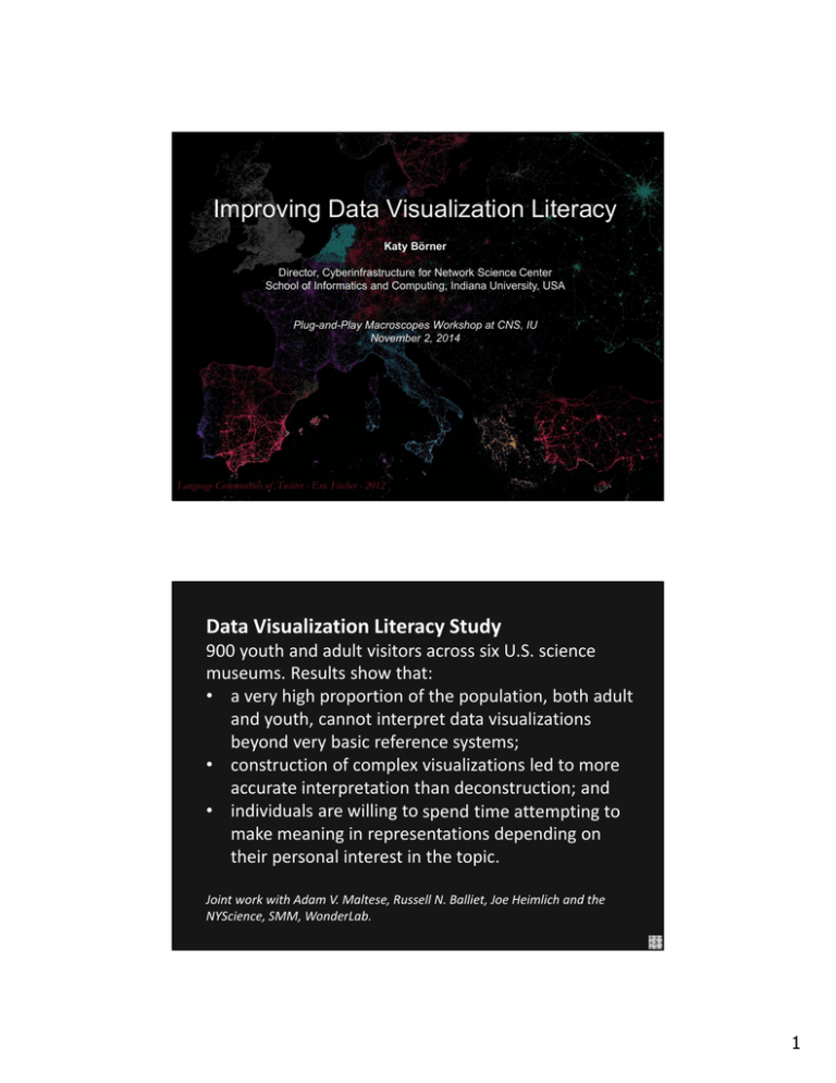
Improving Data Visualization Literacy Katy Börner Director, Cyberinfrastructure for Network Science Center School of Informatics and Computing, Indiana University, USA Plug-and-Play Macroscopes Workshop at CNS, IU November 2, 2014 Language Communities of Twitter - Eric Fischer - 2012 Data Visualization Literacy Study 900 youth and adult visitors across six U.S. science museums. Results show that: • a very high proportion of the population, both adult and youth, cannot interpret data visualizations beyond very basic reference systems; • construction of complex visualizations led to more accurate interpretation than deconstruction; and • individuals are willing to spend time attempting to make meaning in representations depending on their personal interest in the topic. Joint work with Adam V. Maltese, Russell N. Balliet, Joe Heimlich and the NYScience, SMM, WonderLab. 2 1 Study 2: Can 273 Science Museum Visitors Read 20 Visualizations? 3 Visitors saw 5/20 visualizations and were asked to answer: • • • • Does this type of data presentation look at all familiar? Where might you have seen images like this? How do you think you read this type of data presentation? What would you call this type of data presentation? Results omitted as paper is under review 4 2 Visitors saw 5/20 visualizations and were asked to answer: • Does this type of data presentation look at all familiar? Results omitted as paper is under review 5 Theoretically Grounded and Practically Useful Visualization Framework developed to empower the broadest spectrum of users to read and make data visualizations that are useful and meaningful to them. The visualization framework was used to • design the aforementioned study and • develop plug‐and‐play macroscope tools that improve the data visualization literacy of researchers, practitioners, IVMOOC students, museum visitors, and others. Börner, Katy. 2015. Atlas of Knowledge: Anyone Can Map. The MIT Press. http://scimaps.org/atlas2 6 3 Tasks 7 Workflow Design Börner, Katy. 2015. Atlas of Knowledge: Anyone Can Map. The MIT Press. http://scimaps.org/atlas2 8 4 Types Börner, Katy. 2015. Atlas of Knowledge: Anyone Can Map. The MIT Press. http://scimaps.org/atlas2 9 Types 10 5 Types Börner, Katy. 2015. Atlas of Knowledge: Anyone Can Map. The MIT Press. http://scimaps.org/atlas2 11 12 6 Sci2 Tool 13 14 7 15 Register for free at http://ivmooc.cns.iu.edu. Class will restart in January 2015. 16 8 References Börner, Katy, Chen, Chaomei, and Boyack, Kevin. (2003). Visualizing Knowledge Domains. In Blaise Cronin (Ed.), ARIST, Medford, NJ: Information Today, Volume 37, Chapter 5, pp. 179‐255. http://ivl.slis.indiana.edu/km/pub/2003‐ borner‐arist.pdf Shiffrin, Richard M. and Börner, Katy (Eds.) (2004). Mapping Knowledge Domains. Proceedings of the National Academy of Sciences of the United States of America, 101(Suppl_1). http://www.pnas.org/content/vol101/suppl_1/ Börner, Katy, Sanyal, Soma and Vespignani, Alessandro (2007). Network Science. In Blaise Cronin (Ed.), ARIST, Information Today, Inc., Volume 41, Chapter 12, pp. 537‐607. http://ivl.slis.indiana.edu/km/pub/2007‐borner‐arist.pdf Börner, Katy (2010) Atlas of Science. MIT Press. http://scimaps.org/atlas Scharnhorst, Andrea, Börner, Katy, van den Besselaar, Peter (2012) Models of Science Dynamics. Springer Verlag. Katy Börner, Michael Conlon, Jon Corson‐Rikert, Cornell, Ying Ding (2012) VIVO: A Semantic Approach to Scholarly Networking and Discovery. Morgan & Claypool. Katy Börner and David E Polley (2014) Visual Insights: A Practical Guide to Making Sense of Data. MIT Press. 17 All papers, maps, tools, talks, press are linked from http://cns.iu.edu These slides will soon be at http://cns.iu.edu/docs/presentations CNS Facebook: http://www.facebook.com/cnscenter Mapping Science Exhibit Facebook: http://www.facebook.com/mappingscience 18 9
![Science Maps Explore New Ways of Displaying Information [Slide Show]](http://s2.studylib.net/store/data/010768709_1-3220b04c018450634153c8bae5b4b731-300x300.png)
