Tutorial 6: Surfacing and Scene Building
advertisement

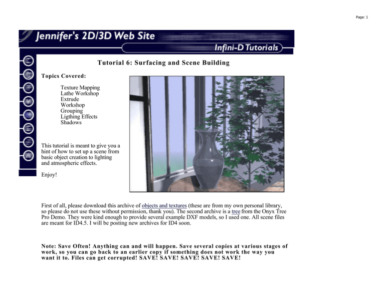
Page: 1 Tutorial 6: Surfacing and Scene Building Topics Covered: Texture Mapping Lathe Workshop Extrude Workshop Grouping Ligthing Effects Shadows This tutorial is meant to give you a hint of how to set up a scene from basic object creation to lighting and atmospheric effects. Enjoy! First of all, please download this archive of objects and textures (these are from my own personal library, so please do not use these without permission, thank you). The second archive is a tree from the Onyx Tree Pro Demo. They were kind enough to provide several example DXF models, so I used one. All scene files are meant for ID4.5. I will be posting new archives for ID4 soon. Note: Save Often! Anything can and will happen. Save several copies at various stages of work, so you can go back to an earlier copy if something does not work the way you want it to. Files can get corrupted! SAVE! SAVE! SAVE! SAVE! SAVE! Page: 2 I. Texturing the Individual Objects 1. Open the vase.geo file in Infini-D 4.5. The vase consists of two objects - the vase itself and the water object. If you are unfamiliar with Infini-D, you might want to take a look at how these objects were made (select the object and choose Edit Object from the MODEL menu). Notice how the point and curve construction, called Bezier curves, is similar to that of vector illustration programs, succh as Illustrator. The water object was made by simply copying the vase, removing unecessary points, and adding the "top" of the water object. 2. Select the vase object. Open the Surface Tab (click the tab with the paint bucket on it). Find the Glass surface on the list and double-click it to apply it to the vase. 3. Select the water object. This time, as you'll see, there isn't a set surface for this type of object. You'll have to create one in the surface editor. There are a set of six buttons at the right of the surface tab. Click the one labeled New. You will see something like this: Page: 3 4. Set the parameters as shown for the water object. The flat color does not have to be changed. You will, however, need to change the effect to Wave, and click the edit button. 5. Once in the wave editor, we want to make the waves smaller and closer together. Experiment. Page: 4 Hit the OK button to accept the changes. (You can make the water animated if you want!) 6. When the thumbnail preveiw in the surface editor looks good to you, give the surface a name in the name box, and hit the OK button to accept it. Close this object file. When the dialog box prompts you to save the changes, hit the Save button. 7. Now, open the folding screen file. This is a relatively simple object to texture. You will create two main surfaces - a black polished surface and a screen surface. Select the screen frame object using the sequencer. Create a New Surface - Set the Flat color to black (hit the Edit... button). Leave the Diffuse Shading at 100%. Set the Specular Highlight to 50%, the Shininess to 7%, and the Reflectiveness to 3%. Name the surface "Black Laquer" and hit the Okay button. Apply the surface to each of the screen frames. Save the file. 8. Now we need to make the screen surface. The look I was going for here is to create a softly glowing surface, similar to the effect of sunlight behind a screen made of thick paper. Select the screen object from the sequencer. Create a New Surface. Edit the Flat color using the HSV picker (Hue, Saturation, and Value). The Hue and Saturation should be set to 0, while the value should be at 92%. This will create a light grey surface. If you want to use the Mac's crayon picker, the color is called Marble-ish. Set the rest of the parameters as follows: Diffuse Shading - 67% Specular Highlight - 50% Shininess - 14% Glow - 25% Transparency - 57% Name the surface Screen Surface (use descriptive names whenever possible). Hit the Okay button and apply the surface to the other screen objects. Save. Close the file. 9. Open the table.geo file. For this object, we are going to import a wood texture to create our own composite. Select the table object. On the surface tab, click the Comp... button. Very complicated dialog, right? Here is a snapshop of the general layout of the dialog. Page: 5 10. Under the Layers area, we need to add a new image. Click the Add... button and locate the woodsmall.pict file. Select it and hit the okay button on the dialogs that come up until you get back to this main Surface Composition dialog. We want to make sure that the table top is covered and that the grain of the wodd is the way we want it to be. You can use the arrow tool to scale the surface and the rotation tools to rotate the object (this does not rotate the surface, but rather, how the surface falls over the actual object, or goes through the object). 11. We want to reuse this surface later, for other objects, so we will need to go to the Repeat area of the dialog. By giving the repeats H and V a zero value, we can make the surface repeat to Infinity, or to cover the surface area, no matter how large the object gets. This can come in very handy, especially if you need to cover large sections of floor with a repeating pattern, as we do later. Page: 6 12. Next, we need to set the other qualities of the surface. In the Mapping area, we will set the surface parameters as shown in this screen shot. This will give our table top a nice, polished, but not too reflective, surface. But contrast, if we wanted to create a worn look, we would leave the Highlight and Reflection parameters off, and turn on the Bump to about 25% or more to get a good amount of roughness on the surface. To finish, give the surface a name and hit the okay button. 13. In order to speed things up, we are going to use the same surface on the pedastal leg of the table, but we are going to use it differently than we did earlier in the tutorial. Select the pedastal object. On the surface tab, you will notice a box marked "Use Parent's Surface". We want to click that box. Do a small ray-trace preview. Notice how the surface of the table top simply continues down the pedastal. Save the file and close it. We are now ready to start placing our objects in the final scene. II. Scene Composition There are several reasons for building and texturing objects in separate files. The major reason is simply that large files with many complex objects are slow. They take a long time to save and a long time to make any changes. By working in separate files, you can work faster, and use those objects in many scenes without having to open up a very large file and copy and paste the object into another large file. By working in a separate file for each object, you can begin to build a library of objects to use if you have to build a scene quickly. Plus, you are less likely to crash and corrupt files, and if you do happen to crash, the only file corrupted will be that of a single object, and not a full-blown scene file with many objects which you might not have copies of. End of sermon. 14. Open the set.geo file. Look around the scene and get an idea of where you want to place your objects. Page: 7 Notice that the windows do not have glass objects in them. There is a reason for this. If you want to use an Infinite plane (which seems to be a little nicer than the plane in previous version of ID), and you want to use fog, if you put glass in the windows, when you render, there will be a difference in color where the plane and the "sky" meet. Since the purpose of using the fog and the plane is for an atmospheric effect, I left the windows out. You really can't tell they are gone, and it decreases rendering time. 15. Everything in the room should be textured already. You'll just need to paste the objects in the room and scale them to the appropriate size. Open the table.geo file. Select the table object parent. Select Copy from the Edit menu. Under the File menu, there is an option called Scenes. If you scroll down to this option, a fly-out menu will list the open scenes. Choose the set.geo scene. Choose Paste from the edit menu to set the table into the scene. The table is fairly correct in size compared to the rest of the room, so we will not need to scale it. 16. Save the set file and close the table file. 17. Open the screen file. Select the main parent and copy the object. Paste it into the set following the same instructions as for the table. Close the screen file and save the set. The screen should also be the correct size. 18. Move the objects to a good position in the "room" I placed the table close to the window, and the screen in the corner by the window and the left wall. I wanted to make sure that the screen would still be visible when looking at the table. Make sure that the objects are resting on the floor, not in the floor.You may need to zoom in close in the front view to make sure that this is correct. 19. When you have a good idea of the placement of your objects, you can go ahead and paste the vase object into the scene. Open the vase file and copy the vase parent object. Paste the object into the set file. The vase object is way too large, so we will need to open the Information Floater to change the size. We want to change the Uniform Scale to 0.300 from 1. Then, you can move the object into place, on the top of the table object. Whew. We are done placing the objects. Now we have to choose a camera view to render. 20. Move the Camera Target to center on the base. This will make the camera point to the vase no matter where the camera is moved to. Move the camera so that the table, vase, and screen are visible in the Camera's FOV (Field-of-View). You might want to make sure that the windows can also be seen, and perhaps a bit of the floor. But the main object of attention should be the vase. You may want to so a few test renders to see how things are looking. Use your knowledge of composition or your intuitive aesthetic sense to pick a good view. You can double-click the trace tool to render preview. If you want, you can add the tree object to the scene, to add a little homey touch (just call me Martha Stewart). Simply follow the copy and pasting instructions, and scale the tree to fit in the set. Page: 8 III. Final Rendering As we are rendering a single frame, we can be more lenient in our rendering expectations. We can render a larger view and at a higher quality. 1. Choose RENDER from the FILE menu again. Set the anti-aliasing to high, the transparency to 5, and the reflections to level 2. 2. Make sure that the light glows and shadows are turned on. Set the size to 640 x 480. Hit the Render button. Save the file as either a Pict or a TIFF, depending on your needs. This could take awhile so get out into the real world! Come back and find your gorgeous render done! That is all for now! Jennifer Last Modified: April 12, 1999 [Home] [Links] [Contact] [Infini-D] [Photoshop] [Web Design] [Classics]


