Guidelines for Statistics and Graphs in General Education Biology
advertisement
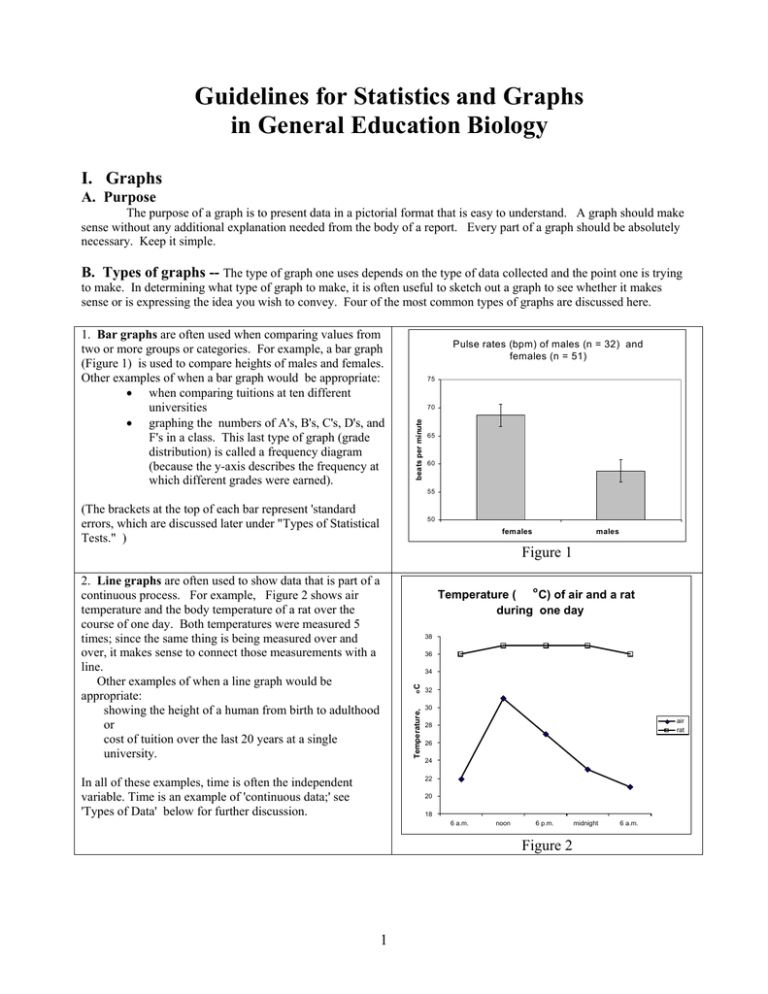
Guidelines for Statistics and Graphs in General Education Biology I. Graphs A. Purpose The purpose of a graph is to present data in a pictorial format that is easy to understand. A graph should make sense without any additional explanation needed from the body of a report. Every part of a graph should be absolutely necessary. Keep it simple. B. Types of graphs -- The type of graph one uses depends on the type of data collected and the point one is trying to make. In determining what type of graph to make, it is often useful to sketch out a graph to see whether it makes sense or is expressing the idea you wish to convey. Four of the most common types of graphs are discussed here. Pulse rates (bpm) of males (n = 32) and females (n = 51) 75 70 beats per minute 1. Bar graphs are often used when comparing values from two or more groups or categories. For example, a bar graph (Figure 1) is used to compare heights of males and females. Other examples of when a bar graph would be appropriate: • when comparing tuitions at ten different universities • graphing the numbers of A's, B's, C's, D's, and F's in a class. This last type of graph (grade distribution) is called a frequency diagram (because the y-axis describes the frequency at which different grades were earned). 65 60 55 (The brackets at the top of each bar represent 'standard errors, which are discussed later under "Types of Statistical Tests." ) 50 females males Figure 1 2. Line graphs are often used to show data that is part of a continuous process. For example, Figure 2 shows air temperature and the body temperature of a rat over the course of one day. Both temperatures were measured 5 times; since the same thing is being measured over and over, it makes sense to connect those measurements with a line. Other examples of when a line graph would be appropriate: showing the height of a human from birth to adulthood or cost of tuition over the last 20 years at a single university. o Temperature ( C) of air and a rat during one day 38 36 Temperature, oC 34 32 30 air rat 28 26 24 22 In all of these examples, time is often the independent variable. Time is an example of 'continuous data;' see 'Types of Data' below for further discussion. 20 18 6 a.m. noon 6 p.m. Figure 2 1 midnight 6 a.m. 3. Scatter plots or scatter diagrams are often used when both axes include numeric data (a.k.a. continuous data). . For example, if one wished to see whether there was a relationship between reaction time in left and right hands in humans, one could record reaction time of the left hand on one axis and reaction time of the right hand on the other (Figure 3); both are numeric data. A comparison of reaction times (sec) between left and right hands 0.45 seconds, left hand 0.40 Each point is data from one person; thus, connecting the dots makes no sense. 0.35 0.30 0.25 0.20 0.15 Scatter plots are often used to visualize a correlation, or lack thereof, between two parameters. See more about correlation under "Type of Statistical Tests." 0.10 0.10 0.15 0.20 0.25 0.30 0.35 0.40 seconds, right hand Figure 3 Cost of Academic Year 2003-2004 at RU for in-state student 4. Pie graphs are used to show the contribution of different categories to a whole. The fractional contribution of each category is indicated as a wedge in a circle. The size of each wedge is proportional to the percent contribution of each category. 600 1400 4140 700 This example was made with Excel, which calculates the appropriate size wedge. If done by hand with pencil and paper, one must convert the percent contribution to degrees. For example: $4140 over $12,500 equals 0.33 or 33%; 33% of 360o is 1200. Thus the wedge symbolizing the contribution of tuition to the cost of an academic year should have an angle of 120o (which can be measured with a protractor). tuition / fees room / board books / supplies personal transportation 5660 Figure 4 Data used from Radford University Admissions Office http://www.Radford.edu/Admissions/ruinfo/finaid.html Daily temperature ( o C) variation in air and rat 38 36 32 air O C 34 Temperature, BAD GRAPHS -- Graphs are a valuable way to display data but, if poorly done, can be a struggle to read, or can be misleading. This bar graph ( Figure 5 ) was made using the same data as was used in Figure 2. The line graph (Figure 2) is simpler ( it has 2 lines rather than 8 bars) and easier to read at a glance. Thus, in this case the line graph conveys the information in a more effective way. 30 28 rat 26 24 22 20 The line graph in Figure 2 also has a lower "ink to information ratio" than the bar graph in Figure 5. 18 6 a.m. noon 6 p.m. midnight 6 a.m. Time Figure 5 Good graphs have a low "ink to information ratio." The pie graph (Figure 6) uses lots of ink and space to convey only two numbers. Computer graphing programs have many graphs types available. Not all of the choices are worthwhile. For instance, 3-dimensional columns generally convey no more information than 2-dimensional ones, but may make the graph more difficult to read. Graphs that look fine on a computer monitor, might not look as good in a smaller version on paper. Sex ratio of students at Radford University, 2004 female 38% male 62% Figure 6 2 C. The following guidelines should be used in the construction of a graph. 1. The independent variable goes on the x-axis. The independent variable is the one you control. For example: if you choose to measure the air temperature every hour for 24 hours, time would be your independent variable. You are in control of that variable, you've made the choice to make a measurement every hour. Time (noon as opposed to midnight) might help explain a measured difference in temperature. 2. The dependent variable goes on the y-axis. To continue the example started above, the temperature would be the dependent variable in this case. The temperature is going to depend on whether you measure it at 6 a.m. or 6 p.m. 3. If you are drawing a graph, use a pencil and a straightedge and graph paper. If you use a computer program to make your graph, all of the other rules listed here still apply. 4. Each axis should have a label telling what information is on it. In the example above the x-axis would be labeled 'time' and the y-axis would be labeled 'temperature.' 5. An axis may include the results of a measurement. If so, be sure to include the units you used to measure, e.g. degrees C, millimeters, hours, kilograms, liters. Or an axis may contain categorical data, which is essentially a classification label. If so, place the classification labels on the axis. E.g., male or female, and smoker or nonsmoker are types of categorical data. 6. Don't put a number by every tick mark on the axes; that just clutters an axis. 7. The units on the scale should be at regular intervals. Each square on the scale should equal the same value as any other square on the scale. (An exception to this would be if you are making a logarithmic scale.) 8. Scales often start at '0,' but do not have to. Choose a scale that does not waste space, and is appropriate for your data. The choice of scale can have a drastic effect on the appearance of a graph and whether or not a graph is effective, so determine your scale only after due deliberation. 9. Give the graph a descriptive title, i.e. one that specifically describes what information is in the graph. Place the title at the top of the graph. Use the appropriate units in your title. Do not use vague titles like these: 'Biology Lab Exercise 1' 'Graph of data' 'Cell lab' Use descriptive titles like these: ( or look at the graphs in this handout for other examples) "The effect of caffeine on pulse rates" "Length of mitotic phases in the apical meristem of Allium" 10. Use most or all available space. If you have a whole piece of graph paper available, don't squeeze the graph into just one fourth or one half of the page. Do your best to make the graph legible and neat. 3 II. Statistics A. The purpose of statistics is to organize, summarize, and compare data. Biological studies often involve studying groups of organisms. This is necessary because organisms are variable. Reaching conclusions about a group based on a study done on one individual is problematic, because any particular individual may not be representative of the entire group. However, when many individuals in a group are studied, a large amount of data may be generated. Statistics are used to summarize such data. For example, a professor will announce the mean test score, rather than all the scores in the class. B. Types of variables: Variables may be independent or dependent. The independent variable goes on the x-axis. The independent variable is the one you control. For example: when measuring daily rainfall throughout the year, time would be the independent variable. The time of year might help explain a measured difference in rain fall. The dependent variable goes on the y-axis. To continue the example started above, the amount of rainfall would be the dependent variable in this case. There will be differing amounts of rainfall, depending on which day rainfall is measured. C. Data types: There are two types of data we may collect: numeric or categorical. Numeric data is quantitative. It is a numerical value. Number of credit hours completed or GPA are examples of numeric data. So are age, weight, height, or body temperature. Such data is also known as continuous data. Categorical data is qualitative. It is a classification label. Examples are sex (M/F) or social affiliation (Greek/independent) or smoker/non-smoker. This is also known as discontinuous data. Depending on what you are doing, you sometimes have a choice about whether the data you measure will be numeric or categorical. For example, if you wanted to measure class level, you could measure it categorically (Freshman, Sophomore, Junior, Senior) or numerically (number of credit hours completed). The first method might be easier way to collect data, the second way is more precise. D. Types of Statistics used in General Education Biology labs: Mean = a single number used to typify a set of numbers. It is calculated by adding all the values and dividing by the number of values. 'Average' is often used as a synonym, though average is sometimes defined in different ways. Mean or average is not a synonym for 'normal' or 'desirable'. (e.g., "The mean score on the test was 67%.") Median = a single number used to typify a set of numbers. It is the value that is in the very middle of a set of values. (If the median score was 71%, that means half the students got above a 71%, and half the students got below a 71%). Range = a way to show how much variation is in a set of numbers; it is the lowest and highest value in a set of numbers. "Scores on the test ranged from 34% to 99%." Standard error = a way to show how much variation is in a set of numbers; we'll let the computer calculate it, but essentially it's the average distance of individual measurements from the mean. If there is a lot of variation in the data, the standard error will be higher than if there is very little variation in the data. Though this term includes the word "error," it does not mean a mistake or an error was made in collecting the data. For example, if the weights of each student in a class were measured, the weights would vary and we could calculate a standard error. Even if all the weights were carefully and precisely measured, there would still be a standard error if the weights of the students varied, as they surely would. Many features of manufactured products should have a standard error of '0.' For example, all of the text books for this course have the exact same number of pages, so the standard error would be 0. n = Number of individuals or measurements in a study. 4 E. Types of Statistical Tests used in General Education Biology classes are shown in Table 1. The type of test used varies depending on the type of data collected. Each type of test is further discussed below the table. Table 1: Types of statistical tests Dependent variable Numerical Independent variable Categorical Type of comparison means Numerical Categorical Numerical Categorical correlation proportion or percentages Statistic used Overlapping standard error bars r = correlation coefficient X2 (Chi-square) 1. If comparing numeric data between 2 categorical populations, compare the means of the two populations. (This is not the only way to look for differences in the means of two populations, but it is a simple test that we will use throughout the semester.) Often we want to know whether there is a difference between two groups in some characteristic we have measured. One way to do this is by comparing means. The means of any two samples are going to be different (at least a little bit). What we want to know, however, is whether the difference is true for the whole population, not just the sample you measured. We don't have the mean of the whole population; we just have the mean of the sample. From the sample data, we can calculate a statistic called the standard error. The standard error is a measure of how much variation is in the sample data. The more variation, the larger the standard error, and the less sure we are of the population mean. The margin of error is a bracket around the mean that 'goes up' one standard error and 'goes down' one standard error. We have a certain amount of confidence that the actual mean of the population (not the sample) might be somewhere within the margin of error. Example of using standard error to test whether means are significantly different. Students in five sections of Biology 102, Spring 2004, took their own pulse rates during lecture and recorded them in 'beats per minute' (see Figure 7).The mean for males and mean for females are each symbolized by a bar on the graph. The margin of error is shown as a bracket around the mean. The margin of error extends one standard error above the mean and one standard error below the mean. P u ls e r a te s ( b p m ) o f m a le s ( n = 3 2 ) a n d fe m a le s ( n = 5 1 ) The mean for females was 68.6 bpm and the s.e. was 1.4 bpm. The mean for males was 58.7 bpm and the s.e. was 1.2 bpm. Since the margins of error do not overlap, we say the means are significantly different. beats per minute However, we do not say we have proven that males have lower pulse rates than females. This sample shows that, but it may not be typical of all males and females. Another sample might show different results. 70 65 60 55 We can say this data supports a hypothesis of different pulse rates for males and females, but does not prove it. 50 fe m a le s m a le s Figure 7 5 Pulse rates (bpm) in two groups of males (caffeine users [n=4] and non-users[n=33] ) Pulse rates of male caffeine users were compared with pulse rates of males who do not use caffeine (Figure 8). The mean for males who used caffeine 55.3 bpm and the s.e. was 3.6 bpm. The mean for males who did not use caffeine was 59.1 bpm and the s.e. was 3.0 bpm. Since the margins of error do overlap in this case, we say the means are not significantly different. 63 beats per minute 61 59 57 55 53 51 non-users users Figure 8 Means and standard errors can be calculated on a template available on the Biology Department's statistics web site (www.radford.edu/~biol-web/stats.html). Scroll down to the section on 'Standard Error Bars'. You can read "How to use and interpret standard error bars" and use "A template and instructions for entering data in a spreadsheet to calculate standard error bars." When you graph means and standard errors, you should graph the standard error as brackets around the mean, (as shown in Fig. 7 and Fig. 8 ) extending one standard error above the mean and one standard error below the mean. The interval within the bracket is the 'margin of error.' b. Chi-square or X2 If yow wish to see whether there is any difference between observed and predicted data when using categorical data, use X2 (pronounced 'Ki- square'). In this case, 'predicted' means that data that would be expected if the hypothesis being tested is true. X2 can help decide how well the observed results fit, or match, the predicted results. An example of how the X2 is used: Let's say you wanted to see if the distribution of births at a local hospital were as predicted based on what's known of sex determination in mammals, 50% male and 50% female. You collect data for a month and get the following results: there were 38 males born and 31 females. This certainly is not a 50:50 distribution, but the question is: is it significantly different from a 50% male / 50% female distribution ? Or is it just chance that caused the distribution to veer from 50:50? We can use the table below to calculate the statistic used in the X2 test. (Under 'expected' we put 34, because out of 68 total births, we'd expect 34 of them to be males if there was a 50%:50% distribution of the sexes.) Observed (o) Expected (e) Difference (o-e) Squared Diff. (o-e)2 Squared difference divided by expected (o-e)2 / e Males born 38 34 4 16 16/ 34 Females born 30 34 -4 16 16/34 X2 = sum of (o - e) 2 / e = 6 32/34 or 0.94 Once the X2 is calculated, the degrees of freedom (d.f.) must be determined. The degrees of freedom are one less than the number of possible outcomes. In this case the d.f. = 1 because there were two possible outcomes for each birth: male or female. To determine whether your observed data fits the expected (or predicted) data, locate your calculated X2 in the distribution table below. Locate your d.f. first and then scan through the same row to find approximately where your calculated X2 would lie. It will usually fall between two numbers in the table. Table 2: Chi-square distribution df P=0.99 0.95 0.80 0.50 0.20 0.05 0.01 1 2 3 4 5 0.00 0.02 0.12 0.30 0.55 0.00 0.10 0.35 0.72 1.15 0.06 0.45 1.01 1.65 1.34 0.46 1.39 2.37 3.36 4.35 1.64 3.22 4.64 5.99 7.29 3.84 5.99 7.82 9.49 11.07 6.64 9.21 11.35 13.28 15.09 In this case 0.94 falls between 0.46 and 1.64. Go to the top of the columns to find the 'p' value. The 'p' value is between 0.20 and 0.50. We interpret this to mean that there is probability, greater than 20% and less than 50%, that the 38-30 distribution of males/ females is not due to an incorrect hypothesis, but that the deviation from the expected is just due to chance. Thus we accept the hypothesis of a 50:50 distribution. In this example, the critical value is 3.84. If Chi-square value was greater than 3.84, we would reject the hypothesis of equal distribution of the sexes. Large X2 values are due to large differences in the observed proportions and the expected proportions. Hypotheses are tested by seeing whether they can be used to make accurate deductions or predictions. Thus when observed results match predicted results, the hypothesis is accepted. If observed results deviate significantly from predicted results, the hypothesis is not accepted. An incorrect hypothesis will lead to an inaccurate prediction. This will result in larger differences between observed and expected data. The larger the X2 value, the smaller the probability that your hypothesis is correct. By the traditions of statistics, a p-value of .05 or less is taken as the cut-off point in deciding whether to accept or reject your hypothesis. If the probability is .05 or less, then the difference between your expected and observed data is too great to be attributed to chance or sampling error and the hypothesis is rejected. Another explanation and example of the usage of X2 can be found at: (www.radford.edu/~biol-web/stats.html). Scroll down until you find "Chi-square. " You can enter data on the templates provided and forego the calculations above. Rather than using the X2 table above, the computer will give you a statistic and a critical value. 3. If you're comparing numeric data with numeric data, scatter plots are often used to see whether there is a correlation between two variables. In a scatter plot, the X and Y axes will both have numeric data. For example, scatter plots might be used to see whether there is a correlation between high school GPA and SAT scores, or years of smoking and age at death, or height and pulse rate. A scatter plot may show that there is a positive correlation, a negative correlation, or no correlation. Correlations can range from weak to strong. 7 Gallons of gasoline purchased with n dollars 14 12 10 gallons The scatter plot ( Figure 9) shows a positive correlation between two variables: dollars spent and gallons of gasoline purchased. When one variable increases, the other increases too. The larger the amount of money spent, the greater the amount of gasoline bought. In this case there is a perfect correlation between the two variables -- i.e. if you know one of the variables, you can predict the other variable exactly. 8 6 4 2 0 0 The correlation coefficient ( r ) is 1.00; more on this below. 5 10 15 20 dollars Figure 9 A comparison of reaction times (sec) between left and right hands This scatter plot ( Figure 10 ) shows a strong positive correlation, though less strong than that shown in Figure 8. Knowing the reaction time in one hand, allows us to approximate the reaction time in the other hand. 0.45 0.40 0.35 seconds The correlation coefficient ( r ) is 0.86, n = 106, and the critical region is -.197 to +.197. Since 'r' lies outside the critical region this is a statistically significant correlation. 0.30 0.25 0.20 0.15 0.10 0.10 0.15 0.20 0.25 0.30 0.35 0.40 seconds Figure 10 This scatter plot (Figure 11) shows a negative correlation When one variable increases, the other variable decreases. The greater the number of hours of television watched, the lower the GPA. One may say there is an inverse relationship between television viewing and GPA. TV viewing (hrs/week) and Grade Point Average 4 3 GPA The correlation coefficient, r = -.72, the critical region is .514 to +.514, and n = 15. 2 1 Since r lies outside the critical region, this correlation is considered significant. Since r is negative, this is a negative correlation. 0 0 5 10 15 TV, hours per week Do not confuse a negative correlation with no correlation. A negative correlation allows one to approximate one variable when knowing the other; when there is no correlation, no such approximation can be made. Figure 11 8 20 25 No correlation is shown between the two variables in Figure 12. In this study, there was no correlation observed between a person' s height and their pulse rate. (i.e., knowing someone's height, does not allow us to predict their pulse rate. Knowing someone's pulse rate, does not allow us to predict their height.) The effect of height (cm) on pulse (bpm) 120 100 Pulse (bpm) 80 The correlation coefficient ( r ) equals -0.16., n = 109 and the the critical region is between -.197 and +.197. Since 'r' is within the critical region, this is not considered significant. 60 40 20 0 150 155 160 165 170 175 180 185 190 195 Height in centim eters Figure 12 The scatter plot allows us to visualize correlations, but it is possible to quantify correlations mathematically. The correlation coefficient is known as 'r.' 'r' can range from -1 to +1. In the strongest negative correlation possible, r = -1. In the strongest positive correlation possible, r = +1. If there is absolutely no correlation, r = 0. We won't go into how the correlation coefficient is calculated, but a template is available for calculating 'r' at the Biology Department's Statistics site. Go to www.radford.edu/~biol-web/stats.html. Scroll down the page to "How to use and interpret the correlation coefficient" and "A template for entering data for correlation analysis". Follow the directions provided for entering your data there. If you enter your data there, a correlation coefficient ( r ) will be calculated. The critical region for various sample sizes are listed Correlation is not the same as causation. Just because two variables are correlated, does not mean that one causes the other. Showing correlation does not mean that you've shown causation. The two variables might be correlated just by chance, or both may be independently related to a third variable. Statistics resources on the web: Carter, Michael; Eric Wiebe; Miriam Ferzli,. Lab Write. 2000. N.C. State University. July 26, 2004. < http://www.ncsu.edu/labwrite/ > Besides helping with writing labs, has discussions and flow charts on graphing and data types. Kugler, Charles. Some Basic Statistical Procedures We Use In Teaching. 2002. Radford University Biology Department. July 27, 2004. <www.radford.edu/~biol-web/stats.html> 9
