EXAMPLES - SAMPLING DISTRIBUTION EXCEL INSTRUCTIONS
advertisement

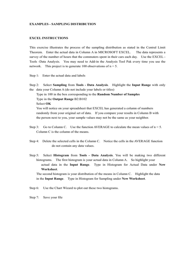
EXAMPLES - SAMPLING DISTRIBUTION EXCEL INSTRUCTIONS This exercise illustrates the process of the sampling distribution as stated in the Central Limit Theorem. Enter the actual data in Column A in MICROSOFT EXCEL. The data represents a survey of the number of hours that the commuters spent in their cars each day. Use the EXCEL Tools -Data Analysis. You may need to Add-in the Analysis Tool Pak every time you use the network. This project is to generate 100 observations of n = 5. Step 1: Enter the actual data and labels Step 2: Select Sampling from Tools - Data Analysis. Highlight the Input Range with only the data your Column A (do not include your labels or titles) Type in 100 in the box corresponding to the Random Number of Samples Type in the Output Range B2:B102 Select OK You will notice on your spreadsheet that EXCEL has generated a column of numbers randomly from your original set of data. If you compare your results in Column B with the person next to you, your sample values may not be the same as your neighbor. Step 3: Go to Column C. Use the function AVERAGE to calculate the mean values of n = 5. Column C is the column of the means. Step 4: Delete the selected cells in the Column C. do not contain any data values. Notice the cells in the AVERAGE function Step 5: Select Histogram from Tools - Data Analysis. You will be making two different histograms. The first histogram is your actual data in Column A. So highlight your actual data in the Input Range. Type in Histogram for Actual Data under New Worksheet. The second histogram is your distribution of the means in Column C. Highlight the data in the Input Range. Type in Histogram for Sampling under New Worksheet. Step 6: Use the Chart Wizard to plot out these two histograms. Step 7: Save your file EXCEL PROJECT (CONT.) Step 1. Type in the data in the ACTUAL DATA column EXCEL PROJECT (CONT.) Step 2: Select Sampling from Tools - Data Analysis. Highlight the Input Range with only the data your Column A (do not include your labels or titles) Type in 100 in the box corresponding to the Random Number of Samples Type in the Output Range B2:B108 Select OK You will notice on your spreadsheet that EXCEL has generated a column of numbers randomly from your original set of data. If you compare your results in Column B with the person next to you, your sample values may not be the same as your neighbor. However, the data in the SAMPLING and SAMPLING DISTRIBUTION columns in your spreadsheet may not be identical to what is printed here. EXCEL PROJECT (CONT.) Step 3: Go to Column C. Use the function AVERAGE to calculate the mean values of n = 5. Column C is the column of the means. EXCEL PROJECT (CONT.) Step 4: Delete the selected cells in the Column C. do not contain any data values. Notice the cells in the AVERAGE function EXCEL PROJECT (CONT.) Step 5: Select Histogram from Tools - Data Analysis. You will be making two different histograms. The first histogram is your actual data in Column A. So highlight your actual data in the Input Range. Type in Histogram for Actual Data under New Worksheet. The second histogram is your distribution of the means in Column C. Highlight the data in the Input Range. Type in Histogram for Sampling under New Worksheet. EXCEL PROJECT (CONT.) Step 6: Actual Use the Chart Wizard to plot out these two histograms. Data is shown here. The histogram for the EXAMPLES - SAMPLING DISTRIBUTION (CONT.) Step 6: Use the Chart Wizard to plot out these two histograms. shown here. The histogram for the Sampling Distribution is Your sampling distribution will be different from the chart below. Income Analysis Project Based on past experience, the annual pay for a person with a Bachelor degree in one Business school with less than three year of experience from the sample taken by a recruiting officer is as follows: 78000, 73500, 65000, 58500, 67000, 79000, 72000, 68000, 51250, 54000, 61000, 66000, 69500, 58000, 72000, 76850, 64750, 61500, 75500, 64000. Use EXCEL to generate 250 random numbers from this sample. with size = 10. (i) (ii) (iii) (iv) Form the distribution of means Print the entire sheet with the actual data and the numerical data of the sampling distribution using the font size of 5. What is the mean value and the standard deviation. Print the histogram of the actual data and the column chart ( the bar graph ) Print the histogram of the sampling distribution and the column chart ( the bar graph ). With the mean value and standard deviation obtained in (i), apply the command NORMINV(probability,mean,standard_dev) to generate 20 normal distributed numbers with two decimal places. Based on the generated numbers, do (i) (ii) and (iii) accordingly.


