Excel 2010 Charts and Graphs
advertisement

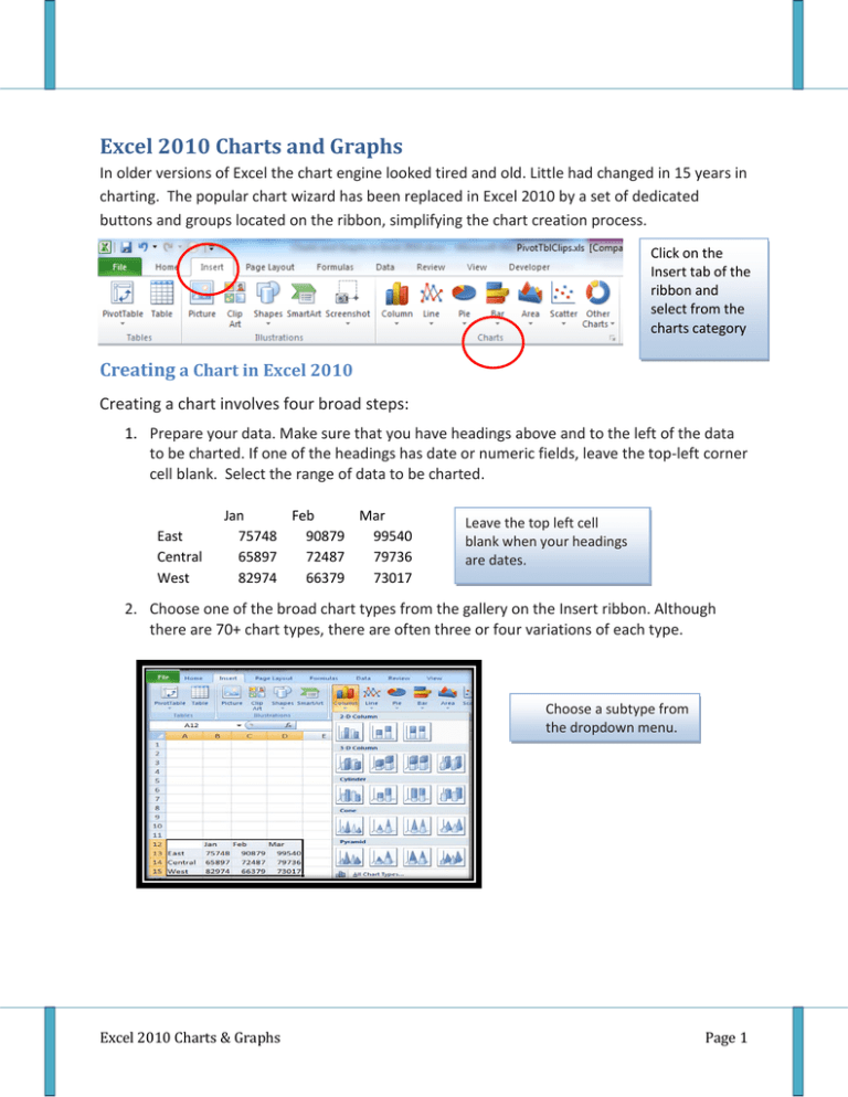
Excel 2010 Charts and Graphs In older versions of Excel the chart engine looked tired and old. Little had changed in 15 years in charting. The popular chart wizard has been replaced in Excel 2010 by a set of dedicated buttons and groups located on the ribbon, simplifying the chart creation process. Click on the Insert tab of the ribbon and select from the charts category Creating a Chart in Excel 2010 Creating a chart involves four broad steps: 1. Prepare your data. Make sure that you have headings above and to the left of the data to be charted. If one of the headings has date or numeric fields, leave the top-left corner cell blank. Select the range of data to be charted. East Central West Jan Feb Mar 75748 90879 99540 65897 72487 79736 82974 66379 73017 Leave the top left cell blank when your headings are dates. 2. Choose one of the broad chart types from the gallery on the Insert ribbon. Although there are 70+ chart types, there are often three or four variations of each type. Choose a subtype from the dropdown menu. Excel 2010 Charts & Graphs Page 1 Most chart types come in variations where series are plotted side by side, stacked, or 100% stacked. 3. Visit the Chart Tools Design ribbon to choose a Chart Layout and a Chart Style. Chart Layouts offer up to a dozen different views of the same chart. Excel 2010 Charts & Graphs Page 2 The Chart Styles gallery offers 48 color combinations built around the current theme. If you copy the chart to PowerPoint, you can use the new darker layouts to match the background of your slide. 4. If the built-in style didn’t perfectly provide axis titles, legends, etc., visit the Layout ribbon to have easy editing choices for all chart elements. For more granular control, visit the Format ribbon, where you can apply an effect to any particular element in the chart. Use the Format ribbon to apply an effect to a particular chart element. Excel 2010 Charts & Graphs Page 3 Using Other Chart Types In a Scatter chart, your data should contain pairs of numbers. Excel will find the first number along the horizontal access and the second number along the vertical axis and add plot a marker at the intersection of those values. This chart works well for seeing if two variables are related. Each point represents the intersection of an X, Y pair. For the Stock Charts, your data must be in the exact order specified by the name of the chart type. The High-Low-Close chart is one of four stock charts available. Pie Charts are percentage charts that are effective in displaying the proportional relationship of values within one data series. Descriptive headings (categories) on the worksheet should be listed in one column, with the related data placed in the next column. Remember that pie charts will not display zero or negative values, that no more than seven categories can be used, and that the categories should represent parts of the whole pie. First Qtr Totals 31% 38% 31% Excel 2010 Charts & Graphs East Central West Page 4 Adding New Data to a Chart Say that you have produced a series of charts last month and now you need to update all of those charts to reflect a new month of data. Follow these steps: 1. Open the workbook from last month. Type the new month’s data adjacent to the old month’s data in the workbook. 2. Click on the plot area of the chart. A blue rectangle appears around the range of data currently plotted on the chart. Notice that there are blue square handles in each corner of the range. Range of Data Drag the handle to the right to include the new October data. Plot Area After dragging the handle, the chart updates to include the new month. Excel 2010 Charts & Graphs Page 5 Custom Chart Templates If you create a chart that might be useful in the future, you can save that chart as a template. To create a custom template: Click on the chart with a formatting setup you want to reuse in the future and, under the design tab, in the type group, click Save as Template. In the Save Chart Template dialog box, enter a name for the template in the File name field and click Save. To use a saved chart template: 1. Highlight the data you want to use for the chart 2. Under the Insert tab, click the desired chart type (e.g. Column, Line) from the Charts gallery, and select All Chart Types from the dropdown menu. 3. In the Insert Chart dialog box, click Templates. Select the desired chart template from the available options and click OK. Tip: Click Manage Template in the Insert Chart dialog box to open the folder where Excel chart templates are stores on your computer. From here, you can copy favorite templates to a backup folder or even send them to other people! Excel 2010 Charts & Graphs Page 6


