Data & Graphs
advertisement
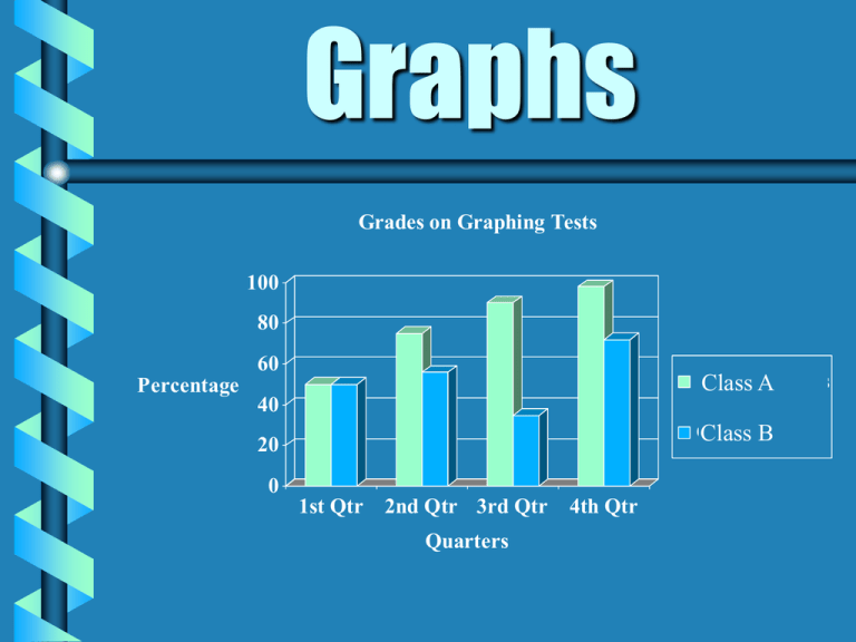
Graphs Grades on Graphing Tests 100 80 60 Barnhart Class A Kids Percentage 40 Other Class Kids B 20 0 1st Qtr 2nd Qtr 3rd Qtr Quarters 4th Qtr Box - and Whisker Plot Circle Graph Pictograph Types of Graphs Bar Graphs Line Graphs Single Double Plots Histogram Stem & Leaf Single Line Scatter Double Pictograph Fireflies More Info Bar Graph Number of Students Favorite Subjects 70 60 50 40 30 20 10 0 Math Science Reading Social Studies Subjects More Info Double Bar Graph Plant Growth 20 Inches 15 Light Dark 10 5 0 Week 1 Week 3 Week 2 Week 4 Weeks More Info Histogram Class Test Scores 10 9 Frequency 8 7 6 5 4 3 2 1 10-Jan 11-20 21-30 31-40 41-50 51-60 Test Scores 61-70 71-80 81-90 90-99 More Info Line Graph Degrees Farenheit Temperature For One Week 100 90 80 70 60 50 40 30 20 10 0 Day 1 Day 2 Day 3 Day 4 Day 5 Days of the Week More Info Double Line Graph Amount of Rainfall 5 Inches 4 3 1999 2 2000 1 0 May July June August Months More Info Circle Graph Eye Color 8% 20% 40% Brown Blue Green Other 32% More Info Line Plot Favorite Colors X X X X X X X X X X X X X X X X X X Red Blue Green Yellow Purple X More Info Stem and Leaf Plot Student Heights in Centimeters 7889 12 7,8,8,9 1244466 13 1,2,4,4,4,6,6 0023347 14 0,0,2,3,3,4,7 11 15 1,1 Key: 12 7 = 127 cm More Info Scatter Plot Study Time Versus Grades 100 80 Grade 60 40 20 0 * 0 ** * * 1 2 3 Study Time in Hours ** 4 5 More Info Box - and - Whisker Plot Hours of Homework 5.25 6.3 6.9 7.75 5 3 4 5 6 7 8 9 More Info Return to Graph Bar Graph b b b The purpose of a bar graph is to display and compare data. Bar graphs use bars to show the data. A bar graph must include: - a title - labeled X and Y axes - equal intervals are used on the Y axis - the bars are evenly spaced apart from each other Return to Graph Stem and Leaf Plot Stem and leaf plots are used as a quick way of seeing how many pieces of data fall in various ranges. The reader can quickly tell: - the range - the mode Stem and leaf plots have a title, a stem, and leaves A key is used to explain how to read the stem and leaves. Return to Graph Pictograph All pictographs have a title. Use pictures to show the data. Rows and columns shape the pictograph. Each picture equals a certain amount of data. Label each row and column. Pictographs need a key. Return to Graph Line Graph A line graph is used to illustrate change over time. Line graphs need: - Title - Labeled X and Y axes - Equal Intervals - Data displayed by points connected into lines Return to Graph Double Line Graph A double line graph is used to compare two groups of related data over time. Double line graphs need: - Title - Labeled X and Y axes - Equal Intervals - Data displayed by points connected into lines - Key Return to Graph Circle Graph Circle graphs are used to display parts of the data in relation to the entire amount of data. All circle graphs need a title. Each part is called a sector and is labeled. All angles correct (+2/-2 degrees) Return to Graph Double Bar Graph The purpose of a double bar graph is to compare two or more sets of data. Uses bars to show the data. Double bar graphs must include: - Title - Labeled X and Y axes - Equal intervals are used on the Y axis - Pairs of bars are equally spaced, but the compared bars are not - Key Return to Graph Line Plot A line plot shows the spread of all the data on a number line. Easily identifies the mode. All line plots include: - a title - a numbered horizontal line - data displayed by use of X’s Histogram Histograms are used to show the frequency of data. Very similar to bar graphs, but use intervals on the X axis. Bars do touch. Return to Graph Histograms have a title. Histograms have two axes which are labeled. Return to Graph Box - and - Whisker Plot Displays large set of data. Gives general idea of how data clusters. Graph includes: - Title - Labeled intervals - Box between lower and upper quartiles - Whiskers from quartiles to extremes - Median, quartiles and whiskers labeled Return to Graph Scatter Plot Shows how closely two sets of data are related The closer the sets are related, the closer the points come to forming a straight line. Scatter Plots include: - title - labeled axes - equal intervals - corresponding numbers plotted as ordered pairs
