CONSIDERING THE ART OBJECT_POP ART_2013
advertisement

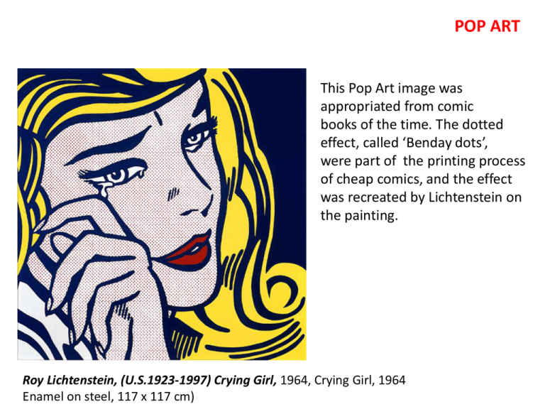
POP ART This Pop Art image was appropriated from comic books of the time. The dotted effect, called ‘Benday dots’, were part of the printing process of cheap comics, and the effect was recreated by Lichtenstein on the painting. Roy Lichtenstein, (U.S.1923-1997) Crying Girl, 1964, Crying Girl, 1964 Enamel on steel, 117 x 117 cm) The 1950s and 60s saw a great increase in mass-produced goods, wealth, power and industrialisation throughout the Western world. Through the 60s and 70s there were also many social justice issues that were being talked about. But at the same time, other groups, such as Pop Artists were celebrating the turbo-charged modernity of the Western world. Pop art reflected back the mad mad world of consumerism – the disposable; the new; the flashy; the cheap. It celebrated it, rather than criticising it as much postmodern art does today. However in celebrating it, it also invited the audience to think about ‘what is art’? Ed Ruscha, (U.S.b1937) Standard Station, Amarillo Texas 1963, oil on canvas, 162 x 303cm Heroic perspective Edgar Degas (French, 1834–1917) Waiting, c. 1882, pastel on paper, 43 x 60cm. Claude Monet (Fr. 1840-1926) , Woman with a parasol, 1875, 100 x 81cm Ed Ruscha (U.S. b.1937)Hey with curled edge, c. 1964 Ink and powdered graphite on paper, 29 x 31cm Use of typography in new and puzzling ways: Kurt Schwitters & Theo von Doesburg, Small Dada Soiree, lithograph, 1923. This was an poster advertising a Dada art event. Picasso, Man with a hat and violin, 1912. Barbara Kruger (US, b.1945), Untitled (Your gaze hits the side of my face), 1981. Ed Ruscha, (U.S.b1937) Hollywood, 8 colour screen-print, 1968, dimensions unknown. How has Ruscha treated this Hollywood sign in this image? Ed Ruscha, (U.S.b1937) Oof, 1963, oil on canvas 181 x 170 cm Pop art was art of the everyday, and looked outwards to the advertising signs, posters, comics on the street and in magazines and movies. It deliberately created art out of stuff that wouldn’t normally be in a Gallery, but for sale on the street. It was also an art that tended to be associated with the young and groovy, so that was attractive. However it also could be confronting, as youth was associated with the anti-war protests, rock music and the rising drug culture. Andy Warhol (US, 1928-1987) Campbell’s Soup cans, oil on 32 canvases, each canvas 50 x 40cm. Originally exhibited with each separate canvas resting on a shelf. Warhol moved to silk screen printing in the early sixties. This acted to further depersonalise the works. Warhol: ‘…the reason I’m painting this way is because I want to be a machine… …I think it would be terrific if everyone was alike…’ (Swanson, 1963) ‘…If you want to know all about Andy Warhol, just look at the surfaces of my paintings and films and me, and there I am. There’s nothing behind it…’ (Warhol, 1968) Warhol was deliberately vulgar and deliberately (but only selectively) antioriginal. He used assistants for his work, incorporating their mistakes etc. that occurred, as with the image below. Ironically, his talk about not being original and about everyone being the same, was a sensation in itself, a kind of scandal. A celebrity cult grew up around him and his work. Warhol, Untitled, from Marilyn Monroe series, Series of 10 screenprints, 91 x 91cm, 1967 Warhol, Big Electric Chair, screenprint, one of series, 1967 Warhol was obsessed his whole life with news and celebrity. This is much more common now But in the 60s this was just beginning. This image of an electric chair (which was used to execute prisoners in New York) was published in a newspaper after the execution of some famous criminals. Much of Warhol’s imagery was concerned with death. HSC Question for your enjoyment…. Q: Ricky Swallow is a contemporary Australian artist. In 2001, he used computer-aided design to create the iMan Prototype body of work. Use the postmodern frame to analyse Plates 3 and 4. Refer to Plate 5 in your response. Plate 3: Ricky Swallow, b.1974, Australia iMan Prototypes, 2001 Injected-moulded resin with colour tint, four pieces, each 16 × 11.5 × 18.5 cm. Plate 5: Apple design team and Jonathan Ive, iMac, 1998, personal computer Manufactured by Apple, 46 × 42 × 38 cm, Moulded plastic available in five different colours. Plate 4: Back view of an iMan Prototype, 2001


