Technical Report
advertisement
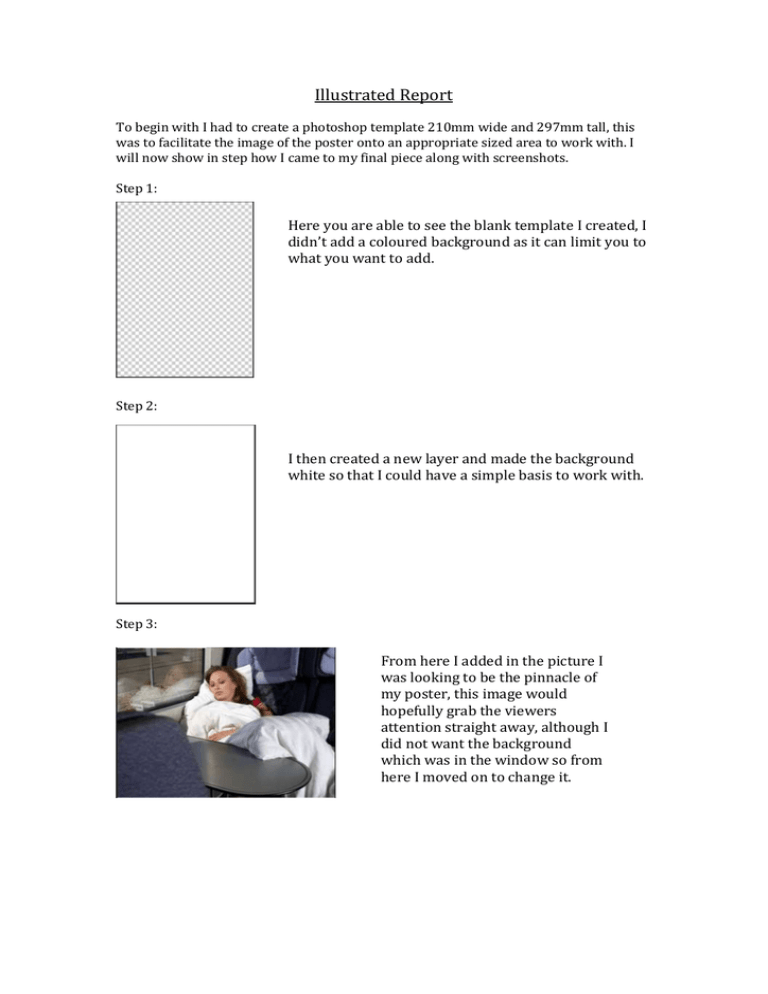
Illustrated Report To begin with I had to create a photoshop template 210mm wide and 297mm tall, this was to facilitate the image of the poster onto an appropriate sized area to work with. I will now show in step how I came to my final piece along with screenshots. Step 1: Here you are able to see the blank template I created, I didn’t add a coloured background as it can limit you to what you want to add. Step 2: I then created a new layer and made the background white so that I could have a simple basis to work with. Step 3: From here I added in the picture I was looking to be the pinnacle of my poster, this image would hopefully grab the viewers attention straight away, although I did not want the background which was in the window so from here I moved on to change it. Step 4: You are able to see that the window now has no background in it and has been taken out completely, this was done my using the magic wand tool and carefully selecting the area to remove, then by using the eraser I tidied up the edges. You may also be able to see that I have darkened some areas of the image such as her face etc., this is because the image I wish to insert is darker than the one in the window before, so the transition did not work well, all I done was selected specific parts of the image and used the brightness select to darken it. You can see that when I first added the image it was the wrong direction, so I resized it and flipped it to the other direction, I then added in a new layer and decided to give it a misty effect, this was done with the drawing tool set to a very light grey and then drawn over the glass, I used the eraser again to tidy it up. The fourth image you see above was adding a frosted effect to it, this was done with a spray can tool with the hardness level very low and has just been sprayed over with a dark white until the desired effect has been received, again the eraser tool was used to tidy up the edges. I also used the blur and smudge tool to blend in the two different pictures as not to allow any subtle changes in the pictures for the user to see. Step 5: I thought I would add in some sort of deal to the image so I decided to add in the flyer for the yLink card, as you can see when I added it, the flyer looked like it didn’t belong there although once I went to transformation and skewed the image a little and transformed it, then blurred the edges a bit, I believe it then looked as if it was on the table. I then decided to sharpen the middle of the flyer and also make it a bit darker as it looked to bright for the image. Step 6: I added the translink logo in at the bottom right hand corner of the page and resized it until it fitted properly. Here is the QR code I added in, once scanned it will bring the user straight to the translink site where they can book a train without delay. Above the QR code I added this text, I believe this is effective in what the QR code is about and making the user want to travel. Step 7: I then moved on to the top of the screen, I believe that this would be the second most important part of the page, it is what the user may look at first, so I decided big writing, would be the best way to go, and also what I wrote would be important, I used the text tool to create it, I then added in an image of what the yLink card actually looks like to give the viewer more of an incentive to get it. To the left you are also able to see a gradient that I added, I believe it adds more character to the poster while as you can see keeping within translinks colours. Final design: This is what my final design of the poster looks like, you can see fully now where and why I added certain aspects of the picture and how it all works together, I don’t believe anything looks out of place, and as you can see I have kept the colour control to the same colours translink have used for their logo. I believe this is a simple but effect poster that could potentially advertise translink quite well and bring in the customers.
