Definition of visual techniques - Université catholique de Louvain
advertisement
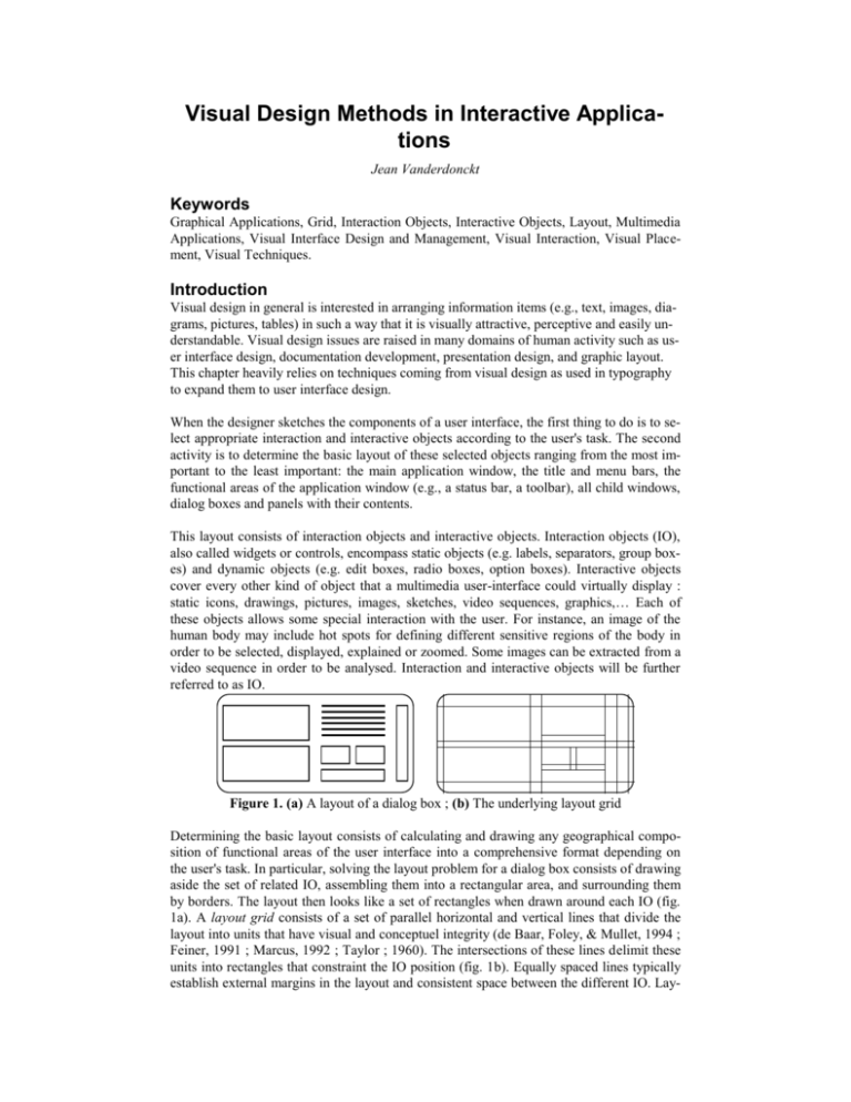
Visual Design Methods in Interactive Applications Jean Vanderdonckt Keywords Graphical Applications, Grid, Interaction Objects, Interactive Objects, Layout, Multimedia Applications, Visual Interface Design and Management, Visual Interaction, Visual Placement, Visual Techniques. Introduction Visual design in general is interested in arranging information items (e.g., text, images, diagrams, pictures, tables) in such a way that it is visually attractive, perceptive and easily understandable. Visual design issues are raised in many domains of human activity such as user interface design, documentation development, presentation design, and graphic layout. This chapter heavily relies on techniques coming from visual design as used in typography to expand them to user interface design. When the designer sketches the components of a user interface, the first thing to do is to select appropriate interaction and interactive objects according to the user's task. The second activity is to determine the basic layout of these selected objects ranging from the most important to the least important: the main application window, the title and menu bars, the functional areas of the application window (e.g., a status bar, a toolbar), all child windows, dialog boxes and panels with their contents. This layout consists of interaction objects and interactive objects. Interaction objects (IO), also called widgets or controls, encompass static objects (e.g. labels, separators, group boxes) and dynamic objects (e.g. edit boxes, radio boxes, option boxes). Interactive objects cover every other kind of object that a multimedia user-interface could virtually display : static icons, drawings, pictures, images, sketches, video sequences, graphics, Each of these objects allows some special interaction with the user. For instance, an image of the human body may include hot spots for defining different sensitive regions of the body in order to be selected, displayed, explained or zoomed. Some images can be extracted from a video sequence in order to be analysed. Interaction and interactive objects will be further referred to as IO. Figure 1. (a) A layout of a dialog box ; (b) The underlying layout grid Determining the basic layout consists of calculating and drawing any geographical composition of functional areas of the user interface into a comprehensive format depending on the user's task. In particular, solving the layout problem for a dialog box consists of drawing aside the set of related IO, assembling them into a rectangular area, and surrounding them by borders. The layout then looks like a set of rectangles when drawn around each IO (fig. 1a). A layout grid consists of a set of parallel horizontal and vertical lines that divide the layout into units that have visual and conceptuel integrity (de Baar, Foley, & Mullet, 1994 ; Feiner, 1991 ; Marcus, 1992 ; Taylor ; 1960). The intersections of these lines delimit these units into rectangles that constraint the IO position (fig. 1b). Equally spaced lines typically establish external margins in the layout and consistent space between the different IO. Lay- out grids are very practical for form fill-in user interfaces and for text displays since their IO reflect the layout of the source doument or the page of a book(Hurlburt, 1978 ; MüllerBrockman, 1981). Such a layout grid can be applied for both the background and foreground of screens, as in HyperCard (Apple, 1992). The problem comes from the fact that in modern user-interfaces (especially multimedia interfaces), layout grids are no longer valid since the layout no longer consists of vertical and horizontal lines. Instead of these kinds of lines, the layout may be based on other lines (e.g., oblique lines, discontinuous lines), convex shapes (e.g., lozenge), planes (e.g., a plane with a vanishing point), and volumes (e.g. cylinder). Therefore, we extend the definition of a layout grid to a layout frame. A layout frame consists of dots, lines, shapes and volumes that constraint the localization of IO. Deciding such a complex layout frame is not an easy task. To help the designer to do this job, several visual techniques are now introduced and examplified. Definition of visual techniques A visual technique relies on a commonly accepted visual principle to suggest the arrangement of the layout frame components. The visual techniques listed in this section are sorted by similarity and not by rank of importance because we are convinced that all visual principles cannot be applied with the same representativeness. Some principles are very thorough to apply, some other are more difficult to compell with, and some other become very hard to translate. Moreover, applying this or that principle mostly depends of the involved IO and the visual aims that the designer has in mind. Some principles cannot be excluded nor all principles can be included. Visual techniques can be grouped into five categories: Physical techniques: balance, symmetry, regularity, alignment, proportion, and horizontality. Composition techniques: simplicity, economy, understatement, neutrality, singularity, positivity, and transparency. Association and dissociation techniques: unity, repartition, grouping, and sparing. Ordering techniques: consistency, predictability, sequentiality, and continuity. Photographic techniques: sharpness, roundness, stability, levelling, activeness, subtlety, representation, realism, and flatness. Table 1 graphically summarizes typical layouts representing the above visual techniques. These techniques are then defined and discussed further in the next sections. The left part of each cell represent a typical graphical layout applying a visual technique expressing harmony, while the right part present the opposite technique expressing contrast in the screen. Table 1 can also serve as a quick reference card to locate a screen with respect to used visual techniques. Physical techniques Balance Symmetry Instability Asymmetry 1 2 1 2 3 4 Regularity Irregularity 1 2 1 2 3 4 5 6 Alignment Misalignment Proportion Disproportion Horizontality Verticality Composition techniques Simplicity Complexity Economy Intricacy Understatement Exaggeration Neutrality Accent Singularity Juxtaposition Negativity Positivity Transparency Opacity Association and dissociation techniques Unity Fragmentation Repartition Grouping Splitting Sparing Quadrant preference Density Ordering techniques Consistency Variation Predictability Spontaneity Sequentiality Randomness Continuity Episodicity Sharpness Diffusion Roundness Angularity Photographic techniques Stability Stress Levelling Sharpening Activeness Passiveness Subtlety Boldness Representation Abstraction Realism Distortion Flatness Depth Table 1. Graphical representations of visual techniques. Physical techniques Balance is a highly recommended technique evoqued by many authors (Dondis, 1973 ; Dumas, 1988 ; Galitz, 1989 ; Horton, 1990 ; Kim & Foley, 1993). Balance is a search for equilibrium along a vertical or horizontal axis in the layout. If a weight is attached to every IO, balance requires that the sum of IO weights on each hand of the axis remains similar. Balance is justified by the human perception and intense need for it in visual layouts. Balance is a technique in which there exists a gravity centre located on an axis (vertical or horizontal). Instability is the opposite of balance where IO are not distributed equally on each hand of the axis. “They seem ready to topple over. “ (Galitz, 1989). Balanced layouts are not only easy to understand, but, also, easy to design by a game of counterpoise. If an IO is placed to the left of the vertical axis, instability is provoked and immediately countered by adding an IO if the same weight to the right of the vertical axis. Figure 2. (a) A symmetrically balanced layout ; (b) An asymmetrically balanced layout. Balance does not have to take the form of symmetry. Balance can be realized through symmetry (fig. 2a) and asymmetry (fig. 2b) (see symmetry). Symmetry provides a balance to the layout by centering titles, headings on both sides of the axis, by placing two columns of equal length, one on the left, one on the right. The weights of IO can be adjusted asymmetrically (Dondis, 1973), although it is technically more complicated to reach a balance with dynamic asymmetry than with static symmetry. Reaching asymmetric balance is a matter of weight, size and position. Symmetry (Dondis, 1973 ; Galitz, 1989 ; Kim & Foley, 1993) consists of duplicating the visual image of IO along a horizontal (fig. 3a) and/or vertical axis (fig. 3b) (e.g., left on the right, top to bottom, or vice versa). Achieving symmetry automatically preserves balance, but the balance can be performed without symmetry. Symmetry is very simple to verify and logical to imagine, but can lead to static layouts without originality (Dondis, 1973). The opposite of symmetry is asymmetry where at least one IO do not possess a replication on the other side of the axis. Figure 3. (a) A horizontally symmetric layout ; (b) A vertically symmetric layout. Regularity (Dondis, 1973 ; Galitz, 1989) is a visual technique establishing uniformity of IO placed according to some principle, method, convention that do not change from one layout to another. Regularity is very concerned with the horizontal and vertical uniformizations and equilibrations. For instance, a layout where IO are uniformly spaced in columns and rows is qualified of regular. Irregularity arrives when no such principles, method or convention exists, when no logical order of IO is apparent. Irregularity emphasizes unexpected, unusual and unconforming layout grids (Dondis, 1973). Alignment (Kobara, 1991 ; Mullet & Sano, 1995 ; Streveler & Wasserman, 1984) is probably the most accessible and practical visual technique. Alignment is guaranteed if the number of vertical alignment points in a row and the number of horizontal alignment points in a column is reduced, minimized. Misalignment - the opposite of the alignment - occurs when the number of alignment points is greater than one. Misalignment is accentuated when all IO containing task's data are placed just after their identification labels. Fonts with descenders and ascenders may affect alignment of similar IO if badly used. Proportion (Dondis, 1973 ; Galitz, 1989 ; Kim & Foley, 1993 ; Marcus, 1992 ; Mullet & Sano, 1995 ; Tufte, 1983) strives for an aesthetically appealing ratio between the dimensions of IO (often composite IO). Because dimensions exist in the real world, we can feel them, we can see them, we can compare them. Mirroring dimensions in layouts consists of retracing this feeling, this illusion in the user interface. The ratio is calculated by dividing the height of an IO by its length. Several proportions have been either proved aesthetic (e.g. the Golden Ratio 1: 1 5 used by the Greeks) or widely and conventionnally preferred 2 (e.g. 1:2, 1:2, 1:1.29, 1:1:5, 1:4/3, 1:1.6 as recommended by Marcus (1992) and Tufte (1983)). Disproportion - the opposite of proportion - is implied at the time no special ratio is used or a large difference appears between the two dimensions. Horizontality (Dondis, 1973) is a corollary of the previous technique: it shows that layouts with greater length than height (i.e., a horizontal ratio) are predominant. Verticality - the opposite of horizontality - arrives if unwanted layouts have greater height than length (i.e. a vertical ratio). Horizontality is highly preferred than verticality : having long, narrow vertical dialog box is disgusting. Composition techniques Simplicity (Dondis, 1973 ; Galitz, 1989 ; Mullet & Sano, 1995 ; Tullis, 1981 ; Tullis, 1983) is directness and singleness of layout, free from secondary complications or sophistications. Simplicity improves largerly the ease of understanding the layout grid. Simplicity is guaranteed by placing IO according to a logical and natural arrangement (e.g. by frequence, by physical property) driven by the task's semantics. Complexity - the opposite of simplicity - increases visual intricacy with too much units, forces and results and hinders any organization of the layout grid. Tiled IO are considered as a simple layout ; varying overlapping IO are considered as a complex layout. Economy (Bowman, 1968 ; Dondis, 1973 ; Galitz, 1989) is the frugal and judicious use of IO in the layout to present information as simply as possible. Economy can be pursuited when necessary and sufficient IO are placed in the layout and nothing else : no IO that are extraneous to the user's task. The aim of economy is the fundamental visual layout, emphasizing the conservative and understatement of the poor and the pure (Dondis, 1973). Economy is intended to define the boundaries of necessity within which it can work sucessfully (Bowman, 1968). Intricacy - the opposite of economy - is manifested when unfrequent, unwanted IO encumber the layout unnecessarily visually or not. Intricacy endlessly details the layout with ornamentation or overcrowding IO. This situation particularly occurs when highly detailed or digitized images with a lot of decoration are placed rather than simple IO that are reduced to the essentials and whose important features are the only salient features. Understatement (Dondis, 1973) and its opposite, the exaggeration, are equivalent to the couple economy-intricacy, but in the domain of intellectual, mental representation rather than physical, spatial representation. Understatement supposes that the viewer of the layout is able to deduce a maximum of information from a minimum of IO to be presented. The verbal counterparts of understatement is euphemism and ellipsis, i.e. the art of saying much things with little words. Exaggeration shows in the layout a minimum of information with maximized IO. The verbal counterparts of exaggeration is hyperbole. Exaggeration is achieved through extravangancy, amplified expressions that are enlarged far beyond possible. Neutrality (Dondis, 1973 ; Horton, 1990) cuts every resistance, repulsion, or even belligerency of the layout viewer. A neutral atmosphere in the layout is obtained by placing all IO at the same level, with the same presentation attributes (or, at least, with little variations) as much as possible and, preferably, with no highlighting method (e.g. no blinking, no underlining, no bolding, no boxing). Accent - the opposite of neutrality - is equivalent to the rendering of any highlighting method on a particular IO against a sameness of background. Most graphical highlighting methods are useful : reverse video, color, brightness, boldness, boxes, borders, different sizes, overprinting, magnifying (Horton, 1990). Singularity (Dondis, 1973) is the focus of a layout on one separate and solitary IO, unsupported by any other IO or composiion of IO. Specific emphasis is conveyed on a simple IO, despite the presence of other IO. Juxtaposition - the opposite of singularity - expresses an interaction between IO placed side by side or to be compared with an activated relationship or to be related by any visual technique. Negativity (Dondis, 1973 ; Horton, 1990) displays IO in dark colors on a light background. Black IO (text, separators, labels, fiels) and coloured IO (bitmaps, images) are generally displayed on a white or grey layout. Positivity - the opposite of negativity - displays IO in a bright color on a dark background. If negativity has been experimentally tested to reduce errors and reading time, to increase subjective satisfaction and legibility, positivity may still be used to convey special atmospheres, often with light IO (e.g. grey pictures). Transparency (Dondis, 1973 ; Staples, 1993) means a visual layout where IO, superseded by other IO, can still stay visible behind or through them. Transparency is typically mandatory when displaying text on a colourful picture. A light transparent surface (e.g. grey or blue) is added between the text and the picture to improve the legibility of the text and to allow in spite of all the visibility of the picture behind the text. Opacity - the opposite of transparency - means the complete blocking out, concealing of IO that become visually occulted. Having partially occulted IO force the user to guess what IO (part or complete) are hidden. Opacity can also be used to give the impression of a relative distance or depth (see depth below) legislated by overlapping. Association and dissociation techniques Unity (Bowman, 1968 ; Dondis, 1973 ; Galitz, 1989) is the placement of individual IO into one totality (e.g. a window) that is visually all of a piece. With unity, all IO seem to belong to each together and to be bound so that they can be seen as a whole and taken as one sealed unsectile thing : seeing one element is seeing the whole. Unity can be revealed with similar sizes, colors, surrounding blank spaces, logical organization exhibiting interrelation of IO in terms of the whole. Contrarily, with fragmentation, all IO seem to be isolated, to retain their own character themselves. Fragmentation is one of the most unbelievable danger of multimedia layouts where IO, as they appear non convex, are not aggregated nor related. Repartition (Dumas, 1988 ; Horton, 1990) proposes to share IO among the four quadrants of the layout as systematically as possible. Experimental results argued it is not often the case while first, second, thrid, and fourth quadrants consume 40%, 20%, 15%, and 25% of the IO, respectively (fig. 4). Quadrant preference - the opposite of repartition - occurs when IO are preferably placed in one or many specific quadrants. Of course, we have taken into account the fact that human eyes favor the left-hand and lower area of any layout (this phenomenon is called Preference for lower left). But there are numerous examples of poorly distributed user interfaces. Most of these examples show displays in which IO are pushed over to the left-hand portion of the layout. Is it because Western users read from left to right or because programmers find very easy this way of placing IO? In all cases, the repartition should be compatible with the task structure, rather than with the file or database structure. 45% 20% 25% 15% Figure 4. Percentage of repartition among the four quadarants on the screen. Grouping (Dondis, 1973 ; Galitz, 1989 ; Horton, 1990 ; Tullis, 1981 ; Zahn, 1971) is a visual technique that creates a circumstance of give and take of relative interaction. Grouping is mainly based on the law of attraction: two grouped IO fight for attention in their interaction by establishing individual statements depending on the distance between the IO. The close the IO are, the stronger the attraction is. Grouping is also affected by the law of similarity: opposite, dissimilar IO repel each other, but equal, similar IO attract each other. When dissimilar IO are grouped, the human eye increases the relation between them. When similar and dissimilar IO are grouped, hidden connections are identified as fast. Grouping is one of the best techniques for structuring a layout namely by providing an aesthetic appearance, by helping remembering and by accelerating a layout search. One of the most important usability guidelines is the fact that objects that are semantically linked should be grouped in some way (Vanderdonckt ; 1994). Contrarily, objects that do not share any semantic relationship should be split. Splitting - the opposite of grouping - means that no such structure is appearing: IO are disseminated without the ability to visually perceive an attraction or a repulsion between IO. Typically, the layout consists of a certain amount of IO that are placed in Indian file or where there is some free space all over the layout. Sparing (Dondis, 1973 ; Galitz, 1989 ; Horton, 1990) looks for avoiding cluttered or overcrowded layouts: it suggest to keep the visual loading of a layout within reasonable boundaries. Density - the opposite of sparing - takes no care about stacking and packing IO too tightly in the layout. Generally, much layouts contain too much IO to the point that easy scanning is no longer possible. The trend is to fill each layout space with as much IO as possible (e.g. text, fields, pushbuttons, images). The visual loading, sometimes called density, is, by definition, the proportion of busy positions on the layout. For alphanumeric displays, it can be expressed as the ratio of displayed characters by the total amount of charac- ters in the layout (Tullis, 1983). In graphical user interfaces, the density is calculated by dividing the number of lighted pixels by the total number of available pixels. Streveler & Wasserman (1984) also measure the field density which is the total amount of fields (static of dynamic) in the layout, and the box density, which is the total amount of visual groups whether surrounded or not. Tullis (1983) recommends that layout density should not exceed 25%. Horton (1990) recalls us that density of a well-designed paper page is located around 40%. Ordering techniques Consistency (Dondis, 1973) is a visual technique for expressing visual compatibility with the subject, for developing a layout whose IO are dominated by one sound, uniform, constant thematic. Consistency takes place not only in the dimensions or the ordering of IO, but, also in their (little) differences. Variation - the opposite of consistency - has no burdens for the domination of one or many themes. Variation is the strategy for identifying changes, elaborations as variations in musical themes. Variation do not have necessarily to take the form of unconsistency, where same IO are laid out at different places from one layout to another. Moreover, variation can be assumed by a serie, a continuum of IO whose contents, shapes, colors, themes vary significantly. Predictability (Dondis, 1973 ; Galitz, 1989) is a visual technique where IO are placed according to some order or plan that is highly conventional and recognizable. Knowing the information structure of the task, viewing one layout or remembering it should enable the user to predict how another layout will be arranged. Predictability also suggests the user is able to foretell in advance what the entire layout will be just by seeing a minimum part or some significant part of it. Predictability is enhanced through layout consistency (see consistency above). Spontaneity - the opposite of predictability - do not suggest such a highly conventional plan. The user will therefore be unable to infer successive layouts from already viewed layout or to generalize the entire layout from its parts. Spontaneity is synonym to impulsion, freedom, unconstraint, and unselfconsciousness. Sequentiality (Dondis, 1973 ; Galitz, 1989) is a plan of layout that is arranged in a logical, rythmic, expected order. Many orders can be followed to sequentially place IO : numerical order, alphabetical order, chronological order, physical order, type order, sequential order, functional order, logical order, frequence order, importance order, consensus order, designation order, For instance, the importance order sorts IO by decreasing rank of importance by placing first important IO and relegating secondary IO to the background. Randomness - the opposite of sequentiality - promotes the abscence of a particular ordering plan, that is a layout where the IO flow cannot be detected due to the lack of plan, or a disorganized, accidental, random one. Continuity (Dondis, 1973) uninterrupts the visual connections existing between the IO. These connections are fundamental for preserving a unitized visual statement. Continuity can be achieved by uninterrupting steps from one IO to another. This is often the case in video sequences, series of snapshots, morphing pictures, Continuity means the cohesion of the parts to the whole layout. Episodicity - the opposite of continuity - interrupts the visual connections that may exist between the IO. Episodicity exploits the rupture of connection, the disconnection, or the loosing of these connections. Episodicity means the reinforcement of the parts of a layout without adding new meaning or message with all IO taken as a whole. Photographic techniques Sharpness (Dondis, 1973) is a visual technique that is closely related to clarity of both physical state and expression. Having sharpness in a layout can be interpreted as having Clearly distinctive IO (e.g. information to be input by the user should be distinctive of information to be displayed by the system). IO with precise outlines, hard edges, distinct margins. The effect of sharpness is a distinct atmosphere, easy to assimilate. Diffusion - the opposite of sharpness - do not draw, place IO carefully, opting for less precision of character, but more fuzzy, wadded atmosphere, more feeling and warmth. Roundness (Dumas, 1988 ; Horton, 1990) is the preference for round IO giving a smooth atmosphere. Angularity - the opposite of roundness- is the preference for IO with angular, rugged outlines. Stability (Dondis, 1973) is the expression of preference for IO that have clear base to rest on. When rectangular, squared IO are placed on their bases, the layout appears stable because of the stability of its inherent IO . Stress - the opposite of stability - occurs when IO are not placed on their firm base or stability: a circle is a good example. But placing a lozenge, a rectangle or a triangle on one of its edges causes stress. When an IO is intrinsically irregular, the analysis and establishment of balance is more involved and intricate. Stress needs a stabilization process. Levelling is a visual technique for automatically establishing balance through artifacts. IO are laid out so that balance axis will stand out. Through our automatic perception, balance can be emphasized (or rubbed out, repectively) when we recognize easily (with difficulty, respectively) the abstract visual condition of balance. This is often the case when IO are equally distributed in two colums with two alignment points per column. Sharpening - the opposite of levelling - on the other hand destroys any automatic balance by placing IO on unexpected, unbalanced locations. Activeness (Dondis, 1973) reflects motion through explicit representation or implicit suggestion. The goal of activeness is to design an active and energetic layout with lively postures (e.g. arrows, stopped image in a video sequence, an action snapshot). Passiveness the opposite of activeness - withdraws any IO that could bring a dynamic effect. Passiveness relies on the technique of static representation, which presents an atmosphere of quiescence, resting by equilibrating IO. Subtlety (Dondis, 1973) is a visual technique in order to make a fine distinction, shunning any obviousness and energy of purpose. Subtlety is often synonym with ingeniosity since it requires delicate, highly refined IO. Boldness - the opposite of subtlety - looks for every obvious IO in its context. Boldness is often synonym with optimum visibility of all IO in the layout. Representation (Dondis, 1973) subsumes subtletly since its intended purpose is to use IO that concretely represent the real world in details. Abstraction - the opposite of representation - uses IO that abstract the real world in many ways. Icons, for example, can be representative if they simply translate a physical object or can be abstract if they mimic some action or just represents metaphors or major characteristics of the physical objects. For instance, concrete icons are believed to be better than abstract icons. Realism (Dondis, 1973) is the natural technique of camera. Many tricks and conventions are able to replicate the same visual cues that our eyes convey to our brain when receiving an external image. Realism tries to follow the same way by reproducing exactly what we see (maybe is it “what you see is what you lay out”?). Perspective (Stapples, 1993) is one possible technique for providing realism in 3D contexts. Distortion - the opposite of realism - tampers with realism, seeking control of effect through the deformation of the real IO in shape, form, color,This technique covers zooming in and out, magnifying lens, fisheye views (Furnas, 1986; Leung & Apperley, 1993), pictures cut in moved rows, teared pictures, Distortion is a great way for catching the eyes and producing an intense response. Flatness (Dondis, 1973) do not use any technique for providing perspective, so erasing the natural feeling of dimension and space. Depth - the opposite of flatness - tries to render perspective by replicating the environment through effects of light, shade, gradient of color, overlapping, Examples of visual techniques Physical and ordering techniques are typically the visual techniques that the designer may apply for the layout of traditional applications, since these techniques are effective for alphanumeric displays and for graphical user interfaces. This is not the case with real multimedia applications. Real multimedia applications are not those database applications where one or two fields containing images or video have just been added (in this case, rectangular layout grids are still working). Figure 5 depicts such a simple multimedia application with its related grid. Real multimedia applications are those applications where the screen consists of a real mix of images, pictures, video, text, graphics controls, icons, with a high degree of interaction, not just leaving the user to graze passively. Figure 5. A simple multimedia layout and its related grid. Fig. 6 illustrates very well the three first sets of visual techniques (i.e. physical, composition, association and dissociation techniques). Symmetry is not preserved, but balance is partially established with the two columns whose length are equal, but whose heights differ significantly. The plan used for regularity promotes the localization of the picture on the upper left part of the layout, because this information is the centre of all interactions and informations displayed elsewhere. Alignment is extremely well achieved because of the two columns reducing the number of alignment points. Even if these columns highlight more verticality than horizontality, they are sized with appropriate proportions: the area containing the picture has a good aspect ratio (Feiner, 1988), the textual zones are limited in height and separated. Figure 6. A multimedia layout in osteology and its related grid. That background of this layout is black, showing white and green informations, grey buttons. Therefore, positivity with a very high degree (this may obscure the reading) is reached rather than negativity, but the accent is placed on the picture since it is lighter. Repartition is guaranteed by filling the two columns of the layout, with pushbuttons on the bottom. Grouping is also used due to the progressive disclosure of objects : the title and the picture are first displayed, textual information informations follow group by group, with different definitions highlighted in each group, commands end the reading path of the layout in each column. The order of objects in each column is highly predictable and sequential since it follows a natural and logical order of reading and understanding. Locating the text objects first should force the reader to first look at the picture on the right before understanding the contents of the informations. Photographic visual techniques are relevant to the picture: sharpness, angularity; stability, levelling, passiveness, boldness, representation, realism and flatness give a 6/9 score in favour of harmony and a 3/9 score in favour of contrast. Despite these qualities, this screen still rely on a layout grid only consisting of vertical and horizontal lines. Though they are not numerous and very simple, they do not suggest a very sophisticated interaction between the system and the user. All physical visual techniques (e.g. symmetry, balance) are respected in the case of figure 7. This is a good example of achieving vertical symmetry (in the centre of the second column) and balance independently of the contents of the pictures. Other characteristics of figure 7, though very similar to figure 6, are very economic, neutral, and, moreover, continuous. The rectangular pictures are equally shaped, following the western convention of reading from the left to the right, and from the top to the bottom. Each picture represents a particular state in the life of the bones. A visual continuity is then established between the images which is further reinforced by full juxtaposition. Figure 7. A continuous multimedia layout and its related grid. Figure 8. A more diffuse multimedia layout and its related layout frame. Figure 8 shows a first case where a layout frame (figure 9) appears due to the large boundary discontinuity of the map of Europe. Despite consistency, accent is provided by highlighting the current country whose flag and address are displayed on the right. Singularity and sharpening are devoted to the map which is the focus of the layout. Slight fragmentation is caused by cutting up the different irregular countries. Moreover, medium diffusion is given of each country and stress is induced by the conventional North-South orientation of the map. Figure 9. A simple multimedia layout and its related grid. Obvious outline gives sharpness in the space of the work environment of a user (figure 10). Stability is lavished on this layout since the main window and the wires of the space are horizontal and vertical. A slight sharpening is provoked by moving the window on the left rather than on the centre, but this provides more the feeling of space. Activeness is raised by the impression of movement towards the vanishing point. Subtlety, distortion and depth are all produced by the illusion of space and perspective. The wired representation of perspective is more abstract than a real space representation, but this representation becomes more obvious to the eyes. Figure 10. A layout of a work environment and its related frame. The representation of figure 11 is significantly more abstract than in the real worl because only the basic functions of the steering-wheel and the drive stick should be emphasized. Locating the steering-wheel in the bottom of the layout and locating the external window view on top of it brings predictability. Understatement is implied by the uncompleteness of the entire dashboard representation which is not necessary in this case. Figure 11. A simple dashboard layout and its related frame. Figure 12. Reusability of a layout frame. Figure 12 highlights that a sequence of screen can take advantage of reusability of the underlying grid. Indeed, the same top area with the aircraft and the take-off/landing strip is repeated on each layout and different bottom areas are presented according to the nature of information. These two screens prove that consistency may be partially applied, though the rest of the layouts prefer variation. This apparent lack of consistency do not necessarily reduce other ordering techniques from the time the user remarked the different portions. Figure 13. A simple multimedia layout and its related grid. Figure 13 only preserves consistency in the title, whereas variation is used for other objects. Though this layout is accentuated on the camera, its realization is spontaneaous. The user can first look at the textual informations, the picture or the controls, and then look at the camera to bind them, or vice versa so that randomness and episodicity are concluded. Figure 14. A highly-interactive multimedia layout. The most original and expressive application of combined visual techniques comes in figure 14 where the layout of a highly-interactive multimedia application is examplified. The layout frame (figure 15) is made of a wide variety of shapes (flat title and oblique floor) and volumes including cone, cube, ellipse, cylinder, sphere, and parallelepiped. Depth (caused by the wired plan with perspective) is fairly combined with stress (caused by the oblique plan). Repartition (there is space enough between the objects) is combined with fragmentation (all objects are placed separately in a non-sequential way). It is highly abstract because interactive objects only consist of volumes with sliding arrows to let the user input a bounded value. Clicking on the spheres or the cylinders on the right triggers the application functions. All physical visual techniques are no longer preserved, e.g. no balance, no symmetry, no regularity, no alignment. If one judges the appropriateness of such interactive objects to input a bounded value, this layout is more intricate than economic and more exaggerated than understated. If traditional interaction objects were employed, spin buttons or scales should have been selected instead. Figure 15. The layout grid of a highly-interactive multimedia application Layout guidelines based on visual techniques The experience gained by applying these techniques allows to suggest some guidelines, as already done in HyperCard (Apple, 1992) : apply physical visual techniques for traditional layouts and especially when the layout is text-dominant rather than graphic-dominant; balance is the most important visual technique to achieve; apply composition visual techniques with contrast so that visibility is not endangered; apply association and dissociation visual techniques with contrast carefully : fragmentation and quadrant preference may hold in certain cases, but splitting and density are to be avoided in every case; apply ordering visual techniques with contrast where the user's task is intrinsically unstructured or asynchroneous, and with harmony where the user's task is structured or sequential; apply exaggeration, accent, singularity to draw a visual impact on the most important objects of the frame if no ordering visual techniques can be applied; apply photographic visual techniques for pure multimedia elements only; prefer abstraction rather than representation in each frame where the real world should not necessarily be depicted as is : abstract images or raster pictures are more easily understood than complex digitized images; combine visual techniques with contrast only when appropriate : the combination of techniques increases the visual impact of the frame, but uncareful combination may destroy the intended purpose; Conclusion The main contribution of visual techniques relies in its ability to locate a screen, perhaps a multimedia screen, on table 1 to find out whether its visual impact is more oriented toward harmony or constrast. By summing up techniques used in each category, it is possible to rank screens by comparison. Visual techniques per se do not claim that a screen oriented towards harmony is better than a screen oriented towards contrast or vice versa. Rather, it helps designers to more precisely estimate the impact of such a screen, depending on the target audience. If a “traditional” audience is expected, perhaps with efficiency goals in mind, it is likely that visual techniques in the domain of harmony will be preferred. Instead, if a “non-traditional” audience is targeted, visual techniques in the domain of contrast may catch more attention than the traditional ones. Furthermore, they may also increase the visual cognitive load. This decision is a trade-off between usability and desired visual impact. While our body of knowledge about multimedia objects is still unsufficient today, several points can be highlighted: Multimedia objects can be qualified with certain attributes (Faraday &Sutcliffe, 1993 ; Sutcliffe & Faraday, 1994). Reasonable proportions for displaying images and video sequences are already known (Feiner, ). Visualization techniques for special objects (3D objects, maps,...) are well studied (Furnas, 1986). The layout frame should be governed by these attributes and informations. One fact is sure: the above mentioned visual techniques will be included in such a generator of layout frame. References Bodart, F., & Vanderdonckt, J. (1993). Expressing Guidelines into an Ergonomical StyleGuide for Highly Interactive Applications. In S. Ashlund, K. Mullet, A. Hender- son, E. Hollnagel, and T. White (Eds.), Adjunct Proc. of ACM Conf. on Human Factors in Computing Systems INTERCHI'93 (pp. 35-36). New York: ACM Press. Bowman, W.J. (1968). Graphic Communication. New York: John Wiley & Sons. de Baar, D., Foley, J.D., and Mullet, K.E. (1992). Coupling Application Design and User Interface Design. In P. Bauersfeld, J. Bennett, and G. Lynch (Eds.), Proc. of the Conf. on Human Factors in Computing Systems CHI'92 (pp. 259-266). New York: ACM Press. Dondis, D.A. (1973). A Primer of Visual Literacy. Cambridge: The MIT Press. Dumas, J.S. (1988). Designing User Interfaces for Software. Englewood Cliffs: Prentice Hall. Faraday, P. and Sutcliffe, A., Toward a Walktrough method for Multimedia Design. In G. Salvendy (Ed.): Proc. of HCI International'93 (pp. 452-457). Amsterdam: Elsevier Science. Feiner, S. (1988). A Grid-Based Approach to Automating Display Layout. In Proc. of Graphics Interface'88 (pp. 192-197). Feiner, S. (1991). An Architecture for Knowledge-Based Graphical Interfaces. In J.W. Sullivan & S.W. Tyler (Eds.): Intelligent User Interfaces (pp. 259-279). New York: ACM Press. Feiner, S., & McKeown, K. (1990). Coordinating Text and Graphics in Explanation Generation. In Proc. of AAIA-90 (pp. 442-449). Foley, J., van Dam, A., Feiner, S., & Hughes, J. (1990). Fundamentals of Interactive Computer Graphics. Reading: Addison-Wesley. Furnas, G.W. (1986). Generalized Fisheye Views. In M. Mantei and P. Orbeton, P. (Eds.): Proc. of ACM Conf. on Human Factors in Computing Systems CHI'86 (pp. 16-23). New York: ACM Press. Galitz, W.O. (1989). Handbook of Screen Format Design. Wellesley: Q.E.D. Information Sciences. Horton, W.K. (1990). Designing & Writing Online Documentation-Helpfiles to Hypertext. New York: John Wiley & Sons. Hurlburt, A. (1978). Layout: the design of the printed page. New York: Watson-Guptill Publishing. HyperCard® Stack Design Guidelines (1990), Apple Computer Inc. Reading: AddisonWesley. Kim, W.C., & Foley, J.D. (1993). Providing High-level Control and Expert Assistance in the User Interface Presentation Design. In Proc. of ACM Conf. on Human Factors in Computing Systems INTERCHI'93 (pp. 430-437). New York: ACM Press. Kobara, S. (1991). Visual Design with OSF/Motif. Reading: Addison-Wesley. Leung, Y.K., & Apperley, M.D. (1993). E3; Towards the Metrication of Graphical Presentation Techniques for Large Data Sets. In Proc. of Int. Conf. on Human-Computer Interaction EWHCI'93 (pp. 9-26), Vol. II. Marcus, A. (1992). Graphic Design for Electronic Documents and User Interfaces. New York: ACM Press. Müller-Brockman, J. (1981). Grid Systems in Graphic Design. Niederteufen: Arthur Niggli Verlag. Mullet, K., & Sano, D. (1995). Designing Visual Interfaces: Communication Oriented Techniques. Sunsoft Press. Seligmann, D.D., & Feiner, S. (1991). Automated Generation of Intent-Based 3D Illustrations. In T.W. Sederberg (Ed.): Proc. of SIGGRAPH'91 (pp. 123-132). Staples, L. (1993). Representation in irtual Space: Visual Convention in the Graphical User Interface, Proc. of the Conference on Human Factors in Computing Systems INTERCHI'93 (pp. 348-354). New York: ACM Press. Streveler, D.J. and Wasserman, A.I. (1984). Quantitative Measures of the Spatial Properties of Screen Designs. In B. Shackel (Ed.): Proc. of the First IFIP TC13 Conf. on HumanComputer Interaction INTERACT'84 (pp. 1125-1133). Amsterdam: Elsevier Science. Sutcliffe, A., & Faraday, P. (1994). Designing Presentation in Multimedia Interfaces Multimedia Interfaces. In Proc. of ACM Conf. on Human Factors in Computing Systems CHI’94 (pp.92-98). New York: ACM Press. Taylor, I. (1960). Perception and Design. In J. Ball and F.C. Pyres (Eds.): Research Principles and Practices in Visual Communication (pp. 51-70). Association for Educational Communication and Technology. Tufte, E.R. (1983). The Visual Display of Quantitative Information. Cheshire: Graphics Press. Tullis, T.S. (1981). An Evaluation of Alphanumeric, Graphic and Color Information Displays. Human Factors, 23, 541-550. Tullis, T.S. (1983). The Formatting of Alphanumeric Displays: A Review and Analysis. Human Factors, 25, 657-682. Vanderdonckt, J., & Bodart, F., (1993). Encapsulating Knowledge for Intelligent Automatic Interaction Objects Selection. In: S. Ashlund, K. Mullet, A. Henderson, E. Hollnagel & T. White (Eds.): Proc. of ACM Conf. on Human Factors in Computing Systems INTERCHI'93 (pp. 424-429). New York: ACM Press. Vanderdonckt, J. (1994), Guide ergonomique des interfaces homme-machine [Usability guide of user interfaces]. Namur: Presses Universitaires. Zahn, C.T. (1971). Graph-Theoretical Methods for Detecting and Describing Gestalt Clusters. IEEE Transactions on Computers, X-20, 68-86. About the author Jean Vanderdonckt holds a Ms. both in Mathematics and Computer Science and a Ph.D. in Computer Science, all from University of Notre-Dame de la Paix. He is currently professor at the School of Management (IAG) of Université catholique de Louvain (UCL), Belgium, where he teaches Information Systems, Human-Computer Interaction, and Computer-Aided Design of User Interfaces (CADUI). He is leading the Belgian Lab. of Human-Computer Interaction (see http://www.isys.ucl.ac.be/bchi). This laboratory is interested in user interface engineering models, methods, and tools incorporating empirically supported usability design guidelines for multiple types of user interfaces.
