Ten Top Tips for Effective PowerPoint Presentations
advertisement
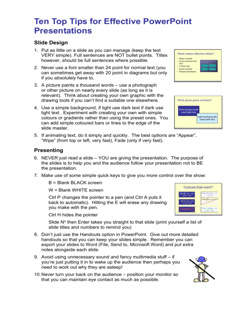
Ten Top Tips for Effective PowerPoint Presentations Slide Design 1. Put as little on a slide as you can manage (keep the text VERY simple). Full sentences are NOT bullet points. Titles however, should be full sentences where possible. 2. Never use a font smaller than 24 point for normal text (you can sometimes get away with 20 point in diagrams but only if you absolutely have to. 3. A picture paints a thousand words – use a photograph or other picture on nearly every slide (as long as it is relevant). Think about creating your own graphic with the drawing tools if you can’t find a suitable one elsewhere. What makes effective slides? • Keep it simple • 24 pt minimum font size • 2 fonts only • Good contrast • Simple animations What gives good contrast? 4. Use a simple background, if light use dark text if dark use light text. Experiment with creating your own with simple colours or gradients rather than using the preset ones. You can add simple coloured bars or lines to the edge of the slide master. Dark backgrounds need light text Light backgrounds need dark text 5. If animating text, do it simply and quickly. The best options are “Appear”, “Wipe” (from top or left, very fast), Fade (only if very fast). Presenting 6. NEVER just read a slide – YOU are giving the presentation. The purpose of the slides is to help you and the audience follow your presentation not to BE the presentation. 7. Make use of some simple quick keys to give you more control over the show: B = Blank BLACK screen W = Blank WHITE screen Ctrl P changes the pointer to a pen (and Ctrl A puts it back to automatic). Hitting the E will erase any drawing you make with the pen. Ctrl H hides the pointer Slide No then Enter takes you straight to that slide (print yourself a list of slide titles and numbers to remind you) 8. Don’t just use the Handouts option in PowerPoint. Give out more detailed handouts so that you can keep your slides simple. Remember you can export your slides to Word (File, Send to, Microsoft Word) and put extra notes alongside each slide. 9. Avoid using unnecessary sound and fancy multimedia stuff – if you’re just putting it in to wake up the audience then perhaps you need to work out why they are asleep! 10. Never turn your back on the audience – position your monitor so that you can maintain eye contact as much as possible. Stop Annoying Audiences A recent survey shows what annoys most people about PowerPoint presentations. These are the top irritants: The speaker reads the slides to us 60.4% Text so small I couldn’t read it 50.9% Full sentences instead of bullet points 47.8% Slides hard to see because of colour choice 37.1% Moving/flying text or graphics 24.5% Annoying use of sounds 22.0% Overly complex diagrams or charts 22.0% It shows that whilst multimedia aspects are usually thought to be the most annoying parts of a slide show, it is actually the text itself that annoys most people. Clear, short, relevant and readable text is simple to achieve – but so many people fail. Don’t be one of them. For more information see www.communicateusingtechnology.com/pptsurvey.htm
