Answers to AP Stats Regression Worksheet
advertisement
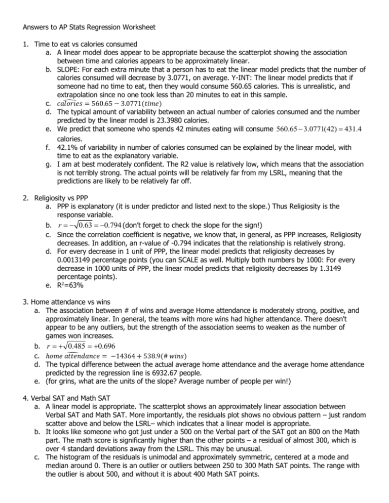
Answers to AP Stats Regression Worksheet 1. Time to eat vs calories consumed a. A linear model does appear to be appropriate because the scatterplot showing the association between time and calories appears to be approximately linear. b. SLOPE: For each extra minute that a person has to eat the linear model predicts that the number of calories consumed will decrease by 3.0771, on average. Y-INT: The linear model predicts that if someone had no time to eat, then they would consume 560.65 calories. This is unrealistic, and extrapolation since no one took less than 20 minutes to eat in this sample. ̂ = 560.65 − 3.0771(𝑡𝑖𝑚𝑒) c. 𝑐𝑎𝑙𝑜𝑟𝑖𝑒𝑠 d. The typical amount of variability between an actual number of calories consumed and the number predicted by the linear model is 23.3980 calories. e. We predict that someone who spends 42 minutes eating will consume 560.65 3.0771(42) 431.4 calories. f. 42.1% of variability in number of calories consumed can be explained by the linear model, with time to eat as the explanatory variable. g. I am at best moderately confident. The R2 value is relatively low, which means that the association is not terribly strong. The actual points will be relatively far from my LSRL, meaning that the predictions are likely to be relatively far off. 2. Religiosity vs PPP a. PPP is explanatory (it is under predictor and listed next to the slope.) Thus Religiosity is the response variable. b. r 0.63 0.794 (don’t forget to check the slope for the sign!) c. Since the correlation coefficient is negative, we know that, in general, as PPP increases, Religiosity decreases. In addition, an r-value of -0.794 indicates that the relationship is relatively strong. d. For every decrease in 1 unit of PPP, the linear model predicts that religiosity decreases by 0.0013149 percentage points (you can SCALE as well. Multiply both numbers by 1000: For every decrease in 1000 units of PPP, the linear model predicts that religiosity decreases by 1.3149 percentage points). e. R2=63% 3. Home attendance vs wins a. The association between # of wins and average Home attendance is moderately strong, positive, and approximately linear. In general, the teams with more wins had higher attendance. There doesn't appear to be any outliers, but the strength of the association seems to weaken as the number of games won increases. b. r 0.485 0.696 ̂ c. ℎ𝑜𝑚𝑒 𝑎𝑡𝑡𝑒𝑛𝑑𝑎𝑛𝑐𝑒 = −14364 + 538.9(# 𝑤𝑖𝑛𝑠) d. The typical difference between the actual average home attendance and the average home attendance predicted by the regression line is 6932.67 people. e. (for grins, what are the units of the slope? Average number of people per win!) 4. Verbal SAT and Math SAT a. A linear model is appropriate. The scatterplot shows an approximately linear association between Verbal SAT and Math SAT. More importantly, the residuals plot shows no obvious pattern – just random scatter above and below the LSRL– which indicates that a linear model is appropriate. b. It looks like someone who got just under a 500 on the Verbal part of the SAT got an 800 on the Math part. The math score is significantly higher than the other points – a residual of almost 300, which is over 4 standard deviations away from the LSRL. This may be unusual. c. The histogram of the residuals is unimodal and approximately symmetric, centered at a mode and median around 0. There is an outlier or outliers between 250 to 300 Math SAT points. The range with the outlier is about 500, and without it is about 400 Math SAT points.


