Tool Strips, Menus, and Events
advertisement
Visual Applications
Tool Strips, Menus, and Events
Lecture Five
Tool Strips, Menus, and Events
This lecture describes additional ways to extend the user interface (UI). Tool
strips allow you to create useful toolbars in a manner consistent with the look and
feel of Microsoft Office. Menus allow you to define custom commands that the
user can execute. Events are raised by controls in response to changes in
application conditions or user interaction. By handling events, you can cause code
that you write to execute in response to events.
ToolStrip Control
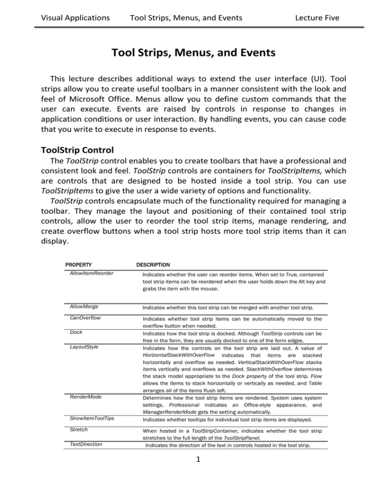
The ToolStrip control enables you to create toolbars that have a professional and
consistent look and feel. ToolStrip controls are containers for ToolStripltems, which
are controls that are designed to be hosted inside a tool strip. You can use
ToolStripltems to give the user a wide variety of options and functionality.
ToolStrip controls encapsulate much of the functionality required for managing a
toolbar. They manage the layout and positioning of their contained tool strip
controls, allow the user to reorder the tool strip items, manage rendering, and
create overflow buttons when a tool strip hosts more tool strip items than it can
display.
PROPERTY
DESCRIPTION
AllowItemReorder
Indicates whether the user can reorder items. When set to True, contained
tool strip items can be reordered when the user holds down the Alt key and
grabs the item with the mouse.
AllowMerge
Indicates whether this tool strip can be merged with another tool strip.
CanOverflow
Indicates whether tool strip items can be automatically moved to the
overflow button when needed.
Indicates how the tool strip is docked. Although ToolStrip controls can be
free in the form, they are usually docked to one of the form edges.
Indicates how the controls on the tool strip are laid out. A value of
HorizontalStackWithOverFlow indicates that items are stacked
horizontally and overflow as needed. VerticalStackWithOverFlow stacks
items vertically and overflows as needed. StackWithOverflow determines
the stack model appropriate to the Dock property of the tool strip. Flow
allows the items to stack horizontally or vertically as needed, and Table
arranges all of the items flush left.
Determines how the tool strip items are rendered. System uses system
settings, Professional indicates an Office-style appearance, and
ManagerRenderMode gets the setting automatically.
Indicates whether tooltips for individual tool strip items are displayed.
Dock
LayoutStyle
RenderMode
ShowltemToolTips
Stretch
TextDirection
When hosted in a ToolStripContainer, indicates whether the tool strip
stretches to the full length of the ToolStripPanel.
Indicates the direction of the text in controls hosted in the tool strip.
1
Visual Applications
Tool Strips, Menus, and Events
Lecture Five
Adding Tool Strip Items to a Tool Strip
At design time you can add tool strip items to a tool strip by choosing
appropriate items from the drop-down menu in the Designer, as shown in Figure.
The item you choose from the menu is added to the tool strip, and an instance of it
is added to your application. You can set properties for the item in the Properties
window and refer to the item in code.
At run time you can dynamically add items to a tool strip by using the
ToolStrip.ltems.Add method. This method allows you to specify a reference to an
existing tool strip item and add it to the toolbar, or it will create and add a new tool
strip item when you specify text or an image. An example is shown here:
ToolStripItem aToolStripItem;
ToolStripItem bToolStripItem;
aToolStripItem = myToolStrip.Items.Add("New Item");
Bitmap anImage = new Bitmap(@"C:\myImage.bmp");
bToolStripItem = myToolStrip.Items.Add(anImage);
In this example a new tool strip item is added when text or an image is specified
in the call to the Add method. When items are added in this way, the resulting item
is always a ToolStrip-Button object. The ToolStrip.Items.Add method returns a
reference to the new item so you can set properties and events for it at run time.
You can also create a new tool strip item and then add it directly, as shown here:
ToolStripComboBox aComboBox = new ToolStripComboBox();
myToolStrip.Items.Add(aComboBox);
By following this example, you can create a tool strip item of any kind and add it
to a tool strip at run time.
2
Visual Applications
Tool Strips, Menus, and Events
Lecture Five
Tool Strip Items
The .NET Framework provides several items designed to be hosted in tool strips.
Items such as the ToolStripLabel, ToolStripButton, ToolStripTextBox,
ToolStripComboBox, and ToolStrip-ProgressBar controls are similar to the Label,
Button, TextBox, ComboBox, and ProgressBar controls, but they are designed to be
hosted in tool strips. ToolStripSplitButton, ToolStripDrop-DownButton, and
ToolStripSeparator are designed to provide functionality specific to tool strips. Tool
strip items have several common properties that govern their behavior in the tool
strip.
PROPERTY
MergeAction
MergeIndex
ToolTipText
DESCRIPTION
Determines how a tool strip item behaves with the tool strip that
contains it when it is merged with another tool strip. Possible
values are Append, Insert, MatchOnly, Remove, and Replace.
Merging tool strips will be discussed later in this lesson.
Indicates where a tool strip item appears in a merged tool strip if
the MergeAction property is set to Insert.
Gets or sets the text that is shown in a tooltip when the mouse
hovers over the tool strip item if the ToolStrip.ShowItemToolTips
property is set to True. Note that the ToolStripSeparator control
does not have this property.
ToolStripLabel
The ToolStripLabel control combines the functionality of the Label control and
the LinkLabel control. When the IsLink property is set to False, the ToolStripLabel
displays the text contained in its Text property in the tool strip and acts similarly to
a basic Label control. When the IsLink property is set to True, the control behaves
like a LinkLabel control. You can program actions to be taken when the label is
clicked in the ToolStripLabel.Click event handler.
ToolStripButton
The ToolStripButton control is analogous to the familiar Button control. It
appears on the tool strip as a button, usually displaying an icon that indicates its
function. The user can click the button to execute an action. Clicking the button
executes code in the ToolStripButton.Click event handler.
ToolStripSeparator
The ToolStripSeparator control is basically a visual cue that separates items in a
tool strip from other items in a tool strip. Although it can respond to mouse clicks
through the ToolStripSepa-rator.Click event handler, it is primarily used to provide
visual feedback.
3
Visual Applications
Tool Strips, Menus, and Events
Lecture Five
ToolStripComboBox
The ToolStripComboBox control is similar to the ComboBox control but is hosted
in a tool strip. Like the ComboBox, it can be set to styles of Simple, DropDown, or
DropDownList, and the items are found in the Items collection. When an item is
selected or typed into the ToolStrip-ComboBox, that item is exposed through the
Text property.
ToolStripTextBox
The ToolStripTextBox is very similar to the basic TextBox control. The user can
type a string into the text box, and this string will be programmatically accessible
through the ToolStrip-TextBox.Text property. The main difference in functionality is
that the ToolStripTextBox does not have a MultiLine property and, thus, can have
only one line.
ToolStripProgressBar
The ToolStripProgressBar is a control that is designed to provide feedback to the
user when progress is made on a time-consuming task, and it functions very
similarly to the standard ProgressBar control. The Minimum and Maximum
properties set the minimum and maximum values for the ToolStripProgressBar,
and the Value property determines the current setting. The visual appearance is
set by the Style property, and when Style is set to Blocks or Continuous, the Value
property is reflected in the visual interface as a percentage of the maximum that is
filled in the progress bar. When it is set to Marquee, blocks continuously move
across the progress bar at the rate specified by the MarqueeAnimationSpeed
property. At run time you can advance the value of the ToolStripProgressBar either
by setting the Value property directly or by using the Increment and PerformStep
methods.
ToolStripDropDownButton
The ToolStripDropDownButton allows you to create a drop-down menu that
appears when the button is clicked. At design time you can create the menu by
typing text for menu items in the menu designer, as shown in Figure. Each menu
item has its own ToolStripMenuItem.Click event that you can respond to.
4
Visual Applications
Tool Strips, Menus, and Events
Lecture Five
Merging Tool Strips
You can merge ToolStrip controls at run time and incorporate their items into a
single tool strip. You merge tool strips by invoking the ToolStripManager.Merge
method, as shown here:
ToolStripManager.Merge(sourceToolStrip, targetToolStrip);
The ToolStripManager is a static class that manages the display and layout of the
tool strips on a form. Because it is a static class, there is no need to instantiate it—
you can invoke the methods directly.
The preceding example takes the first tool strip, sourceToolStrip, and merges it
with the second tool strip (targetToolStrip). The tool strip items on sourceToolStrip
are then merged with the items on targetToolStrip, as is determined by their
MergeAction property value. Following Table summarizes the merge action taken
by the MergeAction property value.
MERGEACTION VALUE ACTION TAKEN
Append
Appends the item at the end of the list of items.
Insert
Inserts the item at the location specified by the MergeIndex
property.
MatchOnly
Looks for a match but takes no action.
Remove
If a matching tool strip item is found, it is removed from the
resulting tool strip.
Replace
If a matching tool strip item is found, it is replaced with this tool
strip.
When tool strips are merged, each tool strip item in the source tool strip is
compared to each tool strip item in the target tool strip. The comparison is based
on the Text property of each tool strip item. Thus, if any two tool strip items have
the same Text property, they are considered a match, even if they are different
types (for example, a ToolStripLabel and a Tool-StripButton that both have a Text
property that is set to Execute is considered a match). If a match is found and the
source tool strip item has the MergeAction property set to MatchOnly, Remove, or
Replace, then the appropriate action is taken. Otherwise, the tool strip item is
appended or inserted, as determined by the MergeAction property. For tool strips
to be merged successfully, they must have their AllowMerge property set to True
5
Visual Applications
Tool Strips, Menus, and Events
Lecture Five
Menus
Menus have always been a part of Windows Forms applications. They give the
user quick and easy access to important application commands in an easy-tounderstand, easy-to-browse interface. The .NET Framework version 2.0 introduced
MenuStrips, which allow the rapid creation of Forms menus as well as context
menus (also known as shortcut menus, which appear when the user right-clicks an
object). In this lesson you will learn how to create menus and context menus and
configure them for use in your application.
MenuStrip Control
The MenuStrip control is essentially a ToolStrip control that is optimized for the
display of ToolStripMenuItems. The MenuStrip control derives from ToolStrip and
can host all of the tool strip items described in the previous lesson. Its primary
function, however, is to host ToolStrip-MenuItems.
ToolStripMenuItems are the controls that provide the visual representation for
items on a menu. They can appear as text, an image, or both, and can execute code
found in their Tool-StripMenuItem.Click event handlers when clicked. Each
ToolStripMenuItem can contain its own set of menu items, allowing for the
creation of nested menus.
The menu strip exposes many properties that affect the behavior of its hosted
ToolStrip-MenuItems. Important properties of the MenuStrip control are shown in
the table.
PROPERTY
AllowItemReorder
AllowMerge
Dock
LayoutStyle
RenderMode
ShowItemToolTips
Stretch
TextDirection
DESCRIPTION
Indicates whether the user can reorder items. When set to True, contained
items can be reordered when the user holds down the Alt key and grabs
the item with the mouse.
Indicates whether this menu strip can be merged with another tool strip.
Indicates how the menu strip is docked. Although MenuStrip controls can
be free in the form, they are usually docked to one of the form edges.
Indicates how the controls on the tool strip are laid out. A value of
HorizontalStackWithOverflow indicates that items are stacked horizontally
and overflow as needed. VerticalStackWithOverflow stacks items vertically
and overflows as needed. StackWithOverflow determines the stack model
appropriate to the Dock property of the tool strip. Flow allows the items to
stack horizontally or vertically as needed, and Table arranges all of the
items flush left.
Determines how the tool strip items are rendered. System uses system
settings, Professional indicates an Office-style appearance, and
ManagerRenderMode gets the setting automatically.
Indicates whether tooltips for individual tool strip items are displayed.
When hosted in a ToolStripContainer, indicates whether the tool strip
stretches to the full length of the ToolStripPanel.
Indicates the direction of the text in controls hosted in the tool strip.
6
Visual Applications
Tool Strips, Menus, and Events
Lecture Five
Note that the properties of the MenuStrip control are very similar to the
properties of the ToolStrip control. Because MenuStrip derives from ToolStrip, it
exposes most of the same properties as the ToolStrip control and encapsulates
most of the same functionality. ToolStripMenuItems provide all of the functionality
that is expected of menus.
Creating Menu Strips and Tool Strip Menu Items
You can create a MenuStrip at design time in the same way that you create any
control: by dragging it from the Toolbox onto the design surface. Once it has been
added to the design surface, an interface for creating tool strip menu items
appears. You can type a string into the box in the menu strip to create a new tool
strip menu item. After a new item has been created, additional boxes appear to
the right and beneath the newly created tool strip menu item to allow you to
create more items or subitems of the first item. This interface disappears if you
move the focus elsewhere in the designer, but you can make it reappear by clicking
the tool strip menu item. The ToolStripMenuItem control design interface is shown
in Figure .
Note that the default naming scheme for the ToolStripMenuItem control is
different from the default naming scheme for other controls. Although controls
such as Button are appended with a number when added to the form (such as
Button1), tool strip menu items are prepended with the text of the menu item. For
example, if you created a File menu item, the default name would be
fileToolStripMenuItem. You can rename a menu item by changing the Name
property in the Properties window.
You can also add tool strip menu items to menu strips programmatically at run
time. You can either add a preexisting menu item (for example, an item on another
menu strip) or create a brand new menu item and add it to the menu strip. The
following code example demonstrates each of these techniques:
7
Visual Applications
Tool Strips, Menus, and Events
Lecture Five
//
Adds
an
existing
ToolStripMenuItem
to
the
MenuStrip
menuStrip1.Items.Add(OpenToolStripMenuItem);
// Creates a new ToolStripMenuItem and adds it to the MenuStrip
ToolStripMenuItem HelpToolStripMenuItem = new
ToolStripMenuItem("Help");
menuStrip1.Items.Add(HelpToolStripMenuItem);
You can also use the MenuStrip.Items.Add method to add new tool strip menu
items even if you don't have a reference to an existing tool strip menu item. The
following example shows how you can specify text or an image to create a tool
strip menu item and get a reference to it:
ToolStripMenuItem newMenuItem1;
ToolStripMenuItem newMenuItem2;
// Adds a new menu item by specifying text
newMenuItem1 = MenuStrip1.Items.Add("File");
// Adds a new menu item by specifying
newMenuItem2 = MenuStrip1.Items.Add(anImage);
an
image
You can use similar techniques to add new or existing tool strip menu items to
the dropdown items of an existing tool strip menu item. This has the effect of
creating new items in a submenu. The following example demonstrates
programmatically adding a tool strip menu item to the DropDownItems collection
of an existing tool strip menu item:
ToolStripMenuItem newMenuItem1;
ToolStripMenuItem newMenuItem2;
// Adds an existing ToolStripMenuItem to another
//existing ToolStripMenuItem
FileToolStripMenuItem.DropDownItems.Add(OpenToolStripMenuItem);
// Creates a new ToolStripMenuItem and adds it to the MenuStrip
ToolStripMenuItem HelpToolStripMenuItem = new
ToolStripMenuItem("Help");
FileToolStripMenuItem.DropDownItems.Add(HelpToolStripMenuItem);
// Adds a new menu item by specifying text
newMenuItem1=
(ToolStripMenuItem)FileToolStripMenuItem.DropDownItems.Add("Open");
// Adds a new menu item by specifying an image
newMenuItem2=
(ToolStripMenuItem)FileToolStripMenuItem.DropDownItems.Add(anImage);
8
Visual Applications
Tool Strips, Menus, and Events
Lecture Five
Context Menus and the ContextMenuStrip Control
Context menus are familiar to all users of Windows Forms applications. These
shortcut menus are displayed when the user right-clicks an object. The
ContextMenuStrip control allows you to create context menus and associate them
with a selected object.
The ContextMenuStrip control is similar to the MenuStrip control. Both controls
have an intuitive design interface that allows you to create tool strip menu items
quickly, and both expose a collection of tool strip menu items in the Items
property. The main difference between the ContextMenuStrip and the MenuStrip
controls is that the ContextMenuStrip control does not have a top-level menu and
is not visible at run time unless invoked by right-clicking the control that it is
associated with.
Adding and Removing Context Menu Items
You can easily add and remove items from a context menu strip by using the
ContextMenu-Strip.Items.Add and ContextMenuStrip.Items.Remove methods, as
shown in the following example:
// Adds an item to the ContextMenuStrip
contextMenuStrip1.Items.Add(ExitToolStripMenuItem);
// Removes an item from the ContextMenuStrip
contextMenuStrip1.Items.Remove(ExitToolStripMenuItem);
Associating a ContextMenuStrip Property with a Control
All controls that can display a context menu expose a ContextMenuStrip
property that represents the context menu associated with that control. When this
property is set to a valid ContextMenuStrip control, the context menu appears
when the user right-clicks the control at run time. You can set this property at
design time in the Properties window.
You can also set the ContextMenuStrip property for a control at run time. The
following example demonstrates how to create a context menu dynamically from
preexisting menu items and then associate it with a control:
contextMenuStrip1.Items.Add(ExitToolStripMenuItem);
contextMenuStrip1.Items.Add(OpenToolStripMenuItem);
button1.ContextMenuStrip = contextMenuStrip1;
9
Visual Applications
Tool Strips, Menus, and Events
Lecture Five
Events and Event Handlers
Events are members of the class or control that raises them. You've been using
events throughout the labs in this book. Whenever you create an OnClick method,
you are responding to that control's Click event. An event represents a message
that is sent to the rest of the application. When something noteworthy happens, a
control or class can raise an event, which sends out the message. This message can
wrap any arguments that contain information about the event and send them out
to the rest of the application. A method that has the same signature as the event
(that is, it has the same number and types of parameters) can handle the event,
which means that the method is executed when the event occurs. An event can be
handled by more than one method, and a given method can handle more than one
event.
Controls and forms can raise a variety of events in response to user input. The
most familiar event is the Click event, which is raised by almost all controls when
the mouse is positioned on the control and the left mouse button is clicked. Other
common events exposed by controls include events that respond to mouse and
keyboard input. Some common events raised by controls are shown in the table.
EVENT
Click
DoubleClick
KeyDown
KeyPress
KeyUp
MouseClick
MouseDoubleClick
MouseDown
MouseEnter
MouseHover
MouseLeave
MouseMove
MouseUp
MouseWheel
DESCRIPTION
Occurs when the left mouse button is clicked. Depending on the
control, it can also occur with certain keyboard input—for example,
when the control is selected and the Enter key is pressed.
Occurs when the left mouse button is clicked twice rapidly. Not all
controls respond to the DoubleClick event.
Occurs when a key is pressed when a control has the focus. Contains different information from the KeyPress event.
Occurs when a key is pressed when a control has the focus. Contains different information from the KeyDown event.
Occurs when a key is released while the control has the focus.
Occurs when the mouse clicks a control.
Occurs when the mouse double-clicks a control.
Occurs when the mouse pointer is over a control and the mouse
button is pressed.
Occurs when the mouse pointer enters the control.
Occurs when the mouse pointer rests on the control.
Occurs when the mouse pointer exits the control.
Occurs when the mouse moves over the control.
Occurs when a mouse button is released over the control.
Occurs when the mouse wheel moves while the control has the
focus.
Each event carries some information about itself to the method that handles it.
Events raised by controls usually contain two parameters: a parameter that carries
an object reference to the control that raised it and a parameter that derives from
the EventArgs class that carries event arguments. In some events, such as the Click
10
Visual Applications
Tool Strips, Menus, and Events
Lecture Five
event, the EventArgs argument carries practically no information. In others, such as
the MouseClick event, a great deal of information about the state of the mouse is
carried in the MouseClickEventArgs argument.
Creating Event Handlers in the Designer
You can create event handlers in the Designer by using the Properties window.
Click the "lightning bolt" button in the Properties window (shown in Figure).
Creating Default Event Handlers
You can create default event handlers for an event through the Properties
window. A default event handler is a method that handles a given event for a
control and has a descriptive name. For example, the default event handler for the
Click event of a button named Button1 would be called Button1_Click. The
following procedure describes how to create a default event handler.
TO CREATE A DEFAULT EVENT HANDLER
1. In the Designer, select the control. In the Properties window, click the
"lightning bolt" button to list events for that control.
2. Double-click the entry for the event for which you want to create the
default event handler. The method is created with the proper signature,
and the Code Editor opens to the new method.
3. Add the code that you want to execute when the event is raised.
11
Visual Applications
Tool Strips, Menus, and Events
Lecture Five
Creating Event Handlers in the Designer
In addition to default event handlers, you can use the designer to assign other
methods to handle events raised by controls. The following procedure describes
how to create an event handler other than the default event handler.
TO CREATE AN EVENT HANDLER OTHER THAN THE DEFAULT EVENT
HANDLER
1. In the Code Editor, create a method whose signature matches the signature
of the event that you want to handle. For example, if you wanted to handle the
Button.Click event, you would create a Sub (void) method with Object and
EventArgs parameters.
2. In the Designer, select the control for which you want to create an event
handler. In the Properties window, click the lightning bolt to list the events for
this control.
3. Single-click the cell next to the event you want to create a handler for. A dropdown arrow appears.
4. Click the drop-down arrow to display a list of methods that match the
signature of the event. Choose the method you created in the Code Editor.
Assigning Multiple Events to the Same Event Handler
You can assign multiple events to the same event handler. All that is required is
that the signature of the method matches the signature of the event. You can
assign multiple events in a single control to a single event handler, or you can
assign events from several controls to a single event handler. An example of when
this might be useful would be in an application like a calculator. You might have the
Button controls that are used to input numbers all share the same Click event
handler, programming logic into the event handler to distinguish between the
buttons that are clicked.
You can assign multiple events to the same event handler in the same way that
you assign an individual event. Select the control and then, in the Properties
window, select the event for which you want to assign a handler. Choose the
method for the event handler from the dropdown menu. Repeat the process for
each event you want to assign a handler to.
Managing Mouse and Keyboard Events
Most of the events involved in interacting with the user are mouse and keyboard
events. Controls can raise events in response to mouse clicks or a variety of
keystrokes and can detect whether modifier keys such as Ctrl, Alt, or Shift are
pressed. This section describes how to respond to mouse and keyboard events.
12
Visual Applications
Tool Strips, Menus, and Events
Lecture Five
Mouse Events
Controls can interact with the mouse in several ways. Controls raise events when
the mouse enters the control, when it leaves the control, when it moves over the
control, when it clicks, when it hovers over the control, or when the mouse wheel
moves while the control has the focus.
CLICK AND DOUBLECLICK
The most familiar mouse events are the Click and DoubleClick events. When the
mouse pointer is over a control and the left button is pressed and released, the
control raises the Click event. This event is also raised when the control has the
focus and the Enter key is pressed. The DoubleClick event is raised when the left
mouse button is clicked twice in rapid succession. Note that not all controls
respond to the DoubleClick event.
The Click and DoubleClick events have a fairly simple signature. They return an
Object reference to the control that raised the event (the parameter that Visual
Studio names Sender when it generates a handler) and an instance of the
EventArgs class that carries no useful information about the event. The following
code example demonstrates the appropriate signature for an event handler that
handles the Click or DoubleClick event:
private void ClickHander(object sender,
EventArgs e)
{
// Insert code to be executed when the event is raised
}
You can assign any method with this signature to handle the Click or DoubleClick
events.
MOUSE MOVEMENT EVENTS
Controls raise events that track the movement of the mouse pointer into and
out of the bounds of the control.
EVENT
MouseEnter
MouseHover
MouseLeave
DESCRIPTION
This event is raised when the mouse pointer enters a control.
This event is raised when the mouse pointer enters a control.
This event is raised when the mouse pointer enters a control.
13
Visual Applications
Tool Strips, Menus, and Events
Lecture Five
Like the Click event, these events pass relatively little information to the
methods that handle them. Their event handlers also require an Object parameter
representing the sender of the event and an EventArgs parameter.
OTHER MOUSE EVENTS
Although the events described previously are useful for tracking mouse
movement and clicks, they provide practically no information about the event
itself. If you want to retrieve more information about the event, such as the
position of the mouse, use one of the mouse events that pass an instance of
MouseEventArgs in its signature.
EVENT
MouseClick
MouseDoubleClick
MouseDown
MouseMove
MouseUp
MouseWheel
DESCRIPTION
This event is raised when a mouse button is pressed and released on
a control.
This event is raised when a mouse button is clicked twice on a
control.
This event is raised when a mouse button is pressed over a control.
This event is raised when the mouse moves over the control.
This event is raised when a mouse button is released over a control.
This event is raised when the mouse wheel is moved while the
control has the focus.
All of the events shown in Table require a handler with two parameters: an
object parameter that represents the control that raised the event and an instance
of MouseEven-tArgs. The following example demonstrates an event handler for
any of these methods:
private void MouseHandler(object sender, MouseEventArgs e)
{
// Insert code to handle your event here
}
The instance of MouseEventArgs that is passed to the event handler contains a
large amount of information about the event. It contains properties that describe
what buttons were clicked, how many times they were clicked, the location of the
mouse, and how far the mouse wheel was turned. Table shows the
MouseEventArgs properties.
Clicks
Delta
Location
X
Y
Indicates how many times the button was pressed
Indicates the number of clicks the mouse wheel has moved
Indicates the current location of the mouse
Indicates the X coordinate of the mouse
Indicates the Y coordinate of the mouse
14
Visual Applications
Tool Strips, Menus, and Events
Lecture Five
Keyboard Events
Controls that can receive keyboard input can raise three keyboard events:
• KeyDown
• KeyPress
• KeyUp
KEYDOWN AND KEYUP
The KeyDown and KeyUp events are raised when a key is pressed and a key is
released, respectively. The control that has the focus raises the event. When these
events are raised, they package information about which key or combination of
keys were pressed or released in an instance of KeyEventArgs that is passed to the
method that handles the event.
PROPERTY
Alt
Control
Handled
KeyCode
KeyData
KeyValue
Modifiers
Shift
SuppressKeyPress
DESCRIPTION
Gets a value indicating whether the Alt key was pressed
Gets a value indicating whether the Ctrl key was pressed
Gets or sets a value indicating whether the event was
handled
Returns an enum value representing which key was
pressed
Returns data representing the key that was pressed,
together with whether the Alt, Ctrl, or Shift key was pressed
Returns an integer representation of the KeyData property
Gets the modifier flags for the event, indicating what
combination of Alt, Ctrl, or Shift key was pressed
Gets a value indicating whether the Shift key was pressed
Gets or sets a value indicating whether the key event
should be passed on to the underlying control
The KeyUp and KeyDown events determine what key and what modifier keys, if
any, were pressed. This information is exposed through properties in the
KeyEventArgs reference that is passed to the event handler.
The KeyEventArgs properties Alt, Control, and Shift return a Boolean value that
indicates if the Alt, Ctrl, and Shift keys are pressed, respectively. A value of True is
returned if the key is pressed, and False is returned if the key is not pressed. The
following code demonstrates a KeyUp event handler that checks whether the Ctrl
key is pressed:
Private
void
textBox1_KeyUp(object
System.Windows.Forms.KeyEventArgs e)
sender,
{
if (e.Control == true)
MessageBox.Show("The CTRL key is still down");
}
15
Visual Applications
Tool Strips, Menus, and Events
Lecture Five
KEYPRESS
When a user presses a key that has a corresponding ASCII value, the KeyPress
event is raised. Keys with a corresponding ASCII value include any alphabetic or
numeric characters (alphanumeric a-z, A-Z, and 0-9), as well as some special
keyboard characters, such as the Enter and Backspace keys. If a key or key
combination does not produce an ASCII value, such as the Alt, Ctrl, or Shift key, it
will not raise the KeyPress event.
This event is most useful for intercepting keystrokes and evaluating them. When
this event is raised, an instance of KeyPressEventArgs is passed to the event
handler as a parameter. The KeyPressEventArgs exposes the character
representation of the key(s) pressed through the KeyPressEventArgs.KeyChar
property. You can use this property to evaluate keystrokes received by your
application.
private void Form1_KeyPress(object sender, KeyPressEventArgs e)
{
this.Text = e.KeyChar.ToString();
}
16
