-
Charts
Charts present information in a visual format and are frequently used for categorical data.
-
Pie or circle charts
Pie or circle charts are used to represent relative amounts of entities and are especially popular in demographics.
-
What is the main downside of pie charts?
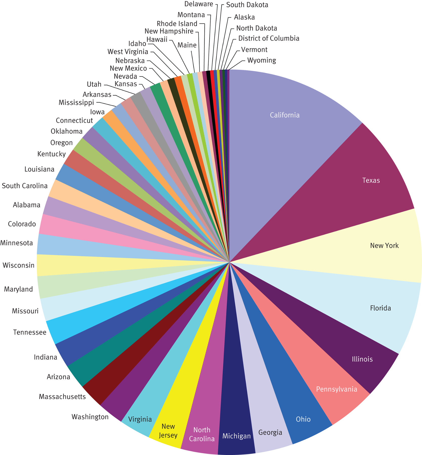
The primary downside to pie charts is that as the number of represented categories increases, the visual representation loses impact and becomes confusing.
-
Bar charts
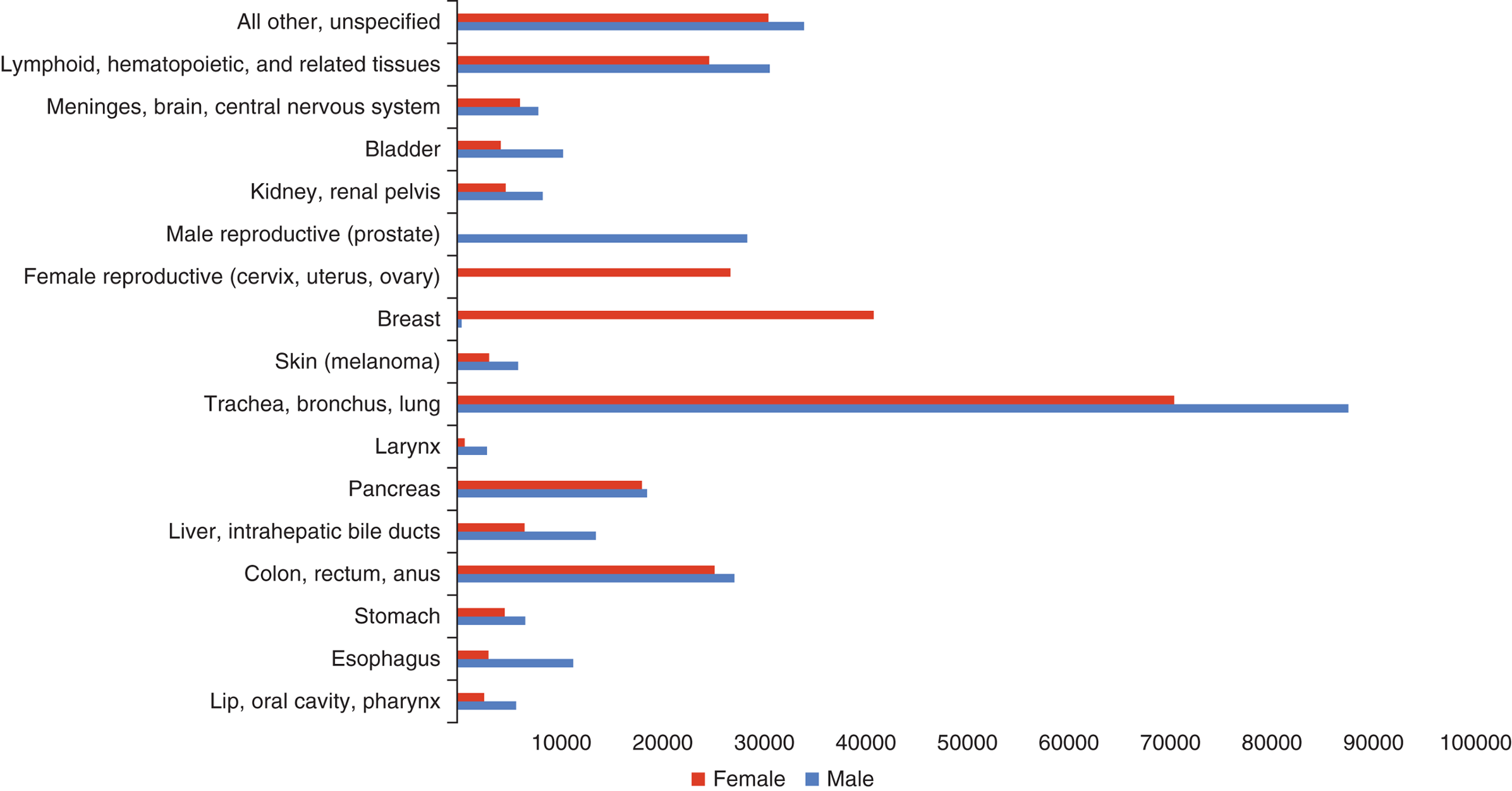
Bar charts are used for categorical data, which sort data points based on predetermined categories.
-
Histograms
Histograms present numerical data rather than discrete categories. Histograms are particularly useful for determining the mode of a data set because they are used to display the distribution of a data set.
-
Box plots
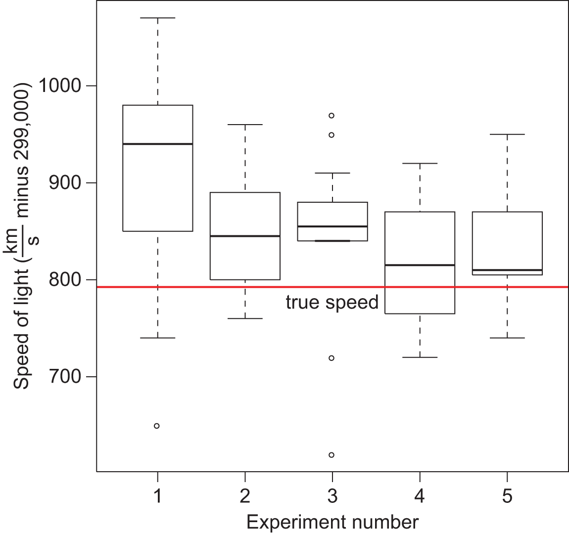
Box plots are used to show the range, median, quartiles and outliers for a set of data.
-
The box of a box-and-whisker plot is bounded by _____; _____ is the line in the middle of the box.
Q1 and Q3
Q2 (the median)
-
The ends of the whiskers correspond to _____ of the data set. Alternatively, _____ can be presented as individual points, with the ends of the whiskers corresponding to ...
maximum and minimum values
outliers
... the largest and smallest values in the data set that are still within 1.5 × IQR of the median
-
The best map data will examine ...
... one or at most two pieces of information simultaneously.
-
Linear graphs
Linear graphs show the relationships between two variables.
-
The shape of the curve on this type of graph may be _____.
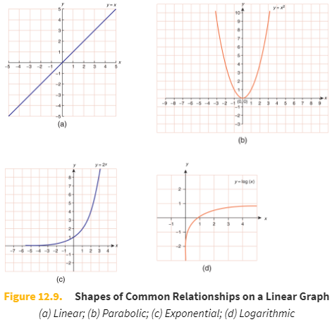
linear, parabolic, exponential, or logarithmic.
-
Slope (m)

