Do the Wave Unit Template
advertisement
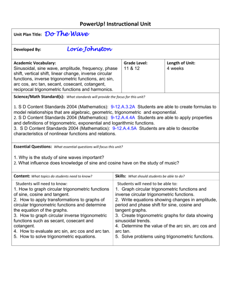
PowerUp! Instructional Unit Unit Plan Title: Developed By: Do The Wave Lorie Johnston Academic Vocabulary: Sinusoidal, sine wave, amplitude, frequency, phase shift, vertical shift, linear change, inverse circular functions, inverse trigonometric functions, arc sin, arc cos, arc tan, secant, cosecant, cotangent, reciprocal trigonometric functions and harmonics. Grade Level: 11 & 12 Length of Unit: 4 weeks Science/Math Standard(s): What standards will provide the focus for this unit? 1. S D Content Standards 2004 (Mathematics): 9-12.A.3.2A Students are able to create formulas to model relationships that are algebraic, geometric, trigonometric and exponential. 2. S D Content Standards 2004 (Mathematics): 9-12.A.4.4A Students are able to apply properties and definitions of trigonometric, exponential and logarithmic functions. 3. S D Content Standards 2004 (Mathematics): 9-12.A.4.5A Students are able to describe characteristics of nonlinear functions and relations. Essential Questions: What essential questions will focus this unit? 1. Why is the study of sine waves important? 2. What influence does knowledge of sine and cosine have on the study of music? Content: What topics do students need to know? Skills: What should students be able to do? Students will need to know: 1. How to graph circular trigonometric functions of sine, cosine and tangent. 2. How to apply transformations to graphs of circular trigonometric functions and determine the equation of the graphs. 3. How to graph circular inverse trigonometric functions such as secant, cosecant and cotangent. 4. How to evaluate arc sin, arc cos and arc tan. 5. How to solve trigonometric equations. Students will need to be able to: 1. Graph circular trigonometric functions and inverse circular trigonometric functions. 2. Write equations showing changes in amplitude, period and phase shift for sine, cosine and tangent graphs. 3. Create trigonometric graphs for data showing sinusoidal trends. 4. Determine the value of the arc sin, arc cos and arc tan. 5. Solve problems using trigonometric functions. Assessment(s): What evidence will show that students understand? Performance Tasks, Projects: Worksheets, Graphing calculator activities and computer investigation, Presentation of Ferris Wheel and Sine Graph project. Unit Circle on Geometer’s Sketchpad. Achievement Series Trigonometric Functions Pretest Achievement Series Trigonometric Functions Post test Chapter Test Quizzes, Tests, Academic Prompts: Informal observations/discussions/interviews: Student Self-Assessment: SynchronEyes Evaluation rubric for Ferris Wheel project. Planning the Learning Experiences: What teaching and learning experiences will equip students to demonstrate the targeted standards? Mathematical modeling: Use of Windows Journal and graphing calculator to work examples. Graphing Calculator Activity: Use of graphing calculator and TI Interactive to create graphs of trigonometric functions. Fathom Activity: Use the internet to collect data on dates for marriages in Canada. Use the information to create sine and cosine graphs to showing the trend for marriages of Youth Cohorts in Canada. Internet Project: Create 3 paper graphs showing personal biorhythms according to internet data. Use the graphs to add the sine functions and create a graph showing the sum of the sines on TI Interactive. Hands on Lab Activity: Activity which models sound waves and a weight bouncing on a spring--collect data and graph using the graphing calculator. Worksheet: Practice the problems and concepts. Geometer’s Sketchpad Project: Create a Ferris Wheel using Geometer’s Sketchpad. Make a table to compare the angle above or below the horizontal for each chair and calculate the vertical or horizontal distance. Use this information to make a sine or cosine graph using TI Interactive. Determine the equation of the sinusoidal graph. Technology Integration: How is technology used to add value to the learning process? Mathematical modeling: Use of Windows Journal and graphing calculator to work examples and project information to the students. Use SynchronEyes to show student work. Graphing Calculator Activity: Use of graphing calculator and TI Interactive to create graphs of trigonometric functions and inverse trigonometric functions. CBL with Graphing Calculator: Use CBL to measure sound wave from a tuning fork, create a graph from the data and find the equation of the graph. Use CBL to measure motion from a weight bouncing on a spring , create a graph from the data and find the equation of the graph Internet Research: Research information about biorhythm. Use of various internet sites for problem solving examples and interactive exponential activities. List of sites: http://www.orchidculture.com/COD/daylength.html http://www.onlinetuningfork.com/ http://mathdemos.gcsu.edu/mathdemos/sinusoidapp/sinusoidapp.html http://www.doe.virginia.gov/Div/Winchester/jhhs/math/lessons/trig/bio.html http://mathforum.org/dynamic/jrk/ferris_dir/ http://www.slidermath.com/rpoly/Circsine.shtml Windows Journal Worksheet: Practice the problems and concepts. Rubric: Use assessment rubric to evaluate Ferris Wheel project Materials: Tablet computer with TI interactive, Geometers Sketchpad, Fathom and Windows Journal TI 83+ or TI 84 graphing calculator CBL with microphone & calculator links CBR with calculator Internet access Modifications: Far Below Standard Cooperative learning activities. Lab type (hands on activities) with additional assistance for the student. Interactive web sites that allow student to check his/her graphs. Approaching Standard Cooperative learning activities with discussion groups. Lab type (hands on activities) with additional assistance for the student. Interactive web sites that allow student to check his/her graphs. Meeting Standard Exceeding Standard Cooperative learning activities with discussion groups. Lab activities that allow for individual investigations Interactive web sites that with problems with varying degrees of difficulty. Cooperative learning activities with discussion groups. Lab activities that allow for individual investigations above the required information Interactive web sites that with challenging problems. Trigonometry Sinusoidal Investigation Name___________ Procedure Use Geometer’s Sketchpad to create a Ferris wheel or double Ferris wheel. Determine the appropriate dimensions of the Ferris wheel and use a suitable scale. Animate your Ferris wheel. Directions may be found here. http://mathforum.org/dynamic/jrk/ferris_dir/ Create a sinusoidal model that shows the path of 1 chair of the Ferris wheel. Determine the equation of the sinusoidal model. You may use technology such as the graphing calculator or TI Interactive to create your graph. You may also use Windows Journal to hand draw the graph. Required components Submit the following items for grading. You will need to submit 2 files (Geometer’s Sketchpad + a file for all other information. 1. Geometer’s Sketchpad Ferris wheel with animation button. 2. List of dimensions of the Ferris wheel along with scale. 3. Graph showing sinusoidal model. 4. Equation of sinusoidal model. Rubric Excellent Ferris Wheel Scale/dimensions TI graph Equation Good Average Needs Improving Sinusoidal Modelling of Canada’s Youth Cohorts Data and Fathom using E-STAT Overview In this lesson, students will gain a better understanding of the parameters of the general form of a sine equation [y = a sin(k(x - d)) + c], where a is amplitude (vertical stretch or compression), k is horizontal stretch or compression, d is horizontal phase shift, and c is vertical displacement. Students will retrieve E-STAT data for one of Canada’s youth cohorts (ages 20 to 24) and import these data into Fathom. By using sliders in Fathom, students will model a sine function by adjusting the parameters to maximize the visual fit of the curve to the data. By doing so, students will learn about the purpose of each variable in the equation. Contributors: Jennifer Hall and Joel Yan, Statistics Canada; Heather Curl, Sarnia Collegiate Institute and Technical School; Jennifer Brown, St. Michael Catholic High School, Kemptville Objectives Describe key properties of periodic functions arising from real-world applications, given a numeric or graphical representation Determine the amplitude, period, phase shift, domain, and range of sine functions whose equations are given in the form f(x) = a sin(k(x-d)) + c Identify restrictions that the context of secondary data places on domain and range Represent a sine function with an equation, given its graph Through investigation, determine how sine functions can be used to model periodic phenomena that do not involve angles Suggested grade levels and subject areas Grades 11 and 12 Mathematics Duration One to two 75 minute periods Materials Computers with Internet access and Fathom software E-STAT Account Computer projector Student instructions Student worksheet Prior knowledge Sine equation in y = a sin(k(x - d)) + c form Basic knowledge of Fathom software and E-STAT Classroom Instructions 1) Discuss important properties of the general form of sinusoidal equations as a review. 2) Using the computer projector, demonstrate the important features of E-STAT (http://estat.statcan.ca). You may wish to use the flash presentation “What’s E-STAT?” (http://www.statcan.ca/english/Estat/motion.htm). 3) Hold a brief class discussion on the topic of the Baby Boom to assess students’ prior knowledge and share information on the topic. 4) Distribute the student instructions and worksheet and have students complete the lesson independently or in pairs. Note: To save time, you may wish to start with the Fathom collection already created, available at www.teacherweb.com/on/statistics/math/photo5.stm under Grades 11 and 12. Enrichment Have students fit a cosine curve to the data instead. Prior to plotting the curve, have students hypothesize what variable(s) will change. Have students summarize the differences between sine and cosine curves. Have students perform trigonometric regression analysis on this data in either a spreadsheet program or graphing calculator. Have them examine the r2 value to see how well the data fit a sine curve. Have the students compare their curve of best fit to the curve from the regression analysis. Have students repeat the lesson using the 15 to 19 year-old age cohort instead. Have students note differences in the shape of the sine curve and attempt to explain these differences using sociological reasons. Have students retrieve data on the number of births in the post-World War II Baby Boom period. Have them compare the shape of this graph to their 20 to 24 year-old youth cohort graph and note similarities and differences. Evaluation Students can be informally assessed on their work habits and computer skills throughout this activity. They can be formally assessed via the worksheet, which can be handed in to be marked using a marking scheme of the teacher’s choice. Statistics Canada and Fathom Fathom is licensed by the Ministry of Education and used by schools in some provinces. Providing the Fathom format is in no way an endorsement or recommendation of the Fathom software by Statistics Canada. Student Instructions Canada’s Youth Cohorts Sinusoidal Activity Background Information A graph of data based on human activities rarely approximates the shape of a sine curve with any accuracy. However, occasionally the underlying conditions lead to trends that closely follow a sinusoidal curve. The Baby Boom occurred after World War II, when Canadian soldiers returned and started having children in record numbers. As such, there was a great increase in the number of births beginning in 1946, the first year after World War II ended. Births increased for several years and then began to decline. As a result of the Baby Boom, distributions of certain age cohorts in Canada closely approximate a sine curve. In this activity, you will obtain data on the number of 20 to 24 year-olds in Canada from the E-STAT database on the Statistics Canada website. You will import these data into Fathom in order to approximate the parametric form of a sine curve [y = a (sin(k(x - d)) + c] to these data using sliders to vary the parameter values (a, k, d, and c). E-STAT Instructions 1) 2) 3) 4) 5) 6) 7) 8) 9) 10) Go to the E-STAT website (http://estat.statcan.ca). Select English. Click on the Accept and enter button on the next page. Under People, select Population and demography. Under CANSIM, select Population estimates and projections. Select Table 051-0001 – Estimates of population, by age group and sex, Canada, provinces and territories, annual (persons), 1971 to 2006. On the Subset selection page: Under Geography, select Canada Under Sex, select Both sexes Under Age group, select 20 to 24 years Under From, select 1971 Under To, select 2006 Click on the Retrieve as individual Time Series button. On the Output specification page, under Screen output – table:, select Plain text: Table, time as rows. Click on the Retrieve now button. Fathom Analysis Note: These instructions were written for Fathom 2. If you are using Fathom 1, some instructions may be slightly different. Copying and pasting the data 1) 2) 3) 4) 5) 6) 7) 8) 9) 10) Highlight only the data, but not the attribute names, legend at the top of the page, or the source line at the bottom of the page Right-click and select Copy. Switch to Fathom. If Fathom isn’t already running, you will need to launch it. Create a new collection by dragging and dropping the Collection icon onto the workspace. Double-click on the pre-assigned collection name to rename it Youth Cohorts. Right-click on the collection and select Paste Cases. Double-click on the collection to inspect it. Double-click on the pre-assigned attribute names to rename them Year and Pop_20_24. Click on the attribute labelled <new> and rename it Years_Since_1971. Right-click on this attribute name and select Edit Formula. 11) Click on the + sign beside the word Attributes. This shows all the attributes available. Double-click on Year so it appears in the display window (Note that Fathom turns the word Year purple because it recognizes it as an attribute name). Then, type – 1971. This creates a new attribute that is the number of years since 1971 (the first year for which we retrieve data). Your screen should look like this: 12) 13) Click on the OK button. Save your Fathom collection as Youth Cohorts. Graphing and modelling the data 1) Create a new graph by dragging and dropping the Graph icon onto the workspace. 2) Create a scatter plot of the youth population aged 20 to 24 by dragging and dropping the attribute Years_Since_1971 on the x-axis and the attribute Pop_20_24 on the y-axis. 3) Create four new sliders by dragging and dropping the Slider icon onto the workspace four times. 4) Rename V1 as a, V2 as k, V3 as d, and V4 as c by double-clicking on the pre-assigned slider names. 5) Right-click on the graph and select Plot Function. A pop-up window ‘Expression for Function’ will appear. 6) Type the letter a and then click on the x button (multiplication sign). 7) Click on the + sign beside Functions to extend the list. Then, click on the + sign beside Trigonometric to extend that list. Now, double-click on sin. Your screen should look like this: 8) Inside the brackets, click on the ( ) button again. In these inner brackets, type the number 2 and then click on the + sign beside Special to extend the list. Double-click on pi. Now, click to the right of the inner brackets (still inside the outer brackets) and then click on the button (division sign) and then type the letter k. Your screen should look like this: Note: It is necessary to use 2 instead of just k in this equation because the dataset has actual numerical k values (as opposed to radian measures) for the x-axis data. 9) Click to the right of the 2 fraction (still inside the outer brackets) and click on the ( ) button again. Click on the k + sign beside Attributes to extend the list. Double-click on Years_Since_1971. Then, type – d. Finally, click to the right of all the brackets and type + c. Your screen should look like this: 10) Click on the OK button. 11) Using your knowledge of sinusoidal functions and the meaning of the parameters a, k, d, and c, change the sliders to values that will closely approximate the youth cohort data. Note: You can change the upper and lower bounds of the slider by double-clicking on the values and then editing the Upper_ and Lower_ in the pop-up table. You can also manually drag the values on the slider by placing your mouse over the values until a sideways hand appears. Drag this hand in order to alter the range of values. ***** Go to your worksheet and answer Questions #1-7. Question #7 requires that you paste your graph into your worksheet. To do this, click on the graph, then go to the Edit menu, and select Copy As Picture. When you are in the worksheet document, right-click and paste your graph. ***** Student Worksheet Fathom Activity Canada’s Youth Cohorts Sinusoidal Activity 1) What do the following variables represent (Provide both the term and a full explanation of the term): a) a? b) k? c) d? d) c? 2) Provide your best values for the parameters below and an explanation of what they mean for this dataset. a) a b) k c) d d) c 3) What is your overall equation for this graph, in y = a (sin( 4) By inspection of your graph, what is the approximate range for this dataset (to the nearest hundred thousand)? 5) If you know the amplitude for a sine curve, how can you calculate the range? Calculate the range here, based on the amplitude from your graph. 6) What happens to the graph when: a) the value of a is increased? b) the value of k is decreased? c) the value of d is negative? Is this reasonable for this dataset? Why/why not? d) The value of c is negative? Is this reasonable for this dataset? Why/why not? 7) Paste your sine graph here. 8) What do the following variables represent (Provide both the term and a full explanation of the term): a) a? b) k? c) d? d) c? 9) Provide your best values for the parameters below and an explanation of what they mean for this dataset. a) a b) k c) d d) c 10) What is your overall equation for this graph, in y = a (sin( 11) By inspection of your graph, what is the approximate range for this dataset (to the nearest thousand)? 12) If you know the amplitude for a sine curve, how can you calculate the range? Calculate the range here, based on the amplitude from your graph. 13) What happens to the graph when: a) the value of a is increased? b) the value of k is decreased? c) the value of d is negative? Is this reasonable for this dataset? Why/why not? d) The value of c is negative? Is this reasonable for this dataset? Why/why not? 2 (x - d)) + c form? k 2 (x - d)) + c form? k 14) Describe differences in the data between 2000-2001 and 2002-2003. 15) Which parameter value(s) would change if the graph was a cosine equation instead [y = a (cos( 2 (x - d)) + c]? Why? k 16) Based on your current equation for the graph, estimate what the new (changed) parameter value(s) would be for a cosine graph. 17) Paste your sine graph here. 18) What is/are your new value(s) for the parameter(s) that changed? What do these changes represent? 19) Write your cosine equation here in the form y = a (cos( 2 (x - d)) + c, with your best choices for the slider k values. 20) Summarize your findings about the similarities and differences between sine and cosine curves. 21) Paste your cosine graph here. 22) How could your findings regarding the pattern of monthly marriage data be useful to: a) People planning a wedding? b) People who offer wedding services (e.g., places of worship, halls, caterers)? Student Worksheet Canada’s Youth Cohorts Sinusoidal Activity TEACHER VERSION 1) What do the following variables represent (Provide both the term and a full explanation of the term): a) a? a represents the amplitude of the sine curve, which is the maximum distance from the centre line. b) k? k represents the period of the curve, which is the length of time to complete one wavelength of the curve. c) d? d represents the phase (horizontal shift) of the curve, which is the number of units the sine curve has moved from its starting position to the left or right. d) c? c represents the displacement (vertical shift) of the curve, which is the number of units the sine curve has moved from its initial position up or down. 2) Provide your best values for the parameters below and an explanation of what they mean for this dataset. a) a? Answers vary – 250 000 used in this example (see graph below). This means that, from the middle value (c), the curve varies by 250 000 both upwards and downwards. In other words, the number of 20 to 24 year-olds varies from the middle value by 250 000. b) k? Answers vary – 27.3 used in this example (see graph below). This means that the period of the graph is 27.3 years. In other words, it takes 27.3 years for the cycle to repeat itself. c) d? Answers vary – 5.00 used in this example (see graph below). This means that this graph is shifted from a basic sine curve by 5.00 units (years) to the right. d) c? Answers vary – 2 250 000 used in this example (see graph below). This means that the graph is shifted from a basic sine curve by 2 250 000 units up. In other words, the centre line is now at y = 2 250 000 instead of being the x-axis (y = 0). 3) What is your overall equation for this graph, in y = a (sin( Answers vary. In this example: y = 250 000 (sin( 2 (x - d)) + c form? k 2 (x – 5.00)) + 2 250 000. 27.3 4) By inspection of your graph, what is the approximate range for this dataset (to the nearest hundred thousand)? The approximate range is 2 000 000 ≤ y ≤ 2 500 000, which constitutes a range of 500 000. 5) If you know the amplitude for a sine curve, how can you calculate the range? Calculate the range here, based on the amplitude from your graph. Range = 2 x Amplitude Range = 2(250 000) Range = 500 000 6) What happens to the graph when: a) the value of a is increased? The amplitude of the graph increases, which in turn increases the range. b) the value of k is decreased? The graph is stretched horizontally, which increases the wavelength/period. c) the value of d is negative? Is this reasonable for this dataset? Why/why not? The graph has a horizontal phase shift to the left. This is reasonable because it is the shift from the basic sine curve, so it can be to the left or right and still be valid. d) the value of c is negative? Is this reasonable for this dataset? Why/why not? The centre line shifts vertically below the x-axis. This is not reasonable for this dataset because it would indicate a negative number of 20 to 24 year-olds, which is impossible. 7) Paste your sine graph here.
