Multimedia
advertisement
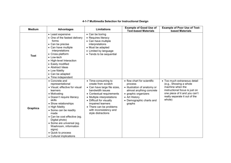
4-1-7 Multimedia Selection for Instructional Design Medium Text Graphics Advantages Least expensive One of the fastest delivery forms Can be precise Can have multiple interpretations Cross-platform Low-tech High-level Interaction Easily modified Abstract Ideas Low fidelity Can be adapted Time independent Concrete and representational Visual; effective for visual learners Motivating Doesn’t require literacy skills Show relationships High fidelity Some can be readily made Can be cost effective (eg. Digital photo) Some are universal (eg. Washroom, information signs) Quick to process Cultural implications Limitations Example of Good Use of Text-based Materials Example of Poor Use of Textbased Materials flow chart for scientific process illustration of anatomy or almost anything concrete graphic organizers Art History Demographic charts and graphs Too much extraneous detail (e.g., Showing a whole machine when the instructional focus is just on one piece of it and you can’t really separate it out of the whole) Can be boring Requires literacy Can have multiple interpretations Must be adapted Limited by language Tends to be sequential Time-consuming to create from scratch Can have large file sizes, bandwidth issues Contextual requirements Multiple interpretations Difficult for visually impaired learners There can be problems with inconsistency and style distractions Sound High impact Engaging Establish mood, setting, place, time Grabs attention Emphasizes certain points or concepts with sound effects Provides authenticity (eg. Heartbeat) Can provide access for non-readers or poor readers Can provide alternative access (e.g., dubbing) to non-speakers of a particular language can be distracting (eg. Doesn’t match up with mouth moving or text off screen is being read) quality needs to be good to be effective replay can be difficult; time dependent need equipment need to think about the environment in which it will be listened to difficult or costly to modify spoken sound can be very large file incompatibilities exist between browsers teaching something that requires sound (eg. Bird calls) music class ‘beep’ in evaluation tool mismatch between music style (e.g. rock and roll) and visual information Animation Video can compress and expand time can be interactive can describe complex processes motivating; eye is drawn to movement shows movement can integrate audio and visual can deal with sensitive material can show processes that can’t be shown by video or photo high fidelity takes you somewhere you can’t go demonstrates something you couldn’t otherwise see safe environment captures real world events compresses time; provides multi speed view (eg. Time lapse) provides minimal cognitive load (eg. Setting, action, mood in one glance) appeals to wider audience can be distracting adults can perceive it as juvenile can be time consuming to create and watch viewer may perceive a loss of control if multiple animations are simultaneously displayed can make people sick style of animation appeals to people differently (e.g., Japanese animation) can be too graphic difficult to learn and expensive to produce rendering time large files requires some media literacy (i.e. what’s real) requires a debrief filtered representation of the world passive expensive to produce difficult to modify time-consuming to produce requires time to preview for instructional use movement of planets around Sun lightning strike hitting earth teaching drill & practice skill case studies dissection frog pithing safety (eg. Bike safety) ‘powerpointlessness’ can be falsified inappropriate (eg. Pornography) can be used for babysitting (i.e., unrelated to topic) talking heads Models & Manipulatives good for kinesthetic learners authentic 3D; higher fidelity; gives a sense of size and proportion concrete to abstract safety allows low/high interaction allows low/high fidelity motivational good for all ages minimal cognitive load sometimes expensive and timeconsuming storage problems requires f2f breakable require supervision requires organization (eg. All pieces are not there; not enough for everyone) artificial element of competency with interactive models no affective domain 3D models for science/health concepts chemistry architecture simulators CPR Math used inappropriately List some effective media combinations if used synchronously: video conferencing & Powerpoint closed captioning TV; video and text (Note that video can work in combination with other media, but only if attention / concentration is not split. For example, most people cannot read text and watch video at the same time and understand both if they are on different topics . text & sound (if the sound is optional, e.g., Sound magazine) List some poor media combinations if used synchronously: graphic and text (Although this can be good (labeled diagrams, for example), it can be poor if the graphic distracts attention away from the text when both are important. animation and text (same comment as with video)
