Statistical Analysis using Excel
advertisement

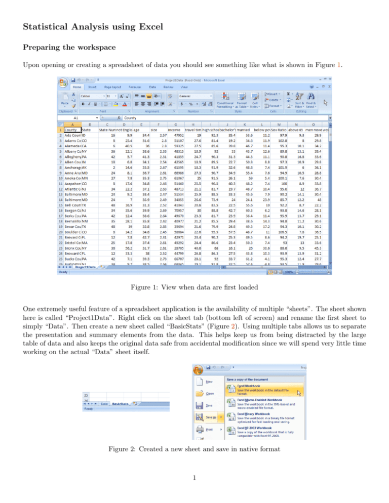
Statistical Analysis using Excel Preparing the workspace Upon opening or creating a spreadsheet of data you should see something like what is shown in Figure 1. Figure 1: View when data are first loaded One extremely useful feature of a spreadsheet application is the availability of multiple “sheets”. The sheet shown here is called “Project1Data”. Right click on the sheet tab (bottom left of screen) and rename the first sheet to simply “Data”. Then create a new sheet called “BasicStats” (Figure 2). Using multiple tabs allows us to separate the presentation and summary elements from the data. This helps keep us from being distracted by the large table of data and also keeps the original data safe from accidental modification since we will spend very little time working on the actual “Data” sheet itself. Figure 2: Created a new sheet and save in native format 1 Since we intend to make use of some advanced spreadsheet features it is a good idea to make sure that the document is saved in the native format for our application (Figure 2). We can access values on different sheets by referring to the sheet’s name. This allows us to structure our document logically and consistently, even if we choose to change column names or data values in the future. On the “BasicStats” sheet we duplicate the column headers by referring to the headers on the first page. Type =Data!D1 into the D1 cell on the “BasicStats” sheet and press enter (Figure 3). If we later decide to change the header labels on the first page, that change will be duplicated on our “BasicStats” sheet. Figure 3: Referencing another sheet and the magic behavior of pasting When you copy and paste a formula in a spreadsheet the referenced cells behave somewhat magically. On the “BasicStats” sheet select the D1 cell (notice that the formula in the formula bar still says “=Data!D1”) and copy that cell by pressing Ctrl - c (at the same time). Then click and drag so that cells E1 through T1 are selected (still on the “BasicStats” sheet). Paste your formula into these cells by pressing Ctrl - v (Figure 3). Notice that if you select one of the other cells the formula was changed to reference the corresponding cell on the “Data” sheet1 . Standard Numerical Summaries We are now able to easily compute all of the basic numerical summaries. We start by labeling each row (just type the label text into the corresponding cell) and compute the mean of the “not English” column (column D) which has data in rows 2 through 237 (Figure 4). We can similarly use the MAX, MEDIAN, MIN, PERCENTILE, and STDEV functions to compute the other values (Figure 4). Figure 4: Computing numerical summaries We can now easily compute all of the other summaries by simply copying these seven cells and pasting them into the remaining columns. Furthermore, since the spreadsheet can do standard arithmetic as well, we can compute some of our own values such as the LOW and HIGH values that arise from the 1.5 IQR rule (Figure 5). Notice that we do not need to precede the cell number with the sheet name when referring to a cell on the same sheet we are working on. 1 You can stop the originally copied cell from blinking by pressing the Escape key. 2 IQR 1.5 IQR LOW HIGH = = = = D8 - D6 1.5 * D11 D6 - D12 D8 + D12 Figure 5: Applying the 1.5 IQR Rule Analyzing a single variable Calculations I recommend creating a new sheet for each variable you wish to analyze. As an example, I have created a new sheet titled “NotEnglish”. The description for column D is “the percentage of people who do not speak English at home.” Therefore those values are percentages of the total population of each county which is held in column T. If we wanted to compute the (approximate) number of individuals who do not speak English at home in Ada county (row 2 of our data) we would need the following computation. number not english = total population × percent not english (as decimal) = value in column T × value in column D/100 = Data!T2 * Data!D2/100 We place this computation into cell A2 on our “NotEnglish” sheet then copy and paste that formula into rows 3 through 237 (select them all at once before pasting!). This tells us the total number of individuals (per county) who live in a household that does not speak English. We could then SUM (add) those values to approximate the total number of individuals in the entire country who live in a household that does not speak English (Figure 6). Figure 6: Counting the number of individuals who do not speak English at home Histogram Creating a histogram in a spreadsheet first requires constructing a frequency table. Looking at the 5 number summary for the “not english” column helps us decide how to break up our bins for the histogram. Since our minimum value is 2.7 and our maximum value is 78.4 we will choose to start at zero and take steps of 5. This 3 should (potentially) give us 17 bars in our histogram. We start by typing by hand some headers and the values we chose to round to (Figure 7 — ignore the highlighted “frequency” column for now). Figure 7: Frequency data for non-English households Now that we have decided how the data should be grouped, we need to tell the spreadsheet to actually compute the frequencies. Highlight the set of cells where you wish the frequencies to be placed (in this case we are putting them in cells D8 through D24). When we type in the FREQUENCY command we need to tell it what data are of interest as well as what bins to use. Here we want the “not english” data and the bins that we just typed so our command will be =FREQUENCY(Data!D2:D237, C8:C24). Now, instead of pressing enter as usual press Ctrl - Shift - Enter all at once2 . This should fill in the frequencies as show in Figure 7. Notice that Excel rounds data to the nearest value rather than truncating down (our minimum, 2.7, was counted in the 5 bin rather than the 0 bin). To create the actual chart, select “Insert” → “Column” → “Clustered Column” then “Select Data”. Select the frequency data that we just generated (Figure 8). Then in the “Horizontal (Category) Axis Labels” panel click “Edit”. This allows us to choose the horizontal axis labels which we have types into column C (Figure 9). 2 Even though one says “all at once” you may hold down the Ctrl and Shift keys and then press enter. 4 Figure 8: Creating a histogram — selecting data Figure 9: Creating a histogram — selecting labels Finally you should add a heading (select “Layout” → “Chart Title” → “Above Chart”) and remove the unnecessary “Series 1” label leaving a histogram which is ready to be copied into a Word document as part of a report. 5 Figure 10: Creating a histogram — completed histogram Boxplot The following method was found on Neville Hunt’s webpage3 . There are also instructions there for other versions of Excel. Begin by arranging the 5 number summary in the order shown in Figure 114 . Select the data and labels (6 rows and 2 columns here, though it is possible to plot more than one boxplot simultaneously by adding more columns). In the menus select “Insert” → “Chart” → “Line Chart” → “Line with Markers” then select “Switch Row/Column”. Your boxplot should now look like Figure 11. Figure 11: Creating a boxplot — Switch Row/Column We now need to do a bit of formatting to make the boxplot look right. • Select any of the data points and click “Layout” → “Lines” → “High-Low Lines”, then “Layout” → “Up/Down Bars” → “Up/Down Bars” • Right click on the box part of the boxplot, select “Format Up Bars”, and set Fill to “No Fill” • Select “Layout” → “Gridlines” → “Primary Horizontal Gridlines” → “None” • Select “Layout” → “Chart Title” → “Above Chart” • Finally, delete the legend 3 http://www.mis.coventry.ac.uk/~nhunt/boxplot.htm I included my boxplot on my “NotEnglish” sheet just below my histogram (I scrolled down a page) so that all of my “not english” analysis can be found on the same sheet. 4 6 Once finished you should have a slightly strange but serviceable boxplot (Figure 12). Figure 12: Creating a boxplot — completed boxplot Two-Variable Statistics Fortunately for us, spreadsheets are a bit more friendly when it comes to two-variable statistics. We can compute the correlation between a pair of variables using the CORREL function. Create a new sheet with the name “above 65 vs men never”. We will be comparing columns N (percent above age 65) and O (percent men never married). In our new sheet we compute the correlation by typing =CORREL(Data!N2:N237,Data!O2:O237) and find an extremely poor association (r = −0.2502). Pressing on, we can draw a scatterplot by switching to the “Data” sheet, highlighting columns N and O (simply by selecting the N and O headers), and then clicking “Insert” → “Scatter” → “Scatter with only Markers”. Unfortunately this puts the chart on the Data sheet which is bad organization so we select “Design” → “Move Chart” and select our “above 65 vs men never” sheet. We may also add a regression line by selecting “Layout” → “Trendline” → “Linear Trendline”. Removing the legend and adjusting the title appropriately gives us the following scatterplot. Figure 13: A complete scatterplot 7


