Constructing a Scattergraph with Point Labels
advertisement
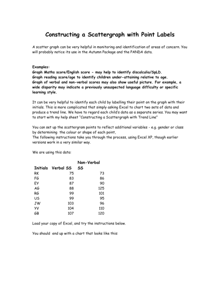
Constructing a Scattergraph with Point Labels A scatter graph can be very helpful in monitoring and identification of areas of concern. You will probably notice its use in the Autumn Package and the PANDA data. Examples: Graph Maths score/English score - may help to identify discalculia/SpLD. Graph reading score/age to identify children under-attaining relative to age. Graph of verbal and non-verbal scores may also show useful picture. For example, a wide disparity may indicate a previously unsuspected language difficulty or specific learning style. It can be very helpful to identify each child by labelling their point on the graph with their initials. This is more complicated that simply asking Excel to chart two sets of data and produce a trend line. We have to regard each child’s data as a separate series. You may want to start with my help sheet “Constructing a Scattergraph with Trend Line” You can set up the scattergram points to reflect additional variables - e.g. gender or class by determining the colour or shape of each point, The following instructions take you through the process, using Excel XP, though earlier versions work in a very similar way. We are using this data: Initials RK FG EY AG RG US JW YV GB Verbal SS 75 83 87 88 99 99 103 104 107 Non-Verbal SS 73 86 90 125 101 95 96 110 120 Load your copy of Excel, and try the instructions below. You should end up with a chart that looks like this: Class 5: Verbal and Non-Verbal Standardised Scores Non-Verbal Scores 130 AG GB 120 110 YV RG US 100 90 FG JW EY 80 RK 70 70 75 80 85 90 95 100 105 Verbal Scores 1. 2. 3. 4. 5. 6. 7. 8. 9. 10. 11. 12. 13. 14. 15. 16. 17. 18. Set up a table in columns A-C and add in the data shown in the table above. Note that at this point you could sort your data. Highlight cells A1:c10 Click on the chart icon or go to Insert / Chart. Select (XY) Scatter, and choose the sub-type without lines. Click on "next" to continue the chart wizard. On the data range tab, check that just the numerical data b2:c10 is selected, and the series in Columns button is filled in Before pressing "next" click on the Series tab. The next bit is the tedious bit. I personally have saved this workbook as a template, so that I can call it up and change data and headings as needed. This seemed simpler than writing a macro. Click on the Series window "series 1" Click on the "name" button. The dialogue box may seem to disappear - do not panic. Click on cell A6 - the name (or initials) of the first child. The dialogue box will reappear with ='data and instructions'!$A$9 inserted. Note that the "series 1" will be replaced with the first set of initials. Click on the "X Values" button, then on cell B6 Click on the "Y Values" button, then on cell C6 Click the "Add" button. Repeat 8-13 above for each child's data in turn. As you enter the data, note the points being added to the chart. The initials may not be there at this stage. When you have entered all the data click "Next". Click on the Data Labels tab. Tick the "Label contains series name" box Click the Legend tab and change the placement of the legend (Key) if you wish. Click the "gridlines" tab, and add in major / minor gridlines to suit your taste Click on the Titles tab, and add titles in to suit. 110 RK FG EY AG RG US JW YV GB 19. Click on "next" 20. Note at this point you can place the chart within the existing worksheet, or as a new sheet. In this case, I have kept everything together on one sheet. 21. Click "Finish" 22. At this point, you may find the chart is in the wrong place. Moving and sizing is similar to working with clipart, except that each part of the chart may be selected individually. 23. Click once on the chart. Note small black boxes appear on each corner and mid-side. These are "handles". Click AND HOLD the left mouse button, and drag the chart to where you want it - then release the left mouse button. 24. If you want the chart larger, position the mouse cursor on a corner handle. Click and hold the left mouse button, and drag to the required size. 25. Note that you could alter the symbol for each set of initials - e.g. indicating all males with a triangle, females with a square. To do this -Left-click once on the "legend" or key. Note that the handles are removed from the chart corners and appear on the key. Left-click again, on the symbol for the first set of initials. The handles will appear on this. RIGHT-click on the symbol, and select "format legend key" - note that you can change the shape (style), colour, size and other features. Click "OK" when finished. 26. Note on the example graph, I have no-one with a IQ range <80 or so. If I had left the x-axis scale as 0 - 130, then much of the graph would have been empty. To alter the scale, RIGHT-click on one of the numbers on the Verbal Scores numeric scale choose "Format Axis" and "Scale" and make the minimum for that scale 70. Note the other features open to you for the "verbal Scores" scale. 27. Other parts of the chart can similarly be formatted using the right-click feature. See if you can alter the background colour. 28. If you get stuck - give me a shout at rik.ludlow@ntlworld.com Rik Ludlow Ludlow Learning Independent consultancy ICT supporting Special Educational Needs
