chapters 2-5 - La Salle University
advertisement
Gillenwater steps for chapters 2–5 (not much from 3, 4)
Note features of speech-bubble_start.html, images folder needed background.gif later
becomes background1.gif, blog comments are in an <ol> semantically.
1 Add word-wrap: break-word (p. 50) to blockquote
2 Rounded corners (p. 52): add to blockquote {}. Vendor prefixes needed:
-moz-border-radius: 20px;
-webkit-border-radius: 20px;
border-radius: 20px;
Add the non-prefixed one last so it wins out (cascade) when it becomes standard
for all browsers. Also in general watch spaces: not 20 px;
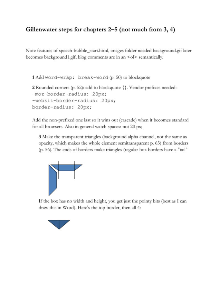
3 Make the transparent triangles (background alpha channel, not the same as
opacity, which makes the whole element semitransparent p. 63) from borders
(p. 56). The ends of borders make triangles (regular box borders have a "tail"
If the box has no width and height, you get just the pointy bits (best as I can
draw this in Word). Here's the top border, then all 4:
With widths the same you'd see the four isosceles triangles, but with top and
bottom lowered to 10, and right and left at 30 you have this:
60px = 30+30
20px = 10+10
border-width: 10px 30px 10px 0;
Then set left=0 (non-existent) and make top & bottom transparent:
Top 10px
Bottom 10px
Right 30 px
Note she does this with generated content, which causes problems with the
non-breaking space entity (&nbsp;). So we’ll do generated content later. I just
added a <span class="triangle">&nbsp;></span> to each
section.
.triangle {
display: block;
width: 0;
height: 0;
border-width: 10px 30px 10px 0;
border-style: solid;
border-color: transparent rgb(166, 218, 220)
transparent transparent;
border-color: transparent rgba(166, 218, 220,
0.7) transparent transparent;
position: absolute;
top: 27px;
left: -30px; /* try different values,
positions; you want the triangle to poke out to the
left */
}
As with #container <div>, position the blockquote relative so it acts as a
reference or parent block for the triangle, and experiment with a min-height,
and add the rgba() color to the blockquote as well. You can either change the
old background-color: #A6DADC or add these lines and delete that
one:
blockquote {
position: relative;
min-height: 40px;
background: rgb(166, 218, 220);
background-color: rgba(166, 218, 220, 0.7)
}
Note rgb is there in case old browser doesn't get rgba, which comes later in the
cascade for those that do.
Also, here (p. 62) she develops an argument for using hsla() rather than rgba().
Her values here are
hsla (182, 44%, 76%, .5)
which is equivalent to rgba(166, 218, 220, .5)
That is Hue, Saturation and Lightness, plus the alpha channel. It's a good
argument, but most people use rgba. This is a good point to get Heather
Arthur's Rainbow Color Tools add-on for Firefox (though note search addons for "rainbow" doesn't find it). It can inspect any element and give you
color codes in Hex, RGB or HSL. Photoshop gives you HSB (HSV) values
which is "similar but not quite the same" as HSL, which is why Rainbow comes
in. But it's also just neat to read colors of anything, store them in a library (I
was always writing Hex codes down).
4 Add conditional comments to the <html> tag. This is meant to work with
scripts e.g. modernizr to allow IE filters to simulate transparency. E.g.:
.ie6 blockquote, .ie7 blockquote { filter: …}. At this
point, FYI so that you know the best practices for conditional comments:
<!--[if
->
<!--[if
<!--[if
<!--[if
<!--[if
<!--[if
lt IE 7]><html lang="en" class="ie6"><![endif]IE 7]><html lang="en" class="ie7"><![endif]-->
IE 8]><html lang="en" class="ie8"><![endif]-->
IE 9]><html lang="en" class="ie9"><![endif]-->
gt IE 9]><html lang="en"><![endif]-->
!IE]>--><html lang="en"><!--<![endif]-->
5 Add a linear gradient to the blockquote.
Image free—they scale with the container (as do border-radius:, etc.). Vendor
syntax is very different. This is one still being worked out, so really can't specify
linear-gradient: at this point.
-moz-linear-gradient(start color, end color position of end color)
-webkit-gradient(type, H+V for start color, H+V for end color, from (start color),
to(end color))
blockquote
{background-image: -moz-lineargradient(rgba(255,255,255,.6), rgba(255,255,255,0)
40px);
background-image: -webkit-gradient(linear, 0 0, 0
30, from(rgba(255,255,255,.6)),
to(rgba(255,255,255,0)) );
}
These are white starting at 60% opacity and ending at 0% opacity (completely
transparent). Equivalent is hsla(0, 0%, 100%, .6), hsla(0, 0%, 100%, 0) because
lightness value =100%.
NOTE: These have now been standardized. It should work with just background:
but mine didn’t till I made it background-image:
background-image: linear-gradient(0deg, rgba(255,
255, 255, 0), rgba(255, 255, 255, 0.6))
Put these after background-color:
A reminder here about the Sandboxes at Westciv (Sitepoint).
6 Drop shadows (image-free, scale with the box …
box-shadow: (H offset, V offset, blur, spread). Note how each pixel makes a
difference. As with text-shadow: values are often 1, 2, or 3px. These can be
multiple. Only need H & V (X and Y), other two values default to zero.
-moz-box-shadow: 1px 1px 2px rgba(0,0,0,.3);
-webkit-box-shadow: 1px 1px 2px rgba(0,0,0,.3);
box-shadow: 1px 1px 2px rgba(0,0,0,.3);
Put this after border-radius: to be sure it also applies to the rounded corners.
Again, this was done in hsla(); equivalent is hsla(0, 0%, 0%, .3) because L=0%
which is black.
7 Hover effects on <blockquote> element. This is the "whatever:hover" that was
introduced in CSS2.1. Think of other ways to use this. Also as we said, you can
style the :focus pseudoclass as well, notably input:focus {maybe add a glow effect
with box-shadow}. Make this pop out to the upper left 2px in both directions.
blockquote:hover {
top:-2px;
right:-2px;
-moz-box-shadow: 3px 3px 2px rgba(0,0,0,.3);
-webkit-box-shadow: 3px 3px 2px rgba(0,0,0,.3);
box-shadow: 3px 3px 2px rgba(0,0,0,.3);
}
Notice that it's moving 2px up and to the left, so it needs to grow from 1px to 3px
in each direction. This (and not much else) will work in IE8.
7b Add a text-shadow on :hover. Note this one doesn't need vendor prefixes.
blockquote:hover {text-shadow: 1px 1px 0
rgba(255,255,255,.7);}
Same as hsla (0, 0%, 100%, .7)
Q: What color is this? Where will it show up? Take a look at my demo and
notice that it's very subtle, but effective.
This is similar to the Apple nav effect (webkit only).
Experiment with multiple text-shadows. Here's embossed text from a Sitepoint
article and my "solution" to the same challenge from Allsopp. Here's another for
engraved text from SixRevisions (Andrew Roberts)
Try negative values. Set both X=0 and Y=0 with a blur to get a glow. (David
DeSandro—we'll take a look at his Masonry project as well. Use shades of gray.)
Add the same shadow to the commenter's name and date:
.comment-meta {text-shadow: 1px 1px 0
rgba(255,255,255,.7);}
8 Rotate images using transform: Note these are 2-D. 3-D is only supported with
–webkit using Safari. And like gradients, this also gets pretty hairy, so here's the
Sandbox for these.
Basic syntax is transform: function(measurements);
There are lots of transform functions in CSS3: key ones are translate (move), scale
(resize) rotate, skew.
Add the transform code to rotate the images -5 degrees (tilts left or counterclockwise). This selector is not in your stylesheet yet.
.comment-meta img {
-moz-transform: rotate(-5deg);
-webkit-transform: rotate(-5deg);
-o-transform: rotate(-5deg);
transform: rotate(-5deg);
}
Add the white box to the images using padding (top left/right bottom)
padding: 5px 5px 20px;
background: #fff;
Note here, I think just for instruction, she includes the Opera prefix (-o-). Again,
the last rule will be what's needed when all the browsers are caught up and
standardized.
And, famously, the workarounds here (p. 93) for IE 6, 7 and 8 using Microsoft's
proprietary filter: are very complicated. That said, try what you have so far in IE,
especially 8 or less, and see what you get. Everything we did so far should work in
recent Mozilla and Webkit browsers.
From Chapter 3, note that you can apply
-moz-background-size: auto 1.6em
(width height)
line-height: 1.2 (assumes ems)
Multiple background images: background: url(i1.jpg) no-repeat,
url(i2.jpg) no-repeat #fff;
Background clip –moz-background-clip: padding-box;
9 @font-face (we've seen this before in Zeldman chapter 13)
Link to an external API e.g. Google's code or Font Squirrel.
<link
href="http://fonts.googleapis.com/css?family=Abril+Fatf
ace" rel="stylesheet" type="text/css" />
Then just add that font to your CSS font stack declaration:
h1 {font-family: 'Abril Fatface', 'Comic Sans', cursive;}
See also my Font Squirrel demo.
Note also the syntax if you have your own fonts locally or on your server:
@font-face {
font-family: 'Prelude';
src: url('fonts/preludeflf-webfont.eot');
src: local(''), url('fonts/preludeflfwebfont.woff') format('woff'), url('fonts/preludeflfwebfont.ttf') format('truetype'),
url('fonts/preludeflf-webfont.svg#webfont')
format('svg');
}
Then she does the same for a bold version.
Should know the font formats: (p. 143)
EOT = embedded open type, which is Microsoft/IE; note it's in its own rule
because old IE can't understand comma-separated lists
WOFF = Web open font format, which should become the standard
TTF = TrueType font
OTF = OpenType font
SVG = Scalable vector graphic
The smiley face is just there to stop IE from trying to read the rest of the rule (it
doesn't understand "local"). Put @font-face first to prevent FOUT (flash of unstyled
text while the browser downloads the font).
From Chapter 4: Attribute selectors. Recall the basics and new CSS3 ones we saw in
our practice exercise here (also p. 152). Here she matches file types with [attr$=val]
where $ means the string ends with val e.g.
a[href$=".pdf"] {background-image: url(icon.pdf);}
Also could see
a[href^="http"] {background-color: #123;} Starts with, so just
external links
a[href*="Wikipedia"] {background-color: #00b;} contains, so
any link from part of Wikipedia
To be safe, always use quotation marks.
Chapter 5: New structural pseudo-classes.
Recall pseudo-elements, which select things that aren't HTML elements, e.g.
p::first-letter {font-size: 120%;}
Note the two colons :: Other useful ones are ::first-line, ::before, ::after (p. 169)
Pseudo-classes (are part of an HTML element e.g. a:hover)
Again, we had a list of these here. Demo here is with :nth-child().
So these can get pretty complex with expressions as arguments inside the (). As with
arrays in scripting/programming, the counter starts at zero, e.g.
li:nth-child(2n+1) Q: What would this select? A: The 1st <li>, 3rd, 5th, etc. So that's
the same as
li:nth-child(odd)
Also useful (as in checkerboard problem or Apple nav bar) are:
:first-child
:last-child
:nth-of-type() (e.g. p:nth-of-type(2) for the second paragraph within a parent
element
:first-of-type
Again, these are pseudo classes, so just one :
10 Zebra striping using :nth-child().
li:nth-child(even) blockquote {
background-color: rgba(125, 198, 244, .5);
}
Think of this as <ol> is the parent, then select the <li> that are the even children of
that, so the 2nd <li> 4th <li> etc.
She uses (p. 178)
img[src*="photos"]:nth-of-type(even) {-moz-transform:
rotate(-2deg);} although she left out the "" which she says to include.
to rotate the photos. *=photos means "starts with" photos, so only <img
src="photos/pic.jpg"> get picked, not other <img src="map.gif">.
11 Add a Table of contents
First we just need to get this set of anchors on the page (section links).
<ul id="toc">
<li><a href="#zoe">Zoe</a></li>
<li><a href="#cary">Cary</a></li>
<li><a href="#faith">Faith</a></li>
<li><a href="#asha">Asha</a></li>
</ul>
Then add the matching id to each <h4> (code not shown).
Then style the TOC div, the list items and the links:
#toc {
margin-bottom: 1.6em;
padding: 0;
list-style: none;
}
#toc li {
float: left;
margin: 0;
padding-left: 80px;
}
#toc li:first-child{
padding-left: 0;
}
#toc a {
color: #146DA3;
float: right;
padding-left: 5px;
this is improvised—you can try different floats and padding. Note I decided I wanted
these to align to the left, but with the first one having no padding. You might use
#toc li:last-child if you were aligning to the right.
12a Number icons with pure CSS
Create a list automatically so you can style them (as opposed to <ol>).
#toc { counter-reset: list;
}
This creates a counter that you have arbitrarily called "list." Then you need to tell it
where to increment, and where to output the content.
#toc li {
counter-increment: list;
12b Then use the :before pseudoclass to generate that content. Note that this is sort
of like document.write or innerHTML in JavaScript—you create content on the fly.
#toc li:before {
content: counter(list);
float: left;
width: 1.6em;
height: 1.6em;
}
12c Create circles. Note same width and height, then border-radius is half of that. I
had to adjust the padding from what she had (padding-left: 5px) to get the numbers in
the center of the circles.
#toc li:before {
-moz-border-radius: .8em;
-webkit-border-radius: .8em;
border-radius: .8em;
background: #87B3CE;
background-color: rgba(125,199,244,.5);
padding-top: 4px;
color: #fff
font-family: Arial, Helvetica, "Helvetica Neue",
sans-serif;
font-weight: bold;
text-decoration: none;
}
Add a text-shadow as before:
#toc li:before {text-shadow: 0 1px 0 rgba(0,0,0,.6);
text-align: center;
}
13 Use :target to change background color on jumped-to section (as in Wikipedia
footnotes; try one out). Because we're doing this on a different file, target the <h4>s
names rather than <h2>s that she uses in the book
h4:target {
background-color: rgb(166, 218, 220);
-moz-box-shadow: 3px 6px 8px -4px #999;
-webkit-box-shadow: 3px 6px 8px -4px #999;
box-shadow: 3px 6px 8px -4px #999;
padding-left: 5px;
}
(4 values here are horizontal offset, vertical, blur and spread radius, negative to
contract it).
14 Animate that change (make it take a while) using transition:
h4 {-moz-transition: background-color 3s ease-out,
padding-left 2s ease-out;
-o-transition: background-color 3s ease-out ,
padding-left 2s ease-out;
-webkit-transition: background-color 3s ease-out ,
padding-left 2s ease-out;
transition: background-color 3s ease-out , paddingleft 2s ease-out;
}
This is saying apply a transition of 3 seconds to the background-color property and 2
seconds to the padding (to create a bit of movement).
Think of ways to make boxes gradually appear (Zurb.com). See also CSS Tricks. (p.
197.
To create more complex animations (more than a start and end value), you can specify
keyframes. Note Webkit (Safari, Chrome) only. See also {} within the {} (although
linear-gradient had extra () instead of {}). This comes up again with media queries
(Part 2).
@-webkit-keyframes fade {from {background: rgba
(166,218,220,.2);} to {background: none;}}
h4:target {
-webkit-animation-name: fade;
-webkit-animation-duration: 2s;
-webkit-animation-iteration-count: 1;
-webkit-animation-timing-function: ease-in;
}
OR h4:target {-webkit-animation: fade 2s ease-in 1;}
Workarounds include using an animated GIF as the background-image:
h4:target {background:
url(fader.gif) no-repeat #fff;}

