AP Stats Ch 4 Notes - Anderson County Schools
advertisement
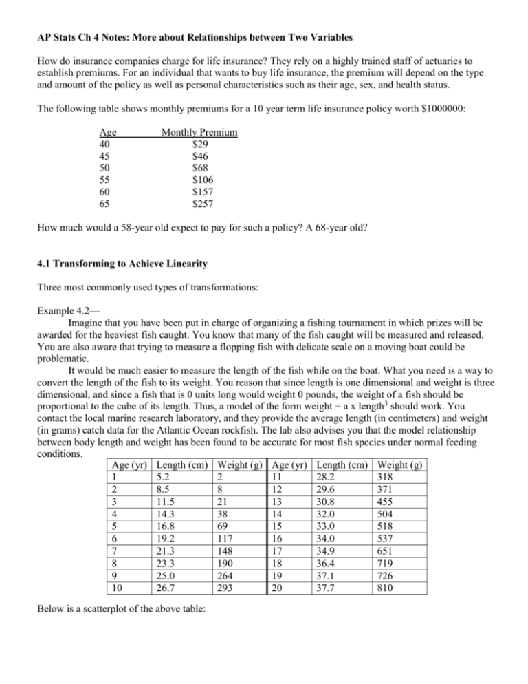
AP Stats Ch 4 Notes: More about Relationships between Two Variables How do insurance companies charge for life insurance? They rely on a highly trained staff of actuaries to establish premiums. For an individual that wants to buy life insurance, the premium will depend on the type and amount of the policy as well as personal characteristics such as their age, sex, and health status. The following table shows monthly premiums for a 10 year term life insurance policy worth $1000000: Age 40 45 50 55 60 65 Monthly Premium $29 $46 $68 $106 $157 $257 How much would a 58-year old expect to pay for such a policy? A 68-year old? 4.1 Transforming to Achieve Linearity Three most commonly used types of transformations: Example 4.2— Imagine that you have been put in charge of organizing a fishing tournament in which prizes will be awarded for the heaviest fish caught. You know that many of the fish caught will be measured and released. You are also aware that trying to measure a flopping fish with delicate scale on a moving boat could be problematic. It would be much easier to measure the length of the fish while on the boat. What you need is a way to convert the length of the fish to its weight. You reason that since length is one dimensional and weight is three dimensional, and since a fish that is 0 units long would weight 0 pounds, the weight of a fish should be proportional to the cube of its length. Thus, a model of the form weight = a x length3 should work. You contact the local marine research laboratory, and they provide the average length (in centimeters) and weight (in grams) catch data for the Atlantic Ocean rockfish. The lab also advises you that the model relationship between body length and weight has been found to be accurate for most fish species under normal feeding conditions. Age (yr) Length (cm) Weight (g) Age (yr) Length (cm) Weight (g) 1 5.2 2 11 28.2 318 2 8.5 8 12 29.6 371 3 11.5 21 13 30.8 455 4 14.3 38 14 32.0 504 5 16.8 69 15 33.0 518 6 19.2 117 16 34.0 537 7 21.3 148 17 34.9 651 8 23.3 190 18 36.4 719 9 25.0 264 19 37.1 726 10 26.7 293 20 37.7 810 Below is a scatterplot of the above table: weight v length weight (g) 900 800 700 600 500 400 Series1 300 200 100 0 0 10 20 30 40 length (cm) Does this data appear linear? Would a least squares regression line be appropriate in this case? What transformation are we going to use? Make a scatterplot of the transformation and compare. Does the new scatterplot seem linear? weight v length cubed 900 800 weight 700 600 500 400 Series1 300 200 100 0 0 10000 20000 30000 40000 50000 60000 length cubed Perform a least squares regression on the transformed points. What is the equation? What is r2 and what does that value tell you? What does a residual plot for this data show and tell you? Writing the transformed equation: Assignment: p. 265-267 4.1, 4.2, 4.3 Transforming with Powers Figure 4.8 on page 268 of your book shows a graph of different power functions. If you graph the functions y = xp for several values of p, we can draw the following conclusions: 1. 2. 3. 4. 5. Read Example 4.3 on p. 268 and then look through the graphs on p. 269. Exponential Growth In linear growth, a fixed increment is ADDED to the variable in each equal time period. Exponential growth occurs when a variable is ______________________ by a fixed number in each equal time period. Think about a bacteria population in which each bacterium splits into two each hour. Beginning with a single bacterium, we have 2 after one hour, 4 after two hours, eight after three, 16, 32, 64, 128, and so on. Make a scatterplot of the growth over the first 24 hours. Bacteria 18000000 16000000 Bacteria 14000000 12000000 10000000 Bacteria 8000000 6000000 4000000 2000000 0 0 5 10 15 Time 20 25 30 Another explanation of linear and exponential growth: Linear growth increases by a fixed amount in each equal time period. Exponential growth increases by a fixed percent of the previous total in each equal time period. Example 4.4: An example of exponential growth. Think about one dollar invested into a savings account that earns 6% interest. After one year the account will have $1.06. Then after two years, the account will have 1.06X1.06 in the account, or 1.062. That would only put $1.12 in the account after two years, not much more than the $1.06 after year one. However, if you continued on this track and continued to multiply by 1.06, the account would have 1.06x dollars after x years in the account. For example, after 15 years the account would have $1.0615 in the account, $2.40. 50 years, $1.0650, $18.42. As time progresses, the money grows much faster. Example 4.5: Moore’s law and computer chips (more exponential growth) Gordon Moore, one of the founders of Intel Corporation, predicted in 1965 that the number of transistors on an integrated circuit chip would double every 18 months. This is “Moore’s Law,” one way to measure the revolution in computing. Here are data on the dates and number of transistors for Intel microprocessors. Processor 4004 8008 8080 8086 286 386 Date 1971 1972 1974 1978 1982 1985 Transistors 2,250 2,500 5,000 29,000 120,000 275,000 Processor 486 DX Pentium Pentium II Pentium III Pentium 4 Date 1989 1993 1997 1999 2000 Transistors 1,180,000 3,100,000 7,500,000 24,000,000 42,000,000 The scatterplot below shows the growth in the number of transistors on a computer chip from 1971 to 2000. Notice that the explanatory scale used is “years since 1970.” Transistors 48500000 Transistors 38500000 28500000 18500000 8500000 -1500000 0 5 10 15 Years since 1970 Is the overall pattern linear? Does this scatterplot show an example of exponential growth? 20 25 30 The Logarithm Transformation While the curve for the growth of transistors may look exponential, we cannot tell this just from sight. We need a better way to check whether growth is exponential. If an exponential model of the form y a b x describes the relationship between x and y, we can use logarithms to transform the data to produce a linear relationship. Review of logarithms algebraic properties: Example 4.6 Moore’s law and computer chips continued: 1. In your calculator, list the years since 1970 in L1, and the number of transistors in L2. 2. Enter the ln of L2 into the L3 column. 3. Make a scatterplot of L1 and L3. a. Does this scatterplot appear to be linear? 4. Find the equation of the least squares regression line for the scatterplot. 5. What is the value of r2, and what does this value tell us? 6. Graph the line on your scatterplot. Does the line fit the points? 7. What does a residual plot look like for the line on the scatterplot? Is the residual plot acceptable to proceed with making predictions? Predictions in the Exponential Growth Model In the case of the exponential growth model, the logarithms of the response variable follow a linear pattern, not the actual response variables. So to make predictions we need to undo the logarithm transformation to return to the original units of measurement. Assignment: p. 276-279—4.5, 4.6, 4.8, 4.9 Power Law Models y ax p Take the logarithm of both sides of this equation: What type of relationship is this? Slope? Prediction in Power Law Models Example 4.10 What’s a planet, anyway? Planet Mercury Venus Earth Mars Jupiter Saturn Uranus Neptune Pluto Distance from Sun (astronomical units) 0.387 0.723 1 1.524 5.203 9.539 19.191 30.061 39.529 Period of revolution (Earth years) 0.241 0.615 1 1.881 11.862 29.456 84.07 164.81 248.53 250 Period (yr) 200 150 100 50 0 0 5 10 15 20 25 30 35 40 45 Distance (AUI) What type of transformation should we use to linearize the data? If the relationship between distance from the sun and period of revolution is exponential, then a plot of log(period) versus distance should be roughly linear. If the relationship between these variables follows a power model, then the plot of log(period) versus log(distance) should be fairly linear. 6 5 5 4 4 3 3 ln(period) ln(period) 6 2 1 2 1 0 0 -1 -1 -2 -2 0 10 20 30 40 50 -1 Distance ln(period) vs distance 0 1 2 3 4 ln(distance) ln(period) vs ln(distance) Since the scatterplot with ln(period) vs ln(distance) is linear, this must be a power model. The least squares regression equation will be: ln(period) = 0.000254 + 1.50 ln(distance) What is the r squared value for this data? How does the residual plot look? The last step is to perform an inverse transformation on the linear regression equation: Now that we have our model, we can make a prediction. A new planet, Xena, has been found. This planet is an average distance of 9.5 billion miles from the sun, that’s about 102.15 astronomical units. Using our power model, we would predict a period of Assignment: p. 285-287—4.11, 4.12, 4.13 4.1 Section Review: p. 288-290—4.15, 4.16, 4.19 4.2 Relationships between Categorical Variables Categorical variables are sometimes unavoidable, such as gender, race or occupation. Other categorical variables are created by the type of research being conducted, such as classes of quantitative variables. To analyze categorical data, we use the counts or percents of individuals that fall into various categories. (thousands of persons) Age group 15 to 17 years 18 to 24 years 25 to 34 years 35 years or older Total Sex Male 61 4697 1589 970 7317 Female 89 5668 1904 1660 9321 Total 150 10365 3494 2630 16639 The above table presents Census Bureau data describing the age and sex of college students. This is a two-way table because it describes two categorical variables. Why is age categorical here? Age group is the row variable because each row in the table describes students in one age group. Sex is the column variable because each column describes one sex. The entries in the table are the counts of students in each age-by-sex class. Marginal Distributions The distributions of sex alone and age alone are called marginal distribution because they appear at the bottom and right margins of the two way table. (Marginal has to do with what numbers are in the margins, or the row and column counts.) Calculating the marginal distributions: What percent of college students are 18 to 24 years old? What percent are 15 to 17 years old? ______________ 25 to 34 years old? ______________ 35 years or older? __________________ Two-way tables require a lot of percents to be calculated. Ask, “What represents the total that I want the percent of?” A bar graph is a good graphical display of percents. Describing Relationships What % are women? What % of 35 and up are women? What % of the traditional group are women? Conditional distributions are when percents are compared within one group. Other conditional distributions: Percent of Males v females within the 18 to 24 year old group. Distributions of age given sex. There are many more comparisons that could be made, however there is not one simple way to display them. Assignment: P. 298-299 4.23, 4.24, 4.25, 4.27 Simpson’s Paradox As is the case with quantitative variables, the effects of lurking variables can change or even reverse relationships between two categorical variables. Here is an example that demonstrates the surprises that can await the unsuspecting user of data. Example 4.15 Do medical helicopters save lives? Accident victims are sometimes taken by helicopter from the accident scene to a hospital. Helicopters save time. Do they also save lives? Let’s compare the percent of accident victims who die with helicopter evacuation and with the usual transport to a hospital by road. Here are the data that illustrate a practical difficulty. Helicopter Road Victim Died 64 260 Victim Survived 136 840 Total 200 1100 What percent of helicopter patients died? _______________ How does that percent compare to the percent that died when transported by road? What is an explanation for the results? Here is the same data but broken down into serious accidents and less serious accidents: Died Survived Total SERIOUS ACCIDENTS Helicopter 48 52 100 Road 60 40 100 Died Survived Total LESS SERIOUS ACCIDENTS Helicopter 16 84 100 Road 200 800 1000 Inspect the tables to make sure we are describing the same data set. How do you go about doing this? How do the accident victims fare when transported by helicopter versus by road in each type of accident? Why is it that when the two types are lumped together the helicopter patients do not survive as much as the road transported patients? Could you say there is a lurking variable here? What might it be? This example shows Simpson’s Paradox: An association or comparison that holds for all of several groups can reverse direction when the data are combined to form a single group. Simpson’s paradox is just an extreme form of the fact that a lurking variable can make observed associations misleading. Assignment: p. 301-302—4.29, 4.30 Section 4.2 review problems—p. 303-305 4.31-4.35, 4.37, 4.40 4.3 Establishing Causation As we study two variables and the relationship between them, we hope to see that the explanatory variables cause changes in the response variable. Just because there is a strong association between the two variables, does not mean we have established causation. ASSOCIATION DOES NOT MEAN CAUSATION. What ties between two variables can explain an observed association? What constitutes good evidence for causation? In the following examples, there is a clear association between an explanatory and response variable. Example 4.16—Six interesting relationships The following are some examples of observed associations between x and y. 1. x = mother’s body mass index y = daughter’s body mass index 2. x = amount of artificial sweetener saccharin in a rat’s diet 3. x = a high school senior’s SAT score y = count of tumor’s in the rat’s bladder y = the student’s first-year college GPA 4. x = the number of years of education a worker has y = the worker’s income Explaining Association: Causation Example 4.17—BMI in mothers and daughters; saccharin in rats Causation?? Items 1 and 2 above in example 4.16 are examples of direct causation. Thinking about these examples, however, shows that “causation” is not a simple idea. 1. A study of Mexican American girls aged 9 to 12 years recorded body mass index (BMI), a measure of weight relative to height, for both the girls and their mothers. People with high BMI are overweight or obese. The study also measured hours of television, minutes of physical activity, and intake of several kinds of food. The strongest correlation (r = 0.506) was between the BMI of daughters and the BMI of mothers. Body type is in part determined by heredity. Daughters inherit half of their genes from their mothers. As a result, there is a direct causal link between the BMI of mothers and daughters. Yet the mothers’ BMIs explain only 25.6% (that’s r squared again) of the variation among the daughters’ BMIs. Other factors, such as diet and exercise, also influence BMI. Even when direct causation is present, it is rarely a complete explanation of an association between two variables. 2. The best evidence for causation comes from experiments that actually change x while holding all other factors fixed. If y changes, we have good reason to think that x caused the change in y. Experiments show conclusively that large amounts of saccharin in the diet cause bladder tumors in rats. Should we avoid saccharin as a replacement for sugar in food? Rats are not people. Although we can’t experiment with people, studies of people who consume different amounts of saccharin show little association between saccharin and bladder tumors. Even well established causal relations may not generalize to other settings. Explaining Association: Common Response “Beware the lurking variable” is a good advice when thinking about an association between two variables. Common response says that the observed association between the variables x and y is explained by a lurking variable z. Both x and y change in response to changes in z. This common response creates an association even though there may be no direct causal link between x and y. Let’s think about 3 from above: 3. Students who are smart and who have learned a lot tend to have both high SAT scores and high college grades. This positive correlation is explained by this common response to students ability and knowledge. Explaining Association: Confounding As noted with BMI of daughters and mothers, there is no doubt that inheritance plays a role in the association. But habits also play a role in the association. Perhaps a parent that does not exercise, has poor eating habits, and watches lots of television sets a poor example for their child. Their daughter may pick up such habits which will also then contribute to her high BMI. So heredity is mixed with influences from the environment of the daughter. The mixing of influences is called confounding. Confounding: Confounding often prevents us from drawing conclusions about causation. Think about 4 from above: 4. It is likely that more education is a cause of higher income—many highly paid professions require advanced education. However, confounding is also present. People who have high ability and come from prosperous homes are more likely to get many years of education than people who are less able or poorer. Of course, people who start out able and rich are more likely to have higher earnings even without mush education. We can’t say how much of the higher income of well-educated people is actually caused by their education. Even a very strong association between two variables is not by itself good evidence that there is a cause and effect link between the variables. Establishing Causation If associations do not explain causation, how then do we establish causation? The best way to establish causation is to conduct a carefully designed experiment in which the effects of possible lurking variables are controlled. Much of statistics is answering questions of causation that cannot be settled with experiments. Do power lines cause cancer? Electric currents generate magnetic fields. So living with electricity exposes people to magnetic fields. Living near power lines increases exposure to these fields. Really strong fields can disturb living cells in laboratory studies. What about weaker fields we experience if we live near power lines? It isn’t ethical to do experiments that expose children to magnetic fields. It’s hard to compare cancer rates among children who happen to live in more and less exposed locations, because leukemia is rare and locations vary in many ways other than magnetic fields. We must rely on studies that compare children who have leukemia with children who don’t. A careful study of the effect of magnetic fields on children took five years and cost $5 million. The researchers compared 638 children who had leukemia and 620 who did not. They went into the homes and actually measured the magnetic fields. They recorded facts about power lines in relation to the home and also for the mother’s residence when she was pregnant. Result: no evidence of more than a chance connection between magnetic fields and childhood leukemia. Smoking and lung cancer? - The association is strong. The association is consistent. Across many studies, there is a link between smoking and lung cancer. Larger values of the response variable are associated with stronger responses. People that smoke more cigarettes, or smoke over a longer period of time get lung cancer more often. The alleged cause precedes the effect in time. Lung cancer develops after years of smoking. The number of men and women dying of cancer rose as smoking became more common. The alleged cause is plausible. Assignment: p.312-313—4.41 to 4.48
