Analytics Desktop User Guide
User Guide Analytics Desktop Document Number: 09619414 CONTENTS Guide Overview Description of this guide............................................................ ix What’s new in this guide .................................................................x 1. Getting Started with Analytics Desktop Introduction.................................................................................. 1 About Analytics Desktop................................................................ 2 Installing Analytics Desktop ........................................................... 5 Upgrading Analytics Desktop................................................... 7 Building your first dashboard ....................................................... 11 Importing your data from a file ............................................... 12 Creating a dashboard ............................................................ 17 Formatting your visualization ................................................. 23 Adding filters to your dashboard ............................................ 25 Allowing a visualization to update the data displayed in another visualization .............................................................. 30 Analyzing your data ............................................................... 33 Sharing your results ............................................................... 37 Understanding how MicroStrategy works with and stores data ... 40 Providing business context to data: Attributes ....................... 41 Calculating data: Metrics........................................................ 42 Storing data: Datasets ........................................................... 43 Powering analysis in Analytics Desktop: MicroStrategy Intelligence Server ................................................................. 44 Running and viewing a dashboard .............................................. 45 Viewing dashboards in Presentation View............................. 46 Saving, exporting, emailing, or printing a dashboard............. 48 Saving a dashboard ............................................................... 48 Exporting a dashboard........................................................... 50 © 2014 MicroStrategy, Inc. iii Contents MicroStrategy Analytics Desktop User Guide Exporting a visualization ........................................................ 51 Emailing a dashboard ............................................................ 53 Printing a dashboard.............................................................. 55 Opening and closing Analytics Desktop ...................................... 56 2. Importing Data into Analytics Desktop Introduction................................................................................ 59 Best practices: Importing data into Analytics Desktop................. 60 Importing data from a file ............................................................. 64 Connecting to a data source........................................................ 70 Creating a DSN...................................................................... 73 Managing database connections ........................................... 75 Importing data from a database................................................... 76 Creating and managing filters to determine which data to import from a database .......................................................... 83 Defining joins between columns in database tables .............. 86 Importing data using a Freeform script ........................................ 88 Preparing your data to display on maps: Geo roles and shape keys ............................................................................................. 93 Importing a dashboard and data from another MicroStrategy user.............................................................................................. 96 Editing imported data................................................................... 97 Adding new data to your imported data: Incrementally updating datasets .................................................................. 99 Replacing your imported data with new data ....................... 101 3. Creating and Modifying Dashboards Introduction.............................................................................. 105 Creating a dashboard ................................................................ 106 Adding and removing datasets from a dashboard ..................... 110 Displaying a visual representation of your data: Visualizations............................................................................. 112 Changing the type of visualization displayed ....................... 115 Determining which mapping visualizations are available..... 116 Creating visualizations............................................................... 119 Creating a blank visualization .............................................. 122 Creating a Graph visualization............................................. 124 Creating a Graph visualization with a dual-axis or combination graph ............................................................... 131 Creating a Graph visualization with pie or ring graphs ........ 133 iv © 2014 MicroStrategy, Inc. MicroStrategy Analytics Desktop User Guide Contents Quick steps and minimum data requirements to create each Graph visualization style ............................................. 140 Creating a Grid visualization ................................................ 147 Creating a Heat Map visualization ....................................... 149 Creating an Image Layout visualization ............................... 152 Creating a Map visualization................................................ 159 Creating a Density Map visualization................................... 164 Creating a Map with Areas visualization .............................. 168 Creating a Network visualization.......................................... 173 Customizing an Image Layout visualization......................... 175 Duplicating visualizations..................................................... 180 Adding, replacing, and removing data from visualizations......... 181 Creating visualizations using data from multiple datasets ......... 183 Linking data shared across multiple datasets ...................... 190 Defining the main dataset to use to display data in a visualization ......................................................................... 193 Formatting visualizations ........................................................... 194 Formatting numeric values in a visualization ....................... 197 Adding or removing a threshold in a visualization................ 199 Formatting a Graph visualization ......................................... 203 Formatting a Grid visualization ............................................ 211 Formatting a Heat Map visualization.................................... 213 Formatting an Image Layout visualization ........................... 217 Formatting a Map visualization ............................................ 220 Formatting a Density Map visualization ............................... 223 Formatting a Map with Areas visualization .......................... 224 Formatting a Network visualization ...................................... 227 Moving visualizations................................................................. 231 Deleting visualizations ............................................................... 232 Adding, editing, and removing text in a dashboard.................... 232 Layering and organizing data in a dashboard............................ 234 Adding, modifying, and deleting layouts in a dashboard...... 235 Adding, modifying, and deleting panels in a dashboard ...... 237 Limiting the data displayed in a dashboard: Filters.................... 239 Adding filters to a dashboard ............................................... 240 Editing and removing filters in a dashboard......................... 244 Allowing a visualization to update the data displayed in another visualization ............................................................ 247 Determining whether to allow filters to restrict other filters .. 250 © 2014 MicroStrategy, Inc. v Contents MicroStrategy Analytics Desktop User Guide Creating a metric based on existing metrics: Derived metrics... 251 About derived metrics .......................................................... 252 Adding derived metrics to a dashboard ............................... 252 Adding derived metrics to a dashboard on-the-fly ............... 253 Creating derived metrics based on a function in a dashboard ............................................................................ 261 Creating a new derived metric in a dashboard from scratch ................................................................................. 263 Providing statistical analysis from R analytics ..................... 269 Editing or deleting derived metrics in a dashboard .............. 271 4. Analyzing Data in Dashboards Introduction.............................................................................. 275 Analyzing data in a visualization................................................ 277 Analyzing data in a Graph visualization ............................... 279 Analyzing data in a Grid visualization .................................. 288 Analyzing data in a Heat Map visualization ......................... 293 Analyzing data in an Image Layout visualization ................. 295 Analyzing data in a Map visualization .................................. 298 Analyzing data in a Density Map visualization ..................... 302 Analyzing data in a Map with Areas visualization ................ 306 Analyzing data in a Network visualization............................ 310 Examining the underlying data in a visualization ................. 312 Filtering data in a dashboard ..................................................... 315 Filtering, sorting, and drilling on data in a visualization ............. 319 Selecting data in one visualization to update the display in another....................................................................................... 320 Grouping data in a dashboard: Page-by.................................... 323 5. Organizing and Searching for Objects Introduction.............................................................................. 327 Using the Back and Forward buttons to navigate ...................... 328 Maintaining folders and objects ................................................. 328 Creating folders ................................................................... 329 Copying a dashboard or folder ............................................ 329 Creating a shortcut to an object ........................................... 330 Viewing details about dashboards and other objects........... 332 Renaming an object ............................................................. 333 Moving an object.................................................................. 333 Deleting an object ................................................................ 334 Displaying folders and objects in a list or as icons............... 335 vi © 2014 MicroStrategy, Inc. MicroStrategy Analytics Desktop User Guide Contents Searching for objects ................................................................. 335 Searching for objects: Quick search .................................... 335 Searching by object description, creation date, and other criteria: Advanced search .................................................... 336 Using efficient search syntax ............................................... 339 6. Setting Your Preferences Introduction.............................................................................. 341 General preferences .................................................................. 342 Specifying email addresses ....................................................... 344 A. System Requirements Introduction.............................................................................. 347 Software requirements............................................................... 348 Hardware requirements and recommendations......................... 349 Data source and ODBC driver support ...................................... 350 B. Configuration Introduction.............................................................................. 359 Requirements for Data DB2 iSeries................................................................................ 360 Sources DB2 Wire ................................................................................... 361 DB2 z/OS................................................................................... 362 Greenplum ................................................................................. 363 Hive............................................................................................ 365 Impala ........................................................................................ 365 Infobright.................................................................................... 366 Informix Wire.............................................................................. 367 Informix XPS.............................................................................. 368 Microsoft Access........................................................................ 369 MySQL....................................................................................... 369 Oracle ........................................................................................ 370 PostgreSQL ............................................................................... 372 Salesforce.................................................................................. 372 SQL Server ................................................................................ 373 Sybase ASE............................................................................... 374 Web services ............................................................................. 375 © 2014 MicroStrategy, Inc. vii Contents MicroStrategy Analytics Desktop User Guide C. Interfaces for Data Introduction.............................................................................. 377 Import, Visualizations, Interfaces for importing data ...................................................... 377 and Functions Database page .................................................................... 378 Freeform page ..................................................................... 383 Preview page ....................................................................... 387 Expression dialog box.......................................................... 392 New Condition dialog box .................................................... 393 Interfaces for creating dashboards ............................................ 394 Select a Visualization dialog box ......................................... 395 Dashboard Editor ................................................................. 398 Dashboard Editor: Graph ..................................................... 405 Dashboard Editor: Grid ........................................................ 409 Dashboard Editor: Heat Map ............................................... 410 Dashboard Editor: Image Layout ......................................... 411 Dashboard Editor: Map ........................................................ 413 Dashboard Editor: Density Map ........................................... 415 Dashboard Editor: Map with Areas ...................................... 416 Dashboard Editor: Network.................................................. 418 Interfaces for formatting visualizations ...................................... 419 Dashboard Editor: Graph: Properties................................... 420 Dashboard Editor: Grid: Properties...................................... 425 Dashboard Editor: Heat Map: Properties ............................. 426 Dashboard Editor: Image Layout: Properties....................... 428 Dashboard Editor: Map: Properties...................................... 429 Dashboard Editor: Density Map: Properties......................... 430 Dashboard Editor: Map with Areas: Properties.................... 431 Dashboard Editor: Network: Properties ............................... 432 Axis Scale dialog box........................................................... 432 Advanced Sort Editor ........................................................... 434 Show Data dialog box .......................................................... 434 Show All dialog box ............................................................. 437 Interfaces for functions .............................................................. 438 New Metric dialog box.......................................................... 438 Select a Function dialog box................................................ 439 Function Arguments for New Metric dialog box ................... 441 Function Arguments dialog box ........................................... 443 Save As dialog box .................................................................... 443 viii © 2014 MicroStrategy, Inc. MicroStrategy Analytics Desktop User Guide Additional Resources Contents Introduction.............................................................................. 445 Discussion Forum ...................................................................... 445 Resources.................................................................................. 446 Documentation..................................................................... 446 Version Information and Legal Notices User Guide................................................................................ 455 Index......................................................................................................................................... 459 © 2014 MicroStrategy, Inc. ix Contents x MicroStrategy Analytics Desktop User Guide © 2014 MicroStrategy, Inc. GUIDE OVERVIEW Description of this guide The Analytics Desktop User Guide describes the steps for a business analyst to execute and analyze a Visual Insight dashboard in MicroStrategy Analytics Desktop. It provides the information necessary for a business analyst to import data from a data source, and use that data to create and modify dashboards. This guide is organized into the following sections: • Chapter 1, Getting Started with Analytics Desktop introduces Analytics Desktop. It describes how MicroStrategy works with and stores the data you import. It explains tasks such as opening, saving, and sharing dashboards. It also provides steps to create your first dashboard. • Chapter 2, Importing Data into Analytics Desktop describes how to import data into Analytics Desktop, for use in creating dashboards. • Chapter 3, Creating and Modifying Dashboards describes how to create a dashboard, add visual representations of the data (called visualizations) to the dashboard to make your data easier to interpret, perform manipulations on the data to customize which information to display, and so on. © 2014 MicroStrategy, Inc. ix Guide Overview MicroStrategy Analytics Desktop User Guide • Chapter 4, Analyzing Data in Dashboards describes common methods you can use to better understand and present the data that appears in a dashboard. • Chapter 5, Organizing and Searching for Objects describes how to manage and search for dashboards, datasets, and folders. • Chapter 6, Setting Your Preferences describes how to set your user preferences, such as the color theme for dashboards and the default email addresses for sending dashboards. • Appendix A, System Requirements lists software and hardware requirements to support Analytics Desktop. It also lists the data source types and ODBC drivers that are certified or supported for Analytics Desktop. • Appendix B, Configuration Requirements for Data Sources provides the configuration information required to connect to data sources. • Appendix C, Interfaces for Data Import, Visualizations, and Functions explains the dialog boxes and other interfaces you can use to import data, create and format visualizations, and so on. • Additional Resources provides information about the Analytics Desktop Discussion Forum, where you can ask questions and exchange information with other Analytics Desktop users. It also introduces the reporting capabilities of the full MicroStrategy product suite with a list of MicroStrategy user manuals. What’s new in this guide Analytics Desktop 9.4.1.4 • You can display your data on a map, with concentrated locations of interest displayed based on color gradients, with the Density Map visualization. For steps, see Creating a Density Map visualization, page 164. • You can display your data as colored, two-dimensional regions on a map with the Map with Areas visualization. For steps, see Creating a Map with Areas visualization, page 168. x What’s new in this guide © 2014 MicroStrategy, Inc. MicroStrategy Analytics Desktop User Guide Guide Overview • You can perform statistical analysis in Analytics Desktop using R analytics. For steps, see Providing statistical analysis from R analytics, page 269. • For steps to enable Image Layout visualizations, see Determining which mapping visualizations are available, page 116. • Additional data source support is included in the list of data sources; see Data source and ODBC driver support, page 350. Analytics Desktop 9.4.1.3 • For updates to the software requirements of Analytics Desktop, see Software requirements, page 348. • Additional data source support is included in the list of data sources; see Data source and ODBC driver support, page 350. Analytics Desktop 9.4.1.2 • You can connect directly to a data source without having to create a DSN. Analytics Desktop includes MicroStrategy-branded ODBC drivers to facilitate this connection. For a list of data sources that support DSNless connections, see Data source and ODBC driver support, page 350. • You can use your own latitude and longitude information to display map markers on a Map visualization. For steps, see Creating a Map visualization, page 159. • For steps to upgrade your version of Analytics Desktop, see Upgrading Analytics Desktop, page 7. © 2014 MicroStrategy, Inc. What’s new in this guide xi Guide Overview xii What’s new in this guide MicroStrategy Analytics Desktop User Guide © 2014 MicroStrategy, Inc. 1 1. GETTING STARTED WITH ANALYTICS DESKTOP Introduction MicroStrategy Analytics Desktop enables you to create interactive Visual Insight dashboards to display and explore your business data. With simple visualizations and pre-defined, presentation-quality formatting, you can quickly display your data in a visually-striking, interactive dashboard. This section provides an overview of Analytics Desktop. It describes how MicroStrategy works with and stores the data you import, explains how to save and share a dashboard, and so on. For details, see the following: • About Analytics Desktop, page 2 • Installing Analytics Desktop, page 5 • Building your first dashboard, page 11 • Understanding how MicroStrategy works with and stores data, page 40 • Running and viewing a dashboard, page 45 • Saving, exporting, emailing, or printing a dashboard, page 48 • Opening and closing Analytics Desktop, page 56 © 2014 MicroStrategy, Inc. 1 1 Getting Started with Analytics Desktop MicroStrategy Analytics Desktop User Guide About Analytics Desktop You can quickly create a customized, interactive dashboard and use it to explore your business data, with Analytics Desktop. You can explore and analyze data on your own, with minimal technical support—even if this is your first time analyzing data with a visual data discovery tool. You can import data, create a dashboard, add visual representations of the data (called visualizations) to the dashboard to make the data easier to interpret, and perform manipulations on the data to customize the information that is included in the dashboard. You can export a dashboard as an interactive PDF file, share a dashboard and its data with other MicroStrategy users, and so on. Analytics Desktop allows you to streamline the tasks that are required to create a polished dashboard using the data that you import. For example, you can: • Quickly add, rearrange, or remove data from a visualization in a dashboard. • Create additional visualizations to display the data in multiple ways, then easily modify, move, and size visualizations in the dashboard. • Automatically change how your data is displayed based on the values of your data, by adding thresholds to a dashboard. 2 About Analytics Desktop © 2014 MicroStrategy, Inc. MicroStrategy Analytics Desktop User Guide Getting Started with Analytics Desktop 1 • Customize the information that is displayed by adding filters to a dashboard. • Easily group data in the dashboard, enabling you to switch between and explore subsets of the data. In the image below, data is displayed in a dashboard using a Grid visualization, which contains revenue, cost, and profit data for each call center in a region. Profit values of less than $300,000 are displayed using a red background, while values that are greater than $800,000 are displayed in green. You can easily add data to the visualization, rearrange objects in the grid, and so on. The image below shows a Heat Map visualization in the same dashboard, which displays the data using nested, colored rectangles of different sizes and colors depending on the cost and profit data for each call center. You can © 2014 MicroStrategy, Inc. About Analytics Desktop 3 1 Getting Started with Analytics Desktop MicroStrategy Analytics Desktop User Guide format the colors used to display the rectangles, delete rectangles from the display, and change how the size and position of the rectangles is calculated. For an overview of how to import your data into Analytics Desktop, see Importing Data into Analytics Desktop, page 59. For steps to create a dashboard, see Creating a dashboard, page 106. For more information on the types of visualizations that can be added to a dashboard, see Displaying a visual representation of your data: Visualizations, page 112. Related topics • Importing Data into Analytics Desktop, page 59 • Creating a dashboard, page 106 • Adding and removing datasets from a dashboard, page 110 • Displaying a visual representation of your data: Visualizations, page 112 • Formatting visualizations, page 194 4 About Analytics Desktop © 2014 MicroStrategy, Inc. MicroStrategy Analytics Desktop User Guide Getting Started with Analytics Desktop 1 Installing Analytics Desktop Analytics Desktop provides a lightweight installation that shortens the setup time required to quickly create polished, interactive dashboards to display and explore your business data. After you install Analytics Desktop, you register the Analytics Desktop software. During the registration process, you sign up for a free MicroStrategy account. Your account gives you access to the MicroStrategy Discussion Forums and Knowledge Base, as well as technical support via email. You can also use this account to sign in to MicroStrategy Analytics Express, MicroStrategy’s cloud-based analytics product. For background information about the Analytics Desktop Discussion Forum, see Discussion Forum, page 445. For background information about MicroStrategy Analytics Express, visit http://www.microstrategy.com/ free/express. You can also register Analytics Desktop with an existing MicroStrategy account. Follow the steps below to install and register Analytics Desktop. If you are upgrading an existing installation, see Upgrading Analytics Desktop, page 7. Prerequisites • Review the software and hardware requirements, provided in Software requirements, page 348 and Hardware requirements and recommendations, page 349 respectively. • You must have the following permissions and privileges to install Analytics Desktop: • You must log on to the machine using a domain account with Windows administrative privileges for the domain or target machine. You must have write permissions in the installation directory to complete the installation. Analytics Desktop and MicroStrategy Analytics Enterprise cannot concurrently be installed on the same machine. © 2014 MicroStrategy, Inc. Installing Analytics Desktop 5 1 Getting Started with Analytics Desktop MicroStrategy Analytics Desktop User Guide To install and register Analytics Desktop on Windows 1 Log on to the machine where you are installing Analytics Desktop. 2 Exit all Windows applications before beginning the installation process. 3 Navigate to the download site for Analytics Desktop and download the Analytics Desktop installation files. Install Analytics Desktop 4 Locate and run the MicroStrategyAnalyticsDesktop_Version.exe file, where Version is the version number of Analytics Desktop to be installed. may have to extract the downloaded files to locate the You MicroStrategyAnalyticsDesktop_Version.exe file. When extracting the files, ensure that the extraction software maintains the folder structure of the compressed files. Most extraction software maintains the folder structure by default, but if you use WinRAR, ensure that you select the Extract full paths option. Depending on your Windows User Account Control settings, you may see a message asking if you want to allow the MicroStrategyAnalyticsDesktop.exe program to make changes to the computer. Click Yes to permit your machine to open the Analytics Desktop installation file. The Analytics Desktop Installation Wizard opens to the Welcome page. 5 Review the welcome information and click Next. The License Agreement page opens. 6 Read the license agreement, and accept or decline the agreement by selecting the appropriate option. If you decline, you cannot install Analytics Desktop. Once you have accepted the license agreement, click Next. The Choose Destination Location page opens. 7 The default location where the Analytics Desktop files will be installed is displayed. You can change this if you want to install the files in a different location. Click Change, and browse to the location where the Analytics Desktop files will be installed. 6 Installing Analytics Desktop © 2014 MicroStrategy, Inc. MicroStrategy Analytics Desktop User Guide Getting Started with Analytics Desktop 1 8 Once you have selected an installation location, click Install to begin the installation of Analytics Desktop. The Setup Status page opens, which displays the installation progress. Once the installation is complete, the InstallShield Wizard Complete page opens. 9 Select the Launch check box and click Finish. You are done installing Analytics Desktop. When you open Analytics Desktop, a registration message is displayed. Register Analytics Desktop 10 In the Email field, type your email address, then click Register. • If you have an existing MicroStrategy account, use the email address for that account. • If you do not have a MicroStrategy account, type the requested information and click Register again. Related topics • Software requirements, page 348 • Hardware requirements and recommendations, page 349 • Upgrading Analytics Desktop, page 7 Upgrading Analytics Desktop To take advantage of new features and functionality, you can upgrade to the latest version of Analytics Desktop. When you upgrade Analytics Desktop, you choose whether to update the MicroStrategy metadata. The MicroStrategy metadata is a repository that stores MicroStrategy object definitions as well as information about your data. The metadata maps your data to MicroStrategy objects, such as attributes and metrics. The metadata also stores the definitions of all objects created with Analytics Desktop, such as dashboards and saved datasets. For background information about attributes, metrics, and datasets, see Understanding how MicroStrategy works with and stores data, page 40. Updating the metadata helps ensure compatibility between your existing dashboards and the MicroStrategy application. You can also take advantage of new functionality available only with the updated version of the metadata. © 2014 MicroStrategy, Inc. Installing Analytics Desktop 7 1 Getting Started with Analytics Desktop MicroStrategy Analytics Desktop User Guide If you choose to update the metadata, all of your dashboards and saved data are deleted when the existing metadata is overwritten by the new metadata. You can keep your dashboards and data by exporting them from Analytics Desktop before you upgrade, then importing them back into Analytics Desktop after you upgrade. For example, you can export your dashboards and data as MicroStrategy files, which include the contents of an entire dashboard, such as visualizations, filters, and so on, plus the associated datasets. After you upgrade Analytics Desktop, you can import the MicroStrategy files back into your upgraded Analytics Desktop environment. For steps to export dashboards and data as MicroStrategy files, see Exporting a dashboard, page 50. For steps to import MicroStrategy files back into your upgraded Analytics Desktop environment, see Importing a dashboard and data from another MicroStrategy user, page 96. If you choose to upgrade Analytics Desktop without overwriting the existing metadata, your existing dashboards and data are retained. By default, Analytics Desktop automatically checks for updates, downloads the update file, and then notifies you to install an update when it is available. You can also prevent Analytics Desktop from automatically checking for updates. Follow the steps below to update Analytics Desktop, prevent Analytics Desktop from automatically checking for updates, and so on. Prerequisites • The steps below assume that you have an earlier version of Analytics Desktop installed on your computer. • To download updates, the computer on which you are upgrading Analytics Desktop must be connected to the Internet. • Review the software and hardware requirements, provided in Software requirements, page 348 and Hardware requirements and recommendations, page 349 respectively. • If you choose to overwrite the existing MicroStrategy metadata but want to keep your dashboards and saved data, you must export your dashboards and data before you upgrade Analytics Desktop. After you upgrade Analytics Desktop, you can import your dashboards and data back into the upgraded Analytics Desktop environment. For steps to export dashboards and data, see Exporting a dashboard, page 50. 8 Installing Analytics Desktop © 2014 MicroStrategy, Inc. MicroStrategy Analytics Desktop User Guide • Getting Started with Analytics Desktop 1 You must have the following permissions and privileges to upgrade Analytics Desktop: You must log on to the machine using a domain account with Windows administrative privileges for the domain or target machine. You must have write permissions in the installation directory to complete the upgrade. To upgrade your version of Analytics Desktop 1 Log on to the machine where you are upgrading Analytics Desktop. 2 If you are working with Analytics Desktop, save any work in progress: • If you are modifying a dashboard, save the dashboard. • If you are importing data, finish importing the data and save the dataset. 3 If you want to keep your saved dashboards and data when you update the existing MicroStrategy metadata, as described above, you must export any dashboards or data that you want to keep. For steps, see Exporting a dashboard, page 50. 4 From the Windows task bar, click the Analytics Desktop icon, then click Check for Updates Now. If an update is available, a notification message is displayed. Click Update. Depending on your Windows User Account Control settings, you may see a message asking if you want to allow the MicroStrategyAnalyticsDesktop.exe program to make changes to the computer. Click Yes to permit your machine to open the Analytics Desktop installation file. The Analytics Desktop Installation Wizard opens to the Welcome page. 5 Review the welcome information and click Next. The License Agreement page opens. 6 Read the license agreement, and accept or decline the agreement by selecting the appropriate option. If you decline, you cannot upgrade Analytics Desktop. Once you have accepted the license agreement, click Install. The Setup message opens. © 2014 MicroStrategy, Inc. Installing Analytics Desktop 9 1 Getting Started with Analytics Desktop MicroStrategy Analytics Desktop User Guide 7 You can choose whether to update the existing MicroStrategy metadata, as described above. Select from the following: the MicroStrategy metadata deletes all existing Updating dashboards and saved data. • To update both Analytics Desktop and the MicroStrategy metadata, and delete your dashboards and saved data, click Yes. The Setup Status page opens, which displays the installation progress. • To update Analytics Desktop and keep the existing metadata, click No. The Setup Status page opens, which displays the installation progress. The upgraded version of Analytics Desktop is installed in the same Windows folder location as the existing Analytics Desktop application. Once the installation is complete, the InstallShield Wizard Complete page opens. 8 Select the Launch check box and click Finish. This completes the installation process and opens Analytics Desktop. To prevent Analytics Desktop from automatically checking for updates 1 From the Windows task bar, click the Analytics Desktop icon, then select Don’t Check for Updates. you select Don’t Check for Updates while an update file is Ifbeing downloaded, the update file will finish downloading, but you will not be prompted to install the update. This update file is downloaded to improve performance in the future if you decide to check for updates. To allow Analytics Desktop to automatically check for updates 1 From the Windows task bar, click the Analytics Desktop icon, then click Check for Updates Automatically. When an update is available, the update file is downloaded and a notification message is displayed. For steps to install an update, see To upgrade your version of Analytics Desktop, page 9. 10 Installing Analytics Desktop © 2014 MicroStrategy, Inc. MicroStrategy Analytics Desktop User Guide Getting Started with Analytics Desktop 1 Related topics • Providing business context to data: Attributes, page 41 • Calculating data: Metrics, page 42 • Storing data: Datasets, page 43 • Software requirements, page 348 • Hardware requirements and recommendations, page 349 • Installing Analytics Desktop, page 5 • Importing Data into Analytics Desktop, page 59 • Importing a dashboard and data from another MicroStrategy user, page 96 Building your first dashboard This section introduces you to the features available in Analytics Desktop. It provides steps to import data from a file, create a dashboard with a Heat Map visualization, analyze and manipulate data on the visualization, and share your results with colleagues. This section is for business analysts who are new to MicroStrategy and creating Visual Insight dashboards. Analytics Desktop includes a wide range of features beyond those covered here as you create your first dashboard. Throughout the section, you will find suggestions to expand your experience of Analytics Desktop beyond the scope of your first dashboard. At a high level, building your first dashboard consists of the following steps: 1 Import your data from a file on your computer or network. For steps, see Importing your data from a file, page 12. 2 Create a dashboard using your imported data. Display your data in the Heat Map visualization. Save your dashboard. For steps, see Creating a dashboard, page 17. 3 Format your Heat Map visualization. For steps, see Formatting your visualization, page 23. © 2014 MicroStrategy, Inc. Building your first dashboard 11 1 Getting Started with Analytics Desktop MicroStrategy Analytics Desktop User Guide 4 Create a filter to limit the data that is displayed on your dashboard. For steps, see Adding filters to your dashboard, page 25. 5 Add a second visualization to your dashboard. Create a different type of filter that allows the selections that you make in one visualization to automatically update the data displayed in another visualization. For steps, see Allowing a visualization to update the data displayed in another visualization, page 30. 6 Analyze your data by filtering and drilling. For steps, see Analyzing your data, page 33. 7 Share your insights with colleagues by exporting or emailing your dashboard. For steps, see Sharing your results, page 37. Importing your data from a file You can import and report on personalized data from various data sources. You can then immediately build dashboards without having to “model” your data source. This section provides steps to import an Excel (.xls or .xlsx), text, or comma-separated values (CSV) file from your computer. You can also import data from additional data sources, such as a database or a custom database query (a Freeform script). For background information about other types of data import, see Chapter 2, Importing Data into Analytics Desktop. Prerequisites • You must have Adobe Flash Player to import data from a file. For specific version requirements, see Software requirements, page 348. • The steps below assume that you have your data in a simple tabular layout in an Excel, CSV , or text file. • The maximum file size for importing data from an Excel file, comma-separated values file, or text file is 200 MB. Be sure that your system has enough free memory to accommodate the file. In general, your browser will require memory that is an additional 1.1 times the size of the file that you want to upload. For example, to upload a 75 MB file, be sure to have at least 83 MB for the browser to use. 12 Building your first dashboard © 2014 MicroStrategy, Inc. MicroStrategy Analytics Desktop User Guide • Getting Started with Analytics Desktop 1 Depending on the type of file that you are importing, ensure that the file meets the following requirements: For Excel files: – Leave cells of data empty to represent NULL values rather than using the text NULL. – Determine whether the data for a column is numeric or textual. If a column contains any non-numeric value in its cells, use a text data type. If all values in the column are numeric, a numeric data type can be used. – Multiple worksheets can be included in the file, but only one worksheet can be uploaded at a time. – The first worksheet for the file cannot be empty. – Avoid leaving more than 20 empty rows between column headers and data on the worksheet, so that you will see an accurate preview of your data. – Analytics Desktop uses the localization settings specified in the MicroStrategy User Preferences. For CSV files: – Leave cells of data empty to represent NULL values rather than using the text NULL. – Determine whether the data for a column is numeric or textual. If a column contains any non-numeric value in its cells, use a text data type. If all values in the column are numeric, a numeric data type can be used. – Use commas to separate values. No other characters, such as tabs or semicolons, should be used to separate values in the file. – The file must use either UTF-8 or UTF-16 encoding. – Multiple worksheets can be included in the file, but only one worksheet can be uploaded at a time. – The first worksheet for the file cannot be empty. – Avoid leaving more than 20 empty rows between column headers and data on the worksheet, so that you will see an accurate preview of your data. © 2014 MicroStrategy, Inc. Building your first dashboard 13 1 Getting Started with Analytics Desktop MicroStrategy Analytics Desktop User Guide For text files: – Leave cells of data empty to represent NULL values rather than using the text NULL. – Determine whether the data for a column is numeric or textual. If a column contains any non-numeric value in its cells, use a text data type. If all values in the column are numeric, a numeric data type can be used. – Use commas to separate values. No other characters, such as tabs or semicolons, should be used to separate values in the file. – The file must use either UTF-8 or UTF-16 encoding. To import and save data from a file 1 From the home page of Analytics Desktop, click Import on the left, and then click Data. 2 From the Select your Data Source panel on the left, click File. The File Upload options are displayed. The maximum file size that can be imported is 200 MB. 3 To import data from a file on your computer or network, select the From My Computer/Network option. 4 Click Browse. The Select a File to Upload dialog box is displayed. 5 Navigate to the file that you want to import, select it, then click Open. 6 Click Continue. A preview of the imported data is displayed on the Preview page. 7 If the file is an Excel workbook with more than one sheet of data, from the Sheet Name drop-down list, select the name of the sheet that you want to import data from. 8 By default, Analytics Desktop assumes that your data is stored in a simple tabular layout, with each column in the table containing a separate attribute or metric. You can also choose to import data stored in a cross-tabbed layout. These steps assume that you have your data in a simple tabular layout. 14 Building your first dashboard © 2014 MicroStrategy, Inc. MicroStrategy Analytics Desktop User Guide Getting Started with Analytics Desktop 1 To import data from a simple tabular layout: a Select Tabular. b By default, Analytics Desktop uses the first row of data as headers for the imported data columns. These column headers are then displayed as the names of the metrics and attributes that you define: Metrics: A metric is a business measure or key performance indicator, such as Revenue, Profit, Employee Headcount, Probability of Purchase, and so on. Attributes: An attribute is a business concept, such as Product, Employee, Month, and so on. Attributes provide a context for metrics. If the data in the imported file does not include column headers for the data columns, you can specify the column headers manually by doing the following: a Select the Insert new column headers check box. A default column header is automatically inserted for each data column. b To specify a name for a column header, hover the cursor over the column header and click the arrow icon in the top right. Select Rename, then type a name for the header in the field and press ENTER. 9 You can define a data column as a business concept (an attribute) or a business measure (a metric), choose not to import a column of data, rename data columns, and so on. Hover the cursor over the header of the data column you want to select options for, then click the arrow icon to display a menu. Select from the following: • To define a data column as a metric, select Metric. Metrics are displayed with this icon: . • To define a data column as an attribute, select Attribute. Attributes are displayed with this icon: . These steps assume that your attributes will have data types automatically assigned by Analytics Desktop. MicroStrategy also offers more detailed options, such as assigning attributes with the Date data type so you can create analyses over time. If you want to display your data on a map-based visualization, you can assign a geo role or shape key to an attribute. For background information about defining your data in more specific detail, see Chapter 2, Importing Data into Analytics Desktop. © 2014 MicroStrategy, Inc. Building your first dashboard 15 1 Getting Started with Analytics Desktop MicroStrategy Analytics Desktop User Guide • To avoid including a data column in the imported data, select Do Not Import. • To rename a data column, select Rename. Type a name in the field and press ENTER. The names of data columns are displayed as the names of attributes and metrics. 10 Repeat the appropriate steps above for each data column that you want to define. 11 Click Continue. The Save Dataset dialog box opens. Browse to the location to save the imported data, then type a name and description for the dataset in the Name and Description fields. 12 Click OK. Select Create Dashboard to create your new dashboard. Next, you add a Heat Map visualization to your dashboard. For steps, see Creating a dashboard, page 17. Beyond your first dashboard: Do more with Analytics Desktop • For background information about attributes and metrics, see Understanding how MicroStrategy works with and stores data, page 40. • You can import data from a database. For steps, see Importing data from a database, page 76. • You can write your own SQL script to choose which data to import from a database. For steps, see Importing data using a Freeform script, page 88. • When you import data, MicroStrategy automatically attempts to determine if your data contains geographical information, such as city or country names. You can use this information to display data on map-based visualizations. For background information and steps, see Preparing your data to display on maps: Geo roles and shape keys, page 93. • You can incrementally add new data to your saved datasets in Analytics Desktop. For example, you have a dashboard that contains sales data for your department. Your data source is updated every month with sales information for the previous month. You can add the monthly sales information to your saved dataset in Analytics Desktop. Dashboards that use the dataset are updated automatically. For steps, see Adding new data to your imported data: Incrementally updating datasets, page 99. 16 Building your first dashboard © 2014 MicroStrategy, Inc. MicroStrategy Analytics Desktop User Guide Getting Started with Analytics Desktop 1 Creating a dashboard A dashboard is an interactive, presentation-quality display that you can create to explore your business data. You explore your data by adding visualizations, or visual representations of your data, to the dashboard. See the following sections: • For an overview of the Analytics Desktop workspace and how you use it to build a dashboard, see Understanding the Analytics Desktop workspace, page 17 • For a brief introduction to visualizations, see Selecting a visualization: The Heat Map, page 19. • For steps to add a Heat Map visualization to your dashboard, see Creating a Heat Map visualization, page 19. Understanding the Analytics Desktop workspace At a high level, you create a dashboard by dragging and dropping data. The image below shows a dashboard with a simple Grid visualization: © 2014 MicroStrategy, Inc. Building your first dashboard 17 1 Getting Started with Analytics Desktop MicroStrategy Analytics Desktop User Guide The Dataset Objects panel on the left displays all the data in your dataset. In the example above, the name of the dataset is Hawaiian Airlines Data. When you import your data into Analytics Desktop, MicroStrategy automatically determines whether each column of data is a metric or an attribute, as follows: • Metrics: Metrics are business measures or key performance indicators, such as Revenue or Employee Headcount. Numerical data is usually a metric. Metrics are displayed with this icon: . • Attributes: Attributes are business concepts that provide context for metrics. Examples of attributes include Product and Employee. Attributes are displayed with this icon: . For background information about attributes and metrics, see Understanding how MicroStrategy works with and stores data, page 40. Visualizations are displayed in the center of the interface. In the example above, a Grid visualization shows Origin Airport and Destination Airport, which are attributes, and Number of Flights and Delay (min), which are metrics. Immediately to the left of the visualization is the Drop Zones panel. The Drop Zones panel shows which attributes and metrics have been added to a visualization. This section of the interface is where you control what data is displayed on a visualization. name of the Drop Zones panel may vary depending on the type of The visualization you are modifying. For example, this panel appears as the Grid panel when modifying a Grid visualization, as in the example above, and appears as the Heat Map panel when modifying a Heat Map visualization, which you will create in the steps below. To create a visualization, you drag and drop attributes and metrics from the Dataset Objects panel to the Drop Zones panel. For example, you can add the On Time % metric to the Grid visualization by dragging it from the Dataset Objects panel and dropping it in the Drop Zones (Grid) panel. The Filters panel enables you to limit the data that is displayed on a dashboard by filtering data. You filter data by dragging and dropping attributes and metrics from the Dataset Objects panel to the Filters panel. Steps to filter data are covered in Adding filters to your dashboard, page 25. You can also group large sets of data into logical subsets, then view only one of the subsets at a time. You do this by dragging and dropping an attribute to the Page-by panel. Grouping data using the Page-by panel is beyond the 18 Building your first dashboard © 2014 MicroStrategy, Inc. MicroStrategy Analytics Desktop User Guide Getting Started with Analytics Desktop 1 scope of creating your first dashboard; for an introduction and steps, see Grouping data in a dashboard: Page-by, page 323. Selecting a visualization: The Heat Map A visualization is a visual representation of the data in a dashboard. Because understanding a business takes more than a single perspective, MicroStrategy offers a library of interchangeable visualizations to provide multiple ways for you to view and interact with your data. You can add visualizations to a dashboard, choose the visualization that makes the most sense for your data and for the goals of your end users, and quickly duplicate or switch visualizations to get a different view in seconds. A single dashboard can contain many visualizations, each containing information from a different set of data. Rendering even very complex business analyses in easy-to-understand visualizations means more people can gain insight from them. A Heat Map visualization is superb for identifying performance patterns. Attention is drawn instantly to color-coded results, and it is easy to understand the impact of multiple business performance indicators at a glance. section explains how to create and analyze a Heat Map This visualization. For more information about the other visualizations available in Analytics Desktop, and steps to create them, see Displaying a visual representation of your data: Visualizations, page 112. Creating a Heat Map visualization A Heat Map visualization is a combination of nested, colored rectangles, each representing an attribute element. You can add a Heat Map visualization to dashboard to quickly grasp the state and impact of a large number of © 2014 MicroStrategy, Inc. Building your first dashboard 19 1 Getting Started with Analytics Desktop MicroStrategy Analytics Desktop User Guide variables at one time. Heat Maps are often used in the financial services industry to review the status of a portfolio. The rectangles contain a wide variety and many shadings of colors, which emphasize the contribution of the various components. In a Heat Map visualization: • The size of each rectangle represents its relative weight. In the example above, Profit determines the size of the rectangles. • The color of each rectangle represents its relative value. For example, in the image above, larger values of Cost are green and smaller values are red. • The large areas, such as the Northeast area of rectangles in the image above, represent different groups of data. • The small rectangles, such as New York in the image above, represent individual attribute elements. A Heat Map visualization requires one to two attributes, such as Region or Category, and two metrics, such as Profit or Revenue. For background information and examples of attributes and metrics, see Providing business context to data: Attributes, page 41 and Calculating data: Metrics, page 42. 20 Building your first dashboard © 2014 MicroStrategy, Inc. MicroStrategy Analytics Desktop User Guide Getting Started with Analytics Desktop 1 To create a Heat Map visualization on a dashboard using your imported data 1 If your dashboard is not already created, click Create Dashboard. 2 Click Select a Visualization. The Select a Visualization dialog box opens. 3 Select Heat Map. A Heat Map visualization is added to the dashboard. MicroStrategy automatically selects data to add to the visualization to optimize your display. 4 You can modify the data displayed on the Heat Map visualization. A list of the attributes and metrics in your dashboard’s dataset is shown in the Dataset Objects panel, on the left side of your screen. If the Dataset Objects panel is not displayed, from the Show menu, select Dataset Objects. 5 If the Heat Map panel is not displayed, from the Show menu, select Edit Visualization. 6 To add data to the visualization, from the Dataset Objects panel, click and drag objects to the Heat Map panel, as follows: • Drag at least one attribute to the Grouping area. The elements of the attribute are displayed in the visualization. For example, if the attribute is Year, a rectangle for each year is displayed in the visualization. You can drag additional attributes to the Grouping area to group the rectangles in the visualization in a larger area. For example, in the example image above, the Region attribute contains the element South and the Call Center attribute contains the elements New Orleans and Memphis. If Region is placed above Call Center in the Grouping area, an area called South is displayed in the visualization, with the rectangles New Orleans and Memphis inside. You can add additional attributes to further group the rectangles in the Heat Map. • Drag a metric to the Size By area. This metric determines the size of each rectangle, with rectangles for large metric values displayed as larger than rectangles for small metric values. • To have the rectangles colored automatically based on the value of a metric or based on the elements in an attribute, drag the attribute or metric to the Color By area. © 2014 MicroStrategy, Inc. Building your first dashboard 21 1 Getting Started with Analytics Desktop MicroStrategy Analytics Desktop User Guide 7 To display additional metrics in a tooltip when you hover the cursor over a rectangle, place the metrics you want to display on the Tooltip area. 8 To remove data from the visualization, in the Heat Map panel, hover the cursor over the name of the object that you want to remove, then click X. 9 To save your dashboard, click the Save As icon . The Save As dialog box opens. Navigate to the location in which you want to save the dashboard, then type a name and description for the dashboard in the Name and Description fields. Click OK. Your dashboard is saved. Next, you format your Heat Map visualization. For steps, see Formatting your visualization, page 23. Beyond your first dashboard: Do more with Analytics Desktop • Analytics Desktop contains a library of visualizations that provide multiple ways for you to view and interact with your data. For descriptions of the available visualizations and steps to create them, see Displaying a visual representation of your data: Visualizations, page 112. • You can easily swap visualizations to gain a new perspective on your data. For steps, see Changing the type of visualization displayed, page 115. • You can display data from multiple datasets on the same visualization. When you import a new dataset into a dashboard, MicroStrategy automatically links attributes in the new dataset to attributes that already exist in the dashboard. You can also link or unlink attributes manually. For details about using multiple datasets in a visualization, see Creating visualizations using data from multiple datasets, page 183. • You can add more than one visualization to your dashboard. For steps, see Creating visualizations, page 119. • You can create new metrics based on the existing metrics on a dashboard. For example, you can subtract the values of one metric from the values of another metrics, such as Revenue - Cost. These new metrics are called derived metrics. For background information and steps to create derived metrics, see Creating a metric based on existing metrics: Derived metrics, page 251. • You can view the underlying attribute and metric data in a visualization. You can sort or copy this data, create a new Grid visualization using the data in the grid, save the data as a comma-separated values (CSV) file, and so on. For steps, see Examining the underlying data in a visualization, page 312. 22 Building your first dashboard © 2014 MicroStrategy, Inc. MicroStrategy Analytics Desktop User Guide Getting Started with Analytics Desktop 1 Formatting your visualization Once you have added visualizations to a dashboard, you can format the visualization. For example, you can determine the number format in which to display numeric values, display or hide the visualization’s title bar, apply banding to values in a grid, and so on. type of visualization provides distinct formatting options to Each enhance your ability to view and read the data. This section assumes that you are formatting a Heat Map visualization. For information about formatting other types of visualizations, see Formatting visualizations, page 194. You can format several aspects of a Heat Map visualization. You can determine whether rectangles can be deleted from the visualization, select the algorithm used to size and position rectangles, and so on. To format a Heat Map visualization 1 If your dashboard is not already open, click the name of the dashboard to run it. 2 Click the visualization that you want to format. 3 If the Properties panel is not displayed, from the Show menu, select Properties. 4 You can enable rectangles to be deleted from the visualization. If this option is enabled, anyone viewing it will be able to delete rectangles from the visualization by hovering over a rectangle and clicking the X icon. Do one of the following: • To allow rectangles to be deleted from the visualization, select the Delete check box. • To disable rectangles from being deleted, clear the Delete check box (default). 5 You can enable zooming in and out of rectangles in the visualization by clicking them. Do one of the following: • To enable zooming in and out of rectangles in the visualization, select the Zoom check box. © 2014 MicroStrategy, Inc. Building your first dashboard 23 1 Getting Started with Analytics Desktop • MicroStrategy Analytics Desktop User Guide To disable zooming in and out of rectangles in the visualization, clear the Zoom check box (default). 6 You can choose whether to display a legend in the visualization. Do one of the following: • To show the legend, select the Show Legend check box (default). • To hide the legend, clear the Show Legend check box. 7 You can choose whether to label each rectangle with the name of the attribute element that it represents. From the Show Labels drop-down list, select one of the following options: • To show the rectangle labels, select On (default). • To hide the rectangle labels, select Off. • To display the rectangle labels with the size of each label reflecting the size of the rectangle, select Proportional. Rectangles that contain large values will be displayed with larger labels than rectangles that contain small values. 8 You can choose whether to display the metric values for each rectangle in the visualization. For example, you add Region, Profit, and Revenue to the visualization. The visualization displays rectangles for each customer region. You can select the Show metric values check box to display the profit and revenue data for the Mid-Atlantic region in the Mid-Atlantic rectangle, the profit and revenue data for the Northeast region in the Northeast rectangle, and so on. Do one of the following: • To show the metric values, select the Show metric values check box. • To hide the metric values, clear the Show metric values check box (default). 9 To determine the algorithm used to size and position rectangles, select one of the following options under Layout: • To size the rectangles in the Heat Map visualization to make them as easy to read as possible, select Keep readability, not element order (default). • To size and position the rectangles to make them as easy to read as possible, while still attempting to display them in the same order in which they appear in the visualization’s Drop Zones panel, select Balance readability and order. 24 Building your first dashboard © 2014 MicroStrategy, Inc. MicroStrategy Analytics Desktop User Guide • Getting Started with Analytics Desktop 1 To position the rectangles in the Heat Map visualization in the same order in which they appear in the visualization’s Drop Zones panel, select Keep element order, not readability. Next, you use filters to restrict the data displayed in your visualization. For steps, see Adding filters to your dashboard, page 25. Beyond your first dashboard: Do more with Analytics Desktop • If you place a metric in the Color By area of a Heat Map visualization, you can change the colors that are applied to rectangles in the visualization. This color formatting is automatically applied when the values of a metric fulfill a specific condition, and is called a threshold. For steps to change colors, and to specify the conditions for which colors are applied, see Adding or removing a threshold in a visualization, page 199. • You can apply formatting to numeric values in a visualization. For steps, see Formatting numeric values in a visualization, page 197. • You can add depth to your dashboard by organizing your data in multiple layers. This is useful if you have a large amount of data that you want to analyze in different ways, using many different visualizations. For steps, see Layering and organizing data in a dashboard, page 234. • Each type of visualization can be formatted in distinct ways. For background information and steps, see Formatting visualizations, page 194. Adding filters to your dashboard An intuitive filter panel makes it easy to screen data to see only the information you need. You can filter data based on any attribute or metric to change your view and better understand your data. Simple check boxes, sliders, and radio buttons make filters easy to use, and the impact of your selections is instantly visible. You can create the following types of filters: • You can filter data based on an attribute. For example, a dashboard displays sales data for several different product categories, from 2009 to 2012. You can filter the data in the dashboard to only display sales data © 2014 MicroStrategy, Inc. Building your first dashboard 25 1 Getting Started with Analytics Desktop MicroStrategy Analytics Desktop User Guide for books and movies in 2012. For steps, see To add an attribute filter, page 26. • Once you have created an attribute filter, you can filter data based on the ranking of each element in the attribute. This type of filter is called a Top N qualification filter. For example, you can add an attribute filter based on product category, then create a filter that displays data for the top three product categories by sales. For steps, see To add a Top N qualification filter, page 27. You can filter data based on a metric. For example, you can display data only for stores with profit data greater $100,000. For steps, see To add a metric filter, page 28. Add a few filters to your visualization to see this functionality in action. To add an attribute filter 1 If your dashboard is not already open, click the name of the dashboard to run it. 2 If the Dataset Objects panel is not displayed, from the Show menu, select Dataset Objects. 3 If the Filters panel is not displayed, from the Show menu, select Filters. 4 From the Dataset Objects panel, click the attribute that you want to use to filter data, and drag it onto the Filters panel. The filter is added to the Filters panel and is automatically named after the attribute that you created the filter based on. You can select and add more than one attribute to the Filters panel at a time. Press CTRL and click each attribute that you want to select. 5 Hover the cursor over the name of the filter you just added, then click the arrow icon. Point to Display Style, then select the style that you want to use to display the filter. 6 You can include or exclude data using elements selected in the filter. Hover the cursor over the name of the filter that you just added, then click the arrow icon and select one of the following: • To display data only for selected elements, select Include. • To display data for all elements except the elements that are selected, select Exclude. 26 Building your first dashboard © 2014 MicroStrategy, Inc. MicroStrategy Analytics Desktop User Guide Getting Started with Analytics Desktop 1 To add a Top N qualification filter a Top N qualification filter, the steps below assume that you Tohavecreate already created an attribute filter to base the Top N qualification filter on. 1 If your dashboard is not already open, click the name of the dashboard to run it. 2 If the Filters panel is not displayed, from the Show menu, select Filters. 3 From the Filters panel, hover the cursor over the name of the attribute filter, then click the arrow icon. Point to Top N. 4 From the Show drop-down list, select one of the following: • To create a filter to display data for the top n elements in the filter, select Highest. • To create a filter to display data for the bottom n elements in the filter, select Lowest. 5 In the field, type the number of elements to include in the filter. 6 From the Ranked By drop-down list, select the object to use to rank each element. 7 Click OK. Your filter is added to the Filters panel and is automatically named Object by Attribute, where Object and Attribute are the names of the object (attribute or metric) that you used to rank the filter elements and the attribute that you used to create the filter. 8 Hover the cursor over the name of the filter you just added, then click the arrow icon. Point to Display Style, then select the style you want to use to display the filter. 9 You can include or exclude data using the elements selected in the filter. Hover the cursor over the name of the filter you just added, then click the arrow icon and select one of the following: • To display data only for selected elements, select Include. • To display data for all elements except the elements that are selected, select Exclude. © 2014 MicroStrategy, Inc. Building your first dashboard 27 1 Getting Started with Analytics Desktop MicroStrategy Analytics Desktop User Guide To add a metric filter 1 If your dashboard is not already open, click the name of the dashboard to run it. 2 If the Dataset Objects panel is not displayed, from the Show menu, select Dataset Objects. 3 If the Filters panel is not displayed, from the Show menu, select Filters. 4 From the Dataset Objects panel, click the metric to use to filter data, and drag it onto the Filters panel. The filter is added to the Filters panel and is automatically given the name of the metric that you created the filter based on. 5 Hover the cursor over the name of the filter that you just added, then click the arrow icon. Point to Display Style and select one of the following: • To filter data by comparing metric data to a value that you specify, select Qualification. • To filter data by choosing values on a slider, select Slider. 6 Hover the cursor over the name of the filter that you just added, then click the arrow icon and select one of the following: • To filter on the metric’s values, select Qualify on Value. For example, you can display data only for stores with profit data greater than or equal to $1,000,000. • To assign a numeric rank to the metric values, where a rank of one is assigned to the highest metric value, and then filter by rank, select Rank Highest. For example, you can display data for the ten employees with the longest tenure in years. • To assign a numeric rank to the metric values, where a rank of one is assigned to the lowest metric value, and then filter by rank, select Rank Lowest. For example, you can display data for the ten stores with the lowest costs. • To filter by the top n% of metric values, select Rank % Highest. For example, if eight items are displayed in a visualization, Rank % Highest = 25 displays the top two items. 28 Building your first dashboard © 2014 MicroStrategy, Inc. MicroStrategy Analytics Desktop User Guide • Getting Started with Analytics Desktop 1 To filter by the bottom n% of metric values, select Rank % Lowest. For example, if eight items are displayed in a visualization, Rank % Lowest = 25 displays the bottom two items. 7 Complete the filter by doing one of the following: • To filter data by comparing metric data to a value that you specify, perform the following steps: a Click Greater than or equal to. From the drop-down list, select the operator to use to compare data, such as Less Than or Equals. b In the field, type the value to use to filter data, then press ENTER. The filter is created. • To filter data by choosing values on a slider, perform the following steps: a Click and drag the endpoints of the slider to cover the range of values for which you want to filter data. b You can choose to include or exclude data using the values selected in the slider. Hover the cursor over the filter name and click the arrow icon, then do one of the following: • To display data in the dashboard only for metric values selected in the slider, select Include. • To display data in the dashboard for all metric values except the values selected in the slider, select Exclude. Next, you create a different type of filter that allows you to select the elements in one visualization to automatically update the data displayed in another visualization. For steps, see Allowing a visualization to update the data displayed in another visualization, page 30. Beyond your first dashboard: Do more with Analytics Desktop • You can determine whether the selections you make in one filter in the Filters panel will affect the choices displayed for any other filter. For steps, see Determining whether to allow filters to restrict other filters, page 250. © 2014 MicroStrategy, Inc. Building your first dashboard 29 1 Getting Started with Analytics Desktop MicroStrategy Analytics Desktop User Guide Allowing a visualization to update the data displayed in another visualization Once you have added multiple visualizations to a dashboard, you can filter, drill on, or select elements in one visualization (the source) to automatically update the data displayed in another visualization (the target). The steps below show you how to add another visualization and create a filter that causes your interactions with one visualization to automatically update another visualization. You can: • Filter or drill on data in the source visualization to update the data displayed in one or more target visualizations. For example, the source visualization contains a list of product categories. When you filter data in the source to include only data for the Movies category, the data in the target is automatically updated to display only data for Movies. Similarly, if you drill to Subcategory in the source, the target will be updated to display data at the Subcategory level. Filtering or drilling on data in the target does not affect the data displayed in the source. You can perform the following data manipulations in the source to automatically update the data displayed in the target: Filter data in the source to display only data for selected elements Filter data in the source to display all data except the data for selected elements Drill on data in the source Undo filtering or drilling in the source For more information on these data manipulations, see Filtering, sorting, and drilling on data in a visualization, page 319. • Restrict the data displayed in one or more targets by selecting elements in the source. For example, if the target displays revenue data across several regions and you select Northeast in the source, the data in the target is automatically updated to display revenue data for the Northeast only. • Highlight the data displayed in one or more targets by selecting elements in the source. For example, if the target is a Heat Map visualization displaying delayed flights for several airports and you select BWI in the source, the rectangles for BWI will be highlighted in the Heat Map. 30 Building your first dashboard © 2014 MicroStrategy, Inc. MicroStrategy Analytics Desktop User Guide Getting Started with Analytics Desktop 1 To enable a visualization to update the data displayed in another visualization 1 If your dashboard is not already open, click the name of the dashboard to run it. 2 To allow the elements in one visualization to filter the elements displayed in another visualization, your dashboard must contain at least two visualizations. Create a Grid visualization to use as the target visualization for your filter. Do the following: a From the toolbar, click the arrow to the right of the Add Visualization icon . Select Grid. A blank visualization is added to the dashboard and displayed with an icon representing the visualization’s type. b If the Dataset Objects panel is not displayed, from the Show menu, select Dataset Objects. c If the Grid panel is not displayed, from the Show menu, select Edit Visualization. d To add data to the Grid visualization, from the Dataset Objects panel, click and drag objects to the Grid panel, as follows: • To add an attribute to the rows, drag the attribute to the Rows area. • To add an attribute to the columns, drag the attribute to the Columns area. • To add a metric to the visualization, drag the metric to the Metrics area. To change whether the metrics are displayed on the rows or columns of the grid, drag and drop the Metric Names object to the Rows or Columns area of the Grid panel. The Metric Names object, an attribute created by Analytics Desktop, is automatically added to the Grid panel. 3 To designate your original visualization as the source for the filter, click the arrow icon in the top right of the visualization to use as the source, then select Use as Filter. The Filtering Options dialog box opens. 4 You can update the data displayed in one or more targets by filtering or drilling on data in the source. Under Apply filtering on VizualizationName to the following targets, where VisualizationName is the name of the visualization, select the check box next to each visualization to use as a target. © 2014 MicroStrategy, Inc. Building your first dashboard 31 1 Getting Started with Analytics Desktop MicroStrategy Analytics Desktop User Guide 5 Once you have selected at least one target visualization to apply filtering to, you can either filter or highlight data in the target by selecting elements in the source visualization. Do one of the following: • To filter the data in the target by selecting elements in the source, select the Enable filtering on selection check box. • To highlight the data in the target by selecting elements in the source, clear the Enable filtering on selection check box. 6 If a drop-down list is displayed next to the Enable filtering on selection option, the visualization has already been configured to update data in the target when you filter or drill on a single, specific attribute in the source. Select one of the following: • To update data in the target when you filter or drill on the attribute already defined for the source, select For Attribute AttributeName, where AttributeName is the name of the attribute. • To update data in the target when you filter or drill on any data in the source, select For All Data. 7 If you enable data in the target to be filtered by selecting elements in the source, you can clear your selections in the source visualization and display the data for all elements at the same time in any target visualizations. For example, if the source is a Grid visualization that allows you to select from elements of Year to filter data in the target, you can click the Year header to display data for all years at the same time in the target. Do one of the following: • To allow you to clear your selections in the source, select the Allow users to clear all selections check box. • To disable clearing selections, clear the Allow users to clear all selections check box. 8 Click OK to apply your changes. Next, you analyze your data in the Heat Map visualization. For steps, see Analyzing your data, page 33. Beyond your first dashboard: Do more with Analytics Desktop • When your dashboard includes data from multiple datasets, you can use a visualization based on one dataset as a selector to update the data displayed in a visualization based on another dataset. For details about 32 Building your first dashboard © 2014 MicroStrategy, Inc. MicroStrategy Analytics Desktop User Guide Getting Started with Analytics Desktop 1 using multiple datasets in a visualization, see Creating visualizations using data from multiple datasets, page 183. Analyzing your data You can analyze data by manipulating the information in a visualization in multiple ways. For example, you can sort, drill, choose to display or hide data for specific elements in a visualization, and so on. You can customize your view of the data, update it, and display it instantly. Filtering and drilling on data in a dashboard You can filter the data displayed in a dashboard, to display only the information that you require. For example, a dashboard displays sales data for several different product categories, from 2009 to 2012. You can filter the data in the grid to only display sales data for books and movies in 2012. You can filter data based on: • The elements of an attribute: The elements of a business attribute are the unique values for that attribute. For example, 2011 and 2012 are elements of the Year attribute, while New York and London are elements of the City attribute. You can filter based on a list of attribute elements belonging to an attribute. For example, the attribute Customer has elements which are individual customer names. For a dashboard containing the attributes Region, Customer, and Income Range, you can use filter on the attribute Customer to obtain income data for only those customers that you specify in your filter’s list. • The value of a metric: You can filter data based on the value, rank, or rank percentage of a metric associated with a set of attributes. For example, you want to see sales numbers for products whose current inventory count falls below a certain level. A metric filter lets you restrict data based on a set of attributes, in this case certain products, based on a metric value, rank, or rank percentage, in this case, inventory count below a certain level. Prerequisite • The steps below assume that your dashboard includes at least one filter. For steps to create filters on a dashboard, see Adding filters to your dashboard, page 25. © 2014 MicroStrategy, Inc. Building your first dashboard 33 1 Getting Started with Analytics Desktop MicroStrategy Analytics Desktop User Guide To filter data by selecting elements in an attribute 1 If your dashboard is not already open, click the name of the dashboard to run it. 2 If the Filters panel is not displayed in the dashboard, from the Show menu, select Filters. 3 In the Filters panel, locate the section that contains the attribute that you want to use to filter data. If the section is collapsed, click the arrow icon to the left of the attribute name to expand it. 4 Select the attribute elements that you want to use to filter data. • If you want to choose all elements at once, select All. • If the filter contains many items, a search field is displayed. You can narrow the list of attribute elements in the filter. Type the name of an attribute in the field, then select attribute elements from the list of results. You can search for and select multiple attribute elements. • If the elements are displayed using the Radio Button or Drop-down styles, you can only select a single element. • For the Radio Button and Check Boxes styles, if a large number of attribute elements are displayed in the filter, you can type the names of the elements in the search box to filter the choices that are displayed. Your selections are automatically used to filter data. To filter data by selecting metric values from a slider 1 If your dashboard is not already open, click the name of the dashboard to run it. 2 If the Filters panel is not displayed in the dashboard, from the Show menu, select Filters. 3 In the Filters panel, locate the section that contains the metric that you want to use to filter data. If the section is collapsed, click the arrow icon next to the name of the metric to expand it. 34 Building your first dashboard © 2014 MicroStrategy, Inc. MicroStrategy Analytics Desktop User Guide Getting Started with Analytics Desktop 1 4 Do one of the following: • To filter the metric values by selecting a general range, click and drag the endpoints of the slider to cover the range of values for which you want to filter data. The selected value range is automatically highlighted in blue. • To filter the metric values by typing a specific range of values, hover your cursor over the endpoint of a slider. A dialog box is displayed. Type the value that you want to use as the new endpoint of the value range, then press ENTER. Your selections are automatically used to filter data. To filter data by comparing metric values against a chosen value 1 If your dashboard is not already open, click the name of the dashboard to run it. 2 If the Filters panel is not displayed in the dashboard, from the Show menu, select Filters. 3 In the Filters panel, locate the section that contains the metric that you want to use to filter data. If the section is collapsed, click the arrow icon next to the name of the metric to expand it. 4 Click Greater than. From the drop-down list, select the operator that you want to use to compare data, such as Less Than or Equals. 5 In the field, type the value that you want to use to filter data, then press ENTER. Your selections are automatically used to filter data. Filtering and drilling on data in a Heat Map visualization You can filter data in a single visualization, without affecting the data displayed in any other visualization. type of visualization provides different options for manipulating Each and exploring data in the visualization. This section assumes that you are analyzing data in a Heat Map visualization. For information about analyzing data in other types of visualizations, see Analyzing data in a visualization, page 277. © 2014 MicroStrategy, Inc. Building your first dashboard 35 1 Getting Started with Analytics Desktop MicroStrategy Analytics Desktop User Guide To drill on or filter data in a Heat Map visualization 1 If your dashboard is not already open, click the name of the dashboard to run it. 2 Select one or more rectangles in the visualization to either filter or drill on, by doing one of the following: • To select individual rectangles, click a rectangle in the visualization. You can select multiple rectangles in the visualization by pressing CTRL, then clicking additional rectangles to select them. • To select all the elements in a rectangular lasso shape, click and drag over an area of the visualization to choose all the items in the area. 3 Click the arrow icon at the top of the selected rectangles. Do one of the following, depending on whether you want to filter your display or drill on the selected rectangles: • To filter your display to view only the rectangles that you have selected and remove all other rectangles from the visualization, select Keep Only. • To filter your display to view all rectangles in the visualization except the rectangles that you have selected, select Exclude. • To drill to an object, point to Keep Only and Show, and then select the attribute that you want to drill to. For example, to drill to the data at the Category level, select Keep Only and Show Category. Only the rectangles you selected are displayed, and the drill-to attribute that you selected is used to group rectangles in the visualization. To undo filtering on data in a Heat Map visualization 1 Hover the cursor over the visualization in which you want to undo filtering, then click the arrow icon in the top right. Point to Edit Filter, then do one of the following: • To remove all filter conditions from the visualization at once, select Clear All. All filter conditions in the filter are removed, and are no longer used to filter data in the visualization. • To remove filter conditions one at a time, hover the cursor over each filter condition that you want to remove, then click X next to each 36 Building your first dashboard © 2014 MicroStrategy, Inc. MicroStrategy Analytics Desktop User Guide Getting Started with Analytics Desktop 1 condition. The filter conditions that you delete are no longer used to filter data in the visualization. Next, you can share your dashboard with others. For steps, see Sharing your results, page 37. Beyond your first dashboard: Do more with Analytics Desktop • When you make selections in a filter, by default your selections are applied immediately. You can choose to filter data only when you click Apply in the Filters panel. For steps, see Editing and removing filters in a dashboard, page 244. • You can group large sets of data into logical subsets, then view only one of the subsets at a time. For background information and steps, see Grouping data in a dashboard: Page-by, page 323. • You can interact with the data in each type of visualization in distinct ways. For information about analyzing data in other types of visualizations, see Analyzing data in a visualization, page 277. Sharing your results Once you have created a dashboard, it is easy to share the results of your analysis with your colleagues. For example, you can: • Export your dashboard. For steps, see Exporting your dashboard, page 37. • Email your dashboard. For steps, see Emailing your dashboard, page 38. Exporting your dashboard Exporting a dashboard enables you view and interact with the results outside of Analytics Desktop. For example, you can view the dashboard results in an interactive PDF file within Adobe Reader, or share your dashboard and its data with other MicroStrategy users. You can export a dashboard to the following formats: • Image: Export the visible portion of the dashboard as an image. © 2014 MicroStrategy, Inc. Building your first dashboard 37 1 Getting Started with Analytics Desktop MicroStrategy Analytics Desktop User Guide • PDF file: Export the dashboard as a PDF file with interactive Flash content embedded in it. • MicroStrategy file: Export the dashboard and its associated data. The entire dashboard, including visualizations, filters, and so on, as well as the associated dataset, are exported. You can share this file with other Analytics Desktop users, or use this file to transfer your data from Analytics Desktop to MicroStrategy Analytics Express or the latest version of MicroStrategy Web. Other users can import the file into their own environments, then modify the imported dashboard, create new dashboards with the imported dataset, and so on. To export a dashboard 1 If your dashboard is not already open, click the name of the dashboard to run it. 2 From the Tools menu, point to Export and select one of the following: • To export the dashboard as an image, select Image. The Select Location for Download dialog box opens. Navigate to the location in which you want to save the image, then specify a name for the image in the File Name field. Click OK. The image is saved. • To export the dashboard as a PDF file with embedded Flash content, select PDF. The dashboard is exported and displayed in a browser window. you are using Firefox or Chrome, save the PDF using your Ifbrowser’s save option, then open the PDF in Adobe Reader. • To export the dashboard and associated data, select MicroStrategy File, then click Save. Depending on your browser, you may need to navigate to the location in which you want to save the file, specify a name for the file, then click Save. The MicroStrategy file is saved. For steps to import a dashboard and its data, see Importing a dashboard and data from another MicroStrategy user, page 96. Emailing your dashboard You can send a dashboard to any email address, to allow colleagues to view it even when they are not using Analytics Desktop. The dashboard is sent as an interactive PDF file with embedded Flash content. 38 Building your first dashboard © 2014 MicroStrategy, Inc. MicroStrategy Analytics Desktop User Guide Getting Started with Analytics Desktop 1 Prerequisite • For recipients to view the interactive PDF file, they must have a PDF viewer that supports embedded Flash files. To email a dashboard 1 If your dashboard is not already open, click the name of the dashboard to run it. 2 From the dashboard toolbar, click the Send Now icon dialog box opens. . The Send Now 3 Click To to locate the email address of the recipient. The Recipients Browser opens. 4 Choose an address from the Available list, then click > to add it to the To, Cc, or Bcc fields. 5 If you do not see the email address that you want to send the dashboard to, you can specify a new email address. Do the following: a Type a name for the email address in the Address Name field. For example, type the name of the recipient, such as John Doe. b Type the email address in the Physical Address field. c From the Device drop-down list, select the email client type of the email address. d Click Add to Recipients. The new email address is added to the To list. 6 To remove an email address from the To, Cc, or Bcc fields, click <. 7 Click OK to return to the Send Now dialog box. 8 From the Delivery Format drop-down list, select PDF. 9 The default file name of the attachment is the same as the file name of the dashboard. You can rename the attachment. To rename the attachment, type the name in the File Name field. 10 Type a subject for the email message in the Subject field. © 2014 MicroStrategy, Inc. Building your first dashboard 39 1 Getting Started with Analytics Desktop MicroStrategy Analytics Desktop User Guide 11 Type a message to be displayed in the body of the email in the Message field. 12 Click OK. The dashboard is sent to the designated email addresses. Beyond your first dashboard: Do more with Analytics Desktop • You can export a specific visualization from a dashboard. For example, you can save the data in a visualization as a comma-separated values (CSV) file, then view the comma-separated values file in the spreadsheet editing software of your choice. For steps, see Exporting a visualization, page 51. • You can print a dashboard. For steps, see Printing a dashboard, page 55. • You and your colleagues can collaborate by sharing the dashboards and datasets that you each create in your Analytics Desktop environments. For steps to import a dashboard and associated dataset from a colleague, see Importing a dashboard and data from another MicroStrategy user, page 96. Understanding how MicroStrategy works with and stores data All dashboards have specific business objects placed on them. These objects determine how your data is imported from your data source, how calculations are performed on that data, and how the results are displayed when each dashboard is run. Objects used on dashboards include such things as: • Attributes: An attribute is a business concept, such as Product, Employee, Month, and so on. Attributes provide a context for metrics, which are business measures. Attributes are based on the data in your data source, and are created when you import data. An attribute on a dashboard serves as a label for a group of metrics. For a more detailed description and examples of attributes, see Providing business context to data: Attributes, page 41. • Metrics: A metric is a business measure or key performance indicator, such as Revenue, Profit, Employee Headcount, or Probability of Purchase. From a practical perspective, metrics are the calculations 40 Understanding how MicroStrategy works with and stores data © 2014 MicroStrategy, Inc. MicroStrategy Analytics Desktop User Guide Getting Started with Analytics Desktop 1 performed on data stored in your database, the results of which are displayed on a dashboard. A metric on a dashboard shows a list of values that are used for analytical calculations. For a more detailed description and examples of metrics, see Calculating data: Metrics, page 42. When you import data into Analytics Desktop, the dataset is stored in Analytics Desktop’s memory. This allows you to use the same dataset for multiple dashboards and to dynamically manipulate the data displayed on a dashboard without importing a new dataset. For a more detailed description of datasets and a list of goals that your stored datasets enable you to achieve, see Storing data: Datasets, page 43. Analytics Desktop is powered by MicroStrategy Intelligence Server. MicroStrategy Intelligence Server runs queries and performs calculations on your data, formats dashboards, and manages the performance of Analytics Desktop. For a more detailed description of MicroStrategy Intelligence Server, see Powering analysis in Analytics Desktop: MicroStrategy Intelligence Server, page 44. Providing business context to data: Attributes Attributes are the business concepts that are reflected in the data in your data source. Attributes provide a context in which to report on and analyze business facts or calculations. For example, consider the sales figures of your company. If you were informed that your company had sales of $100,000, you can gather little useful information. To make the sales figure meaningful, you would need to know more about the source of that sales figure, such as: • A time frame for the sales • Who and how many people contributed to the sales total • What products were sold from which departments • The scope of the sale, such as national, regional, local, or a single store Attributes provide context for your data to help answer the type of questions listed above. In this example, attributes such as Month, Year, Department, or Region can provide the analytical depth necessary to understand your company sales figures. An attribute on a dashboard serves as a label for a group of metrics. © 2014 MicroStrategy, Inc. Understanding how MicroStrategy works with and stores data 41 1 Getting Started with Analytics Desktop MicroStrategy Analytics Desktop User Guide Attributes are also used to answer business questions about your data at varying levels of detail. For example, a Day attribute allows you to see sales data summarized at the day level, and a Month attribute allows you to see the same sales data summarized at the month level. Attributes are comprised of attribute elements. An attribute element is a value of an attribute. For example, the attribute City includes the attribute elements New York and Dallas; January, February, and March are elements of the attribute Month. Attributes are displayed with this icon: . Attributes are created when you import data into Analytics Desktop. For steps to import data and designate data as attributes, see Importing Data into Analytics Desktop, page 59. Related topics • Calculating data: Metrics, page 42 • Importing Data into Analytics Desktop, page 59 • Linking data shared across multiple datasets, page 190 Calculating data: Metrics Metrics are MicroStrategy objects that represent business measures and key performance indicators. From a practical perspective, metrics are the calculations that are performed on data stored in your data source, the results of which are displayed on a dashboard. Metrics are similar to formulas in spreadsheet software. Metric calculations can show information at simple levels as well as at complex levels of analysis: displaying sales trends, growth patterns, percent-to-total contributions, profit analysis, and so on. Questions such as “What were the sales for the Eastern Region during the fourth quarter?” and “How many employees received a bonus greater than $5000 in the last 3 years?” can easily be answered by metrics. Specifically, metrics define the analytical calculations to be performed against data that is stored in the data source. A metric is made up of data source facts and the mathematical operations to be performed on those facts, so that meaningful business analysis can be performed on the results. A 42 Understanding how MicroStrategy works with and stores data © 2014 MicroStrategy, Inc. MicroStrategy Analytics Desktop User Guide Getting Started with Analytics Desktop 1 metric on a dashboard shows a list of values that are used for analytical calculations. Metrics are displayed with this icon: . Metrics are created when you import data into Analytics Desktop. You can also create new metrics that are based on the metrics in your dataset while you are viewing a dashboard. For example, you can create a Profit metric from the values of other metrics, such as Revenue - Cost. For steps to import data and designate data as metrics, see Importing Data into Analytics Desktop, page 59. For steps to create new metrics based on the metrics in your dataset, see Creating a metric based on existing metrics: Derived metrics, page 251. Related topics • Providing business context to data: Attributes, page 41 • Importing Data into Analytics Desktop, page 59 • Creating a metric based on existing metrics: Derived metrics, page 251 Storing data: Datasets When you import data into Analytics Desktop, your imported data is saved as a dataset in Analytics Desktop’s memory. A stored dataset can be shared among many different dashboards, and enables you to dynamically manipulate the data that appears on a dashboard, without having to import a new dataset. For example, you can move attributes or metrics on and off a visualization, create new metrics based on the metrics in your dataset, and so on. You can perform the following manipulations on the data in a dashboard without importing a new dataset: • Display data on the fly: Dynamic aggregation. See Adding, replacing, and removing data from visualizations, page 181. • Filter data on the fly: Filters. See Limiting the data displayed in a dashboard: Filters, page 239 • Create metrics on the fly: Derived metrics. See Creating a metric based on existing metrics: Derived metrics, page 251. Your saved datasets are displayed with this icon: © 2014 MicroStrategy, Inc. . Understanding how MicroStrategy works with and stores data 43 1 Getting Started with Analytics Desktop MicroStrategy Analytics Desktop User Guide Related topics • Importing Data into Analytics Desktop, page 59 • Editing imported data, page 97 • Adding new data to your imported data: Incrementally updating datasets, page 99 • Replacing your imported data with new data, page 101 Powering analysis in Analytics Desktop: MicroStrategy Intelligence Server MicroStrategy Intelligence Server delivers world-class monitoring, reporting, and analysis on a single integrated platform, offering next generation Business Intelligence (BI) capabilities for the full range of BI applications. MicroStrategy Intelligence Server is the architectural foundation of the MicroStrategy platform. It performs the following critical tasks for the MicroStrategy BI platform: • Runs queries, performs calculations, and formats dashboards • Significantly improves user-perceived query performance • In MicroStrategy Developer and Web, efficiently manages thousands of end-user requests (jobs) • Serves as a central point for the MicroStrategy metadata Intelligence Server also provides a library of over 150 different sophisticated mathematical and statistical functions, which can be added to. See the Functions Reference for details about these functions. All other products in the MicroStrategy platform work in conjunction with Intelligence Server and benefit from its broad functionality. Related topic • Understanding how MicroStrategy works with and stores data, page 40 44 Understanding how MicroStrategy works with and stores data © 2014 MicroStrategy, Inc. MicroStrategy Analytics Desktop User Guide Getting Started with Analytics Desktop 1 Running and viewing a dashboard A dashboard is an interactive display that you can create to showcase and explore business data. You can click on the name of a dashboard to view, or run, it. For steps to create a dashboard, see Creating a dashboard, page 106. By default, dashboards are displayed as fully interactive dashboards in Visual Insight Mode, allowing you to display visual representations (called visualizations) of the data in the dashboard to make the data easier to interpret, sort and rearrange data in visualizations, perform manipulations on the data to display only the information that you are interested in, and so on. You can also display dashboards in Presentation View, to minimize the navigation features that are visible in Visual Insight Mode. For steps to switch to Presentation View, see Viewing dashboards in Presentation View, page 46. Layering and organizing data in dashboards If your dashboard contains multiple layouts, you can click the name of a layout tab to switch between pages of data in the visualization. If a layout on your dashboard contains at least two panels, you can also switch between panels of content in the layout. Click the circles in the top right, next to the name of the panel, to select and display a different panel. For background information and steps to create layouts and panels in a dashboard, see Layering and organizing data in a dashboard, page 234. Manipulating data in a dashboard You can display your data in interactive visualizations, sort and pivot data in a visualization, filter your data by selecting attribute elements or metric values, quickly switch between different visualizations, and so on. For steps to perform a specific task, see the appropriate topic in the related topics below. To run and view a dashboard 1 In Analytics Desktop, navigate to the folder in which the dashboard is located. © 2014 MicroStrategy, Inc. Running and viewing a dashboard 45 1 Getting Started with Analytics Desktop MicroStrategy Analytics Desktop User Guide 2 Click the name of the dashboard. By default, the dashboard opens in Visual Insight Mode. You can view the dashboard in Presentation View instead. For steps, see Viewing dashboards in Presentation View, page 46. Related topics • Creating a dashboard, page 106 • Adding and removing datasets from a dashboard, page 110 • Displaying a visual representation of your data: Visualizations, page 112 • Creating visualizations, page 119 • Formatting visualizations, page 194 • Layering and organizing data in a dashboard, page 234 • Limiting the data displayed in a dashboard: Filters, page 239 • Creating a metric based on existing metrics: Derived metrics, page 251 • Analyzing Data in Dashboards, page 275 • Saving a dashboard, page 48 Viewing dashboards in Presentation View You can view a dashboard without having to see all the navigation features, such as toolbars, menus, and panels, that are available in the default interface. This allows you to maximize the amount of data that you can view at one time, while still allowing you to interact with your data. You can perform the following tasks in Presentation View: • Maximize and minimize visualizations • Include, exclude, or drill on data in a visualization • Filter data • Resize the Filters panel, as well as individual filters • Group your data by selecting page-by elements 46 Running and viewing a dashboard © 2014 MicroStrategy, Inc. MicroStrategy Analytics Desktop User Guide • Getting Started with Analytics Desktop 1 Switch between panels and layouts in a dashboard To run and view a dashboard in Presentation View 1 Click the name of the dashboard to open it in Visual Insight Mode. 2 To ensure that the Filters panel will appear in Presentation View, display the Filters panel in Visual Insight Mode by clicking the Show menu and selecting Filters. Add at least one attribute or metric to the Filters panel. 3 To ensure that the Page-by panel will appear in Presentation View, display the Page-by panel in Visual Insight Mode by clicking the Show menu and selecting Page-by. Add at least one attribute to the Page-by panel. 4 From the dashboard toolbar, click the Presentation View icon © 2014 MicroStrategy, Inc. . Running and viewing a dashboard 47 1 Getting Started with Analytics Desktop MicroStrategy Analytics Desktop User Guide To exit Presentation View, press ESC or click the Exit Presentation View icon . Related topics • About Analytics Desktop, page 2 • Running and viewing a dashboard, page 45 • Creating a dashboard, page 106 • Limiting the data displayed in a dashboard: Filters, page 239 • Layering and organizing data in a dashboard, page 234 • Analyzing data in a visualization, page 277 • Grouping data in a dashboard: Page-by, page 323 Saving, exporting, emailing, or printing a dashboard You can save, export, email, or print a dashboard or visualization. For steps, see the following sections: • Saving a dashboard, page 48 • Exporting a dashboard, page 50 • Exporting a visualization, page 51 • Emailing a dashboard, page 53 • Printing a dashboard, page 55 Saving a dashboard You can make changes to a dashboard, then save it for easy access at a later date. 48 Saving, exporting, emailing, or printing a dashboard © 2014 MicroStrategy, Inc. MicroStrategy Analytics Desktop User Guide Getting Started with Analytics Desktop 1 To save a dashboard 1 In a dashboard, from the toolbar, select one of the following: • To save the dashboard, click the Save icon . If you are working on a dashboard that has already been saved, a confirmation message appears. If desired, select the Do not ask me again check box to avoid showing this message in the future. Click Yes to save your changes and return to the dashboard. If you are saving a new dashboard, the Save As dialog box opens. Select the appropriate options to save your dashboard, as described in the steps below. • To save a copy of an existing dashboard using a different name, click the Save As icon . The Save As dialog box opens. Select the appropriate options to save your dashboard, as described in the steps below. 2 Depending on whether you want to create a new folder for the dashboard, do one of the following: • To select an existing folder in which to save your dashboard, from the Save In drop-down list, choose My Dashboards, then browse to the desired folder. • To create a new folder in which to save the dashboard, browse to the location in which to create the new folder, then click the Create New Folder icon . The Create Folder dialog box opens. Perform the following steps to create a new folder: a In the Folder field, type a name for the folder. b In the Description field, type a description for the new folder. c Click Create Folder. The new folder is created and displayed. 3 Type a name and description for the dashboard in the Name and Description fields. 4 Click OK to save the dashboard. If a dashboard with the same name already exists in the folder, a Confirm Overwrite message is displayed. Click Yes to overwrite the existing dashboard. © 2014 MicroStrategy, Inc. Saving, exporting, emailing, or printing a dashboard 49 1 Getting Started with Analytics Desktop MicroStrategy Analytics Desktop User Guide Related topics • Running and viewing a dashboard, page 45 • Creating and Modifying Dashboards, page 105 Exporting a dashboard Exporting a dashboard enables you view and interact with the results outside of Analytics Desktop. For example, you can view the dashboard results in an interactive PDF file within Adobe Reader, or share your dashboard and data with other MicroStrategy users. You can export a dashboard to the following formats: • Image: Export the visible portion of the dashboard as an image, including panels, visualizations, and the contents of the Page-by area. • PDF file: Export the dashboard as a PDF file with interactive Flash content embedded in it. • MicroStrategy file: Export the dashboard and its associated data. The entire dashboard, including visualizations, filters, and so on, as well as the associated dataset, are exported. You can share this file with other Analytics Desktop users, or use this file to transfer your data from Analytics Desktop to MicroStrategy Analytics Express or the latest version of MicroStrategy Web. Other users can import the file into their own environments, then modify the imported dashboard, create new dashboards with the imported dataset, and so on. For steps to import a dashboard and its data into Analytics Desktop, see Importing a dashboard and data from another MicroStrategy user, page 96. Prerequisites • The steps below assume that the dashboard that you want to export has already been created. • If your dashboard contains a Map, Density Map, or Map with Areas visualization and you export the dashboard to a PDF file, the map-based visualization will display as blank. To export a map-based visualization, you can instead export the entire dashboard or the individual visualization as an image. Steps to export a dashboard as an image are below; for steps to export a visualization as an image, see Exporting a visualization, page 51. 50 Saving, exporting, emailing, or printing a dashboard © 2014 MicroStrategy, Inc. MicroStrategy Analytics Desktop User Guide Getting Started with Analytics Desktop 1 To export a dashboard 1 Click the name of the dashboard to run it. 2 From the Tools menu, point to Export and select one of the following: you modify the dashboard after opening it, you must save your Ifchanges before exporting the dashboard and associated data as a MicroStrategy file. To save the dashboard, click the Save icon For detailed steps, see Saving a dashboard, page 48. . • To export the dashboard as an image, select Image. The Select Location for Download dialog box opens. Navigate to the location in which you want to save the image, then specify a name for the image in the File Name field. Click OK. The image is saved. • To export the dashboard as a PDF file with embedded Flash content, select PDF. The dashboard is exported and displayed in a browser window. you are using Firefox or Chrome, save the PDF using your Ifbrowser’s save option, then open the PDF in Adobe Reader. • To export the dashboard and its data, select MicroStrategy File, then click Save. Depending on your browser, you may need to navigate to the location in which you want to save the file, specify a name for the file, then click Save. The MicroStrategy file is saved. Related topics • Running and viewing a dashboard, page 45 • Creating and Modifying Dashboards, page 105 • Exporting a visualization, page 51 • Upgrading Analytics Desktop, page 7 Exporting a visualization You can export a visualization to the following formats: • Data: Save the data in a visualization as a tabular comma-separated values (CSV) file. For example, a Graph visualization contains a line © 2014 MicroStrategy, Inc. Saving, exporting, emailing, or printing a dashboard 51 1 Getting Started with Analytics Desktop MicroStrategy Analytics Desktop User Guide graph that displays revenue data across several different product categories. You can save the data in the visualization as a CSV file, with revenue data for each product category displayed in a tabular format, with values separated by commas. • Image: Export the visualization as an image, similar to taking a screenshot. Prerequisite • The steps below assume that you have already created the visualization that you want to export. To export a visualization 1 Click the name of the dashboard to run it. 2 Hover the cursor over the title bar of the visualization that you want to export, then click the arrow icon in the top right. Point to Export, then select one of the following: • To export the data in the visualization as a CSV file, select Data. The Select Location for Download dialog box opens. Navigate to the location in which you want to save the CSV file and specify a name for the file in the File Name field. Click OK. The CSV file is saved. • To export the visualization as an image, select Image. Navigate to the location in which you want to save the image and specify a name for the image in the File Name field. Click OK. The image is saved. Related topics • Creating and Modifying Dashboards, page 105 • Running and viewing a dashboard, page 45 • Exporting a dashboard, page 50 52 Saving, exporting, emailing, or printing a dashboard © 2014 MicroStrategy, Inc. MicroStrategy Analytics Desktop User Guide 1 Getting Started with Analytics Desktop Emailing a dashboard You can send a dashboard to any email address, to allow colleagues to view it even when they are not using Analytics Desktop. The dashboard is sent as an interactive PDF file with embedded Flash content. a map-based visualization, export the entire dashboard or Totheemail individual visualization as an image, then email the image using the email application of your choice. For steps to export a dashboard as an image, see Exporting a dashboard, page 50; for steps to export a visualization as an image, see Exporting a visualization, page 51. Prerequisites • The steps below assume that the dashboard that you want to email has already been created. • For recipients to view the interactive PDF file, they must have a PDF viewer that supports embedded Flash files. To email a dashboard 1 Click the name of the dashboard to run it. 2 From the dashboard toolbar, click the Send Now icon dialog box opens. . The Send Now have not saved the dashboard, you will be prompted to save Iftheyoudashboard before you can send it. Click Save. Select the appropriate options to save your dashboard, as described in Saving a dashboard, page 48, then click OK. 3 Click To to locate the email address of the recipient. The Recipients Browser opens. 4 Choose an address from the Available list, then click > to add it to the To, Cc, or Bcc fields. 5 If you do not see the email address that you want to send the dashboard to, you can specify a new email address. Perform the following steps: a Type a name for the email address in the Address Name field. For example, type the name of the recipient, such as John Doe. © 2014 MicroStrategy, Inc. Saving, exporting, emailing, or printing a dashboard 53 1 Getting Started with Analytics Desktop MicroStrategy Analytics Desktop User Guide b Type the email address in the Physical Address field. c From the Device drop-down list, select the email client type of the email address. d Click Add to Recipients. The new email address is added to the To list. 6 To remove an email address from the To, Cc, or Bcc fields, click <. 7 Click OK to return to the Send Now dialog box. 8 From the Delivery Format drop-down list, select PDF. 9 If the dashboard has tabs across the top, the dashboard contains multiple layouts. You can choose whether to send the currently displayed layout or all layouts in the dashboard. Select from the following: • To send the currently displayed layout, clear the Expand layouts check box (default). • To send all layouts in the dashboard, select the Expand layouts check box. 10 The default file name of the attachment is the same as the file name of the dashboard. You can rename the attachment. To rename the attachment, type the name in the File Name field. 11 Type a subject for the email message in the Subject field. 12 Type a message to be displayed in the body of the email in the Message field. 13 Click OK. The dashboard is sent to the designated email addresses. Related topics • Running and viewing a dashboard, page 45 • Creating and Modifying Dashboards, page 105 54 Saving, exporting, emailing, or printing a dashboard © 2014 MicroStrategy, Inc. MicroStrategy Analytics Desktop User Guide Getting Started with Analytics Desktop 1 Printing a dashboard Dashboards are printed by converting them to a PDF file, and then printing the PDF file. Certain visualizations may not appear exactly as they are displayed in Analytics Desktop. print a map-based visualization, export the entire dashboard or the Toindividual visualization as an image, then print using your image viewer’s print options. For steps to export a dashboard as an image, see Exporting a dashboard, page 50; for steps to export a visualization as an image, see Exporting a visualization, page 51. Prerequisites • You must have Adobe Reader installed on your computer. For specific version requirements, see Software requirements, page 348. To print a dashboard 1 Click the name of the dashboard to run it. 2 From the Tools menu, point to Export and select PDF. The dashboard is exported as a PDF file and displayed in a browser window. you are using Firefox or Chrome, save the PDF using your Ifbrowser’s save option, then open the PDF in Adobe Reader. 3 Print the dashboard using your PDF viewer’s print options. Related topics • Running and viewing a dashboard, page 45 • Creating and Modifying Dashboards, page 105 • Exporting a dashboard, page 50 © 2014 MicroStrategy, Inc. Saving, exporting, emailing, or printing a dashboard 55 1 Getting Started with Analytics Desktop MicroStrategy Analytics Desktop User Guide Opening and closing Analytics Desktop You can ensure optimal performance of Analytics Desktop by allowing MicroStrategy Intelligence Server and the Analytics Desktop application to remain running in the background on your computer, even when you are not using Analytics Desktop. To open Analytics Desktop, double-click the MSTRAnalyticsDesktop.exe file in the folder that you specified during installation. By default, the folder location when installing on a 32-bit version of Windows is C:\Program Files\MicroStrategy\Client. The default location when installing on a 64-bit version of Windows is C:\ Program Files (x86)\MicroStrategy\Client. Analytics Desktop opens in a web browser. on your Internet Explorer settings, you may see a message Depending that your browser is not supported even though you are using a certified version of Internet Explorer. To allow Analytics Desktop to display properly, turn off Internet Explorer’s Compatibility View mode. For example, if you use Internet Explorer 8, from the browser’s Tools menu, clear the Compatibility View selection. See your browser’s third-party documentation for steps. When you close Analytics Desktop, you can choose whether to ensure optimal performance the next time you open Analytics Desktop, or to conserve computer resources. Select from the following: • To ensure optimal performance when you reopen Analytics Desktop, close your web browser. MicroStrategy Intelligence Server and the Analytics Desktop application remain running in the background on your machine. • To conserve computer resources, from the Windows task bar, click the Analytics Desktop icon, then click Quit. MicroStrategy Intelligence Server and the Analytics Desktop application are shut down. To improve performance when you open Analytics Desktop, when you restart your computer MicroStrategy Intelligence Server and the Analytics Desktop application automatically start running in the background. 56 Opening and closing Analytics Desktop © 2014 MicroStrategy, Inc. MicroStrategy Analytics Desktop User Guide Getting Started with Analytics Desktop 1 Related topics • Installing Analytics Desktop, page 5 • Powering analysis in Analytics Desktop: MicroStrategy Intelligence Server, page 44 © 2014 MicroStrategy, Inc. Opening and closing Analytics Desktop 57 1 Getting Started with Analytics Desktop 58 Opening and closing Analytics Desktop MicroStrategy Analytics Desktop User Guide © 2014 MicroStrategy, Inc. 2 2. IMPORTING DATA INTO ANALYTICS DESKTOP Introduction You import data directly into MicroStrategy Analytics Desktop, for use in creating Visual Insight dashboards. You can import data from different data sources, such as an Excel file or a database, or using the results of a custom database query (a Freeform script). You can immediately create a dashboard after importing data, or use the saved dataset to create dashboards at a later time. For steps to import data from various data sources, see the appropriate topic below: • To import data from a file, see Importing data from a file, page 64. • To import data from a database, see Importing data from a database, page 76. • To import data using a custom database query (a Freeform script), such as SQL, XQuery, SOQL, or HiveQL, see Importing data using a Freeform script, page 88. You can also import a dashboard and its associated data that another MicroStrategy user has shared with you. You can analyze or modify the imported dashboard, or use the imported dataset to create your own © 2014 MicroStrategy, Inc. 59 2 Importing Data into Analytics Desktop MicroStrategy Analytics Desktop User Guide dashboard. For steps to import a dashboard and its dataset, see Importing a dashboard and data from another MicroStrategy user, page 96. When you import data into Analytics Desktop, the dataset is saved in Analytics Desktop’s memory. You can update your saved datasets. For steps, see the appropriate topic below: • To make changes to your data, such as adding new data columns or changing data types, see Editing imported data, page 97. • To incrementally add new data to your saved datasets and determine whether the new data replaces or adds to the existing data, see Adding new data to your imported data: Incrementally updating datasets, page 99. • To update your saved datasets by overwriting the existing data, see Replacing your imported data with new data, page 101. Related topics • Best practices: Importing data into Analytics Desktop, page 60 • Creating a dashboard, page 106 • Storing data: Datasets, page 43 • Preparing your data to display on maps: Geo roles and shape keys, page 93 Best practices: Importing data into Analytics Desktop Consider the following best practices before importing data: • Importing data from a file, page 61 • Importing data from a database or using a custom database query (a Freeform SQL script), page 63 • Data storage limits, page 63 • Updating imported data with new data, page 63 60 Best practices: Importing data into Analytics Desktop © 2014 MicroStrategy, Inc. MicroStrategy Analytics Desktop User Guide Importing Data into Analytics Desktop 2 Importing data from a file • The maximum size for a file that can be imported is 200 MB. • Be sure that your system has enough free memory to accommodate the file. In general, your browser will require memory that is an additional 1.1 times the size of the file that you want to upload. For example, to upload a 75 MB file, be sure to have at least 83 MB for the browser to use. • If you are importing data from a file that contains cross-tabbed data, be sure to appropriately highlight and specify the cells that contain your metric data, attribute element data, and the names of metric headers, as described in Importing data from a file, page 64. • You can import data from files on your computer or a shared location using a Windows file path. Specifying the location of your file as a Windows file path allows you to easily update your imported data, without having to manually upload the file each time you update it. You can import data from a file: On your computer, using the format File:///Path/FileName, where Path is the file path in which the file is located and FileName is the name of the file. In a shared location, using the format File://ComputerName/ Path/FileName, where ComputerName is the name of the machine on which the file is located, Path is the file path in which the file is located, and FileName is the name of the file. • You can import data from http, https, and ftp URLs. Basic authentication is supported during the import process for https and ftp URLs. To support basic authentication, the user name and password must be included as part of the URL. You can include port information in URLs. Question marks in URLs are not supported. • Depending on the type of file that you are importing, ensure that the file meets the following requirements: For Excel files: – Leave cells of data empty to represent NULL values rather than using the text NULL. – Determine whether the data for a column is numeric or textual. If a column contains any non-numeric value in its cells, use a text data type. If all values in the column are numeric, a numeric data type can be used. © 2014 MicroStrategy, Inc. Best practices: Importing data into Analytics Desktop 61 2 Importing Data into Analytics Desktop MicroStrategy Analytics Desktop User Guide – Multiple worksheets can be included in the file, but only one worksheet can be uploaded at a time. – The first worksheet for the file cannot be empty. – Avoid leaving more than 20 empty rows between column headers and data on the worksheet, so that you will see an accurate preview of your data. For CSV files: – Leave cells of data empty to represent NULL values rather than using the text NULL. – Determine whether the data for a column is numeric or textual. If a column contains any non-numeric value in its cells, use a text data type. If all values in the column are numeric, a numeric data type can be used. – Use commas to separate values. No other characters, such as tabs or semicolons, should be used to separate values in the file. – The file must use either UTF-8 or UTF-16 encoding. – Multiple worksheets can be included in the file, but only one worksheet can be uploaded at a time. – The first worksheet for the file cannot be empty. – Avoid leaving more than 20 empty rows between column headers and data on the worksheet, so that you will see an accurate preview of your data. For text files: – Leave cells of data empty to represent NULL values rather than using the text NULL. – Determine whether the data for a column is numeric or textual. If a column contains any non-numeric value in its cells, use a text data type. If all values in the column are numeric, a numeric data type can be used. – Use commas to separate values. No other characters, such as tabs or semicolons, should be used to separate values in the file. – The file must use either UTF-8 or UTF-16 encoding. 62 Best practices: Importing data into Analytics Desktop © 2014 MicroStrategy, Inc. MicroStrategy Analytics Desktop User Guide Importing Data into Analytics Desktop 2 Importing data from a database or using a custom database query (a Freeform SQL script) • The maximum amount of data that can be imported at one time from a database or using a Freeform script is 1 GB. • If you connect to your data source by creating DSNs using the Microsoft ODBC Data Source Administrator, create system DSNs so that MicroStrategy interfaces will recognize them. DSNs are used to establish communication between Analytics Desktop and your database, for data sources that require a DSN to connect, as described in Connecting to a data source, page 70. For steps to create a DSN, see Creating a DSN, page 73. • When importing data using a Freeform script, if you type a multi-pass SQL statement, the data returned will be from the last SELECT pass that you typed in your Freeform script. • When importing data using a Freeform script, ensure that the column names in your source database do not contain spaces or special characters other than underscore (_). Data storage limits • The maximum amount of memory available for imported data is 5 GB. To view the amount of memory currently being used by imported data, from any folder page, click Import, and then click Data. A space usage summary and a list of your saved datasets is displayed. Analytics Desktop displays a warning message if you are close to reaching the memory quota. Updating imported data with new data • By default, when you edit your imported data or update your imported data with new data, the original data is deleted and replaced with the new data. By incrementally updating your imported data, you can specify whether the new data overwrites the existing data, or adds to the existing data without overwriting it. For steps, see Adding new data to your imported data: Incrementally updating datasets, page 99. • When you replace your imported data with new data, consider maintaining the same data structure as your original data. Ensure that the names of columns have not changed from the names in the original dataset, so that columns in the new dataset can be accurately matched to attributes and metrics in the original dataset. If columns are missing in © 2014 MicroStrategy, Inc. Best practices: Importing data into Analytics Desktop 63 2 Importing Data into Analytics Desktop MicroStrategy Analytics Desktop User Guide the new data, these columns will no longer appear in the updated dataset, and will not be available for displaying on dashboards. If the data structure remains the same, Analytics Desktop automatically resaves the new data. Related topics • Importing Data into Analytics Desktop, page 59 • Importing data from a file, page 64 • Importing data from a database, page 76 • Importing data using a Freeform script, page 88 • Connecting to a data source, page 70 Importing data from a file You can import data from files, such as an Excel spreadsheet or a text file, directly into Analytics Desktop, to create dashboards. You can: • Import data from a file while creating a dashboard. Your imported data is saved and can be used immediately in the dashboard. For steps to create a dashboard, see Creating a dashboard, page 106. • Import and save data from a file to a folder location. If desired, you can create a dashboard immediately from the imported data. When you import data into Analytics Desktop, the data is saved as a dataset. For background information on datasets, see Storing data: Datasets, page 43. Prerequisites • You must have Adobe Flash Player to import data from a file. For specific version requirements, see Software requirements, page 348. • Read Best practices: Importing data into Analytics Desktop, page 60. • The following file types can be used to import data: .xls 64 Importing data from a file © 2014 MicroStrategy, Inc. MicroStrategy Analytics Desktop User Guide .xlsx .txt .csv Importing Data into Analytics Desktop • The maximum file size that can be imported is 200 MB. • You can provide the location of the file using the following methods: 2 Select a file on your computer or network Specify the location of your file using a URL or a Windows file path, as follows: – URL: You can provide the location of your file using an http, https, or ftp URL. Anonymous authentication (and basic authentication, for https and ftp URLs) is supported during the import process. To support basic authentication, the user name and password must be included as part of the URL. You can include port information in URLs. Question marks in URLs are not supported. The following are examples of URLs that you can use to import data, where Host is the host, Path is the file path in which the file is located, FileName is the name of the file, Port is the port number, and User and Password are the username and password that are required to access the file. – http://Host/Path/FileName – https://User:Password@Host/Path/FileName – ftp://User:Password@Host/Path/FileName – ftp://User:Password@Host:Port/Path/FileName – Windows file path: You can specify the location of a file on a local drive or shared location using a Windows file path (UNC path). Specifying the location of your file as a Windows file path allows you to easily update your imported data, without having to manually upload the file each time you update it. You can import data from a file: – On your computer, using the format File:///Path/ FileName, where Path is the file path in which the file is located and FileName is the name of the file. – In a shared location, using the format File:// ComputerName/Path/FileName, where ComputerName is the name of the machine on which the file is located, Path is © 2014 MicroStrategy, Inc. Importing data from a file 65 2 Importing Data into Analytics Desktop MicroStrategy Analytics Desktop User Guide the file path in which the file is located, and FileName is the name of the file. • For text files and CSV files, Analytics Desktop uses English (United States) localization settings to import data. For example, a comma is used as the separator symbol for every three digits. • For Excel files, Analytics Desktop uses the localization settings specified in the MicroStrategy User Preferences. For steps to specify locale and internationalization settings, see General preferences, page 342. • Password-protected or compressed files (such as .zip files) cannot be used to upload data. • To prepare your data for displaying on a map-based visualization, during the data import process you assign geo roles to your data. A geo role associates geographical information, such as city or longitude, with a data column, allowing you to integrate your data with the Map, Density Map, or Map with Areas visualizations. If Image Layout visualizations are enabled, a shape key allows you to associate your data with the shape files that are displayed in an Image Layout visualization. For more details about geo roles and shape keys, see Preparing your data to display on maps: Geo roles and shape keys, page 93. Steps are included below to assign a geo role or shape key to a data column. To import and save data from a file 1 Do one of the following: • To import data into an existing dashboard to use as a dataset: a Click the name of the dashboard to run it. b From the toolbar, click the arrow next to the Add Dataset icon , and then select Import File. • To import data without immediately adding it to an existing dashboard: From any folder page, click Import on the left, and then click Data. Select the data source 2 From the Select Your Data Source panel on the left, click File. The File Upload options are displayed. The maximum file size that can be imported is 200 MB. 66 Importing data from a file © 2014 MicroStrategy, Inc. MicroStrategy Analytics Desktop User Guide Importing Data into Analytics Desktop 2 3 Do one of the following: • To import data from a file on your computer or network, select the From My Computer/Network option, then perform the following steps: a Click Browse. The Select a File to Upload dialog box is displayed. b Navigate to and select a file to import, then click Open. • To import data from a file using a URL link or Windows file path, select the From the URL (File://, Http://, Https://, Ftp://...) option, then type the location of the file in the field below. 4 Click Continue. A preview of the imported data is displayed on the Preview page. 5 If the file is an Excel workbook with more than one sheet of data, from the Sheet Name drop-down list, select the name of the sheet that you want to import data from. 6 By default, Analytics Desktop assumes that your data is stored in a simple tabular layout, with each column in the table containing a separate attribute or metric, as shown in the image below. You can also import data stored in a cross-tabbed layout, with attributes and metrics stored in both table rows and columns. An example of a crosstabbed table is shown in the image below. Select one of the following options: • To import data from a simple tabular layout, select Tabular. © 2014 MicroStrategy, Inc. Importing data from a file 67 2 Importing Data into Analytics Desktop MicroStrategy Analytics Desktop User Guide By default, Analytics Desktop uses the first row of data as headers for the imported data columns. These column headers are then displayed as the names of the attributes and metrics that you define. If the data in the imported file does not include column headers for the data columns, you can specify the column headers manually by doing the following: a Select the Insert new column headers check box. A default column header is automatically inserted for each data column. b To specify a name for a column header, hover the cursor over the column header and click the arrow icon in the top right. Select Rename, then type a name for the header in the field and press ENTER. • To import data from a cross-tabbed layout, select Cross-tabbed. A preview of your data is displayed, with cells of data that contain metric data, attribute element data, and metric header names each displayed in separate colors. The legend in the top right lists the colors in which each type of data is displayed. Ensure that each type of data is included in the appropriate colored area by performing the following steps: a Click and drag the edges of the Metric Data area to highlight each cell that contains metric data. b Specify which cells contain metric header information by doing one of the following: – If no metric headers are contained in the file, select the No Metric Headers check box. – If metric headers are included in the file, clear the No Metric Headers check box. Click and drag the Metric Header Block area to highlight the cells that contain metric header data. c To display a preview of your data, click Continue. You can return to specifying attribute, metric, and metric header data by clicking Back on the bottom right. 7 You can define a data column as an attribute or metric, choose not to import a column of data, rename data columns, and so on. Hover the cursor over the header of the data column you want to select options for, then click the arrow icon to display a menu. Select from the following: 68 Importing data from a file © 2014 MicroStrategy, Inc. MicroStrategy Analytics Desktop User Guide • Importing Data into Analytics Desktop 2 To define the data column as an attribute, point to Attribute. a If the column’s data type is Date, Time, or DateTime, you can define your data in more specific detail by having Analytics Desktop automatically generate additional time-related information based on the contents of the data column. For example, if the column is assigned the Date data type, you can have Analytics Desktop automatically generate separate attributes for year and month information. Select the check box next to each attribute that you want to have automatically generated, then click OK. For detailed information about which attributes can be generated for each data type, see the Project Design Guide. b To enable your data to be displayed on a map-based visualization, you assign a geo role or shape key to the data column, as described in Preparing your data to display on maps: Geo roles and shape keys, page 93. Do one of the following: – To assign a geo role to the data column, select the geo role that you want to assign, such as City, State, or Latitude. Select the check box next to each attribute that you want to have automatically generated based on the data column, then click OK. For detailed information about which attributes can be generated for each geo role, see the Project Design Guide. – To assign a shape key to the data column, select Others, then select the shape key you want to assign, such as Countries of the World or States of USA. Click OK. – To define the data column without assigning it a geo role, select None, then click OK. • To define the data column as a metric, select Metric. • To avoid including the data column in the imported data, select Do Not Import. • To rename the data column, select Rename. Type a name in the field and press ENTER. • To change the data type of the column, point to Data Type, then select the data type that you want to use. 8 Repeat the appropriate steps above for each data column that you want to define. Save the imported data 9 Click Continue. The Save Dataset dialog box opens. © 2014 MicroStrategy, Inc. Importing data from a file 69 2 Importing Data into Analytics Desktop MicroStrategy Analytics Desktop User Guide 10 Browse to the location to save the imported data, then type a name and description for the dataset in the Name and Description fields. 11 Click OK. Your dataset is saved. • If you imported data while creating a dashboard, the data is added to the dashboard as a dataset. For steps to work with datasets on a dashboard, see Adding and removing datasets from a dashboard, page 110. • If you are not currently creating a dashboard, the Data Imported page is displayed. You can use the imported data to create a dashboard. To do this, select Create Dashboard. For steps to create a dashboard, see Creating a dashboard, page 106. Related topics • Importing Data into Analytics Desktop, page 59 • Best practices: Importing data into Analytics Desktop, page 60 • Creating a dashboard, page 106 • Providing business context to data: Attributes, page 41 • Calculating data: Metrics, page 42 • Storing data: Datasets, page 43 Connecting to a data source To import data from a database or with a custom query (a Freeform script), you must establish communication between MicroStrategy and your data source. To establish communication, you create a database connection. A database connection specifies the connection information used to access the database that is your data source. The database connection enables Analytics Desktop to retrieve data from your data source. Some types of data sources allow you to connect directly to the data source during the data import process. This can streamline the process of importing data. To determine whether your data source is a type that supports direct connections, see Data source and ODBC driver support, page 350. Steps to connect to a data source are below. 70 Connecting to a data source © 2014 MicroStrategy, Inc. MicroStrategy Analytics Desktop User Guide Importing Data into Analytics Desktop 2 Prerequisites • Determine whether your data source is a certified or supported data source for use with Analytics Desktop. For a list of certified and supported data sources, see Data source and ODBC driver support, page 350. • Determine whether you can connect directly to your data source during the data import process. For a list of data sources and connection types, see Data source and ODBC driver support, page 350. • Depending on whether your data source supports direct connections during the data import process, do the following: Direct connection is available: a Gather the required configuration information for connecting to your data source. Commonly required items include: • DBMS: The version of the data source you are connecting to. • IP Address: The IP address of the machine on which the data source resides. • User: The name of a valid user account for the data source. • Password: The password for the data source user account. • Name: A name to identify the data source configuration in Analytics Desktop. Each database type requires specific information; see Appendix B, Configuration Requirements for Data Sources for the information that is required for your data source. Direct connection is not available: a Ensure that the required ODBC driver for your data source is installed on your machine. MicroStrategy certifies and supports a range of ODBC drivers for connecting to data sources. For a list of certified and supported ODBC drivers, see Data source and ODBC driver support, page 350. If the required ODBC driver is not installed on your machine, you must install the ODBC driver made available through the third-party (non-MicroStrategy) vendor of the driver. Refer to the vendor’s documentation for steps. After installing an ODBC driver, you must shut down and restart Analytics Desktop. For steps, see Opening and closing Analytics Desktop, page 56. © 2014 MicroStrategy, Inc. Connecting to a data source 71 2 Importing Data into Analytics Desktop MicroStrategy Analytics Desktop User Guide b Create a DSN for your data source. For steps, see Creating a DSN, page 73. To create a new database connection 1 From any folder page, click Import on the left, and then click Data. 2 From the Select Your Data Source panel on the left, click Database. 3 From the Database Connections panel on the left, click the New Connection icon . The Database Connection dialog box opens. 4 Select the type of connection to your database, as follows: • To connect directly to a data source, select DSNless Connections. From the drop-down lists, select the database connection type. Provide the configuration information that is required for your data source type, as described in Appendix B, Configuration Requirements for Data Sources. • To connect to a data source that requires a DSN, select DSN Connections. Select the DSN of the database that you want to connect to from the DSN drop-down list, then select the appropriate database management system (DBMS) from the DBMS drop-down list. Provide the login name and password to use to connect to the database, and type a name for the database connection. can create a new DSN. Click the Create new DSN icon You The Windows ODBC Data Source Administrator opens. For . steps to create a DSN using the Windows ODBC Data Source Administrator, see Creating a DSN, page 73. Refresh the Analytics Desktop browser page after you create the DSN to apply your changes. 5 Click OK to create the connection. 6 Once you have created a connection to your data source, you can import data from your data source. For steps, see Importing data from a database, page 76 and Importing data using a Freeform script, page 88. Related topics • Importing data from a database, page 76 • Importing data using a Freeform script, page 88 72 Connecting to a data source © 2014 MicroStrategy, Inc. MicroStrategy Analytics Desktop User Guide • Importing Data into Analytics Desktop 2 Managing database connections, page 75 Creating a DSN To import data from a database or with a custom query (a Freeform script), you establish communication between MicroStrategy and your data source. You can connect directly to a variety of data sources during the data import process. If your data source is a type that does not support direct connections during the data import process, you must create a DSN (data source name) for your data source. After you create a DSN, you can connect to the data source and import your data. A DSN is the name for a pointer that is used by a client application (in this case MicroStrategy) to find and connect to a database. The information obtained through a DSN generally includes the host computer name or IP address, instance name, and database name. The exact information varies depending on the type of database server. To determine whether your data source requires you to create a DSN, see Data source and ODBC driver support, page 350. A DSN uses an ODBC (Open Database Connectivity) driver to establish connectivity to a database. An ODBC driver is a type of software that translates MicroStrategy Intelligence Server requests into commands that the database understands. For a list of ODBC drivers that are certified or supported for use with Analytics Desktop, see Data source and ODBC driver support, page 350. The Microsoft ODBC Data Source Administrator manages database drivers and data sources on Windows. The utility is available from Microsoft and is usually included with the purchase of an ODBC driver. You can use the utility to create a DSN for a database. You can then use the DSN to establish a database connection, for use in importing data from a database or with a Freeform script. The steps below show you how to create a DSN using the Microsoft ODBC Data Source Administrator. Prerequisites • Determine whether your data source requires a DSN to connect with Analytics Desktop. For a list of data sources that require a DSN, see Data source and ODBC driver support, page 350. © 2014 MicroStrategy, Inc. Connecting to a data source 73 2 Importing Data into Analytics Desktop MicroStrategy Analytics Desktop User Guide • Review the list of certified and supported ODBC drivers for use with Analytics Desktop in Data source and ODBC driver support, page 350. If the required ODBC driver is not installed on your machine, you must install the ODBC driver made available through the third-party (non-MicroStrategy) vendor of the driver. Refer to the vendor’s documentation for steps. After installing an ODBC driver, you must shut down and restart Analytics Desktop. For steps, see Opening and closing Analytics Desktop, page 56. • You must log on to the machine using a Windows user account with administrative privileges. To create a DSN using the Microsoft ODBC Data Source Administrator 1 Log in to the machine as an administrator. This gives you the ability to create a system-wide DSN, rather than a user-specific DSN. You must create system DSNs to use them with Analytics Desktop. 2 To access the ODBC Data Source Administrator, do the following: • If you are using a 32-bit version of Windows, the Microsoft ODBC Data Source Administrator can be accessed from the Control Panel. Refer to your third-party Microsoft documentation for steps to access the ODBC Data Source Administrator tool. • If you are using a 64-bit version of Windows, the Microsoft ODBC Data Source Administrator that is accessed from the Control Panel only displays 64-bit drivers. To create a system-wide DSN, you must use the 32-bit version of Microsoft ODBC Data Source Administrator. To access this version of the tool, locate the Windows SysWOW64 folder. Within this folder, double-click the odbcad32.exe file. 3 Click the System DSN tab. A list displays all the existing system data sources and their associated drivers. To view all the installed ODBC drivers, click the Drivers tab. 4 Click Add. The Create New Data Source dialog box opens. 5 Select the desired driver and click Finish. A driver setup dialog box is displayed. 6 Enter the information in the appropriate fields to create a data source for the selected database driver. The information to enter varies depending 74 Connecting to a data source © 2014 MicroStrategy, Inc. MicroStrategy Analytics Desktop User Guide Importing Data into Analytics Desktop 2 on the database platform that you selected. For specific details, refer to the vendor’s documentation. 7 Click OK to create a new DSN. 8 Click OK to close the ODBC Data Source Administrator. Related topics • Connecting to a data source, page 70 • Importing data from a database, page 76 • Importing data using a Freeform script, page 88 • Powering analysis in Analytics Desktop: MicroStrategy Intelligence Server, page 44 Managing database connections You can edit, delete, rename, or duplicate an existing database connection. Prerequisite • The steps below assume that you have created the database connection that you want to modify. For steps to create a database connection, see Connecting to a data source, page 70. To duplicate, edit, or rename a database connection 1 From any folder page, click Import on the left, and then click Data. 2 From the Select Your Data Source panel on the left, click Database. 3 From the Database Connections panel on the left, hover the cursor over the name of the database connection that you want to modify, then click the arrow icon. Select from the following: • To duplicate the database connection, click Duplicate. The duplicate connection is automatically created and displayed in the Database Connections panel. © 2014 MicroStrategy, Inc. Connecting to a data source 75 2 Importing Data into Analytics Desktop MicroStrategy Analytics Desktop User Guide • To edit the database connection, click Edit. The Database Connection dialog box opens. Edit the database connection by providing the appropriate details for the type of connection that you want to define, such as the database management system (DBMS), and the login name and password to use to connect to the database. The information required may vary depending on the specific type of database connection that you want to edit. Click OK to save your changes. • To rename the database connection, click Rename. Type the new name in the Please Enter Name field, then click OK. The connection is renamed. To delete a database connection 1 From any folder page, click Import on the left, and then click Data. 2 From the Select Your Data Source panel on the left, click Database. 3 From the Database Connections panel on the left, hover the cursor over the name of the database connection that you want to delete, then click the arrow icon. A menu is displayed. 4 Click Delete. A confirmation message is displayed. 5 Click Yes. The database connection is deleted. Related topics • Connecting to a data source, page 70 • Importing data from a database, page 76 • Importing data using a Freeform script, page 88 Importing data from a database You can import data from a database directly into Analytics Desktop, for use in creating dashboards. An intuitive visual interface makes it easy to build the SQL query that imports your data by dragging and dropping tables, selecting columns, defining joins, and specifying filter conditions. 76 Importing data from a database © 2014 MicroStrategy, Inc. MicroStrategy Analytics Desktop User Guide Importing Data into Analytics Desktop 2 By default, when you select data to import using the Database page, MicroStrategy automatically generates the SQL query that is required to select your data from the database. You can choose to customize how your data is imported by changing the SQL query displayed in the Editor panel, just as you would when importing data using a Freeform script (a custom database query). For steps to change the SQL query used to select data from a database, see Customizing the SQL query used when importing data, page 82. can write your own database queries, called Freeform scripts, to You retrieve data from a data source. For background information and steps, see Importing data using a Freeform script, page 88. You can: • Import data from a database while creating a dashboard. Your imported data is saved and can be used immediately in the dashboard. • Import and save data from a database to a folder location. If desired, you can create a dashboard immediately from the imported data. At a high level, the steps to connect to a database and import data consist of the following: 1 Define a connection to a database: While you are importing data from a database, you can choose to create a new database connection, or use an existing connection. For steps to create a database connection, see Connecting to a data source, page 70. 2 Import data. Specific steps are below. You can use joins, expressions, aggregations, and filters to define the data that you want to import. Follow the steps below to create joins, expressions, aggregations, and filters. Prerequisites • Read Best practices: Importing data into Analytics Desktop, page 60. • The steps below assume that you have created a database connection. For steps to create a database connection, see Connecting to a data source, page 70. • The maximum amount of data that can be imported at one time from a database is 1 GB. © 2014 MicroStrategy, Inc. Importing data from a database 77 2 Importing Data into Analytics Desktop • MicroStrategy Analytics Desktop User Guide To prepare your data for displaying on a map-based visualization, during the data import process you assign geo roles to your data. A geo role associates geographical information, such as city or longitude, with a data column, allowing you to integrate your data with the Map, Density Map, or Map with Areas visualizations. If Image Layout visualizations are enabled, a shape key allows you to associate your data with the shape files that are displayed in an Image Layout visualization. For more details about geo roles and shape keys, see Preparing your data to display on maps: Geo roles and shape keys, page 93. Steps are included below to assign a geo role or shape key to a data column. To import and save data from a database 1 Do one of the following: • To import data into an existing dashboard to use as a dataset: a Click the name of the dashboard to run it. b From the toolbar, click the arrow next to the Add Dataset icon , and then select Database. • To import data without immediately adding it to an existing dashboard: From any folder page, click Import on the left, and then click Data. Select the data source 2 From the Select Your Data Source panel on the left, click Database. 3 From the Database Connections panel on the left, select the name of the database connection that contains the data to import. A list of the database tables in the selected database is displayed in the Available Tables panel. can create a new connection to a database while importing You your data. For steps to create a new database connection, see Connecting to a data source, page 70. 4 If your database source supports multiple namespaces, you can select a namespace from the drop-down list to display only the database tables within a selected namespace. To search for a namespace, type the namespace in the field. The choices in the drop-down list are filtered as you type. 78 Importing data from a database © 2014 MicroStrategy, Inc. MicroStrategy Analytics Desktop User Guide Importing Data into Analytics Desktop 2 5 To expand the name of a table and view a list of columns in the table, click the Expand icon next to the table name. Each column in the table is displayed, along with its data type. You can filter the list of database tables by typing the name of a table in the search field. The list of tables is updated automatically as you type. MicroStrategy creates a cache of the database’s tables Byanddefault, columns when a database connection is first used. To view a tooltip containing the time the cache was created, hover the cursor over the Information icon . You can click the Refresh icon to update the list of available tables. The list of namespaces available in the namespace drop-down list is also updated. Select the data to be imported 6 To add a table to your imported data, click and drag the name of the table onto the Editor panel in the middle of the page. The table name is displayed, with a list of the data columns contained in the table. Define the data that you want to import from the table by selecting from the following: You can refresh the display of the database tables in the Editor panel at the top of the by clicking the Update Tables icon Editor panel. • To include a data column in your imported data, hover the cursor over the name of the column and click the Add icon . A green check mark is displayed next to the column, and the column header is displayed below the Editor panel in the Data Preview panel. • To include all the data columns in the table in your imported data, hover the cursor over the asterisk (*) at the top of the table and click the Add icon . Green check marks are displayed next to each column in the table, and the column headers are displayed below the Editor panel in the Data Preview panel. • To remove a column from being included in your imported data, in the Data Preview panel, hover the cursor over the name of the column and click the arrow that appears. Click Delete. The column is removed from the Data Preview panel. • To remove a table and all of its columns from being included in your imported data, in the Editor panel, click the Delete icon next to the name of the table. The columns are removed from the Data Preview panel. © 2014 MicroStrategy, Inc. Importing data from a database 79 2 Importing Data into Analytics Desktop MicroStrategy Analytics Desktop User Guide 7 You can create joins, expressions, aggregations, and filters to define the data that you want to import. Select from the following: • To import data from multiple tables that have a column of data in common, create a join between the columns of the tables. For example, if the first table contains City_ID and Revenue columns, and the second table contains City_ID and Profit columns, you can relate the data in the tables by creating a join between the City_ID columns. To create a join, click and drag the name of the column from the first table onto the name of the column from the second table. The join is automatically created and a line representing the join is displayed in the Editor panel, running from the first column to the second column. To change the join type or join operator, or to delete the join, click the line representing the join and select the appropriate option. For more information about joins and detailed steps to define joins, see Defining joins between columns in database tables, page 86. • To import data based on an expression on a column, hover the cursor over the name of the column in the Editor panel, then click the arrow icon that appears. A menu is displayed. Select Expression, then choose the appropriate options to define the expression. For detailed steps to create expressions, see Expression dialog box, page 392. The column with its expression is displayed in the Data Preview panel. • To aggregate and import data from a column, hover the cursor over the name of the column that contains the data that you want to aggregate, then click the arrow icon that appears. A menu is displayed. Point to Aggregation, then select the type of function that you want to use to aggregate data. The column with its aggregation function is displayed in the Data Preview panel. • To create a filter that determines which data to import, hover the cursor over the name of the column that you want to create the filter based on, then click the arrow icon that appears. A menu is displayed. Point to Filter, then select the type of filter that you want to create and select the appropriate options to define the filter. A filter icon is displayed next to the name of the data column. For detailed steps to create filters and view a summary of all filters, see Creating and managing filters to determine which data to import from a database, page 83. 8 Repeat the appropriate steps above to select and define the data that you want to import. 9 Once you are satisfied with the data that you have selected, click the Execute SQL icon . A preview of your data is displayed in the Data 80 Importing data from a database © 2014 MicroStrategy, Inc. MicroStrategy Analytics Desktop User Guide Importing Data into Analytics Desktop 2 Preview panel. You can change the SQL query used to select data. For steps, see Customizing the SQL query used when importing data, page 82. 10 You can define a data column as an attribute or metric, choose not to import a column of data, rename data columns, and so on. In the Data Preview panel, hover the cursor over the header of the data column that you want to select options for, then click the arrow icon to display a menu. Select from the following: • To define the data column as an attribute, point to Attribute. a If the column’s data type is Date, Time, or DateTime, you can define your data in more specific detail by having Analytics Desktop automatically generate additional time-related information based on the contents of the data column. For example, if the column is assigned the Date data type, you can have Analytics Desktop automatically generate separate attributes for year and month information. Select the check box next to each attribute that you want to have automatically generated, then click OK. For detailed information about which attributes can be generated for each data type, see the Project Design Guide. b To enable your data to be displayed on a map-based visualization, you assign a geo role or shape key to the data column, as described in Preparing your data to display on maps: Geo roles and shape keys, page 93. Do one of the following: – To assign a geo role to the data column, select the geo role that you want to assign, such as City, State, or Latitude. Select the check box next to each attribute that you want to have automatically generated based on the data column, then click OK. For detailed information about which attributes can be generated for each geo role, see the Project Design Guide. – To assign a shape key to the data column, select Others, then select the shape key that you want to assign, such as Countries of the World or States of USA. Click OK. – To define the data column without assigning it a geo role, select None, then click OK. • To define the data column as a metric, select Metric. • To avoid including the data column in the imported data, select Do Not Import. • To rename the data column, select Rename. Type a name in the field and press ENTER. © 2014 MicroStrategy, Inc. Importing data from a database 81 2 Importing Data into Analytics Desktop • MicroStrategy Analytics Desktop User Guide To change the data type of the column, point to Data Type, then select the data type that you want to use. 11 Repeat the appropriate steps above for each data column that you want to define. Save the imported data 12 Click Continue. The Save Dataset dialog box opens. 13 Browse to the location to save the imported data, then type a name and description for the dataset in the Name and Description fields. 14 Click OK. Your dataset is saved. • If you imported data while creating a dashboard, the data is added to the dashboard as a dataset. For steps to work with datasets on a dashboard, see Adding and removing datasets from a dashboard, page 110. • If you are not currently creating a dashboard, the Data Imported page is displayed. You can use the imported data to create a dashboard. To do this, select Create Dashboard. For steps to create a dashboard, see Creating a dashboard, page 106. Customizing the SQL query used when importing data By default, when you select data to import by dragging and dropping tables, selecting columns, and so on, MicroStrategy automatically generates the SQL query that is required to import your data from the database. You can view and edit the query directly to customize the way that your data is imported. Prerequisite • The following steps assume that you are in the process of importing data from a database, as described above. To change the SQL query used when importing data 1 In the Database Editor, click the Edit SQL icon . The query that will be used to import your data is displayed in the Editor panel. 82 Importing data from a database © 2014 MicroStrategy, Inc. MicroStrategy Analytics Desktop User Guide Importing Data into Analytics Desktop 2 2 Type your query in the Editor panel as you would when importing data using a Freeform script. To clear the entire query, click the Clear icon . If you type a multi-pass SQL statement, the data returned is from the last SELECT pass that you typed in the Editor panel. You can undo your changes and return to selecting the data that you want to import. To do this, click the Convert to Query Builder icon .A confirmation message is displayed, notifying you that any changes that you made while manually editing the query will be reverted. Click OK. Related topics • Importing Data into Analytics Desktop, page 59 • Best practices: Importing data into Analytics Desktop, page 60 • Connecting to a data source, page 70 • Creating a DSN, page 73 • Defining joins between columns in database tables, page 86 • Creating and managing filters to determine which data to import from a database, page 83 • Importing data using a Freeform script, page 88 • Expression dialog box, page 392 • Creating a dashboard, page 106 • Database page, page 378 • Providing business context to data: Attributes, page 41 • Calculating data: Metrics, page 42 • Storing data: Datasets, page 43 Creating and managing filters to determine which data to import from a database When you are importing data from a database, you can use a filter to determine which data to import. You can select from a list of simple filters, define a filter by supplying the arguments in an expression, specify the operator used to join filter qualifications, and so on. © 2014 MicroStrategy, Inc. Importing data from a database 83 2 Importing Data into Analytics Desktop MicroStrategy Analytics Desktop User Guide Follow the steps below to select a simple filter, define a filter based on an expression, and so on. Prerequisites • The steps below assume that you are importing data from a database and have added at least one database table to the Editor panel. For steps to import data from a database, see Importing data from a database, page 76. • To specify the operator used to join filter qualifications, you must create at least two filters. To select a simple filter to determine which data to import 1 In the Editor panel, hover the cursor over a data column to use to create the filter, then click the arrow icon that appears. A menu is displayed. 2 Point to Filter, then select the filtering comparison operator that you want to use, such as In List or Between. The Enter Value dialog box opens. 3 In the Enter Value field, type the values to compare the data column to. 4 Click OK. Your filter is automatically created and a filter icon is displayed next to the name of the data column. To filter the data to import based on a complex expression 1 In the Editor panel, hover the cursor over a data column to use to create the filter, then click the arrow icon that appears. A menu is displayed. 2 Point to Filter, then select Expression. The New Condition dialog box opens. 3 In the Expression pane, type the condition that you want to define. You can insert functions into the condition by doing the following: a Click the Insert icon . A menu is displayed. b To select a function, choose the name of the function from the list. The Function Arguments dialog box opens. 84 Importing data from a database © 2014 MicroStrategy, Inc. MicroStrategy Analytics Desktop User Guide c Importing Data into Analytics Desktop 2 Select the appropriate options to provide arguments for the function and click OK. Your function is displayed in the Expression pane. 4 To check your condition for valid syntax, click the Syntax validation icon . If the condition is valid, a message appears in the bottom of the Expression pane to inform you that your syntax is valid. If the condition is not valid, the message explains the syntax problem. 5 To clear the contents of the Expression pane, click Clear . 6 Repeat the steps above as appropriate to define your condition. 7 When you are finished editing your condition, click Save to apply your changes. Your filter is created and a filter icon is displayed next to the name of the data column. To modify a filter that determines the data to import 1 From the toolbar, click the Filters icon . The Filters dialog box opens with a list of all the filters that you have created. 2 Click the filter to modify. The Condition Editor dialog box opens. 3 In the Expression pane, type the condition that you want to define. You can insert functions into the condition by doing the following: a Click the Insert icon . A menu is displayed. b To select a function, choose the name of the function from the list. The Function Arguments dialog box opens. c Select the appropriate options to provide arguments for the function and click OK. Your function is displayed in the Expression pane. 4 To check your condition for valid syntax, click the Syntax validation icon . If the condition is valid, a message is displayed in the bottom of the Expression pane to inform you that your syntax is valid. If the condition is not valid, the message explains the syntax problem. 5 To clear the contents of the Expression pane, click Clear . 6 Repeat the steps above as appropriate to define your condition. 7 When you are finished editing your condition, click Save to apply your changes and save the condition. © 2014 MicroStrategy, Inc. Importing data from a database 85 2 Importing Data into Analytics Desktop MicroStrategy Analytics Desktop User Guide 8 Repeat the appropriate steps above to continue modifying each filter condition. 9 Click OK to apply your changes. To specify the operator used to join filter qualifications 1 From the toolbar, click the Filters icon . The Filters dialog box opens with a list of all the filters that you have created. 2 By default, the AND operator is used to join filter qualifications. To change the operator, click the And operator between the filters whose operator you want to specify, then click the operator to use, such as And Not or Or. To delete a filter that determines the data to import 1 From the toolbar, click the Filters icon . The Filters dialog box opens with a list of all the filters that you have created. 2 Hover the cursor over the filter to delete, then click the Delete Condition icon. The filter is deleted. Related topics • Importing data from a database, page 76 • Database page, page 378 • Select a Function dialog box, page 439 • Editor panel, page 380 Defining joins between columns in database tables When you are importing data from a database, you can use a join to relate data from one table with data from another table. Creating this relationship between data in different tables allows you to include the data from multiple database tables on the same dashboard. The join specifies a column that the two tables have in common. In most cases, an ID column can be used to join 86 Importing data from a database © 2014 MicroStrategy, Inc. MicroStrategy Analytics Desktop User Guide Importing Data into Analytics Desktop 2 two tables. The column used to join tables should keep the records unique, to ensure that the records are combined accurately. For example, you have a City_ID attribute that uniquely identifies each city in your data source. If your first table contains City_ID and Revenue columns, and the second table contains City_ID and Profit columns, you can relate the data in the tables by creating a join between the two City_ID columns. This allows you to create a dashboard that shows both Revenue and Profit for each city. Creating a join is important to avoid a cartesian product, or cross join, when MicroStrategy automatically generates the SQL to retrieve data from your database tables. Follow the steps below to create a join between the columns in two database tables and to select additional options for the join, such as the join type and join operator. For a detailed explanation of joins, see the Advanced Reporting Guide. Prerequisite • The steps below assume that you are importing data from a database and have added at least two database tables to the Editor panel. For steps to import data from a database, see Importing data from a database, page 76. To define a join between the columns of two tables 1 In the Editor panel of the Database page, click and drag the name of the column from the first table onto the column from the second table. An inner join is created and a line representing the join is displayed in the Editor panel, running from the column in the first table to the column in the second table. 2 You can specify additional options for the join, such as the join type or join operator. Click the line representing the join, then select one of the following: • To only include records in which the joined columns from both tables satisfy the join condition, select Inner Join. © 2014 MicroStrategy, Inc. Importing data from a database 87 2 Importing Data into Analytics Desktop MicroStrategy Analytics Desktop User Guide • To include all records from the column in the first table and only those records from the column in the second table in which the join condition is satisfied, select Left Outer Join. • To include all records from the column in the second table and only those records from the column in the first table in which the join condition is satisfied, select Right Outer Join. • To include all records from both tables, select Outer Join. • To select an operator to use to compare columns, select More Options. The Join Options dialog box opens. Do the following: a In the Join area, select the join type, such as Inner Join or Left Outer Join, as described above. b In the Join Operator area, select the operator used to compare columns in the join, such as greater than (<) or equals (=). c • Click OK to apply your changes. To delete the join, select Delete. Related topic • Importing data from a database, page 76 Importing data using a Freeform script A Freeform script is a MicroStrategy feature that allows you to write your own database queries to retrieve data from a relational database, giving you full control over accessing your data. You can import data using a Freeform script directly into Analytics Desktop, for use in creating dashboards. For example, you can import data from a database using SQL, from third-party web services using XQuery, from Salesforce.com using SOQL, or from a Hadoop database using HiveQL. You can: • Import data while creating a dashboard. Your imported data is saved and can be used immediately in the dashboard. • Import and save the Freeform script results to a folder location. If desired, you can create a dashboard immediately from the imported data. 88 Importing data using a Freeform script © 2014 MicroStrategy, Inc. MicroStrategy Analytics Desktop User Guide Importing Data into Analytics Desktop 2 At a high level, the steps to connect to a database and import data consist of the following: 1 Define a connection to a database: While you are importing data from a database, you can choose to create a new database connection, or use an existing connection. For steps to create a database connection, see Connecting to a data source, page 70. 2 Import data. Specific steps are below. Prerequisites • Read Best practices: Importing data into Analytics Desktop, page 60. • The steps below assume that you have created a database connection. For steps to create a database connection, see Connecting to a data source, page 70. • The maximum amount of data that can be imported at one time with a Freeform script is 1 GB. • To prepare your data for displaying on a map-based visualization, during the data import process you assign geo roles to your data. A geo role associates geographical information, such as city or longitude, with a data column, allowing you to integrate your data with the Map, Density Map, or Map with Areas visualizations. If Image Layout visualizations are enabled, a shape key allows you to associate your data with the shape files that are displayed in an Image Layout visualization. For more details about geo roles and shape keys, see Preparing your data to display on maps: Geo roles and shape keys, page 93. Steps are included below to assign a geo role or shape key to a data column. To import and save data using a Freeform script 1 Do one of the following: • To import data into an existing dashboard to use as a dataset: a Click the name of the dashboard to run it. b From the toolbar, click the arrow next to the Add Dataset icon , and then select Database. © 2014 MicroStrategy, Inc. Importing data using a Freeform script 89 2 Importing Data into Analytics Desktop • MicroStrategy Analytics Desktop User Guide To import data without immediately adding it to an existing dashboard: From any folder page, click Import on the left, and then click Data. Select the data source 2 From the Select Your Data Source panel on the left, click Freeform. 3 From the Database Connections panel on the left, select the name of the database connection that contains the data to import. A list of the database tables in the selected database is displayed in the Available Tables panel. can create a new connection to a database while importing You your data. For steps to create a new database connection, see Connecting to a data source, page 70. 4 If your database source supports multiple namespaces, you can select a namespace from the drop-down list to display only the database tables within a selected namespace. To search for a namespace, type the namespace in the field. The choices in the drop-down list are filtered as you type. 5 To expand the name of a table and view a list of columns in the table, click the Expand icon next to the table name. Each column in the table is displayed, along with its data type. You can filter the list of database tables by typing the name of a table in the search field. The list of tables is updated automatically as you type. MicroStrategy creates a cache of the database’s tables Byanddefault, columns when a database connection is first used. To view a tooltip containing the time the cache was created, hover the cursor over the Information icon . You can click the Refresh icon to update the list of available tables. The list of namespaces available in the namespace drop-down list is also updated. 6 You can type a Freeform script to select data from the database, or automatically generate the Freeform script you want to use to select data. Do one of the following: • To select data from the database by typing a Freeform script, type your script in the Editor panel. If you type a multi-pass SQL statement, the data returned will be from the last SELECT pass that you typed in the Editor panel. • To automatically generate a Freeform script to select the data from all of the columns in a table, double-click the name of the table in the 90 Importing data using a Freeform script © 2014 MicroStrategy, Inc. MicroStrategy Analytics Desktop User Guide Importing Data into Analytics Desktop 2 Available Tables panel. The Freeform script is automatically added to the Editor panel. You can edit the Freeform script as desired. If you have already typed text in the Editor panel, the automatically-added Freeform script is treated as the last SELECT pass, and the data returned will be from this pass. • To automatically generate a Freeform script to select the data in a column, double-click the name of the column in the Available Tables panel. The Freeform script is automatically added to the Editor panel. You can edit the Freeform script as desired. If you have already typed text in the Editor panel, the automatically-added Freeform script is treated as the last SELECT pass, and the data returned will be from this pass. 7 To run your Freeform script, click the Execute SQL icon . A preview of your query results is displayed below the Editor panel in the Data Preview panel. 8 You can delete elements of your Freeform script by deleting text in the . Editor panel. To clear the entire Freeform script, click the Clear icon 9 You can define a data column as an attribute or metric, change the data type of attribute data columns, rename data columns, and so on. In the Data Preview panel, hover the cursor over the header of the data column that you want to select options for, then click the arrow icon to display a menu. Select from the following: • To define the data column as an attribute, point to Attribute. a If the column’s data type is Date, Time, or DateTime, you can define your data in more specific detail by having Analytics Desktop automatically generate additional time-related information based on the contents of the data column. For example, if the column is assigned the Date data type, you can have Analytics Desktop automatically generate separate attributes for year and month information. Select the check box next to each attribute that you want to have automatically generated, then click OK. For detailed information about which attributes can be generated for each data type, see the Project Design Guide. b To enable your data to be displayed on a map-based visualization, you assign a geo role or shape key to the data column, as described in Preparing your data to display on maps: Geo roles and shape keys, page 93. Do one of the following: – To assign a geo role to the data column, select the geo role that you want to assign, such as City, State, or Latitude. Select the © 2014 MicroStrategy, Inc. Importing data using a Freeform script 91 2 Importing Data into Analytics Desktop MicroStrategy Analytics Desktop User Guide check box next to each attribute that you want to have automatically generated based on the data column, then click OK. For detailed information about which attributes can be generated for each geo role, see the Project Design Guide. – To assign a shape key to the data column, select Others, then select the shape key that you want to assign, such as Countries of the World or States of USA. Click OK. – To define the data column without assigning it a geo role, select None, then click OK. • To define the data column as a metric, select Metric. • To rename the data column, select Rename. Type a name in the field and press ENTER. • To change the data type of an attribute column, point to Data Type, then select the data type you want to use. 10 Repeat the appropriate steps above for each data column you want to define. Save the imported data 11 Click Continue. The Save As dialog box opens. 12 Browse to the location to save the imported data, then type a name and description for the dataset in the Name and Description fields. 13 Click OK. Your dataset is saved. • If you imported data while creating a dashboard, the data is added to the dashboard as a dataset. For steps to work with datasets on a dashboard, see Adding and removing datasets from a dashboard, page 110. • If you are not currently creating a dashboard, the Data Imported page is displayed. You can use the imported data to create a dashboard. To do this, select Create Dashboard. For steps to create a dashboard, see Creating a dashboard, page 106. Related topics • Importing Data into Analytics Desktop, page 59 • Best practices: Importing data into Analytics Desktop, page 60 92 Importing data using a Freeform script © 2014 MicroStrategy, Inc. MicroStrategy Analytics Desktop User Guide Importing Data into Analytics Desktop • Connecting to a data source, page 70 • Creating a DSN, page 73 • Creating a dashboard, page 106 • Providing business context to data: Attributes, page 41 • Calculating data: Metrics, page 42 • Storing data: Datasets, page 43 2 Preparing your data to display on maps: Geo roles and shape keys Geo roles and shape keys indicate that a data column contains geographical information, making it easier to display geographical data on mapping visualizations. When your data includes geographical information, you can prepare your data to be displayed on a map by assigning geo roles or shape keys to each data column that contains geographical data. See the following: • For background information about preparing your data for displaying on map-based visualizations, such as the Map or Density Map visualization, see Geo roles and map-based visualizations, page 93. • For background information about preparing your data for displaying on the Image Layout visualization, see Shape keys and the Image Layout visualization, page 95. • For steps to assign geo roles and shape keys, see Assigning geo roles or shape keys, page 95. Geo roles and map-based visualizations During the data import process, Analytics Desktop automatically attempts to determine if any data columns in the data that you have chosen to import contain geographical information, such as city or latitude information. When Analytics Desktop determines that a data column contains geographical information, Analytics Desktop automatically assigns a geo role to identify the type of information that the data column contains. You can also assign geo roles manually. © 2014 MicroStrategy, Inc. Preparing your data to display on maps: Geo roles and shape keys 93 2 Importing Data into Analytics Desktop MicroStrategy Analytics Desktop User Guide Assigning a geo role to a data column lets you easily display your geographic data in map-based visualizations that require latitude and longitude information, such as the Map and Density Map visualizations. When you assign a data column the Country, State, City, ZIP Code, or Location geo role, Analytics Desktop automatically adds latitude and longitude information to the attribute. For example, you import a data column containing the names of multiple cities, create an attribute called City, and assign it the City geo role. Analytics Desktop automatically adds latitude and longitude information for each city to the City attribute. When you create a Map or Density Map visualization, you can use the City attribute to provide latitude and longitude information for map markers in the visualization. Alternatively, you can import separate columns of data for latitude and longitude information, and create separate Latitude and Longitude attributes. For example, you can assign the Latitude geo role to the latitude data column, and assign the Longitude geo role to the longitude data column. You can then use the Latitude and Longitude attributes to display map markers on a Map or Density Map visualization. Assigning a geo role to a data column also lets you easily display your geographic data on map-based visualizations that require general location information, such as the Map with Areas visualization. If you assign a geo role to the attribute that contains location information, and then create a Map with Areas visualization, Analytics Desktop uses the attribute’s geo role to determine the default base map to display in the visualization. The visualization will automatically display the first base map that supports the attribute’s geo role. For example, if the attribute’s geo role is State, the U.S. States Names base map will be displayed in the visualization by default. If a geo role has not been assigned to an attribute, you select the appropriate base map to use. Automatically creating additional geographical information based on your data Once a data column has been assigned a geo role, you can improve the depth of the geographical information available for your data by having Analytics Desktop automatically generate attributes containing higher levels of geographical data based on the data column. For example, if the data column contains city data, you can have Analytics Desktop automatically generate the State attribute, which contains the state each city is located in. For detailed information about which attributes can be generated for each geo role, see the Project Design Guide. 94 Preparing your data to display on maps: Geo roles and shape keys © 2014 MicroStrategy, Inc. MicroStrategy Analytics Desktop User Guide Importing Data into Analytics Desktop 2 Shape keys and the Image Layout visualization A shape file is an HTML file that contains the background image of an Image Layout visualization, as well as the location of each area or bubble marker you want to display on top of the image. You can determine which shape file to display in an Image Layout visualization by default, by assigning a geo role or shape key to the data column. create an Image Layout visualization, you must first enable Image ToLayout visualizations by modifying the configuration file that specifies which visualizations are available. If you want to display your data as a map overlaid with colored areas, consider creating a Map with Areas visualization instead. For steps, see Creating a Map with Areas visualization, page 168. For more information and steps to create an Image Layout visualization, see Creating an Image Layout visualization, page 152. Assigning geo roles or shape keys You assign a geo role or shape key when you import data. For steps to assign a geo role or shape key, see the following sections: • Importing data from a file, page 64 • Importing data from a database, page 76 • Importing data using a Freeform script, page 88 Related topics • Creating an Image Layout visualization, page 152 • Creating a Map visualization, page 159 • Creating a Density Map visualization, page 164 • Creating a Map with Areas visualization, page 168 • Providing business context to data: Attributes, page 41 © 2014 MicroStrategy, Inc. Preparing your data to display on maps: Geo roles and shape keys 95 2 Importing Data into Analytics Desktop MicroStrategy Analytics Desktop User Guide Importing a dashboard and data from another MicroStrategy user You can import a dashboard and data that an Analytics Desktop or MicroStrategy Analytics Express user has shared with you. When you import a dashboard, the entire dashboard, including visualizations, filters, and so on, as well as the associated dataset, are imported. You can modify the imported dashboard, create new dashboards with the imported dataset, and so on. Prerequisite • If you are importing a dashboard and its data from MicroStrategy Analytics Express, the Analytics Express dashboard must have been created using the Visualizations dashboard template in Analytics Express. For information about creating dashboards in Analytics Express, see the MicroStrategy Analytics Express User Guide. To import a dashboard and its data 1 From the home page, click Import on the left, and then click MicroStrategy File. 2 Navigate to and select the MicroStrategy file to import. MicroStrategy files have the file extension .mstr. 3 Click Open. The Import dialog box opens. 4 To open the dashboard, click View Dashboard. Related topics • Creating a dashboard, page 106 • Displaying a visual representation of your data: Visualizations, page 112 • Formatting visualizations, page 194 • Analyzing data in a visualization, page 277 96 Importing a dashboard and data from another MicroStrategy user © 2014 MicroStrategy, Inc. MicroStrategy Analytics Desktop User Guide • Exporting a dashboard, page 50 • Storing data: Datasets, page 43 • Upgrading Analytics Desktop, page 7 Importing Data into Analytics Desktop 2 Editing imported data You can edit data that you have imported and saved as a dataset. For example, you can add new data columns, rename columns, change data types, and so on. As another example, if you imported your data from a database using a custom database query (a Freeform script), you can edit the query to then import and save a different set of results. By default, when you edit your saved data, all of your existing data is overwritten with the new data. If you want to add new data to your existing data without overwriting the existing data, you can incrementally update your saved data. For background information and steps, see Adding new data to your imported data: Incrementally updating datasets, page 99. If you want to simply update your imported data by replacing it with new data, see Replacing your imported data with new data, page 101. Prerequisites • The steps below assume that you have already imported the data that you want to edit. • If you are editing data that you imported from another MicroStrategy user, the steps below assume the following: If the original data source was a file, such as an Excel or CSV file, you must be able to provide the location of the file on your computer or network. If the original data source was a database, the database must be certified or supported for Analytics Desktop. For a list of certified and supported data sources, see Data source and ODBC driver support, page 350. If the original data source was data imported from Salesforce.com into MicroStrategy Analytics Enterprise or MicroStrategy Analytics Express using the default Salesforce.com data import option, Analytics Desktop does not support editing the dataset. As an © 2014 MicroStrategy, Inc. Editing imported data 97 2 Importing Data into Analytics Desktop MicroStrategy Analytics Desktop User Guide alternative, you can import new data from Salesforce.com by creating a database connection to Salesforce.com, then selecting data to import as you would when importing data from a database. For steps to create a database connection and select data to import, see Connecting to a data source, page 70. To edit your imported data 1 Navigate to the dataset that you want to edit, right-click the dataset, then select Edit. 2 To edit your imported data, you define again how your data was imported and saved. For example, to edit data that was imported from a file, you first specify the file you used to upload your data. Do one of the following: • To edit data that was imported from an uploaded file, select and reupload the file that you imported data from. You can then define attributes and metrics, select columns to import, and so on. For detailed steps to specify how you want to import the data, see Importing data from a file, page 64. • To edit data that was imported from a URL or Windows file path, specify the URL or Windows file path of the file that you used to import data. You can then define attributes and metrics, select columns to import, and so on. For detailed steps to specify how you want to import the data, see Importing data from a file, page 64. • To edit data that was imported from a database, define the data again that you want to import using the interactive Database page. For detailed steps to specify how you want to import the data, see Importing data from a database, page 76. • To edit data that was imported from the results of a Freeform script, re-execute the script that you used to import data. You can change database connection properties, make changes to the script, modify column linking options, and so on. For detailed steps to specify how you want to import the data, see Importing data using a Freeform script, page 88. Related topics • Adding new data to your imported data: Incrementally updating datasets, page 99 • Importing Data into Analytics Desktop, page 59 98 Editing imported data © 2014 MicroStrategy, Inc. MicroStrategy Analytics Desktop User Guide Importing Data into Analytics Desktop • Best practices: Importing data into Analytics Desktop, page 60 • Importing a dashboard and data from another MicroStrategy user, page 96 • Storing data: Datasets, page 43 2 Adding new data to your imported data: Incrementally updating datasets Once you have imported and saved your data as a dataset, you can incrementally add new data to your saved dataset. Any dashboards that use the incrementally updated dataset are updated automatically. For example, your dataset contains sales information for your department. Your data source is updated every quarter with sales information for the most recent quarter. You can add the most recent sales information to your dataset by incrementally updating your dataset. Any dashboards that use this dataset are automatically updated to display the new sales information. You can also specify whether new data replaces or adds to your existing data. For example, your dataset contains accumulated cost information for your department, while your external data source contains cost information for the most recent month only. You can add cost information for the most recent month to your dataset, without deleting the information for previous months, by incrementally updating the dataset. Prerequisites • The steps below assume that you have already imported the data that you want to incrementally update. • If you are incrementally updating a dataset that you imported from another MicroStrategy user, the steps below assume the following: If the original data source was a file, such as an Excel or CSV file, you must be able to provide the location of the file on your computer or network. If the original data source was a database, the database must be certified or supported for Analytics Desktop. For a list of certified and supported data sources, see Data source and ODBC driver support, page 350. © 2014 MicroStrategy, Inc. Editing imported data 99 2 Importing Data into Analytics Desktop MicroStrategy Analytics Desktop User Guide If the original data source was data imported from Salesforce.com into MicroStrategy Analytics Enterprise or MicroStrategy Analytics Express using the default Salesforce.com data import option, Analytics Desktop does not support incrementally updating the dataset. As an alternative, you can import new data from Salesforce.com by creating a database connection to Salesforce.com, then selecting data to import as you would when importing data from a database. For steps to create a database connection and select data to import, see Connecting to a data source, page 70. To incrementally update your imported data 1 Navigate to the dataset that you want to incrementally update, right-click the dataset, then select Edit. 2 If the original data source was a file that was uploaded from your computer or network, do the following: a Click Browse. The Select a File to Upload dialog box is displayed. b Navigate to and select the file you want to upload, then click Open. Click Next. 3 Click the Data Refresh Options icon . The Options - Data Refresh dialog box opens. Select one of the following options to determine how your dataset will be updated when the new data is saved: • To overwrite your existing data, select Replace existing data. • To update your existing data, as well as add new data that was not previously included in your existing data, select Update existing data and add new data. • To retain your existing data without modifying it, as well as add new data that was not previously included in your existing data, select Keep existing data and add new data. 4 Click OK. 5 Click Continue to save your changes. Any dashboards that use the dataset are automatically updated with the new data. 100 Editing imported data © 2014 MicroStrategy, Inc. MicroStrategy Analytics Desktop User Guide 2 Importing Data into Analytics Desktop Related topics • Importing Data into Analytics Desktop, page 59 • Replacing your imported data with new data, page 101 • Importing a dashboard and data from another MicroStrategy user, page 96 • Storing data: Datasets, page 43 • Powering analysis in Analytics Desktop: MicroStrategy Intelligence Server, page 44 Replacing your imported data with new data You can ensure that the data in your dashboards is up-to-date by updating your imported data. You can do this by replacing (overwriting) your saved datasets with new data from the same type of data source. Any dashboards that use the updated dataset are updated automatically. If the original data source of your imported data was a Freeform script (a custom database query), a database, or a file from a URL or Windows file path, MicroStrategy attempts to automatically update the saved dataset with new data from the same data source. If the original data source was a file uploaded from your computer, you must reupload the file. However, you can avoid reuploading a file stored on your computer by specifying the location of the file as a Windows file path. For details, see Importing data from a file, page 64. If you want to add new data columns to your imported data, rename columns, change data types, and so on, you can edit the dataset. For steps, see Editing imported data, page 97. If you want to specify whether new data overwrites your existing data or adds to your existing data without overwriting it, you can incrementally update the dataset. For steps, see Adding new data to your imported data: Incrementally updating datasets, page 99. Prerequisites • The steps below assume that you have already imported the data that you want to update and overwrite. • Read Best practices: Importing data into Analytics Desktop, page 60. © 2014 MicroStrategy, Inc. Editing imported data 101 2 Importing Data into Analytics Desktop • MicroStrategy Analytics Desktop User Guide If you are updating a dataset that you imported from another MicroStrategy user, the steps below assume the following: If the original data source was a file, such as an Excel or CSV file, you must be able to provide the location of the file on your computer or network. If the original data source was a database, the database must be certified or supported for Analytics Desktop. For a list of certified and supported data sources, see Data source and ODBC driver support, page 350. If the original data source was data imported from Salesforce.com into MicroStrategy Analytics Enterprise or MicroStrategy Analytics Express using the default Salesforce.com data import option, Analytics Desktop does not support updating the dataset. As an alternative, you can import new data from Salesforce.com by creating a database connection to Salesforce.com, then selecting data to import as you would when importing data from a database. For steps to create a database connection and select data to import, see Connecting to a data source, page 70. To update and overwrite imported data a dataset affects the data displayed on dashboards that Overwriting use the dataset. 1 Navigate to the dataset that you want to update, right-click the dataset, then select Republish. 2 Depending on how your data was originally imported, do the following: • If the data was originally imported from a file using a URL or Windows file path, from a database, or using a Freeform script, MicroStrategy attempts to automatically update the dataset using data from the same data source. • If the original data source was a file that was uploaded from your computer or network, do the following: a Click Browse. The Select a File to Upload dialog box is displayed. b Navigate to and select the file you want to upload, then click Open. can edit your imported data or incrementally add new data You to your existing data. Select the Show a preview of the data check box, then click Continue. For steps to edit your imported 102 Editing imported data © 2014 MicroStrategy, Inc. MicroStrategy Analytics Desktop User Guide Importing Data into Analytics Desktop 2 data, see Importing data from a file, page 64. For steps to incrementally add new data to your existing data, see Adding new data to your imported data: Incrementally updating datasets, page 99. c Click Continue. d If the file is an Excel workbook with more than one sheet of data, from the Sheet Name drop-down list, select the name of the sheet from which you want to import data, then click OK. • If the original data source cannot be not found, the Freeform script cannot be executed successfully, or MicroStrategy is otherwise unable to import data from the original data source, you must specify the data source using the same steps required to import new data. You can hover the cursor over the information icon to display a detailed description of the problems MicroStrategy encountered during the upload process. If the names or data types of the data columns originally used to save the dataset have changed, or if data columns are now missing, you must define new data columns as attributes and metrics. Select the appropriate options to define attributes and metrics. For steps, see the appropriate topic below: Importing data from a file, page 64 Importing data from a database, page 76 Importing data using a Freeform script, page 88 Related topics • Importing Data into Analytics Desktop, page 59 • Editing imported data, page 97 • Importing a dashboard and data from another MicroStrategy user, page 96 • Storing data: Datasets, page 43 © 2014 MicroStrategy, Inc. Editing imported data 103 2 Importing Data into Analytics Desktop 104 Editing imported data MicroStrategy Analytics Desktop User Guide © 2014 MicroStrategy, Inc. 3 3. CREATING AND MODIFYING DASHBOARDS Introduction A Visual Insight dashboard is an interactive display that you can create to showcase and explore business data. You can add visual representations of the data (called visualizations) to the dashboard to make your data easier to interpret, perform manipulations on the data to customize which information to display, organize data into multiple layout tabs (or “pages”) to provide a logical flow to your dashboard, and so on. You can quickly and easily create a polished dashboard without requiring a lot of design time. For steps to create and modify dashboards, see the following sections: • Creating a dashboard, page 106 • Adding and removing datasets from a dashboard, page 110 • Displaying a visual representation of your data: Visualizations, page 112 • Creating visualizations, page 119 • Adding, replacing, and removing data from visualizations, page 181 • Creating visualizations using data from multiple datasets, page 183 © 2014 MicroStrategy, Inc. 105 3 Creating and Modifying Dashboards MicroStrategy Analytics Desktop User Guide • Formatting visualizations, page 194 • Adding, editing, and removing text in a dashboard, page 232 • Layering and organizing data in a dashboard, page 234 • Limiting the data displayed in a dashboard: Filters, page 239 • Creating a metric based on existing metrics: Derived metrics, page 251 For background information about and steps to perform other common tasks, see the following sections: • About Analytics Desktop, page 2 • Understanding how MicroStrategy works with and stores data, page 40 • Saving, exporting, emailing, or printing a dashboard, page 48 • Analyzing data in a visualization, page 277 • Filtering data in a dashboard, page 315 • Filtering, sorting, and drilling on data in a visualization, page 319 • Grouping data in a dashboard: Page-by, page 323 • Importing Data into Analytics Desktop, page 59 Creating a dashboard A dashboard is an interactive display that you can create to showcase and explore business data. You can add simple visual representations of the data (called visualizations) to the dashboard to make the data easier to interpret, perform manipulations on the data to customize which information to display, organize data into multiple layout tabs (or “pages”) to provide a logical flow to your dashboard, and so on. You can quickly and easily create a polished dashboard without requiring a lot of design time using 106 Creating a dashboard © 2014 MicroStrategy, Inc. MicroStrategy Analytics Desktop User Guide 3 Creating and Modifying Dashboards visualizations and pre-defined, presentation-quality formatting. An example of a dashboard is shown below: You can add data to a dashboard in the following ways: • By importing the data from a file, database, or the results of a custom database query (a Freeform script). For an overview of importing data, see Importing Data into Analytics Desktop, page 59. • Based on your stored datasets. Each time you import data, the data is saved in Analytics Desktop’s memory. You can reuse your imported data as datasets for multiple dashboards. For an introduction to datasets, see Storing data: Datasets, page 43. • By importing a dashboard and its dataset from another MicroStrategy user. You can use the imported dataset to create a new dashboard, or customize the imported dashboard based on your needs. For steps to import a dashboard and its dataset, see Importing a dashboard and data from another MicroStrategy user, page 96. Dashboards open by default in Visual Insight Mode, where you can easily drag and drop attributes and metrics to display data, create filters, group data, and more. You can also maximize the amount of space available for data display by viewing dashboards in Presentation View. For steps, see Viewing dashboards in Presentation View, page 46. For more information on the types of visualizations available to be added to a dashboard, see Displaying a visual representation of your data: Visualizations, page 112. © 2014 MicroStrategy, Inc. Creating a dashboard 107 3 Creating and Modifying Dashboards MicroStrategy Analytics Desktop User Guide Prerequisites • To create a dashboard by importing data, you must have access to the file (Excel spreadsheet, text, or CSV file) or database information that you want to import. For best practices information for importing data, see Best practices: Importing data into Analytics Desktop, page 60. • You must have Adobe Flash Player to create a dashboard. For specific version requirements, see Software requirements, page 348. To create a dashboard 1 On the home page or any folder page, click Create Dashboard The Select Dataset dialog box opens. . 2 Do one of the following: • • To create your dashboard by importing new data, under New, click Import Data. Select the appropriate options to import and save your data, then click Create Dashboard. For detailed steps to import data, see the appropriate link below: Importing data from a file, page 64 Importing data from a database, page 76 Importing data using a Freeform script, page 88 To create your dashboard using saved data, under Use Existing, browse to and select the dataset, then click Next. 3 Your dashboard is created and displayed, containing a single blank visualization. To add data to display in the visualization, choose from the following: • To select the visualization’s type from a list and have MicroStrategy automatically select data to add to the visualization to optimize your display, in the empty visualization, click Select a Visualization. MicroStrategy recommends a visualization best suited to your data; this recommended visualization is indicated with an icon . Click the type of visualization that you want to use to display your data. on the type of visualization that you select, different Depending visualization subtypes may be available. For example, if you want to represent your data as a bar graph, you can choose to display it as a vertical bar graph or a horizontal bar graph. Click 108 Creating a dashboard © 2014 MicroStrategy, Inc. MicroStrategy Analytics Desktop User Guide 3 Creating and Modifying Dashboards the icon for the subtype to use to display your data. The visualization is automatically created and added using data in your dashboard. • To manually select the data to add to the visualization, from the Dataset Objects panel to the left, double-click the names of the attributes and metrics to add. To add content to the dashboard 4 You can add additional visualizations to the dashboard. For steps to add a specific type of visualization, see the related links below: • Creating a Graph visualization, page 124 • Creating a Grid visualization, page 147 • Creating a Heat Map visualization, page 149 • Creating a Map visualization, page 159 • Creating a Density Map visualization, page 164 • Creating a Map with Areas visualization, page 168 • Creating a Network visualization, page 173 5 Once you have created a dashboard, you can add filters, text, and additional data to the dashboard, format the display of your data, organize your content into multiple page panels and layout tabs, and so on. For background information and steps to perform a specific task, see the appropriate link below. • Adding and removing datasets from a dashboard, page 110 • Creating visualizations using data from multiple datasets, page 183 • Formatting visualizations, page 194 • Adding, editing, and removing text in a dashboard, page 232 • Adding, modifying, and deleting layouts in a dashboard, page 235 • Adding, modifying, and deleting panels in a dashboard, page 237 • Limiting the data displayed in a dashboard: Filters, page 239 • Creating a metric based on existing metrics: Derived metrics, page 251 © 2014 MicroStrategy, Inc. Creating a dashboard 109 3 Creating and Modifying Dashboards MicroStrategy Analytics Desktop User Guide 6 Click the Save icon . The Save As dialog box is displayed. Navigate to the location in which you want to save the dashboard, then type a name and description for the dashboard in the Name and Description fields. Click OK. The dashboard is saved. Related topics • About Analytics Desktop, page 2 • Displaying a visual representation of your data: Visualizations, page 112 • Creating visualizations, page 119 • Understanding how MicroStrategy works with and stores data, page 40 • Providing business context to data: Attributes, page 41 • Calculating data: Metrics, page 42 • Storing data: Datasets, page 43 Adding and removing datasets from a dashboard Once you have created a dashboard, you can add or remove datasets from the dashboard. Datasets provide the data in a dashboard; by adding multiple datasets to a dashboard, you can use attributes and metrics from multiple datasets to create visualizations, analyze data, and so on. If you add multiple datasets to a dashboard, you must link the attributes that are shared in common across multiple datasets. Linking the common attributes allows the data in one dataset to relate to the data in other datasets. For an introduction to creating visualizations using multiple datasets, see Creating visualizations using data from multiple datasets, page 183. For steps to link attributes that are shared in common, see Linking data shared across multiple datasets, page 190. If you remove a dataset from a dashboard, some controls on the dashboard may contain references to data that is no longer available. These controls will be automatically updated to remove references from the removed dataset. For example, if a visualization contains attributes and metrics from a single 110 Adding and removing datasets from a dashboard © 2014 MicroStrategy, Inc. MicroStrategy Analytics Desktop User Guide 3 Creating and Modifying Dashboards dataset, and the dataset is removed from the dashboard, the visualization is cleared and no longer contains any data. Prerequisites • The following steps assume that you have already created the dashboard that you want to modify. • If you are importing data, read Best practices: Importing data into Analytics Desktop, page 60 • If you are importing data, be sure to review the prerequisites for the data source type (such as a file or database), as described in the respective Importing data sections linked below. To add a dataset to a dashboard 1 Click the name of the dashboard to run it. 2 From the toolbar, click the arrow next to the Add Dataset icon then select one of the following: , • To add a saved dataset, choose Select Existing Dataset. The Select Dataset dialog box opens. Navigate to and select the dataset to add. You can make multiple selections at once by pressing CTRL as you select each item. Click OK. • To import data into the dashboard to use as a dataset, select one of the following: To import data from a file, select Import File, then select the appropriate options to import your data. For detailed steps, see Importing data from a file, page 64. To import data from a database, select Database, then select the appropriate options to import your data. For detailed steps, see Importing data from a database, page 76 To import data using a custom database query (a Freeform script), select Freeform Query, then select the appropriate options to import your data. For detailed steps, see Importing data using a Freeform script, page 88. The dataset is added to the dashboard. If the dashboard contains multiple datasets, the datasets are displayed as options in the drop-down list at the top of the Dataset Objects panel. © 2014 MicroStrategy, Inc. Adding and removing datasets from a dashboard 111 3 Creating and Modifying Dashboards MicroStrategy Analytics Desktop User Guide 3 If you add multiple datasets to a dashboard, you must link the attributes that are shared in common across multiple datasets. For an introduction to creating visualizations using multiple datasets, see Creating visualizations using data from multiple datasets, page 183. For steps to link attributes that are shared in common, see Linking data shared across multiple datasets, page 190. To remove a dataset from a dashboard 1 Click the name of the dashboard to run it. 2 If the Dataset Objects panel is not displayed, from the Show menu, select Dataset Objects. 3 If the dashboard contains multiple datasets, from the drop-down list at the top of the Dataset Objects panel, select the dataset to remove. 4 Hover the cursor over the name of the Dataset Objects panel, then click the arrow icon in the top right. Select Remove Dataset. A confirmation message is displayed. 5 Click OK. The dataset is removed from the dashboard. Related topics • About Analytics Desktop, page 2 • Creating a dashboard, page 106 • Creating visualizations using data from multiple datasets, page 183 Displaying a visual representation of your data: Visualizations A visualization is a visual representation of the data in a dashboard, such as a grid, line chart, or heat map. Visualizations provide a variety of ways for you to display and interact with the data in a dashboard. For example, you can explore the relationships between data elements by creating a Network visualization, or create visually striking graphs that summarize key business indicators in a clear, easy-to-understand format. Each visualization can 112 Displaying a visual representation of your data: Visualizations © 2014 MicroStrategy, Inc. MicroStrategy Analytics Desktop User Guide Creating and Modifying Dashboards 3 include data from multiple datasets at once. Each panel or layout tab in a dashboard can contain multiple visualizations. You can add visualizations to your dashboard in multiple ways, allowing you to select the approach that best suits your needs. You can: • Choose the type of visualization to create from a list of options, and have MicroStrategy automatically select data to add to the visualization to optimize your display. • Select the data that you want to display and have MicroStrategy automatically determine which type of visualization to add to the dashboard to best showcase the data. • Define exactly what data to display and which type of visualization to use to display it. For general steps to add a visualization to a dashboard, see Creating visualizations, page 119. You can add the following visualizations to a dashboard: • Graph visualization: You can display your data in a graphical format and choose between a variety of different graphs, such as an area graph, line graph, or pie chart. For steps, see Creating a Graph visualization, page 124. • Grid visualization: You can display your data in an interactive grid, allowing you to pivot, sort, move, drill, filter, and perform additional manipulations on data displayed in the grid. You can also understand your data and prepare it for displaying on other types of visualizations by using the Grid visualization as an intermediate tool. For steps, see Creating a Grid visualization, page 147. • Heat Map visualization: You can display your data as a combination of nested, colored rectangles. Each rectangle represents an attribute element, and is colored and sized according to the value of metrics in the visualization, allowing you to quickly grasp the state and impact of a large number of variables at one time. For steps, see Creating a Heat Map visualization, page 149. • Map visualization: You can display your data as geographical markers on a map, then change the color, size, and display of markers based on the value of a metric, allowing you to quickly grasp relationships between different locations. For steps, see Creating a Map visualization, page 159. © 2014 MicroStrategy, Inc. Displaying a visual representation of your data: Visualizations 113 3 Creating and Modifying Dashboards MicroStrategy Analytics Desktop User Guide • Density Map visualization: You can display your data on a interactive map with color gradients displayed based on the concentration of locations of interest, allowing you to quickly understand patterns across a large amount of geographical data. For steps, see Creating a Density Map visualization, page 164. • Map with Areas visualization: You can display your data as two-dimensional regions on a map, then change the color of regions based on the value of a metric, allowing you to quickly grasp the impact of different regions. For steps, see Creating a Map with Areas visualization, page 168. • Network visualization: You can display your data as a network of nodes, with lines between the nodes representing the relationships between attribute elements. For steps, see Creating a Network visualization, page 173. You can enable the following visualization if you modify the configuration file that specifies which mapping visualizations are available: • Image Layout visualization: You can display your data using an image overlaid with colored areas or bubble markers, allowing you to quickly grasp relationships between different locations, such as the sales data for regions on a map. For steps, see Creating an Image Layout visualization, page 152. For steps to modify the configuration file and enable Image Layout visualizations, see Determining which mapping visualizations are available, page 116. After you add a visualization to a dashboard, you can easily gain additional insights into your data by changing the type of visualization used to display your data. For steps, see Changing the type of visualization displayed, page 115. Related topics • About Analytics Desktop, page 2 • Creating a dashboard, page 106 • Creating visualizations, page 119 • Creating a Graph visualization, page 124 • Creating a Grid visualization, page 147 • Creating a Heat Map visualization, page 149 • Creating an Image Layout visualization, page 152 114 Displaying a visual representation of your data: Visualizations © 2014 MicroStrategy, Inc. MicroStrategy Analytics Desktop User Guide 3 Creating and Modifying Dashboards • Creating a Map visualization, page 159 • Creating a Density Map visualization, page 164 • Creating a Map with Areas visualization, page 168 • Creating a Network visualization, page 173 • Layering and organizing data in a dashboard, page 234 • Understanding how MicroStrategy works with and stores data, page 40 Changing the type of visualization displayed Once you have added a visualization to a dashboard, you can quickly change the type of visualization used to display your data. Prerequisite • The steps below assume that you have already created the visualization that you want to modify. To change the visualization’s display type 1 Click the name of the dashboard to run it. 2 Hover the cursor over the visualization, then click the arrow icon on the top right. Select Change Visualization. MicroStrategy recommends a visualization best suited to your data; this recommended visualization is indicated with an icon . 3 Click the icon of the visualization that you want to use to display your data. The visualization is automatically created and added using the objects in your dashboard. visualizations can be displayed using different subtypes. For Some example, if you want to represent your data as a bar graph, you can choose to display it as a vertical bar graph or a horizontal bar graph. Click the icon of the visualization you want to create, then click the icon for the subtype that you want to use to display your data. © 2014 MicroStrategy, Inc. Displaying a visual representation of your data: Visualizations 115 3 Creating and Modifying Dashboards MicroStrategy Analytics Desktop User Guide 4 You can customize the display of the visualization by adding, replacing, and removing attributes and metrics from the visualization. For steps, see Adding, replacing, and removing data from visualizations, page 181. For background information and data requirements to create each type of visualization, see the related links below. Related topics • Adding, replacing, and removing data from visualizations, page 181 • Creating a Graph visualization, page 124 • Creating a Grid visualization, page 147 • Creating a Heat Map visualization, page 149 • Creating an Image Layout visualization, page 152 • Creating a Map visualization, page 159 • Creating a Density Map visualization, page 164 • Creating a Map with Areas visualization, page 168 • Creating a Network visualization, page 173 • Formatting visualizations, page 194 Determining which mapping visualizations are available Some visualizations used for displaying and mapping geographical data, such as the Image Layout visualization, are not available as options in Analytics Desktop by default. You can determine which mapping visualizations are available in dashboards. visualizations involves modifying configuration files that are Enabling provided with Analytics Desktop. Subsequent upgrades can overwrite these files. To minimize the impact of upgrades and avoid losing your customizations, create duplicates of your configuration files to make sure you have access to them even if the copy provided as part of Analytics Desktop is overwritten. Keep a copy of the VisualizationGallery.xml file in case you make an error in modifying the file. 116 Displaying a visual representation of your data: Visualizations © 2014 MicroStrategy, Inc. MicroStrategy Analytics Desktop User Guide Creating and Modifying Dashboards 3 To determine which mapping visualizations are available 1 Locate the VisualizationGallery.xml file on your computer. The default location for this file is C:\Program Files\MicroStrategy\ Client\resources\webapp\swf\XML\visualizationGallery. 2 Open the xml file in a text editor and search for <VisualizationGroup id="2". This tag contains a list of entries, with one entry for each mapping visualization available in Analytics Desktop. 3 In the <VisualizationGroup> tag, type a separate entry for each visualization you want to make available, as follows: <VisualizationTemplateID>VisualizationID</ VisualizationTemplateID> where VisualizationID is the ID of the visualization you want to make available. The table below contains the types of visualizations that you can enable and the IDs for each visualization. Type of Visualization Description ID Map The Map visualization displays locations in a map as image or bubble markers. For details, see Creating a Map visualization, page 159 69 Map with Areas The Map with Areas visualization displays locations in a map as shaded areas representing countries, states, or other geographical boundaries. For details, see Creating a Map with Areas visualization, page 168. 70 Density Map The Density Map visualization displays locations in a map as color-coded regions based on the concentration of locations of interest on the map. For details, see Creating a Density Map visualization, page 164. 71 Image Layout The Image Layout visualization displays an image overlaid with colored areas or bubble markers. You can define your own background image for use in the visualization, and define each area or bubble marker to display. For details, see Creating an Image Layout visualization, page 152. 59 © 2014 MicroStrategy, Inc. Displaying a visual representation of your data: Visualizations 117 3 Creating and Modifying Dashboards MicroStrategy Analytics Desktop User Guide For example, in the image below, the Image Layout, Map, and Density Map visualizations are enabled. 4 Save your changes to VisualizationGallery.xml. 5 Restart Analytics Desktop to apply your changes. Do the following: a Close the Analytics Desktop web browser window or tab. b From the Windows task bar, click the Analytics Desktop icon, then click Quit. Analytics Desktop shuts down. c To restart Analytics Desktop, navigate to the folder location where Analytics Desktop is installed, then double-click the MSTRAnalyticsDesktop.exe file. The visualizations you specified now appear as options in Analytics Desktop. For steps to add a visualization to a dashboard, see Creating visualizations, page 119. Related topics • Displaying a visual representation of your data: Visualizations, page 112 • Creating an Image Layout visualization, page 152 • Creating a Map visualization, page 159 • Creating a Density Map visualization, page 164 • Creating a Map with Areas visualization, page 168 118 Displaying a visual representation of your data: Visualizations © 2014 MicroStrategy, Inc. MicroStrategy Analytics Desktop User Guide Creating and Modifying Dashboards 3 Creating visualizations A visualization is a visual representation of the data in a dashboard, such as a grid, line chart, or heat map. Visualizations provide multiple ways for you to display and interact with the data in a dashboard. You can add visualizations to your dashboard in multiple ways, allowing you to select the approach that best suits your needs. You can: • Choose the type of visualization to create from a list of options, and have MicroStrategy automatically select data to add to the visualization to optimize your display. • Select the data that you want to display and have MicroStrategy automatically determine which type of visualization to add to the dashboard to best showcase the data. • Define exactly what data to display and which type of visualization to use to display it. You can create a blank visualization to serve as a placeholder while you design a dashboard. For steps to create a blank visualization, see Creating a blank visualization, page 122. Once you create a visualization, you can quickly change the visualization’s display type to view your data in a different format. For steps, see Changing the type of visualization displayed, page 115. Follow the steps below to create a visualization on a dashboard and then add data to the visualization. For detailed steps and data requirements to create each type of visualization, see the following links: • Creating a Graph visualization, page 124 • Creating a Grid visualization, page 147 • Creating a Heat Map visualization, page 149 • Creating a Map visualization, page 159 • Creating a Density Map visualization, page 164 • Creating a Map with Areas visualization, page 168 • Creating a Network visualization, page 173 © 2014 MicroStrategy, Inc. Creating visualizations 119 3 Creating and Modifying Dashboards MicroStrategy Analytics Desktop User Guide Prerequisite • The steps below assume that you have already created the dashboard that you want to modify. For steps, see Creating a dashboard, page 106. To create and add a visualization to a dashboard 1 Click the name of the dashboard to run it. 2 If the Dataset Objects panel is not displayed, from the Show menu, select Dataset Objects. If your dashboard contains multiple datasets, from the drop-down list at the top of the Dataset Objects panel, select the dataset that contains the objects that you want to add to the visualization. 3 If the visualization’s Drop Zones panel is not displayed, from the Show menu, select Edit Visualization. name of the Drop Zones panel for a visualization can vary The depending on the type of visualization you are modifying. For example, the Drop Zones panel appears as the Grid panel when modifying a Grid visualization, and appears as the Network panel when modifying a Network visualization. 4 Create the visualization by doing one of the following: • To select the type of visualization to create and have MicroStrategy automatically select the data to add to the visualization: a From the toolbar, click the Add Visualization icon . An empty visualization is automatically added to the dashboard. b Click Select a Visualization in the empty visualization. MicroStrategy recommends a visualization best suited to your data; this recommended visualization is indicated with an icon c . Click the icon of the visualization that you want to use to display your data. Depending on the type of visualization that you select, different visualization subtypes may be available. For example, if you want to represent your data as a bar graph, you can choose to display it as a vertical bar graph or a horizontal bar graph. Click the icon for the subtype to use to display your data. For a list of graphs and graph subtypes, see Select a Visualization dialog box, page 395. 120 Creating visualizations © 2014 MicroStrategy, Inc. MicroStrategy Analytics Desktop User Guide 3 Creating and Modifying Dashboards The visualization is automatically created and added using the attributes and metrics in your dashboard. • To select the data that you want to display and have MicroStrategy automatically determine which type of visualization to add to the dashboard: a In the Dataset Objects panel, select the attributes and metrics to display in the visualization. To select multiple objects, press CTRL and click each object to select it. b From the toolbar, click the Add Visualization icon . The visualization is automatically added to the dashboard and displayed using the objects that you selected. • To define exactly what data to display and which visualization type to use to display it: a Click the arrow to the right of the Add Visualization icon . b Select the type of visualization to add to the dashboard. A blank visualization is added to the dashboard and displayed with an icon representing the visualization’s type. c Add the attributes or metrics that you want to display to the visualization, as described below. 5 You can customize the display of the visualization by adding, replacing, and removing attributes and metrics from the visualization. Choose from the following: • To add an attribute or metric to the visualization, from the Dataset Objects panel, drag and drop the object onto the appropriate area on the visualization’s Drop Zones panel. • To replace an attribute or metric that has already been added to the visualization, click the name of the object on the visualization’s Drop Zones panel, then select the item that you want to replace the object with. • To remove an attribute or metric from the visualization, in the visualization’s Drop Zones panel, hover the cursor over the object’s name, then click X. 6 Repeat the appropriate steps above to define your visualization. For detailed steps and data requirements to create each type of visualization, see the related links below. © 2014 MicroStrategy, Inc. Creating visualizations 121 3 Creating and Modifying Dashboards MicroStrategy Analytics Desktop User Guide Related topics • Creating a blank visualization, page 122 • Creating a Graph visualization, page 124 • Creating a Grid visualization, page 147 • Creating a Heat Map visualization, page 149 • Creating an Image Layout visualization, page 152 • Creating a Map visualization, page 159 • Creating a Density Map visualization, page 164 • Creating a Map with Areas visualization, page 168 • Creating a Network visualization, page 173 • Adding, replacing, and removing data from visualizations, page 181 • Creating visualizations using data from multiple datasets, page 183 • Formatting visualizations, page 194 Creating a blank visualization You can create and add a blank visualization to a dashboard, for use as a data placeholder. You can add a specific type of blank visualization to the dashboard, such as a Grid or Heat Map, or add a generic blank visualization and choose the visualization’s type later. If you add a generic blank visualization to the dashboard, the visualization has no specific type. Once you decide on the type of visualization to use to display your data, you select the visualization type from a list, and MicroStrategy automatically adds the appropriate attributes and metrics to the visualization to optimize your display. If you add a specific type of blank visualization to the dashboard, you can select and add each attribute and metric to display in the visualization. For data requirements and steps to create a specific type of visualization, see the related links below: • Creating a Graph visualization, page 124 • Creating a Grid visualization, page 147 122 Creating visualizations © 2014 MicroStrategy, Inc. MicroStrategy Analytics Desktop User Guide Creating and Modifying Dashboards • Creating a Heat Map visualization, page 149 • Creating a Map visualization, page 159 • Creating a Density Map visualization, page 164 • Creating a Map with Areas visualization, page 168 • Creating a Network visualization, page 173 3 Prerequisite • The steps below assume that you have already created the dashboard that you want to modify. For steps, see Creating a dashboard, page 106. To add a blank visualization to a dashboard 1 Click the name of the dashboard to run it. 2 Add the blank visualization by doing one of the following: • To add a generic blank visualization without defining the visualization’s type, from the toolbar, click the Add Visualization icon . The blank visualization is added to the dashboard and displayed. • To add a specific type of blank visualization, click the arrow to the . Select the type of right of the Add Visualization icon visualization to add to the dashboard. The blank visualization is added to the dashboard and displayed with an icon representing the visualization’s type. 3 Once you have added your blank visualization to the dashboard, you can customize your display by adding data to the visualization. For steps, see Adding, replacing, and removing data from visualizations, page 181. 4 If you chose to add a generic blank visualization to the dashboard, you can select the type of visualization to use to display your data. In the blank visualization, click Select a Visualization, then click the icon of the visualization to use to display your data. MicroStrategy automatically adds attributes and metrics to the visualization to optimize your display. 5 For steps to add data to a specific type of blank visualization, see the appropriate link in the introduction above. © 2014 MicroStrategy, Inc. Creating visualizations 123 3 Creating and Modifying Dashboards MicroStrategy Analytics Desktop User Guide Related topics • Displaying a visual representation of your data: Visualizations, page 112 • Creating visualizations, page 119 • Adding, replacing, and removing data from visualizations, page 181 • Formatting visualizations, page 194 Creating a Graph visualization You can quickly explore your data in a polished graphical display with a Graph visualization. The Graph visualization is a powerful, interactive visualization that allows you to display your data using a variety of graph styles, then customize it to suit your needs. You can choose from a variety of graph styles to use to display the data, such as the vertical area graph, bubble graph, pie graph, and so on. For example, you can: • Organize the data displayed in the graph based on a specific attribute. For example, a bar graph contains unit sales data for several regions. You can choose to display a different bar for each individual store within each region. • Color graph elements (such as bubbles, lines, or bar risers) by an attribute or a metric. For example, you can choose to display a different color for each element in an attribute. You can choose to have graph elements automatically colored based on the value of a metric, with the darkest colors being displayed for the largest metric values. • Automatically size graph elements based on the value of a metric, with the largest elements being displayed for the largest metric values. • Slice your data, by displaying a graph for each combination of attribute elements in the rows and columns of the Graph visualization. For example, you can display the revenue data for each Region as a separate line graph, or display a bar graph containing store sales for each year. An example of a Graph visualization is displayed in the image below. The data in the visualization is shown as a series of bar graphs, with a separate bar riser displayed for each Call Center. The bar riser for each Call Center is 124 Creating visualizations © 2014 MicroStrategy, Inc. MicroStrategy Analytics Desktop User Guide 3 Creating and Modifying Dashboards displayed in a different color. Finally, the data is sliced to display a separate graph for the revenue and profit data for each product category by quarter. For steps to create a blank Graph visualization, then select the data to display in the visualization, see the appropriate link below: • For steps to create a dual-axis or combination graph, see Creating a Graph visualization with a dual-axis or combination graph, page 131. • For steps to create a pie or ring graph, see Creating a Graph visualization with pie or ring graphs, page 133. • For general steps to create all other types of graphs, including bar, area, and line graphs, see To create and add a Graph visualization to a dashboard, page 128. As an alternative, you can choose to create a Graph visualization and have MicroStrategy select and add data to the visualization for you. For steps to have MicroStrategy select and add data, see Creating visualizations, page 119. For sample images, data requirements, and steps to display each graph type, see Quick steps and minimum data requirements to create each Graph visualization style, page 140. © 2014 MicroStrategy, Inc. Creating visualizations 125 3 Creating and Modifying Dashboards MicroStrategy Analytics Desktop User Guide To design a Graph visualization, you should perform the following basic steps: • Determine the graph style that you want to use, based on the data that you want to display. For example images and data requirements for each graph style, see Quick steps and minimum data requirements to create each Graph visualization style, page 140. • Add attributes and metrics to the visualization, to display the data using the graph style that you have chosen. • Select additional display options, such as whether to size or color graph elements (such as bar risers or bubbles) based on attributes or metric values. • Slice the data to show the graphs at the level of data you want to display. Displaying metric data in a visualization using the Metric Names object The Metric Names object is an attribute that contains the names of the metrics in a visualization. You can determine how to display these metrics by placing the Metric Names object on the appropriate area of the Graph panel. For example, you can add the Metric Names object to the Break By area of a line graph to display a separate line for each metric in the graph. The Metric Names object can be placed on any area that accepts attributes. The Metric Names object is automatically added to the Graph panel when you add metrics to the visualization. You can then choose how to display the metrics by placing the Metric Names object on one of the following areas: • Vertical Axis: Display metric names in rows in the graph. If the Vertical Axis area contains only attributes (including the Metric Names object), each attribute can be used either to slice data into rows of graphs, or to display values along the Y-axis. • Horizontal Axis: Display metric names in columns in the graph. If the Horizontal Axis area contains only attributes (including the Metric Names object), each attribute can be used either to slice data into columns of graphs, or to display values along the X-axis. • Break By: Display a graph item for each metric, such as a bar or line. • Slice: Display a wedge for each metric in the Angle area. This option is available for pie or ring graphs. 126 Creating visualizations © 2014 MicroStrategy, Inc. MicroStrategy Analytics Desktop User Guide Creating and Modifying Dashboards 3 You can also color graph items based on the metrics that they represent, by clicking and dragging the Metric Names object from any of the above areas to the Color By area. For example, in an area graph containing the Profit per Employee, Revenue per Employee, and Cost per Employee metrics, you can display each metric using a different colored area. In a pie or ring graph, if you have placed at least two metrics in the Angle area and there are no metrics in the Horizontal Axis area or Vertical Axis area, the Metric Names object controls the location in which the names of the metrics in the Angle area are displayed. If you have placed metrics on the Horizontal Axis area or the Vertical Axis area, or for all other types of graphs other than dual axis and combination graphs, the Metric Names object controls the display of the metrics in the Horizontal Axis area or Vertical Axis area. For example, in the image below, a visualization containing pie graphs is displayed. The Profit and Profit Per Employee metrics are placed on the Angle area, and no metrics have been placed on the Vertical Axis or Horizontal Axis areas. The Metric Names object, which controls the display of Profit and Profit per Employee, is placed on the Horizontal Axis area. As a result, separate columns of pie graphs for Profit and Profit Per Employee are displayed in the visualization. Because the Horizontal Axis area contains only attributes (in this case, the Metric Names object), you can determine whether to use the metrics to slice data into columns of graphs, or display values along the X-axis. In the image above, note the arrow icon displayed in the Horizontal Axis area, which is placed below the Metric Names object. In the image below, the arrow is © 2014 MicroStrategy, Inc. Creating visualizations 127 3 Creating and Modifying Dashboards MicroStrategy Analytics Desktop User Guide placed above the Metric Names object. As a result, the graphs are no longer divided into columns for Profit and Profit Per Employee. Instead, Profit and Profit Per Employee are displayed along the X-axis. Prerequisites • The steps below assume that you have already created the dashboard that you want to modify. For steps, see Creating a dashboard, page 106. • You should be familiar with the Metric Names object and how it can be used to display data in a Graph visualization. For details, see Displaying metric data in a visualization using the Metric Names object, page 126. To create and add a Graph visualization to a dashboard 1 Click the name of the dashboard to run it. 2 From the toolbar, click the arrow to the right of the Add Visualization , then select Graph. A blank visualization is added to the icon dashboard and displayed with an icon representing the visualization’s type. 3 If the Dataset Objects panel is not displayed, from the Show menu, select Dataset Objects. 128 Creating visualizations © 2014 MicroStrategy, Inc. MicroStrategy Analytics Desktop User Guide 3 Creating and Modifying Dashboards 4 To add data to the visualization, from the Dataset Objects panel, click and drag attributes or metrics to the Graph panel, as described in the steps below. 5 To display values along the X-axis and Y-axis of the graph, perform the following steps: a To display data on the X-axis of the graph, place objects on the Horizontal Axis area, as follows: To display attribute elements on the X-axis, place at least one attribute on the Horizontal Axis area. To display metric values on the X-axis, place at least one metric on the Horizontal Axis area. b To display data on the Y-axis of the graph, place objects on the Vertical Axis area, as follows: c To display attribute elements on the Y-axis, place at least one attribute on the Vertical Axis area. To display metric values on the Y-axis, place at least one metric on the Vertical Axis area. If the Horizontal Axis area contains only attributes, an arrow icon is displayed in the list of attributes. All attributes displayed below the arrow icon are shown in the X-axis of the graph. Click and drag the arrow icon to place the arrow above all objects in the Horizontal Axis area. d If the Vertical Axis area contains only attributes, an arrow icon is displayed in the list of attributes. All attributes displayed below the arrow icon are shown in the Y-axis of the graph. Click and drag the arrow icon to place the arrow above all objects in the Vertical Axis area. 6 To color the items in the graph based on attributes or metrics, place objects on the Color By area, as follows: • To color the graph items based on an attribute, place at least one attribute on the Color By area. Each element in the attribute is displayed using a different color. For example, you can display the sales data for each employee using a different bar riser color. If you add more than one attribute to the Color By area, each combination of the attribute elements is displayed using a different color. • To color graph items based on the value of a metric, place one metric on the Color By area. The graph items in the visualization are © 2014 MicroStrategy, Inc. Creating visualizations 129 3 Creating and Modifying Dashboards MicroStrategy Analytics Desktop User Guide automatically shaded based on the value of the metric. For example, you can automatically color the bubbles in a bubble graph based on the value of the Profit metric, with larger profit values displayed using darker colors and smaller profit values displayed using lighter colors. • To color graph items based on the metric each item represents, place the Metric Names object on the Color By area. Each metric in the visualization is displayed using a different color. For example, you can display the Revenue, Cost, and Profit metrics using a different color for each metric. 7 To display a separate graph item for each element in an attribute, place at least one attribute in the Break By area. For example, you can display the revenue data for each Region as a separate line graph, or display a bar riser for each year of data. If you add more than one attribute to the Break By area, a graph element is displayed for each combination of the attribute elements. 8 To have the graph items automatically sized based on the value of a metric, place one metric in the Size By area. Graph items corresponding to large metric values are automatically displayed as larger in size, while graph elements for small metric values are displayed as smaller in size. For example, in a line graph, lines representing larger metric values are displayed as thicker than lines representing smaller metric values. 9 Once you have added data to the visualization, you can choose to slice the data into rows and columns of separate graphs, based on attributes. If you slice the data into both rows and columns, a table of graphs is displayed, with a graph for each combination of the attribute elements. Choose from the following: • To display a row of graphs in the visualization, click and drag at least one attribute to the top of the Vertical Axis area. If an arrow icon is displayed in the Vertical Axis area, the attribute should be placed above the arrow. Each graph is displayed in a separate row, one for each element in the attribute. • To display a column of graphs in the visualization, click and drag at least one attribute to the top of the Horizontal Axis area. If an arrow icon is displayed in the Horizontal Axis area, the attribute should be placed above the arrow. Each graph is displayed in a separate column, one for each element in the attribute. 10 To display additional metrics in a tooltip when you hover the cursor over a graph element, place the metrics that you want to display on the Tooltip area. 130 Creating visualizations © 2014 MicroStrategy, Inc. MicroStrategy Analytics Desktop User Guide Creating and Modifying Dashboards 3 11 You can define other options, such as whether graph items are displayed as squares, lines, or circles, or whether the areas in an area graph are displayed as absolute or stacked. For steps, see Formatting a Graph visualization, page 203. 12 To save the dashboard, click the Save icon . Related topics • Displaying a visual representation of your data: Visualizations, page 112 • Creating a Graph visualization with a dual-axis or combination graph, page 131 • Creating a Graph visualization with pie or ring graphs, page 133 • Creating a dashboard, page 106 • Formatting a Graph visualization, page 203 • Analyzing data in a Graph visualization, page 279 Creating a Graph visualization with a dual-axis or combination graph You can quickly explore your data in a polished graphical display with a Graph visualization. Follow the steps below to add a dual-axis or combination graph to a dashboard. For steps to create a pie or ring graph, see Creating a Graph visualization with pie or ring graphs, page 133. For © 2014 MicroStrategy, Inc. Creating visualizations 131 3 Creating and Modifying Dashboards MicroStrategy Analytics Desktop User Guide general steps to create all other types of graphs, including bar, area, and line graphs, see Creating a Graph visualization, page 124. Prerequisite • The steps below assume that you have already created the dashboard that you want to modify. For steps, see Creating a dashboard, page 106. To create and add a dual-axis or combination graph to a dashboard 1 Click the name of the dashboard to run it. 2 Click the Add Visualization icon . An empty visualization is automatically added to the dashboard. Click Select a Visualization in the empty visualization. The Select a Visualization dialog box opens. Do one of the following: • To create a dual-axis graph, click the Dual Axis icon, then click the icon of the graph subtype to use to display your data. • To create a combination graph, click the Combination of Bar and Area icon. Your visualization is created and displayed. MicroStrategy automatically adds attributes and metrics to the graph for you. 132 Creating visualizations © 2014 MicroStrategy, Inc. MicroStrategy Analytics Desktop User Guide 3 Creating and Modifying Dashboards 3 If desired, you can clear the visualization and select each attribute and metric to display in the graph. Perform the following steps: a If the Dataset Objects panel is not displayed, from the Show menu, select Dataset Objects. b From the toolbar, click the Clear Visualization icon the visualization is removed. c . All data in From the Dataset Objects panel, click and drag attributes or metrics to the Graph panel, as follows: To add an attribute to the categories, or groups of data usually found along the X-axis of the graph, drag the attribute to the Categories area. To add an attribute to the series, or groups of data usually found along the Y-axis of the graph, drag the attribute to the Series area. To add a metric to the graph, drag the metric to the Metrics area. The Metric Names object, an attribute created by Analytics Desktop, is automatically added to the Graph panel. You can change whether the name of each metric in the graph is displayed on the categories or series of the graph by clicking and dragging the Metric Names object to the Categories or Series area. 4 To save the dashboard, click the Save icon . Related topics • Creating a Graph visualization, page 124 • Creating a Graph visualization with a dual-axis or combination graph, page 131 • Formatting a Graph visualization, page 203 • Analyzing data in a Graph visualization, page 279 Creating a Graph visualization with pie or ring graphs You can quickly explore your data in a polished graphical display with a Graph visualization. Follow the steps below to add pie or ring graphs to a dashboard. For steps to create a dual-axis or combination graph, see Creating a Graph visualization with a dual-axis or combination graph, © 2014 MicroStrategy, Inc. Creating visualizations 133 3 Creating and Modifying Dashboards MicroStrategy Analytics Desktop User Guide page 131. For general steps to create all other types of graphs, including bar, area, and line graphs, see Creating a Graph visualization, page 124. You can take advantage of a variety of display styles to display pie or ring graphs. For example, you can display pie graphs in a scatter layout, or display ring graphs in a grid. For a list of available display styles, see Display styles for pie or ring graphs, page 138. If your Graph visualization contains pies or rings displayed in the same position in the visualization, the graphs are overlaid on top of each other, as shown in the image below. A white circle is displayed around pie graphs that have been overlaid on top of other pie graphs to distinguish them as separate graphs. 134 Creating visualizations © 2014 MicroStrategy, Inc. MicroStrategy Analytics Desktop User Guide 3 Creating and Modifying Dashboards Prerequisites • The steps below assume that you have already created the dashboard that you want to modify. For steps, see Creating a dashboard, page 106. • You should be familiar with the Metric Names object and how it can be used to display data in a Graph visualization. For details, see Displaying metric data in a visualization using the Metric Names object, page 126. To create and add a pie or ring graph to a dashboard 1 Click the name of the dashboard to run it. 2 From the toolbar, click the arrow to the right of the Add Visualization icon , then select Graph. A blank visualization is added to the dashboard and displayed with an icon representing the visualization’s type. 3 From the Show menu, select Properties. In the Properties panel, from the Shape drop-down list, select Pie or Ring. 4 Click X in the top right of the Properties panel to close it. 5 If the Dataset Objects panel is not displayed, from the Show menu, select Dataset Objects. 6 To add data to the visualization, from the Dataset Objects panel, click and drag attributes or metrics to the Graph panel, as described in the steps below. 7 To determine the size of wedges in the pie or ring graph, place at least one metric on the Angle area. Wedges that represent larger metric values are displayed as larger than wedges that represent smaller metric values. If you add multiple metrics to the Angle area, each metric in the Angle area is used to display a separate pie or ring graph in the visualization. 8 To determine the number of wedges in the pie or ring graph, choose from the following: • To display a wedge for each element of an attribute, place at least one attribute on the Slice area. • To display a wedge for each metric in the Angle area, place the Metric Names object on the Slice area. © 2014 MicroStrategy, Inc. Creating visualizations 135 3 Creating and Modifying Dashboards MicroStrategy Analytics Desktop User Guide 9 You can determine the attributes and metrics to display along the X-axis and Y-axis. Depending on the data that you select, you can also show data in the visualization using a specific display layout. For example, you can display pie graphs in a scatter chart or grid. For a list of display styles, example images, and the data requirements to use each style, see Display styles for pie or ring graphs, page 138. Do the following: a To display data on the X-axis of the graph, place attributes or metrics on the Horizontal Axis area, as follows: To display attribute elements on the X-axis, place at least one attribute on the Horizontal Axis area. To display metric values on the X-axis, place at least one metric on the Horizontal Axis area. b To display data on the Y-axis of the graph, place attributes or metrics on the Vertical Axis area, as follows: c To display attribute elements on the Y-axis, place at least one attribute on the Vertical Axis area. To display metric values on the Y-axis, place at least one metric on the Vertical Axis area. If the Horizontal Axis area contains only attributes, an arrow icon is displayed in the list of attributes. All attributes displayed below the arrow icon are shown in the X-axis of the graph. Click and drag the arrow icon to place the arrow above all objects in the Horizontal Axis area. d If the Vertical Axis area contains only attributes, an arrow icon is displayed in the list of attributes. All attributes displayed below the arrow icon are shown in the Y-axis of the graph. Click and drag the arrow icon to place the arrow above all objects in the Vertical Axis area. Determine color, break by, and sizing options 10 To color the wedges in a visualization, choose from the following: • To color the wedges based on the attribute element each wedge represents, place at least one attribute on the Color By area. Each element in the attribute is displayed using a different color. • To color the wedges based on the value of a metric, place one metric on the Color By area. Wedges corresponding to smaller metric values are displayed as lighter in color than wedges corresponding to larger metric values. 136 Creating visualizations © 2014 MicroStrategy, Inc. MicroStrategy Analytics Desktop User Guide • Creating and Modifying Dashboards 3 To color the wedges based on the metric each wedge represents, place the Metric Names object on the Color By area. Each metric in the Angle area is displayed using a different color. 11 You can display a separate ring or pie graph for each element in an attribute, each metric in the Angle area, or both. For example, you can display the revenue data for each Region as a separate pie graph. This option is available if the Slice area is empty and there are no attributes or metrics displayed on the X-axis or Y-axis, or if there is an attribute in the Slice area and at least one metric on either the X-axis or Y-axis of the graph. • To display a separate graph for each element in an attribute, place at least one attribute in the Break By area. If you add more than one attribute to the Break By area, a graph is displayed for each combination of the attribute elements. • To display a separate graph for each metric in the Angle area, click and drag the Metric Names object onto the Break By area. 12 To have the pie or ring graphs automatically sized based on the value of a metric, place one metric in the Size By area. Pie or ring graphs corresponding to large metric values are automatically displayed as larger in size, while pie or ring graphs for small metric values are displayed as smaller in size. Slice the data into rows and columns 13 Once you have added data to the visualization, you can choose to slice the data into rows and columns of separate graphs, based on attributes. If you slice the data into both rows and columns, a table of graphs is displayed, with a graph for each combination of the attribute elements. Choose from the following: • To display a row of graphs in the visualization, click and drag at least one attribute to the top of the Vertical Axis area. If an arrow icon is displayed in the Vertical Axis area, the attribute should be placed above the arrow. Each graph is displayed in a separate row, one for each element in the attribute. • To display a column of graphs in the visualization, click and drag at least one attribute to the top of the Horizontal Axis area. If an arrow icon is displayed in the Horizontal Axis area, the attribute should be placed above the arrow. Each graph is displayed in a separate column, one for each element in the attribute. © 2014 MicroStrategy, Inc. Creating visualizations 137 3 Creating and Modifying Dashboards MicroStrategy Analytics Desktop User Guide 14 To display additional metrics in a tooltip when you hover the cursor over a graph element, place the metrics you want to display on the Tooltip area. 15 To save the dashboard, click the Save icon . Display styles for pie or ring graphs You can display the pie or ring graphs in a visualization using a variety of different display layouts. For example, you can display pie graphs in a scatter graph, or arrange ring graphs in a grid, with a ring graph for each combination of attribute elements displayed on the X-axis and Y-axis. The table below displays a list of possible layouts that you can choose from when designing pie or ring graphs and the data requirements to display each layout type, as well as example images. Goal Display the pie or ring graphs in a vertical layout Minimum Data Requirements Example • One metric in the Vertical Axis area 138 Creating visualizations © 2014 MicroStrategy, Inc. MicroStrategy Analytics Desktop User Guide Goal Minimum Data Requirements Display the pie or ring graphs in a horizontal layout • One metric in the Horizontal Axis area Display the pie or ring graphs in a scatter graph layout • One metric in the Vertical Axis area • One metric in the Horizontal Axis area Display the pie or ring graphs in a bubble graph layout • One metric in the Vertical Axis area • One metric in the Horizontal Axis area • One metric in the Size By area © 2014 MicroStrategy, Inc. Creating and Modifying Dashboards 3 Example Creating visualizations 139 3 Creating and Modifying Dashboards Minimum Data Requirements Goal MicroStrategy Analytics Desktop User Guide Example Display the pie or ring • One attribute in the Vertical graphs in a grid layout Axis area • One attribute in the Horizontal Axis area Related topics • Creating a Graph visualization, page 124 • Creating a Graph visualization with a dual-axis or combination graph, page 131 • Formatting a Graph visualization, page 203 • Analyzing data in a Graph visualization, page 279 Quick steps and minimum data requirements to create each Graph visualization style The table below contains example images and data requirements for each graph style available for the Graph visualization. Steps to create each graph style follow. For detailed steps to create a Graph visualization, see Creating a Graph visualization, page 124. For steps to format a Graph visualization, such as 140 Creating visualizations © 2014 MicroStrategy, Inc. MicroStrategy Analytics Desktop User Guide Creating and Modifying Dashboards 3 steps to determine whether an area graph is displayed as an absolute or stacked percent graph, see Formatting a Graph visualization, page 203. Graph Style Requirements Line • One attribute • One metric You can display the data as a vertical or horizontal line graph, where the lines represent metric values for each element of an attribute. See To create a Graph visualization using the line graph style, page 143. Bar You can display the data as a vertical or horizontal bar graph, where the bars represent metric values for each element of an attribute. See To create a Graph visualization using the bar graph style, page 143. Area You can display the data as a vertical or horizontal area graph, where the area represents metric values for each element of an attribute. See To create a Graph visualization using the area graph style, page 144. Scatter You can display a scatter plot that allows you to visualize the trends of two different metrics for a set of attribute elements. See To create a Graph visualization using the scatter graph style, page 144. © 2014 MicroStrategy, Inc. Example Graph • One attribute • One metric • One attribute • One metric • Two metrics • One attribute (optional) Creating visualizations 141 3 Creating and Modifying Dashboards MicroStrategy Analytics Desktop User Guide Graph Style Requirements Bubble • Three metrics • One attribute (optional) You can display a bubble plot that allows you to visualize the trends of three different metrics for a set of attribute elements. See To create a Graph visualization using the bubble graph style, page 145. Grid You can use the Grid style to identify trends across combinations of data. Each marker in the grid can be automatically sized or colored based on the value of a metric. See To create a Graph visualization using the grid graph style, page 145. Example Graph • Two attributes • Two metrics (optional) In the example graph, a separate marker is displayed for each combination of publisher and quarter. Markers representing large revenue values are displayed in dark blue, and markers for smaller revenue values are displayed in light blue. Pie or Ring You can view the contribution of attribute elements or metrics to a total by displaying data in a pie or ring graph. See To create a Graph visualization using the pie or ring graph styles, page 146. • One attribute • One metric Prerequisite • The following steps assume that you have already added a blank Graph visualization to a dashboard. For steps, see Creating a blank visualization, page 122 142 Creating visualizations © 2014 MicroStrategy, Inc. MicroStrategy Analytics Desktop User Guide 3 Creating and Modifying Dashboards To create a Graph visualization using the line graph style 1 From the Dataset Objects panel, click and drag attributes and metrics onto the Graph panel, as follows: • To display a vertical line graph: a Place at least one attribute in the Horizontal Axis area. b Place at least one metric in the Vertical Axis area. • To display a horizontal line graph: a Place at least one metric in the Horizontal Axis area. b Place at least one attribute in the Vertical Axis area. 2 From the Show menu, select Properties. In the Properties panel, from the Shape drop-down list, select Line. To create a Graph visualization using the bar graph style 1 From the Dataset Objects panel, click and drag attributes and metrics onto the Graph panel, as follows: • To display a vertical bar graph: a Place at least one attribute in the Horizontal Axis area. b Place at least one metric in the Vertical Axis area. • To display a horizontal bar graph: a Place at least one metric in the Horizontal Axis area. b Place at least one attribute in the Vertical Axis area. 2 From the Show menu, select Properties. In the Properties panel, from the Shape drop-down list, select Bar. © 2014 MicroStrategy, Inc. Creating visualizations 143 3 Creating and Modifying Dashboards MicroStrategy Analytics Desktop User Guide To create a Graph visualization using the area graph style 1 From the Dataset Objects panel, click and drag attributes and metrics onto the Graph panel, as follows: • To display a vertical area graph: a Place at least one attribute in the Horizontal Axis area. b Place at least one metric in the Vertical Axis area. • To display a horizontal area graph: a Place at least one metric in the Horizontal Axis area. b Place at least one attribute in the Vertical Axis area. 2 From the Show menu, select Properties. In the Properties panel, from the Shape drop-down list, select Area. To create a Graph visualization using the scatter graph style 1 From the Dataset Objects panel, click and drag metrics onto the Graph panel, as follows: • Place at least one metric in the Horizontal Axis area. This metric determines the position of each bubble on the X-axis of the graph. • Place at least one metric in the Vertical Axis area. This metric determines the position of each bubble on the Y-axis of the graph. 2 You can display a graph marker for each element in an attribute. To do this, place at least one attribute in the Break By area. 3 You can determine the shape to use to display graph markers in the visualization. From the Show menu, select Properties. In the Properties panel, from the Shape drop-down list, select a shape such as Square or Circle. 144 Creating visualizations © 2014 MicroStrategy, Inc. MicroStrategy Analytics Desktop User Guide 3 Creating and Modifying Dashboards To create a Graph visualization using the bubble graph style 1 From the Dataset Objects panel, click and drag metrics onto the Graph panel, as follows: • Place at least one metric in the Horizontal Axis area. This metric determines the position of each bubble on the X-axis of the graph. • Place at least one metric in the Vertical Axis area. This metric determines the position of each bubble on the Y-axis of the graph. • Place one metric in the Size By area. This metric determines the size in which each bubble is displayed. 2 You can display a graph marker for each element in an attribute. To do this, place at least one attribute in the Break By area. 3 You can determine the shape to use to display graph markers in the visualization. From the Show menu, select Properties. In the Properties panel, from the Shape drop-down list, select a shape such as Square or Circle. To create a Graph visualization using the grid graph style 1 From the Dataset Objects panel, click and drag attributes onto the Graph panel, as follows: • Place at least one attribute in the Horizontal Axis area. A column of bubbles will be displayed for each element in this attribute. • Place at least one attribute in the Vertical Axis area. A row of bubbles will be displayed for each element in this attribute. 2 You can automatically color markers in the grid based on the value of a metric. To do this, place a metric in the Color By area. 3 You can automatically size markers in the grid based on the value of a metric. To do this, place a metric in the Size By area. 4 You can determine the shape to use to display grid markers in the visualization. From the Show menu, select Properties. In the Properties panel, from the Shape drop-down list, select a shape such as Square or Circle. © 2014 MicroStrategy, Inc. Creating visualizations 145 3 Creating and Modifying Dashboards MicroStrategy Analytics Desktop User Guide To create a Graph visualization using the pie or ring graph styles 1 From the Dataset Objects panel, click and drag attributes and metrics onto the Graph panel, as follows: • Place at least one attribute in the Slice area. Elements of this attribute will be displayed as separate slices in the Pie or Ring graph. • Place at least one metric in the Angle area. This metric determines the size of slices in the Pie or Ring graph. A separate Pie or Ring graph is displayed for each metric. 2 From the Show menu, select Properties. In the Properties panel, from the Shape drop-down list, select Pie or Ring. Related topics • Creating a Graph visualization, page 124 • Creating a Graph visualization with a dual-axis or combination graph, page 131 • Creating a Graph visualization with pie or ring graphs, page 133 • Formatting a Graph visualization, page 203 146 Creating visualizations © 2014 MicroStrategy, Inc. MicroStrategy Analytics Desktop User Guide 3 Creating and Modifying Dashboards Creating a Grid visualization You can display your data in a tabular layout with a Grid visualization, as shown in the image below. You can quickly interact with data in the grid to customize your view of the information displayed in the visualization. For example, you can: • Sort attribute elements or metric values in ascending or descending order, or use multiple conditions to sort data. • Rearrange attributes and metrics, or swap the rows and columns displayed in the grid. • Filter data to display only selected attribute elements or metric values. • Add and display subtotals in the grid. You can also understand your data and prepare it for displaying on other types of visualizations by using the Grid visualization as an intermediate tool. For example, you can: • Select a subset of your business data to display by filtering and drilling on the data in a Grid visualization, and then change the Grid visualization into the type of visualization that you want to use to display your data. For steps to filter or drill on data in a Grid visualization, see Analyzing data in a Grid visualization, page 288. For steps to change a visualization, see Changing the type of visualization displayed, page 115. • Easily view the values of attributes and metrics in a dataset. For example, you have a dataset that contains unfamiliar data. You can quickly © 2014 MicroStrategy, Inc. Creating visualizations 147 3 Creating and Modifying Dashboards MicroStrategy Analytics Desktop User Guide familiarize yourself with the data by displaying the data in a Grid visualization. Follow the steps below to display your data in a Grid visualization. • Identify and resolve problems with your datasets. For example, when you link attributes that are shared in common across datasets, you can confirm whether the data linking created the expected results by displaying data from the linked datasets in a Grid visualization. Once you are satisfied, you can change the visualization into the type of visualization that you want to use to display your data. For background information about using multiple datasets in a dashboard, see Creating visualizations using data from multiple datasets, page 183. Follow the steps below to create a blank Grid visualization, then select and add data to display in the visualization. As an alternative, you can choose to create a Grid visualization and have MicroStrategy select and add data to the visualization for you. For steps to have MicroStrategy select and add data, see Creating visualizations, page 119. Prerequisite • The steps below assume that you have already created the dashboard that you want to modify. For steps, see Creating a dashboard, page 106. To create and add a Grid visualization to a dashboard 1 Click the name of the dashboard to run it. 2 To add a new visualization to the dashboard, from the toolbar, click the . Select Grid. A arrow to the right of the Add Visualization icon blank visualization is added to the dashboard and displayed with an icon representing the visualization’s type. 3 If the Dataset Objects panel is not displayed, from the Show menu, select Dataset Objects. 4 If the Grid panel is not displayed, from the Show menu, select Edit Visualization. 5 To add data to the visualization, from the Dataset Objects panel, click and drag objects to the Grid panel, as follows: • To add an attribute to the rows, drag the attribute to the Rows area. 148 Creating visualizations © 2014 MicroStrategy, Inc. MicroStrategy Analytics Desktop User Guide Creating and Modifying Dashboards 3 • To add an attribute to the columns, drag the attribute to the Columns area. • To add a metric to the visualization, drag the metric to the Metrics area. The Metric Names object, an attribute created by Analytics Desktop, is automatically added to the Grid panel. You can drag and drop the Metric Names object to the Rows or Columns area of the Grid panel, to change whether the metrics are displayed on the rows or columns of the grid. 6 To save your dashboard, click the Save icon . Related topics • Creating visualizations, page 119 • Creating a dashboard, page 106 • Formatting a Grid visualization, page 211 • Analyzing data in a Grid visualization, page 288 Creating a Heat Map visualization You can quickly grasp the state and impact of a large number of variables at one time by displaying your data with a Heat Map visualization. A Heat Map visualization is a combination of nested, colored rectangles, each © 2014 MicroStrategy, Inc. Creating visualizations 149 3 Creating and Modifying Dashboards MicroStrategy Analytics Desktop User Guide representing an attribute element. Heat Maps are often used in the financial services industry to review the status of a portfolio. The rectangles contain a wide variety and many shadings of colors, which emphasize the weight of the various components. In a Heat Map visualization: • The size of each rectangle represents its relative weight. In the example above, Profit determines the size of the rectangles. • The color of each rectangle represents its relative value. For example, in the image above, larger values are green and smaller values are red. • The large areas, such as the Northeast area of rectangles in the image above, represent different groups of data. • The small rectangles, such as New York in the image above, represent individual attribute elements. Follow the steps below to create a blank Heat Map visualization, then select and add data to display in the visualization. As an alternative, you can choose to create a Heat Map visualization and have MicroStrategy select and add data to the visualization for you. For steps to have MicroStrategy select and add data, see Creating visualizations, page 119. 150 Creating visualizations © 2014 MicroStrategy, Inc. MicroStrategy Analytics Desktop User Guide 3 Creating and Modifying Dashboards Prerequisite • The steps below assume that you have already created the dashboard that you want to modify. For steps, see Creating a dashboard, page 106. To create and add a Heat Map visualization to a dashboard 1 Click the name of the dashboard to run it. 2 Click the arrow to the right of the Add Visualization icon , then select Heat Map. A blank visualization is added to the dashboard and displayed with an icon representing the visualization’s type. 3 If the Dataset Objects panel is not displayed, from the Show menu, select Dataset Objects. 4 If the Heat Map panel is not displayed, from the Show menu, select Edit Visualization. 5 To add data to the visualization, from the Dataset Objects panel, click and drag objects to the Heat Map panel, as follows: • Drag at least one attribute to the Grouping area. The elements of the attribute are displayed in the visualization. For example, if the attribute is Year, a rectangle for each year is displayed in the visualization. You can drag additional attributes to the Grouping area to group the rectangles in the visualization in a larger area. For example, in the example image above, the Region attribute contains the element South and the Call Center attribute contains the elements New Orleans and Memphis. If Region is placed above Call Center in the Grouping area, an area called South is displayed in the visualization, with the rectangles New Orleans and Memphis inside. You can add additional attributes to further group the rectangles in the Heat Map. • Drag a metric to the Size By area. This metric determines the size of each rectangle, with rectangles for large metric values displayed as larger than rectangles for small metric values. • To have the rectangles colored automatically based on the value of a metric or based on the elements in an attribute, drag the attribute or metric to the Color By area. 6 To display additional metrics in a tooltip when you hover the cursor over a rectangle, place the metrics that you want to display on the Tooltip area. © 2014 MicroStrategy, Inc. Creating visualizations 151 3 Creating and Modifying Dashboards MicroStrategy Analytics Desktop User Guide 7 To save your dashboard, click the Save icon . Related topics • Creating visualizations, page 119 • Formatting a Heat Map visualization, page 213 • Analyzing data in a Heat Map visualization, page 293 Creating an Image Layout visualization display your data as a map overlaid with colored areas, consider Tocreating a Map with Areas visualization. For steps, see Creating a Map with Areas visualization, page 168. To create an Image Layout visualization, you must first enable Image Layout visualizations by modifying the configuration file that specifies which visualizations are available. For steps, see Determining which mapping visualizations are available, page 116. You can display your data as an image overlaid with colored areas or bubble markers with an Image Layout visualization. For example, you can display a map of the United States, with a bubble marker displayed over each state. You can have states with a high number of stores displayed using large bubble markers, and states with a low number of stores displayed using small bubble markers. As another example, you can display the layout of a store in the visualization, with each aisle displayed as a separate area, then have Analytics Desktop automatically color each aisle based on the number of visits each aisle receives. The image below shows an Image Layout 152 Creating visualizations © 2014 MicroStrategy, Inc. MicroStrategy Analytics Desktop User Guide 3 Creating and Modifying Dashboards visualization with a map of the United States, in which each state is displayed as a separate colored region. A shape file is an HTML file that contains the visualization’s background image, as well as the location of each area or bubble marker that you want to display on top of the image. You can display a single shape file in the visualization, as shown in the image above, or display multiple shape files at the same time, as shown in the image below. You can filter which areas or bubble markers are displayed in the visualization, as described in Analyzing data in an Image Layout visualization, page 295. For visualizations with multiple shape files, your © 2014 MicroStrategy, Inc. Creating visualizations 153 3 Creating and Modifying Dashboards MicroStrategy Analytics Desktop User Guide selections can also determine which shape files are displayed in the Image Layout. For example, you can: • Determine which shape files to display by selecting items in a filter, as shown in the image below. In this example, you create a filter based on the attribute that provides the location of each shape file in the visualization. Each shape file is displayed as an item in the filter. For steps to create a filter, see Adding filters to a dashboard, page 240. • Select items in a visualization (the source) to determine which shape files to display in the Image Layout visualization (the target). For example, in the image below, you can select items in the Grid visualization to update the data displayed in the Image Layout visualization. The Grid visualization contains the attribute that provides the location of each shape file in the Image Layout visualization. You can select a shape file in the grid to change which shape file is displayed in the Image Layout. In the example below, the Italy shape file is selected in the grid, so the map for Italy is displayed in the Image Layout visualization. 154 Creating visualizations © 2014 MicroStrategy, Inc. MicroStrategy Analytics Desktop User Guide Creating and Modifying Dashboards 3 For steps to enable visualizations to filter other visualizations, see Allowing a visualization to update the data displayed in another visualization, page 247. Follow the steps below to create a blank Image Layout visualization, then select and add data to display in the visualization. As an alternative, you can choose to create an Image Layout visualization and have MicroStrategy select and add data to the visualization for you. For steps to have MicroStrategy select and add data, see Creating visualizations, page 119. Prerequisites • You must enable Image Layout visualizations by modifying the configuration file that specifies which visualizations are available. For steps, see Determining which mapping visualizations are available, page 116. • The steps below assume that you have already created the following: The shape file to display in the visualization. Analytics Desktop provides several default shape files for you to choose from, including a map of countries of the world and a map of states in the United States. The default location for the folder containing shape files is C:\ Program Files\MicroStrategy\Client\resources\ webapp\VisFramework\map. You can define your own shape file to use in the visualization. For steps, see Customizing an Image Layout visualization, page 175. © 2014 MicroStrategy, Inc. Creating visualizations 155 3 Creating and Modifying Dashboards MicroStrategy Analytics Desktop User Guide An attribute with the name of each location that you want to display in the visualization. Each element in the attribute should contain the name of a location defined in the shape file described above, as listed in the ALT parameter for the location. For example, if the shape file defines a bubble marker for Washington state as follows: <AREA SHAPE= "triangle" HREF="#" ALT="Washington" COORDS="69,30" />, the attribute should contain an element named Washington. Analytics Desktop uses this attribute to determine the default shape file to display in the visualization. If a geo role, such as City, State, or Country, has been assigned to this attribute, the visualization will automatically display the first shape file with the same geo role as the attribute. For example, if the attribute’s geo role is State, the States of USA shape file will be displayed in the visualization by default. The attribute can also be used to display a specific shape file by assigning it a shape key. A shape key is a unique identifier given to each shape file. If a shape key has been assigned to the attribute, the visualization will automatically display the shape file with the same shape key. You can assign a geo role or shape key to an attribute during the Data Import process. For more information about assigning a geo role or shape key while importing data, see Preparing your data to display on maps: Geo roles and shape keys, page 93. If you want to display multiple shape files in a visualization at the same time, you must provide a SHAPEFILE attribute. Each element in the attribute must consist of the file path of the shape file to display in the visualization. For example, if you want to display maps of France and Italy in the visualization, the attribute should contain elements such as VisFramework/map/FranceImageMapCoords.html and VisFramework/map/ItalyImageMapCoords.html. The default location for the folder containing shape files is C:\Program Files\ MicroStrategy\Client\resources\webapp\VisFramework\ map. The dashboard that you want to modify. For steps, see Creating a dashboard, page 106. To create and add an Image Layout visualization to a dashboard 1 Click the name of the dashboard to run it. 156 Creating visualizations © 2014 MicroStrategy, Inc. MicroStrategy Analytics Desktop User Guide 3 Creating and Modifying Dashboards 2 Click the arrow to the right of the Add Visualization icon , then select Image Layout. A blank visualization is added to the dashboard and displayed with an icon representing the visualization’s type. 3 If your visualization is designed to display a single shape file at a time, you can select the shape file to display in the visualization. A shape file is an HTML file that contains the image that you want to display in the visualization, as well as the location of each area or bubble marker that you want to display on top of the image. Analytics Desktop provides several default shape files for you to choose from, including a map of countries of the world and a map of states in the United States. Do the following: a If the Properties panel is not displayed, from the Show menu, select Properties. b From the Shape File drop-down list, select the name of the shape file that you want to use. If the attribute you placed in the Geo Attribute area has a geo role, shape files with the same geo role will be displayed as options in the drop-down list. c Click X in the top right of the Properties panel to close it. 4 If the Dataset Objects panel is not displayed, from the Show menu, select Dataset Objects. 5 If the Image Layout panel is not displayed, from the Show menu, select Edit Visualization. 6 To add data to the visualization, from the Dataset Objects panel, click and drag objects to the Image Layout panel, as follows: • To display multiple shape files in the visualization at the same time, click and drag the attribute containing the location of each shape file onto the Path to Map area. • To specify the areas or bubble markers to display in the visualization, drag an attribute to the Geo Attribute area. This attribute must contain the name of each location that you want to display in the visualization, as described in the prerequisites above. • You can have Analytics Desktop automatically change the color of areas or bubble markers, replace bubble markers with images, or size © 2014 MicroStrategy, Inc. Creating visualizations 157 3 Creating and Modifying Dashboards MicroStrategy Analytics Desktop User Guide bubble markers based on the value of a metric. Do one of the following: • To have areas or bubble markers automatically colored based on the value of a metric, drag the metric to the Color By area. Click the Thresholds icon . In the Thresholds dialog box, select the appropriate options to define threshold conditions and specify the that colors you want to have applied to the areas or bubble markers. For detailed steps to define a threshold, see Formatting an Image Layout visualization, page 217. To have bubble markers automatically replaced with images based on the value of a metric, drag the metric to the Color By area. Hover the cursor over the name of the metric and click the arrow icon, then select Thresholds. In the Thresholds dialog box, select the appropriate options to define threshold conditions and specify the images that you want to use to replace the bubble markers. For detailed steps to define a threshold, see Formatting an Image Layout visualization, page 217. To have bubble markers automatically sized based on the value of a metric, drag the metric to the Size By area. By default, when you hover the cursor over a location in the visualization, a tooltip containing additional information about the location is displayed. You can include additional data to be displayed in the tooltip. To do this, from the Dataset Objects panel, click and drag the attributes or metrics that you want to display to the Tooltip area. 7 To save your dashboard, click the Save icon . Related topics • Creating visualizations, page 119 • Creating a Map with Areas visualization, page 168 • Formatting an Image Layout visualization, page 217 • Analyzing data in an Image Layout visualization, page 295 158 Creating visualizations © 2014 MicroStrategy, Inc. MicroStrategy Analytics Desktop User Guide 3 Creating and Modifying Dashboards Creating a Map visualization You can display your data as map markers on an interactive map with a Map visualization. You can use this visualization to: • Display only a subset of map markers in the visualization by filtering map markers. • Display map markers in the visualization as either static images, or as bubble markers. If you choose to display the map markers as bubble markers, the size of each bubble marker is automatically determined based on the value of the metric used to display the map markers, with the largest bubbles being displayed for the largest metric values. • Display additional information about a location when you click a map marker in the visualization, by adding tooltips to the map markers. Determining which map-based visualization to use A Map visualization is ideal when you want to display an individual map marker for each geographical location. Depending on how you want to © 2014 MicroStrategy, Inc. Creating visualizations 159 3 Creating and Modifying Dashboards MicroStrategy Analytics Desktop User Guide display data on a map, you can create the following other map-based visualizations: • To quickly understand patterns and trends for many geographical locations by displaying color gradients based on the concentration of geographical data, use a Density Map visualization. See Creating a Density Map visualization, page 164. • To display colored, two-dimensional regions on a map, such as states or countries, use a Map with Areas visualization. See Creating a Map with Areas visualization, page 168. Providing geographical information for the Map visualization To display map markers in the Map visualization, you must provide the latitude and longitude of each map marker. You provide this information when you are importing data by assigning a geo role to a data column, as described in Preparing your data to display on maps: Geo roles and shape keys, page 93. You provide latitude and longitude information for a Map visualization in one of the following ways: • Define a single attribute and assign it a geo role to identify what type of geographical information it contains. Analytics Desktop automatically adds latitude and longitude information to the attribute, enabling you to display the attribute data as markers on a map. For example, your data source includes the names of cities where your company has field offices. You can create an attribute called City, which contains the names of these cities, then assign it the City geo role. Analytics Desktop automatically adds latitude and longitude information for each city to the City attribute. You can then use the City attribute to provide latitude and longitude information for map markers in the visualization. Analytics Desktop automatically adds latitude and longitude information to data columns that you assign the Country, State, City, ZIP Code, or Location geo roles. adds latitude and longitude information to an MicroStrategy attribute by adding attribute forms to the attribute. An attribute form is a component of an attribute that provides additional descriptive information about the attribute. Attribute forms appear in the Map panel of a Map visualization when you display your data using an attribute that has been assigned a geo role for which MicroStrategy automatically adds latitude and longitude information. For example, in the example above, the supplemental 160 Creating visualizations © 2014 MicroStrategy, Inc. MicroStrategy Analytics Desktop User Guide 3 Creating and Modifying Dashboards latitude and longitude information is contained in the attribute forms City@Latitude and City@Longitude. • Define two separate attributes to provide the latitude and longitude information of each map marker. For example, your data source has latitude and longitude information for each of your company’s stores. You can create one attribute that contains the latitude of each store, and assign the attribute the Latitude geo role. You can create a second attribute that contains the longitude of each store, and assign the second attribute the Longitude geo role. You can then use the two Latitude and Longitude attributes to provide latitude and longitude information for map markers in the visualization. For background information about importing data into Analytics Desktop, see Importing Data into Analytics Desktop, page 59. Steps to create a Map visualization Follow the steps below to create a blank Map visualization, then select and add data to display in the visualization. As an alternative, you can choose to create a Map visualization and have MicroStrategy select and add data to the visualization for you. For steps to have MicroStrategy select and add data, see Creating visualizations, page 119. Prerequisites • The steps below assume that the dashboard’s dataset already includes attributes that provide the geographical location of each map marker in the Map visualization. You can provide location information in one of the following ways: Provide one attribute that has been assigned a geo role for which MicroStrategy automatically adds the latitude and longitude information for each map marker. For example, you can provide an attribute that has been assigned the Country, State, City, ZIP Code, or Location geo roles during the data import process. Provide two separate attributes, as follows: – One attribute that contains the latitude of each map marker. For example, you can provide an attribute that has been assigned the Latitude geo role during the data import process. © 2014 MicroStrategy, Inc. Creating visualizations 161 3 Creating and Modifying Dashboards MicroStrategy Analytics Desktop User Guide – One attribute that contains the longitude of each map marker. For example, you can provide an attribute that has been assigned the Longitude geo role during the data import process. • The steps below assume that you have already created the dashboard that you want to modify. For steps, see Creating a dashboard, page 106. • You must be connected to the Internet. If you use a proxy to connect to the Internet, specify your proxy settings in the Internet Options section of the Windows Control Panel; contact your network administrator for help. To create and add a Map visualization to a dashboard 1 Click the name of the dashboard to run it. 2 Click the arrow to the right of the Add Visualization icon , then select Map. A blank visualization is added to the dashboard and displayed with an icon representing the visualization’s type. 3 If the Dataset Objects panel is not displayed, from the Show menu, select Dataset Objects. 4 If the Map panel is not displayed, from the Show menu, select Edit Visualization. 5 From the Dataset Objects panel, click and drag attributes to the appropriate area in the Map panel by doing one of the following: • To provide the locations in the visualization using one attribute with latitude and longitude information added by MicroStrategy, click and drag the attribute containing location information to the Geo Attribute area. Analytics Desktop automatically detects the latitude and longitude attribute forms and displays their names in the Latitude and Longitude areas. • To provide the locations in the visualization using separate latitude and longitude attributes, do the following: a Click and drag the attribute that contains the latitude information to the Latitude area. a Click and drag the attribute that contains the longitude information to the Longitude area. 162 Creating visualizations © 2014 MicroStrategy, Inc. MicroStrategy Analytics Desktop User Guide 3 Creating and Modifying Dashboards 6 You can use static images as map markers for locations displayed in the Map visualization, or display the map markers as bubble markers. Select from the following: • To display the map markers as images, perform the following steps: a If the Color By area is not displayed in the Map panel, click the Color By icon . The Size By area becomes the Color By area. b From the Dataset Objects panel, click and drag the metric to use to color the map markers to the Color By area. • To display the map markers as bubble markers, perform the following steps: a If the Color By area is not displayed in the Map panel, click the Size By icon . The Color By area becomes the Size By area. b From the Dataset Objects panel, click and drag the metric to use to size the map markers to the Size By area. 7 You can display the map markers in different colors based on the value of the metric. To do this, define a threshold on the metric used to display the map markers. Under Additional Data, click the Thresholds icon . The Thresholds dialog box opens. Select the appropriate options to define a threshold on the metric. For detailed steps to define the threshold, see Formatting a Map visualization, page 220. 8 By default, when you click a map marker in the visualization, a tooltip containing additional information about the location is displayed. You can include additional metrics or attributes in the tooltip. To do this, from the Dataset Objects panel, click and drag the metrics or attributes that you want to display to the Tooltip area. 9 To save your dashboard, click the Save icon . Related topics • Displaying a visual representation of your data: Visualizations, page 112 • Creating visualizations, page 119 • Formatting a Map visualization, page 220 • Analyzing data in a Map visualization, page 298 © 2014 MicroStrategy, Inc. Creating visualizations 163 3 Creating and Modifying Dashboards MicroStrategy Analytics Desktop User Guide Creating a Density Map visualization You can display your data on an interactive map, with colored shading displayed based on the concentration of locations of interest, with a Density Map visualization. For example, you can display areas with a high number of stores in red, and areas with a low number of stores in blue. You can: • Customize the color theme used to display areas in the map. • View different types of maps, such as a topographical map or a satellite image. • Zoom in or out on the map, and automatically recalculate data and display color-coding based on the displayed map area. • Display additional information about a location when you click a map marker in the visualization, by adding tooltips to the map markers. Determining which map-based visualization to use A Density Map visualization is useful for quickly grasping patterns and trends for a large number of geographical locations. Depending on how you 164 Creating visualizations © 2014 MicroStrategy, Inc. MicroStrategy Analytics Desktop User Guide 3 Creating and Modifying Dashboards want to display your data on a map, you can create the following other map-based visualizations: • To display individual map markers for each geographical location, such as a marker for each store, use a Map visualization. See Creating a Map visualization, page 159. • To display colored two-dimensional regions on a map, such as states or countries, use a Map with Areas visualization. See Creating a Map with Areas visualization, page 168. Providing geographical information for the Density Map visualization To display map markers in the Map visualization, you must provide the latitude and longitude of each map marker. You provide this information when you are importing data by assigning a geo role to a data column, as described in Preparing your data to display on maps: Geo roles and shape keys, page 93. You provide latitude and longitude information for a Map visualization in one of the following ways: • Define a single attribute and assign it a geo role to identify what type of geographical information it contains. Analytics Desktop automatically adds latitude and longitude information to the attribute, enabling you to display the attribute data as markers on a map. For example, your data source includes the names of cities where your company has field offices. You can create an attribute called City, which contains the names of these cities, then assign it the City geo role. Analytics Desktop automatically adds latitude and longitude information for each city to the City attribute. You can then use the City attribute to provide latitude and longitude information for map markers in the visualization. Analytics Desktop automatically adds latitude and longitude information to data columns that you assign the Country, State, City, ZIP Code, or Location geo roles. adds latitude and longitude information to an MicroStrategy attribute by adding attribute forms to the attribute. An attribute form is a component of an attribute that provides additional descriptive information about the attribute. Attribute forms appear in the Map panel of a Density Map visualization when you display your data using an attribute that has been assigned a geo role for which MicroStrategy automatically adds latitude and longitude information. For example, in the example above, the © 2014 MicroStrategy, Inc. Creating visualizations 165 3 Creating and Modifying Dashboards MicroStrategy Analytics Desktop User Guide supplemental latitude and longitude information is contained in the attribute forms City@Latitude and City@Longitude. • Define two separate attributes to provide the latitude and longitude information of each map marker. For example, your data source has latitude and longitude information for each of your company’s stores. You can create one attribute that contains the latitude of each store, and assign the attribute the Latitude geo role. You can create a second attribute that contains the longitude of each store, and assign the second attribute the Longitude geo role. You can then use the two Latitude and Longitude attributes to provide latitude and longitude information for map markers in the visualization. For background information about importing data into Analytics Desktop, see Importing Data into Analytics Desktop, page 59. Steps to create a Density Map visualization Follow the steps below to create a Density Map visualization. Prerequisites • The steps below assume that the dashboard’s dataset already includes attributes that provide the geographical location of each location in the Density Map visualization. You can provide location information in one of the following ways: Provide one attribute that has been assigned a geo role for which MicroStrategy automatically adds the latitude and longitude information for each map marker. For example, you can provide an attribute that has been assigned the Country, State, City, ZIP Code, or Location geo roles during the data import process. Provide two separate attributes, as follows: – One attribute that contains the latitude of each location. For example, you can provide an attribute that has been assigned the Latitude geo role during the data import process. – One attribute that contains the longitude of each location. For example, you can provide an attribute that has been assigned the Longitude geo role during the data import process. • The steps below assume that you have already created the dashboard that you want to modify. For steps, see Creating a dashboard, page 106. 166 Creating visualizations © 2014 MicroStrategy, Inc. MicroStrategy Analytics Desktop User Guide • 3 Creating and Modifying Dashboards You must be connected to the Internet. If you use a proxy to connect to the Internet, specify your proxy settings in the Internet Options section of the Windows Control Panel; contact your network administrator for help. To create and add a Density Map visualization to a dashboard 1 Click the name of the dashboard to run it. 2 If the Dataset Objects panel is not displayed, from the Show menu, select Dataset Objects. 3 If the Map panel is not displayed, from the Show menu, select Edit Visualization. 4 Click the Add Visualization icon the dashboard. . A blank visualization is added to 5 Click Select a Visualization. The Select a Visualization dialog box opens. 6 Select Map, then select the Density Map subtype. A Density Map visualization is added to the dashboard. MicroStrategy automatically selects the attribute or attributes that were assigned geo roles during the data import process, and adds them to the visualization. If MicroStrategy does not automatically detect the correct attributes to add to the visualization, do the following: • To provide the locations in the visualization using one attribute that contains the latitude and longitude information automatically added by MicroStrategy, from the Dataset Objects panel, click and drag the attribute to the Geo Attribute area in the Map panel. Analytics Desktop automatically detects the latitude and longitude attribute forms and displays their names in the Latitude and Longitude areas. • To provide the locations in the visualization using separate attributes for the latitude and longitude of each location, do the following: a From the Dataset Objects panel, click and drag the attribute that contains the latitude information to the Latitude area in the Map panel. b From the Dataset Objects panel, click and drag the attribute that contains the longitude information to the Longitude area in the Map panel. © 2014 MicroStrategy, Inc. Creating visualizations 167 3 Creating and Modifying Dashboards MicroStrategy Analytics Desktop User Guide 7 By default, when you click a location in the visualization, a tooltip containing additional information about the location is displayed. You can include additional metrics or attributes in the tooltip. To do this, from the Dataset Objects panel, click and drag the metrics or attributes that you want to display to the Tooltip area. 8 To save your dashboard, click the Save icon . Related topics • Displaying a visual representation of your data: Visualizations, page 112 • Creating visualizations, page 119 • Formatting a Density Map visualization, page 223 • Analyzing data in a Density Map visualization, page 302 • Creating a Map visualization, page 159 • Creating a Map with Areas visualization, page 168 Creating a Map with Areas visualization You can display your data as colored regions on an interactive map using a Map with Areas visualization. For example, you can display a map of the 168 Creating visualizations © 2014 MicroStrategy, Inc. MicroStrategy Analytics Desktop User Guide Creating and Modifying Dashboards 3 United States, then have states automatically colored based on the number of customers. You can use this visualization to: • Display areas in the visualization with different colors based on the value of a metric. • Display additional information about a location when you click an area in the visualization, by adding tooltips to the map areas. Determining which map-based visualization to use A Map with Areas visualization is useful when you want to display two-dimensional regions on a map. Depending on how you want to display data on a map, you can create the following other map-based visualizations: • To display individual map markers for each geographical location, such as a marker for each store, use a Map visualization. See Creating a Map visualization, page 159 • To quickly understand patterns and trends for many geographical locations by displaying color gradients based on the concentration of geographical data, use a Density Map visualization. See Creating a Density Map visualization, page 164. © 2014 MicroStrategy, Inc. Creating visualizations 169 3 Creating and Modifying Dashboards MicroStrategy Analytics Desktop User Guide Providing geographical information for the Map with Areas visualization To display areas in the Map with Areas visualization, you must provide an attribute whose values include the names of each area in the map’s base map. The base map is an ESRI map that contains the shape of each area that can be displayed in the visualization. The base maps available in Analytics Desktop include the following: • Continents • Countries of the world • United States counties • United States regions • United States state abbreviations • United States state names • United States ZIP codes • World administrative divisions For example, your data source includes the names of countries where your company has sales representatives. You can create an attribute called Country, which contains the names of these countries, then use the Country attribute to provide location information for areas in a visualization that uses the Countries of the World base map. Analytics Desktop uses the attribute that contains location information to determine the default base map to display in the visualization. For background information about assigning geo roles, see Preparing your data to display on maps: Geo roles and shape keys, page 93. If a geo role has not been assigned to an attribute, you select the appropriate base map to use. You create attributes while you are importing data. For background information about importing data into Analytics Desktop, see Importing Data into Analytics Desktop, page 59. Steps to create a Map with Areas visualization Follow the steps below to create a blank Map with Areas visualization, then select and add data to display in the visualization. As an alternative, you can choose to create a Map with Areas visualization and have MicroStrategy 170 Creating visualizations © 2014 MicroStrategy, Inc. MicroStrategy Analytics Desktop User Guide Creating and Modifying Dashboards 3 select and add data to the visualization for you. For steps to have MicroStrategy select and add data, see Creating visualizations, page 119. Prerequisites • The steps below assume that you have already created the following: An attribute with the name of each location that you want to display in the visualization. Each element in the attribute should contain the name of a location defined in the base map, as described above. For example, if the base map defines an area for Japan, the country attribute should contain an element named Japan. • The dashboard that you want to modify. For steps, see Creating a dashboard, page 106. You must be connected to the Internet. If you use a proxy to connect to the Internet, specify your proxy settings in the Internet Options section of the Windows Control Panel; contact your network administrator for help. To create and add a Map with Areas visualization to a dashboard 1 Click the name of the dashboard to run it. 2 Click the arrow to the right of the Add Visualization icon , then select Map with Areas. A blank visualization is added to the dashboard and displayed with an icon representing the visualization’s type. 3 If the Dataset Objects panel is not displayed, from the Show menu, select Dataset Objects. 4 If the Map panel is not displayed, from the Show menu, select Edit Visualization. 5 From the Dataset Objects panel, click and drag the attribute containing the location information for each area to the Geo Attribute area in the Map panel. © 2014 MicroStrategy, Inc. Creating visualizations 171 3 Creating and Modifying Dashboards MicroStrategy Analytics Desktop User Guide 6 Depending on whether the attribute containing the location information has been assigned a geo role, select from the following: • If the attribute has been assigned a geo role, Analytics Desktop automatically displays the first base map that supports the attribute’s geo role. You can change the base map that is used. Do the following: a From the Show menu, select Properties. b From the Current Shape drop-down list, select the name of the base map that you want to use, such as World Administrative Divisions or U.S. States Names. c • Click X in the top right of the Properties panel to close it. If the attribute has not been assigned a geo role, you must select the base map to use to display areas in the visualization. Do the following: a From the Show menu, select Properties. b From the Current Shape drop-down list, select the name of the base map that you want to use, such as Continents or U.S. Regions. c Click X in the top right of the Properties panel to close it. 7 To display map areas in different colors based on the value of a metric, from the Dataset Objects panel, click and drag the metric to the Color By area. 8 By default, when you click an area in the visualization, a tooltip containing additional information about the location is displayed. You can include additional metrics or attributes in the tooltip. To do this, from the Dataset Objects panel, click and drag the metrics or attributes that you want to display to the Tooltip area. 9 To save your dashboard, click the Save icon . Related topics • Displaying a visual representation of your data: Visualizations, page 112 • Creating visualizations, page 119 • Formatting a Map with Areas visualization, page 224 • Analyzing data in a Map with Areas visualization, page 306 172 Creating visualizations © 2014 MicroStrategy, Inc. MicroStrategy Analytics Desktop User Guide Creating and Modifying Dashboards 3 Creating a Network visualization You can quickly and easily identify relationships between related items and clusters by displaying your data with a Network visualization. For example, a Network visualization is useful when visualizing a social network or performing a market basket analysis. Attribute elements are displayed as nodes in the visualization, with lines (called edges) drawn between the nodes to represent relationships between elements. Once the visualization is created, you can view characteristics of the nodes and the relationships between them, using display options such as node size, edge thickness, and edge color. For example, if a node is displayed for each store in a country, you can display a connection between two nodes using a thicker line if the two stores share a large number of customers. Follow the steps below to create a blank Network visualization, then select and add data to display in the visualization. As an alternative, you can choose to create a Network visualization and have MicroStrategy select and add data to the visualization for you. For steps to have MicroStrategy select and add data, see Creating visualizations, page 119. Prerequisite • The steps below assume that you have already created the dashboard that you want to modify. For steps to create a dashboard, see Creating a dashboard, page 106. © 2014 MicroStrategy, Inc. Creating visualizations 173 3 Creating and Modifying Dashboards MicroStrategy Analytics Desktop User Guide To create and add a Network visualization to a dashboard 1 Click the name of the dashboard to run it. 2 Click the arrow to the right of the Add Visualization icon , then select Network. A blank visualization is added to the dashboard and displayed with an icon representing the visualization’s type. 3 If the Dataset Objects panel is not displayed, from the Show menu, select Dataset Objects. 4 If the Network panel is not displayed, from the Show menu, select Edit Visualization. 5 To add data to the visualization, from the Dataset Objects panel, click and drag attributes and metrics to the Network panel, as follows: will be drawn from attribute elements that belong to the Edges From Item area to related attribute elements that belong to the To Item area. Attribute elements are considered related to each other if they are included in the same data row when the data in the visualization is displayed as a grid. • Drag an attribute to the From Item area. Each element of this attribute will be displayed as a node in the visualization. • Drag an attribute to the To Item area. Each element of this attribute will be displayed as a node in the visualization. • Drag a metric to the Edge Size area. This metric determines the thickness of each edge, with edges for larger metric values displayed as thicker than edges for small metric values. • Drag a metric to the Edge Color area. Each edge in the visualization is automatically colored based on the value of this metric. • Drag a metric to the Item Size area. This metric determines the size of each node, with nodes for larger metric values displayed as larger than nodes for small metric values. 6 To save your dashboard, click the Save icon 174 Creating visualizations . © 2014 MicroStrategy, Inc. MicroStrategy Analytics Desktop User Guide 3 Creating and Modifying Dashboards Related topics • Creating visualizations, page 119 • Creating a dashboard, page 106 • Formatting a Network visualization, page 227 • Analyzing data in a Network visualization, page 310 Customizing an Image Layout visualization display your data as a map overlaid with colored areas, consider Tocreating a Map with Areas visualization. For steps, see Creating a Map with Areas visualization, page 168. To create an Image Layout visualization, you must first enable Image Layout visualizations by modifying the configuration file that specifies which visualizations are available. For steps, see Determining which mapping visualizations are available, page 116. You can add an Image Layout visualization to a dashboard, to display an image overlaid with colored areas or bubble markers. For example, you can display a map of the United States, with a bubble marker displayed over each state. You can have states with a high number of stores displayed using large bubble markers, and states with a low number of stores displayed using small bubble markers. A shape file is an HTML file that contains the visualization’s background image, as well as the location of each area or bubble marker that you want to display on top of the image. Analytics Desktop provides several default shape files for you to choose from, including a map of countries of the world and a map of states in the United States. You can define your own shape file for use in the visualization, as described in the steps below. For example, you can display the layout of a store in the visualization, with each aisle displayed as a separate area, then have Analytics Desktop automatically color each aisle based on the number of visits each aisle receives. Customizing the Image Layout visualization involves modifying configuration files that are provided with Analytics Desktop. Subsequent upgrades can overwrite these files. To minimize the impact of upgrades and avoid losing your customizations, create duplicates of your shape files to make sure you have access to them even if the copy provided as part of © 2014 MicroStrategy, Inc. Creating visualizations 175 3 Creating and Modifying Dashboards MicroStrategy Analytics Desktop User Guide Analytics Desktop is overwritten. In addition, keep a copy of the ShapeFileMap.xml file in case you make an error in modifying the file. For steps to create an Image Layout using the shape files that are provided with Analytics Desktop, see Creating an Image Layout visualization, page 152. Prerequisite • To define a shape file for use in an Image Layout visualization, you must first create an HTML file that contains the background image to display in the map and a list of the coordinates of each area or bubble marker that you want to display in the visualization. The steps below assume that you have already created this HTML file using an image map tool. To define a shape file for an Image Layout visualization 1 Open your HTML file in a text editor, then modify it according to the following steps: a If you want to include a background image in the visualization, the shape file should include an <IMG/> tag, which specifies the name of the background image. To specify an empty background image, the SRC parameter of the <IMG/> tag should be empty. For example, <IMG SRC="" USEMAP="#regionHome1" WIDTH="401" HEIGHT="235" BORDER="0"/> specifies an empty background image. An <IMG/> tag that includes a background image is shown in the example below. b Each area or bubble marker you want to display in the visualization should be defined in a separate <AREA/> tag. This tag should be formatted as <AREA SHAPE="SHAPETYPE" ALT="AREANAME" COORDS="COORDINATES">, where: • SHAPETYPE determines whether areas or bubble markers will be displayed in the visualization. Replace SHAPETYPE with one of the following: – To display areas in the visualization, replace SHAPETYPE with POLY. – To display bubble markers in the visualization, replace SHAPETYPE with TRIANGLE. • 176 Creating visualizations AREANAME is the name of the area or bubble marker. © 2014 MicroStrategy, Inc. MicroStrategy Analytics Desktop User Guide • 3 Creating and Modifying Dashboards COORDINATES consists of a single pair of coordinates that define where to display the bubble marker, or a list of comma-separated coordinates that define the boundaries of the area. An example of a shape file for displaying areas in an Image Layout visualization is displayed below. 2 Save your changes. 3 Copy the shape file that you just created into VisFramework\map in the MicroStrategy Client folder. The default location for this folder is C:\ Program Files\MicroStrategy\Client\resources\webapp\ VisFramework\map. 4 For visualizations that will be available for exporting from Analytics Desktop as PDF files with embedded Flash content, copy the shape file into VisFramework\map in the Common Files folder. The default location for this folder is C:\Program Files\Common Files\ MicroStrategy\VisFramework\map. Add the shape file to ShapeFileMap.xml 5 The ShapeFileMap.xml file is located in VisFramework\map in the MicroStrategy Client folder. The default location for this folder is C:\ Program Files\MicroStrategy\Client\resources\webapp\ VisFramework\map. © 2014 MicroStrategy, Inc. Creating visualizations 177 3 Creating and Modifying Dashboards MicroStrategy Analytics Desktop User Guide 6 Add the following entry to the xml file: <ShapeFileMap shapeKey="SHAPEKEYID" shapeType= "SHAPETYPE" role="GEOROLE" name="SHAPEFILENAME" shapeFile="FILELOCATION"/> 7 Replace SHAPEKEYID with the unique shape key identifier to use to identify the shape file. You can determine which shape file Analytics Desktop displays in the visualization by default by associating the attribute used to display the visualization with a shape key, as described in Creating an Image Layout visualization, page 152. 8 Replace SHAPETYPE with one of the following: • To display areas in the visualization, replace SHAPETYPE with POLYGON. • To display bubble markers in the visualization, replace SHAPETYPE with POINT. 9 Replace GEOROLE with the geo role that you want to assign to the shape file. You can have Analytics Desktop automatically display the first shape file in ShapeFileMap.xml that has a specific geo role when the visualization is run. To do this, you must associate a geo role with the attribute used to show the visualization, as described in Creating an Image Layout visualization, page 152. Other shape files with the same geo role will be displayed as options in the visualization. The options are: • Country • State • City • ZIP Code • Location 10 Replace SHAPEFILENAME with the default name of the shape file. You can select this name from the Shape File drop-down list to specify the shape file to display in the Image Layout visualization, as described in Formatting an Image Layout visualization, page 217. 178 Creating visualizations © 2014 MicroStrategy, Inc. MicroStrategy Analytics Desktop User Guide 3 Creating and Modifying Dashboards 11 Replace FILELOCATION with the physical location of the shape file. Each shape file you define must have its own unique folder location. 12 Save your changes to ShapeFileMap.xml into VisFramework\map in the MicroStrategy Client folder. The default location for this folder is C:\ Program Files\MicroStrategy\Client\resources\webapp\ VisFramework\map. 13 For visualizations that will be available for exporting from Analytics Desktop as PDF files with embedded Flash content, copy your ShapeFileMap.xml file into VisFramework\map in the Common Files folder. The default location for this folder is C:\Program Files\ Common Files\MicroStrategy\VisFramework\map. 14 Restart Analytics Desktop to apply your changes. Do the following: a In the Analytics Desktop web browser, save any open work. For steps to save a dashboard, see Saving a dashboard, page 48. b Close the Analytics Desktop web browser window or tab. c From the Windows task bar, click the Analytics Desktop icon, then click Quit. Analytics Desktop shuts down. d To restart Analytics Desktop, navigate to the folder location where Analytics Desktop is installed, then double-click the MSTRAnalyticsDesktop.exe file. If your changes do not appear, be sure to clear your web browser’s cache. Related topics • Creating an Image Layout visualization, page 152 • Formatting an Image Layout visualization, page 217 © 2014 MicroStrategy, Inc. Creating visualizations 179 3 Creating and Modifying Dashboards MicroStrategy Analytics Desktop User Guide • Preparing your data to display on maps: Geo roles and shape keys, page 93 • Creating a Map with Areas visualization, page 168 Duplicating visualizations You can create a new visualization by duplicating an existing visualization, and then modifying it. When you copy a visualization, by default the new visualization is added to the panel that is currently displayed. You can specify a different panel or layout to add the copy of the visualization to. For an explanation of layouts and panels, and steps to create them, see Layering and organizing data in a dashboard, page 234. Follow the steps below to copy a visualization and specify the location to place the copy. Prerequisite • The steps below assume that you have already created the dashboard with the visualization that you want to copy. To create a copy of a visualization 1 Click the name of the dashboard to run it. 2 Hover the cursor over the visualization that you want to copy, then click the arrow icon on the right. Select Duplicate. The new visualization is added to the dashboard. To copy a visualization to a specific layout or panel 1 Click the name of the dashboard to run it. 2 Hover the cursor over the visualization that you want to copy, then click the arrow icon on the right. Point to Copy To, then do one of the following: • To copy the visualization to an existing panel, select the panel to copy the visualization to. • To create a new panel and copy the visualization to it, select New Panel. 180 Creating visualizations © 2014 MicroStrategy, Inc. MicroStrategy Analytics Desktop User Guide Creating and Modifying Dashboards 3 • To copy the visualization to an existing layout, select the layout to copy the visualization to. If the layout includes multiple panels, select the name of the panel to add the visualization to. • To create a new layout and copy the visualization to it, select New Layout. A message is displayed notifying you that the filters in the currently displayed layout will not be copied to the new layout along with the visualization. Click OK. The new visualization is added to the dashboard. Related topics • Creating visualizations, page 119 • Layering and organizing data in a dashboard, page 234 Adding, replacing, and removing data from visualizations Once you have created and added a visualization to a dashboard, you can add, replace, or remove data from the visualization. If you have added more than one dataset to your dashboard, a visualization can include data from multiple datasets at the same time. For more details about creating a visualization using data from multiple datasets, see Creating visualizations using data from multiple datasets, page 183. Prerequisites • The following steps assume that you have already created the visualization to add data to. For steps, see Creating visualizations, page 119. • If you are including data from more than one dataset on a visualization, you must link the attributes that are shared in common across datasets. For steps to link attributes across datasets, see Linking data shared across multiple datasets, page 190. © 2014 MicroStrategy, Inc. Adding, replacing, and removing data from visualizations 181 3 Creating and Modifying Dashboards MicroStrategy Analytics Desktop User Guide To add, replace, or remove data in a visualization 1 Click the name of the dashboard to run it. 2 If the Dataset Objects panel is not displayed, from the Show menu, select Dataset Objects. 3 If the visualization’s Drop Zones panel is not displayed, from the Show menu, select Edit Visualization. 4 Click the visualization that you want to modify. 5 If your dashboard contains multiple datasets, from the drop-down list in the Dataset Objects panel, select the dataset that contains the data to add to the visualization. The Dataset Objects panel is updated to display attributes and metrics from the dataset that you selected. 6 Add, replace, and remove data from the visualization by doing one of the following: • To add data to the visualization, click and drag an attribute or metric from the Dataset Objects panel onto the appropriate area in the visualization’s Drop Zones panel, so that a green indicator line is displayed in the location in which you want to place the attribute or metric. The attribute or metric is added to the visualization and displayed. • To replace an attribute or metric that has already been added to the visualization, click the name of the object on the visualization’s Drop Zones panel, then select the item that you want to replace the object with. • To remove data from the visualization, in the visualization’s Drop Zones panel, hover the cursor over the name of the object that you want to remove, then click X. The object is removed from the visualization. 7 Repeat the appropriate steps above to add, replace, and remove data from the visualization as desired. Related topics • Adding and removing datasets from a dashboard, page 110 • Creating visualizations using data from multiple datasets, page 183 182 Adding, replacing, and removing data from visualizations © 2014 MicroStrategy, Inc. MicroStrategy Analytics Desktop User Guide Creating and Modifying Dashboards • Defining the main dataset to use to display data in a visualization, page 193 • Linking data shared across multiple datasets, page 190 • Displaying a visual representation of your data: Visualizations, page 112 • Creating a Graph visualization, page 124 • Creating a Grid visualization, page 147 • Creating a Heat Map visualization, page 149 • Creating an Image Layout visualization, page 152 • Creating a Map visualization, page 159 • Creating a Density Map visualization, page 164 • Creating a Map with Areas visualization, page 168 • Creating a Network visualization, page 173 3 Creating visualizations using data from multiple datasets If your dashboard contains more than one dataset, you can include data from multiple datasets in a visualization. To create visualizations using multiple datasets: • The dashboard that contains the visualization must include at least two datasets. For steps to add multiple datasets to a dashboard, see Adding and removing datasets from a dashboard, page 110. • You must link any related attributes that appear in more than one dataset. By default, when you import a new dataset directly into a dashboard that contains at least one dataset, the new dataset is automatically linked to attributes that already exist in the dashboard. You can also manually link attributes that are shared across multiple existing datasets. An attribute that is linked across multiple datasets is displayed with a link icon and is displayed as one attribute when added to a visualization. © 2014 MicroStrategy, Inc. Creating visualizations using data from multiple datasets 183 3 Creating and Modifying Dashboards MicroStrategy Analytics Desktop User Guide You can choose to unlink attributes that are already linked. Unlinked attributes with the same name are treated as two separate attributes when displayed in a visualization. For more information on linking and steps to manually link or unlink attributes, see Linking data shared across multiple datasets, page 190. You can add data to a visualization that uses multiple datasets as you would to a visualization that uses a single dataset. When you link attributes, MicroStrategy automatically displays the appropriate data in the visualization. For example, in the image below: • The Northern dataset contains the Region attribute and the Profit metric. The Central, Mid-Atlantic, Northeast, and Northwest regions are included in the dataset. • The Southern dataset contains the Region attribute and the Revenue metric. The Central, South, Southeast, and Southwest regions are included in the dataset. • The Region attribute in the Northern dataset is linked to the Region attribute in the Southern dataset. In the image below, the two original datasets are displayed in the two Grid visualizations on the top, with their dataset names displayed in the title bar. The Grid visualization on the bottom contains data from both datasets: the 184 Creating visualizations using data from multiple datasets © 2014 MicroStrategy, Inc. MicroStrategy Analytics Desktop User Guide 3 Creating and Modifying Dashboards linked Region attribute, the Profit metric from the Northern dataset, and the Revenue metric from the Southern dataset. MicroStrategy combines the data from the datasets and displays the combined grid with information that is as complete as possible. Because Revenue data does not exist for the Mid-Atlantic, Northeast, and Northwest regions, the corresponding cells in the grid are displayed as blank. In contrast, the Central region is included in both of the original datasets, so it has both Profit and Revenue data. If you combine data from multiple datasets in a visualization, and the datasets contain attribute data that can be used to relate multiple attributes to each other, MicroStrategy can use the relationships between the attributes to calculate additional data. For example, consider the following scenario: • Dataset 1 contains Region, Year, and Category. • Dataset 2 contains Region and Year. • Dataset 3 contains Region and Category. • The Year attribute in Dataset 1 is linked with the Year attribute in Dataset 2, the Category attribute in Dataset 1 is linked with the Category attribute in Dataset 3, and the Region attribute is linked across all three datasets. In the image below, the contents of each dataset are displayed in the three grid visualizations at the top. Data from all the datasets is combined in the © 2014 MicroStrategy, Inc. Creating visualizations using data from multiple datasets 185 3 Creating and Modifying Dashboards MicroStrategy Analytics Desktop User Guide bottom Grid visualization. As shown in the image, Dataset 1 contains each of the attributes in Dataset 2 and Dataset 3. Data in the combined grid is calculated at the level of Region, Year, and Category. The Revenue data from Dataset 1 is available at the Region-Year-Category level, so a different Revenue value is displayed for each combination of Region, Year, and Category. However, the Profit metric from Dataset 2 is available at the Region-Year level, and contains no Category information. As a result, the combined grid contains Profit data at the Region-Year level, and repeats for all four categories. Similarly, the Cost metric from Dataset 3 is available at the Region-Category level, and contains no Year information. As a result, the combined grid contains Cost data at the Region-Category level, and repeats for each year in the visualization. Determining which data is displayed in a visualization When you create a visualization that contains linked data from multiple datasets, you can determine which data is included in the visualization. • For visualizations that contain attributes and metrics, the data displayed in the visualization is determined by the metrics added to the visualization. For details, see For visualizations that contain attributes and metrics, page 187. 186 Creating visualizations using data from multiple datasets © 2014 MicroStrategy, Inc. MicroStrategy Analytics Desktop User Guide • 3 Creating and Modifying Dashboards For visualizations that contain only attributes, the data displayed in the visualization is determined by the dataset defined as the visualization’s grid source (also called the data source). For details, see For visualizations that contain only attributes, page 189. For visualizations that contain attributes and metrics For visualizations that contain attributes and metrics, you can determine which attribute elements are displayed in the visualization by adding metric data. For example, in the image below: • The first dataset contains the Category attribute and the Profit metric. Only data for Movies and Music is included in the dataset. • The second dataset contains the Category attribute and the Revenue metric. Only data for Books and Movies is included in the dataset. • The Category attribute in the first dataset is linked with the Category attribute in the second dataset. The combined Revenue and Profit grid at the bottom contains the linked Category attribute, the Revenue metric, and the Profit metric. Because either Revenue or Profit data exists for the Books, Movies, and Music categories, Books, Movies, and Music are all included in the combined grid. In the example above, both of the original datasets contained different metrics. When more than one dataset contains the same metric, you can specify which dataset provides the metric values displayed when the datasets are combined in a visualization. To display the metric from a specific dataset, add the metric from the desired dataset to the data included in a visualization. © 2014 MicroStrategy, Inc. Creating visualizations using data from multiple datasets 187 3 Creating and Modifying Dashboards MicroStrategy Analytics Desktop User Guide For example, in the image below, both datasets contain the Profit metric. The Category attribute in the first dataset is linked to the Category attribute in the second dataset. The Combined Profit grid contains the Profit metric from the first dataset. Because data exists for the Movies and Music categories, the Movies and Music categories are displayed. To display data for multiple datasets, you can add the metric from each dataset to the grid. When you import your data, MicroStrategy creates a separate object ID for each metric, even if metrics in different datasets have the same name. For example, the Profit metric in Dataset 1 is assigned a different ID from the Profit metric in Dataset 2, even though both metrics are named “Profit.” Although metrics from different datasets may have the same name, they are treated as separate metrics because of their different object IDs. For example, in the image below, the Profit metric from the first dataset is displayed in the first column and the Profit metric from the second dataset is displayed in the second column. Because data exists for the Books, Electronics, Movies, and Music categories, all categories are displayed on the grid. The two Profit metrics have separate object IDs, and are therefore treated as separate metrics and displayed in separate columns. 188 Creating visualizations using data from multiple datasets © 2014 MicroStrategy, Inc. MicroStrategy Analytics Desktop User Guide Creating and Modifying Dashboards 3 For visualizations that contain only attributes For visualizations that contain only attributes, the visualization’s grid source determines which attribute elements are included in the visualization, as follows: • If a dataset is selected as the grid source: For each attribute in the visualization, only attribute elements included in the grid source are displayed in the visualization. Attribute elements that exist only in other datasets are not displayed. • If the visualization has no grid source: For each attribute in the visualization, all attribute elements are displayed, regardless of which dataset they belong to. For example, a dashboard has two datasets, both containing the City attribute. The first dataset contains the cities Detroit, New York, Pittsburgh, and San Francisco. The second dataset contains the cities New York, Pittsburgh, St. Louis, and Washington. The City attribute in the first dataset is linked to the City attribute in the second dataset. In the image below, the Grid visualization contains the City attribute. The first dataset is defined as the grid source for the visualization. As a result, the visualization contains only elements from the first dataset: Detroit, New York, Pittsburgh, and San Francisco. © 2014 MicroStrategy, Inc. Creating visualizations using data from multiple datasets 189 3 Creating and Modifying Dashboards MicroStrategy Analytics Desktop User Guide In the image below, the visualization has no grid source. All elements of City from all datasets in the dashboard are displayed in the visualization: Detroit, New York, Pittsburgh, San Francisco, St. Louis, and Washington. The grid source of a visualization that uses multiple datasets is automatically determined by the last attribute added to the visualization. You can also manually define the grid source for a visualization. For steps, see Defining the main dataset to use to display data in a visualization, page 193. Related topics • Adding and removing datasets from a dashboard, page 110 • Linking data shared across multiple datasets, page 190 • Defining the main dataset to use to display data in a visualization, page 193 • Creating visualizations, page 119 • Adding, replacing, and removing data from visualizations, page 181 Linking data shared across multiple datasets When you are creating a dashboard, you can: • Display data from multiple datasets in the same visualization. • Use a visualization based on one dataset as a selector to update the data displayed in a visualization based on another dataset. • Group data from one dataset based on an attribute that exists in another dataset. To achieve any of these goals, you must link the attributes that are shared in common across multiple datasets. For example, you have one dataset that contains Customer ID, Customer Name, and Profit data, and another dataset that contains Customer ID and Shipping Cost data. You can link the two 190 Creating visualizations using data from multiple datasets © 2014 MicroStrategy, Inc. MicroStrategy Analytics Desktop User Guide Creating and Modifying Dashboards 3 Customer ID attributes, allowing you to display Customer Name, Profit, and Shipping Cost in one visualization, group Shipping Cost data by Customer Name, and so on. You can have MicroStrategy automatically attempt to link data by importing a new dataset directly into a dashboard that contains the attribute to which you want to link the data, or you can link data manually while you are editing a dashboard. By default, when you import a new dataset directly into a dashboard that contains at least one dataset, the new dataset is automatically linked to attributes that already exist in the dashboard. MicroStrategy attempts to link attributes that share the same name. You can also manually link attributes when you are editing a dashboard. Manually linking attributes allows you to link attributes across multiple existing datasets. The attributes that you link to each other should uniquely identify each record, to ensure that the results are calculated accurately. In most cases, an ID attribute can be used to link attributes. The attributes that you link must be the same data type. You can link an attribute to attributes in one or more datasets. When you link data in one dashboard, all other dashboards that contain the linked attributes are automatically updated. An attribute that is linked across multiple datasets is displayed with a link and is displayed as one attribute when added to a visualization. icon You can choose to unlink attributes that are already linked, if the link is incorrect for your needs. Unlinked attributes with the same name are treated as two separate attributes when displayed in a visualization. Prerequisites • The steps below assume that you have already created the dashboard that you want to modify. For steps to create a dashboard, see Creating a dashboard, page 106. • The dashboard must include at least two datasets. For steps to add a dataset to a dashboard, see Adding and removing datasets from a dashboard, page 110. • You must have write access to at least one of the datasets in the intended link. © 2014 MicroStrategy, Inc. Creating visualizations using data from multiple datasets 191 3 Creating and Modifying Dashboards • MicroStrategy Analytics Desktop User Guide Read Creating visualizations using data from multiple datasets, page 183. To manually link or unlink data in a dashboard 1 Click the name of the dashboard to run it. Any attributes that are already linked are shown with a link icon: . 2 If the Dataset Objects panel is not displayed, from the Show menu, select Dataset Objects. 3 In the Dataset Objects panel, hover the cursor over the attribute to link or unlink, then click the arrow icon. A list of options is displayed. Select from the following: • To link attributes, point to Link To. A list of available datasets is displayed. Point to the dataset that contains the attribute that you want to link to, and then select that attribute. • If the attributes can be linked, a message is displayed indicating that the link might affect other dashboards that the attribute is used on. Click OK to continue. If the attributes cannot be linked in the direction that you specify, but can be linked in the reverse direction, a message is displayed. You can allow the reverse link by clicking OK, or cancel the link by clicking Cancel. If the attributes cannot be linked, an error message is displayed. Click OK to continue. To remove a link, select Unlink. Related topics • Creating visualizations using data from multiple datasets, page 183 • Defining the main dataset to use to display data in a visualization, page 193 • Adding and removing datasets from a dashboard, page 110 • Adding, replacing, and removing data from visualizations, page 181 192 Creating visualizations using data from multiple datasets © 2014 MicroStrategy, Inc. MicroStrategy Analytics Desktop User Guide 3 Creating and Modifying Dashboards Defining the main dataset to use to display data in a visualization When you create a visualization that contains data from multiple datasets, you can determine which data is included in the visualization. • For visualizations that contain attributes and metrics, the data displayed in the visualization is determined by the metrics added to the visualization. For details, see For visualizations that contain attributes and metrics, page 187. • For visualizations that contain only attributes, the data displayed in the visualization is determined by the dataset defined as the visualization’s grid source (also called the data source). For details, see For visualizations that contain only attributes, page 189. The grid source of a visualization that uses multiple datasets is automatically determined by the last attribute added to the visualization. You can also manually define the grid source for a visualization. Follow the steps below to manually define the grid source for a visualization. Prerequisite • The dashboard that contains the visualization must include at least two datasets. For steps to add a dataset to a dashboard, see Adding and removing datasets from a dashboard, page 110. To define the grid source for a visualization 1 Click the name of the dashboard to run it, then click the visualization. 2 If the visualization’s Drop Zones panel is not displayed, from the Show menu, select Edit Visualization. 3 From the visualization’s Drop Zones panel, click the Add icon Show All, then do one of the following: • . Select To define a dataset as the grid source, hover over the cursor over the name of the dataset to use as the grid source, then click the Use As the Primary Source of Data icon . The name of the dataset is highlighted and an icon is displayed next to its name to signify that it is defined as the grid source. © 2014 MicroStrategy, Inc. Creating visualizations using data from multiple datasets 193 3 Creating and Modifying Dashboards • MicroStrategy Analytics Desktop User Guide To define the visualization as having no grid source, if a dataset has the This is the Primary Source of Data icon displayed next to its name, click the icon. The icon disappears from the list of datasets and the visualization is defined as having no grid source. 4 Click OK to apply your changes. Related topics • Creating visualizations using data from multiple datasets, page 183 • Linking data shared across multiple datasets, page 190 • Adding and removing datasets from a dashboard, page 110 Formatting visualizations Once you have added a visualization to a dashboard, you can format the visualization. You can rename attributes or metrics, choose whether to display a visualization’s title bar, what color theme to use to display dashboards, whether to apply banding to values in a grid, and so on. For steps to specify the format to display numeric values, see Formatting numeric values in a visualization, page 197. For background information and steps to apply formatting, such as color-coding, to a visualization based on the value of a metric, see Adding or removing a threshold in a visualization, page 199. Follow the steps below to select general formatting options for a visualization. For steps to select formatting options for a specific type of visualization, see the appropriate topic below: • Formatting a Density Map visualization, page 223 • Formatting a Graph visualization, page 203 • Formatting a Grid visualization, page 211 • Formatting a Heat Map visualization, page 213 • Formatting an Image Layout visualization, page 217 • Formatting a Map visualization, page 220 194 Formatting visualizations © 2014 MicroStrategy, Inc. MicroStrategy Analytics Desktop User Guide 3 Creating and Modifying Dashboards • Formatting a Map with Areas visualization, page 224 • Formatting a Network visualization, page 227 Prerequisite • The steps below assume that you have already created the visualization that you want to format. To rename an attribute or metric 1 In the visualization’s Drop Zones panel, hover the cursor over the name of the attribute or metric that you want to change, then click the arrow icon displayed in the top right. A list of options is displayed. 2 Select Rename. A field displaying the name of the attribute or metric is displayed. 3 Type a new name for the attribute or metric in the field, then press ENTER. The object is renamed. To show or hide the title bar for a visualization Displaying a title bar for a visualization enables you to provide a descriptive title for the visualization, as well as rearrange the visualizations displayed in a dashboard by clicking and dragging the visualization’s title bar to a new position. 1 Click the name of the dashboard to run it, then click the visualization. 2 Hover the cursor over the visualization, then click the arrow icon displayed in the top right. Select either Show Title Bar or Hide Title Bar. To size a visualization in a dashboard 1 Click the name of the dashboard to run it. 2 Click and drag the edges of the visualization to size it. © 2014 MicroStrategy, Inc. Formatting visualizations 195 3 Creating and Modifying Dashboards MicroStrategy Analytics Desktop User Guide To maximize a visualization to fit the entire visualization area, or restore a visualization to its default size 1 Click the name of the dashboard to run it. 2 Do one of the following: • To maximize the display of the visualization, hover the cursor over the visualization, then click the arrow icon in the top right and select Maximize. • To restore the visualization to its default size, hover the cursor over the visualization, then click the arrow icon in the top right and select Restore. To specify a color theme to use to display a dashboard 1 Click the name of the dashboard to run it. 2 From the Tools menu, point to Theme, then select the color theme that you want to use to display the dashboard by choosing either Dark or Light. Related topics • Creating visualizations, page 119 • Adding or removing a threshold in a visualization, page 199 • Formatting numeric values in a visualization, page 197 • Formatting a Density Map visualization, page 223 • Formatting a Graph visualization, page 203 • Formatting a Grid visualization, page 211 • Formatting a Heat Map visualization, page 213 • Formatting an Image Layout visualization, page 217 • Formatting a Map visualization, page 220 • Formatting a Map with Areas visualization, page 224 196 Formatting visualizations © 2014 MicroStrategy, Inc. MicroStrategy Analytics Desktop User Guide 3 Creating and Modifying Dashboards • Formatting a Network visualization, page 227 • Moving visualizations, page 231 Formatting numeric values in a visualization You can apply formatting to numeric values in a visualization. For example, you can choose to display 1,000 as a currency value, such as $1,000.00, or in scientific format, as 1E03. Prerequisite • The steps below assume that you have already created the visualization that you want to format. To format numeric values in a visualization 1 Click the name of the dashboard to run it, then click the visualization that you want to format. 2 If the visualization’s Drop Zones panel is not displayed, from the Show menu, select Edit Visualization. 3 From the visualization’s Drop Zones panel, hover the cursor over the name of the object whose values you want to format, then click the arrow icon on the right. Point to Number Format. 4 From the first drop-down list, select the type of number formatting that you want to use to display numeric values, as follows: • To display numbers without any special formatting, select General. • To display numbers with a fixed number of decimal places, select Fixed, then perform the following steps: a From the second drop-down list, select the format to use to display each value. b You can choose whether to display numbers with a separator symbol every three digits. To display the separator, click the button to highlight it. Numbers are displayed with a separator symbol every three digits (for example, 1,000,000). To display © 2014 MicroStrategy, Inc. Formatting visualizations 197 3 Creating and Modifying Dashboards MicroStrategy Analytics Desktop User Guide numbers without the separator symbol, such as 1000000, click the button again to remove the highlight. c You can add additional decimal places to the displayed numbers, or decrease the number of decimal places shown. Do one of the following: • To add decimal places, click the Increase Decimal icon • To decrease the number of decimal places, click the Decrease Decimal icon • . . To display numbers formatted as currency, select Currency, then perform the following steps: a In the Currency Symbol field, type the currency symbol that you want to use to display the numeric values. b From the Currency Position drop-down list, select the position in which to display the currency symbol. c From the Type drop-down list, select the format that you want to display the currency values in. d You can add additional decimal places to the displayed numbers, or decrease the number of decimal places shown. Do one of the following: • To add decimal places, click the Increase Decimal icon • To decrease the number of decimal places, click the Decrease Decimal icon . . • To display numbers formatted as dates, select Date. From the second drop-down list, select the format to use to display the dates. • To display numbers formatted as time values, select Time. From the second drop-down list, select the format to use to display each time value. • To display numbers as percentages, select Percentage, then perform the following steps: a From the second drop-down list, select the format to use to display the percentages. 198 Formatting visualizations © 2014 MicroStrategy, Inc. MicroStrategy Analytics Desktop User Guide 3 Creating and Modifying Dashboards b You can add additional decimal places to the displayed numbers, or decrease the number of decimal places shown. Do one of the following: • To add decimal places, click the Increase Decimal icon • To decrease the number of decimal places, click the Decrease Decimal icon . . • To display numbers as fractions, select Fraction. From the second drop-down list, select the format to use to display the fractions. • To display numbers in scientific format, select Scientific. You can add additional decimal places to the displayed numbers, or decrease the number of decimal places shown. Do one of the following: • To add decimal places, click the Increase Decimal icon . To decrease the number of decimal places, click the Decrease Decimal icon . To display numbers in a custom number format, select Custom. In the field, type the format that you want to use to display numbers, along with the symbols that you want to use to display them. The pound symbol (#) represents the numeric value. For example, to display a number with two decimal places, such as 12.34, type #.##. A preview of the numeric value is displayed as you type. 5 Click OK to apply your changes. Related topics • Creating visualizations, page 119 • Formatting visualizations, page 194 Adding or removing a threshold in a visualization You can highlight metric data in a visualization by applying formatting to the visualization when data fulfills a specific condition. This formatting is called a threshold. For example, a Grid visualization displays revenue data for different geographical regions. You can use thresholds to display revenue values less than $500,000 in red, or replace values greater than $5,000,000 with a company logo. Thresholds can make analyzing large amounts of data © 2014 MicroStrategy, Inc. Formatting visualizations 199 3 Creating and Modifying Dashboards MicroStrategy Analytics Desktop User Guide easier because images are easy to locate and different colors are quickly identified. A threshold is made up of two parts: the condition, and the formatting that will be applied to the values that meet the condition. Once a metric value meets the threshold condition, the formatting is automatically applied to the value. The following steps are general steps to add and remove a threshold in a visualization. For steps to add or remove a threshold in a specific type of visualization, see the appropriate link below: • Formatting a Graph visualization, page 203 • Formatting a Heat Map visualization, page 213 • Formatting an Image Layout visualization, page 217 • Formatting a Map visualization, page 220 • Formatting a Map with Areas visualization, page 224 • Formatting a Network visualization, page 227 Prerequisites • The steps below assume that you have already created the visualization that you want to add or remove a threshold from. • To remove a threshold for a metric, you must have already created a threshold for the metric in the visualization. To create a threshold in a visualization 1 Click the name of the dashboard to run it, then click the visualization to add the threshold to. 2 If the visualization’s Drop Zones panel is not displayed, from the Show menu, select Edit Visualization. 3 From the visualization’s Drop Zones panel, hover the cursor over the name of the metric that you want to define a threshold on, then click the arrow icon on the right. Select Thresholds. 200 Formatting visualizations © 2014 MicroStrategy, Inc. MicroStrategy Analytics Desktop User Guide Creating and Modifying Dashboards 3 4 From the Show drop-down list, select the type of formatting that you want to apply to metric values that meet the threshold condition, as follows: • To create a threshold to change the color used to display metric values, select a set of colors to apply to the values, such as Blue or Red. • To create a threshold to replace metric values with an image, select Images. From the second drop-down list, select the set of images to replace values with. The Images option is shown for visualizations that support replacing metric values with images. 5 From the Based on drop-down list, select the metric that you want to define the threshold condition based on. 6 From the next drop-down list, select one of the following: • To create a threshold based on the value of the metric, select Value. For example, you can display metric values greater than 5 million in blue. • To create a threshold based on the top n metric values, select Highest. For example, you can display the top 5 metric values in red. • To create a threshold based on the bottom n metric values, select Lowest. For example, you can display the bottom 5 metric values in green. • To create a threshold based on the top n percent of metric values, select Highest %. For example, you can display the top 10% of metric values with a green arrow. • To create a threshold based on the bottom n percent of metric values, select Lowest %. For example, you can display the bottom 50% of metric values with a red arrow. 7 From the Break By drop-down list, select the attribute level at which you want to restart counting rank or percent values for the metric. To continue counting without restarting, select None. This option is only available for thresholds that are based on rank or percent values. © 2014 MicroStrategy, Inc. Formatting visualizations 201 3 Creating and Modifying Dashboards MicroStrategy Analytics Desktop User Guide 8 Each band displayed in the dialog box represents a different range of metric values. To modify the range covered by a band, do one of the following: • To increase or decrease the range of values covered by the band, click and drag a thumb left or right along the slider. • To change the end of a band to a specific value, double-click the thumb at the end of the band, then type the value and press ENTER. The bands are updated. 9 For thresholds that use colors rather than images, you can add or edit bands, as described below: • To create a new band, click on the location on the band to add a new thumb to. The band is divided into two separate bands. • To change the color applied to the range of values covered by a band, double-click the band or click the Edit Color icon , then select the new color from the palette. • To delete a band, hover the cursor over the band, then click the Delete icon . The band is deleted. 10 To preview your changes in the visualization, click Apply. 11 Once you have finished defining the threshold, click OK. The threshold is created. To remove all thresholds defined using a metric 1 Click the name of the dashboard to run it, then click the visualization to remove the threshold from. 2 If the visualization’s Drop Zones panel is not displayed, from the Show menu, select Edit Visualization. 3 From the visualization’s Drop Zones panel, hover the cursor over the name of the metric that you want to remove thresholds from, then click the arrow icon on the right. 202 Formatting visualizations © 2014 MicroStrategy, Inc. MicroStrategy Analytics Desktop User Guide 3 Creating and Modifying Dashboards 4 Select Clear Thresholds. All thresholds defined for the metric are removed, and no longer affect the display of data in the visualization. Related topics • About Analytics Desktop, page 2 • Creating a dashboard, page 106 • Formatting visualizations, page 194 • Formatting a Graph visualization, page 203 • Formatting a Grid visualization, page 211 • Formatting a Heat Map visualization, page 213 • Formatting an Image Layout visualization, page 217 • Formatting a Map visualization, page 220 • Formatting a Density Map visualization, page 223 • Formatting a Map with Areas visualization, page 224 • Formatting a Network visualization, page 227 Formatting a Graph visualization You can format a Graph visualization, to determine the shape used to display graph elements, whether to have MicroStrategy optimize space in the visualization by automatically sizing graph elements, and so on. The options that are available may vary depending on the type of Graph visualization that you have created, as described below: • For Dual Axis and Combination graphs, you can choose to display data in the visualization using a specific graph style, or determine the number of items to display on the categories of the graph. For steps, see To format a Dual Axis or Combination graph, page 204. • For other types of graphs, including bar, area, and line graphs, you can perform the following tasks: You can determine the shape used to display graph elements, whether to have MicroStrategy optimize space in the visualization by automatically sizing graph elements, and so on. For steps, see To select formatting options for a Graph visualization, page 204. © 2014 MicroStrategy, Inc. Formatting visualizations 203 3 Creating and Modifying Dashboards MicroStrategy Analytics Desktop User Guide You can determine whether axis scale values are displayed on the X-axis and Y-axis using space-saving abbreviations. For example, you can have the value 1,000,000 displayed as 1M. For large currency values, such as those above 10,000, the currency symbol is not included as part of the abbreviation. For example, the value $500,000.00 is displayed as 500K. For steps, see To determine whether X-axis and Y-axis values in a Graph visualization are abbreviated, page 210. You can format how the graph legend is displayed. For steps, see To format the legend in a Graph visualization, page 211. Prerequisite • The steps below assume that you have already created the visualization that you want to format. For steps, see Creating a Graph visualization, page 124 To format a Dual Axis or Combination graph 1 Click the name of the dashboard to run it, then click the visualization. 2 If the Properties panel is not displayed, from the Show menu, select Properties. 3 From the Subtype list, select the graph subtype to use to display your data. To display properly, each graph style requires certain types of data. For requirements for each graph style, see Quick steps and minimum data requirements to create each Graph visualization style, page 140. 4 Type the maximum number of items to display in the categories of the graph (data usually found on the X-axis of a graph, which typically contains attribute data) in the Maximum Categories field. To select formatting options for a Graph visualization 1 Click the name of the dashboard to run it, then click the visualization. 2 If the Properties panel is not displayed, from the Show menu, select Properties. 204 Formatting visualizations © 2014 MicroStrategy, Inc. MicroStrategy Analytics Desktop User Guide Creating and Modifying Dashboards 3 3 To size the visualization, from the Fit To drop-down list, select one of the following: • To size the visualization so that all graph elements are displayed, select Content. • To size the visualization to take up all available space on the visualization’s panel, select Panel (default). 4 You can specify how Analytics Desktop determines the minimum and maximum values to display on the axes of each graph in the visualization. From the Axis Scale drop-down list, select one of the following: • To display each graph on axes with the same minimum and maximum values, select Global (default). • To display each graph using the same minimum and maximum Y-axis values across each column of graphs, and the same X-axis values across each row of graphs, select Per row/column. • To allow Analytics Desktop to display each graph using the axis values best suited to display the data contained in the graph, select Per Cell. • To specify custom axis formatting options, such as selecting different minimum and maximum axis values for specific metrics in the visualization, select Custom. The Axis Scale dialog box opens. Do the following: options available may vary based on your selections and The the number and placement of metrics displayed on the X-axis and Y-axis of your visualization. a From the Scale For drop-down list, select the metrics that you want to specify axis formatting options for, as follows: – To select formatting options for all metrics in the visualization, select All Metrics. – To select formatting options for all metrics on the X-axis, select X Axis Metrics. – To select formatting options for all metrics on the Y-axis, select Y Axis Metrics. – To select formatting options for a specific metric, select the name of the metric. © 2014 MicroStrategy, Inc. Formatting visualizations 205 3 Creating and Modifying Dashboards MicroStrategy Analytics Desktop User Guide b To determine how to display the axes for the metrics selected in the Scale For drop-down list above, from the Set To drop-down list, select one of the following: – To display each of the selected metrics on axes with the same minimum and maximum values, select Global (default). – To display the selected metrics using the same minimum and maximum Y-axis values across each column of graphs, and the same X-axis values across each row of graphs, select Per row/ column. – To allow Analytics Desktop to display the selected metrics using the axis values best suited to display the metric data, select Per Cell. – To define specific minimum and maximum values to use to display the selected metrics, select Custom. In the Min and Max fields, type the minimum and maximum axis values. For example, if you selected Profit in the Scale For drop-down list, and you want to display the Profit metric on an axis that includes values from 0 to 5 million, type 0 in the Min field and 5000000 in the Max field. c Repeat the appropriate steps above to define axis formatting options for additional metrics, as desired. d Click OK to apply your changes. 5 From the Shape drop-down list, select the shape to use to display graph elements in the visualization, such as line, bar, tick, or pie. The options available can vary depending on the type of graph displayed in the visualization. 6 You can select the graph subtype to use to display your data, such as Absolute or Clustered, when you provide enough data for a graph visualization to be displayed using more than one graph subtype. For example, a bar graph contains one attribute on the X-axis of the graph and one metric on the Y-axis. By default, if you add an attribute to the Break By area, a stacked bar graph is displayed. You can choose to display the graph as clustered instead. From the Subtype drop-down list, select one of the following: options available can vary depending on the type of graph The displayed in the visualization. • To allow MicroStrategy to determine which type of graph to display, select Automatic. 206 Formatting visualizations © 2014 MicroStrategy, Inc. MicroStrategy Analytics Desktop User Guide Creating and Modifying Dashboards • To display the elements as absolute, select Absolute (default). • To display the elements as clustered, select Clustered. • To display the elements as stacked bars, select Stacked. • To display the elements in a stacked percent graph, select 100% Stacked. 3 7 You can show or hide data labels for graph elements in the visualization. For example, if your visualization contains a vertical bar graph, with the number of delayed flights for several airlines each displayed as a separate bar, you can display the number of delayed flights for each airline over the corresponding bar in the visualization. Data labels enable you to display pertinent values or text for each element in the visualization without having to hover the cursor over each element in the visualization to view a tooltip. From the Data Labels drop-down list, select one of the following: • To show data labels using the metric values associated with each graph element, select Show values. In the example above, the number of delayed flights would be displayed over each bar in the visualization. • To show data labels using the attribute values associated with each graph element, select Show text. In the example above, the name of the airline would be displayed over each bar in the visualization. This option is only available if you have added an attribute to the Break By area. • To hide data labels, select Hide (default). 8 You can determine whether color banding is applied to alternating rows in the visualization. Banded rows can make reading multiple rows of data easier. Do one of the following: • To display banded rows in the visualization, select the Banding check box. Rows in the visualization are displayed using alternating colors. • To display the visualization without banding, clear the Banding check box. 9 You can choose whether to have a legend displayed in the visualization. From the Legend drop-down list, select one of the following: • To display the legend, select Show (default). • To hide the legend, select Hide. © 2014 MicroStrategy, Inc. Formatting visualizations 207 3 Creating and Modifying Dashboards MicroStrategy Analytics Desktop User Guide 10 If your visualization displays graphs across multiple columns, you can determine the horizontal alignment of column labels for graphs in the visualization. Next to Column Alignment, select whether to align items to the Left, Center, or Right. 11 If your visualization displays graphs across multiple rows, you can determine the horizontal and vertical alignment of row labels for graphs in the visualization, as follows: • In the top row next to Row Alignment, select whether to align items to the Left, Center, or Right. • In the second row next to Row Alignment, select whether to align items to the Top, Center, or Bottom. 12 You can specify how MicroStrategy determines the maximum size with which to display graph elements in the visualization. By default, MicroStrategy attempts to automatically size graph elements in the visualization to optimize the graph display. For example, in a bubble graph, MicroStrategy attempts to display large bubbles for large metric values and small bubbles for small metric values, without hiding smaller bubbles under large ones if they overlap. Under Max Size, from the Type drop-down list, select one of the following: • To have MicroStrategy automatically size graph elements to optimize the graph display, select Automatic (default). • To have graph elements automatically sized to touch each neighboring graph element, select Auto Fit. This option is only available for the Grid graph style. • To manually select the size in which to display graph elements, select Manual. In the Value field, type the maximum size of the graph elements as a ratio between .01 and 1. For example, type 1 to display the largest bubble markers at the maximum size at which the visualization can display graph elements. If all graph elements in the visualization are the same size (the Size By area does not contain a metric), this value determines the size of all elements displayed in the visualization. If the graph elements are automatically sized based on the value of a metric (the Size By area does contains a metric), this value is the size of the largest graph element displayed in the visualization. This option is only available if the Size option is set to Manual. 208 Formatting visualizations © 2014 MicroStrategy, Inc. MicroStrategy Analytics Desktop User Guide 3 Creating and Modifying Dashboards 13 You can specify how MicroStrategy determines the minimum size with which to display graph elements in the visualization. Under Min Size, from the Type drop-down list, select one of the following: • To have MicroStrategy automatically size graph elements to optimize the graph display, select Automatic (default). • To have graph elements automatically sized as proportional to the largest values displayed in the visualization, select Proportional. • To manually size graph elements, select Manual. In the Value field, type a percentage. The graph element for the smallest metric value in the visualization will be displayed as a percentage of the size of the largest element. For example, to display the smallest value using a graph element that is 20 percent of the size of the largest graph element in the visualization, type .2. 14 You can choose whether to have a single border displayed around the entire visualization area (minus the graph legend). From the Outside Border drop-down list, select one of the following: • To display the border, select Show (default). • To hide the border, select Hide. 15 You can determine how the X-axis and Y-axis of each graph in the visualization are displayed. From the Axes drop-down list, select one of the following: • To display both the X-axis and the Y-axis, select Show Both (default). • To hide both the X-axis and the Y-axis, select Show None. • To display only the X-axis, select Show Only X. • To display only the Y-axis, select Show Only Y. 16 You can determine how the horizontal and vertical boundary lines between each graph in the visualization are displayed. From the Matrix Lines drop-down list, select one of the following: • To display all boundary lines, select Show All (default). • To hide all boundary lines, select Show None. • To display only horizontal boundary lines, select Show Only Horizontal. • To display only vertical boundary lines, select Show Only Vertical. © 2014 MicroStrategy, Inc. Formatting visualizations 209 3 Creating and Modifying Dashboards MicroStrategy Analytics Desktop User Guide 17 You can determine whether to show or hide grid lines in each graph in the visualization. From the Grid Lines drop-down list, select one of the following: • To allow MicroStrategy to determine whether to show grid lines, select Automatic (default). • To show grid lines in the visualization, select Show. • To hide grid lines in the visualization, select Hide. To determine whether X-axis and Y-axis values in a Graph visualization are abbreviated 1 Click the name of the dashboard to run it, then click the visualization. 2 If the Graph panel is not displayed, from the Show menu, select Edit Visualization. 3 In the Graph panel, hover the cursor over the name of the metric whose values are graphed along the X-axis or Y-axis, then click the arrow icon on the right. Select one of the following: • To abbreviate metric values, select Condense Labels (default). • To display metric values without abbreviation, clear Condense Labels. If the metric you just formatted is included on the same drop zone area (the Horizontal Axis area or Vertical Axis area) and the same axis as other metrics in the visualization, perform the following steps for each metric that shares the same drop zone area and axis: a Hover the cursor over the name of the metric, then click the arrow icon on the right. Clear Condense Labels. b Hover the cursor over the name of the metric, then click the arrow icon on the right. Point to Number Format, then select the appropriate options to apply the same number formatting to this metric as the first metric that you formatted. Click OK to apply your changes. For detailed steps to apply number formatting to a metric, see Formatting numeric values in a visualization, page 197. 4 Repeat the appropriate steps above to format both X-axis and Y-axis values. 210 Formatting visualizations © 2014 MicroStrategy, Inc. MicroStrategy Analytics Desktop User Guide 3 Creating and Modifying Dashboards To format the legend in a Graph visualization 1 Click the name of the dashboard to run it, then click the visualization. 2 If the Properties panel is not displayed, from the Show menu, select Properties. 3 From the Legend drop-down list, select Show. 4 You can change the position in which the legend is displayed in the visualization. Click and drag the legend to the place that you want to move the legend to, so that a blue indicator line is displayed in the new position. The legend is automatically moved and added to the visualization in the position that you selected. 5 You can expand or collapse the legend. Do one of the following: • To expand the legend, click the Maximize Legend icon of the legend. at the top • To collapse the legend, click the Minimize Legend icon of the legend. at the top Related topics • Formatting visualizations, page 194 • Creating a Graph visualization, page 124 • Creating a Graph visualization with a dual-axis or combination graph, page 131 • Creating a Graph visualization with pie or ring graphs, page 133 • Analyzing data in a Graph visualization, page 279 Formatting a Grid visualization You can format a Grid visualization, to determine whether to show banding in rows in the grid, whether to merge row and column headers, and so on. © 2014 MicroStrategy, Inc. Formatting visualizations 211 3 Creating and Modifying Dashboards MicroStrategy Analytics Desktop User Guide Prerequisite • The steps below assume that you have already created the visualization that you want to format. For steps, see Creating a Grid visualization, page 147. To format a Grid visualization 1 Click the name of the dashboard to run it, then click the visualization. 2 If the Properties panel is not displayed, from Show menu, select Properties. 3 You can determine whether color banding is applied to rows in the visualization. Do one of the following: • To display banded rows in the visualization, select the Show Banding check box. Rows in the visualization are displayed using alternating colors. • To display the visualization without banding, clear the Show Banding check box (default). 4 From the Width drop-down list, select one of the following: • To size the visualization so that all graph elements are displayed, select Fit to Content (default). • To size the visualization to take up all available screen space, select Fit to Window. • To manually specify the width of each column in the visualization, select Fixed. 5 You can determine whether to prevent the row or column headers in the grid from being realigned or shifted. From the Lock drop-down list, select one of the following: • To lock the display of column headers, select Columns (default). • To lock the display of row headers, select Rows. • To lock the display of row and column headers, select Rows and Columns. • To realign and shift row and column headers, select None. 212 Formatting visualizations © 2014 MicroStrategy, Inc. MicroStrategy Analytics Desktop User Guide 3 Creating and Modifying Dashboards 6 You can determine whether to merge row or column headers that are repeated in the grid. From the Merge drop-down list, select one of the following: • To merge column headers, select Columns (default). • To merge row headers, select Rows. • To merge row and column headers, select Rows and Columns. • To display row and column headers without merging, select None. Related topics • Formatting visualizations, page 194 • Creating a Grid visualization, page 147 • Analyzing data in a Grid visualization, page 288 Formatting a Heat Map visualization You can format a Heat Map visualization, to determine whether you can delete rectangles from the visualization, select the algorithm used to size and position rectangles in the visualization, and so on. Prerequisite • The steps below assume that you have already created the visualization that you want to format. For steps, see Creating a Heat Map visualization, page 149. To format a Heat Map visualization 1 Click the name of the dashboard to run it, then click the visualization. 2 If the Properties panel is not displayed, from the Show menu, select Properties. 3 You can enable rectangles to be deleted from the visualization. If this option is enabled, anyone viewing it will be able to delete rectangles from © 2014 MicroStrategy, Inc. Formatting visualizations 213 3 Creating and Modifying Dashboards MicroStrategy Analytics Desktop User Guide the visualization by hovering over a rectangle and clicking the X icon. Do one of the following: • To allow rectangles to be deleted from the visualization, select the Delete check box. • To disable rectangles from being deleted, clear the Delete check box (default). 4 You can enable zooming in and out of rectangles in the visualization by clicking them. Do one of the following: • To enable zooming in and out of rectangles in the visualization, select the Zoom check box. • To disable zooming in and out of rectangles in the visualization, clear the Zoom check box (default). 5 You can choose whether to display a legend in the visualization. Do one of the following: • To show the legend, select the Show Legend check box (default). • To hide the legend, clear the Show Legend check box. 6 You can choose whether to label each rectangle with the name of the attribute element that it represents. From the Show Labels drop-down list, select one of the following options: • To show the rectangle labels, select On (default). • To hide the rectangle labels, select Off. • To display the rectangle labels with the size of each label reflecting the size of the rectangle, select Proportional. Rectangles that contain large values will be displayed with larger labels than rectangles that contain small values. 7 You can choose whether to display the metric values for each rectangle in the visualization. For example, you add Region, Profit, and Revenue to the visualization. The visualization displays rectangles for each customer region. You can select the Show metric values check box to display the profit and revenue data for the Mid-Atlantic region in the Mid-Atlantic rectangle, the profit and revenue data for the Northeast region in the Northeast rectangle, and so on. Do one of the following: • To show the metric values, select the Show metric values check box. 214 Formatting visualizations © 2014 MicroStrategy, Inc. MicroStrategy Analytics Desktop User Guide • 3 Creating and Modifying Dashboards To hide the metric values, clear the Show metric values check box (default). 8 Select one of the following options under Layout: • To size the rectangles in the Heat Map visualization to make them as easy to read as possible, select Keep readability, not element order (default). • To size and position the rectangles to make them as easy to read as possible, while still attempting to display them in the same order in which they appear in the Heat Map panel, select Balance readability and order. • To position the rectangles in the Heat Map visualization in the same order in which they appear in the Heat Map panel, select Keep element order, not readability. To color-code rectangles in a Heat Map visualization by defining a threshold on a metric 1 Click the name of the dashboard to run it, then click the visualization. 2 If the Heat Map panel is not displayed, from the Show menu, select Edit Visualization. 3 From the Color By area in the Heat Map panel, click the Thresholds icon . The Thresholds dialog box opens. 4 From the Show drop-down list, select a set of colors to apply to the metric values, such as Green or Red. 5 From the Based on drop-down list, select one of the following: • To color rectangles based on the value of the metric, select Value. For example, you can display metric values greater than 5 million in blue. • To color rectangles based on the top n metric values, select Highest. For example, you can display the top five metric values in red. • To color rectangles based on the bottom n metric values, select Lowest. For example, you can display the bottom five metric values in green. © 2014 MicroStrategy, Inc. Formatting visualizations 215 3 Creating and Modifying Dashboards MicroStrategy Analytics Desktop User Guide • To color rectangles based on the top n percent of metric values, select Highest %. For example, you can display the top 10% of metric values with a green arrow. • To color rectangles based on the bottom n percent of metric values, select Lowest %. For example, you can display the bottom 50% of metric values with a red arrow. 6 From the Break By drop-down list, select the attribute level at which you want to restart counting rank or percent values for the metric. To continue counting without restarting, select None. This option is only available for thresholds that are based on rank or percent values. 7 Each band displayed in the dialog box represents a different range of metric values. To modify the range covered by a band, do one of the following: • To increase or decrease the range of values covered by the band, click and drag a thumb left or right along the slider. • To change the end of a band to a specific value, double-click the thumb at the end of the band, then type the value and press ENTER. The bands are updated. 8 You can add or edit bands, as described below: • To create a new band, click the location on the band to add a new thumb to. The band is divided into two separate bands. • To change the color applied to the range of values covered by a band, double-click the band or click the Edit Color icon , then select the new color from the palette. • To delete a band, hover the cursor over the band, then click the Delete icon . The band is deleted. 9 To preview your changes in the visualization, click Apply. 10 Once you have finished defining the threshold, click OK. The threshold is created. 216 Formatting visualizations © 2014 MicroStrategy, Inc. MicroStrategy Analytics Desktop User Guide 3 Creating and Modifying Dashboards Related topics • Formatting visualizations, page 194 • Creating a Heat Map visualization, page 149 • Analyzing data in a Heat Map visualization, page 293 Formatting an Image Layout visualization Once you have created an Image Layout visualization, you can specify formatting options to change the image displayed in the visualization, determine whether to display areas or bubble markers on top of the image, and so on. Prerequisite • The steps below assume that you have already created the visualization that you want to format. For steps, see Creating an Image Layout visualization, page 152. To format an Image Layout visualization 1 Click the name of the dashboard to run it, then click the visualization. 2 If the Properties panel is not displayed, from the Show menu, select Properties. 3 You can determine whether the visualization displays areas or bubble markers. From the Display Mode drop-down list, select one of the following: options available can vary depending on the type of display The mode that the visualization’s shape file supports. All display modes are available for shape files that are designed to display areas. The Bubble display mode is available for shape files that are designed to display bubble markers. • To allow MicroStrategy to decide whether to show areas or bubble markers, select Automatic (default). • To display areas, select Area. © 2014 MicroStrategy, Inc. Formatting visualizations 217 3 Creating and Modifying Dashboards • MicroStrategy Analytics Desktop User Guide To display bubble markers, select Bubble. 4 If your visualization is designed to display a single shape file at a time, you can select the shape file to use to display the visualization. A shape file is an HTML file that contains the image that you want to display in the visualization, as well as the location of each area or bubble marker that you want to display on top of the image. If Image Layout visualizations have been enabled, you can choose from several default shape files, including a map of countries of the world and a map of states in the United States. From the Shape File drop-down list, select the name of the shape file that you want to use. If the attribute that you placed in the Geo Attribute area has a geo role, shape files with the same geo role will be displayed as options in the drop-down list. 5 You can determine how bubble markers in the visualization are sized. From the Type drop-down list, select one of the following: • To allow MicroStrategy to decide how to size the bubble markers, select Automatic (default). • To manually specify the maximum size of bubble markers in the visualization, select Manual. In the Value field, type the maximum size of the bubble markers as a ratio between .01 and 1. For example, type 1 to display the largest bubble markers at the maximum size at which the visualization can display bubble markers. To define a threshold in an Image Layout visualization You can have regions or bubble markers in the visualization automatically colored based on the value of a metric, or have bubble markers automatically replaced with images. To do this, define a threshold on the metric in the Color By area, as described in the steps below. 1 Click the name of the dashboard to run it, then click the visualization. 2 If the Image Layout panel is not displayed, from the Show menu, select Edit Visualization. 3 From the Color By area in the Image Layout panel, click the Thresholds icon . The Thresholds dialog box opens. 218 Formatting visualizations © 2014 MicroStrategy, Inc. MicroStrategy Analytics Desktop User Guide Creating and Modifying Dashboards 3 4 From the Show drop-down list, select the type of formatting that you want to apply to metric values that meet the threshold condition, as follows: • To create a threshold to change the background color used to display metric values, select a set of colors to apply to the values, such as Green or Red. • To replace metric values with an image, select Images. From the second drop-down list, select the images that you want to display. 5 From the Based on drop-down list, select one of the following: • To create a threshold based on the value of the metric, select Value. For example, you can display metric values greater than 5 million in blue. • To create a threshold based on the top n metric values, select Highest. For example, you can display the top five metric values in red. • To create a threshold based on the bottom n metric values, select Lowest. For example, you can display the bottom five metric values in green. • To create a threshold based on the top n percent of metric values, select Highest %. For example, you can display the top 10% of metric values with a green arrow. • To create a threshold based on the bottom n percent of metric values, select Lowest %. For example, you can display the bottom 50% of metric values with a red arrow. 6 From the Break By drop-down list, select the attribute level at which you want to restart counting rank or percent values for the metric. To continue counting without restarting, select None. This option is only available for thresholds that are based on rank or percent values. 7 Each band displayed in the dialog box represents a different range of metric values. To modify the range covered by a band, do one of the following: • To increase or decrease the range of values covered by the band, click and drag a thumb left or right along the slider. © 2014 MicroStrategy, Inc. Formatting visualizations 219 3 Creating and Modifying Dashboards • MicroStrategy Analytics Desktop User Guide To change the end of a band to a specific value, double-click the thumb at the end of the band, then type the value and press ENTER. The bands are updated. 8 For thresholds that use colors rather than images, you can add or edit bands, as described below: • To create a new band, click the location on the band to add a new thumb. The band is divided into two separate bands. • To change the color applied to the range of values covered by a band, double-click the band or click the Edit Color icon , then select the new color from the palette. • To delete a band, hover the cursor over the band, then click the Delete icon . The band is deleted. 9 To preview your changes in the visualization, click Apply. 10 Once you have finished defining the threshold, click OK. The threshold is created. Related topics • Formatting visualizations, page 194 • Creating an Image Layout visualization, page 152 • Analyzing data in an Image Layout visualization, page 295 • Creating a Map with Areas visualization, page 168 Formatting a Map visualization You can format a Map visualization to determine whether items in the map are clustered together. You can color map markers in the visualization based on the value of a metric by defining a threshold on the metric used to display the map markers. You can also specify the background map, such as a street map or a satellite map. 220 Formatting visualizations © 2014 MicroStrategy, Inc. MicroStrategy Analytics Desktop User Guide 3 Creating and Modifying Dashboards Prerequisite • The steps below assume that you have already created the visualization that you want to format. For steps, see Creating a Map visualization, page 159. • You must be connected to the Internet. If you use a proxy to connect to the Internet, specify your proxy settings in the Internet Options section of the Windows Control Panel; contact your network administrator for help. To determine whether to cluster map markers in a Map visualization 1 Click the name of the dashboard to run it, then click the visualization. 2 From the Show menu, select Properties. The Properties panel is displayed. 3 You can enable map items to be clustered together and displayed as a circle when a large number of map markers must be displayed in the same map area. You can double-click on a cluster to zoom in on the area and display individual map markers. From the Clustering drop-down list, select one of the following: • To allow MicroStrategy to determine whether to cluster map markers, select Automatic. • To display items on the map as clustered, select On. • To display items on the map without clustering, select Off (default). To color-code markers in a Map visualization by defining a threshold on a metric 1 Click the name of the dashboard to run it, then click the visualization. 2 If the Map panel is not displayed, from the Show menu, select Edit Visualization. 3 From the Map panel, click the Thresholds icon dialog box opens. . The Thresholds 4 From the Show drop-down list, select the set of colors to apply to the metric values, such as Green or Red. © 2014 MicroStrategy, Inc. Formatting visualizations 221 3 Creating and Modifying Dashboards MicroStrategy Analytics Desktop User Guide 5 From the Based on drop-down list, select the metric to use to define the threshold. 6 From the second drop-down list, select one of the following: • To color map markers based on the value of the metric, select Value. For example, you can display metric values greater than 5 million in blue. • To color map markers based on the top n metric values, select Highest. For example, you can display the top five metric values in red. • To color map markers based on the bottom n metric values, select Lowest. For example, you can display the bottom five metric values in green. • To color map markers based on the top n percent of metric values, select Highest %. For example, you can display the top 10% of metric values in green. • To color map markers based on the bottom n percent of metric values, select Lowest %. For example, you can display the bottom 50% of metric values in red. 7 From the Break By drop-down list, select the attribute level at which you want to restart counting rank or percent values for the metric. To continue counting without restarting, select None. This option is only available for thresholds that are based on rank or percent values. 8 Each band displayed in the dialog box represents a different range of metric values. To modify the range covered by a band, do one of the following: • To increase or decrease the range of values covered by the band, click and drag a thumb left or right along the slider. • To change the end of a band to a specific value, double-click the thumb at the end of the band, then type the value and press ENTER. The bands are updated. 222 Formatting visualizations © 2014 MicroStrategy, Inc. MicroStrategy Analytics Desktop User Guide 3 Creating and Modifying Dashboards 9 You can add or edit bands, as described below: • To create a new band, click on the location on the band to add a new thumb to. The band is divided into two separate bands. • To change the color applied to the range of values covered by a band, double-click the band or click the Edit Color icon , then select the new color from the palette. • To delete a band, hover the cursor over the band, then click the Delete icon . The band is deleted. 10 To preview your changes in the visualization, click Apply. 11 Once you have finished defining the threshold, click OK. The threshold is created. To change the background map for a Map visualization 1 Click the name of the dashboard to run it, then click the visualization. 2 If the Properties panel is not displayed, from the Show menu, select Properties. 3 From the Default View drop-down list, select the background theme that you want to display the map with, such as World Street Map or Satellite View Map. Related topics • Formatting visualizations, page 194 • Creating a Map visualization, page 159 • Analyzing data in a Map visualization, page 298 Formatting a Density Map visualization You can define the color theme to use when color-coding areas in the map. You can also display different background maps, such a street map or satellite map. © 2014 MicroStrategy, Inc. Formatting visualizations 223 3 Creating and Modifying Dashboards MicroStrategy Analytics Desktop User Guide Prerequisite • The steps below assume that you have already created the visualization that you want to format. For steps, see Creating a Density Map visualization, page 164. • You must be connected to the Internet. If you use a proxy to connect to the Internet, specify your proxy settings in the Internet Options section of the Windows Control Panel; contact your network administrator for help. To format a Density Map visualization 1 Click the name of the dashboard to run it, then click the visualization. 2 From the Show menu, select Properties. The Properties panel is displayed. 3 From the Density Map Theme drop-down list, select the color theme to apply to areas in the visualization. For example, to display areas with a low density of locations of interest as blue, and areas with a high density as red, select the color theme Rainbow. 4 From the Default View drop-down list, select the background map that you want to display the visualization with, such as World Street Map or Satellite View Map. Related topics • Formatting visualizations, page 194 • Creating a Density Map visualization, page 164 • Analyzing data in a Density Map visualization, page 302 Formatting a Map with Areas visualization You can display map areas in different colors based on the value of a metric by defining a threshold on the metric. You can also select different background maps, such a street map or satellite map. Depending on your data, you can specify the base map to use to display areas in the visualization. The base map is an ESRI map that contains the shape of 224 Formatting visualizations © 2014 MicroStrategy, Inc. MicroStrategy Analytics Desktop User Guide 3 Creating and Modifying Dashboards each area that can be displayed in the visualization. For example, the base map for Countries of the World contains shape information for each country. Some location data can be displayed on more than one base map. For example, your attribute containing location information includes data for American states and Canadian provinces. You can display data for both states and provinces by displaying your data on the World Admin Divisions base map, or display data only for states by displaying your data on the U.S. States Names base map. Prerequisite • The steps below assume that you have already created the visualization that you want to format. For steps, see Creating a Map with Areas visualization, page 168. • To color-code areas in the visualization by defining a threshold, the metric on which the threshold is based must be added to the Color By area of the Map panel. • You must be connected to the Internet. If you use a proxy to connect to the Internet, specify your proxy settings in the Internet Options section of the Windows Control Panel; contact your network administrator for help. To color-code areas in a Map with Areas visualization by defining a threshold on a metric 1 Click the name of the dashboard to run it, then click the visualization. 2 If the Map panel is not displayed, from the Show menu, select Edit Visualization. 3 From the Map panel, click the Thresholds icon dialog box opens. . The Thresholds 4 From the Show drop-down list, select the set of colors to apply to the metric values, such as Green or Red. 5 From the Based on drop-down list, select the metric to use to define the threshold. 6 From the second drop-down list, select one of the following: • To color areas based on the value of the metric, select Value. For example, you can display metric values greater than 5 million in blue. © 2014 MicroStrategy, Inc. Formatting visualizations 225 3 Creating and Modifying Dashboards MicroStrategy Analytics Desktop User Guide • To color areas based on the top n metric values, select Highest. For example, you can display the top five metric values in red. • To color areas based on the bottom n metric values, select Lowest. For example, you can display the bottom five metric values in green. • To color areas based on the top n percent of metric values, select Highest %. For example, you can display the top 10% of metric values in green. • To color areas based on the bottom n percent of metric values, select Lowest %. For example, you can display the bottom 50% of metric values in red. 7 From the Break By drop-down list, select the attribute level at which you want to restart counting rank or percent values for the metric. To continue counting without restarting, select None. This option is only displayed for thresholds that are based on rank or percent values. 8 Each band displayed in the dialog box represents a different range of metric values. To modify the range covered by a band, do one of the following: • To increase or decrease the range of values covered by the band, click and drag a thumb left or right along the slider. • To change the end of a band to a specific value, double-click the thumb at the end of the band, then type the value and press ENTER. The bands are updated. 9 You can add or edit bands, as described below: • To create a new band, click on the location on the band to add a new thumb to. The band is divided into two separate bands. • To change the color applied to the range of values covered by a band, double-click the band or click the Edit Color icon , then select the new color from the palette. • To delete a band, hover the cursor over the band, then click the Delete icon . The band is deleted. 10 To preview your changes in the visualization, click Apply. 226 Formatting visualizations © 2014 MicroStrategy, Inc. MicroStrategy Analytics Desktop User Guide 3 Creating and Modifying Dashboards 11 Once you have finished defining the threshold, click OK. The threshold is created. To specify the base map used to display areas in a Map with Areas visualization 1 Click the name of the dashboard to run it, then click the visualization. 2 If the Properties panel is not displayed, from the Show menu, select Properties. 3 From the Current Shape drop-down list, select the name of the base map that you want to use. If the attribute placed in the visualization’s Geo Attribute area has been assigned a geo role, base maps that support the attribute’s geo role are displayed as options in the drop-down list. To change the background map theme for a Map with Areas visualization 1 Click the name of the dashboard to run it, then click the visualization. 2 If the Properties panel is not displayed, from the Show menu, select Properties. 3 From the Default View drop-down list, select the background theme that you want to display the map with, such as World Street Map or Satellite View Map. Related topics • Formatting visualizations, page 194 • Creating a Map with Areas visualization, page 168 • Analyzing data in a Map with Areas visualization, page 306 Formatting a Network visualization Once you create a Network visualization, you can customize the display of the visualization. For example, you can display labels for nodes in the visualization, determine how node sizes are calculated, show where each © 2014 MicroStrategy, Inc. Formatting visualizations 227 3 Creating and Modifying Dashboards MicroStrategy Analytics Desktop User Guide edge starts and stops by displaying arrows on the edge, and so on. You can also have edges in the visualization automatically colored based on the value of a metric. To do this, you define a threshold on the metric in the Edge Color area. For steps, see the following sections: • To display node labels, determine how node sizes are calculated, show arrows on each edge, and so on, see To format a Network visualization, page 228. • To have edges in the visualization automatically colored based on the value of a metric, see To color-code edges in a Network visualization by defining a threshold on a metric, page 229. Prerequisite • The steps below assume that you have already created the visualization that you want to format. For steps, see Creating a Network visualization, page 173. To format a Network visualization 1 Click the name of the dashboard to run it, then click the visualization. 2 If the Properties panel is not displayed, from the Show menu, select Properties. 3 You can choose whether to show descriptive labels for nodes in the visualization. Do one of the following: • To show labels for nodes in the visualization, select the Node Label check box. • To show nodes in the visualization without labels, clear the Node Label check box (default). 4 You can display edges in the visualization as arrows to show the node at which each edge starts and ends. Do one of the following: • To display edges as arrows, select the Edge Direction check box. • To display edges as lines instead of arrows, clear the Edge Direction check box (default). 228 Formatting visualizations © 2014 MicroStrategy, Inc. MicroStrategy Analytics Desktop User Guide 3 Creating and Modifying Dashboards 5 You can show an animation when you change the layout style used to display nodes in the visualization. Do one of the following: • To show the transition, select the Layout Transition check box (default). • To change the layout style without showing the transition, clear the Layout Transition check box. 6 From the Size Aggregation drop-down list, select the function that you want to use to aggregate the metric values used to determine node size in the visualization. To color-code edges in a Network visualization by defining a threshold on a metric 1 Click the name of the dashboard to run it, then click the visualization. 2 If the Network panel is not displayed, from the Show menu, select Edit Visualization. 3 From the Network panel, click the Thresholds icon dialog box opens. . The Thresholds 4 From the Show drop-down list, select a set of colors to apply to the metric values, such as Green or Red. 5 From the Based on drop-down list, select one of the following: • To color edges based on the value of the metric, select Value. For example, you can display metric values greater than 5 million in blue. • To color edges based on the top n metric values, select Highest. For example, you can display the top five metric values in red. • To color edges based on the bottom n metric values, select Lowest. For example, you can display the bottom five metric values in green. • To color edges based on the top n percent of metric values, select Highest %. For example, you can display the top 10% of metric values in green. • To color edges based on the bottom n percent of metric values, select Lowest %. For example, you can display the bottom 50% of metric values in red. © 2014 MicroStrategy, Inc. Formatting visualizations 229 3 Creating and Modifying Dashboards MicroStrategy Analytics Desktop User Guide 6 From the Break By drop-down list, select the attribute level at which you want to restart counting rank or percent values for the metric. To continue counting without restarting, select None. This option is only available for thresholds based on rank or percent values. 7 Each band displayed in the dialog box represents a different range of metric values. To modify the range covered by a band, do one of the following: • To increase or decrease the range of values covered by the band, click and drag a thumb left or right along the slider. • To change the end of a band to a specific value, double-click the thumb at the end of the band, then type the value and press ENTER. The bands are updated. 8 For thresholds that use colors rather than images, you can add or edit bands, as described below: • To create a new band, click the location on the band to add a new thumb. The band is divided into two separate bands. • To change the color applied to the range of values covered by a band, double-click the band or click the Edit Color icon new color from the palette. • , then select the To delete a band, hover the cursor over the band, then click the Delete icon . The band is deleted. 9 To preview your changes in the visualization, click Apply. 10 Once you have finished defining the threshold, click OK. The threshold is created. Related topics • Formatting visualizations, page 194 • Creating a Network visualization, page 173 • Analyzing data in a Network visualization, page 310 230 Formatting visualizations © 2014 MicroStrategy, Inc. MicroStrategy Analytics Desktop User Guide Creating and Modifying Dashboards 3 Moving visualizations After you create a visualization in a dashboard, you can change the position of the visualization within the dashboard. You can move a visualization to a different position within the same panel, or move a visualization from one panel to another panel. Follow the steps below to move a visualization within a panel or to move a visualization across panels. For a description of panels and steps to create a panel, see Adding, modifying, and deleting panels in a dashboard, page 237. Prerequisite • To move a visualization’s position within the same panel, there must be at least two visualizations in the panel. To move a visualization’s position within a panel 1 Click the name of the dashboard to run it. 2 If the visualization’s title bar is not displayed, hover the cursor over the visualization and click the arrow icon in the top right, then select Show Title Bar. 3 Click the visualization’s title bar and drag it to its new location in the dashboard. A blue bar indicates where the visualization will be displayed. To move a visualization to another panel 1 Click the name of the dashboard to run it. 2 Hover the cursor over the visualization that you want to move, then click the arrow icon on the right. 3 Point to Move To, then select one of the following: • To move the visualization to an existing panel, select the panel to move the visualization to. • To create a new panel to move the visualization to, select New Panel. 4 The new visualization is moved to the selected panel. © 2014 MicroStrategy, Inc. Moving visualizations 231 3 Creating and Modifying Dashboards MicroStrategy Analytics Desktop User Guide Related topics • Creating visualizations, page 119 • Adding, modifying, and deleting panels in a dashboard, page 237 • Layering and organizing data in a dashboard, page 234 Deleting visualizations You can delete a visualization on a dashboard. To delete a visualization from a dashboard 1 Click the name of the dashboard to run it. 2 Hover the cursor over the visualization that you want to delete, then click the X icon on the top right. The visualization is removed from the dashboard. Related topic • Creating visualizations, page 119 Adding, editing, and removing text in a dashboard Once you have created a dashboard, you can add text to the dashboard, format or size the text, and so on. Follow the steps below add, edit, delete, or move a text field in a dashboard. Prerequisite • The steps below assume that you have already created the dashboard that you want to modify. For steps, see Creating a dashboard, page 106. 232 Deleting visualizations © 2014 MicroStrategy, Inc. MicroStrategy Analytics Desktop User Guide Creating and Modifying Dashboards 3 To add a text field 1 Click the name of the dashboard to run it. 2 From the Tools menu, select Insert Text Field. The text field is automatically added to the dashboard. 3 In the field, type the text that you want to display. 4 Hover the cursor over the text field, then click the arrow icon in the top right. A floating toolbar is displayed, containing formatting options such as font type and font size. Select the appropriate options to format your text. 5 When you are finished editing the text field, click the arrow icon to close the floating toolbar. To edit a text field 1 Click the name of the dashboard to run it. 2 Click the text that you want to edit, then type the text that you want to display. 3 Hover the cursor over the text field, then click the arrow icon in the top right. A floating toolbar is displayed, containing formatting options such as font type and size. Select the appropriate options to format your text. 4 To resize the text field, hover the cursor over the edge of the text field that you want to size. Click and drag the edge to change the size of the text field. 5 When you are finished editing the text field, click the arrow icon to close the floating toolbar. To delete a text field 1 Click the name of the dashboard to run it. 2 Hover the cursor over the text field that you want to delete, then click the arrow icon displayed to the right. © 2014 MicroStrategy, Inc. Adding, editing, and removing text in a dashboard 233 3 Creating and Modifying Dashboards MicroStrategy Analytics Desktop User Guide 3 Click the X icon. The text field is removed from the dashboard. To move a text field 1 Click the name of the dashboard to run it. 2 Click and drag the text field, so that a blue indicator line is displayed in the location that you want to move the text field to. The text field is moved and displayed in its new location. Related topics • About Analytics Desktop, page 2 • Creating a dashboard, page 106 Layering and organizing data in a dashboard You can create dashboards with multiple layers of organization to view data in more intuitive and useful ways, as follows: • Layout tabs: You can create a “book” of data in a dashboard using layouts, with each layout displayed on a separate page in the dashboard. You can switch between layouts by clicking the tab of the layout that you want to display. For steps, see Adding, modifying, and deleting layouts in a dashboard, page 235. • Panels: You can use panels to create stacks of analytic layers on a single dashboard page. You can switch between the panels in a layout to examine your data using different layers. Each layout tab in a dashboard can contain multiple panels. For steps, see Adding, modifying, and deleting panels in a dashboard, page 237. Related topics • Adding, modifying, and deleting layouts in a dashboard, page 235 • Adding, modifying, and deleting panels in a dashboard, page 237 • Creating a dashboard, page 106 234 Layering and organizing data in a dashboard © 2014 MicroStrategy, Inc. MicroStrategy Analytics Desktop User Guide 3 Creating and Modifying Dashboards Adding, modifying, and deleting layouts in a dashboard You can create a “book” of data in a dashboard using layouts. You can quickly switch between each layout in a dashboard by clicking the different layout tabs, much like turning the pages in a book. Each layout has its own grouping and filtering options, independent of other layouts in the dashboard. You can edit the contents of each layout separately, without affecting the contents on other layouts in the dashboard. For steps to filter data, see Filtering data in a dashboard, page 315. For steps to group data, see Grouping data in a dashboard: Page-by, page 323. Follow the steps below to add, duplicate, rename, rearrange, or delete layouts in a dashboard. To add a layout to a dashboard 1 Click the name of the dashboard to run it. 2 Click the Add Layout icon added to the dashboard. in the top right. A new empty layout is 3 Add text, visualizations, and other elements to the layout as desired. For steps, see Creating a dashboard, page 106. To duplicate a layout and its contents 1 Click the name of the dashboard to run it. 2 Hover the cursor over the layout’s tab, then click the arrow icon on the right. 3 Select Duplicate. The layout is duplicated and added to the dashboard as a new layout. To rename a layout in a dashboard 1 Click the name of the dashboard to run it. © 2014 MicroStrategy, Inc. Layering and organizing data in a dashboard 235 3 Creating and Modifying Dashboards MicroStrategy Analytics Desktop User Guide 2 Hover the cursor over the layout’s tab, then click the arrow icon on the right. 3 Select Rename, then type a new name for the tab in the field. 4 Press ENTER. The layout is renamed. To rearrange the layouts in a dashboard 1 Click the name of the dashboard to run it. 2 Do one of the following: • To quickly rearrange a layout tab, click and drag the tab of the layout to its new location in the list of tabs. • To move a layout one tab to the left in the list of tabs, hover over the name of the layout’s tab, click the arrow icon in the top right, and select Move Left. • To move a layout one tab to the right in the list of tabs, hover over the name of the layout’s tab, click the arrow icon in the top right, and select Move Right. To delete a layout 1 Click the name of the dashboard to run it. 2 Hover over the name of the layout’s tab, then click the arrow icon in the top right. 3 Select Delete. The layout is removed from the dashboard. Related topics • Creating a dashboard, page 106 • Filtering data in a dashboard, page 315 • Grouping data in a dashboard: Page-by, page 323 • Adding, modifying, and deleting panels in a dashboard, page 237 236 Layering and organizing data in a dashboard © 2014 MicroStrategy, Inc. MicroStrategy Analytics Desktop User Guide 3 Creating and Modifying Dashboards Adding, modifying, and deleting panels in a dashboard You can use panels to create stacks of analytic layers on a single dashboard page (called a layout). Panels summarize key business indicators in easy-to-read interfaces and are essential building blocks for interactive dashboards. Once you add panels to a dashboard, you can switch between panels to view the different layers of data. If you filter or group data in a layout tab in the dashboard, the data will be filtered or grouped across all panels on the layout tab. For background information on layouts, including steps to create a new layout, see Adding, modifying, and deleting layouts in a dashboard, page 235. Follow the steps below to add, rename, rearrange, duplicate, or delete panels in a dashboard. Prerequisites • The following steps assume you have already created the dashboard that you want to modify. • You must add at least two panels to a layout in order to rename, rearrange, duplicate, or delete panels on the layout. To add a panel 1 Click the name of the dashboard to run it. 2 From the Tools menu, select Add Panel. A new, empty panel is added to the dashboard. 3 Add text, visualizations, and other elements to the panel as desired. For steps, see Creating a dashboard, page 106. To duplicate a panel 1 Click the name of the dashboard to run it. © 2014 MicroStrategy, Inc. Layering and organizing data in a dashboard 237 3 Creating and Modifying Dashboards MicroStrategy Analytics Desktop User Guide 2 Hover the cursor over the name of the panel, then click the arrow icon displayed in the top right. 3 Select Duplicate. The new panel is added to the dashboard. To rename a panel 1 Click the name of the dashboard to run it. 2 Hover the cursor over the name of the panel, then click the arrow icon displayed in the top right. Select Rename. 3 Type a name for the panel in the field, then press ENTER. To rearrange the order in which a panel is displayed in a layout 1 Click the name of the dashboard to run it. 2 Hover the cursor over the name of the panel, then click the arrow icon displayed in the top right. A list of options is displayed. Select one of the following: • To move the panel one spot to the left in the list of panels, select Move Left. • To move the panel one spot to the right in the list of panels, select Move Right. To delete a panel 1 Click the name of the dashboard to run it. 2 Hover the cursor over the name of the panel, then click the arrow icon displayed in the top right. 3 Select Delete. 238 Layering and organizing data in a dashboard © 2014 MicroStrategy, Inc. MicroStrategy Analytics Desktop User Guide 3 Creating and Modifying Dashboards Related topics • Creating a dashboard, page 106 • Filtering data in a dashboard, page 315 • Grouping data in a dashboard: Page-by, page 323 • Adding, modifying, and deleting layouts in a dashboard, page 235 Limiting the data displayed in a dashboard: Filters You can filter the data displayed in a dashboard by selecting options in the Filters panel. For example, a dashboard displays sales data for several different product categories, from 2009 to 2012. You can filter the data in the dashboard to only display sales data for books and movies in 2012. When you add filters to a dashboard, the filters are added to the currently displayed layout, and do not affect filtering in other layouts in the visualization. For steps to add or modify filters, use a source visualization to filter the data displayed in a target visualization, and allow a filter to restrict the choices available for another filter, see the appropriate topic below: • You can filter data based on an attribute, the ranking of elements in an attribute, or a metric. For steps, see Adding filters to a dashboard, page 240. • You can modify filters and how they are displayed on the Filters panel. For example, you can choose to add or remove filters from the Filters panel, collapse or expand individual filters, or display or hide the entire Filters panel. For steps, see Editing and removing filters in a dashboard, page 244. • You can filter, drill on, or select elements in a source visualization to automatically update the data displayed in another, target visualization. For steps, see Allowing a visualization to update the data displayed in another visualization, page 247. • You can cause selections in one filter in the Filters panel to affect the choices displayed for another filter. For example, you can enable selections in the Category filter to affect which product subcategories are © 2014 MicroStrategy, Inc. Limiting the data displayed in a dashboard: Filters 239 3 Creating and Modifying Dashboards MicroStrategy Analytics Desktop User Guide displayed in the Subcategory filter. For steps, see Determining whether to allow filters to restrict other filters, page 250. Adding filters to a dashboard You can filter the data displayed in a dashboard by selecting options in the Filters panel. You can create the following types of filters: • You can filter data based on an attribute. For example, a dashboard displays sales data for several different product categories, from 2009 to 2012. You can filter the data in the dashboard to only display sales data for the books and movies categories in 2012. For steps, see To add an attribute filter, page 240. • Once you have created an attribute filter, you can filter data based on the ranking of each element in the attribute. For example, you can add an attribute filter based on Category, then create a filter that displays data for the top three product categories by sales. For steps, see To add a Top N qualification filter, page 241. You can filter data based on a metric. For example, you can display data only for stores with profit data greater $100,000. For steps, see To add a metric filter, page 242. When you add filters to a dashboard, the filters are added to the currently displayed layout, and do not affect filtering in other layouts in the visualization. Prerequisites • The following steps assume you have already created the dashboard to add the filter to. • To create a Top N qualification filter, the steps below assume that you have already created an attribute filter to create the Top N qualification based on. To add an attribute filter 1 Click the name of the dashboard to run it, then click the tab of the layout to add the filter to. 240 Limiting the data displayed in a dashboard: Filters © 2014 MicroStrategy, Inc. MicroStrategy Analytics Desktop User Guide 3 Creating and Modifying Dashboards 2 If the Dataset Objects panel is not displayed, from the Show menu, select Dataset Objects. 3 If the Filters panel is not displayed, from the Show menu, select Filters. 4 From the Dataset Objects panel, click the attribute that you want to use to filter data, and drag it onto the Filters panel. The filter is added to the Filters panel and is automatically named after the attribute that you created the filter based on. You can select and add more than one attribute to the Filters panel at a time. Press CTRL and click each attribute that you want to select. 5 Hover the cursor over the name of the filter you just added, then click the arrow icon. Point to Display Style, then select the style that you want to use to display the filter. 6 You can include or exclude data using elements selected in the filter. Hover the cursor over the name of the filter that you just added, then click the arrow icon and select one of the following: • To display data only for selected elements, select Include. • To display data for all elements except the elements that are selected, select Exclude. To add a Top N qualification filter 1 Click the name of the dashboard to run it, then click the tab of the layout to add the filter to. 2 If the Filters panel is not displayed, from the Show menu, select Filters. 3 From the Filters panel, hover the cursor over the name of the attribute filter, then click the arrow icon. Point to Top N. 4 From the Show drop-down list, select one of the following: • To create a filter to display data for the top n elements in the filter, select Highest. • To create a filter to display data for the bottom n elements in the filter, select Lowest. 5 In the field, type the number of elements to include in the filter. © 2014 MicroStrategy, Inc. Limiting the data displayed in a dashboard: Filters 241 3 Creating and Modifying Dashboards MicroStrategy Analytics Desktop User Guide 6 From the Ranked By drop-down list, select the object to use to rank each element. 7 Click OK. Your filter is added to the Filters panel and is automatically named Object by Attribute, where Object and Attribute are the names of the object (attribute or metric) that you used to rank the filter elements and the attribute that you used to create the filter. 8 Hover the cursor over the name of the filter you just added, then click the arrow icon. Point to Display Style, then select the style you want to use to display the filter. 9 You can include or exclude data using the elements selected in the filter. Hover the cursor over the name of the filter you just added, then click the arrow icon and select one of the following: • To display data only for selected elements, select Include. • To display data for all elements except the elements that are selected, select Exclude. To add a metric filter 1 Click the name of the dashboard to run it, then click the tab of the layout to add the filter to. 2 If the Dataset Objects panel is not displayed, from the Show menu, select Dataset Objects. 3 If the Filters panel is not displayed, from the Show menu, select Filters. 4 From the Dataset Objects panel, click the metric to use to filter data, and drag it onto the Filters panel. The filter is added to the Filters panel and is automatically given the name of the metric that you created the filter based on. 5 Hover the cursor over the name of the filter that you just added, then click the arrow icon. Point to Display Style and select one of the following: • To filter data by comparing metric values to a number that you specify, select Qualification. • To filter data by choosing values on a slider, select Slider. 242 Limiting the data displayed in a dashboard: Filters © 2014 MicroStrategy, Inc. MicroStrategy Analytics Desktop User Guide 3 Creating and Modifying Dashboards 6 Hover the cursor over the name of the filter that you just added, then click the arrow icon and select one of the following: • To filter on the metric’s values, select Qualify on Value. For example, you can display data only for stores with profit data greater than or equal to $100,000. • To assign a numeric rank to the metric values, where a rank of one is assigned to the highest metric value, and then filter by rank, select Rank Highest. For example, you can display data for the ten employees with the longest tenure in years. • To assign a numeric rank to the metric values, where a rank of one is assigned to the lowest metric value, and then filter by rank, select Rank Lowest. For example, you can display data for the ten stores with the lowest costs. • To filter by the top n% of metric values, select Rank % Highest. For example, if eight items are displayed in a visualization, Rank % Highest = 25 displays the top two items. • To filter by the bottom n% of metric values, select Rank % Lowest. For example, if eight items are displayed in a visualization, Rank % Lowest = 25 displays the bottom two items. 7 Complete the filter by doing one of the following: • To filter data by comparing metric data to a value that you specify, perform the following steps: a Click Greater than or equal to. From the drop-down list, select the operator to use to compare data, such as Less Than or Equals. b In the field, type the value to use to filter data, then press ENTER. The filter is created. • To filter data by choosing values on a slider, perform the following steps: a Click and drag the endpoints of the slider to cover the range of values for which you want to filter data. b You can choose to include or exclude data using the values selected in the slider. Hover the cursor over the filter name and click the arrow icon, then do one of the following: • © 2014 MicroStrategy, Inc. To display data in the dashboard only for metric values selected in the slider, select Include. Limiting the data displayed in a dashboard: Filters 243 3 Creating and Modifying Dashboards • MicroStrategy Analytics Desktop User Guide To display data in the dashboard for all metric values except the values selected in the slider, select Exclude. Related topics • Creating a dashboard, page 106 • Editing and removing filters in a dashboard, page 244 • Allowing a visualization to update the data displayed in another visualization, page 247 • Determining whether to allow filters to restrict other filters, page 250 Editing and removing filters in a dashboard Once you have created a dashboard, you can determine how filters are displayed. For example, you can choose to add or remove filters from the Filters panel, collapse or expand individual filters, display or hide the entire Filters panel, and so on. Prerequisite • The following steps assume you have already created the dashboard that you want to modify. For steps, see Creating a dashboard, page 106. To add a filter to the Filters panel 1 From the Dataset Objects panel, click and drag the attribute or metric that you want to use to filter data to the Filters panel. The object is added as a new filter in the Filters panel. For detailed steps to add a filter to the Filters panel and define how it is used to filter data, see Adding filters to a dashboard, page 240. To move a filter’s position in the Filters panel You can choose to have each filter restrict the choices available in the filters displayed after it in the Filters panel. For steps, see Determining whether to allow filters to restrict other filters, page 250. 244 Limiting the data displayed in a dashboard: Filters © 2014 MicroStrategy, Inc. MicroStrategy Analytics Desktop User Guide 3 Creating and Modifying Dashboards 1 From the Filters panel, click and drag the header of the filter to a new location. You can move it to a location before or after any existing filter in the Filters panel. To remove a filter from the Filters panel 1 Hover the cursor over the name of the filter in the Filters panel, then click the arrow icon displayed in the top right of the panel. Select Delete. The filter is removed from the Filters panel for the currently displayed layout tab. 2 To remove the filter from multiple layout tabs, click the tab of each layout that you want to remove the filter from and repeat the step above. To determine whether to automatically apply selections made in the Filters panel You can choose to automatically filter data when you make selections in a filter, or filter data only when you click Apply in the Filters panel. 1 Hover the cursor over the Filters panel, then click the arrow icon displayed in the top right of the panel. Do one of the following: • To automatically filter data when you make selections in a filter, select Auto-Apply Changes (default). • To filter data only when you click Apply in the Filters panel, clear Auto-Apply Changes. To expand or collapse the display of all filters in the Filters panel 1 Hover the cursor over the Filters panel, then click the arrow icon displayed in the top right of the panel. Do one of the following: • To expand and display all filters in the Filters panel, select Expand All. • To collapse all filters in the Filters panel, displaying only their headers, select Collapse All. © 2014 MicroStrategy, Inc. Limiting the data displayed in a dashboard: Filters 245 3 Creating and Modifying Dashboards MicroStrategy Analytics Desktop User Guide To expand or collapse an individual filter 1 Click the title of the filter to collapse it. Click it again to expand it. To move the Filters panel to a specific position on a dashboard 1 Hover the cursor over the Filters panel, then click the arrow icon displayed in the top right of the panel. Point to Position, then select one of the following: • To move the Filters panel to the left side of the dashboard, select Left. The Filters panel is moved to the left side of the dashboard, with the filters displayed in a vertical list layout. • To move the Filters panel to the right side of the dashboard, select Right. The Filters panel is moved to the right side of the dashboard, with the filters displayed in a vertical list layout. • To move the Filters panel to the bottom of the dashboard, select Bottom. The Filters panel is moved to the bottom of the dashboard, with the filters displayed next to each other in a horizontal layout. • To move the Filters panel to the top of the dashboard, select Top. The Filters panel is moved to the top of the dashboard, with the filters displayed next to each other in a horizontal layout. To show or hide the Filters panel 1 Do one of the following: • To show the Filters panel, from the Show menu, select Filters. • To hide the Filters panel, from the top right of the Filters panel, click the Close icon . Related topics • Adding filters to a dashboard, page 240 • Allowing a visualization to update the data displayed in another visualization, page 247 246 Limiting the data displayed in a dashboard: Filters © 2014 MicroStrategy, Inc. MicroStrategy Analytics Desktop User Guide 3 Creating and Modifying Dashboards • Determining whether to allow filters to restrict other filters, page 250 • Creating a dashboard, page 106 Allowing a visualization to update the data displayed in another visualization Once you have added visualizations to a dashboard, you can filter, drill on, or select elements in one visualization (the source) to automatically update the data displayed in another visualization (the target) on the same panel. You can: • Filter or drill on data in the source visualization to update the data displayed in one or more target visualizations. For example, the source visualization contains a list of product categories. When you filter data in the source to include only data for the Movies category, the data in the target is automatically updated to display only data for Movies. Similarly, if you drill to Subcategory in the source, the target will be updated to display data at the Subcategory level. Filtering or drilling on data in the target does not affect the data displayed in the source. You can perform the following data manipulations in the source to automatically update the data displayed in the target: Filter data in the source to display only data for selected elements Filter data in the source to display all data except the data for selected elements Drill on data in the source Undo filtering or drilling in the source • Restrict the data displayed in one or more targets by selecting elements in the source. For example, if the target displays revenue data across several regions and you select Northeast in the source, the data in the target is automatically updated to display revenue data for the Northeast only. • Highlight the data displayed in one or more targets by selecting elements in the source. For example, if the target is a Heat Map visualization displaying delayed flights for several airports and you select BWI in the source, the rectangles for BWI will be highlighted in the Heat Map. You can highlight the data displayed in the following types of visualizations: Graph, except dual-axis and combination graphs Grid © 2014 MicroStrategy, Inc. Limiting the data displayed in a dashboard: Filters 247 3 Creating and Modifying Dashboards Heat Map Image Layout Map Network MicroStrategy Analytics Desktop User Guide When you allow a visualization to update the data displayed in another visualization, you can select multiple items in the source for which to display data in the target. For more information on these data manipulations, see Selecting data in one visualization to update the display in another, page 320. Prerequisite • The steps below assume that you have already created a dashboard that contains two or more visualizations. Both the source and target visualizations must be added to the same panel in the dashboard. For steps to add a visualization to a dashboard, see Creating visualizations, page 119. To enable a visualization to update the data displayed in another visualization 1 Click the name of the dashboard to run it. 2 Hover the cursor over the visualization to use as the source, then click the arrow icon in the top right. Select Use as Filter. The Filtering Options dialog box opens. 3 You can update the data displayed in one or more targets by filtering or drilling on data in the source. Under Apply filtering on VizualizationName to the following targets, where VizualizationName is the name of the source visualization, select the check box next to each visualization to use as a target. 4 Once you have selected at least one target visualization to apply filtering to, you can either filter or highlight data in the target by selecting elements in the source visualization. Do one of the following: • To filter the data in the target by selecting elements in the source, select the Enable filtering on selection check box. 248 Limiting the data displayed in a dashboard: Filters © 2014 MicroStrategy, Inc. MicroStrategy Analytics Desktop User Guide • 3 Creating and Modifying Dashboards To highlight the data in the target by selecting elements in the source, clear the Enable filtering on selection check box. 5 If a drop-down list is displayed next to the Enable filtering on selection option, the visualization has already been configured to update data in the target when you filter or drill on a single, specific attribute in the source. Select one of the following: • To update data in the target when you filter or drill on the attribute already defined for the source, select For Attribute AttributeName, where AttributeName is the name of the attribute. • To update data in the target when you filter or drill on any data in the source, select For All Data. 6 If you enable data in the target to be filtered by selecting elements in the source, you can clear your selections in the source visualization and display the data for all elements at the same time in any target visualizations. For example, if the source is a Grid visualization that allows you to select from elements of Year to filter data in the target, you can click the Year header to display data for all years at the same time in the target. Do one of the following: • To allow you to clear your selections in the source, select the Allow users to clear all selections check box. • To disable clearing selections, clear the Allow users to clear all selections check box. 7 Click OK to apply your changes. Related topics • Adding filters to a dashboard, page 240 • Editing and removing filters in a dashboard, page 244 • Determining whether to allow filters to restrict other filters, page 250 • Selecting data in one visualization to update the display in another, page 320 • Adding, modifying, and deleting panels in a dashboard, page 237 • Creating a dashboard, page 106 © 2014 MicroStrategy, Inc. Limiting the data displayed in a dashboard: Filters 249 3 Creating and Modifying Dashboards MicroStrategy Analytics Desktop User Guide Determining whether to allow filters to restrict other filters Once you have created a dashboard, you can determine whether the selections you make in one filter in the Filters panel will affect the choices displayed for any other filter. For example, you create a dashboard, then add the Category and Subcategory filters to the Filters panel. You can enable selections in the Category filter to affect which product subcategories are displayed in the Subcategory filter. If you select Books in the Category filter, the items in the Subcategory filter are restricted, and only product subcategories within Books, such as Art and Architecture, are displayed. You can enable selections in an attribute filter to affect which choices are displayed for other attribute filters. Selecting an item in a metric filter does not affect the items displayed in any other filter. Prerequisite • The steps below assume that you have already created a dashboard and added at least two attribute filters to the Filters panel. For steps, see Adding filters to a dashboard, page 240. To determine whether the selections in one filter restrict the items in any other filters 1 Click the name of the dashboard to run it. 2 If the Filters panel is not displayed, from the Show menu, select Filters. 3 Hover the cursor over the Filters panel, then click the arrow icon displayed in the top right of the panel. 4 Point to Filtering Mode, then select one of the following: • No Filtering: Elements selected in one filter do not change the items available in any other filter. • Filter All Below: Making a selection in one filter restricts the items available in all the filters that follow it in the Filters panel. This includes filters that are collapsed. • Filter All: Selecting an element in one filter restricts the elements available in every other filter. 250 Limiting the data displayed in a dashboard: Filters © 2014 MicroStrategy, Inc. MicroStrategy Analytics Desktop User Guide 3 Creating and Modifying Dashboards 5 You can move a filter to rearrange the order in which it is displayed in the Filters panel. To do this, from the Filters panel, click and drag the header of the filter to a new location. You can move it to a position before or after any existing filter in the Filters panel. Related topics • Adding filters to a dashboard, page 240 • Editing and removing filters in a dashboard, page 244 • Creating a dashboard, page 106 Creating a metric based on existing metrics: Derived metrics You can create a new metric while you are viewing a dashboard. For example, you can subtract the values of one metric from the values of another metric, such as Revenue Forecast - Revenue. Derived metrics are metrics that you can create based on existing metrics on the dashboard. A derived metric performs a calculation on the fly with the data available on a dashboard, without re-executing the dashboard against the data source. For background information about derived metrics, and steps to create, modify, and delete derived metrics on a dashboard, see the following sections: • About derived metrics, page 252 • Adding derived metrics to a dashboard, page 252 • Adding derived metrics to a dashboard on-the-fly, page 253 • Creating derived metrics based on a function in a dashboard, page 261 • Creating a new derived metric in a dashboard from scratch, page 263 • Providing statistical analysis from R analytics, page 269 • Editing or deleting derived metrics in a dashboard, page 271 © 2014 MicroStrategy, Inc. Creating a metric based on existing metrics: Derived metrics 251 3 Creating and Modifying Dashboards MicroStrategy Analytics Desktop User Guide About derived metrics You can create a new metric while you are viewing a dashboard, based on the existing metrics on the dashboard. For example, you can subtract the values of one metric from the values of another metric, such as Revenue Forecast Revenue. You can calculate a monthly average, for example, Yearly Profit / 12. If a dashboard shows the dollar sales for a particular region, you can create a derived metric to view the same data in millions, defined as Dollar Sales / 1,000,000. Derived metrics are metrics that you can create based on existing metrics on a dashboard. A derived metric performs a calculation on the fly with the data available on a dashboard, without re-executing the dashboard against the data source. Derived metrics are not metric objects that can be re-used in other dashboards. They are metrics that are saved and displayed only on the specific dashboard on which they are created. You can only use metrics already existing in a dashboard to create a derived metric. If the derived metric requires data that is not available in the Dataset Objects panel, the dataset must be updated and resaved before the new data is displayed. For steps to add a derived metric to a dashboard, see Adding derived metrics to a dashboard, page 252. Related topics • Creating a dashboard, page 106 • Adding derived metrics to a dashboard, page 252 • Providing statistical analysis from R analytics, page 269 • Replacing your imported data with new data, page 101 • Calculating data: Metrics, page 42 Adding derived metrics to a dashboard You can create new metrics (called derived metrics) based on attributes and metrics that have already been added to a dashboard. For example, you can create a new metric by subtracting the values of one metric from the values of another metric, such as Revenue Forecast - Revenue. You can rank a metric’s 252 Creating a metric based on existing metrics: Derived metrics © 2014 MicroStrategy, Inc. MicroStrategy Analytics Desktop User Guide 3 Creating and Modifying Dashboards value from least to greatest, or display metric values as percentages of an accumulated total. A derived metric performs a calculation on-the-fly with the data available on a dashboard, without re-executing the dashboard against the data source. Derived metrics are saved and displayed only in the specific dashboard in which they are created. For background information on derived metrics, see About derived metrics, page 252. For steps to create, modify, or delete derived metrics in a dashboard, see the appropriate topic below: • You can quickly and easily add simple derived metrics, such as running sum or percent-to-total metrics, to a dashboard. For steps, see Adding derived metrics to a dashboard on-the-fly, page 253. • You can quickly create a new metric based on a MicroStrategy function, by selecting the function and providing the required arguments for the function from data in the dashboard. For steps, see Creating derived metrics based on a function in a dashboard, page 261. • You can create complex derived metrics from scratch, using attributes, metrics, functions, and arithmetic operators. For steps, see Creating a new derived metric in a dashboard from scratch, page 263. • You can perform statistical analysis by creating derived metrics based on R analytics. For steps, see Providing statistical analysis from R analytics, page 269. • You can modify or delete derived metrics in a dashboard. For steps, see Editing or deleting derived metrics in a dashboard, page 271. Related topics • Creating a dashboard, page 106 • Editing or deleting derived metrics in a dashboard, page 271 Adding derived metrics to a dashboard on-the-fly You can quickly and easily add simple derived metrics to a dashboard on-the-fly. For example, you can create a metric by adding two metrics together, or by ranking the values of an existing metric. For background information on derived metrics, see About derived metrics, page 252. Follow © 2014 MicroStrategy, Inc. Creating a metric based on existing metrics: Derived metrics 253 3 Creating and Modifying Dashboards MicroStrategy Analytics Desktop User Guide the steps below to create each type of derived metric in a dashboard. See the following procedures: derived metrics calculate subtotals and dynamic aggregation These both for functions that have a default dynamic aggregation (such as sum or minimum) and for functions that do not have a default dynamic aggregation (such as average and count distinct). For a complete list of the functions, as well as more details about dynamic aggregation, see the OLAP Services Guide. • To create a new metric based on an arithmetic calculation, page 254 • To create a new metric by changing the aggregation function used to calculate values in the metric, page 255 • To create a new metric to calculate a running total, page 256 • To create a new metric to calculate a moving total, page 256 • To create a new metric by assigning a numeric rank to each value in a metric, page 257 • To create a new metric by displaying metric values as percentages of a cumulative total, page 258 • To create a new metric by combining the values of two or more metrics, page 259 • To create a new metric based on an attribute, page 260 • To replace an object in a visualization with a derived metric, page 261 Prerequisite • The following steps assume that you have already created the dashboard to add the derived metric to. To create a new metric based on an arithmetic calculation 1 Click the name of the dashboard to run it. 254 Creating a metric based on existing metrics: Derived metrics © 2014 MicroStrategy, Inc. MicroStrategy Analytics Desktop User Guide 3 Creating and Modifying Dashboards 2 When you create and add a derived metric to a dashboard, you can also add the derived metric immediately to a specific visualization to be displayed. Do one of the following: • To create the metric without adding it to a visualization, from the Dataset Objects panel, hover the cursor over the name of the metric to use to create the derived metric, then click the arrow icon on the right. • To create the metric and add it immediately to a specific visualization, from the visualization’s Drop Zones panel, hover the cursor over the name of the metric to use to create the derived metric, then click the arrow icon on the right. 3 Point to Calculation, then define the arithmetic calculation using the steps below. You must select at least one metric to use to create the derived metric. a From the first drop-down list, select the first metric to include in the calculation, or type a number in the field. b Select the arithmetic operator to use to combine the metrics. c From the next drop-down list, select the second metric to use in the calculation, or type a number in the field. d To select additional functions or choose from a list of attributes and metrics to include in the function, click the Advanced arrow in the bottom right. The New Metric dialog box opens. Enter the appropriate options to define the function. For a description of the available options, see New Metric dialog box, page 438. 4 Click OK. The new metric is added to the dashboard. To create a new metric by changing the aggregation function used to calculate values in the metric 1 Click the name of the dashboard to run it. 2 When you create and add a derived metric to a dashboard, you can also add the derived metric immediately to a specific visualization to be displayed. Do one of the following: • To create the metric without adding it to a visualization, from the Dataset Objects panel, hover the cursor over the name of the metric to use to create the derived metric, then click the arrow icon on the right. © 2014 MicroStrategy, Inc. Creating a metric based on existing metrics: Derived metrics 255 3 Creating and Modifying Dashboards • MicroStrategy Analytics Desktop User Guide To create the metric and add it immediately to a specific visualization, from the visualization’s Drop Zones panel, hover the cursor over the name of the metric to use to create the derived metric, then click the arrow icon on the right. 3 Point to New Metric, then select the aggregation function to use to calculate metric values. The new metric is added to the dashboard. To create a new metric to calculate a running total 1 Click the name of the dashboard to run it. 2 When you create and add a derived metric to a dashboard, you can also add the derived metric immediately to a specific visualization to be displayed. Do one of the following: • To create the metric without adding it to a visualization, from the Dataset Objects panel, hover the cursor over the name of the metric to use to create the derived metric, then click the arrow icon on the right. • To create the metric and add it immediately to a specific visualization, from the visualization’s Drop Zones panel, hover the cursor over the name of the metric to use to create the derived metric, then click the arrow icon on the right. 3 Point to New Metric, then Running Totals. Select the function to use to calculate the running total. For example, to calculate a running sum, select Sum. The new metric is added to the dashboard. To create a new metric to calculate a moving total 1 Click the name of the dashboard to run it. 2 When you create and add a derived metric to a dashboard, you can also add the derived metric immediately to a specific visualization to be displayed. Do one of the following: • To create the metric without adding it to a visualization, from the Dataset Objects panel, hover the cursor over the name of the metric to use to create the derived metric, then click the arrow icon on the right. • To create the metric and add it immediately to a specific visualization, from the visualization’s Drop Zones panel, hover the cursor over the 256 Creating a metric based on existing metrics: Derived metrics © 2014 MicroStrategy, Inc. MicroStrategy Analytics Desktop User Guide 3 Creating and Modifying Dashboards name of the metric to use to create the derived metric, then click the arrow icon on the right. 3 Point to New Metric, then Moving Totals. 4 From the drop-down list, select the function to use to calculate the moving total. For example, to calculate a moving sum, select Sum. 5 In the Window Size field, type the window size to use to calculate the moving total. 6 To specify additional parameters to define the function, click the Advanced arrow in the bottom right. The Function Arguments for New Metric dialog box opens. Enter the appropriate options to define the function. For a description of the available options, see Function Arguments for New Metric dialog box, page 441. 7 Click OK. The new metric is added to the dashboard. To create a new metric by assigning a numeric rank to each value in a metric When you rank each value in a metric, you can choose to break the rankings by a specific attribute. Breaking the rankings by an attribute restarts the ranking calculation for each element in that attribute. For example, a Grid visualization displays revenue data for each Call Center in a Region. • If you choose to break the data by Region, the metric values for each Call Center will be assigned a number based on each value’s rank within its region. • If you choose to break the data by Country, the metric values for each Call Center will be assigned a number based on each value’s rank within its country. 1 Click the name of the dashboard to run it. 2 When you create and add a derived metric to a dashboard, you can also add the derived metric immediately to a specific visualization to be displayed. Do one of the following: • To create the metric without adding it to a visualization, from the Dataset Objects panel, hover the cursor over the name of the metric to use to create the derived metric, then click the arrow icon on the right. © 2014 MicroStrategy, Inc. Creating a metric based on existing metrics: Derived metrics 257 3 Creating and Modifying Dashboards • MicroStrategy Analytics Desktop User Guide To create the metric and add it immediately to a specific visualization, from the visualization’s Drop Zones panel, hover the cursor over the name of the metric to use to create the derived metric, then click the arrow icon on the right. 3 Point to New Rank Metric, then select one of the following: • To display the metric values by rank in ascending order, select Ascending. • To display the metric values by rank in descending order, select Descending. 4 Under Break By, select the check box next to each attribute to use to break the ranking data. 5 To specify additional parameters to define the function, click the Advanced arrow in the bottom right. The Function Arguments for New Metric dialog box opens. Enter the appropriate options to define the function. For a description of the available options, see Function Arguments for New Metric dialog box, page 441. 6 Click OK. The new metric is added to the dashboard. To create a new metric by displaying metric values as percentages of a cumulative total 1 Click the name of the dashboard to run it. 2 When you create and add a derived metric to a dashboard, you can also add the derived metric immediately to a specific visualization to be displayed. Do one of the following: • To create the metric without adding it to a visualization, from the Dataset Objects panel, hover the cursor over the name of the metric to use to create the derived metric, then click the arrow icon on the right. • To create the metric and add it immediately to a specific visualization, from the visualization’s Drop Zones panel, hover the cursor over the name of the metric to use to create the derived metric, then click the arrow icon on the right. 3 Point to Percent to Total, then select one of the following: options available may vary depending on whether attributes The have been added to the visualization and the location in which 258 Creating a metric based on existing metrics: Derived metrics © 2014 MicroStrategy, Inc. MicroStrategy Analytics Desktop User Guide 3 Creating and Modifying Dashboards attributes have been added. For example, if the Year attribute is added to the Rows area of a Grid visualization, you can select Over Rows to display the metric values as percentages of the accumulated row total. If the Category and Month attributes are added to the visualization, you can choose to create the percent-to-total metric based on Category or Month. • To display the metric values as percentages of an accumulated row or column total, select Over Rows or Over Columns. • To display the metric values as percentages of a grand total, select Grand Total. • To display the metric values as percentages of a cumulative total for each element of an attribute in the visualization, select the name of the attribute. The new metric is added to the dashboard. To create a new metric by combining the values of two or more metrics 1 Click the name of the dashboard to run it. 2 When you create and add a derived metric to a dashboard, you can also add the derived metric immediately to a specific visualization to be displayed. Do one of the following: • To create the metric without adding it to a visualization, from the Dataset Objects panel, press CTRL and click the names of the metrics to use to create the derived metric. Hover the cursor over the names of the metrics, then click the arrow icon on the right. • To create the metric and add it immediately to a specific visualization, from the visualization’s Drop Zones panel, press CTRL and click the names of the metrics to use to create the derived metric. Hover the cursor over the names of the metrics, then click the arrow icon on the right. 3 Point to New Metric, then select the function to use to combine the metrics. The options are: • To add the metrics together, select Add. • To calculate the average of the selected metrics, select Average. • To calculate the maximum across each of the selected metrics, select Greatest. © 2014 MicroStrategy, Inc. Creating a metric based on existing metrics: Derived metrics 259 3 Creating and Modifying Dashboards MicroStrategy Analytics Desktop User Guide • To calculate the minimum across each of the selected metrics, select Least. • To calculate the product of the selected metrics, select Multiply. The options below are available if you have selected two metrics. • To divide the first metric that you selected by the second, select Metric1/Metric2. • To divide the second metric that you selected by the first, select Metric2/Metric1. • To subtract the second metric that you selected from the first, select Metric1-Metric2. • To subtract the first metric that you selected from the second, select Metric2-Metric1. • To calculate the difference between the metrics as a percentage of the second metric that you selected, select (Metric1-Metric2)/Metric2. • To calculate the difference between the metrics as a percentage of the first metric that you selected, select (Metric2-Metric1)/Metric1. The metric is created and added to the dashboard. To create a new metric based on an attribute 1 Click the name of the dashboard to run it. 2 When you create and add a derived metric to a dashboard, you can also add the derived metric immediately to a specific visualization to be displayed. Do one of the following: • To create the metric without adding it to a visualization, from the Dataset Objects panel, hover the cursor over the name of the attribute to use to create the derived metric, then click the arrow icon on the right. • To create the metric and add it immediately to a specific visualization, from the visualization’s Drop Zones panel, hover the cursor over the name of the attribute to use to create the derived metric, then click the arrow icon on the right. 260 Creating a metric based on existing metrics: Derived metrics © 2014 MicroStrategy, Inc. MicroStrategy Analytics Desktop User Guide 3 Creating and Modifying Dashboards 3 Point to New Metric, then select the calculation to perform on each element in the attribute, such as Sum or Maximum. The new metric is added to the dashboard. To replace an object in a visualization with a derived metric area in the Drop Zones panel in which the object is placed does Ifnottheaccept metrics, this option is not available. 1 Click the name of the dashboard to open it. 2 In the visualization’s Drop Zones panel, click the name of the object that you want to convert. A list of options is displayed. 3 Select one of the following: • To replace the object with a derived metric created on-the fly, select the appropriate options to define the metric, as described in the tasks above. • To replace the object with a derived metric that already exists, select the derived metric to replace the object with. Related topics • Adding derived metrics to a dashboard, page 252 • Creating derived metrics based on a function in a dashboard, page 261 • Creating a new derived metric in a dashboard from scratch, page 263 • Providing statistical analysis from R analytics, page 269 • Editing or deleting derived metrics in a dashboard, page 271 • Creating a dashboard, page 106 Creating derived metrics based on a function in a dashboard You can quickly create a new derived metric based on a MicroStrategy function, such as the absolute value and sine functions. To do this, you must specify the function that you want to create the derived metric based on, then provide the required arguments for the function from data in the dashboard. © 2014 MicroStrategy, Inc. Creating a metric based on existing metrics: Derived metrics 261 3 Creating and Modifying Dashboards MicroStrategy Analytics Desktop User Guide For detailed information about the functions available with Analytics Desktop, when you are selecting a function for a derived metric, click Details to open the Functions Reference. You can deploy R analytics from the R statistical environment by creating derived metrics based on several functions available in Analytics Desktop. For steps to perform statistical analysis by creating derived metrics based on R analytics, see Providing statistical analysis from R analytics, page 269. For background information on derived metrics, see About derived metrics, page 252. Prerequisite • The steps below assume that you have already created the dashboard to add the derived metric to. To create a derived metric based on a MicroStrategy function 1 Click the name of the dashboard to open it. 2 When you create and add a derived metric to a dashboard, you can also add the derived metric immediately to a specific visualization to be displayed. Do one of the following: • To create the metric without adding it to a visualization, from the Dataset Objects panel, hover the cursor over the name of the metric to use to create the derived metric, then click the arrow icon on the right. • To create the metric and add it immediately to a specific visualization, from the visualization’s Drop Zones panel, hover the cursor over the name of the metric to use to create the derived metric, then click the arrow icon on the right. 3 Point to New Metric, then select More Functions. The Select a Function dialog box opens. 4 A list of functions is displayed in the bottom pane. From the pane, select the function that you want to use to create the derived metric. • To display only functions from a specific category in the pane, select the category from the Select a Category drop-down list. • To search for a function, type a function name in the Select a Function field. 262 Creating a metric based on existing metrics: Derived metrics © 2014 MicroStrategy, Inc. MicroStrategy Analytics Desktop User Guide • 3 Creating and Modifying Dashboards To view a description of the function, syntax information, and examples, click Details to open the Functions Reference. 5 Click Next. A list of arguments, which provide the inputs to functions, is displayed. Select the required arguments for each function. You can hover the cursor over the name of each argument to display a tooltip showing what type of argument is required. 6 Type a name for the metric in the Metric Name field, then click Finish. The new metric is added to the dashboard. Related topics • Adding derived metrics to a dashboard, page 252 • Adding derived metrics to a dashboard on-the-fly, page 253 • Creating a new derived metric in a dashboard from scratch, page 263 • Providing statistical analysis from R analytics, page 269 • Editing or deleting derived metrics in a dashboard, page 271 • Creating a dashboard, page 106 Creating a new derived metric in a dashboard from scratch You can create new metrics (called derived metrics) based on attributes and metrics that have already been added to a dashboard. For example, you can create a new metric by subtracting the values of one metric from the values of another metric, such as Revenue Forecast - Revenue. You can rank a metric’s value from least to greatest, or display metric values as percentages of an accumulated total. Follow the steps below to create complex derived metrics from scratch, using attributes, metrics, functions, and arithmetic operators. For background information on derived metrics, see About derived metrics, page 252. Prerequisite • The steps below assume you have already created the dashboard to add the derived metric to. © 2014 MicroStrategy, Inc. Creating a metric based on existing metrics: Derived metrics 263 3 Creating and Modifying Dashboards MicroStrategy Analytics Desktop User Guide To create a derived metric from scratch 1 Click the name of the dashboard to open it. 2 When you create and add a derived metric to a dashboard, you can also add the derived metric immediately to a specific visualization to be displayed. Do one of the following: • To create the metric without adding it to a visualization, from the Dataset Objects panel, hover the cursor over the name of the metric to use to create the derived metric, then click the arrow icon on the right. • To create the metric and add it immediately to a specific visualization, from the visualization’s Drop Zones panel, hover the cursor over the name of the metric to use to create the derived metric, then click the arrow icon on the right. 3 Point to New Metric, then select Enter Formula. The New Metric dialog box opens. 4 Type a name for the metric in the Metric Name field. 5 Type the metric formula in the Formula field. You can type arithmetic operators and values directly into the Formula field. You can quickly add attributes, metrics, and functions to the metric by choosing from the following: • To add an attribute or metric, from the Available Objects list to the right, double-click an object to add it to the Formula field. • To add a function, click the Functions icon . The Select a Function dialog box opens. Perform the following steps: a A list of functions is displayed in the bottom pane. From the pane, select the function that you want to use to create the derived metric. To display only functions from a specific category in the pane, select the category from the Select a Category drop-down list. You can search for a function by typing a function name in the Select a Function field and clicking the Search icon. You can click Details to see a description of the function, examples, and syntax information. b Click Next. A list of arguments, which provide the inputs to functions, is displayed. Select the required arguments for each function. For a list of functions and their required arguments, see the Functions Reference. You can hover the cursor over the name 264 Creating a metric based on existing metrics: Derived metrics © 2014 MicroStrategy, Inc. MicroStrategy Analytics Desktop User Guide 3 Creating and Modifying Dashboards of each argument to display a tooltip showing what type of argument is required. c Click Finish to apply your changes. The metric formula, including the arguments you provided, is displayed in the Formula field. 6 When finished, click OK. The new metric is added to the dashboard. Performing conditional calculations: If and Case functions Conditional calculations can be used to supplement the conditional analysis provided with filtering and thresholds in Analytics Desktop. For example, you can provide conditional analysis by combining data into different groups based on the value of one or more metrics in a dashboard. For example, Analytics Desktop comes with the Airline Flight Analysis sample dashboard, which includes the following Day of the Week Stats visualization: You can assess the performance of flights based on the average on-time percentage. For example, an average on-time percentage of 60% or lower is considered poor performance, while anything else is considered good performance. You can create a new Performance metric that includes a conditional analysis based on the Avg On-time (%) metric, as shown below. © 2014 MicroStrategy, Inc. Creating a metric based on existing metrics: Derived metrics 265 3 Creating and Modifying Dashboards MicroStrategy Analytics Desktop User Guide This conditional analysis can be done by creating a derived metric that uses the If conditional function. The Performance metric shown above uses the following formula: IF(([Avg On-time (%)] <= .6),"Poor","Good") You can then continue this analysis by selecting the cell that says Good in the row for Sunday, then from the drop-down list point to Keep Only and Show, and select Origin Airport Name. This updates the visualization to include the origin airport and display data for Sunday only, as shown below. If you want to qualify the values of a metric into more than two groups, you can create a derived metric using the Case function. For example, you can modify the Performance metric to use the following expression, which qualifies performance into three groups rather than only two groups: Case(([Avg On-time (%)] <= 0.6),"Poor",([Avg On-time (%)] > 0.65),"Excellent","Good") 266 Creating a metric based on existing metrics: Derived metrics © 2014 MicroStrategy, Inc. MicroStrategy Analytics Desktop User Guide Creating and Modifying Dashboards 3 This expression will display the results in the example below, which includes an Excellent group to denote airports that have an average on-time percentage greater than 65%. The Case function provides the same conditional analysis as the If function. However, the If function can only qualify metric values into two different groups, while the Case function can qualify metric values into two or more groups. The Case function allows you to specify two or more conditions to use to evaluate the metrics you are interested in. You can apply qualifications on more than one metric in an If or Case function. For example, you can assess the performance of flights based on both the average on-time percentage and the average delay time in minutes. Having an average on-time percentage of 60% or lower combined with an average delay time of 15 minutes or greater is considered poor performance, while anything else is considered good performance. You can create a new Performance metric that includes a conditional analysis based on the Avg On-time (%) metric and the Avg Delay (min) metric, as follows: IF((([Avg On-time (%)] <= 0.6) And ([Avg Delay (min)] >= 15)),"Poor","Good") The example below shows the results of this conditional analysis. Since a conditional analysis is created as a derived metric, rather than included in a visualization as a filter, all the results of a conditional analysis © 2014 MicroStrategy, Inc. Creating a metric based on existing metrics: Derived metrics 267 3 Creating and Modifying Dashboards MicroStrategy Analytics Desktop User Guide are displayed on a visualization at once. In the examples above, this allows you to view data about all airports, both those that are performing well and those that are performing poorly. Applying a filter to a visualization, in contrast, hides the data on a visualization that does not meet the filter condition. Prerequisite • The steps below assume you have already created the dashboard to add the derived metric to. To perform conditional calculations with derived metrics 1 Click the name of the dashboard to open it. 2 Hover your cursor over the top of the Dataset Objects panel, click the arrow icon on the right, then select Insert New Metric. The New Metric dialog box opens. 3 Type a name for the metric in the Metric Name field. 4 Type the metric formula in the Formula field. To perform conditional calculations, you can use the If and Case functions: • The syntax for the If function is IF(Condition, TrueResult, FalseResult) where: • Condition is the conditional expression. The condition can contain metrics, comparison and logical operators, and constants. The condition must be evaluated to be TRUE or FALSE. TrueResult is a constant or metric value to return if the condition is TRUE. To display text as the value that is returned, enclose the text in double quotes (""). FalseResult is a constant or metric value to return if the condition is FALSE. To display text as the value that is returned, enclose the text in double quotes (""). The syntax for the Case function is Condition(Condition1, ReturnValue1, Condition2, ReturnValue2,..., DefaultValue) where: Condition1 is the first condition to evaluate. The condition can contain metrics, comparison and logical operators, and constants. 268 Creating a metric based on existing metrics: Derived metrics © 2014 MicroStrategy, Inc. MicroStrategy Analytics Desktop User Guide 3 Creating and Modifying Dashboards ReturnValue1 is a constant or metric value to return if the Condition1 condition is TRUE. To display text as the value that is returned, enclose the text in double quotes (""). Condition2 is the second condition to evaluate. The condition can contain metrics, comparison and logical operators, and constants. ReturnValue2 is a constant or metric value to return if the Condition2 condition is TRUE. To display text as the value that is returned, enclose the text in double quotes (""). The ... (ellipsis) represents any number of condition and return value combinations that can be used to create another logical group. Every condition must have a return value. DefaultValue is a constant or metric value to return if none of the conditions are TRUE. To display text as the value that is returned, enclose the text in double quotes (""). 5 When finished, click OK. The new metric is added to the dashboard. You can now add the derived metric to a visualization, as described in Adding, replacing, and removing data from visualizations, page 181. Related topics • Adding derived metrics to a dashboard, page 252 • Limiting the data displayed in a dashboard: Filters, page 239 • Adding or removing a threshold in a visualization, page 199 • Adding derived metrics to a dashboard on-the-fly, page 253 • Creating derived metrics based on a function in a dashboard, page 261 • Providing statistical analysis from R analytics, page 269 • Editing or deleting derived metrics in a dashboard, page 271 • Creating a dashboard, page 106 Providing statistical analysis from R analytics You can perform statistical analysis in Analytics Desktop using R analytics. Once an R analytic is deployed to Analytics Desktop as a derived metric, the © 2014 MicroStrategy, Inc. Creating a metric based on existing metrics: Derived metrics 269 3 Creating and Modifying Dashboards MicroStrategy Analytics Desktop User Guide statistical analysis can be added to and analyzed on visualizations. An example of trend analysis is shown below. Analytics Desktop supports the deployment of R analytics from the R statistical environment as derived metrics. R is an open-source language and environment for statistical computing and graphics. The third-party R environment is freely available, as a separate download, from http:// CRAN.R-project.org. Prerequisites • The MicroStrategy R Integration Pack must be installed and configured on the same machine as Analytics Desktop: To download the R Integration Pack, visit http:// rintegrationpack.codeplex.com/. For steps to install and configure the R Integration Pack, see the R Integration Pack User Guide, which can be downloaded from http:// rintegrationpack.codeplex.com/documentation. • A metric expression has been created for the R script using the deployR utility. For steps to use the deployR utility to create metric expressions for R scripts, see the R Integration Pack User Guide. • The dashboard on which you create the derived metric for the R analytic must contain the metrics required to support the statistical analysis. For example, if an R analytic requires three inputs to define the target, trend, and season for a statistical analysis, the dashboard must include three metrics that can supply the data for those three inputs. 270 Creating a metric based on existing metrics: Derived metrics © 2014 MicroStrategy, Inc. MicroStrategy Analytics Desktop User Guide 3 Creating and Modifying Dashboards To provide statistical analysis from R analytics 1 Click the name of the dashboard to open it. 2 Hover your cursor over the top of the Dataset Objects panel, click the arrow icon on the right, then select Insert New Metric. The New Metric dialog box opens. 3 Type a name for the new metric in the Metric Name field. 4 From the deployR utility of the R Integration Pack, copy the metric expression that describes the R script, then paste the metric expression into the Formula field. 5 Map all of the inputs for the metric expression, which are included in parentheses and separated by commas at the end of the metric expression, to metrics available in the dashboard. Each input must map to one metric in the dashboard. 6 When finished, click OK. The new metric is added to the dashboard. You can now add the derived metric to a visualization to begin analyzing the statistical analysis, as described in Adding, replacing, and removing data from visualizations, page 181. Related topics • Adding derived metrics to a dashboard, page 252 • Adding derived metrics to a dashboard on-the-fly, page 253 • Creating derived metrics based on a function in a dashboard, page 261 • Creating a new derived metric in a dashboard from scratch, page 263 • Editing or deleting derived metrics in a dashboard, page 271 • Creating a dashboard, page 106 Editing or deleting derived metrics in a dashboard Once you have added derived metrics to a dashboard, you can quickly edit the definition of a derived metric, or delete derived metrics from the dashboard. © 2014 MicroStrategy, Inc. Creating a metric based on existing metrics: Derived metrics 271 3 Creating and Modifying Dashboards MicroStrategy Analytics Desktop User Guide For background information on derived metrics, see About derived metrics, page 252. Prerequisites • The following steps assume that you have already created the derived metric that you want to edit or delete. To edit a derived metric in a dashboard 1 Click the name of the dashboard to open it. 2 If the Dataset Objects panel is not displayed, from the Show menu, select Dataset Objects. 3 In the Dataset Objects panel, hover the cursor over the derived metric, then click the arrow icon. A list of options is displayed. 4 Select Edit. The New Metric Editor opens. 5 Select the appropriate options to define the metric, then click OK. For detailed steps, see Creating a new derived metric in a dashboard from scratch, page 263. To delete a derived metric from a dashboard 1 Click the name of the dashboard to open it. 2 If the Dataset Objects panel is not displayed, from the Show menu, select Dataset Objects. 3 In the Dataset Objects panel, hover the cursor over the derived metric, then click the arrow icon. A list of options is displayed. 4 Select Delete. The derived metric is deleted from the dashboard. Related topics • Adding derived metrics to a dashboard, page 252 • Adding derived metrics to a dashboard on-the-fly, page 253 272 Creating a metric based on existing metrics: Derived metrics © 2014 MicroStrategy, Inc. MicroStrategy Analytics Desktop User Guide 3 Creating and Modifying Dashboards • Creating derived metrics based on a function in a dashboard, page 261 • Creating a new derived metric in a dashboard from scratch, page 263 • Providing statistical analysis from R analytics, page 269 • Creating a dashboard, page 106 © 2014 MicroStrategy, Inc. Creating a metric based on existing metrics: Derived metrics 273 3 Creating and Modifying Dashboards 274 Creating a metric based on existing metrics: Derived metrics MicroStrategy Analytics Desktop User Guide © 2014 MicroStrategy, Inc. 4 4. ANALYZING DATA IN DASHBOARDS Introduction A Visual Insight dashboard is a quick-to-design, presentation-quality display that you can use to explore your business data. You can easily interact with your data to identify trends, patterns, and details at a glance. © 2014 MicroStrategy, Inc. 275 4 Analyzing Data in Dashboards MicroStrategy Analytics Desktop User Guide For example, you can: • Emphasize the data that you are most interested in by sorting information. • Examine your data at different levels of detail by drilling on the data. For example, if you are examining sales data at a regional level, you can choose to drill down to view the same data at the level of individual franchise locations. • Gain a different perspective on your data by switching the visualization used to display the data. For steps to interact with the data on a dashboard and analyze data in a visualization, see the following sections: 276 • Analyzing data in a visualization, page 277 • Examining the underlying data in a visualization, page 312 • Filtering data in a dashboard, page 315 • Filtering, sorting, and drilling on data in a visualization, page 319 • Selecting data in one visualization to update the display in another, page 320 • Grouping data in a dashboard: Page-by, page 323 © 2014 MicroStrategy, Inc. MicroStrategy Analytics Desktop User Guide Analyzing Data in Dashboards 4 Analyzing data in a visualization Dashboards display business data using a variety of visually striking, interactive data representations, called visualizations. You can use visualizations to form a picture of business trends at a glance, explore relationships between data, and quickly identify areas of improvement. In the image below, data in a dashboard is displayed using a Grid visualization, which contains revenue, cost, and profit data for each Call Center in a Region. Total profit data is calculated and displayed for each region in the grid. Profit values of less than $300,000 are displayed using a red background, while values greater than $800,000 are displayed in green. You can sort and pivot data in the grid, drill down into the data, filter which regional data is included in the grid, and so on. For background information and steps to analyze data using a specific type of visualization, click the appropriate link below: • Graph visualization: You can display your data in a graphical format and examine your data using a variety of different graph types, such as an area graphs, line graphs, or pie charts. For steps, see Analyzing data in a Graph visualization, page 279. • Grid visualization: You can display your data in an interactive grid, allowing you to pivot, sort, move, drill, filter, and perform additional manipulations on the data displayed in the grid. You can also understand your data and prepare it for displaying on other types of visualizations by using the Grid visualization as an intermediate tool. For steps, see Analyzing data in a Grid visualization, page 288. © 2014 MicroStrategy, Inc. Analyzing data in a visualization 277 4 Analyzing Data in Dashboards MicroStrategy Analytics Desktop User Guide • Heat Map visualization: You can display your data as a combination of nested, colored rectangles. Each rectangle represents an attribute element, and is colored and sized according to the value of metrics in the visualization, allowing you to quickly grasp the state and impact of a large number of variables at one time. For steps, see Analyzing data in a Heat Map visualization, page 293. • Image Layout visualization: You can display your data as an image overlaid with colored areas or bubble markers. For example, an Image Layout visualization might display a map of the United States, with a bubble marker displayed over each state. You can define the visualization so that states with a high number of stores are displayed using large bubble markers, and states with a low number of stores are displayed using small bubble markers. For steps, see Analyzing data in an Image Layout visualization, page 295. • Map visualization: You can display your data as geographical markers on a map, then change the color, size, and display of markers based on the value of a metric, allowing you to quickly grasp relationships between different locations. For steps, see Analyzing data in a Map visualization, page 298. • Density Map visualization: You can display your data on a interactive map with color gradients displayed based on the concentration of locations of interest, allowing you to quickly understand patterns across a large amount of geographical data. For steps, see Analyzing data in a Density Map visualization, page 302. • Map with Areas visualization: You can display your data as two-dimensional regions on a map, then change the color of regions based on the value of a metric, allowing you to quickly grasp the impact of different regions. For steps, see Analyzing data in a Map with Areas visualization, page 306. • Network visualization: You can display your data as a network of nodes, with lines between the nodes representing the relationships between attribute elements. For steps, see Analyzing data in a Network visualization, page 310. You can view and save the underlying attribute and metric data within a visualization. For steps, see Examining the underlying data in a visualization, page 312. 278 Analyzing data in a visualization © 2014 MicroStrategy, Inc. MicroStrategy Analytics Desktop User Guide Analyzing Data in Dashboards 4 Related topics • About Analytics Desktop, page 2 • Creating a dashboard, page 106 • Displaying a visual representation of your data: Visualizations, page 112 Analyzing data in a Graph visualization A Graph visualization allows you to view your data in a graphical layout, such as a bar graph or scatter graph. You can select from a variety of graph styles to display the data. In the example below, the vertical bar graph style was chosen. While viewing a Graph visualization, you can swap the data that is displayed on the horizontal axis with the data that is displayed on the vertical axis. From the toolbar, click the Swap icon . The data displayed on the horizontal axis is swapped with the data displayed on the vertical axis. See the appropriate link below for example images and steps to analyze data displayed in different types of graphs: • For example images of the graph styles available for Graph visualizations, see Examples of Graph visualization styles, page 280. © 2014 MicroStrategy, Inc. Analyzing data in a visualization 279 4 Analyzing Data in Dashboards MicroStrategy Analytics Desktop User Guide • For steps to analyze the data in a dual-axis or combination graph, see Analyzing the data in dual-axis or combination graphs, page 282. • For steps to analyze the data in any other type of Graph visualization, such as bar graphs, line graphs, and pie graphs, see Analyzing the data in all other graph types, page 283. • For steps to specify whether the attributes in a graph are displayed on the axes or used to slice the data into multiple graphs, see Determining whether to graph or slice data using attributes in a Graph visualization, page 286. Examples of Graph visualization styles The table below contains example images of each graph style available for a Graph visualization. Graph Style Description Line You can display your data in a vertical or horizontal line graph, to view lines representing metric values for each element of an attribute. Bar You can display your data in a vertical or horizontal bar graph, to view bars representing metric values for each element of an attribute. 280 Analyzing data in a visualization Example Image © 2014 MicroStrategy, Inc. MicroStrategy Analytics Desktop User Guide Graph Style Description Area You can display your data in a vertical or horizontal area graph, to view an area representing metric values for each element of an attribute. Scatter You can display a scatter plot that allows you to visualize the trends of two different metrics for a set of attribute elements. In the scatter plot: • One bubble is displayed for each attribute element. • Each bubble’s position on the X-axis represents the value of the first metric. • Each bubble's position on the Y-axis represents the value of the second metric. Bubble You can display a bubble plot that allows you to visualize the trends of three different metrics for a set of attribute elements. In the bubble plot: • One bubble is displayed for each attribute element. • Each bubble’s position on the X-axis represents the value of the first metric. • Each bubble's position on the Y-axis represents the value of the second metric. • The size of each bubble represents the value of the third metric. Grid You can use the Grid style to identify trends across combinations of data. Each marker in the grid can be automatically sized or colored based on the value of a metric. Analyzing Data in Dashboards 4 Example Image For example, in the image to the right, a separate marker is displayed for each combination of publisher and quarter. Markers representing large revenue values are displayed in dark blue, and markers for smaller revenue values are displayed in light blue. © 2014 MicroStrategy, Inc. Analyzing data in a visualization 281 4 Analyzing Data in Dashboards Graph Style Description Pie or Ring You can view the contribution of attribute elements or metrics to a total by displaying data in a pie or ring graph. MicroStrategy Analytics Desktop User Guide Example Image Analyzing the data in dual-axis or combination graphs When analyzing the data in a dual-axis or combination graph, you can sort the attribute and metric data to determine the order in which information is displayed. For example, in a bar graph containing flight information across several airports, you can display the bar risers in ascending or descending order based on the number of on-time flights for each airport. Follow the steps below to sort data in a dual-axis or combination graph. Prerequisite • The steps below assume that the visualization in which you want to analyze data has already been created. To sort attributes or metrics in ascending or descending order 1 Click the name of the dashboard to run it, then click the Graph visualization. 2 If the Graph panel is not displayed, from the Show menu, select Edit Visualization. 3 In the Graph panel, hover the cursor over the name of the attribute or metric to use to sort data, then click the arrow icon on the right. A list of options is displayed. 282 Analyzing data in a visualization © 2014 MicroStrategy, Inc. MicroStrategy Analytics Desktop User Guide 4 Analyzing Data in Dashboards 4 Do one of the following: • To sort the attribute or metric values in ascending order, select Sort Ascending. • To sort the attribute or metric values in descending order, select Sort Descending. To sort data using multiple conditions 1 Click the name of the dashboard to run it, then click the Graph visualization. 2 If the Graph panel is not displayed, from the Show menu, select Edit Visualization. 3 In the Graph panel, hover the cursor over the name of an attribute or metric, then click the arrow icon on the right. A list of options is displayed. 4 Select Advanced Sort. The Sort dialog box opens. 5 Do one of the following: • To sort by data in the rows, click the Rows tab. • To sort by data in the columns, click the Columns tab. 6 From the Sort by drop-down list, select the attribute form or metric to use to sort data. 7 Do one of the following: • To sort the data in ascending order, select Ascending. • To sort the data in descending order, select Descending. 8 Specify additional sorting criteria using the appropriate steps above. 9 Click OK to apply your changes. Analyzing the data in all other graph types You can drill on and examine your data at the level of a specific attribute element, or filter the data to display only the graph items that you are © 2014 MicroStrategy, Inc. Analyzing data in a visualization 283 4 Analyzing Data in Dashboards MicroStrategy Analytics Desktop User Guide interested in. Follow the steps below to filter or drill on data in a Graph visualization. Depending on how the visualization was designed, you can determine whether to graph or slice data using attributes in a Graph visualization. For example, in a bar graph that contains sales data across several years, you can slice the data to display columns of bar graphs, with each column containing a bar graph for a single year’s sales data. For steps, see Determining whether to graph or slice data using attributes in a Graph visualization, page 286. When analyzing the data in a Graph visualization, you can slice the data into multiple graphs based on an attribute, or graph the attribute along the X-axis or Y-axis. You can drill on data in the following ways: • You can drill on a scatter or bubble graph to display only the data for the graph items that you choose, then break the data by a selected attribute. For example, a scatter graph contains profit data across several regions. If you select the bubbles for the Northeast and Central regions, and then drill to Call Center, profit data for each call center in the Northeast and Central regions is displayed. • When you drill on a vertical line graph, vertical bar graph, vertical area graph, or grid graph, you can display only data for the graph items that you choose, then display your data in a separate graph column for each attribute element on the horizontal axis. For example, a vertical bar graph contains profit margin data across several years. If you select the bars for 2011 and 2012, and then drill to Category, profit margin data for each Category is displayed, and a graph is displayed in a separate column for 2011 and 2012. • When you drill on a horizontal line graph, horizontal bar graph, or horizontal area graph, you can display only data for the graph items that you choose, then display your data in a separate graph row for each attribute element on the vertical axis. For example, a horizontal bar graph contains profit margin data across several years. If you select the bars for 2011 and 2012, and then drill to Category, profit margin data for each Category is displayed, and a graph is displayed in a separate row for 2011 and 2012. If you choose to filter or drill on the data in a visualization, filter conditions are automatically added to the visualization’s local filter to customize your view. Because each visualization has its own separate local filter, these filter 284 Analyzing data in a visualization © 2014 MicroStrategy, Inc. MicroStrategy Analytics Desktop User Guide 4 Analyzing Data in Dashboards conditions are only used to filter the display of data in the selected visualization, and do not affect any other visualizations in the dashboard. Follow the steps below to drill on data, filter data, or undo your filtering changes. The tasks below can be performed for Graph visualizations other than dual-axis and combination graphs. Prerequisite • The steps below assume that the visualization in which you want to analyze data has already been created. To drill on data in a Graph visualization 1 Click the name of the dashboard to run it, then do one of the following: • Click a graph element in the visualization to select it. You can select multiple graph elements in the Graph visualization by pressing CTRL, then clicking additional elements to select them. Click the arrow icon displayed at the top of your selection to display a list of options. • Click and drag over an area of the visualization to choose all the graph elements in a selected area. Click the arrow icon displayed at the top of the selected area to display a list of options. 2 From the context menu, select the object that you want to drill to. For example, to drill to the data at the Category level, select Drill to Category. To filter the data displayed in a Graph visualization 1 Click the name of the dashboard to run it, then do one of the following: • Click a graph element in the visualization to select it. You can select multiple graph elements in the Graph visualization by pressing CTRL, then clicking additional elements to select them. Click the arrow icon displayed at the top of your selection to display a list of options. • Click and drag over an area of the visualization to choose all the graph elements in a selected area. Click the arrow icon displayed at the top of the selected area to display a list of options. © 2014 MicroStrategy, Inc. Analyzing data in a visualization 285 4 Analyzing Data in Dashboards MicroStrategy Analytics Desktop User Guide 2 From the context menu, select one of the following: • To display only the graph elements that you have selected and remove all other elements from the visualization, select Keep Only. • To display all graph elements in the visualization except the elements that you have selected, select Exclude. • To drill to an object, point to Keep Only and Show, and then select the attribute that you want to drill to. For example, to drill to the data at the Category level, select Keep Only and Show Category. Only the rectangles that you selected are displayed, and the attribute that you selected is used to group rectangles in the visualization. To undo filtering on data in a Graph visualization 1 Hover the cursor over the visualization in which you want to undo filtering, then click the arrow icon in the top right. Point to Edit Filter, then do one of the following: • To remove all filter conditions from the visualization at once, select Clear All. All filter conditions in the local filter are removed, and are no longer used to filter data in the visualization. • To remove filter conditions one at a time, hover the cursor over each filter condition that you want to remove, then click the X icon next to each condition. The filter conditions that you delete are no longer used to filter data in the visualization. Determining whether to graph or slice data using attributes in a Graph visualization When analyzing the data in a Graph visualization, you can slice the data into multiple graphs based on an attribute, or graph the attribute along the X-axis or Y-axis. For example, in the image below, the visualization is sliced into multiple columns based on Year. However, Category is graphed on the 286 Analyzing data in a visualization © 2014 MicroStrategy, Inc. MicroStrategy Analytics Desktop User Guide Analyzing Data in Dashboards 4 X-axis, so Books, Electronics, and Movies are included on the X-axis of each graph. Prerequisite • The steps below assume that the visualization in which you want to analyze data has already been created. To determine whether to graph or slice data using attributes in a Graph visualization 1 Click the name of the dashboard to run it. 2 In the Vertical Axis area, if an arrow icon is displayed, click and drag the arrow icon so that it is displayed above the attributes to display on the Y-axis, and below the attributes to use to slice data into rows. The graph is updated and displayed. 3 In the Horizontal Axis area, if an arrow icon is displayed, click and drag the arrow icon so that it is displayed above the attributes to display on the X-axis, and below the attributes to use to slice data into columns. The graph is updated and displayed. © 2014 MicroStrategy, Inc. Analyzing data in a visualization 287 4 Analyzing Data in Dashboards MicroStrategy Analytics Desktop User Guide Related topics • Creating a Graph visualization, page 124 • Formatting a Graph visualization, page 203 Analyzing data in a Grid visualization You can use a Grid visualization to analyze data displayed in a tabular layout. You can sort, drill, choose to include or exclude data for specific elements in the visualization, and so on. If you choose to filter or drill on the data in a visualization, filter conditions are automatically added to the visualization’s local filter to customize your view. Because each visualization has its own separate local filter, these filter conditions are only used to filter the display of data in the selected visualization, and do not affect any other visualizations in the dashboard. You can remove these filter conditions. Follow the steps below to analyze data in a Grid visualization. Prerequisites • The steps below assume that the visualization in which you want to analyze data has already been created. • If the Grid panel is not displayed, from the Show menu, select Edit Visualization. 288 Analyzing data in a visualization © 2014 MicroStrategy, Inc. MicroStrategy Analytics Desktop User Guide Analyzing Data in Dashboards 4 To resize the columns in a Grid visualization 1 Hover the cursor over the right edge of the column that you want to resize so that the cursor becomes directional arrows, then do one of the following: • To resize the column manually, click and drag the column edge to the desired width. • To have the column automatically sized to fit all of the column contents, double-click on the column edge. To copy the contents of a Grid visualization to the clipboard 1 In the grid, click the row that contains the data that you want to copy. You can select multiple rows by pressing SHIFT or CTRL and clicking additional rows. 2 Press CTRL+C. The contents of the selected rows are copied to the clipboard. To sort attributes or metrics in a Grid visualization in ascending or descending order 1 In the Grid panel, hover the cursor over the name of the attribute or metric that you want to use to sort data, then click the arrow icon on the right. A list of options is displayed. 2 Do one of the following: • To sort the attribute or metric values in ascending order, select Sort Ascending. • To sort the attribute or metric values in descending order, select Sort Descending. © 2014 MicroStrategy, Inc. Analyzing data in a visualization 289 4 Analyzing Data in Dashboards MicroStrategy Analytics Desktop User Guide To sort data using multiple conditions 1 In the Grid panel, hover the cursor over the name of an attribute or metric, then click the arrow icon on the right. A list of options is displayed. 2 Select Advanced Sort. The Sort dialog box opens. 3 Do one of the following: • To sort by data in the rows, click the Rows tab. • To sort by data in the columns, click the Columns tab. 4 From the Sort by drop-down list, select the attribute or metric to use to sort data. 5 Do one of the following: • To sort the data in ascending order, select Ascending. • To sort the data in descending order, select Descending. 6 Specify additional sorting criteria using the appropriate steps above. 7 Click OK to apply your changes. To pivot or move a row or column 1 Hover the cursor over the header of the row or column that you want to pivot, then click the arrow icon to the right. A list of options is displayed. 2 Do one of the following: • To move the row or column to the left, select Move Left. • To move the row or column to the right, select Move Right. • To move a row to be the first row, select Move to Beginning. • To move a row to the columns, select Move to Columns. • To move a column to the rows, select Move to Rows. 290 Analyzing data in a visualization © 2014 MicroStrategy, Inc. MicroStrategy Analytics Desktop User Guide 4 Analyzing Data in Dashboards To swap the rows and columns 1 In the toolbar, click the Swap icon Columns areas are swapped. . The objects in the Rows and To display or hide subtotals A subtotal is a total of a specific subset of metric data, totaled at a level that you select. Common subtotal functions include sum, count, minimum, maximum, average, mean, and median. Grand totals and subtotals are often collectively referred to as totals. For a definition and examples of levels of aggregation, see the Basic Reporting Guide. 1 Hover the cursor over the attribute for which you want to display subtotals, then click the arrow icon displayed in the top right, and point to Show Totals. A list of subtotals is displayed. 2 Do one of the following: • To display a subtotal, select the check box next to the type of subtotal that you want to display in the visualization. • To hide a subtotal, clear the check box next to the type of subtotal that you want to remove from the visualization. 3 Repeat the step above for each subtotal that you want to display or hide, then click OK to apply your changes to the visualization. To filter data to only include data for selected attribute elements 1 In the grid, hover the cursor over the attribute element to use to filter data. You can select multiple elements by pressing CTRL and clicking additional elements. 2 Click the arrow icon displayed in the top right. A list of options is displayed. 3 Select Keep Only. The data in the visualization is filtered and updated. © 2014 MicroStrategy, Inc. Analyzing data in a visualization 291 4 Analyzing Data in Dashboards MicroStrategy Analytics Desktop User Guide To filter data by excluding data for selected attribute elements 1 In the grid, hover the cursor over the attribute element to use to filter data. You can select multiple elements by pressing CTRL and clicking additional elements. 2 Click the arrow icon displayed in the top right. A list of options is displayed. 3 Select Exclude. The data in the visualization is filtered and updated. To drill on an attribute element Drilling lets you view data at levels other than that displayed in the visualization. For an introduction to drilling, see the Basic Reporting Guide. You can drill down, up, or across attributes and some metrics displayed in a dashboard. 1 In the grid, hover the cursor over the attribute element that you want to drill from, then click the arrow icon to the right. 2 Select the object that you want to drill to. For example, to drill to the data at the Category level, select Drill to Category. You can select multiple elements by pressing CTRL and clicking each element you want to select. you drill on an attribute element in a grid, you can only drill When to objects within the dashboard’s dataset that are not included in the Grid panel. If all objects within the dataset are displayed in the dashboard, no drilling options are displayed. To undo filtering on data in a Grid visualization 1 Hover the cursor over the visualization in which you want to undo filtering, then click the arrow icon in the top right. Point to Edit Filter, then do one of the following: • To remove all filter conditions from the visualization at once, select Clear All. All filter conditions in the local filter are removed, and are no longer used to filter data in the visualization. • To remove filter conditions one at a time, hover the cursor over each filter condition you want to remove, then click X next to each 292 Analyzing data in a visualization © 2014 MicroStrategy, Inc. MicroStrategy Analytics Desktop User Guide Analyzing Data in Dashboards 4 condition. The filter conditions that you delete are no longer used to filter data in the visualization. Related topics • Creating a Grid visualization, page 147 • Formatting a Grid visualization, page 211 • Filtering, sorting, and drilling on data in a visualization, page 319 Analyzing data in a Heat Map visualization A Heat Map visualization is a combination of nested, colored rectangles, each representing an attribute element. A Heat Map visualization allows you to quickly grasp the state and impact of a large number of variables at one time. Heat Maps are often used in the financial services industry to review the status of a portfolio. © 2014 MicroStrategy, Inc. Analyzing data in a visualization 293 4 Analyzing Data in Dashboards MicroStrategy Analytics Desktop User Guide The rectangles contain a wide variety and many shadings of colors, which emphasize the contribution of the various components. In a Heat Map visualization: • The size of each rectangle represents its relative weight. • The color of each rectangle represents its relative value. For example, in the image above, larger values are green and smaller values are red. • The large areas, such as the Northeast area of rectangles in the image above, represent different groups of data. • The small rectangles, such as New York in the image above, represent individual attribute elements. If you choose to filter or drill on a visualization, filter conditions are automatically added to the visualization’s local filter to customize your view. Because each visualization has its own separate local filter, these filter conditions are only used to filter the display of data in the selected visualization, and do not affect any other visualizations in the dashboard. You can remove these filter conditions to undo your changes. Follow the steps below to drill on data, filter data, or undo your filtering changes. Prerequisite • The steps below assume that the visualization in which you want to analyze data has already been created. To drill on or filter data in a Heat Map visualization 1 Click the name of the dashboard to run it. 2 Select one or more rectangles in the visualization to either filter or drill on, by doing one of the following: • To select individual rectangles, click a rectangle in the visualization. You can select multiple rectangles in the visualization by pressing CTRL, then clicking additional rectangles to select them. • To select all the elements in a rectangular lasso shape, click and drag over an area of the visualization to choose all the items in the area. 294 Analyzing data in a visualization © 2014 MicroStrategy, Inc. MicroStrategy Analytics Desktop User Guide 4 Analyzing Data in Dashboards 3 Click the arrow icon at the top of the selected rectangles. Do one of the following, depending on whether you want to filter your display or drill on the selected rectangles: • To filter your display to view only the rectangles that you have selected and remove all other rectangles from the visualization, select Keep Only. • To filter your display to view all rectangles in the visualization except the rectangles that you have selected, select Exclude. • To drill to an object, point to Keep Only and Show, and then select the attribute that you want to drill to. For example, to drill to the data at the Category level, select Keep Only and Show Category. Only the rectangles you selected are displayed, and the drill-to attribute that you selected is used to group rectangles in the visualization. To undo filtering on data in a Heat Map visualization 1 Hover the cursor over the visualization in which you want to undo filtering, then click the arrow icon in the top right. Point to Edit Filter, then do one of the following: • To remove all filter conditions from the visualization at once, select Clear All. All filter conditions in the local filter are removed, and are no longer used to filter data in the visualization. • To remove filter conditions one at a time, hover the cursor over each filter condition that you want to remove, then click X next to each condition. The filter conditions that you delete are no longer used to filter data in the visualization. Related topics • Creating a Heat Map visualization, page 149 • Formatting a Heat Map visualization, page 213 Analyzing data in an Image Layout visualization An Image Layout visualization displays an image overlaid with colored areas or bubble markers. For example, an Image Layout visualization might display a map of the United States, with a bubble marker displayed over each © 2014 MicroStrategy, Inc. Analyzing data in a visualization 295 4 Analyzing Data in Dashboards MicroStrategy Analytics Desktop User Guide state. You can define the visualization so that states with a high number of stores are displayed using large bubble markers, and states with a low number of stores are displayed using small bubble markers. If you choose to filter on the data in a visualization, filter conditions are automatically added to the visualization’s local filter to customize your view. Because each visualization has its own separate local filter, these filter conditions are only used to filter the display of data in the selected visualization, and do not affect any other visualizations in the dashboard. Prerequisite • The steps below assume that the visualization in which you want to analyze data has already been created. To filter data in an Image Layout visualization 1 Click the name of the dashboard to run it. 2 Select one or more elements in the visualization by doing one of the following: • To select individual elements, click an element in the visualization. You can select multiple elements in the visualization by pressing CTRL, then clicking additional elements to select them. 296 Analyzing data in a visualization © 2014 MicroStrategy, Inc. MicroStrategy Analytics Desktop User Guide • 4 Analyzing Data in Dashboards To select all the elements in a rectangular lasso shape, click and drag over an area of the visualization to choose all the elements in the area. 3 Hover the cursor over your selection, then click the arrow icon and select one of the following: • To display only the elements you have selected and remove all other elements from the visualization, select Keep Only. • To display all elements in the visualization except the elements you have selected, select Exclude. To undo filtering on data in an Image Layout visualization 1 Hover the cursor over the visualization in which you want to undo filtering, then click the arrow icon in the top right. Point to Edit Filter, then do one of the following: • To remove all filter conditions from the visualization at once, select Clear All. All filter conditions in the visualization are removed, and are no longer used to filter data in the visualization. • To remove filter conditions one at a time, hover the cursor over each filter condition you want to remove, then click X next to each condition. The filter conditions that you delete are no longer used to filter data in the visualization. Related topics • Creating an Image Layout visualization, page 152 • Formatting an Image Layout visualization, page 217 • Analyzing data in a Map with Areas visualization, page 306 © 2014 MicroStrategy, Inc. Analyzing data in a visualization 297 4 Analyzing Data in Dashboards MicroStrategy Analytics Desktop User Guide Analyzing data in a Map visualization The Map visualization allows you to display locations as map markers on an interactive map. You can: • Zoom in, zoom out, and pan across the map to customize your display • Display additional information about a location in a tooltip when you click a map marker in the visualization • Display the underlying attribute and metric data for selected map markers • Filter data to display only map markers for the locations that you select • Filter data to display all map markers except those for the locations that you select Follow the steps below to perform each task. 298 Analyzing data in a visualization © 2014 MicroStrategy, Inc. MicroStrategy Analytics Desktop User Guide 4 Analyzing Data in Dashboards Prerequisite • The steps below assume that the visualization in which you want to analyze data has already been created. • You must be connected to the Internet. If you use a proxy to connect to the Internet, specify your proxy settings in the Internet Options section of the Windows Control Panel; contact your network administrator for help. To zoom in or out of the map display 1 Click the thumb on the slider located on the left side of the map, then do one of the following: • To zoom in on the map, drag the thumb towards the + side of the slider. • To zoom out of the map, drag the thumb towards the - side of the slider. To pan the map display to show a different region of the map 1 Click on the map, then drag it in the direction that you want to pan the map display. Area Selection icon is highlighted, click IfthetheiconRectangular to remove the highlight, to enable the cursor to pan the map display rather than select map markers. To display additional location information for a map marker in the visualization 1 From the visualization’s toolbar, click the View Information Window icon . When you click a map marker in the visualization, a tooltip is displayed. To select locations in the map by clicking individual map markers 1 From the visualization’s toolbar, click the Mouse Click Selection icon . © 2014 MicroStrategy, Inc. Analyzing data in a visualization 299 4 Analyzing Data in Dashboards MicroStrategy Analytics Desktop User Guide 2 Click a map marker to select it. You can select multiple map markers by pressing CTRL and clicking additional map markers. To select locations in the map by drawing a rectangular lasso shape 1 From the visualization’s toolbar, click the Rectangular Area Selection icon . 2 Click and drag on the map to enclose a set of map markers within a rectangle. All of the map markers within the rectangle are selected. To clear all map marker selections 1 From the visualization’s toolbar, click the Clear Selections icon map marker selections are cleared. . All To examine the underlying attribute and metric data for selected map markers 1 Select map markers in the visualization by doing one of the following: • To select locations in the map by clicking individual map markers, from the visualization’s toolbar, click the Mouse Click Selection icon . Click a map marker to select it. You can select multiple map markers by pressing CTRL and clicking additional map markers. • To select locations in the map by enclosing them in a rectangular lasso shape, from the visualization’s toolbar, click the Rectangular Area Selection icon . Click and drag on the map to enclose a set of markers within a rectangle. All of the map markers within the rectangle are selected. 2 From the toolbar, click the Show Data icon . The Show Data dialog box opens, with attribute and metric data for the map markers that you selected. For detailed steps to analyze the data, including steps to copy the data to the clipboard or create a new visualization using the displayed data, see Examining the underlying data in a visualization, page 312. 300 Analyzing data in a visualization © 2014 MicroStrategy, Inc. MicroStrategy Analytics Desktop User Guide 4 Analyzing Data in Dashboards To display only the selected map markers on the map, or display all map markers except those currently selected 1 Select map markers in the visualization by doing one of the following: • To select locations in the map by clicking individual map markers, from the visualization’s toolbar, click the Mouse Click Selection icon . Click a map marker to select it. You can select multiple map markers by pressing CTRL and clicking additional map markers. • To select locations in the map by enclosing them in a rectangular lasso shape, from the visualization’s toolbar, click the Rectangular Area Selection icon . Click and drag on the map to enclose a set of markers within a rectangle. All of the map markers within the rectangle are selected. 2 To filter the map markers displayed in the map, do one of the following: • To display only the selected map markers on the map, from the . Only the map visualization’s toolbar, click the Keep Only icon markers that you selected are displayed. • To display all map markers except those currently selected on the map, from the visualization’s toolbar, click the Exclude icon . All of the map markers except those that you selected are displayed. To undo filtering on data in a Map visualization 1 Hover the cursor over the visualization in which you want to undo filtering, then click the arrow icon in the top right. Point to Edit Filter, then do one of the following: • To remove all filter conditions from the visualization at once, select Clear All. All filter conditions in the local filter are removed, and are no longer used to filter data in the visualization. • To remove filter conditions one at a time, hover the cursor over each filter condition that you want to remove, then click X next to each condition. The filter conditions that you delete are no longer used to filter data in the visualization. © 2014 MicroStrategy, Inc. Analyzing data in a visualization 301 4 Analyzing Data in Dashboards MicroStrategy Analytics Desktop User Guide Related topics • Creating a Map visualization, page 159 • Formatting a Map visualization, page 220 Analyzing data in a Density Map visualization The Density Map visualization allows you to display your data on an interactive map, with colored shading displayed based on the concentration of locations of interest. For example, you can display areas with a high number of stores in red, and areas with a low number of stores in blue. You can: • Zoom in, zoom out, and pan across the map to customize your display • Filter data to display only the locations that you select • Filter data to display all locations except for those that you select • Display additional information about a location in a tooltip when you click a location in the visualization • Display the underlying attribute and metric data for a selected area 302 Analyzing data in a visualization © 2014 MicroStrategy, Inc. MicroStrategy Analytics Desktop User Guide 4 Analyzing Data in Dashboards Follow the steps below to perform each task. Prerequisite • The steps below assume that the visualization in which you want to analyze data has already been created. • You must be connected to the Internet. If you use a proxy to connect to the Internet, specify your proxy settings in the Internet Options section of the Windows Control Panel; contact your network administrator for help. To zoom in or out of the map display 1 Click the thumb on the slider located on the left side of the map, then do one of the following: • To zoom in on the map, drag the thumb towards the + side of the slider. • To zoom out of the map, drag the thumb towards the - side of the slider. To pan the map display to show a different region of the map 1 Click on the map, then drag it in the direction that you want to pan the map display. Area Selection icon is highlighted, click IfthetheiconRectangular to remove the highlight, to enable the cursor to pan the map display rather than select locations. To display additional location information for locations in the visualization 1 From the visualization’s toolbar, click the View Information Window icon . When you click a location in the visualization, a tooltip is displayed. © 2014 MicroStrategy, Inc. Analyzing data in a visualization 303 4 Analyzing Data in Dashboards MicroStrategy Analytics Desktop User Guide To select locations in the map by clicking individual locations 1 From the visualization’s toolbar, click the Mouse Click Selection icon . 2 Click a location to select it. You can select multiple locations by pressing CTRL and clicking additional locations. To select locations in the map by drawing a rectangular lasso shape 1 From the visualization’s toolbar, click the Rectangular Area Selection icon . 2 Click and drag on the map to enclose a set of locations within a rectangle. All of the locations within the rectangle are selected. To clear all map selections 1 From the visualization’s toolbar, click the Clear Selections icon map selections are cleared. . All To examine the underlying attribute and metric data for a selected area 1 Select areas in the visualization by doing one of the following: • To select locations in the map by clicking individual map markers, from the visualization’s toolbar, click the Mouse Click Selection icon . Click a location to select it. You can select multiple locations by pressing CTRL and clicking additional locations. • To select locations in the map by enclosing them in a rectangular lasso shape, from the visualization’s toolbar, click the Rectangular Area Selection icon . Click and drag on the map to enclose a set of locations within a rectangle. All of the locations within the rectangle are selected. 2 From the toolbar, click the Show Data icon . The Show Data dialog box opens, with attribute and metric data for the locations that you selected. For detailed steps to analyze the data, including steps to copy 304 Analyzing data in a visualization © 2014 MicroStrategy, Inc. MicroStrategy Analytics Desktop User Guide 4 Analyzing Data in Dashboards the data to the clipboard or create a new visualization using the displayed data, see Examining the underlying data in a visualization, page 312. To display only the selected locations on the map, or display all locations except those currently selected 1 Select areas in the visualization by doing one of the following: • To select locations in the map by clicking individual locations, from . the visualization’s toolbar, click the Mouse Click Selection icon Click a location to select it. You can select multiple locations by pressing CTRL and clicking additional locations. • To select locations in the map by enclosing them in a rectangular lasso shape, from the visualization’s toolbar, click the Rectangular Area Selection icon . Click and drag on the map to enclose a set of locations within a rectangle. All of the map markers within the rectangle are selected. 2 To filter the locations displayed in the map, do one of the following: • To display only the selected locations on the map, from the visualization’s toolbar, click the Keep Only icon . Only the locations that you selected are displayed. • To display all locations except those currently selected on the map, . All of the from the visualization’s toolbar, click the Exclude icon locations except those that you selected are displayed. To undo filtering on data in a Map visualization 1 Hover the cursor over the visualization in which you want to undo filtering, then click the arrow icon in the top right. Point to Edit Filter, then do one of the following: • To remove all filter conditions from the visualization at once, select Clear All. All filter conditions in the local filter are removed, and are no longer used to filter data in the visualization. • To remove filter conditions one at a time, hover the cursor over each filter condition that you want to remove, then click X next to each condition. The filter conditions that you delete are no longer used to filter data in the visualization. © 2014 MicroStrategy, Inc. Analyzing data in a visualization 305 4 Analyzing Data in Dashboards MicroStrategy Analytics Desktop User Guide Related topics • Creating a Density Map visualization, page 164 • Formatting a Density Map visualization, page 223 Analyzing data in a Map with Areas visualization The Map with Areas visualization allows you to display your data as colored regions on an interactive map. You can: • Zoom in, zoom out, and pan across the map to customize your display • Display additional information about a location in a tooltip when you click a map area in the visualization • Display the underlying attribute and metric data for selected map locations • Filter data to display only map locations for the locations that you select • Filter data to display all map locations except those for the locations that you select Follow the steps below to perform each task. 306 Analyzing data in a visualization © 2014 MicroStrategy, Inc. MicroStrategy Analytics Desktop User Guide 4 Analyzing Data in Dashboards Prerequisite • The steps below assume that the visualization in which you want to analyze data has already been created. • You must be connected to the Internet. If you use a proxy to connect to the Internet, specify your proxy settings in the Internet Options section of the Windows Control Panel; contact your network administrator for help. To zoom in or out of the map display 1 Click the thumb on the slider located on the left side of the map, then do one of the following: • To zoom in on the map, drag the thumb towards the + side of the slider. • To zoom out of the map, drag the thumb towards the - side of the slider. To pan the map display to show a different region of the map 1 Click on the map, then drag it in the direction that you want to pan the map display. Area Selection icon is highlighted, click IfthetheiconRectangular to remove the highlight, to enable the cursor to pan the map display rather than select map areas. To display additional location information for an area in the visualization 1 From the visualization’s toolbar, click the View Information Window icon . When you click a location in the visualization, a tooltip is displayed. To select locations in the map by clicking individual map areas 1 From the visualization’s toolbar, click the Mouse Click Selection icon . © 2014 MicroStrategy, Inc. Analyzing data in a visualization 307 4 Analyzing Data in Dashboards MicroStrategy Analytics Desktop User Guide 2 Click a location to select it. You can select multiple locations by pressing CTRL and clicking additional locations. To select locations in the map by drawing a rectangular lasso shape 1 From the visualization’s toolbar, click the Rectangular Area Selection icon . 2 Click and drag on the map to enclose a set of locations within a rectangle. All of the locations within the rectangle are selected. To clear all map selections 1 From the visualization’s toolbar, click the Clear Selections icon selections are cleared. . All To examine the underlying attribute and metric data for selected locations 1 Select locations in the visualization by doing one of the following: • To select locations in the map by clicking individual map areas, from the visualization’s toolbar, click the Mouse Click Selection icon . Click a location to select it. You can select multiple locations by pressing CTRL and clicking additional locations. • To select locations in the map by enclosing them in a rectangular lasso shape, from the visualization’s toolbar, click the Rectangular Area Selection icon . Click and drag on the map to enclose a set of locations within a rectangle. All of the locations within the rectangle are selected. 2 From the toolbar, click the Show Data icon . The Show Data dialog box opens, with attribute and metric data for the locations that you selected. For detailed steps to analyze the data, including steps to copy the data to the clipboard or create a new visualization using the displayed data, see Examining the underlying data in a visualization, page 312. 308 Analyzing data in a visualization © 2014 MicroStrategy, Inc. MicroStrategy Analytics Desktop User Guide 4 Analyzing Data in Dashboards To display only the selected locations on the map, or display all locations except those currently selected 1 Select locations in the visualization by doing one of the following: • To select locations in the map by clicking individual locations, from the visualization’s toolbar, click the Mouse Click Selection icon . Click a location to select it. You can select multiple locations by pressing CTRL and clicking additional locations. • To select locations in the map by enclosing them in a rectangular lasso shape, from the visualization’s toolbar, click the Rectangular Area Selection icon . Click and drag on the map to enclose a set of locations within a rectangle. All of the locations within the rectangle are selected. 2 To filter the locations displayed in the map, do one of the following: • To display only the selected locations on the map, from the . Only the visualization’s toolbar, click the Keep Only icon locations that you selected are displayed. • To display all locations except those currently selected on the map, from the visualization’s toolbar, click the Exclude icon . All of the locations except those that you selected are displayed. To undo filtering on data in a Map with Areas visualization 1 Hover the cursor over the visualization in which you want to undo filtering, then click the arrow icon in the top right. Point to Edit Filter, then do one of the following: • To remove all filter conditions from the visualization at once, select Clear All. All filter conditions in the local filter are removed, and are no longer used to filter data in the visualization. • To remove filter conditions one at a time, hover the cursor over each filter condition that you want to remove, then click X next to each condition. The filter conditions that you delete are no longer used to filter data in the visualization. © 2014 MicroStrategy, Inc. Analyzing data in a visualization 309 4 Analyzing Data in Dashboards MicroStrategy Analytics Desktop User Guide Related topics • Creating a Map with Areas visualization, page 168 • Formatting a Map with Areas visualization, page 224 Analyzing data in a Network visualization The Network visualization allows you to quickly view data about individual items and the relationships between them in a visual format. Business attributes are represented by circular nodes, while the lines between the nodes (called edges) represent relationships between the nodes. You can view additional information about an item in the visualization by hovering the cursor over a node or edge. A tooltip is automatically displayed in the visualization, showing the attribute and metric values associated with the node or edge. To zoom in or out on a Network visualization, click and drag the thumb on the slider located in the top left of the visualization. You can click the Fit to Screen icon on the top of the slider to size the visualization so that all nodes and edges are displayed in the visualization area. You can reposition a node, select multiple nodes, or click and drag on an empty area in the visualization to pan your display. Do one of the following: • To reposition a node, click and drag the node to its new location. 310 Analyzing data in a visualization © 2014 MicroStrategy, Inc. MicroStrategy Analytics Desktop User Guide 4 Analyzing Data in Dashboards • To select multiple nodes, click the Select icon over the nodes that you want to select. , then click and drag • To pan your display of the visualization, click the Pan icon and drag in the direction of the area that you want to view. , then click You can change the layout style used to display nodes in the visualization. Do one of the following: • To display the nodes with edges of similar length, minimizing the number of times the edges cross each other, select the Force-directed Layout icon in the top right. • To display the nodes in a circular layout, select the Circular Layout icon in the top right. A circular layout makes it easy to identify clusters and relationships in the visualization. • To display the nodes in a straight line, select the Linear Layout icon in the top right. The linear layout makes it easy to see where edges begin and end (if the edges are displayed as arrows), as well as groups of closely related nodes. By default, a legend is displayed on the right side of the visualization, which contains information on node size, edge size, edge color, and so on. You can expand or collapse the legend by clicking the arrow icon at the top of the legend. Prerequisite • The steps below assume that the visualization in which you want to analyze data has already been created. To drill or filter data in a Network visualization 1 In the visualization, select one or more nodes to either include or exclude by doing one of the following: • To select nodes one at a time, press CTRL, then click each node that you want to select. Click the arrow icon displayed at the top of the selected nodes. • To select all of the nodes in a rectangular lasso shape, click the Select , then click and drag over an area of the visualization to choose icon all the nodes in the area. Click the arrow icon displayed at the top of the selected nodes. © 2014 MicroStrategy, Inc. Analyzing data in a visualization 311 4 Analyzing Data in Dashboards MicroStrategy Analytics Desktop User Guide 2 From the context menu, select one of the following: • To drill to an object, select the attribute that you want to drill to. For example, to drill to the data at the Category level, select Drill to Category. Only the nodes that you selected are displayed, and the attribute that you selected is used to group nodes in the visualization. • To display the nodes that you have selected and their neighboring nodes, and remove all other nodes from the visualization, select Keep Only (Nodes + Neighbors). • To display all nodes in the visualization except the nodes that you have selected, select Exclude. To undo filtering on data in a Network visualization 1 Hover the cursor over the visualization in which you want to undo filtering, then click the arrow icon in the top right. Point to Edit Filter, then do one of the following: • To remove all filter conditions from the visualization at once, select Clear All. All filter conditions in the local filter are removed, and are no longer used to filter data in the visualization. • To remove filter conditions one at a time, hover the cursor over each filter condition that you want to remove, then click X next to each condition. The filter conditions that you delete are no longer used to filter data in the visualization. Related topics • Creating a Network visualization, page 173 • Formatting a Network visualization, page 227 Examining the underlying data in a visualization You can examine the underlying attribute and metric data within a visualization in a simple grid format. Data from each attribute in the visualization is displayed in columns in the grid, followed by data from each metric in the visualization. You can: • Sort, pivot, and copy data in the grid. 312 Analyzing data in a visualization © 2014 MicroStrategy, Inc. MicroStrategy Analytics Desktop User Guide 4 Analyzing Data in Dashboards • Save the data in the grid as a CSV file. • Create a new Grid visualization using the data in the grid. For background information, see Creating a Grid visualization, page 147. To view the underlying data in a visualization 1 Click the name of the dashboard to run it, then select the data to examine by doing one of the following: • To display all the underlying attribute and metric data in a visualization, hover the cursor over the visualization. Click the arrow icon displayed in the top right, then select Show Data. • To display underlying attribute and metric data only for selected elements in a visualization, select the elements that you want to examine. Click the arrow icon displayed in the top right, then select Show Data. Your data is automatically displayed on the My Data tab in the Show Data dialog box. 2 You can create and display additional views of your data. For example, you can create a view that includes data from all attributes and metrics in the dashboard’s dataset, regardless of whether the attributes and metrics are displayed in the visualization. Each view is displayed on a different tab at the top of the Show Data dialog box. You can click on a tab to switch to a specific data view. Choose from the following: • To add a view of your data, click the Add icon of the tabs, then select one of the following: • displayed to the right To create a view that includes data from all objects in the dashboard’s dataset, select All Objects. To create a view that contains data from a selected attribute in addition to the attributes and metrics that have already been added to the visualization, select the name of the attribute that you want to include in the view. To delete an existing view, hover the cursor over the view’s tab, then click X. You cannot delete the My Data tab. © 2014 MicroStrategy, Inc. Analyzing data in a visualization 313 4 Analyzing Data in Dashboards MicroStrategy Analytics Desktop User Guide 3 You can include data from all metrics in the dashboard’s dataset on the currently displayed tab. Do one of the following: • To include all metrics in the dashboard’s dataset, select the Show All Metrics check box. • To include only metrics that have already been added to the visualization, clear the Show All Metrics check box. 4 You can sort and pivot data, resize columns, copy data rows in the grid, and so on. Choose from the following: • To sort data in the grid, click the header of the column that you want to sort by. The data is automatically sorted in ascending (A to Z) order. Click the header again to sort in descending (Z to A) order. • To move data in the grid, hover the cursor over the header of the data that you want to move, then click the arrow icon. Select Move Left to move the column one space to the left, or Move Right to move the column one space to the right. • To copy data rows in the grid, click on a row to select it. You can press CTRL and click specific rows to select them, or press SHIFT to select consecutive rows. Click the Copy to Clipboard icon to copy the data to the clipboard. You can then paste the copied rows into the text editing or spreadsheet software of your choice. • To resize columns, hover the cursor over the right edge of the column that you want to resize. Click and drag the edge of the column to resize it, or click the edge of the column to have the column automatically sized to fit its contents. 5 You can use the data on the currently displayed tab in the Show Data dialog box to create a new Grid visualization. Click the Add as a Grid To icon , then do one of the following: • To add the visualization to the currently displayed panel in the dashboard, select Current Panel. • To add the visualization to an existing panel, select the name of the panel. • To add the visualization to a new panel, select New Panel. The new visualization is added to the dashboard and displayed. 6 You can save the data on the currently displayed tab in the Show Data dialog box as a comma-separated values (CSV) file. Click the Save Data 314 Analyzing data in a visualization © 2014 MicroStrategy, Inc. MicroStrategy Analytics Desktop User Guide 4 Analyzing Data in Dashboards icon . Browse to the location in which you want to save the file, then type a name for the file and click Save to save it. 7 When finished, click Close to return to the dashboard. Related topic • Show Data dialog box, page 434 • Analyzing data in a visualization, page 277 Filtering data in a dashboard You can filter the data displayed in a dashboard, to display only the information that you require. For example, a dashboard displays sales data for several different product categories, from 2009 to 2012. You can filter the data in the grid to only display sales data for books and movies in 2012. You can filter data based on: • The elements of an attribute: The elements of a business attribute are the unique values for that attribute. For example, 2011 and 2012 are elements of the Year attribute, while New York and London are elements of the City attribute. You can filter based on a list of attribute elements belonging to an attribute. For example, the attribute Customer has elements which are individual customer names. For a dashboard containing the attributes Region, Customer, and Income Range, you can filter based on a list of attribute elements for the attribute Customer to obtain income data for only those customers that you specify in your filter’s list. • The value of a metric: You can filter data based on the value, rank, or rank percentage of a metric associated with a set of attributes. For example, you want to see sales numbers for products whose current inventory count falls below a certain level. A metric set qualification lets you restrict data in a set of attributes, in this case certain products, based on a metric value, rank, or rank percentage, in this case, inventory count below a certain level. When you filter data in a dashboard, your selections are applied to every visualization on the layout tab currently selected in the dashboard. For example, a dashboard contains a Grid visualization and a Heat Map visualization, which both display sales data for a series of regions. Both are displayed on separate panels and are located on the Sales layout tab. If you © 2014 MicroStrategy, Inc. Filtering data in a dashboard 315 4 Analyzing Data in Dashboards MicroStrategy Analytics Desktop User Guide filter to only display data in the Grid visualization for the Northeast and Southeast regions, both the Grid visualization and the Heat Map visualization will be updated to only include data for Northeast and Southeast. You can also filter data in a single visualization, without affecting the data displayed in any other visualization. For steps, see Filtering, sorting, and drilling on data in a visualization, page 319. Selecting attribute elements in a filter also restricts the choices available in the Page-by area. For example, a dashboard contains revenue data grouped by the Category attribute, allowing you to display the revenue for Books, Movies, Music, and so on. If you filter the data to only display revenue information for the Books and Movies categories, only Books and Movies will be available as options in the Page-by area. For background information and steps to group data in the Page-by area of a dashboard, see Grouping data in a dashboard: Page-by, page 323. Prerequisites • The steps below assume that the dashboard that you want to filter data on includes at least one filter. For steps to create filters on a dashboard, see Limiting the data displayed in a dashboard: Filters, page 239. To filter data by selecting attribute elements 1 If the Filters panel is not displayed in the dashboard, from the Show menu, select Filters. 2 In the Filters panel, locate the section that contains the attribute that you want to use to filter data. If the section is collapsed, click the arrow icon to the left of the name of the filter to expand it. 3 Do the following: • To display data for an attribute element, select the attribute element. filter contains many items, a search field is displayed. You Ifcanthenarrow the list of attribute elements displayed in the filter. Type the name of an attribute in the field to update the list of results. • To display data for all attribute elements at once, select All. • To exclude data for an attribute element, clear the attribute element. 316 Filtering data in a dashboard © 2014 MicroStrategy, Inc. MicroStrategy Analytics Desktop User Guide 4 Analyzing Data in Dashboards 4 If the data is not automatically filtered, click Apply to filter data using your selections. To filter data by searching for attribute elements 1 If the Filters panel is not displayed in the dashboard, from the Show menu, select Filters. 2 In the Filters panel, locate the section that contains the search box style filter that you want to use to search for attribute elements. If the section is collapsed, click the arrow icon to the left of the name of the filter to expand it. 3 In the search field, type the name of the attribute element that you want to use to filter data. 4 From the list of results, select the name of the attribute element. The attribute element is added to the list of elements included in the filter. 5 Repeat the steps above to add additional elements to the filter. You can remove an element from the filter by clicking X next to the element that you want to remove. 6 If the data is not automatically filtered, click Apply to filter data using your selections. To filter data by selecting metric values from a slider 1 If the Filters panel is not displayed in the dashboard, from the Show menu, select Filters. 2 In the Filters panel, locate the section that contains the metric that you want to use to filter data. If the section is collapsed, click the arrow icon to the left of the name of the filter to expand it. 3 Do the following: • To filter the metric values by selecting a general range, click and drag the endpoints of the slider to cover the range of values for which you want to filter data. The selected value range is automatically highlighted in blue. © 2014 MicroStrategy, Inc. Filtering data in a dashboard 317 4 Analyzing Data in Dashboards • MicroStrategy Analytics Desktop User Guide To filter the metric values by typing a specific range of values, hover your cursor over the endpoint of a slider. A dialog box is displayed. Type the value that you want to use as the new endpoint of the value range, then press ENTER. 4 If the data is not automatically filtered, click Apply to filter data using your selections. To filter data by comparing metric values against a chosen value 1 If the Filters panel is not displayed in the dashboard, from the Show menu, select Filters. 2 In the Filters panel, locate the section that contains the metric that you want to use to filter data. If the section is collapsed, click the arrow icon to the left of the name of the metric to expand it. 3 Click Greater than. From the drop-down list, select the operator that you want to use to compare data, such as Less Than or Equals. 4 In the field, type the value that you want to use to filter data, then press ENTER. 5 If the data is not automatically filtered, click Apply to filter data using your selections. To clear all selections in a filter 1 If the Filters panel is not displayed in the dashboard, from the Show menu, select Filters. 2 Next to the name of the filter, click the Clear Filter icon . All the selections in the filter are cleared and all data for the attribute or metric that the filter is based on is displayed. To clear all selections in all filters on a layout tab 1 If the Filters panel is not displayed in the dashboard, from the Show menu, select Filters. 318 Filtering data in a dashboard © 2014 MicroStrategy, Inc. MicroStrategy Analytics Desktop User Guide 4 Analyzing Data in Dashboards 2 Hover the cursor over the Filters panel, then click the arrow icon displayed in the top right of the panel. 3 Select Clear All Filters. All the selections in the Filters panel are cleared and all data is displayed. Related topics • Adding filters to a dashboard, page 240 • Filtering, sorting, and drilling on data in a visualization, page 319 • Selecting data in one visualization to update the display in another, page 320 • Grouping data in a dashboard: Page-by, page 323 Filtering, sorting, and drilling on data in a visualization You can analyze data by manipulating the information in a visualization in multiple ways. For example, you can: • Organize how data is displayed on a visualization by sorting the data. • Choose to include or exclude data for specific elements in a visualization by filtering the data. A filter sifts the data in your visualization to display a subset of information that answers exactly what you require. • Explore data at additional levels of detail beyond what is immediately visible in a visualization by drilling on the data in a visualization. For more information and steps to sort, filter, and drill on data in a specific type of visualization, see the appropriate topic below: • Analyzing data in a Graph visualization, page 279 • Analyzing data in a Grid visualization, page 288 • Analyzing data in a Heat Map visualization, page 293 • Analyzing data in an Image Layout visualization, page 295 • Analyzing data in a Map visualization, page 298 © 2014 MicroStrategy, Inc. Filtering, sorting, and drilling on data in a visualization 319 4 Analyzing Data in Dashboards MicroStrategy Analytics Desktop User Guide • Analyzing data in a Density Map visualization, page 302 • Analyzing data in a Map with Areas visualization, page 306 • Analyzing data in a Network visualization, page 310 In addition to sorting, filtering, and drilling on a single visualization, you can filter data for all visualizations on a single layout tab. For steps, see Filtering data in a dashboard, page 315. Related topics • Limiting the data displayed in a dashboard: Filters, page 239 • Filtering data in a dashboard, page 315 Selecting data in one visualization to update the display in another You can select elements in one visualization (the source) to automatically update the data displayed in another visualization (the target), depending on how your dashboard has been designed. The data in the target visualization is then filtered or highlighted based on the items you selected in the source. You can select multiple items for which to display data by pressing CTRL and clicking each item in the source. If you select items across multiple attributes, the conditions used to filter or highlight data for each attribute are combined using the OR operator. For example, you select Central and Southwest from the Region attribute and Movies from the Category attribute. The target visualization displays data for which (Region = Central or Southwest) OR Category = Movies. 320 Selecting data in one visualization to update the display in another © 2014 MicroStrategy, Inc. MicroStrategy Analytics Desktop User Guide Analyzing Data in Dashboards 4 If you select a metric value, the conditions used to filter or highlight data for each attribute are combined using the AND operator. For example, you select a metric cell for which the Region is Central and the Category is Movies. The target visualization displays data for which Region = Central AND Category = Movies. If you select an additional metric value, for which the Region is Northwest and the Category is Music, the target visualization is updated to include data for which Region = Northwest AND Category = Music. If data in the target visualization is filtered (rather than highlighted) by selecting items in the source visualization, you can clear your selections in the source visualization and display data for all elements at the same time in any target visualizations. Follow the steps below to select elements or clear your selections in one visualization, to update the data displayed in other visualizations. Prerequisites • The steps below assume that you have already created a dashboard in which one visualization updates the data displayed in another visualization. For steps, see Allowing a visualization to update the data displayed in another visualization, page 247. • To clear selections in the source visualization and display data for all values in the target visualization, the source visualization must be designed to enable users to clear selections. For steps, see Allowing a visualization to update the data displayed in another visualization, page 247. © 2014 MicroStrategy, Inc. Selecting data in one visualization to update the display in another 321 4 Analyzing Data in Dashboards MicroStrategy Analytics Desktop User Guide To select elements in one visualization to update the data displayed in another visualization 1 For steps to select data, see the appropriate topic below, based on the type of visualization that is the source visualization: • Analyzing data in a Graph visualization, page 279 • Analyzing data in a Grid visualization, page 288 • Analyzing data in a Heat Map visualization, page 293 • Analyzing data in an Image Layout visualization, page 295 • Analyzing data in a Map visualization, page 298 • Analyzing data in a Density Map visualization, page 302 • Analyzing data in a Map with Areas visualization, page 306 • Analyzing data in a Network visualization, page 310 The target visualization is automatically updated based on your selections. To clear selections in one visualization and display data for all values in another visualization 1 Depending on the type of visualization that is the source visualization, do the following: • For a Graph visualization other than a dual-axis or combination graph, click a blank area of the graph. • For a Graph visualization with a dual-axis or combination graph, hover the cursor over the source visualization, then click the arrow icon in the top right. Select Use as Filter. The Filtering Options dialog box opens. Under Apply filtering on VisualizationName to the following targets, where VisualizationName is the name of the source visualization, clear the check box next to each target visualization on which you want to display data for all values. • For a Grid visualization, click the header of a column in the grid. • For a Heat Map visualization, click the header of a rectangle in the visualization. 322 Selecting data in one visualization to update the display in another © 2014 MicroStrategy, Inc. MicroStrategy Analytics Desktop User Guide 4 Analyzing Data in Dashboards • For an Image Layout visualization, click a blank area in the visualization. • For a Map visualization, click the Clear Selections icon visualization’s toolbar. • For a Density Map visualization, click the Clear Selections icon the visualization’s toolbar. • For a Map with Areas visualization, click the Clear Selections icon in the visualization’s toolbar. • For a Network visualization, click a blank area in the visualization. in the in The target visualization is automatically updated, and data for all elements in the target visualization is displayed. Related topics • Allowing a visualization to update the data displayed in another visualization, page 247 • Filtering data in a dashboard, page 315 Grouping data in a dashboard: Page-by When you have a very large set of data in a dashboard, it can be easier to work with that data by grouping it into logical subsets, and viewing only one of the subsets at a time. For example, a grid in a dashboard displays salary expenditures by Region, Manager, and Employee. You can place Region in the Page-by panel and view the salary expenditures data by Manager and Employee, one region at a time. All the data from the grid is still present, but it is grouped into smaller, more manageable sections. Once you have added an attribute to the Page-by panel, you can click an attribute element to use to group data. When you group data in a dashboard, the grouping is applied to all visualizations on the current layout tab. Each layout in a dashboard is grouped separately, without affecting the contents of the other layouts in the dashboard. You can display an animation of the data, to cycle through a display of the data grouped by each attribute element in the Page-by panel. © 2014 MicroStrategy, Inc. Grouping data in a dashboard: Page-by 323 4 Analyzing Data in Dashboards MicroStrategy Analytics Desktop User Guide Follow the steps below to group and ungroup data, as well as to create an animation of the grouped data. To group or ungroup data in a dashboard 1 If the Dataset Objects panel is not displayed, from the Show menu, select Dataset Objects. 2 If the Page-by panel is not displayed, from the Show menu, select Page-by. 3 Do one of the following: • To group data by an attribute, perform the following steps: a From the Dataset Objects panel, drag and drop the attribute that you want to use to group data to the Page-by panel. The elements of the attribute are automatically displayed in the Page-by panel. b By default, attribute elements in the Page-by panel are displayed as selectable buttons on a button bar. You can change the style in which elements in the Page-by panel are displayed. For example, you can choose to display the attribute elements as options in a drop-down list. To change the style, hover the cursor over the name of the attribute in the Page-by panel, then click the arrow icon to the right. A list of options is displayed. Select a display style. • To ungroup data, remove the attribute from the Page-by panel by hovering the cursor over the name of the attribute in the Page-by panel, clicking the arrow icon to the right, and selecting Delete. • To replace the attribute in the Page-by panel with another attribute from the Dataset Objects panel, hover the cursor over the name of the attribute in the Page-by panel, then point to Replace with and select the attribute that you want to group data by. To play an animation of the data grouped by the Page-by attribute 1 Do one of the following: • To show the animation and display the data grouped by each element in the Page-by panel, click the Play icon . 324 Grouping data in a dashboard: Page-by © 2014 MicroStrategy, Inc. MicroStrategy Analytics Desktop User Guide • Analyzing Data in Dashboards To pause the animation, click Stop 4 . Related topics • Filtering data in a dashboard, page 315 • Filtering, sorting, and drilling on data in a visualization, page 319 • Adding, modifying, and deleting layouts in a dashboard, page 235 © 2014 MicroStrategy, Inc. Grouping data in a dashboard: Page-by 325 4 Analyzing Data in Dashboards 326 Grouping data in a dashboard: Page-by MicroStrategy Analytics Desktop User Guide © 2014 MicroStrategy, Inc. 5 5. ORGANIZING AND SEARCHING FOR OBJECTS Introduction Analytics Desktop makes navigating through and organizing your information simple. You can easily manage Visual Insight dashboards, datasets, and other objects to make navigation easier, or locate specific objects by searching for them. For specific steps to navigate through Analytics Desktop, manage folders and other objects, and search for objects, see the following sections: • Using the Back and Forward buttons to navigate, page 328 • Maintaining folders and objects, page 328 • Searching for objects, page 335 © 2014 MicroStrategy, Inc. 327 5 Organizing and Searching for Objects MicroStrategy Analytics Desktop User Guide Using the Back and Forward buttons to navigate Use the Back and Forward buttons on the Analytics Desktop toolbar to navigate back and forth among Analytics Desktop pages you have visited. This feature is similar to the Back and Forward buttons in browsers, but your browser’s Back and Forward buttons may return a Page Expired message. Related topics • Maintaining folders and objects, page 328 • Searching for objects, page 335 Maintaining folders and objects MicroStrategy objects include dashboards, datasets, and folders. You can view details about objects, copy and delete objects, create folders to organize your information, and so on. For specific steps to manage folders and objects, see the following sections: • Creating folders, page 329 • Copying a dashboard or folder, page 329 • Creating a shortcut to an object, page 330 • Viewing details about dashboards and other objects, page 332 • Renaming an object, page 333 • Moving an object, page 333 • Deleting an object, page 334 • Displaying folders and objects in a list or as icons, page 335 328 Using the Back and Forward buttons to navigate © 2014 MicroStrategy, Inc. MicroStrategy Analytics Desktop User Guide Organizing and Searching for Objects 5 Creating folders You can create new folders to help you organize MicroStrategy objects. To create a folder 1 Browse to the folder in which to create a new folder. From the icon bar on . The Create Folder dialog the left, click the Create New Folder icon box opens. 2 Specify a name and, if you want, a description of the new folder in the Name and Description fields. 3 Click OK. The new folder is created. Related topics • Copying a dashboard or folder, page 329 • Creating a shortcut to an object, page 330 • Renaming an object, page 333 • Moving an object, page 333 • Deleting an object, page 334 Copying a dashboard or folder You can copy dashboards and folders. Saved datasets cannot be copied. Instead, you can organize datasets by creating shortcuts to your datasets. For steps to create a shortcut reference to datasets, dashboards, or folders, rather than creating a copy, see Creating a shortcut to an object, page 330. © 2014 MicroStrategy, Inc. Maintaining folders and objects 329 5 Organizing and Searching for Objects MicroStrategy Analytics Desktop User Guide To copy a dashboard or folder 1 Browse to the folder that contains the object that you want to copy, right-click the object to copy, then select Copy. The Copy dialog box opens. 2 Browse to the folder that you want to save the object in. You can create a new folder to save the object in, as described below: a Click the Create New Folder icon displayed. . The Create Folder dialog box is b In the Name field, enter a name for the folder. You cannot create a folder with the same name as an existing folder. c In the Description field, enter a description for your folder. d Click OK. The folder is automatically created and displayed. 3 In the Name and Description fields, type a name and description for the object. 4 Click OK. The object is copied to the folder. Related topics • Creating a shortcut to an object, page 330 • Renaming an object, page 333 • Moving an object, page 333 • Deleting an object, page 334 Creating a shortcut to an object You can create shortcuts to dashboards, datasets, and folders. Shortcuts are helpful when you want quick access to an object that is stored in a different location, but you do not want to create multiple copies of the object. Shortcuts also allow you to store references to datasets in multiple folder locations. 330 Maintaining folders and objects © 2014 MicroStrategy, Inc. MicroStrategy Analytics Desktop User Guide Organizing and Searching for Objects 5 For example, if you have a folder in which you commonly create dashboards, and you frequently add one dataset to most dashboards, you can create a shortcut to that dataset, placing the shortcut within your dashboards folder. This makes it easy to locate the frequently used dataset where you most commonly use it. The icon that represents a shortcut to an object looks similar to the following image, which shows a shortcut to a dataset . The small arrow in the corner of the icon indicates that this is a shortcut to the original object. Creating a shortcut to an object is different from copying an object. A shortcut is only a reference to an object, not a separate copy of it. To create a shortcut to an object 1 Navigate to the folder that contains the object for which you want to create a shortcut, right-click the object, then select Create Shortcut. The Create Shortcut dialog box opens. 2 Navigate to the folder in which to create the new shortcut and click OK. The shortcut is created in the specified folder. 3 By default, the name of the shortcut is the same as the name of the object. To rename the shortcut, perform the following steps: a Right-click the shortcut and select Rename. A field with the shortcut’s name is displayed. b Type a new name for the object and click the check mark name of the shortcut is updated. . The Related topics • Copying a dashboard or folder, page 329 • Renaming an object, page 333 • Moving an object, page 333 • Deleting an object, page 334 © 2014 MicroStrategy, Inc. Maintaining folders and objects 331 5 Organizing and Searching for Objects MicroStrategy Analytics Desktop User Guide Viewing details about dashboards and other objects Analytics Desktop objects include dashboards, datasets, and folders. The following information is displayed under or beside every object: • Name: Name of the object. • Modified: The date and time the object was last modified. • Description: A description of the object, if one is provided. • Actions: The icons of the actions that can be performed on the objects. You can click the icon and choose to email a dashboard, export a dashboard as a PDF file, export a dashboard and its data as a MicroStrategy file, or edit a dataset. You can view additional information about an object using the following steps. To view information about an object 1 Right-click the object whose information you want to view, and select Properties. The Properties dialog box is displayed. You can view: • The object’s name, type, location, and description • The object’s unique ID • The date that the object was created • The date that the object was last modified Related topics • Creating a shortcut to an object, page 330 • Renaming an object, page 333 • Moving an object, page 333 • Deleting an object, page 334 • Displaying folders and objects in a list or as icons, page 335 • Understanding how MicroStrategy works with and stores data, page 40 332 Maintaining folders and objects © 2014 MicroStrategy, Inc. MicroStrategy Analytics Desktop User Guide 5 Organizing and Searching for Objects Renaming an object You can rename dashboards, datasets, and folders. When you rename an object, the object’s version ID changes to reflect the new name. To rename an object 1 Navigate to the folder or other object you want to rename, right-click the object, then select Rename. A field with the object’s name is displayed. 2 Type a new name for the object and click the check mark the object is updated. . The name of Related topics • Copying a dashboard or folder, page 329 • Creating a shortcut to an object, page 330 • Moving an object, page 333 • Deleting an object, page 334 Moving an object You can move dashboards, datasets, and folders to another location within Analytics Desktop. To move an object 1 Navigate to the folder that contains the object you want to move, right-click the object to move, then select Move. The Move dialog box opens. 2 Do one of the following: • Navigate to the folder that you want to move the object into and click OK. © 2014 MicroStrategy, Inc. Maintaining folders and objects 333 5 Organizing and Searching for Objects • MicroStrategy Analytics Desktop User Guide Create a new folder to place the object in by clicking the Create New Folder icon . Type a name for the new folder and click OK. The object is moved to the folder you specify. Related topics • Copying a dashboard or folder, page 329 • Creating a shortcut to an object, page 330 • Renaming an object, page 333 • Deleting an object, page 334 Deleting an object You can delete objects in Analytics Desktop when you no longer need them. To delete an object 1 Right-click the object to delete, and then select Delete. You are prompted to confirm that you want to delete the object. 2 Click OK. The object is deleted. Related topics • Creating folders, page 329 • Copying a dashboard or folder, page 329 • Creating a shortcut to an object, page 330 • Renaming an object, page 333 • Moving an object, page 333 334 Maintaining folders and objects © 2014 MicroStrategy, Inc. MicroStrategy Analytics Desktop User Guide 5 Organizing and Searching for Objects Displaying folders and objects in a list or as icons You can customize how folders and objects are displayed within Analytics Desktop. You can display lists of folders, and objects within folders, in the following ways: • Icon view: Displays objects as large icons. Click View: Icon bottom left. • List view: Displays objects in a list. Click View: List left. on the on the bottom Related topics • Searching for objects: Quick search, page 335 Searching for objects You can search for dashboards, datasets, and folders in Analytics Desktop. With quick search, a list of suggestions is displayed as you type. You can perform an advanced search to specify additional search criteria, such as an object’s description or the date it was created. You can also use operators such as AND to focus the results of your search. For steps to search for objects, see the following sections: • Searching for objects: Quick search, page 335 • Searching by object description, creation date, and other criteria: Advanced search, page 336 • Using efficient search syntax, page 339 Searching for objects: Quick search Quick search provides results and suggestions as you type a word or phrase to search for. You can search for objects: • Within all of Analytics Desktop using the Search field on the home page. © 2014 MicroStrategy, Inc. Searching for objects 335 5 Organizing and Searching for Objects • MicroStrategy Analytics Desktop User Guide In a specific folder (such as My Dashboards) using the Search field at the top of that folder page. By default, a quick search searches for dashboards, datasets, and folders in the selected folder (if you are on a folder page) or across all of Analytics Desktop (for all other pages). Before you begin typing, the Search field displays the location of the search. If you are having difficulty locating an object, you can also try a more focused search by using an Advanced search. For steps, see Searching by object description, creation date, and other criteria: Advanced search, page 336. As you type, suggestions are displayed below the Search field. You can select a search suggestion to retrieve results based on that suggestion. To submit the search text exactly as you typed it, press ENTER. To perform a quick search 1 Type the name of the dashboard, dataset, or folder in the Search field. As you type, suggestions and results are displayed below the Search field. 2 To change the search type, or to search using additional criteria, such as creation date or object description, click the Search icon to open the Search page. For steps, see Searching by object description, creation date, and other criteria: Advanced search, page 336. Related topics • Searching by object description, creation date, and other criteria: Advanced search, page 336 • Using efficient search syntax, page 339 • Maintaining folders and objects, page 328 Searching by object description, creation date, and other criteria: Advanced search It is often useful to search for an object using criteria such as the object’s description, or the date the object was created or modified. This type of search is called an Advanced search. 336 Searching for objects © 2014 MicroStrategy, Inc. MicroStrategy Analytics Desktop User Guide Organizing and Searching for Objects 5 You can search for the following objects: • Dashboards • Datasets • Folders You can view, edit, and perform other operations on a search result, by right-clicking the object and selecting an action. Analytics Desktop limits the maximum number of dashboards, datasets, and folders returned in any search to 50 (10 results per page, on 5 pages). To search by object type, creation date, folder location, and other criteria 1 From the Analytics Desktop home page, click Search Search page opens. on the left. The you are not on the Analytics Desktop home page, click the IfSearch icon to open the Search page. The search will apply to the folder from which you clicked the Search icon. 2 You can specify how the text in the Search field is used to search for objects, by selecting an option from the drop-down list below the Search Type field: • Contains (default search type): Search for an object that contains the search text and rank the results. The search text is split into individual words and each word is also used as a prefix when searching the search index. For example, a search for report is treated as report*, returning report, reports, and reporting. For a search on a phrase, a search for quarter rep is treated as quarter* rep*, returning 2011 Quarterly Report and Quarter Revenue Report. • Exactly: Search for an object that matches the search text exactly. For example, a search for quarterly report returns Quarterly Report but not 2011 Quarterly Report or Quarter Revenue Report. • Begins with: Search for an object that begins with the search text phrase, returning ranked results. The search text is split into individual words and each word is also used as a prefix when searching the search index. For example, a search for quarter report is treated as quarter* report*, returning Quarter Report and Quarterly Report, but not 2011 Quarter Report. © 2014 MicroStrategy, Inc. Searching for objects 337 5 Organizing and Searching for Objects • MicroStrategy Analytics Desktop User Guide Ends with: Search for an object that ends with the search text. For example, a search for report returns 2011 Quarter Report but not Quarter Report 2011. This type of search is generally slower than other types. 3 You can search for objects that were created or modified during a certain time period. Do one of the following: • To search for an object created or modified at any time, select All from the Date drop-down list. • To search for an object created or modified at a specific time, complete the following: a From the Date drop-down list, select one of the following: • To search for an object created at a specific time, select Created from the drop-down list. • To search for an object modified at a specific time, select Modified from the drop-down list. b To specify the time, do one of the following: • To search for objects from a specific period of time, select Last. Type a number in the field, then select the unit from the drop-down list. For example, to search for objects created in the last three years, type 3 in the field and select Year(s) from the drop-down list. • To search between two specified dates, select Between, then select the two dates from the calendar. 4 To search for an object that contains specific text in its description, type the text in the Description field. 5 Type the name of the object to search for in the Search field. For tips to search for objects effectively, see Using efficient search syntax, page 339. As you type, the results are displayed, while suggestions are displayed in a drop-down list below the Search field. • You can leave the Search field blank, and therefore search for any object name, if any of the following are true: The Description field contains text. The Date field has a defined range (that is, Date is not set as All). 338 Searching for objects © 2014 MicroStrategy, Inc. MicroStrategy Analytics Desktop User Guide Organizing and Searching for Objects 5 Related topics • Using efficient search syntax, page 339 • Searching for objects: Quick search, page 335 • Maintaining folders and objects, page 328 Using efficient search syntax You can use operators such as AND to combine search terms and phrases, to focus the results of a search. • A term is a single word, such as sales or analysis. • A phrase is a group of words surrounded by double quotes, such as “sales analysis.” You can use the following operators in quick search: must be typed in all capital letters such as AND, not and Operators or And. • OR: The default operator, used if terms are not separated by an operator. OR links terms and finds a matching object if any of the terms exist. For example, to search for objects that contain either the term SALES or the term REVENUE, type either sales revenue or sales OR revenue in the Search field. • AND: Finds objects where both terms exist anywhere in the object’s name. For example, to search for objects that contain both SALES and REVENUE, type sales AND revenue in the Search field. • + (the plus sign): Requires that the term exists in the object’s name. The required term must be typed after the +. For example, to search for objects that contain SALES and could also contain REVENUE, type +sales revenue in the Search field. • NOT: Excludes objects that contain the term in the object’s name. The search must contain a term to search for, as well as the term to exclude. For example, to search for objects that contain SALES but not REVENUE, type sales NOT revenue in the Search field. © 2014 MicroStrategy, Inc. Searching for objects 339 5 Organizing and Searching for Objects • MicroStrategy Analytics Desktop User Guide - (the minus sign): Excludes objects that contain the term in the object’s name. The search can use only the excluded term, unlike a search using the NOT operator. For example, to search for objects that do not contain REVENUE, type -revenue in the Search field. If you need to search for a special character, such as + or -, type a backslash (\) before the character. This indicates that the character is part of the search, not used as operator. For example, to search for RATING +A -A REPORT, type rating \+A \-A report. Related topics • Searching by object description, creation date, and other criteria: Advanced search, page 336 • Searching for objects: Quick search, page 335 340 Searching for objects © 2014 MicroStrategy, Inc. 6 6. SETTING YOUR PREFERENCES Introduction You can customize options for working with and displaying Visual Insight dashboards. For example, you can specify the default email addresses for sending dashboards, or determine the default color theme to use for dashboards. The user preferences in Analytics Desktop are divided into the following categories: • General preferences, page 342 • Specifying email addresses, page 344 To specify user preferences in Analytics Desktop 1 From the upper left of the home page or any folder page, click the MicroStrategy icon , then select Preferences. By default, the General preferences page is displayed. 2 From the left, click the preferences page that contains the user preferences you want to modify. For details on the options available on each page, click the appropriate link above. © 2014 MicroStrategy, Inc. 341 6 Setting Your Preferences MicroStrategy Analytics Desktop User Guide General preferences The General preferences page lets you personalize your Analytics Desktop settings, including the language in which web pages are displayed and the default font style. To set general user preferences 1 From the upper left of any folder page, click the MicroStrategy icon then select Preferences. The Preferences page opens. , 2 From the left, select General. The following options are available: • Default Start Page: Select a page to be displayed by default when you open Analytics Desktop. Options include: Home, which displays links to create dashboards, import data and dashboards, search for objects, and set preferences. It also provides links to sample dashboards and introductory videos. (This is the default start page.) Search, which allows you to search for objects using criteria such as the object’s description, or the date the object was created or modified. It also provides icons and links for common tasks, such as creating a dashboard. My Dashboards, which lists the dashboards, datasets, and folders you have created. The following option is displayed only if you browsed through a folder before opening the General preferences page. Last Folder: FolderName, where FolderName is the name of the folder you last browsed through. • Color Theme: Select the color theme you want to use to display Analytics Desktop. A preview of the color theme is automatically displayed once you select an option from the drop-down list. • Language: Specify the language in which to display Analytics Desktop pages. Click Show advanced options to set languages for the following: – Metadata: Select the language in which the object names, such as row and column names, should be displayed. 342 General preferences © 2014 MicroStrategy, Inc. MicroStrategy Analytics Desktop User Guide Setting Your Preferences 6 – Data: Select the language in which results should be displayed. This is the data that comes from your organization’s data storage. – Number and Date Format: Specify the language in which numbers and dates are displayed. Using this setting along with a custom number format can create a dynamic currency format that changes according to the locale’s default currency symbol. – Intelligence Server: Specify the language in which all messages from the MicroStrategy Intelligence Server, such as error messages and warning messages, are displayed. – Measurement Units: Specify the unit of measurement that Analytics Desktop should use for horizontal and vertical rulers, the alignment grid, and the measurement and positioning of objects. • Time Zone: Specify the time zone in which you work. The default setting is Greenwich Mean Time (GMT). Font Style: Specify options for the fonts or typefaces that are applied to the interface and dashboards. you are using a double-byte (Asian) character set in the Ifinterface, be sure to select a font type that suits your language display. • Fonts: Determine whether to use the default font settings or select specific fonts for use in Analytics Desktop. To specify fonts, select Custom. Once you select a font in the Available column, click the right arrow to move it to the Selected column. You can then select a font and click the up or down arrows to order them in the priority to use on dashboards. To remove a font from the Selected column, select the font and click the left arrow. The default fonts are Tahoma, Arial, Verdana, and Microsoft Sans Serif. Font Size: Determine whether to use the default font settings or select a custom font size. To specify a custom font size, select Custom, then type a number in the field. The default is 8. Save and Copy Options: Specify whether to display a confirmation message when you save changes to a dashboard. To display a confirmation message when you save a dashboard, select the Ask before saving changes check box. To save without displaying a confirmation message, clear the Ask before saving changes check box. © 2014 MicroStrategy, Inc. General preferences 343 6 Setting Your Preferences MicroStrategy Analytics Desktop User Guide 3 Click Apply to save your preferences. Load Default Values will reset all of your preferences Clicking settings. Related topics • Setting Your Preferences, page 341 • Specifying email addresses, page 344 Specifying email addresses You can set preferences in Analytics Desktop for where to send dashboards. The Email Addresses page lets you manage email addresses associated with the Send (email) Now feature. Use these preferences to add, change, and delete email addresses to which dashboards can be delivered. To specify an email address 1 From the upper left of any folder page, click the MicroStrategy icon then select Preferences. The Preferences page opens. , 2 From the left, click Email Addresses. The Email Addresses Preference page is displayed, with a list of email addresses. 3 Type a name for the new email address in the Address Name field. For example, type the name of the recipient, such as John Doe. 4 In the Physical Address field, type the email address to which the dashboard will be delivered. 5 From the Device drop-down list, select the type of email address you want to specify. 6 Click Save to save your changes. The new email address appears in the list. 7 Repeat the steps above to specify additional email addresses. 344 Specifying email addresses © 2014 MicroStrategy, Inc. MicroStrategy Analytics Desktop User Guide Setting Your Preferences 6 8 You can edit existing email addresses, set default email addresses, or delete email addresses, as follows: • To edit an email address, click Edit. Specify the options for the email address, using the appropriate steps listed above. • You can specify a default email address to automatically add it to the list of recipients when sending a dashboard. For example, if John Doe is specified as the default email address, John Doe is automatically added to the To drop-down list when you send a dashboard. Select an email address and click Set New Default. • To delete an email address, click Delete. Related topics • Setting Your Preferences, page 341 • General preferences, page 342 • Emailing your dashboard, page 38 © 2014 MicroStrategy, Inc. Specifying email addresses 345 6 Setting Your Preferences 346 Specifying email addresses MicroStrategy Analytics Desktop User Guide © 2014 MicroStrategy, Inc. A SYSTEM REQUIREMENTS A. Certified and supported software, hardware, and data source types Introduction This section lists software and hardware requirements to support Analytics Desktop. It also lists the data source types and ODBC drivers that are certified or supported for Analytics Desktop. See the following topics: • Software requirements, page 348 • Hardware requirements and recommendations, page 349 • Data source and ODBC driver support, page 350 © 2014 MicroStrategy, Inc. 347 A System Requirements MicroStrategy Analytics Desktop User Guide Software requirements To install and support Analytics Desktop, your machine must meet the following software requirements: Software Software Requirements Operating system Certified: • Windows Vista Business Edition SP2 (on x86 or x64) • Windows Vista Enterprise Edition SP2 (on x86 or x64) • Windows 7 Professional Edition SP1 (on x86 or x64) • Windows 7 Enterprise Edition SP1 (on x86 or x64) • Windows 8 all editions (on x64) • Windows Server 2008 Standard Edition R2 SP1(on x64) • Windows Server 2008 Enterprise Edition R2 SP1 (on x64) • Windows Server 2008 Standard Edition SP2 (on x64) • Windows Server 2008 Enterprise Edition SP2 (on x64) • Windows Server 2012 Standard (on x64) Supported: • Windows 8 all editions (on x86) • Windows XP Professional Edition SP3 (on x86) • Windows XP Professional Edition SP2 (on x64) • Windows Server 2003 Enterprise Edition SP2 (on x86 or x64) • Windows Server 2003 Standard Edition SP2 (on x86 or x64) • Windows Server 2003 Enterprise Edition R2 SP2 (on x86 or x64) • Windows Server 2003 Standard Edition R2 SP2 (on x86 or x64) Web browser Be aware that MicroStrategy certifies and supports 32-bit web browsers only. Certified: • Microsoft Internet Explorer 8.x, 9.x, 10.x, and 11.x • Firefox 16.x, 17.x, 18.x, 19.x, 20.x, 21.x, 22.x, 23.x, 24.x, 25.x, and 26.x • Google Chrome 22.x, 23.x, 24.x, 25.x, 26.x, 27.x, 28.x, 29.x, 30.x, and 31.x Supported: • Microsoft Internet Explorer 7.x Export application Certified: • Adobe Reader 10.x and 11.x • Microsoft Office 2003 SP3 • Microsoft Office 2007 SP2 • Microsoft Office 2010 SP1 • Microsoft Office 2013 Adobe Flash Player Certified: • Adobe Flash Player 11.x • Adobe Flash Player 10.3.x Supported: • Adobe Flash Player 10.1.x Desktop and MicroStrategy Analytics Enterprise cannot Analytics concurrently be installed on the same machine. 348 Software requirements © 2014 MicroStrategy, Inc. MicroStrategy Analytics Desktop User Guide A System Requirements Definition of certified versus supported MicroStrategy uses the following terminology when listing support for components made by third-party (non-MicroStrategy) vendors: • Certified: The third-party component has been actively tested with the current release. All tests were passed with no significant issues that would prevent the use of any applicable MicroStrategy features. MicroStrategy expects any certified third-party component to be used successfully with any and all applicable MicroStrategy functionality. • Supported: A third-party component that has been listed as supported is expected to be used successfully with any and all applicable MicroStrategy functionality. A third-party component that is supported rather than certified means that its testing meets one or more of any of the following conditions: Testing of a given version of the third-party component has been lowered in priority to focus testing efforts on newer versions of the third-party component. Proper functionality is implied through the comprehensive testing executed during a relevant previous release of MicroStrategy, along with some basic coverage using the current release. This transition period provides a migration path to the newer versions of the component. The third-party component was put through full certification testing, but an issue was found, which caused a significant loss of functionality or degradation in performance, for at least one applicable MicroStrategy feature or functionality set. Related topics • Hardware requirements and recommendations, page 349 • Installing Analytics Desktop, page 5 Hardware requirements and recommendations MicroStrategy acknowledges that variables such as CPU speed, CPU type, operating system version, service upgrades, file space, and physical and swap memory are factors that play an important role in making your deployment of Analytics Desktop a successful one. See below for the hardware requirements and recommendations for Analytics Desktop. © 2014 MicroStrategy, Inc. Hardware requirements and recommendations 349 A System Requirements MicroStrategy Analytics Desktop User Guide Required Hardware Clock Speed Processor Memory Storage 1 GHz x86 or x64 compatible 4 GB 1 GB Recommended Hardware Clock Speed Processor Memory Storage 2 GHz or higher x86 or x64 compatible 4 GB 6 GB Related topics • Software requirements, page 348 • Installing Analytics Desktop, page 5 Data source and ODBC driver support The following table identifies the ODBC drivers that are certified or supported for Analytics Desktop and different data source types. An ODBC (Open Database Connectivity) driver is a type of software that translates MicroStrategy requests into commands that the database understands. ODBC drivers are used to establish connectivity to a database. MicroStrategy-branded ODBC drivers are installed with Analytics Desktop. a definition of the terms “certified” and “supported,” see For Definition of certified versus supported, page 349. The configurations listed below that support direct (DSNless) connections allow you to create a connection directly to the data source during the data import process, without creating a DSN, as described in Connecting to a data source, page 70. You can also connect to all of the certified and 350 Data source and ODBC driver support © 2014 MicroStrategy, Inc. MicroStrategy Analytics Desktop User Guide System Requirements A supported connections listed below by creating a DSN, as described in Creating a DSN, page 73. certifies 32-bit ODBC drivers for connection to data MicroStrategy sources on Windows. Therefore, all ODBC driver support listed below is for the 32-bit version of the driver. Data source Driver (32-bit only) Status Support direct (DSNless) connection during data import Actian Ingres 10S Client Runtime with configuration defaulted for Vectorwise Certified No Actian Vectorwise: • 2.5 • 3.0 Client Runtime with configuration defaulted for Vectorwise Certified No Amazon EMR Cloud (Hive 0.10) MicroStrategy ODBC Driver for Apache Hive Wire Protocol Certified Yes. To review a list of configuration information required for a DSNless connection to this data source, see Hive, page 365. Amazon Redshift PostgreSQL ODBC Driver version 8.04.00, Unicode version Certified No Apache Hadoop (for Apache Hive 0.11, 0.10, and 0.9) MicroStrategy ODBC Driver for Apache Hive Wire Protocol Certified Yes. To review a list of configuration information required for a DSNless connection to this data source, see Hive, page 365. Aster Database 4.6.x Aster Database ODBC Driver version 4.6.x Certified No Aster Database 5.x Aster Database ODBC Driver version 5.x Certified No Aster Database 6.0.x Aster Database ODBC Driver version 6.0.x Certified No Calpont InfiniDB: • 2.2.x • 3.x MySQL ODBC Driver version 5.2.5 Certified No Cisco Composite 6.0.x Composite ODBC version 6.0.0.03.06 Certified No Cisco Composite 6.1.x Composite ODBC version 6.1.0.01.09 Certified No Cisco Composite 6.2.x Composite ODBC version 6.02.00.00 Certified No © 2014 MicroStrategy, Inc. Data source and ODBC driver support 351 A System Requirements MicroStrategy Analytics Desktop User Guide Support direct (DSNless) connection during data import Data source Driver (32-bit only) Status Cloudera CDH (for Apache Hive 0.11, 0.10, and 0.9) MicroStrategy ODBC Driver for Apache Hive Wire Protocol Certified Yes. To review a list of configuration information required for a DSNless connection to this data source, see Hive, page 365. Cloudera Impala 1.x MicroStrategy ODBC driver for Impala Wire Protocol Certified Yes. To review a list of configuration information required for a DSNless connection to this data source, see Impala, page 365. Connection Cloud Connection Cloud Driver version 1.4.x Certified No Denodo 5.0 PostgreSQL ODBC Driver version 9.1, Unicode version Certified No EnterpriseDB Postgres Plus 9.0 EnterpriseDB 9.0 ODBC driver version 9.0.4.14 Supported No EnterpriseDB Postgres Plus 9.1 EnterpriseDB 9.1 ODBC driver version 9.1.2.2 Supported No EXASolution 4.1 EXASolution Driver version 4.1 Certified No EXASolution 4.2 EXASolution Driver version 4.2 Certified No Google BigQuery Simba BigQuery ODBC Driver version 1.0.x Certified No Greenplum 4.1.x MicroStrategy ODBC Driver for Greenplum Wire Protocol Supported Yes. To review a list of configuration information required for a DSNless connection to this data source, see Greenplum, page 363. Greenplum 4.2.x MicroStrategy ODBC Driver for Greenplum Wire Protocol Certified Yes. To review a list of configuration information required for a DSNless connection to this data source, see Greenplum, page 363. Hortonworks HDP (for Apache Hive 0.11, 0.10, and 0.9) MicroStrategy ODBC Driver for Apache Hive Wire Protocol Certified Yes. To review a list of configuration information required for a DSNless connection to this data source, see Hive, page 365. HP Vertica 5.1 Vertica ODBC driver version 5.01.xx.xx Certified No 352 Data source and ODBC driver support © 2014 MicroStrategy, Inc. MicroStrategy Analytics Desktop User Guide System Requirements A Data source Driver (32-bit only) Status Support direct (DSNless) connection during data import HP Vertica 6.0 Vertica ODBC driver version 6.00.xx.xx Certified No HP Vertica 6.1 Vertica ODBC driver version 6.01.xx.xx Certified No IBM DB2: • 9.5 with Fix pack 10 • 9.7 with Fix pack 8 • 10.1 with Fix pack 2 • 10.5 MicroStrategy ODBC Driver for DB2 Wire Protocol Certified Yes. To review a list of configuration information required for a DSNless connection to this data source, see DB2 Wire, page 361. IBM DB2 for i: • 6.1 • 7.1 MicroStrategy ODBC Driver for DB2 Wire Protocol Certified Yes. To review a list of configuration information required for a DSNless connection to this data source, see DB2 iSeries, page 360. IBM DB2 for z/OS • 9.1 • 10 MicroStrategy ODBC Driver for DB2 Wire Protocol Supported Yes. To review a list of configuration information required for a DSNless connection to this data source, see DB2 z/OS, page 362. IBM Informix IDS: • 11.5 MicroStrategy ODBC Driver for Informix Wire Protocol Certified Yes. To review a list of configuration information required for a DSNless connection to this data source, see Informix Wire, page 367. IBM Informix XPS 8.5 MicroStrategy ODBC Driver for Informix 8 with Informix Client SDK 3.50.TC5 Certified Yes. To review a list of configuration information required for a DSNless connection to this data source, see Informix XPS, page 368. IBM InfoSphere BigInsights 2.x BigInsights ODBC Driver version 2.1 Certified No IBM Netezza 4.6.x IBM Netezza ODBC Driver version 4.6.x Supported No IBM Netezza 5.0.x IBM Netezza ODBC Driver version 5.0.x Certified No IBM Netezza 6.0.x IBM Netezza ODBC Driver version 6.0.x Certified No IBM Netezza 7.0.x IBM Netezza ODBC Driver version 7.0.x Certified No IBM Informix Ultimate Edition: • 11.7 • 12.1 © 2014 MicroStrategy, Inc. Data source and ODBC driver support 353 A System Requirements MicroStrategy Analytics Desktop User Guide Data source Driver (32-bit only) Status Support direct (DSNless) connection during data import IBM Red Brick 6.3 IBM Red Brick Driver (6.30.TC12) Certified No Infobright 4.0.x MicroStrategy ODBC Driver for MySQL Wire Protocol Certified Yes. To review a list of configuration information required for a DSNless connection to this data source, see Infobright, page 366. Intel Distribution for Apache Hadoop (for Apache Hive 0.11, 0.10, and 0.9) MicroStrategy ODBC Driver for Apache Hive Wire Protocol Certified Yes. To review a list of configuration information required for a DSNless connection to this data source, see Hive, page 365. Kognitio WX2 7.1.x ODBC Driver for Kognitio WX2 version 7.1.2 Certified No Kognitio WX2 7.2.x ODBC Driver for Kognitio WX2 version 7.2 Certified No MapR (for Apache Hive 0.11, 0.10, and 0.9) MicroStrategy ODBC Driver for Apache Hive Wire Protocol Certified Yes. To review a list of configuration information required for a DSNless connection to this data source, see Hive, page 365. MarkLogic 7.0 MarkLogic SQL ODBC Driver version 9.02.01.00 Supported No Maria DB 5.5.x MySQL ODBC Driver version 5.2.5, Unicode version Certified Microsoft Access: • 2000, 2002, 2003 • 2007 Microsoft Access Driver Supported Yes. To review a list of configuration information required for a DSNless connection to this data source, see Microsoft Access, page 369. Microsoft Excel 2000 and 2003 Microsoft Excel Driver Certified No. You can also import data from an Excel spreadsheet as a file, as described in Importing data from a file, page 64. Microsoft SQL Database Microsoft SQL Server 2008 SP3 Native Client ODBC Driver Certified No 354 Data source and ODBC driver support No © 2014 MicroStrategy, Inc. MicroStrategy Analytics Desktop User Guide System Requirements A Support direct (DSNless) connection during data import Data source Driver (32-bit only) Status Microsoft SQL Server: • 2005 SP4 • 2008 R2 SP1/SP2 • 2008 SP3 • 2012 SP1 SQL Server ODBC Driver (version number dependent on the certified operating system) Certified Yes. To review a list of configuration information required for a DSNless connection to this data source, see SQL Server, page 373. Microsoft SQL Server Microsoft SQL Server 2008 R2 Parallel Data Warehouse Parallel Data Warehouse 2008 R2 ODBC Client 1.00.17.70 Certified No Microsoft SQL Server Microsoft SQL Server 2008 R2 Parallel Data Warehouse SP2 Native Client ODBC 2012 Driver Certified No MongoDB 2.4 Simba MongoDB ODBC Driver Supported No version 0.04.x MySQL Community Edition: • 5.0 • 5.1 MySQL ODBC Driver version 5.2.5, Unicode version Supported No MySQL Community Edition: • 5.5 • 5.6 MySQL ODBC Driver version 5.2.5, Unicode version Certified MySQL Enterprise Edition: • 5.0 • 5.1 MicroStrategy ODBC Driver for MySQL Wire Protocol Supported Yes. To review a list of configuration information required for a DSNless connection to this data source, see MySQL, page 369. MySQL Enterprise Edition: • 5.5 • 5.6 MicroStrategy ODBC Driver for MySQL Wire Protocol Certified Oracle: • 9i • 9iR2 MicroStrategy ODBC Driver for Oracle Wire Protocol Supported Yes. To review a list of configuration information required for a DSNless connection to this data source, see Oracle, page 370. Oracle: • 10g • 10gR2 • 11g • 11gR2 • 12c MicroStrategy ODBC Driver for Oracle Wire Protocol Certified © 2014 MicroStrategy, Inc. No Yes. To review a list of configuration information required for a DSNless connection to this data source, see MySQL, page 369. Yes. To review a list of configuration information required for a DSNless connection to this data source, see Oracle, page 370. Data source and ODBC driver support 355 A System Requirements MicroStrategy Analytics Desktop User Guide Data source Driver (32-bit only) Status Support direct (DSNless) connection during data import ParAccel: • 3.1 • 3.5 • 4.0 ODBC Driver for ParAccel version 2.0.1 Certified No Pivotal HD (for Apache Hive 0.11, 0.10, and 0.9) MicroStrategy ODBC Driver for Apache Hive Wire Protocol Certified Yes. To review a list of configuration information required for a DSNless connection to this data source, see Hive, page 365. PostgreSQL: • 8.4 • 9.0 • 9.1 • 9.2 • 9.3 MicroStrategy ODBC Driver for PostgreSQL Wire Protocol Certified Yes. To review a list of configuration information required for a DSNless connection to this data source, see PostgreSQL, page 372. Salesforce.com MicroStrategy ODBC Driver for Salesforce Certified Yes. To review a list of configuration information required for a DSNless connection to this data source, see Salesforce, page 372. SAND CDBMS 6.1 Nucleus ODBC Driver version 3.01.2067.00 Certified No SAND CDBMS 7.1 Nucleus ODBC Driver version 7.01.3327.00 Certified No SAP HANA: • 1.0 SP4 • 1.0 SP5 HDBODC32 Driver version 1.00.56.49638 Certified No SAP HANA 1.0 SP6 SAP HANA Driver version 1.00.68 Certified No SAP Sybase ASE 15 MicroStrategy ODBC Driver for Sybase ASE Wire Protocol Supported Yes. To review a list of configuration information required for a DSNless connection to this data source, see Sybase ASE, page 374. SAP Sybase ASE: • 15.5 • 15.7 MicroStrategy ODBC Driver for Sybase ASE Wire Protocol Certified Yes. To review a list of configuration information required for a DSNless connection to this data source, see Sybase ASE, page 374. SAP Sybase IQ15.2 Sybase IQ ODBC Driver (15.2 IQ Network Client ESD #3) Certified No 356 Data source and ODBC driver support © 2014 MicroStrategy, Inc. MicroStrategy Analytics Desktop User Guide System Requirements A Data source Driver (32-bit only) Status Support direct (DSNless) connection during data import SAP Sybase IQ 15.3 Sybase IQ ODBC Driver (15.3 IQ Network Client) Certified No SAP Sybase IQ 15.4 Sybase IQ ODBC Driver (15.4 IQ Network Client ESD #3) Certified No SAP Sybase IQ 16.0 Sybase IQ ODBC Driver (16.0 IQ Network Client SP #01) Certified No Teradata: • V12 • V13 • V13.10 • V14.0 • V14.10 Teradata ODBC Driver version 14.10.xx.xx Certified No Web services data sources No driver required Certified Yes. To review a list of configuration information required for a DSNless connection to this data source, see Web services, page 375. Related topics • Connecting to a data source, page 70 • Creating a DSN, page 73 © 2014 MicroStrategy, Inc. Data source and ODBC driver support 357 A System Requirements 358 Data source and ODBC driver support MicroStrategy Analytics Desktop User Guide © 2014 MicroStrategy, Inc. B CONFIGURATION REQUIREMENTS FOR DATA SOURCES B. Introduction To import data from a database or with a custom database query (a Freeform script), you establish communication between MicroStrategy and your database by creating a database connection. You can connect directly to a variety of data sources during the data import process, without having to create a DSN. This can streamline the process of importing data from your data source. For a list of data sources that you can connect to without having to create a DSN, see the list of data sources that support direct (DSNless) connections in Data source and ODBC driver support, page 350. You create a connection to a data source during the data import process. For steps, see Connecting to a data source, page 70. The configuration information required for your data source is described in the following sections: • DB2 iSeries, page 360 • DB2 Wire, page 361 • DB2 z/OS, page 362 • Greenplum, page 363 © 2014 MicroStrategy, Inc. 359 B Configuration Requirements for Data Sources • Hive, page 365 • Impala, page 365 • Infobright, page 366 • Informix Wire, page 367 • Informix XPS, page 368 • Microsoft Access, page 369 • MySQL, page 369 • Oracle, page 370 • PostgreSQL, page 372 • Salesforce, page 372 • SQL Server, page 373 • Sybase ASE, page 374 • Web services, page 375 MicroStrategy Analytics Desktop User Guide For more information about importing data, see Importing data from a database, page 76 and Importing data using a Freeform script, page 88. DB2 iSeries To connect to a DB2 iSeries data source, provide the following information: • DBMS: The version of the DB2 iSeries data source you are connecting to. For a list of certified and supported data source versions, see Data source and ODBC driver support, page 350. • IP Address: The IP address of the machine where the catalog tables are stored. This can be either a numeric address such as 123.456.789.98, or a host name. If you use a host name, it must be located in the HOSTS file of the machine or a DNS server. • Collection: The name that identifies a logical group of database objects. • Location: The DB2 iSeries location name, which is defined during the local DB2 installation. 360 DB2 iSeries © 2014 MicroStrategy, Inc. MicroStrategy Analytics Desktop User Guide B Configuration Requirements for Data Sources • Isolation Level: The method by which locks are acquired and released by the system. Refer to your third-party DB2 iSeries documentation for information on the available isolation levels. • Package Owner (Optional): The package’s AuthID if you want to specify a fixed user to create and modify the packages on the database. The AuthID must have authority to execute all the SQL in the package. • TCP Port: The DB2 DRDA listener process’s port number on the server host machine provided by your database administrator. The default port number is usually 446. Check with your database administrator for the correct number. • User: The name of a valid user account for the data source. • Password: The password for the data source user account provided above. • Name: A name to identify the DB2 iSeries data source configuration in Analytics Desktop. Related topics • Connecting to a data source, page 70 • Importing data from a database, page 76 • Importing data using a Freeform script, page 88 DB2 Wire To connect to a DB2 Wire Protocol data source, provide the following information: • DBMS: The version of the DB2 Wire Protocol data source you are connecting to. For a list of certified and supported data source versions, see Data source and ODBC driver support, page 350. • IP Address: The IP address of the machine where the catalog tables are stored. You can use an IP address such as 123.456.78.90, or a host name. If you use a host name, it must be located in the HOSTS file of the machine or a DNS server. • TCP Port: The DB2 DRDA listener process’s port number on the server host machine provided by your database administrator. The default port © 2014 MicroStrategy, Inc. DB2 Wire 361 B Configuration Requirements for Data Sources MicroStrategy Analytics Desktop User Guide number is usually 50000. Check with your database administrator for the correct number. • Database Name: The name of the database to connect to by default. • User: The name of a valid user account for the data source. • Password: The password for the data source user account provided above. • Name: A name to identify the DB2 Wire Protocol data source configuration in Analytics Desktop. Related topics • Connecting to a data source, page 70 • Importing data from a database, page 76 • Importing data using a Freeform script, page 88 DB2 z/OS To connect to a DB2 z/OS data source, provide the following information: • DBMS: The version of the DB2 z/OS data source you are connecting to. For a list of certified and supported data source versions, see Data source and ODBC driver support, page 350. • IP Address: The IP address of the machine where the catalog tables are stored. This can be either a numeric address such as 123.456.789.98, or a host name. If you use a host name, it must be located in the HOSTS file of the machine or a DNS server. • Collection: The name that identifies a logical group of database objects, which is also the current schema. On DB2 z/OS, the user ID should be used as the Collection. • Location: The DB2 z/OS location name, which is defined during the local DB2 z/OS installation. To determine the DB2 location, you can run the command DISPLAY DDF. • Package Collection: The collection or location name where bind packages are created and stored for searching purposes. 362 DB2 z/OS © 2014 MicroStrategy, Inc. MicroStrategy Analytics Desktop User Guide B Configuration Requirements for Data Sources • Package Owner (Optional): The package’s AuthID if you want to specify a fixed user to create and modify the packages on the database. The AuthID must have authority to execute all the SQL in the package. • TCP Port: The DB2 DRDA listener process’s port number on the server host machine provided by your database administrator. The default port number is usually 446. • User: The name of a valid user account for the data source. • Password: The password for the data source user account provided above. • Name: A name to identify the DB2 z/OS data source configuration in Analytics Desktop. Related topics • Connecting to a data source, page 70 • Importing data from a database, page 76 • Importing data using a Freeform script, page 88 Greenplum To connect to a Greenplum data source, provide the following information: • DBMS: The version of the Greenplum data source you are connecting to. For a list of certified and supported data source versions, see Data source and ODBC driver support, page 350. • Host Name: The name or IP address of the machine on which the Greenplum data source resides. • Port Number: The port number for the connection. The default port number for Greenplum is usually 5432. Check with your database administrator for the correct number. • Database Name: The name of the database to connect to by default. The database administrator assigns the database name. • Alternate Servers: A list of alternate database servers to enable connection failover for the driver. If the primary database server is unavailable, a connection to the servers in this list is attempted until a © 2014 MicroStrategy, Inc. Greenplum 363 B Configuration Requirements for Data Sources MicroStrategy Analytics Desktop User Guide connection can be established. You can list the servers in the following format: HostName=Host:PortNumber=Port:Database=Database In the syntax listed above: Host: Is the name or IP address of the machine on which the alternate Greenplum data source resides. Port: The port number for the alternate connection. Database: The name of the database to connect to by default for the alternate Greenplum data source. To provide multiple alternate servers for failover, each HostName, PortNumber, and Database combination must be separated by commas, as shown in the example below: HostName=GreenplumServer1:PortNumber=5432:Database=Da tabase1, HostName=GreenplumServer2:PortNumber=5432:Database=Da tabase2 • User: The name of a valid user account for the data source. • Password: The password for the data source user account provided above. • Name: A name to identify the Greenplum data source configuration in Analytics Desktop. Related topics • Connecting to a data source, page 70 • Importing data from a database, page 76 • Importing data using a Freeform script, page 88 364 Greenplum © 2014 MicroStrategy, Inc. MicroStrategy Analytics Desktop User Guide Configuration Requirements for Data Sources B Hive To connect to a Hive data source, provide the following information: • DBMS: The version of the Hive data source you are connecting to. For a list of certified and supported data source versions, see Data source and ODBC driver support, page 350. • Host Name: The name or IP address of the machine on which the Hive data source resides. The system administrator or database administrator assigns the host name. • Database Name: The name of the database to connect to by default. If no database name is provided, the default database is used for the connection. The database administrator assigns the database name. • Port Number: The port number for the connection. The default port number for Hive is usually 10000. Check with your database administrator for the correct number. • User: The name of a valid user account for the data source. • Password: The password for the data source user account provided above. • Name: A name to identify the Hive data source configuration in Analytics Desktop. Related topics • Connecting to a data source, page 70 • Importing data from a database, page 76 • Importing data using a Freeform script, page 88 Impala To connect to an Impala data source, provide the following information: • DBMS: The version of the Impala data source you are connecting to. For a list of certified and supported data source versions, see Data source and ODBC driver support, page 350. © 2014 MicroStrategy, Inc. Hive 365 B Configuration Requirements for Data Sources MicroStrategy Analytics Desktop User Guide • Server Name: The name or IP address of the machine on which the Impala data source resides. The system administrator or database administrator assigns the host name. • Port Number: The port number for the connection. The default port number for Impala is usually 21050. Check with your database administrator for the correct number. • User: The name of a valid user account for the data source. • Password: The password for the data source user account provided above. • Name: A name to identify the Impala data source configuration in Analytics Desktop. Related topics • Connecting to a data source, page 70 • Importing data from a database, page 76 • Importing data using a Freeform script, page 88 Infobright To connect to an Infobright data source, provide the following information: • DBMS: The version of the Infobright data source you are connecting to. For a list of certified and supported data source versions, see Data source and ODBC driver support, page 350. • Host Name: The name or IP address of the machine on which the Infobright data source resides. The system administrator or database administrator assigns the host name. • Port Number: The port number for the connection. Check with your database administrator for the correct number. • Database Name: The name of the database to connect to by default. The database administrator assigns the database name. • User: The name of a valid user account for the data source. • Password: The password for the data source user account provided above. 366 Infobright © 2014 MicroStrategy, Inc. MicroStrategy Analytics Desktop User Guide • B Configuration Requirements for Data Sources Name: A name to identify the Infobright data source configuration in Analytics Desktop. Related topics • Connecting to a data source, page 70 • Importing data from a database, page 76 • Importing data using a Freeform script, page 88 Informix Wire To connect to an Informix Wire Protocol data source, provide the following information: • DBMS: The version of the Informix Wire Protocol data source you are connecting to. For a list of certified and supported data source versions, see Data source and ODBC driver support, page 350. • Server Name: The client connection string designating the server and database to be accessed. • Host Name: The name of the machine on which the Informix server resides. The system administrator or database administrator assigns the host name. • Port Number: The Informix server listener’s port number. The default port number for Informix is commonly 1526. Check with your database administrator for the correct number. • Database Name: The name of the database to connect to by default, which is assigned by the database administrator. • User: The name of a valid user account for the data source. • Password: The password for the data source user account provided above. • Name: A name to identify the Informix Wire Protocol data source configuration in Analytics Desktop. © 2014 MicroStrategy, Inc. Informix Wire 367 B Configuration Requirements for Data Sources MicroStrategy Analytics Desktop User Guide Related topics • Connecting to a data source, page 70 • Importing data from a database, page 76 • Importing data using a Freeform script, page 88 Informix XPS To connect to an Informix XPS (eXtended Parallel Server) data source, provide the following information: • DBMS: The version of the Informix XPS data source you are connecting to. For a list of certified and supported data source versions, see Data source and ODBC driver support, page 350. • Database: The name of the database to connect to by default, which is assigned by the database administrator. • Server Name: The client connection string designating the server and Informix XPS database to be accessed. • Host Name: The name of the machine on which the Informix XPS server resides. • Service Name: The service name, as it exists on the host machine. The system administrator assigns the service name. • Protocol Type: The protocol used to communicate with the server. • User: The name of a valid user account for the data source. • Password: The password for the data source user account provided above. • Name: A name to identify the Informix XPS data source configuration in Analytics Desktop. Related topics • Connecting to a data source, page 70 • Importing data from a database, page 76 • Importing data using a Freeform script, page 88 368 Informix XPS © 2014 MicroStrategy, Inc. MicroStrategy Analytics Desktop User Guide Configuration Requirements for Data Sources B Microsoft Access To connect to a Microsoft Access data source, provide the following information: • DBMS: The version of the Microsoft Access data source you are connecting to. For a list of certified and supported data source versions, see Data source and ODBC driver support, page 350. • File Path: The directory where the Microsoft Access database file is stored. • User: The name of a valid user account for the data source. • Password: The password for the data source user account provided above. • Name: A name to identify the Microsoft Access data source configuration in Analytics Desktop. Related topics • Connecting to a data source, page 70 • Importing data from a database, page 76 • Importing data using a Freeform script, page 88 MySQL To connect to a MySQL data source, provide the following information: • DBMS: The version of the MySQL data source you are connecting to. For a list of certified and supported data source versions, see Data source and ODBC driver support, page 350. • Host Name: The name or IP address of the machine on which the MySQL data source resides. The system administrator or database administrator assigns the host name. • Database Name: The name of the database to connect to by default. The database administrator assigns the database name. © 2014 MicroStrategy, Inc. Microsoft Access 369 B Configuration Requirements for Data Sources MicroStrategy Analytics Desktop User Guide • Port Number: The port number for the connection. The default port number for MySQL is usually 3306. Check with your database administrator for the correct number. • User: The name of a valid user account for the data source. • Password: The password for the data source user account provided above. • Name: A name to identify the MySQL data source configuration in Analytics Desktop. Related topics • Connecting to a data source, page 70 • Importing data from a database, page 76 • Importing data using a Freeform script, page 88 Oracle To connect to an Oracle data source, provide the following information: • DBMS: The version of the Oracle data source you are connecting to. For a list of certified and supported data source versions, see Data source and ODBC driver support, page 350. • Standard Connection: A standard connection is configured with the following connection parameters: Host Name: The name of the Oracle server to be accessed. This can be a server name such as Oracle-1 or an IP address such as 123.456.789.98. Port Number: The Oracle listener port number provided by your database administrator. The default port number is usually 1521. One of the following parameters; which one you choose is up to your personal preference: – SID: The Oracle System Identifier for the instance of Oracle running on the server. The default SID is usually ORCL. – Service Name: The global database name, which includes the database name and the domain name. For example, if your 370 Oracle © 2014 MicroStrategy, Inc. MicroStrategy Analytics Desktop User Guide Configuration Requirements for Data Sources B database name is finance and its domain is business.com, the service name is finance.business.com. Alternate Servers: A list of alternate database servers to enable connection failover for the driver. If the primary database server entered as the SID or service name is unavailable, a connection to the servers in this list is attempted until a connection can be established. You can list the servers in SID or service name format, as shown in the following examples: – Using an SID: (HostName=DB_server_name: PortNumber=1526:SID=ORCL) – Using a Service Name: (HostName=DB_server_name: PortNumber=1526:ServiceName=service.name.com) • TNSNames Connection: A TNSNames connection uses a TNSNAMES.ORA file to retrieve host, port number, and SID information from a server (alias or Oracle net service name) listed in the TNSNAMES.ORA file. A TNSNames connection requires the following parameters: Server Name: A server name, which is included in a TNSNAMES.ORA file included in the TNSNames File text box described below. TNSNames File: The location of your TNSNAMES.ORA file. Make sure to enter the entire path to the TNSNAMES.ORA file, including the file name itself. You can specify multiple TNSNAMES.ORA files. • User: The name of a valid user account for the data source. • Password: The password for the data source user account provided above. • Name: A name to identify the Oracle data source configuration in Analytics Desktop. Related topics • Connecting to a data source, page 70 • Importing data from a database, page 76 • Importing data using a Freeform script, page 88 © 2014 MicroStrategy, Inc. Oracle 371 B Configuration Requirements for Data Sources MicroStrategy Analytics Desktop User Guide PostgreSQL To connect to a PostgreSQL data source, provide the following information: • DBMS: The version of the PostgreSQL data source you are connecting to. For a list of certified and supported data source versions, see Data source and ODBC driver support, page 350. • Host Name: The name or IP address of the machine on which the PostgreSQL data source resides. The system administrator or database administrator assigns the host name. • Port Number: The port number for the connection. The default port number for PostgreSQL is usually 5432. Check with your database administrator for the correct number. • Database Name: The name of the database to connect to by default. The database administrator assigns the database name. • User: The name of a valid user account for the data source. • Password: The password for the data source user account provided above. • Name: A name to identify the PostgreSQL data source configuration in Analytics Desktop. Related topics • Connecting to a data source, page 70 • Importing data from a database, page 76 • Importing data using a Freeform script, page 88 Salesforce To connect to a Salesforce data source, provide the following information: • 372 PostgreSQL DBMS: The version of the Salesforce data source you are connecting to. For a list of certified and supported data source versions, see Data source and ODBC driver support, page 350. © 2014 MicroStrategy, Inc. MicroStrategy Analytics Desktop User Guide Configuration Requirements for Data Sources B • Host Name: The URL used to log in to the Salesforce.com system. You can keep the default of login.salesforce.com to connect to the production instance. However, you can also connect to other systems such as test.salesforce.com if you are connecting to testing environments. • User: The name of a valid user account for the data source. • Password: The password for the data source user account provided above. • Name: A name to identify the Salesforce data source configuration in Analytics Desktop. Related topics • Connecting to a data source, page 70 • Importing data from a database, page 76 • Importing data using a Freeform script, page 88 SQL Server To connect to a SQL Server data source, provide the following information: • DBMS: The version of the SQL Server data source you are connecting to. For a list of certified and supported data source versions, see Data source and ODBC driver support, page 350. • Server, Port: The name of a SQL Server on your network, in the format ServerName_or_IPAddress,PortNumber. For example, if your network supports named servers, you can specify an address such as SQLServer-1,1433. You can also specify the IP address such as 123.45.678.998,1433. Additionally, if you use named instances to distinguish SQL Server databases, you can include the named instance along with either the server name or IP address using the format ServerName\NamedInstance or IPAddress\NamedInstance. The following are examples of providing the server name for your SQL Server database: SQLServer-1\Instance1,1433 123.45.678.998\Instance1,1433 © 2014 MicroStrategy, Inc. SQL Server 373 B Configuration Requirements for Data Sources MicroStrategy Analytics Desktop User Guide • Database Name: The name of the database to connect to by default. The database administrator assigns the database name. • User: The name of a valid user account for the data source. • Password: The password for the data source user account provided above. • Name: A name to identify the SQL Server data source configuration in Analytics Desktop. Related topics • Connecting to a data source, page 70 • Importing data from a database, page 76 • Importing data using a Freeform script, page 88 Sybase ASE To connect to a Sybase ASE (Adaptive Server Enterprise) data source, provide the following information: • DBMS: The version of the Sybase ASE data source you are connecting to. For a list of certified and supported data source versions, see Data source and ODBC driver support, page 350. • Network Address: The network address of the machine on which the Sybase ASE data source resides, in the format ServerName_or_IPAddress,PortNumber. For example, if your network supports named servers, you can specify an address such as SybaseASE-1,5000. You can also specify the IP address such as 123.456.789.98,5000. Contact your system administrator for the server name or IP address. • Database Name: The name of the database to connect to by default. The database administrator assigns the database name. • User: The name of a valid user account for the data source. • Password: The password for the data source user account provided above. 374 Sybase ASE © 2014 MicroStrategy, Inc. MicroStrategy Analytics Desktop User Guide • B Configuration Requirements for Data Sources Name: A name to identify the Sybase ASE data source configuration in Analytics Desktop. Related topics • Connecting to a data source, page 70 • Importing data from a database, page 76 • Importing data using a Freeform script, page 88 Web services To connect to a web services data source, provide the following information: • DBMS: The type of web services data source you are connecting to. You have the following options: XQuery: Provides connection to a web services data source by using XQuery statements to retrieve data. XQuery is a language for processing XML data. Any web service that uses the REST architecture or SOAP protocol can be accessed using Analytics Desktop. Refer to your third-party XQuery documentation for information on how to create XQuery statements. For steps to connect to a specific web services data source and retrieve data through the use of XQuery statements, see Importing data using a Freeform script, page 88. Salesforce SOQL: Provides connection to a Salesforce data source by using Salesforce Object Query Language (SOQL) statements to retrieve data. SOQL is a language for processing data from Salesforce data sources. Refer to your third-party Salesforce documentation for information on how to create SOQL statements. For steps to connect to a specific Salesforce data source and retrieve data through the use of SOQL statements, see Importing data using a Freeform script, page 88. You can also connect to Salesforce data sources and retrieve data by including tables and columns of data. For information on connecting to Salesforce data sources in this way, see Salesforce, page 372. • User: The name of a valid user account for the data source. • Password: The password for the data source user account provided above. © 2014 MicroStrategy, Inc. Web services 375 B Configuration Requirements for Data Sources • MicroStrategy Analytics Desktop User Guide Name: A name to identify the web services data source configuration in Analytics Desktop. Related topics • Connecting to a data source, page 70 • Importing data from a database, page 76 • Importing data using a Freeform script, page 88 376 Web services © 2014 MicroStrategy, Inc. C INTERFACES FOR DATA IMPORT, VISUALIZATIONS, AND FUNCTIONS C. Introduction For descriptions of the dialog boxes and other user interfaces in MicroStrategy Analytics Desktop, see the following sections: • Interfaces for importing data, page 377 • Interfaces for creating dashboards, page 394 • Interfaces for formatting visualizations, page 419 • Interfaces for functions, page 438 • Save As dialog box, page 443 Interfaces for importing data For information on the different interfaces during the data import process, see the following sections: • Database page, page 378 © 2014 MicroStrategy, Inc. Interfaces for importing data 377 C Interfaces for Data Import, Visualizations, and Functions • Freeform page, page 383 • Preview page, page 387 • Expression dialog box, page 392 • New Condition dialog box, page 393 MicroStrategy Analytics Desktop User Guide Database page You can import your data from a database by dragging and dropping tables, selecting columns, defining joins, and specifying filter conditions using the Database page. For detailed steps to import data from a database, see Importing data from a database, page 76. The Database page contains the following features and functionality: • Toolbar, page 378 • Database Connections panel, page 379 • Available Tables panel, page 379 • Editor panel, page 380 • Preview panel, page 381 Prerequisite • Read Best practices: Importing data into Analytics Desktop, page 60. Toolbar The following toolbar options are available: • Database View : Click this icon to highlight it and display the Database Connections and Available Tables panels. Click the icon again to remove the panels from display. • Data Preview : Click this icon to highlight it and display the Preview panel. Click the icon again to remove the Preview panel from display. • Filter : Click this icon to define filters to use to select your data. For background information about filters and steps to use a filter to 378 Interfaces for importing data © 2014 MicroStrategy, Inc. MicroStrategy Analytics Desktop User Guide C Interfaces for Data Import, Visualizations, and Functions determine which data to import, see Creating and managing filters to determine which data to import from a database, page 83. • Data Refresh Options : By default, if the data in a dataset needs to be updated, it is overwritten. You can retain your existing data by incrementally updating the dataset. This can also reduce the time and system resources necessary to update a dataset. Click the Data Refresh Options icon . The Options - Data Refresh dialog box opens. Select one of the following options to determine how your dataset will be updated when the new data is saved: To re-execute your SQL query and replace existing data with the new results, select Replace existing data. To update data that has been modified, and include new data, select Update existing data and add new data. To update the data to include new data rows, select Keep existing data and add new data. Data that has already been imported and saved is not changed. Database Connections panel You can select the database connection to use to import data, create a new database connection, or edit, rename, duplicate, or delete an existing database connection using the Database Connections panel. A list of available database connections is displayed in the panel. • To define a new database connection, click the New Connection icon , then specify the appropriate options for the connection. For steps to create a database connection, see Connecting to a data source, page 70. • To edit, rename, duplicate, or delete an existing connection, hover the cursor over the name of the connection and click the arrow icon. A pop-up menu is displayed. Select the appropriate options to edit, rename, duplicate, or delete the connection. For steps, see Managing database connections, page 75. Available Tables panel You can view a list of the tables for a database connection using the Available Tables panel. If your database supports multiple namespaces, you can select a namespace from the drop-down list to display only the database tables © 2014 MicroStrategy, Inc. Interfaces for importing data 379 C Interfaces for Data Import, Visualizations, and Functions MicroStrategy Analytics Desktop User Guide within a selected namespace. To search for a namespace, type the namespace in the field. The choices in the drop-down list are filtered as you type. To view a list of the columns in a table, click the expand icon next to the table name. The name of each column in the table is displayed, along with its data type. To filter the list of database tables by table name, type the name in the search field. The list of tables is updated automatically as you type. By default, MicroStrategy creates a cache of the database’s tables and columns when a database connection is first used. Only the namespaces that are in use are cached. You can hover the cursor over the information icon to display a tooltip containing the time the cache was created. You can click the Refresh icon to update the cache and refresh the list of available tables. The list of namespaces available in the namespace drop-down list is also updated. To select data from a table to be imported, click and drag the name of the table onto the Editor panel on the right. The table is automatically added to the Editor panel and displayed. Define the data that you want to import, as follows: • To include a data column in your imported data, hover the cursor over the name of the column and click the Add icon . A green check mark is displayed next to the column. • To include all the data columns in the table in your imported data, hover the cursor over the asterisk (*) at the top of the table and click the Add icon . Green check marks are displayed next to each column in the table. • To remove a column from being included in your imported data, in the Data Preview panel below the Editor panel, hover the cursor over the name of the column and click the arrow that appears. Click Delete. The column is removed from the Data Preview panel. • To remove a table and all of its columns from being included in your data, click the Delete icon next to the name of the table. Editor panel You can use the Editor panel to define joins between tables, define filters, aggregate data, and more. For background information and steps, see Importing data from a database, page 76. • Execute SQL : Click this icon to display a preview of your imported data in the Preview panel. 380 Interfaces for importing data © 2014 MicroStrategy, Inc. MicroStrategy Analytics Desktop User Guide C Interfaces for Data Import, Visualizations, and Functions • Edit SQL : By default, when you select data to import by dragging and dropping tables, selecting columns, and so on, MicroStrategy automatically generates the SQL query required to import your data from the database. Click this icon to view and edit the query directly to customize the way your data is imported. The query that will be used to select your data is displayed in the Editor panel. • Convert to Query Builder : By default, when you select data to import by dragging and dropping tables, selecting columns, and so on, MicroStrategy automatically generates the SQL query required to import your data from the database. If you have chosen to edit your query directly, you can undo your changes and return to selecting the data that you want to import by dragging and dropping data on the Editor panel. To do this, click the Convert to Query Builder icon . A confirmation message is displayed, notifying you that any changes that you made while manually editing the query will be reverted. Click OK. • Update Tables : Click this icon to update the display of tables placed on the Editor panel. Preview panel You can view a preview of your data using the Preview panel. To display a preview of your data, click the Execute SQL icon . You can designate a data column as an attribute or metric, or specify additional importing options. Hover the cursor over a column, then click the arrow icon. A list of options is displayed. Select one of the following: • To define the data column as an attribute, point to Attribute. a If the column’s data type is Date, Time, or DateTime, you can define your data in more specific detail by having Analytics Desktop automatically generate additional time-related information based on the contents of the data column. For example, if the column is assigned the Date data type, you can have Analytics Desktop automatically generate separate attributes for year and month information. Select the check box next to each attribute you want to have automatically generated, then click OK. For detailed information about which attributes can be generated for each data type, see the Project Design Guide. b You can assign a geo role or shape key to the data column, to generate additional geographical data and to allow for easier integration with map-based visualizations. For background information about geo © 2014 MicroStrategy, Inc. Interfaces for importing data 381 C Interfaces for Data Import, Visualizations, and Functions MicroStrategy Analytics Desktop User Guide roles and shape keys, see Preparing your data to display on maps: Geo roles and shape keys, page 93. Do one of the following: – To assign a geo role to the data column, select the geo role you want to assign, such as City, State, or Latitude. Select the check box next to each attribute you want to have automatically generated based on the data column, then click OK. For detailed information about which attributes can be generated for each geo role, see the Project Design Guide. – To assign a shape key to the data column, select Others, then select the shape key you want to assign, such as Countries of the World or States of USA. Click OK. – To define the data column without assigning it a geo role, select None, then click OK. • To designate the data column as a metric, select Metric. • To exclude the data column from the imported data, select Delete. The SQL is automatically re-executed and the data column is removed from the Preview panel. • To change the expression used to import the data in a column, select Edit. For steps to define an expression, see Expression dialog box, page 392. • To rename the data column, select Rename. Type a name for the data column, then press ENTER. • To change the data type of the column, point to Data Type, then select the data type that you want to use. Click Continue. The Save As dialog box opens. Browse to the location to save the imported data, then type a name and description for the dataset in the Name and Description fields. Click OK. The dataset is saved. Related topics • Importing data from a database, page 76 • Best practices: Importing data into Analytics Desktop, page 60 • Importing Data into Analytics Desktop, page 59 • Creating and managing filters to determine which data to import from a database, page 83 382 Interfaces for importing data © 2014 MicroStrategy, Inc. MicroStrategy Analytics Desktop User Guide C Interfaces for Data Import, Visualizations, and Functions • Managing database connections, page 75 • Storing data: Datasets, page 43 Freeform page You can import the results of a Freeform script (a custom database query) into Analytics Desktop. For example, you can import data from a database using SQL, from third-party web services using XQuery, or from Salesforce.com using SOQL. For detailed steps to import data using a Freeform script, see Importing data using a Freeform script, page 88. The Freeform page contains the following features and functionality: • Toolbar, page 383 • Database Connections panel, page 384 • Available Tables panel, page 384 • Editor panel, page 385 • Preview panel, page 385 Prerequisite • Read Best practices: Importing data into Analytics Desktop, page 60. Toolbar The following toolbar options are available: • Database View : Click this icon to highlight it and display the Database Connections and Available Tables panels. Click the icon again to remove the panels from display. • Data Preview : Click this icon to highlight it and display the Preview panel. Click the icon again to remove the Preview panel from display. • Data Refresh Options : By default, if the data in a dataset needs to be updated, it is overwritten. You can retain your existing data by incrementally updating the dataset. This can also reduce the time and system resources necessary to update a dataset. © 2014 MicroStrategy, Inc. Interfaces for importing data 383 C Interfaces for Data Import, Visualizations, and Functions MicroStrategy Analytics Desktop User Guide Click the Data Refresh Options icon . The Options - Data Refresh dialog box opens. Select one of the following options to determine how your dataset will be updated when the new data is saved: To re-execute your SQL query and replace existing data with the new results, select Replace existing data. To update data that has been modified, and include new data, select Update existing data and add new data. To update the data to include new data rows, select Keep existing data and add new data. Data that has already been imported and saved is not changed. Database Connections panel You can select the database connection to use to import data, create a new database connection, or edit, rename, duplicate, or delete an existing database connection using the Database Connections panel. A list of available database connections is displayed in the panel. • To define a new database connection, click the New Connection icon , then specify the appropriate options for the connection. For steps to create a database connection, see Connecting to a data source, page 70. • To edit, rename, duplicate, or delete an existing connection, hover the cursor over the name of the connection and click the arrow icon. A pop-up menu is displayed. Select the appropriate options to edit, rename, duplicate, or delete the connection. For steps, see Managing database connections, page 75. Available Tables panel You can view a list of the tables for a database connection using the Available Tables panel. If your database supports multiple namespaces, you can select a namespace from the drop-down list to display only the database tables within a selected namespace. To search for a namespace, type the namespace in the field. The choices in the drop-down list are filtered as you type. To view a list of the columns in a table, click the expand icon next to the table name. The name of each column in the table is displayed, along with its data type. To filter the list of database tables by table name, type the name in the search field. 384 Interfaces for importing data © 2014 MicroStrategy, Inc. MicroStrategy Analytics Desktop User Guide Interfaces for Data Import, Visualizations, and Functions C By default, MicroStrategy creates a cache of the database’s tables and columns when a database connection is first used. Only the namespaces that are in use are cached. You can hover the cursor over the information icon to display a tooltip containing the time the cache was created. You can click to update the cache and refresh the list of available the Refresh icon tables. The list of namespaces available in the namespace drop-down list is also updated. You can automatically generate a Freeform script to select one or more data columns in a database table. Do one of the following: • To generate a Freeform script to select all of the data columns in a table, double-click the name of the table in the Available Tables list. The Freeform script is automatically added to the Editor panel. • To generate a Freeform script to select a single column in a table, double-click the name of the column in the Available Tables list. The Freeform script is automatically added to the Editor panel. Editor panel You can type a Freeform script in the Editor panel to select data from the database. If you type a multi-pass SQL statement in the Editor panel, a small arrow icon is displayed next to each pass. The data returned will be from the last SELECT pass that you typed in the Editor panel. • Execute SQL : Run the script in the Editor panel. The results are displayed in the Preview panel. • Clear : Clear the contents of the Editor panel. Preview panel Once you run a Freeform script, you can view a preview of the script results using the Preview panel. To run the Freeform script and view a preview of the results, click the Execute SQL icon . © 2014 MicroStrategy, Inc. Interfaces for importing data 385 C Interfaces for Data Import, Visualizations, and Functions MicroStrategy Analytics Desktop User Guide You can designate a data column as an attribute or metric, or specify additional importing options. Hover the cursor over a column, then click the arrow icon. A list of options is displayed. Select one of the following: • To define the data column as an attribute, point to Attribute. a If the column’s data type is Date, Time, or DateTime, you can define your data in more specific detail by having Analytics Desktop automatically generate additional time-related information based on the contents of the data column. For example, if the column is assigned the Date data type, you can have Analytics Desktop automatically generate separate attributes for year and month information. Select the check box next to each attribute that you want to have automatically generated, then click OK. For detailed information about which attributes can be generated for each data type, see the Project Design Guide. b You can assign a geo role or shape key to the data column, to generate additional geographical data and to allow for easier integration with map-based visualizations. For background information about geo roles and shape keys, see Preparing your data to display on maps: Geo roles and shape keys, page 93. Do one of the following: – To assign a geo role to the data column, select the geo role that you want to assign, such as City, State, or Latitude. Select the check box next to each attribute that you want to have automatically generated based on the data column, then click OK. For detailed information about which attributes can be generated for each geo role, see the Project Design Guide. – To assign a shape key to the data column, select Others, then select the shape key that you want to assign, such as Countries of the World or States of USA. Click OK. – To define the data column without assigning it a geo role, select None, then click OK. • To designate the data column as a metric, select Metric. • To rename the data column, select Rename. Type a name for the data column, then press ENTER. • To change the data type of the column, point to Data Type, then select the data type that you want to use. • To exclude a data column from the imported data, delete the column name from the text of your Freeform script in the Editor panel. To clear . Click the Execute the entire Freeform script, click the Clear icon SQL icon to update the data displayed in the Preview panel. 386 Interfaces for importing data © 2014 MicroStrategy, Inc. MicroStrategy Analytics Desktop User Guide Interfaces for Data Import, Visualizations, and Functions C Click Continue. The Save As dialog box opens. Browse to the location to save the imported data, then type a name and description for the dataset in the Name and Description fields. Click OK. The dataset is saved. Related topics • Importing data using a Freeform script, page 88 • Best practices: Importing data into Analytics Desktop, page 60 • Importing Data into Analytics Desktop, page 59 • Managing database connections, page 75 • Storing data: Datasets, page 43 Preview page When you import data from a file into Analytics Desktop, you can display a preview of the data, then select options to modify your data before it is imported. For example, Analytics Desktop automatically designates data columns in your file as attributes or metrics based on the values contained in each data column, with attributes displayed in blue with an attribute icon and metrics displayed in orange with a metric icon . You can manually designate data columns as attributes or metrics before the dataset is saved. You can: • Display a preview of the data before it is imported • Insert column headers into the data, if the file does not provide them • Select the sheet of data to import, if you are importing the data from an Excel workbook with more than one sheet • Designate columns of data as attributes or metrics Steps to perform these tasks are below. For background information and steps to import data from a file, see Importing data from a file, page 64. Prerequisites • You must have Adobe Flash Player to import data from a file. For specific version requirements, see Software requirements, page 348. © 2014 MicroStrategy, Inc. Interfaces for importing data 387 C Interfaces for Data Import, Visualizations, and Functions • MicroStrategy Analytics Desktop User Guide Read Best practices: Importing data into Analytics Desktop, page 60. To specify data import options using the Preview page 1 If you are importing data from an Excel workbook with more than one sheet of data, from the Sheet Name drop-down list, select the name of the sheet from which you want to import data. 2 By default, Analytics Desktop assumes that your data is stored in a simple tabular layout, with each column in the table containing a separate attribute or metric, as shown in the image below. You can also import data stored in a cross-tabbed layout, with attributes and metrics stored in both table rows and columns. An example of a crosstabbed table is shown in the image below. Select one of the following options: • To import data from a simple tabular layout, select Tabular, then perform the following steps: a By default, Analytics Desktop uses the first row of data as headers for the imported data columns. These column headers are then displayed as the names of the attributes and metrics that you define. 388 Interfaces for importing data © 2014 MicroStrategy, Inc. MicroStrategy Analytics Desktop User Guide C Interfaces for Data Import, Visualizations, and Functions If the data in the imported file does not provide column headers for the data columns, you can specify the column headers manually by doing the following: • • Select the Insert new column headers check box. A default column header is automatically inserted for each data column. • To specify a name for a column header, hover the cursor over the column header and click the arrow icon in the top right. Select Rename, then type a name for the header in the field and press ENTER. To import data from a cross-tabbed layout, select Cross-tabbed. A preview of your data is displayed, with cells of data that contain metric data, attribute data, and metric header names each displayed in separate colors. The legend in the top right lists the colors in which each type of data is displayed. Perform the following steps: a Click and drag the edges of the Metric Data area to highlight each cell that contains metric data. b Specify which cells contain metric header information by doing one of the following: c • If no metric headers are contained in the file, select the No Metric Headers check box. • If metric headers are included in the file, clear the No Metric Headers check box. Click and drag the Metric Header Block area to highlight the cells that contain metric header data. To display a preview of your data, click Continue. You can return to specifying attribute, metric, and metric header data by clicking Back on the bottom right. 3 You can define a data column as an attribute or metric, choose not to import a column of data, rename data columns, and so on. For background information on attributes and metrics, see Understanding how MicroStrategy works with and stores data, page 40. Hover the cursor over a column, then click the arrow icon. A list of options is displayed. Select one of the following: • To define the data column as an attribute, point to Attribute. a If the column’s data type is Date, Time, or DateTime, you can define your data in more specific detail by having Analytics Desktop automatically generate additional time-related information based on the contents of the data column. For © 2014 MicroStrategy, Inc. Interfaces for importing data 389 C Interfaces for Data Import, Visualizations, and Functions MicroStrategy Analytics Desktop User Guide example, if the column is assigned the Date data type, you can have Analytics Desktop automatically generate separate attributes for year and month information. Select the check box next to each attribute that you want to have automatically generated, then click OK. For detailed information about which attributes can be generated for each data type, see the Project Design Guide. b You can assign a geo role or shape key to the data column, to generate additional geographical data and to allow for easier integration with map-based visualizations. For background information about geo roles and shape keys, see Preparing your data to display on maps: Geo roles and shape keys, page 93. Do one of the following: • To assign a geo role to the data column, select the geo role that you want to assign, such as City, State, or Latitude. Select the check box next to each attribute that you want to have automatically generated based on the data column, then click OK. • To assign a shape key to the data column, select Others, then select the shape key that you want to assign, such as Countries of the World or States of USA. Click OK. • To define the data column without assigning it a geo role, select None, then click OK. • To define the data column as a metric, select Metric. • To avoid including the data column in the imported data, select Do Not Import. • To rename the data column, select Rename. Type a name in the field and press ENTER. • To change the data type of the column, point to Data Type, then select the data type that you want to use. 4 Repeat the appropriate steps above for each data column that you want to define. 5 By default, if the data in a dataset needs to be updated, it is overwritten. You can retain your existing data by incrementally updating the dataset. 390 Interfaces for importing data © 2014 MicroStrategy, Inc. MicroStrategy Analytics Desktop User Guide C Interfaces for Data Import, Visualizations, and Functions This can also reduce the time and system resources necessary to update a dataset. To incrementally update your dataset, do the following: a Click the Data Refresh Options icon . The Options - Data Refresh dialog box opens. Select one of the following options to determine how your dataset will be updated when the new data is saved: • To overwrite your existing data, select Replace existing data. • To update your existing data, as well as add new data that was not previously included in your existing data, select Update existing data and add new data. • To retain your existing data without modifying it, as well as add new data that was not previously included in your existing data, select Keep existing data and add new data. b Click OK. 6 To save your data, click Publish. The Save Dataset dialog box opens. 7 Browse to the location to save the imported data, then type a name and description for the dataset in the Name and Description fields. 8 Click OK. Your dataset is saved. • If you imported data while creating a dashboard, the data is added to the dashboard as a dataset. For steps to work with datasets on a dashboard, see Adding and removing datasets from a dashboard, page 110. • If you are not creating a dashboard, the Data Imported page is displayed. You can use the imported data to create a dashboard. To do this, select Create Dashboard. For steps to create a dashboard, see Creating a dashboard, page 106. Related topics • Importing data from a file, page 64 • Importing Data into Analytics Desktop, page 59 • Best practices: Importing data into Analytics Desktop, page 60 © 2014 MicroStrategy, Inc. Interfaces for importing data 391 C Interfaces for Data Import, Visualizations, and Functions MicroStrategy Analytics Desktop User Guide Expression dialog box When you are importing data from a database, you can define an expression based on a column to select the data that you want to import. To define an expression, type the expression into the Expression pane in the middle of the Expression dialog box. The following options are available: • Insert : Click this icon to select a MicroStrategy function to insert into the expression. • Syntax validation : Click this icon to check your expression for valid syntax. If the expression is valid, a message appears in the bottom of the Expression pane to inform you that your syntax is valid. If the expression is not valid, the message explains the syntax problem. • Clear : Click this icon to clear the contents of the Expression pane. Prerequisite • The steps below assume that you are importing data from a database and have added at least one database table to the Editor panel. For steps to import data from a database, see Importing data from a database, page 76. To select data to import based on an expression 1 In the Editor panel, hover the cursor over the data column to use to create the expression, then click the arrow icon that appears. A pop-up menu is displayed. Select Expression. The Expression dialog box opens. 2 In the Expression pane, type the expression that you want to define. You can insert functions into the expression by doing the following: a Click the Insert icon . A pop-up menu is displayed. b To select a function, choose the name of the function from the list. The Function Arguments dialog box opens. c Select the appropriate options to provide arguments for the function and click OK. Your function is displayed in the Expression pane. 3 To check your condition for valid syntax, click the Syntax validation icon . If the condition is valid, a message is displayed in the bottom of the 392 Interfaces for importing data © 2014 MicroStrategy, Inc. MicroStrategy Analytics Desktop User Guide Interfaces for Data Import, Visualizations, and Functions C Expression pane to inform you that your syntax is valid. If the condition is not valid, the message explains the syntax problem. 4 To clear the contents of the Expression pane, click Clear . 5 Repeat the steps above as appropriate to define your expression. 6 When you are finished editing your expression, click Save to apply your changes and create the expression. Related topics • Importing data from a database, page 76 • Select a Function dialog box, page 439 New Condition dialog box When you are importing data from a database, you can define a condition to select the data that you want to import. To define a condition, type the condition into the Expression pane in the middle of the New Condition dialog box. The following options are available: • Insert : Click this icon to select a MicroStrategy function to insert into the condition. • Syntax validation : Click this icon to check your condition for valid syntax. If the condition is valid, a message appears in the bottom of the Expression pane to inform you that your syntax is valid. If the condition is not valid, the message explains the syntax problem. • Clear : Click this icon to clear the contents of the Expression pane. Prerequisite • The steps below assume that you are importing data from a database and have added at least one database table to the Editor pane. © 2014 MicroStrategy, Inc. Interfaces for importing data 393 C Interfaces for Data Import, Visualizations, and Functions MicroStrategy Analytics Desktop User Guide To select data to import based on a condition 1 From the toolbar, click the Filters icon . The Filters dialog box opens. 2 In the Expression pane, type the condition that you want to define. You can insert functions into the condition by doing the following: a Click the Insert icon . A pop-up menu is displayed. b To select a function, choose the name of the function from the list. The Function Arguments dialog box opens. c Select the appropriate options to provide arguments for the function and click OK. Your function is displayed in the Expression pane. 3 To check your condition for valid syntax, click the Syntax validation icon . If the condition is valid, a message is displayed in the bottom of the Expression pane to inform you that your syntax is valid. If the condition is not valid, the message explains the syntax problem. 4 To clear the contents of the Expression pane, click Clear . 5 Repeat the steps above as appropriate to define your condition. 6 When you are finished editing your condition, click Save to apply your changes and save the condition. Related topics • Importing data from a database, page 76 • Creating and managing filters to determine which data to import from a database, page 83 • Select a Function dialog box, page 439 Interfaces for creating dashboards Refer to the sections below for an explanation of the interfaces that you can use to create dashboards: • Select a Visualization dialog box, page 395 394 Interfaces for creating dashboards © 2014 MicroStrategy, Inc. MicroStrategy Analytics Desktop User Guide C Interfaces for Data Import, Visualizations, and Functions • Dashboard Editor, page 398 • Dashboard Editor: Graph, page 405 • Dashboard Editor: Grid, page 409 • Dashboard Editor: Heat Map, page 410 • Dashboard Editor: Image Layout, page 411 • Dashboard Editor: Map, page 413 • Dashboard Editor: Density Map, page 415 • Dashboard Editor: Map with Areas, page 416 • Dashboard Editor: Network, page 418 Select a Visualization dialog box You can select the type of visualization to use to display your data in a dashboard using the Select a Visualization dialog box. A green icon is displayed next to the visualization that Analytics Desktop recommends based on the data in your dashboard. The icons of visualizations that cannot be created using the objects in the dashboard’s dataset are displayed in gray. You can hover the cursor over a grayed icon to view information about the visualization’s dataset requirements. Click the icon of the visualization that you want to use to use to display your data. The visualization is automatically created and displayed using the objects in your dashboard. visualizations can be displayed using different subtypes. For Some example, if you want to represent your data as a bar graph, you can choose to display it as a vertical bar graph with clustered bars or a horizontal bar graph with stacked bars. Click the icon of the visualization that you want to create, then click the icon for the subtype to use to display your data. The table below contains a list of the visualization types and subtypes that you can use to display your data, as well as a link to a help topic with © 2014 MicroStrategy, Inc. Interfaces for creating dashboards 395 C Interfaces for Data Import, Visualizations, and Functions MicroStrategy Analytics Desktop User Guide additional information on the visualization, such as detailed steps to create the visualization and example images. Visualization Type Visualization Subtypes Description Grid None You can display your data in an interactive grid, allowing you to pivot, sort, move, drill, filter, and perform additional manipulations on data displayed in the grid. For steps, see Creating a Grid visualization, page 147. Heat Map None You can display your data as a combination of colored rectangles. Each rectangle represents an attribute element, and is colored and sized according to the value of metrics in the visualization, allowing you to quickly grasp the state and impact of a large number of variables at one time. For steps, see Creating a Heat Map visualization, page 149. Map • • • • You can display your data as colored regions or map markers overlaid on a map, as follows: • Map: You can display your data as markers on a map, then change the color, size, and display of markers based on the value of a metric, allowing you to quickly grasp relationships between different locations. You can enable map items to be clustered together and displayed as a circle when a large number of map markers must be displayed in the same map area. For steps, see Creating a Map visualization, page 159. • Density Map: You can display your data as color gradients on a map, with colored shading displayed based on the concentration of locations of interest, allowing you to understand patterns in large amounts of geographical data. For steps, see Creating a Density Map visualization, page 164. • Map with Areas: You can display your data as two-dimensional regions on a map, then change the color of regions based on the value of a metric, allowing you to quickly grasp the impact of different locations. For steps, see Creating a Map with Areas visualization, page 168. Map Density Map Map with Areas Image Layout (displayed if Image Layout visualizations have been enabled) If you have enabled Image Layout visualizations, the following option is available: • Image Layout: You can display your data using an image overlaid with colored areas or bubble markers, allowing you to quickly grasp relationships between different locations, such as the foot traffic of aisles in a store or sales data for regions on a map. For steps, see Creating an Image Layout visualization, page 152. 396 Interfaces for creating dashboards © 2014 MicroStrategy, Inc. MicroStrategy Analytics Desktop User Guide C Interfaces for Data Import, Visualizations, and Functions Visualization Type Visualization Subtypes Description Network None You can display your data as a network of nodes, with lines between the nodes representing the relationships between attribute elements. For steps, see Creating a Network visualization, page 173. Bar • Vertical Bar - Clustered • Vertical Bar - Stacked • Vertical Bar - 100% Stacked (Percent) • Horizontal Bar - Clustered • Horizontal Bar - Stacked • Horizontal Bar - 100% Stacked You can display your data using bar graphs and select from a variety of graph styles, including stacked and clustered bar graphs. For steps, see Creating a Graph visualization, page 124. Line • • • • • • Vertical Line - Absolute Vertical Line - Stacked Vertical Line - 100% Stacked Horizontal Line - Absolute Horizontal Line - Stacked Horizontal Line - 100% Stacked You can display your data using line graphs and select from a variety of graph styles, including stacked or absolute line graphs. For steps, see Creating a Graph visualization, page 124. Area • • • • • • Vertical Area - Absolute Vertical Area - Stacked Vertical Area - 100% Stacked Horizontal Area - Absolute Horizontal Area - Stacked Horizontal Area - 100% Stacked You can display your data using area graphs and select from a variety of graph styles, including absolute and stacked percent graphs. For steps, see Creating a Graph visualization, page 124. Scatter • • • • Scatter Scatter Grid Bubble Bubble Grid You can display your data using scatter or bubble graphs with circular markers in a variety of different styles, such as in a grid layout. For steps, see Creating a Graph visualization, page 124. Pie • Pie • Ring You can display your data in a colorful pie chart or ring pie chart. For steps, see Creating a Graph visualization with pie or ring graphs, page 133. Dual Axis • • • • • • • You can display your data using a variety of dual axis graphs, using bars, lines, and areas. For steps, see Creating a Graph visualization with a dual-axis or combination graph, page 131. Combination of Bar and Area None Vertical Bar - Dual Axis Horizontal Bar - Dual Axis Vertical Line - Dual Axis Horizontal Line - Dual Axis Vertical Area - Dual Axis Horizontal Area - Dual Axis Bar and Area - Dual Axis © 2014 MicroStrategy, Inc. You can display your data in a graph that combines multiple types of graph elements, such as a bar and area graph. For steps, see Creating a Graph visualization with a dual-axis or combination graph, page 131. Interfaces for creating dashboards 397 C Interfaces for Data Import, Visualizations, and Functions MicroStrategy Analytics Desktop User Guide Image Layout visualization type is displayed if you have enabled The Image Layout visualizations. To do this, you must modify the configuration file that specifies which mapping visualizations are available. For steps, see Determining which mapping visualizations are available, page 116. Related topics • Creating a dashboard, page 106 • Displaying a visual representation of your data: Visualizations, page 112 • Creating visualizations, page 119 Dashboard Editor The image below shows the Dashboard Editor, with a Grid visualization in the Visualization area: 398 Interfaces for creating dashboards © 2014 MicroStrategy, Inc. MicroStrategy Analytics Desktop User Guide C Interfaces for Data Import, Visualizations, and Functions The Dashboard Editor contains the following features and functionality: • Visualization area: The data that has been added to the dashboard, including interactive visualizations and text fields, is displayed in the center of the interface. • Toolbar: You can undo or redo almost any actions in a dashboard, including inserting a blank visualization, adding and removing dataset objects from visualizations, filtering data, changing a visualization’s type, drilling, and switching between layouts. From the toolbar, select the Undo • and Redo icons. Dataset Objects panel: This panel is located on the left side of the interface, and displays a list of the attributes and metrics in the dashboard’s dataset. You can drag and drop objects from the Dataset Objects panel to add them to a visualization, filter a visualization based on an attribute or metric, and so on. the Dataset Objects panel is not displayed in the Dashboard Ifeditor, you can show it by clicking Show in the toolbar, then selecting Dataset Objects. For a detailed explanation of the Dataset Objects panel, see Dashboard Editor: Dataset Objects, page 401. • Drop Zones panel: You can drag and drop objects in the Drop Zones panel to add them to the visualization that is currently selected in the dashboard. For steps to create and display data in visualizations, see Displaying a visual representation of your data: Visualizations, page 112. You can access the Drop Zones panel by clicking Show in the toolbar, then selecting Edit Visualization. name of the Drop Zones panel may vary depending on the type The of visualization you are modifying. For example, the Drop Zones panel appears as the Grid panel when modifying a Grid visualization, and appears as the Network panel when modifying a Network visualization. In the Drop Zones panel, you can: • Quickly replace objects in the Drop Zones panel with other objects, or with a derived metric based on the object. In the Drop Zones panel, click the name of the object that you want to replace, then select the object you want to replace it with or define your new derived metric. For steps to define a derived metric, see Creating a metric based on existing metrics: Derived metrics, page 251. © 2014 MicroStrategy, Inc. Interfaces for creating dashboards 399 C Interfaces for Data Import, Visualizations, and Functions MicroStrategy Analytics Desktop User Guide • Drag and drop objects from the Drop Zones panel to the Dataset Objects panel to remove them from a visualization. • Create derived metrics for use in the dashboard. For steps, see Creating a metric based on existing metrics: Derived metrics, page 251. • Select elements in one visualization to filter the data displayed in another visualization. For steps, see Allowing a visualization to update the data displayed in another visualization, page 247. • Apply thresholds to highlight metric data in a visualization when the data fulfills a specific condition. For steps, see Adding or removing a threshold in a visualization, page 199. • Change the number format used to display data in a visualization. For steps, see Formatting numeric values in a visualization, page 197. • Properties panel: You can select options in the Properties panel to specify the type of graph elements to display in a Graph visualization, banding options for a Grid visualization, whether to allow rectangles to be deleted in a Heat Map visualization, and so on. For steps, see Formatting visualizations, page 194. You can access the Properties panel by clicking Show in the toolbar, then selecting Properties. • Filters panel: This panel is located on the left of the interface by default. You can filter the data displayed in the dashboard by selecting options from filters in the Filters panel. For steps, see Limiting the data displayed in a dashboard: Filters, page 239. You can access the Filters panel by clicking Show in the toolbar, then selecting Filters. For a detailed explanation of the Filters panel, see Dashboard Editor: Filters, page 403. • Page-by panel: You can add an attribute in the Page-by panel to group and organize the data in a dashboard based on a selected attribute element. For steps, see Grouping data in a dashboard: Page-by, page 323. You can access the Page-by panel by clicking Show in the toolbar, then selecting Page-by. For a detailed explanation of the Page-by panel, see Dashboard Editor: Page-by, page 404. 400 Interfaces for creating dashboards © 2014 MicroStrategy, Inc. MicroStrategy Analytics Desktop User Guide Interfaces for Data Import, Visualizations, and Functions C Dashboard Editor: Dataset Objects The Dataset Objects panel contains all of the attributes and metrics that can be displayed as data on a dashboard. To display the Dataset Objects panel while viewing a dashboard, from the Show menu, select Dataset Objects. The Dataset Objects panel shows the attributes and metrics from one dataset at a time. If the dashboard contains data from more than one dataset, you can choose the dataset that you want to display attributes and metrics from. From the drop-down list at the top of the Dataset Objects panel, select the desired dataset. Any attribute that has been linked across multiple datasets is displayed with a link icon. In the example below, the Country attribute is used in another dataset, while Region and Year are not. You can: • Add or remove datasets from the dashboard. For steps, see Adding and removing datasets from a dashboard, page 110. • Specify which objects to display in the Dataset Objects panel. The Dataset Objects panel displays the objects from one dataset at a time. If your dashboard contains multiple datasets, you can select a dataset from the drop-down list in the Dataset Objects panel to specify which dataset to display in the panel. • Link attributes that are shared in common across multiple datasets. Linking attributes across multiple datasets allows you to display data from multiple datasets in the same visualization and to manipulate data from one dataset based on the data in another dataset. For more details and steps to link attributes, see Linking data shared across multiple datasets, page 190. • Create, edit, and delete derived metrics for use in the dashboard. For steps, see Creating a metric based on existing metrics: Derived metrics, page 251. © 2014 MicroStrategy, Inc. Interfaces for creating dashboards 401 C Interfaces for Data Import, Visualizations, and Functions MicroStrategy Analytics Desktop User Guide You can add, replace, or remove data from a visualization, as follows: • To add data to the visualization, click and drag an attribute or metric from the Dataset Objects panel onto the appropriate area in the visualization’s Drop Zones panel, so that a green indicator line is displayed in the location in which you want to place the attribute or metric. The attribute or metric is added to the visualization and displayed. You can quickly select objects to add to the visualization. Click the visualization to select it, then double-click the name of each attribute or metric to add to the visualization. Analytics Desktop automatically adds each attribute and metric to the visualization’s drop zones. If the visualization is a blank, generic visualization, the visualization is displayed as a Grid visualization if the first object added to the visualization is an attribute and as a Graph visualization if the first object is a metric. • To replace an attribute or metric that has already been added to the visualization, click the name of the object on the visualization’s Drop Zones panel, then select the item that you want to replace the object with. The data is replaced in the visualization and displayed. • To remove an attribute or metric from the visualization, in the visualization’s Drop Zones panel, hover the cursor over the object’s name, then click X. You can add or remove filters from the dashboard, as follows: • To add a filter, from the Dataset Objects panel, click and drag the attribute or metric that you want to use to create the filter onto the Filters panel. If the Filters panel is not displayed, you can hover the cursor over the attribute or metric in the Dataset Objects panel, click the arrow icon, and select Add to Filters. • To remove a filter, click and drag the name of the filter from the Filters panel onto the Dataset Objects panel. You can group data in a visualization into logical subsets based on attribute elements. To do this, click and drag an attribute from the Dataset Objects panel onto the Page-by panel. If the Page-by panel is not displayed, you can hover the cursor over the attribute in the Dataset Objects panel, click the arrow icon, and select Add to Page-by. The attribute is added to the Page-by panel. You can click an element in the Page-by panel to display data only for the selected element. 402 Interfaces for creating dashboards © 2014 MicroStrategy, Inc. MicroStrategy Analytics Desktop User Guide C Interfaces for Data Import, Visualizations, and Functions Dashboard Editor: Filters The Filters panel displays a list of all filters in a dashboard. To display the Filters panel while viewing a dashboard, from the Show menu, select Filters. When you make selections in the Filters panel, your selections are used to filter the data displayed in every visualization on the layout tab currently displayed in the dashboard. For example, a dashboard contains a Grid visualization and a Heat Map visualization, which both display sales data for a series of product categories. Both are placed on separate panels and are located on the Sales layout tab, which is displayed in the dashboard. If you make selections to only display data in the Grid visualization for the Books and Electronics categories, both the Grid visualization and the Heat Map visualization will be updated to only include data for Books and Electronics. You can: • Add filters to the dashboard. To add a filter to a dashboard, click and drag the attribute or metric to create the filter from the Dataset Objects panel onto the Filters panel, so that a green plus (+) icon is displayed next to the cursor. The filter is added to the Filters panel and displayed. For detailed steps to add filters, including steps to determine the display style to use when creating a filter, see Adding filters to a dashboard, page 240. • Edit filters in the dashboard. For example, you can determine whether items selected in the filter are included or excluded from the dashboard, © 2014 MicroStrategy, Inc. Interfaces for creating dashboards 403 C Interfaces for Data Import, Visualizations, and Functions MicroStrategy Analytics Desktop User Guide or whether to display filters in a horizontal or vertical layout. For steps, see Editing and removing filters in a dashboard, page 244. • Allow selections in one filter to restrict the options available in another filter. For steps, see Determining whether to allow filters to restrict other filters, page 250. Dashboard Editor: Page-by The Page-by panel displays the attribute elements that can be used to group and display data in a dashboard. To display the Page-by panel while viewing a dashboard, from the Show menu, select Page-By. When you have a very large set of data in a dashboard, it can be easier to work with that data by grouping it into logical subsets, and viewing only one of the subsets at a time. For example, a grid in a dashboard displays salary expenditures by Region, Manager, and Employee. You can place Region in the Page-by panel and view the salary expenditures data by Manager and Employee, one region at a time. All of the data from the grid is still present, but it is grouped into smaller, more manageable sections. When you group data in a dashboard, the grouping is applied to all visualizations on the current layout tab. Each layout in a dashboard is grouped separately, without affecting the contents of the other layouts in the dashboard. Once you have added an attribute to the Page-by panel, you can click an attribute element to group data by. You can also display an animation of the data, to cycle through a display of the data grouped by each attribute element in the Page-by panel. To group data in a dashboard, click and drag the attribute that you want to use to group data from the Dataset Objects panel onto the Page-by panel, so that a green plus (+) icon is displayed next to the cursor. The elements of the attribute are added to the Page-by panel and displayed. For detailed steps to group data in a dashboard, including steps to determine how elements in the Page-by panel are displayed, see Grouping data in a dashboard: Page-by, page 323. Related topics • Creating a dashboard, page 106 • Adding and removing datasets from a dashboard, page 110 404 Interfaces for creating dashboards © 2014 MicroStrategy, Inc. MicroStrategy Analytics Desktop User Guide C Interfaces for Data Import, Visualizations, and Functions • Creating visualizations, page 119 • Formatting visualizations, page 194 • Adding, editing, and removing text in a dashboard, page 232 • Adding, modifying, and deleting layouts in a dashboard, page 235 • Adding, modifying, and deleting panels in a dashboard, page 237 • Creating a metric based on existing metrics: Derived metrics, page 251 • Filtering data in a dashboard, page 315 • Grouping data in a dashboard: Page-by, page 323 Dashboard Editor: Graph The Graph panel contains a list of all the attributes and metrics that are displayed as data in a Graph visualization. To display the Graph panel while viewing a dashboard, click the Graph visualization. From the Show menu, select Edit Visualization. Depending on the type of Graph visualization, you may be presented with different options, as follows: • For dual-axis or combination graphs, the Category, Series, and Metrics areas are displayed. You can select options such as the data to display along the graph axes. For a list of options, see For dual-axis or combination graphs, page 406. • For all other types of graphs, the Vertical Axis and Horizontal Axis areas are displayed. You can select options to slice and dice your data into multiple graphs, determine how graph items are sized and colored, determine which data is displayed on the graph axes, and so on. For a list of available options, see For all other types of graphs, page 406. For detailed steps to create a Graph visualization, see the appropriate link below: • For steps to create a dual-axis or combination graph, see Creating a Graph visualization with a dual-axis or combination graph, page 131. © 2014 MicroStrategy, Inc. Interfaces for creating dashboards 405 C Interfaces for Data Import, Visualizations, and Functions MicroStrategy Analytics Desktop User Guide • For steps to create a pie or ring graph, see Creating a Graph visualization with pie or ring graphs, page 133. • For steps to create all other types of graphs, including bar, area, and line graphs, see Creating a Graph visualization, page 124. For dual-axis or combination graphs To add data to the visualization, from the Dataset Objects panel, click and drag attributes or metrics onto the Graph panel, so that a green indicator line is displayed in the location to add the attribute or metric to, as follows: • Categories: To add an attribute to the categories, or groups of data usually found along the X-axis of the graph, drag the attribute onto the Categories area. • Series: To add an attribute to the series, or groups of data usually found along the Y-axis of the graph, drag the attribute onto the Series area. • Metrics: To add a metric to the graph, drag the metric to the Metrics area. The Metric Names object, an attribute created by Analytics Desktop, is automatically added to the Graph panel. To change whether the metrics are displayed on the categories or series of the graph, drag and drop the Metric Names object onto the Categories or Series area of the Graph panel. For all other types of graphs To add data to the visualization, from the Dataset Objects panel, click and drag attributes or metrics onto the appropriate area in the Graph panel, as described below. A green line indicates the location where the object will be added. Once you add metrics to the Graph panel, the Metric Names object is automatically added to the Graph panel. The Metric Names object is an attribute that contains the names of each metric placed on the Horizontal Axis area, Vertical Axis area, or Angle area in the Graph panel. You can determine how to display the names of metrics in the visualization by placing the Metric Names object on the areas described below, like any other attribute. For steps to determine how metric names are displayed for pie or ring graphs, see Creating a Graph visualization with pie or ring graphs, page 133. For general information on displaying data in a graph using the 406 Interfaces for creating dashboards © 2014 MicroStrategy, Inc. MicroStrategy Analytics Desktop User Guide Interfaces for Data Import, Visualizations, and Functions C Metric Names object, see Displaying metric data in a visualization using the Metric Names object, page 126. options available in the Graph panel can vary depending on the The graph’s type. • Pie: Define options for pie and ring graphs, such as the number of wedges to display in the graph. • Slice: To determine the number of wedges in a pie or ring graph, place at least one attribute on the Slice area. A wedge is displayed for each element of the attribute. Angle: To determine the size of wedges in a pie or ring graph, place at least one metric on the Angle area. Wedges that represent larger metric values are displayed as larger than wedges that represent smaller metric values. If you add multiple metrics to the Angle area, each metric in the Angle area is used to display a separate pie or ring graph in the visualization. Graph: Define display options, such as the data to add to the Y-axis and X-axis of the graph. Vertical Axis: To display data on the Y-axis, place attributes or metrics on the Vertical Axis area. If the Vertical Axis area contains at least one attribute and at least one metric, the attribute is automatically used to slice data into rows of graphs, with one row displayed for each element in the attribute. If the Vertical Axis area contains only attributes, each attribute is used either to slice data into rows of graphs, or to display values along the Y-axis. Click and drag the arrow icon in the Vertical Axis area to determine how to display the attributes, according to the following guidelines: – Attributes displayed above the arrow icon are used to slice data in the visualization. For example, if the Year attribute contains the 2010, 2011, and 2012 elements and the Year attribute is displayed above the arrow icon, the Graph visualization is split into rows of graphs, with one row of graphs displayed for each year. – If an attribute is displayed below the arrow icon, its elements are graphed and displayed on the Y-axis. Horizontal Axis: To display data on the X-axis, place attributes or metrics on the Horizontal Axis area. If the Horizontal Axis area contains at least one attribute and at least one metric, the attribute is automatically used to slice data into columns of graphs, with one column displayed for each element in the attribute. If the Horizontal Axis area contains only attributes, each attribute is used either to slice data into columns of graphs, or to display values along the X-axis. © 2014 MicroStrategy, Inc. Interfaces for creating dashboards 407 C Interfaces for Data Import, Visualizations, and Functions MicroStrategy Analytics Desktop User Guide Click and drag the arrow icon in the Horizontal Axis area to determine how to display the attributes, according to the following guidelines: – Attributes displayed above the arrow icon are used to slice data in the visualization. For example, if the Year attribute contains the 2010, 2011, and 2012 elements and the Year attribute is displayed above the arrow icon, the Graph visualization is split into columns of graphs, with one column of graphs displayed for each year. – If an attribute is displayed below the arrow icon, its elements are graphed and displayed on the X-axis. Color By: To color the items in the graph, place objects on the Color By area, as follows: – To color the graph items based on an attribute, place at least one attribute on the Color By area. Each element in the attribute is displayed using a different color. For example, you can display the sales data for each employee using a different bar riser color. If you add more than one attribute to the Color By area, each combination of the attribute elements is displayed using a different color. – To color graph items based on the value of a metric, place one metric on the Color By area. The graph items in the visualization are automatically shaded based on the value of the metric. For example, you can automatically color the bubbles in a bubble graph based on the value of the Profit metric, with larger profit values displayed using darker colors and smaller profit values displayed using lighter colors. • Break By: You can display a separate graph item in the visualization for each element of an attribute. For example, you can display the revenue data for each region as a separate line graph, or display a bar riser for each year of data. To do this, place at least one attribute on the Break By area. Options: Define how to size graph items, and the data to display in graph tooltips. Size By: To have the graph elements automatically sized based on the value of a metric, place one metric in the Size By area. Graph elements corresponding to larger metric values are automatically displayed as larger in size, while graph items for small metric values are displayed as smaller in size. For example, in a line graph, lines representing larger metric values are displayed as thicker than lines representing smaller metric values. 408 Interfaces for creating dashboards © 2014 MicroStrategy, Inc. MicroStrategy Analytics Desktop User Guide C Interfaces for Data Import, Visualizations, and Functions Tooltip: To display additional metrics in an Information Window when you hover the cursor over a graph item, place the metrics that you want to display on the Tooltip area. To remove an attribute or metric from the visualization, hover the cursor over the name of the object, then click X. You can remove all of the attributes and metrics in a visualization at once. To do this, from the toolbar, click the Clear Visualization icon . All objects in the visualization are removed. Related topics • Creating a Graph visualization, page 124 • Formatting a Graph visualization, page 203 • Formatting visualizations, page 194 • Adding or removing a threshold in a visualization, page 199 • Creating a metric based on existing metrics: Derived metrics, page 251 Dashboard Editor: Grid The Grid panel contains a list of all the attributes and metrics that are displayed as data in a Grid visualization. To display the Grid panel while viewing a dashboard, click the Grid visualization. From the Show menu, select Edit Visualization. For detailed steps to create a Grid visualization, see Creating a Grid visualization, page 147. To add data to the visualization, from the Dataset Objects panel, click and drag an attribute or metric onto the Grid panel, so that a green indicator line is displayed in the location to add the attribute or metric to, as follows: • Rows: To add an attribute to the rows of the grid, drag the attribute onto the Rows area. • Columns: To add an attribute to the columns of the grid, drag the attribute onto the Columns area. • Metrics: To add a metric to the visualization, drag the metric onto the Metrics area. The Metric Names object, an attribute created by Analytics Desktop, is automatically added to the Grid panel. To change whether the metrics are displayed on the rows or columns of the grid, drag and drop © 2014 MicroStrategy, Inc. Interfaces for creating dashboards 409 C Interfaces for Data Import, Visualizations, and Functions MicroStrategy Analytics Desktop User Guide the Metric Names object onto the Rows or Columns area of the Grid panel. To remove an attribute or metric from the visualization, hover the cursor over the name of the object, then click X. You can remove all of the attributes and metrics in a visualization at once. To do this, from the toolbar, click the Clear Visualization icon . All objects in the visualization are removed. Related topics • Creating a Grid visualization, page 147 • Formatting a Grid visualization, page 211 • Formatting visualizations, page 194 • Adding or removing a threshold in a visualization, page 199 • Creating a metric based on existing metrics: Derived metrics, page 251 Dashboard Editor: Heat Map The Heat Map panel contains a list of all the attributes and metrics that are displayed as data in a Heat Map visualization. To display the Heat Map panel while viewing a dashboard, click the Heat Map visualization. From the Show menu, select Edit Visualization. For detailed steps to create a Heat Map visualization, see Creating a Heat Map visualization, page 149. To add data to the visualization, from the Dataset Objects panel, click and drag an attribute or metric onto the Heat Map panel, so that a green indicator line is displayed in the location to add the attribute or metric to, as follows: • Grouping: To display rectangles in the Heat Map, click and drag at least one attribute onto the Grouping area. For example, if the attribute is Year, a rectangle for each year is displayed in the visualization. You can drag additional attributes onto the Grouping area to group the rectangles in the visualization into larger areas. For example, the Region attribute contains the element Northeast and the State attribute contains the elements New York and New Jersey. If Region is placed above State in the Grouping area, an area called Northeast is displayed in the visualization, with the rectangles New York and New Jersey inside. You 410 Interfaces for creating dashboards © 2014 MicroStrategy, Inc. MicroStrategy Analytics Desktop User Guide Interfaces for Data Import, Visualizations, and Functions C can add additional attributes to further group the rectangles in the Heat Map. • Size By: To size each rectangle based on the value of a metric, click and drag the metric onto the Size By area. This metric is used to determine the size of each rectangle, with rectangles for larger metric values displayed as larger than rectangles for small metric values. • Color By: To have the rectangles colored automatically based on the elements in an attribute or based on the value of a metric, click and drag the attribute or metric onto the Color By area. • Tooltip: To display additional metric values in a tooltip when you hover the cursor over a rectangle, click and drag the metrics that you want to display onto the Tooltip area. To remove an attribute or metric from the visualization, hover the cursor over the name of the object, then click X. You can remove all of the attributes and metrics in a visualization at once. To do this, from the toolbar, click the Clear Visualization icon . All objects in the visualization are removed. Related topics • Creating a Heat Map visualization, page 149 • Formatting a Heat Map visualization, page 213 • Formatting visualizations, page 194 • Adding or removing a threshold in a visualization, page 199 • Creating a metric based on existing metrics: Derived metrics, page 251 Dashboard Editor: Image Layout The Image Layout panel contains a list of all the attributes and metrics that are displayed as data in an Image Layout visualization. To display the Image Layout panel while viewing a dashboard, click the Image Layout visualization. From the Show menu, select Edit Visualization. Image Layout panel is available if Image Layout visualizations are The enabled. To enable Image Layout visualizations, you must modify the configuration file that specifies which visualizations are available. For steps, see Determining which mapping visualizations are available, page 116 © 2014 MicroStrategy, Inc. Interfaces for creating dashboards 411 C Interfaces for Data Import, Visualizations, and Functions MicroStrategy Analytics Desktop User Guide To display map markers in the visualization, you must provide an attribute that contains the location of each map marker. For information on the data requirements and detailed steps to create an Image Layout visualization, see Creating an Image Layout visualization, page 152. To add data to the visualization, from the Dataset Objects panel, click and drag an attribute or metric onto the Image Layout panel, so that a green indicator line is displayed in the location to add the attribute or metric to, as follows: • Map • Geo Attribute: To add areas or bubble markers to display in the visualization, drag an attribute to the Geo Attribute area. This attribute must contain the name of each location that you want to display in the visualization. For detailed information on the requirements for this attributes and steps to create an Image Layout visualization, see Creating an Image Layout visualization, page 152. Color By: To automatically change the color of areas or bubble markers, replace bubble markers with images, or size bubble markers based on the value of a metric, drag the metric to the Color By area. You can define threshold conditions that must be met to apply colors to the areas or bubble markers. For detailed steps, see To define a threshold in an Image Layout visualization, page 218. Size By: To have bubble markers in the visualization automatically sized based on the value of a metric, drag the metric to the Size By area. Larger bubble markers are used to represent larger metric values. Tooltip: You can include additional data to be displayed in a tooltip when you hover the cursor over a location in the visualization. Click and drag the attributes or metrics you want to display to the Tooltip area. Map’s Location Path to Map: To display multiple shape files in the visualization at the same time, click and drag the attribute containing the location of each shape file onto the Path to Map area. To remove an attribute or metric from the visualization, hover the cursor over the name of the object, then click X. You can remove all of the attributes and metrics in a visualization at once. To do this, from the toolbar, click the Clear Visualization icon . All objects in the visualization are removed. 412 Interfaces for creating dashboards © 2014 MicroStrategy, Inc. MicroStrategy Analytics Desktop User Guide C Interfaces for Data Import, Visualizations, and Functions Related topics • Creating an Image Layout visualization, page 152 • Formatting an Image Layout visualization, page 217 • Formatting visualizations, page 194 • Adding or removing a threshold in a visualization, page 199 • Creating a metric based on existing metrics: Derived metrics, page 251 Dashboard Editor: Map The Map panel contains a list of all the attributes and metrics that are displayed as data in a Map visualization. To view the attributes and metrics for a Map while viewing a dashboard, click the Map visualization. From the Show menu, select Edit Visualization. To display map markers in the visualization, you must provide latitude and longitude information for each map marker. You can provide latitude and longitude information in either of the following ways: • You can provide a single attribute that has been assigned a geo role of Country, State, City, ZIP code, or Location. MicroStrategy automatically adds latitude and longitude information to an attribute that has been assigned one of these geo roles. • You can provide two separate attributes, one that includes latitude information for each map marker and another that contains longitude information for each map marker. For information on the data requirements and detailed steps to create a Map visualization, see Creating a Map visualization, page 159. To add data to the visualization, from the Dataset Objects panel, click and drag an attribute or metric onto the Map panel, so that a green indicator line is displayed in the location to add the attribute or metric to, as follows: • To display map markers in the visualization, click and drag the attribute or attributes containing the latitude and longitude information to the Map panel, as follows: To provide locations in the map using one attribute assigned a geo role for which MicroStrategy automatically adds the latitude and longitude information, click and drag the attribute containing the © 2014 MicroStrategy, Inc. Interfaces for creating dashboards 413 C Interfaces for Data Import, Visualizations, and Functions MicroStrategy Analytics Desktop User Guide latitude and longitude information to the Geo Attribute area. Analytics Desktop automatically detects the latitude and longitude attribute forms and displays their names in the Latitude and Longitude areas. To provide locations in the map using separate attributes for latitude and longitude, do the following: – Click and drag the attribute that contains the latitude information to the Latitude area. – Click and drag the attribute that contains the longitude information to the Longitude area. • You can display the map markers in the visualization as images or bubble markers. Do one of the following: To display the map markers as images, perform the following steps: a If the Color By area is not displayed, click the Color By icon The Size By area becomes the Color By area. . b From the Dataset Objects panel, click and drag the metric to use to color the map markers to the Color By area. To display the map markers as bubble markers, perform the following steps: a If the Color By area is not displayed, click the Size By icon Color By area becomes the Size By area. . The b From the Dataset Objects panel, click and drag the metric to use to size the map markers to the Size By area. • Tooltip: To display additional metric or attribute information in a tooltip when you click an area in the visualization, click and drag the metrics or attributes that you want to display to the Tooltip area. To remove an attribute or metric from the visualization, hover the cursor over the name of the object, then click X. You can remove all of the attributes and metrics in a visualization at once. To do this, from the toolbar, click the Clear Visualization icon . All objects in the visualization are removed. Related topics • Creating a Map visualization, page 159 • Formatting a Map visualization, page 220 414 Interfaces for creating dashboards © 2014 MicroStrategy, Inc. MicroStrategy Analytics Desktop User Guide Interfaces for Data Import, Visualizations, and Functions • Formatting visualizations, page 194 • Adding or removing a threshold in a visualization, page 199 • Adding derived metrics to a dashboard, page 252 C Dashboard Editor: Density Map The Map panel contains a list of all the attributes and metrics that are displayed as data in a Density Map visualization. To view the attributes and metrics for a Density Map while viewing a dashboard, click the Density Map visualization. From the Show menu, select Edit Visualization. To display locations in the visualization, you must provide latitude and longitude information for each location. You can provide latitude and longitude information in either of the following ways: • You can provide a single attribute that has been assigned a geo role of Country, State, City, ZIP code, or Location. MicroStrategy automatically adds latitude and longitude information to an attribute that has been assigned one of these geo roles. • You can provide two separate attributes, one that includes latitude information for each location and another that contains longitude information for each location. For information on the data requirements and detailed steps to create a Density Map visualization, see Creating a Density Map visualization, page 164. To add data to the visualization, from the Dataset Objects panel, click and drag an attribute or metric onto the Map panel, so that a green indicator line is displayed in the location to add the attribute or metric to, as follows: • Map: To display map markers in the visualization, click and drag the attribute or attributes containing the latitude and longitude information to the Map panel, as follows: Geo Attribute: To provide locations in the map using one attribute assigned a geo role for which MicroStrategy automatically adds the latitude and longitude information, click and drag the attribute containing the latitude and longitude information to the Geo Attribute area. Analytics Desktop automatically detects the latitude and longitude attribute forms and displays their names in the Latitude and Longitude areas. © 2014 MicroStrategy, Inc. Interfaces for creating dashboards 415 C Interfaces for Data Import, Visualizations, and Functions MicroStrategy Analytics Desktop User Guide To provide locations in the map using separate attributes for latitude and longitude, do the following: – Latitude: Click and drag the attribute that contains the latitude information to the Latitude area. – Longitude: Click and drag the attribute that contains the longitude information to the Longitude area. • Tooltip: To display additional metric or attribute information in a tooltip when you click an area in the visualization, click and drag the metrics or attributes that you want to display to the Tooltip area. To remove an attribute or metric from the visualization, hover the cursor over the name of the object, then click X. You can remove all of the attributes and metrics in a visualization at once. To do this, from the toolbar, click the Clear Visualization icon . All objects in the visualization are removed. Related topics • Creating a Density Map visualization, page 164 • Formatting a Density Map visualization, page 223 • Formatting visualizations, page 194 • Adding derived metrics to a dashboard, page 252 Dashboard Editor: Map with Areas The Map panel contains a list of all the attributes and metrics that are displayed as data in a Map with Areas visualization. To view the attributes and metrics for a Map with Areas visualization while viewing a dashboard, click the Map with Areas visualization. From the Show menu, select Edit Visualization. To display areas in the Map with Areas visualization, you must provide an attribute whose values include the names of each area in the map’s base map. The base map is an ESRI map that contains the shape of each area that can be displayed in the visualization. For example, if you are displaying data on the Countries of the World base map, you must provide an attribute whose values include the names of countries. 416 Interfaces for creating dashboards © 2014 MicroStrategy, Inc. MicroStrategy Analytics Desktop User Guide C Interfaces for Data Import, Visualizations, and Functions For information on the data requirements and detailed steps to create a Map with Areas visualization, see Creating a Map with Areas visualization, page 168. To add data to the visualization, from the Dataset Objects panel, click and drag an attribute or metric onto the Map panel, so that a green indicator line is displayed in the location to add the attribute or metric to, as follows: • Geo Attribute: To display areas in the visualization, click and drag the attribute containing the location information for each area to the Geo Attribute area. Depending on whether the attribute containing the location information has been assigned a geo role, select from the following: If the attribute has been assigned a geo role, Analytics Desktop automatically displays the first base map that supports the attribute’s geo role. You can change the base map that is used. Do the following: a From the Show menu, select Properties. b From the Current Shape drop-down list, select the name of the base map that you want to use, such as World Administrative Divisions or U.S. States Names. c Click X in the top right of the Properties panel to close it. If the attribute has not been assigned a geo role, you must select the base map to use to display areas in the visualization. Do the following: a From the Show menu, select Properties. b From the Current Shape drop-down list, select the name of the base map that you want to use, such as Continents or U.S. Regions. c Click X in the top right of the Properties panel to close it. • Color By: To display areas in different colors based on the value of a metric, click and drag the metric to the Color By area. • Tooltip: To display additional metric or attribute information in a tooltip when you click an area in the visualization, click and drag the metrics or attributes that you want to display to the Tooltip area. To remove an attribute or metric from the visualization, hover the cursor over the name of the object, then click X. You can remove all of the attributes and metrics in a visualization at once. To do this, from the toolbar, click the . All objects in the visualization are removed. Clear Visualization icon © 2014 MicroStrategy, Inc. Interfaces for creating dashboards 417 C Interfaces for Data Import, Visualizations, and Functions MicroStrategy Analytics Desktop User Guide Related topics • Creating a Map with Areas visualization, page 168 • Formatting a Map with Areas visualization, page 224 • Formatting visualizations, page 194 • Adding or removing a threshold in a visualization, page 199 • Adding derived metrics to a dashboard, page 252 Dashboard Editor: Network The Network panel contains a list of all the attributes and metrics that are displayed as data in a Network visualization. To display the Network panel while viewing a dashboard, click the Network visualization. From the Show menu, select Edit Visualization. For information detailed steps to create a Network visualization, see Creating a Network visualization, page 173. To add data to the visualization, from the Dataset Objects panel, click and drag an attribute or metric onto the Network panel, so that a green indicator line is displayed in the location to add the attribute or metric to, as follows: are drawn from attribute elements that belong to the From Edges Item area to related attribute elements that belong to the To Item area. Attribute elements are considered related to each other if they are included in the same data row when the data in the visualization is displayed as a grid. • Network • From Item: To display each node at which an edge in the visualization begins, click and drag the attribute that contains the name of each node onto the From Item area. To Item: To display each node at which an edge in the visualization ends, click and drag the attribute that contains the name of each node onto the To Item area. Color and Size Edge Color: To have each edge colored automatically based on the value of a metric, drag the metric onto the Edge Color area. 418 Interfaces for creating dashboards © 2014 MicroStrategy, Inc. MicroStrategy Analytics Desktop User Guide Interfaces for Data Import, Visualizations, and Functions C Edge Size: To size each edge based on the value of a metric, with edges for larger metric values displayed as thicker than edges for smaller metric values, drag the metric onto the Edge Size area. Item Size: To size each node based on the value of a metric, with nodes for larger metric values displayed as larger than nodes for smaller metric values, drag the metric onto the Item Size area. To remove an attribute or metric from the visualization, hover the cursor over the name of the object, then click X. You can remove all of the attributes and metrics in a visualization at once. To do this, from the toolbar, click the Clear Visualization icon . All objects in the visualization are removed. Related topics • Creating a Network visualization, page 173 • Formatting a Network visualization, page 227 • Formatting visualizations, page 194 • Adding or removing a threshold in a visualization, page 199 • Creating a metric based on existing metrics: Derived metrics, page 251 Interfaces for formatting visualizations Refer to the sections below for an explanation of the interfaces you can use to format dashboards: • Dashboard Editor: Graph: Properties, page 420 • Dashboard Editor: Grid: Properties, page 425 • Dashboard Editor: Heat Map: Properties, page 426 • Dashboard Editor: Image Layout: Properties, page 428 • Dashboard Editor: Map: Properties, page 429 • Dashboard Editor: Density Map: Properties, page 430 • Dashboard Editor: Map with Areas: Properties, page 431 • Dashboard Editor: Network: Properties, page 432 © 2014 MicroStrategy, Inc. Interfaces for formatting visualizations 419 C Interfaces for Data Import, Visualizations, and Functions • Axis Scale dialog box, page 432 • Advanced Sort Editor, page 434 • Show Data dialog box, page 434 • Show All dialog box, page 437 MicroStrategy Analytics Desktop User Guide Dashboard Editor: Graph: Properties You can format a Graph visualization using the options available on the Properties panel. For example, you can determine whether to show a legend for the graph, or define the minimum and maximum values to display on the graph axes. The options available may vary depending on the type of Graph visualization you have created, as described below. If the Subtype and Maximum Categories options are displayed, you can choose to display data in the visualization using a specific graph style, or determine the number of items to display on the categories of the graph. The following options are available: • Subtype: Select the graph subtype to use to display your data. • Maximum Categories: Type the maximum number of items to display in the categories of the graph (data usually found on the X-axis of a graph, which typically contains attribute data). If the General, Max Size, and Min Size sections are displayed, you can determine the shape used to display graph elements, whether to have MicroStrategy optimize space in the visualization by automatically sizing graph elements, and so on. The following options are available: • General Fit To: Determine how to size the visualization. From the drop-down list, select one of the following: – Content: Size the visualization so that all graph elements are displayed at once. – Panel (default): Size the visualization to take up all available space on the visualization’s panel. 420 Interfaces for formatting visualizations © 2014 MicroStrategy, Inc. MicroStrategy Analytics Desktop User Guide C Interfaces for Data Import, Visualizations, and Functions Axis Scale: Determine how MicroStrategy calculates the minimum and maximum values to display on the axes of each graph in the visualization. From the drop-down list, select one of the following: – Global (default): Display each graph on axes with the same minimum and maximum values. – Per row/column: Display each graph using the same minimum and maximum Y-axis values across each column of graphs, and the same X-axis values across each row of graphs. – Per Cell: Allow MicroStrategy to display each graph using the axis values best suited to display the data contained in the graph. – Custom: Specify custom axis formatting options, such as selecting different minimum and maximum axis values for specific metrics in the visualization. The Axis Scale dialog box opens. For details, see Axis Scale dialog box, page 432. Select the appropriate options to define the axis formatting options, then click OK to apply your changes. Shape: Select the shape to use to display graph elements in the visualization, such as line, bar, tick, or pie. The options available may vary depending on the type of graph displayed in the visualization. Subtype: Select the graph subtype to use to display your data, such as Absolute or Clustered. When you provide enough data for a graph visualization to be displayed using more than one graph subtype, this option determines which graph subtype is used to display the data. You can select a specific subtype, or allow MicroStrategy to determine what to do with the data. For example, a bar graph contains one attribute on the X-axis of the graph, and one metric on the Y-axis. By default, if you add an attribute to the Break By area, a stacked bar graph is displayed. You can choose to display the graph as clustered instead. From the drop-down list, select one of the following: options available may vary depending on the type of graph The displayed in the visualization. – Automatic: Allow MicroStrategy to determine which type of graph to display. – Absolute: Display the elements as absolute. – Clustered: Display the elements as clustered. – Stacked: Display the elements as stacked. © 2014 MicroStrategy, Inc. Interfaces for formatting visualizations 421 C Interfaces for Data Import, Visualizations, and Functions MicroStrategy Analytics Desktop User Guide – 100% Stacked: Display the elements in a stacked percent graph. Data Labels: Show or hide data labels for graph elements in the visualization. For example, if your visualization contains a vertical bar graph, with the number of delayed flights for several airlines each displayed as a separate bar, you can display the number of delayed flights for each airline over the corresponding bar in the visualization. Data labels allow you to display pertinent values or text for each element in the visualization without having to hover the cursor over each element in the visualization to view a tooltip. From the drop-down list, select one of the following: – Hide (default): Do not display data labels. – Show values: Show data labels using the metric values associated with each graph element. In the example above, the number of delayed flights would be displayed over each bar in the visualization. – Show text: Show data labels using the attribute values associated with each graph element. In the example above, the name of the airline would be displayed over each bar in the visualization. This option is only available if you have added an attribute to the Break By area. Banding: Apply color banding to alternating rows in the visualization. Banding rows can make it easier to read multiple rows of data. Legend: Display or hide the legend in the visualization. From the drop-down list, select one of the following: – Show (default): Display the legend. – Hide: Hide the legend. Column Alignment: If your visualization displays graphs across multiple columns, you can determine the horizontal alignment of column labels for graphs in the visualization. Select whether to align items to the Left, Center, or Right. Row Alignment: If your visualization displays graphs across multiple rows, you can determine the horizontal and vertical alignment of row labels for graphs in the visualization, as follows: – Select whether to align items to the Left, Center, or Right. – Select whether to align items to the Top, Center, or Bottom. 422 Interfaces for formatting visualizations © 2014 MicroStrategy, Inc. MicroStrategy Analytics Desktop User Guide • C Interfaces for Data Import, Visualizations, and Functions Max Size Type: Specify how MicroStrategy determines the maximum size of graph elements in the visualization. By default, MicroStrategy attempts to automatically size graph elements in the visualization to optimize the graph display. For example, in a bubble graph, MicroStrategy attempts to display large bubbles for large metric values and small bubbles for small metric values, without hiding smaller bubbles under large ones if they overlap. From the drop-down list, select one of the following: – Automatic (default): Allow MicroStrategy to automatically size graph elements to optimize the graph display. – Auto Fit: Automatically size graph elements to touch each neighboring graph element. This option is only available if graph elements are displayed in a grid format. – Manual: Manually select the size of graph elements. Type the maximum size of the graph elements as a ratio between .01 and 1. For example, type 1 to display the largest bubble markers at the maximum size at which the visualization can display graph elements. If all graph elements in the visualization are the same size (there is no metric in the Size By area), this value determines the size of all elements displayed in the visualization. If the graph elements are automatically sized based on the value of a metric (there is a metric in the Size By area), this value is the size of the largest graph element displayed in the visualization. • Min Size Type: Specify how MicroStrategy determines the minimum size of graph elements in the visualization. From the drop-down list, select one of the following: – Automatic (default): Allow MicroStrategy to automatically size graph elements to optimize the graph display. – Proportional: Automatically size graph elements as proportional to the largest values displayed in the visualization. – Manual: Manually size graph elements. In the Value field, type a percentage. The graph element for the smallest metric value in the visualization will be displayed as a percentage of the size of the largest element. For example, to display the smallest value using a graph element that is 20 percent of the size of the largest graph element in the visualization, type .2. © 2014 MicroStrategy, Inc. Interfaces for formatting visualizations 423 C Interfaces for Data Import, Visualizations, and Functions • MicroStrategy Analytics Desktop User Guide Borders and Lines Outside Border: Display or hide a single border around the entire visualization area (minus the graph legend). From the drop-down list, select one of the following: – Show (default): Display the border. – Hide: Hide the border. Axes: Determine how the X-axis and Y-axis of each graph in the visualization are displayed. From the drop-down list, select one of the following: – Show Both (default): Display both the X-axis and the Y-axis. – Show None: Hide both the X-axis and the Y-axis. – Show Only X: Display only the X-axis. – Show Only Y: Display only the Y-axis. Matrix Lines: Determine how the horizontal and vertical boundary lines between each graph in the visualization are displayed. From the drop-down list, select one of the following: – Show All (default): Display all boundary lines. – Show None: Hide all boundary lines. – Show Only Horizontal: Display only horizontal boundary lines. – Show Only Vertical: Display only vertical boundary lines. Grid Lines: Determine whether to show or hide grid lines in each graph in the visualization. From the drop-down list, select one of the following: – Automatic (default): Allow MicroStrategy to determine whether to show grid lines. – Show: Show grid lines in the visualization. – Hide: Hide grid lines in the visualization. To display the Properties panel for a Graph visualization 1 Click the name of a dashboard to run it, then click the visualization. 424 Interfaces for formatting visualizations © 2014 MicroStrategy, Inc. MicroStrategy Analytics Desktop User Guide C Interfaces for Data Import, Visualizations, and Functions 2 From the Show menu, select Properties. The Properties panel is displayed. Related topics • Creating a Graph visualization, page 124 • Formatting a Graph visualization, page 203 • Dashboard Editor: Graph, page 405 Dashboard Editor: Grid: Properties You can format a Grid visualization, to determine whether to show banding in rows in the grid, whether to merge row and column headers, and so on. The following options are available: • Show Banding: Apply color banding to rows in the visualization. Rows in the visualization are displayed using alternating colors. • Width: Determine how to size the visualization. The options are: • • Fit to Contents (default): Size the visualization so that all graph elements are displayed. Fit to Window: Size the visualization to take up all available screen space. Fixed: Allow you to manually specify the width of each column in the visualization. Lock: Determine whether to prevent the row or column headers in the grid from moving while scrolling. From the drop-down list, select one of the following: Columns (default): Lock the display of column headers. Rows: Lock the display of row headers. Rows and Columns: Lock the display of row and column headers. None: Allow row and column headers to move. Merge: Determine whether to merge row or column headers that are repeated in the grid. From the drop-down list, select one of the following: Columns (default): Merge column headers. © 2014 MicroStrategy, Inc. Interfaces for formatting visualizations 425 C Interfaces for Data Import, Visualizations, and Functions MicroStrategy Analytics Desktop User Guide Rows: Merge row headers. Rows and Columns: Merge row and column headers. None: Do not merge row or column headers. To display the Properties panel for a Grid visualization 1 Click the name of a dashboard to run it, then click the visualization. 2 From the Show menu, select Properties. The Properties panel is displayed. Related topics • Creating a Grid visualization, page 147 • Formatting a Grid visualization, page 211 • Dashboard Editor: Grid, page 409 Dashboard Editor: Heat Map: Properties You can format a Heat Map visualization, to enable rectangles to be deleted from the visualization, to select the algorithm used to size and position rectangles in the visualization, and so on. The following options are available: • Delete: Select this option to allow rectangles to be deleted from the visualization. You can delete rectangles from the visualization by hovering the cursor over a rectangle and clicking X. • Zoom: Select this option to enable you to zoom in and out of rectangles in the visualization by clicking them. • Show Legend: Select this option to have a legend displayed in the visualization. • Show Labels: You can choose whether to label each rectangle with the name of the attribute element that it represents. From the drop-down list, select one of the following options: On (default): Show the rectangle labels. 426 Interfaces for formatting visualizations © 2014 MicroStrategy, Inc. MicroStrategy Analytics Desktop User Guide Interfaces for Data Import, Visualizations, and Functions C Off: Hide the rectangle labels. Proportional: Display the rectangle labels with the size of each label reflecting the size of the rectangle. Rectangles that contain large values will be displayed with larger labels than rectangles that contain small values. • Show metric values: Select this option to display the metric values for each rectangle in the visualization. For example, if you add Region, Profit, and Revenue to the Heat Map visualization, with rectangles displayed for each customer region, you can select the Show metric values check box to display the profit and revenue data for the Mid-Atlantic region in the Mid-Atlantic rectangle, the profit and revenue data for the Northeast region in the Northeast rectangle, and so on. • Layout: Determine how rectangles in the visualization are sized and positioned. The options are: Keep readability, not element order (default): Size the rectangles in the Heat Map visualization to make them as easy to read as possible. Balance readability and order: Size and position the rectangles to make them as easy to read as possible, while still attempting to display them in the same order in which they appear in the Heat Map panel. Keep element order, not readability: Position the rectangles in the Heat Map visualization in the same order in which they appear in the Heat Map panel. To display the Properties panel for a Heat Map visualization 1 Click the name of a dashboard to run it, then click the visualization. 2 From the Show menu, select Properties. The Properties panel is displayed. Related topics • Creating a Heat Map visualization, page 149 • Formatting a Heat Map visualization, page 213 • Dashboard Editor: Heat Map, page 410 © 2014 MicroStrategy, Inc. Interfaces for formatting visualizations 427 C Interfaces for Data Import, Visualizations, and Functions MicroStrategy Analytics Desktop User Guide Dashboard Editor: Image Layout: Properties Once you have created an Image Layout visualization, you can specify formatting options to change the image displayed in the visualization, determine whether to display areas or bubble markers on top of the image, and so on. Image Layout: Properties panel is available if you have enabled The Image Layout visualizations by modifying the configuration file that specifies which visualizations are available. For steps, see Determining which mapping visualizations are available, page 116. The following options are available: • Display Mode: You can determine whether the visualization displays areas or bubble markers. From the drop-down list, select one of the following: options available may vary depending on the type of display The mode the visualization’s shape file supports. All display modes are available for shape files that are designed to display areas. The Bubble display mode is available for shape files designed to display bubble markers. • Automatic (default): Allow MicroStrategy to decide whether to show areas or bubble markers. Area: Display areas. Bubble: Display bubble markers. Shape File: You can select the shape file to display in the visualization. A shape file is an HTML file that contains the image that you want to display in the visualization, as well as the location of each area or bubble marker that you want to display on top of the image. Analytics Desktop provides several default shape files for you to choose from, including a map of countries of the world and a map of states in the United States. From the drop-down list, select the name of the shape file that you want to use. If the attribute you placed in the Geo Attribute area while creating the visualization has a geo role, shape files with the same geo role will be displayed as options in the drop-down list. • Type: You can determine how bubble markers in the visualization are sized. From the drop-down list, select one of the following: Automatic: Allow MicroStrategy to decide how to size the bubble markers. 428 Interfaces for formatting visualizations © 2014 MicroStrategy, Inc. MicroStrategy Analytics Desktop User Guide C Interfaces for Data Import, Visualizations, and Functions Manual: Manually specify the maximum size of bubble markers in the visualization. In the Value field, type the maximum size of the bubble markers as a ratio between .01 and 1. For example, type 1 to display the largest bubble markers at the maximum size at which the visualization can display bubble markers. To display the Properties panel for an Image Layout visualization 1 Click the name of a dashboard to run it, then click the visualization. 2 From the Show menu, select Properties. The Properties panel is displayed. Related topics • Creating an Image Layout visualization, page 152 • Formatting an Image Layout visualization, page 217 • Dashboard Editor: Image Layout, page 411 Dashboard Editor: Map: Properties You can format a Map visualization to determine whether markers on the map are clustered together in the visualization, or change the background map theme, such a street map or satellite map. The following options are available: • Clustering: Enable map markers to be clustered together and displayed as a circle when a large number of map markers must be displayed in the same map area. You can double-click on a cluster to zoom in on the area and display individual map markers. The options are: • Automatic: Allow MicroStrategy to determine whether to cluster map markers. On: Display markers on the map as clustered. Off (default): Display markers on the map without clustering. Default View: Select the background map theme to display in the visualization, such as World Street Map or Satellite View Map. © 2014 MicroStrategy, Inc. Interfaces for formatting visualizations 429 C Interfaces for Data Import, Visualizations, and Functions MicroStrategy Analytics Desktop User Guide To display the Properties panel for a Map visualization 1 Click the name of a dashboard to run it, then click the visualization. 2 From the Show menu, select Properties. The Properties panel is displayed. Related topics • Creating a Map visualization, page 159 • Formatting a Map visualization, page 220 • Dashboard Editor: Map, page 413 Dashboard Editor: Density Map: Properties You can format a Density Map visualization to determine the color theme to use when color-coding areas in the map, or change the background map, such a street map or satellite map. The following options are available: • Clustering: For internal MicroStrategy use. • Density Map Theme: Select the color theme to apply to areas in the visualization. For example, to display areas with a low density of locations of interest as blue, and areas with a high density as red, select the Rainbow color theme. • Default View: Select the background map to display in the visualization, such as World Street Map or Satellite View Map. To display the Properties panel for a Density Map visualization 1 Click the name of a dashboard to run it, then click the visualization. 2 From the Show menu, select Properties. The Properties panel is displayed. 430 Interfaces for formatting visualizations © 2014 MicroStrategy, Inc. MicroStrategy Analytics Desktop User Guide C Interfaces for Data Import, Visualizations, and Functions Related topics • Creating a Density Map visualization, page 164 • Formatting a Density Map visualization, page 223 • Dashboard Editor: Density Map, page 415 Dashboard Editor: Map with Areas: Properties You can format a Map with Areas visualization to change the background map theme, such as a street map or a satellite map. Depending on your data, you can specify the base map to use to display areas in the visualization, such as Countries of the World or United States Regions. The base map determines the shape of each area that can be displayed in the visualization. If the attribute containing the location information has been assigned a geo role, Analytics Desktop automatically displays the first base map that supports the attribute’s geo role. If the attribute has not been assigned a geo role, you must select the appropriate base map to use. The following options are available: • Clustering: For internal MicroStrategy use. • Current Shape: Select the name of the base map that you want to use, such as World Administrative Divisions or U.S. States Names. • Default View: Select the background map theme to display in the visualization, such as World Street Map or Satellite View Map. To display the Properties panel for a Map with Areas visualization 1 Click the name of a dashboard to run it, then click the visualization. 2 From the Show menu, select Properties. The Properties panel is displayed. Related topics • Creating a Map with Areas visualization, page 168 • Formatting a Map with Areas visualization, page 224 © 2014 MicroStrategy, Inc. Interfaces for formatting visualizations 431 C Interfaces for Data Import, Visualizations, and Functions • MicroStrategy Analytics Desktop User Guide Dashboard Editor: Map with Areas, page 416 Dashboard Editor: Network: Properties Once you create a Network visualization, you can customize the display of the visualization, such as the size of the font used to show labels for nodes in the visualization, or whether to display an animation when switching between node layout styles. The following options are available: • Show Node Label: Show descriptive labels for nodes in the visualization. • Show Edge Direction: Display edges in the visualization as arrows to show the node at which each edge starts and ends. • Animate Layout Transition: Show an animation when you change the layout style used to display nodes in the visualization. • Node Size Aggregation: Select the function that you want to use to aggregate the metric values used to determine node size in the visualization. To display the Properties panel for a Network visualization 1 Click the name of a dashboard to run it, then click the visualization. 2 From the Show menu, select Properties. The Properties panel is displayed. Related topics • Creating a Network visualization, page 173 • Formatting a Network visualization, page 227 • Dashboard Editor: Network, page 418 Axis Scale dialog box You can format a Graph visualization to determine how the minimum and maximum values are calculated for the axes of each graph in the 432 Interfaces for formatting visualizations © 2014 MicroStrategy, Inc. MicroStrategy Analytics Desktop User Guide C Interfaces for Data Import, Visualizations, and Functions visualization. To do this, use the options in the Axis Scale dialog box. The following options are available: options available may vary based on your selections and the The number and placement of metrics displayed on the X-axis and Y-axis of your visualization. • • Scale For: From the drop-down list, select the metrics that you want to specify axis formatting options for, as follows: All Metrics: Format options for all metrics in the visualization. X-Axis Metrics: Format options for all metrics on the X-axis. Y-Axis Metrics: Format options for all metrics on the Y-axis. Metric Name: Format a specific metric. Set To: To determine how to display the axes for the metrics selected in the Scale For drop-down list above, select one of the following: Global (default): Display each of the selected metrics on axes with the same minimum and maximum values. Per row/column: Display the selected metrics using the same minimum and maximum Y-axis values across each column of graphs, and the same X-axis values across each row of graphs. Per Cell: Allow MicroStrategy to display the selected metrics using the axis values best suited to display the metric data. Custom: Define specific minimum and maximum values to use to display the selected metrics. In the Min and Max fields, type the minimum and maximum axis values. For example, if you selected Profit in the Scale For drop-down list, and you want to display the Profit metric on an axis that includes values from 0 to 5 million, type 0 in the Min field and 5000000 in the Max field. Click OK when finished to apply your changes. Related topics • Formatting a Graph visualization, page 203 • Dashboard Editor: Graph: Properties, page 420 © 2014 MicroStrategy, Inc. Interfaces for formatting visualizations 433 C Interfaces for Data Import, Visualizations, and Functions MicroStrategy Analytics Desktop User Guide Advanced Sort Editor You can sort data in a visualization based on multiple conditions at the same time. To do this, use the Advanced Sort dialog box to define each sorting condition to use to sort the data. The following options are available: • Rows: Select this tab to sort data added to the rows of the visualization. • Columns: Select this tab to sort data added to the columns of the visualization. • Sort By: From the drop-down list, select the attribute or metric whose values you want to sort, then choose whether to sort the values in ascending or descending order, as follows: • Ascending: Sort the data in ascending order (from A to Z). • Descending: Sort the data in descending order (from Z to A). You can define additional sorting conditions by selecting additional attributes or metrics from the Then By drop-down lists and choosing to sort in ascending or descending order. When finished, click OK to apply changes and sort the data. Related topic • Analyzing data in a visualization, page 277 Show Data dialog box You can examine the underlying attribute and metric data within a visualization in a simple grid format, using the Show Data dialog box. You can: • Sort, pivot, and copy data in the grid • Save the data in the grid as a comma-separated values (CSV) file • Create a new Grid visualization using the data in the grid For steps to view the underlying data in a visualization, see Examining the underlying data in a visualization, page 312. 434 Interfaces for formatting visualizations © 2014 MicroStrategy, Inc. MicroStrategy Analytics Desktop User Guide Interfaces for Data Import, Visualizations, and Functions C Adding, displaying, and deleting data views When you examine the underlying data in a visualization, the My Data tab is automatically created and displayed in the Show Data dialog box. Depending on the data that you chose to examine, this tab contains one of the following: • Data from all attributes and metrics that have been added to the visualization • Attribute and metric data for selected elements in the visualization only You can create and display additional views of your data. For example, you can create a view that includes data from all attributes and metrics in the dashboard’s dataset, regardless of whether the attributes and metrics are displayed in the visualization. Each view is displayed on a different tab at the top of the Show Data dialog box. You can click on a tab to switch to a specific data view. To add a view of your data, click the Add icon tabs, then select one of the following: displayed to the right of the • All Objects: Select this option to create a view that includes data from all objects in the dashboard’s dataset. • To create a view that contains data from a specific attribute in addition to the attributes and metrics that are currently added to the visualization, select the name of the attribute to include in the view. To include data from all metrics on the currently displayed view, including metrics that are included in the dashboard’s dataset but have not been added to the visualization, select the Show All Metrics check box. To delete an existing view, hover the cursor over the view’s tab, then click X. You cannot delete the My Data tab. Sorting, pivoting, and copying the underlying data in a visualization The underlying data in the visualization is shown in grid format in the Show Data dialog box, with all of the attribute data displayed in columns in the grid, followed by all of the metric data. You can sort and pivot data, resize columns, copy data rows in the grid, and so on. • To sort data in the grid, click the header of the column that you want to sort by. The data is automatically sorted in ascending (A to Z) order. Click the header again to sort in descending (Z to A) order. © 2014 MicroStrategy, Inc. Interfaces for formatting visualizations 435 C Interfaces for Data Import, Visualizations, and Functions MicroStrategy Analytics Desktop User Guide • To move data in the grid, hover over the header of the data that you want to move, then click the arrow icon. Select Move Left to move the column one space to the left, or Move Right to move the column one space to the right. • To copy data rows in the grid, click on a row to select it. You can press CTRL and click specific rows to select them, or press SHIFT to select consecutive rows. Click the Copy to Clipboard icon to copy the data to the clipboard. You can then paste the copied rows into an application such as Word or Excel. • To resize columns, hover the cursor over the right edge of the column that you want to resize, so that the cursor becomes horizontal arrows. Click and drag the edge of the column to resize it, or double-click the edge of the column to have the column automatically sized to fit its contents. The following options are available: • Save Data : Select this option to save the data on the currently displayed tab in a CSV file. Browse to the location in which you want to save the file, then type a name for the file and click Save. • Copy to Clipboard : Select this option to copy selected data rows to the clipboard. You can then paste the copied rows into an application such as Word or Excel. • Add as a Grid To : Select this option to add the data on the currently displayed tab to the dashboard as a new Grid visualization. Do one of the following: To add the visualization to the panel that is currently displayed, select Current Panel. To add the visualization to a new panel, select New Panel. To view the underlying data in a visualization using the Show Data dialog box 1 Select the data to examine by doing one of the following: • To display all of the underlying attribute and metric data in a visualization, hover the cursor over the visualization. Click the arrow icon displayed in the top right, then select Show Data. • To display underlying attribute and metric data only for selected elements in a visualization, select the elements that you want to 436 Interfaces for formatting visualizations © 2014 MicroStrategy, Inc. MicroStrategy Analytics Desktop User Guide C Interfaces for Data Import, Visualizations, and Functions examine. Click the arrow icon displayed in the top right, then select Show Data. 2 The Show Data dialog box opens, with a grid containing the underlying data in the visualization. Select the appropriate options to view, save, or add additional data to the dashboard, as described above. When finished, click Close to return to the dashboard. Related topic • Examining the underlying data in a visualization, page 312 Show All dialog box If your dashboard contains more than one dataset, you can add data to a visualization, create metrics, filter data, group data, and so on using dataset objects belonging to different datasets. You can select dataset objects from each dataset in the dashboard using the Show All dialog box. For example, when creating a Graph visualization, you can quickly add attribute and metrics from several different datasets to the graph at the same time. The Show All dialog box contains a list of each dataset in the dashboard. You can expand or collapse a list of all available dataset objects in a dataset by clicking the arrow displayed to the left of the dataset’s name. The dataset objects displayed in the list can vary based on the task that you are performing. For example, attributes are used to group the rectangles in a Heat Map visualization. If you are selecting the attribute to use to group rectangles in a Heat Map visualization, attributes are displayed in the dialog box. In the Show All dialog box, select a dataset object. Depending on the task that you are performing, you may be able to make multiple selections. If you are adding dataset objects to a visualization, you can define the main dataset to use to display data in the visualization (called the grid source). By default, the name of the grid source is highlighted and displayed at the top of the dialog box, with an icon displayed next to its name. To define the grid source, do one of the following: • To define a dataset as the grid source, hover over the name of the dataset to use as the grid source, then click the Use as the Primary Source of Data icon . The name of the dataset is highlighted and an icon is displayed next to its name to signify that it is defined as the grid source. © 2014 MicroStrategy, Inc. Interfaces for formatting visualizations 437 C Interfaces for Data Import, Visualizations, and Functions • MicroStrategy Analytics Desktop User Guide To define the visualization as having no grid source, if a dataset has the This is the Primary Source of Data icon displayed next to its name, click the icon. The icon disappears from the list of datasets and the visualization is defined as having no grid source. For background information and example images, see Creating visualizations using data from multiple datasets, page 183. For steps to define the grid source for a visualization, see Defining the main dataset to use to display data in a visualization, page 193. When finished, click OK to apply your changes. Related topics • Adding and removing datasets from a dashboard, page 110 • Creating visualizations using data from multiple datasets, page 183 • Defining the main dataset to use to display data in a visualization, page 193 Interfaces for functions For descriptions of the dialog boxes that you can use to create functions, see the following sections: • New Metric dialog box, page 438 • Select a Function dialog box, page 439 • Function Arguments for New Metric dialog box, page 441 • Function Arguments dialog box, page 443 New Metric dialog box You can create and add new metrics to a dashboard using the New Metric dialog box. These metrics, called derived metrics, are created using data already added to the dashboard. For example, you can create a new metric by subtracting one metric in the dashboard from another metric, such as Revenue Forecast - Revenue. 438 Interfaces for functions © 2014 MicroStrategy, Inc. MicroStrategy Analytics Desktop User Guide C Interfaces for Data Import, Visualizations, and Functions For steps to create a derived metric, see Creating a metric based on existing metrics: Derived metrics, page 251. The following options are available: • Metric Name: Type a name for the metric. • Formula: Type the metric’s formula in the Formula field. You can type values and arithmetic values directly. • Available Objects: Displays a list of attributes and metrics that can be added to the metric. Double-click an object to add it to the metric formula. The name of the object is added and displayed in the Formula field to the right. You can expand or collapse the list of attributes or metrics by clicking the arrow icon next to Attributes or Metrics. • Clear • Functions : Click this icon to select a function to add to the metric's formula. Define the function by selecting the appropriate options in the Select a Function dialog box. For details about selecting a function, see Select a Function dialog box, page 439. : Click this icon to clear the contents of the Formula field. When finished, click OK to create and add your new metric to the dashboard. Related topic • Creating a metric based on existing metrics: Derived metrics, page 251 Select a Function dialog box You can create a metric based on a function or add a function to the formula of a metric in a dashboard using the Select a Function dialog box. You can also specify what data to import from a database by defining a function. The following options are available: • Select a Category: From the drop-down list, select a category to narrow the list of functions available in the Select a Function pane below. See the list below for the names and descriptions of each available function category. • Select a Function: Type the name of the function in the field to narrow the list of functions available in the Select a Function pane below. To clear your search, click X in the field. © 2014 MicroStrategy, Inc. Interfaces for functions 439 C Interfaces for Data Import, Visualizations, and Functions • MicroStrategy Analytics Desktop User Guide In the pane, select the name of the function. A description of the function is displayed at the bottom of the Select a Function dialog box. You can click Details to see a description of the function, examples, and syntax information. The available functions are grouped into the following categories: • Basic Functions are basic mathematical functions like average, greatest, least, maximum, minimum, first, last, and so on. They are among the most commonly used functions when creating a calculation. • Data Mining Functions provide support for deploying analytics from the R statistical environment. • Date and Time Functions provide date and time information, such as current date, the day of the week of a particular date, and so on. • Financial Functions provide many standard financial calculations. • Internal Functions include banding functions, which are used to differentiate the data that is displayed. • Math Functions include more complex functions than the simple operators found in the Basic functions category. This category includes exponential, logarithmic, and trigonometric functions. • Null/Zero Functions determine how nulls and zeros are displayed. • OLAP Functions are relative functions, such as rank, running sum, moving average, and so on. • Rank and NTile Functions are very similar to OLAP functions in behavior. The primary difference is that rank functions use only metrics, not attributes. • Statistical Functions include a wide range of functions that enable you to perform statistical analysis on your data. • String Functions work on text strings, performing tasks such as trimming and concatenating. Click Details to view a description of the function, the syntax, and an example. Once you have selected your function, click Next and select the appropriate options to define any arguments that the function requires to calculate data. Click Finish to apply your changes. 440 Interfaces for functions © 2014 MicroStrategy, Inc. MicroStrategy Analytics Desktop User Guide C Interfaces for Data Import, Visualizations, and Functions Related topics • Creating a metric based on existing metrics: Derived metrics, page 251 • Importing data from a database, page 76 • Database page, page 378 Function Arguments for New Metric dialog box You can select the appropriate arguments to provide data for a derived metric using the Function Arguments for New Metric dialog box. A list of the parameters required for the function is displayed in the Function Arguments dialog box. Select the appropriate options to define each parameter required for the function. For detailed information and examples of each function, see the Functions Reference. options available depend on the function you selected before the The Function Arguments for New Metric dialog box opens. For example, if you selected the Rank metric, the following parameters are available: • ValueList: A metric representing a list of numbers that you want to rank. • ASC: A TRUE/FALSE parameter that indicates the order of ranking. True assigns a rank of 1 to the lowest metric value; False assigns a rank of 1 to the highest metric value. • ByValue: A TRUE/FALSE parameter that indicates whether the ranking is done by integer values (1, 2, 3, 4) or by percentage (10%, 50%, 75%, 100%). True assigns an integer rank; False assigns a percentage rank. • NullInclude: Determines how NULL values are included in a rank calculation. The following options are available: • 1: NULL values are given a rank value equal to the number of other rank values, plus one. -1: NULL values are given the rank value of one. 0 (default): NULL values are treated as zero values in the rank calculation. BreakBy: The attribute indicating where the calculation restarts. © 2014 MicroStrategy, Inc. Interfaces for functions 441 C Interfaces for Data Import, Visualizations, and Functions MicroStrategy Analytics Desktop User Guide For example, if you selected a Moving Totals metric, the following parameters are available: • ValueList: A metric representing a list of numbers on which you want to calculate a moving total function. • WindowSize: Depending on which Moving Totals function you selected, the WindowSize parameter consists of the following: For the MovingSum function, it is a positive integer indicating the number of values to sum in each calculation. For the MovingAvg (moving average) function, it is a positive integer indicating the number of values to use in each calculation. For the MovingCount function, it is a positive integer indicating the highest number to use in the count. For the MovingDifference function, it is a positive integer indicating the range of values to use to compute each difference. For the MovingMax (moving maximum) function, it is a positive integer indicating the number of values to compare in each calculation. For the MovingMin (moving minimum) function, it is a positive integer indicating the number of values to compare in each calculation. For the MovingStDev (moving standard deviation) function, it is a positive integer indicating the number of values to use in each calculation. For the MovingStDevP (moving standard deviation of a population) function, it is a positive integer indicating the number of values to use in each calculation. • BreakBy: The attribute indicating where the calculation restarts. • SortBy: The attribute or metric by which the data is sorted. Enter a name for the derived metric in the Metric Name field, then click OK to apply your changes and add the new metric to the dashboard. 442 Interfaces for functions © 2014 MicroStrategy, Inc. MicroStrategy Analytics Desktop User Guide C Interfaces for Data Import, Visualizations, and Functions Related topics • Creating a metric based on existing metrics: Derived metrics, page 251 • For additional information and descriptions of the functions available, see the Functions Reference. Function Arguments dialog box You can select the appropriate arguments to provide data for a function using the Function Arguments dialog box. A description of the function, a description of the arguments required for the function, and a preview of the function’s formula are displayed in the Function Arguments dialog box. Select the appropriate options to define each argument required for the function. Click OK to apply your changes. Related topics • Select a Function dialog box, page 439 • Creating and managing filters to determine which data to import from a database, page 83 • For additional information and descriptions of the functions available, see the Functions Reference. Save As dialog box You can use the Save As dialog box to specify a name and location in which to save an object. Browse to the folder in which you want to save the object. You can use the drop-down list to quickly navigate to a specific folder. You can create a new folder by clicking the Create New Folder icon. Type a name for the new folder in the Name field, then type a description in the Description field. Click OK to create the new folder. © 2014 MicroStrategy, Inc. Save As dialog box 443 C Interfaces for Data Import, Visualizations, and Functions MicroStrategy Analytics Desktop User Guide Once you have browsed to and located the folder in which you want to save the object, type a name for the object in the Name field and a description of the object in the Description field. Click OK to save the object. Related topics • Importing data from a file, page 64 • Importing data from a database, page 76 • Importing data using a Freeform script, page 88 • Creating a dashboard, page 106 • Saving a dashboard, page 48 444 Save As dialog box © 2014 MicroStrategy, Inc. ADDITIONAL RESOURCES Introduction MicroStrategy provides a variety of resources to complete tasks using MicroStrategy products. These resources include manuals, integrated help systems, online forums, and so on. For details, see the following: • For background information and steps to access the MicroStrategy Analytics Desktop Discussion Forum, see Discussion Forum, page 445. • For details about the reporting capabilities of the full MicroStrategy product suite, and a description of the manuals that support the full product suite, see Resources, page 446. Discussion Forum The Analytics Desktop Discussion Forum is an extension of the MicroStrategy Support Site. It allows you and other members of the MicroStrategy user community to exchange information about your experiences with the MicroStrategy platform. You can ask questions, share best practices, comment about MicroStrategy products and related technologies, and so on. To access the Analytics Desktop Discussion Forum, visit https://resource.microstrategy.com/Forum/TopicListPage.aspx?id=383& containerType=category. © 2014 MicroStrategy, Inc. Discussion Forum 445 Additional Resources MicroStrategy Analytics Desktop User Guide Resources Documentation MicroStrategy provides both manuals and online help; these two information sources provide different types of information, as described below: • Manuals: In general, MicroStrategy manuals provide: Introductory information and concepts Examples and images Checklists and high-level procedures to get started The steps to access the manuals are described in Accessing manuals and other documentation sources, page 453. Most of these manuals are also available printed in a bound, soft cover format. To purchase printed manuals, contact your MicroStrategy Account Executive with a purchase order number. • Help: In general, MicroStrategy help provides: Detailed steps to perform procedures Descriptions of each option on every software screen Additional formats MicroStrategy manuals are available as electronic publications, downloadable on the Apple iBookstore or Google Play, and can be read on your iOS or Android device respectively. To download a book, search for the book’s title in the iBookstore or Google Play respectively. To view a list of manuals that are currently available, scan the following QR codes using your device’s camera: 446 Resources © 2014 MicroStrategy, Inc. MicroStrategy Analytics Desktop User Guide • For iOS devices, scan the following QR code: • For Android devices, scan the following QR code: Additional Resources new MicroStrategy releases, it may take several days for the latest For manuals to be available on the iBookstore or Google Play. Translations For the most up-to-date translations of MicroStrategy documentation, refer to the MicroStrategy Knowledge Base. Due to translation time, manuals in languages other than English may contain information that is one or more releases behind. You can see the version number on the title page of each manual. Finding information You can search all MicroStrategy books and Help for a word or phrase, with a simple Google™ search at http://www.google.com. For example, type “MicroStrategy derived metric” or “MicroStrategy logical table” into a Google search. As described above, books typically describe general concepts and examples; Help typically provides detailed steps and screen options. To limit your search to MicroStrategy books, on Google’s main page you can click More, then select Books. © 2014 MicroStrategy, Inc. Resources 447 Additional Resources MicroStrategy Analytics Desktop User Guide Manuals for MicroStrategy overview and evaluation • Introduction to MicroStrategy: Evaluation Guide Instructions for installing, configuring, and using the MicroStrategy Evaluation Edition of the software. This guide also includes a detailed, step-by-step evaluation process of MicroStrategy features, where you perform reporting with the MicroStrategy Tutorial project and its sample business data. • MicroStrategy Evaluation Edition Quick Start Guide Overview of the installation and evaluation process, and additional resources. • MicroStrategy Suite: Quick Start Guide Evaluate MicroStrategy as a departmental solution. Provides detailed information to download, install, configure, and use the MicroStrategy Suite. Resources for Identity and Loyalty • Alert Commerce Management System (CMS) Guide and Alert API Reference Content resources providing steps to deliver and manage marketing and commerce content through the Alert mobile applications. • Usher Administration Guide Steps to perform mobile identity validation using the Usher mobile identity network to issue electronic badges for identifying users. Manuals for query, reporting, and analysis • MicroStrategy Installation and Configuration Guide Information to install and configure MicroStrategy products on Windows, UNIX, Linux, and HP platforms, as well as basic maintenance guidelines. • MicroStrategy Upgrade Guide Instructions to upgrade existing MicroStrategy products. 448 Resources © 2014 MicroStrategy, Inc. MicroStrategy Analytics Desktop User Guide • Additional Resources MicroStrategy Project Design Guide Information to create and modify MicroStrategy projects, and understand facts, attributes, hierarchies, transformations, advanced schemas, and project optimization. • MicroStrategy Basic Reporting Guide Instructions to get started with MicroStrategy Developer and MicroStrategy Web, and how to analyze data in a report. Includes the basics for creating reports, metrics, filters, and prompts. • MicroStrategy Advanced Reporting Guide: Enhancing Your Business Intelligence Application Instructions for advanced topics in the MicroStrategy system, building on information in the Basic Reporting Guide. Topics include reports, Freeform SQL reports, Query Builder reports, filters, metrics, Data Mining Services, custom groups, consolidations, and prompts. • Document and Dashboard Analysis Guide Instructions for a business analyst to execute and analyze a document in MicroStrategy Developer and MicroStrategy Web, building on basic concepts about projects and reports presented in the MicroStrategy Basic Reporting Guide. • MicroStrategy Report Services Document Creation Guide: Creating Boardroom Quality Documents Instructions to design and create Report Services documents, building on information in the Document and Dashboard Analysis Guide. It is organized to help guide you through creating a new document, from creating the document itself, to adding objects to the new document, and formatting the document and its objects. • MicroStrategy Dashboards and Widgets Creation Guide: Creating Interactive Dashboards for Your Data Instructions for designing and creating MicroStrategy Report Services dashboards, a type of document that is optimized for viewing online and for user interactivity. It builds on the basic concepts about documents presented in the MicroStrategy Report Services Document Creation Guide. • MicroStrategy OLAP Services Guide Information on MicroStrategy OLAP Services, which is an extension of MicroStrategy Intelligence Server. OLAP Services features include © 2014 MicroStrategy, Inc. Resources 449 Additional Resources MicroStrategy Analytics Desktop User Guide Intelligent Cubes, derived metrics, derived elements, dynamic aggregation, view filters, and dynamic sourcing. • MicroStrategy Office User Guide Instructions for using MicroStrategy Office to work with MicroStrategy reports and documents in Microsoft® Excel, PowerPoint, and Word, to analyze, format, and distribute business data. • MicroStrategy Mobile Analysis Guide: Analyzing Data with MicroStrategy Mobile Information and instructions for using MicroStrategy Mobile to view and analyze data, and perform other business tasks with MicroStrategy reports and documents on a mobile device. • MicroStrategy Mobile Design and Administration Guide: A Platform for Mobile Intelligence Information and instructions to install and configure MicroStrategy Mobile, as well as instructions for a designer working in MicroStrategy Developer or MicroStrategy Web to create effective reports and documents for use with MicroStrategy Mobile. • MicroStrategy System Administration Guide: Tuning, Monitoring, and Troubleshooting Your MicroStrategy Business Intelligence System Concepts and high-level steps to implement, deploy, maintain, tune, and troubleshoot a MicroStrategy business intelligence system. • MicroStrategy Supplemental Reference for System Administration: VLDB Properties, Internationalization, User Privileges, and other Supplemental Information for Administrators Information and instructions for MicroStrategy administrative tasks such as configuring VLDB properties and defining data and metadata internationalization, and reference material for other administrative tasks. • MicroStrategy Functions Reference Function syntax and formula components; instructions to use functions in metrics, filters, attribute forms; examples of functions in business scenarios. • MicroStrategy MDX Cube Reporting Guide Information to integrate MicroStrategy with MDX cube sources. You can integrate data from MDX cube sources into your MicroStrategy projects and applications. 450 Resources © 2014 MicroStrategy, Inc. MicroStrategy Analytics Desktop User Guide Additional Resources Manuals for Analytics Modules • Analytics Modules Installation and Porting Guide • Customer Analysis Module Reference • Sales Force Analysis Module Reference • Financial Reporting Analysis Module Reference • Sales and Distribution Analysis Module Reference • Human Resources Analysis Module Reference Manuals for Narrowcast Services products • MicroStrategy Narrowcast Server Getting Started Guide Instructions to work with the tutorial to learn Narrowcast Server interfaces and features. • MicroStrategy Narrowcast Server Installation and Configuration Guide Information to install and configure Narrowcast Server. • MicroStrategy Narrowcast Server Application Designer Guide Fundamentals of designing Narrowcast Server applications. • MicroStrategy Narrowcast Server System Administrator Guide Concepts and high-level steps to implement, maintain, tune, and troubleshoot Narrowcast Server. • MicroStrategy Narrowcast Server Upgrade Guide Instructions to upgrade an existing Narrowcast Server. Software Development Kits • MicroStrategy Developer Library (MSDL) Information to understand the MicroStrategy SDK, including details about architecture, object models, customization scenarios, code samples, and so on. © 2014 MicroStrategy, Inc. Resources 451 Additional Resources • MicroStrategy Analytics Desktop User Guide MicroStrategy Web SDK Web SDK is available in the MicroStrategy Developer Library, The which is part of the MicroStrategy SDK. • Narrowcast Server SDK Guide Instructions to customize Narrowcast Server functionality, integrate Narrowcast Server with other systems, and embed Narrowcast Server functionality within other applications. Documents the Narrowcast Server Delivery Engine and Subscription Portal APIs, and the Narrowcast Server SPI. Documentation for MicroStrategy Portlets • Enterprise Portal Integration Help Information to help you implement and deploy MicroStrategy BI within your enterprise portal, including instructions for installing and configuring out-of-the-box MicroStrategy Portlets for several major enterprise portal servers. This resource is available from http://www.microstrategy.com/producthelp. Documentation for MicroStrategy GIS Connectors • GIS Integration Help Information to help you integrate MicroStrategy with Geospatial Information Systems (GIS), including specific examples for integrating with various third-party mapping services. This resource is available from http://www.microstrategy.com/producthelp. 452 Resources © 2014 MicroStrategy, Inc. MicroStrategy Analytics Desktop User Guide Additional Resources Help Each MicroStrategy product includes an integrated help system to complement the various interfaces of the product as well as the tasks that can be accomplished using the product. Some of the MicroStrategy help systems require a web browser to be viewed. For supported web browsers, see the MicroStrategy Readme. MicroStrategy provides several ways to access help: • Help button: Use the Help button or ? (question mark) icon on most software windows to see help for that window. • Help menu: From the Help menu or link at the top of any screen, select MicroStrategy Help to see the table of contents, the Search field, and the index for the help system. • F1 key: Press F1 to see context-sensitive help that describes each option in the software window you are currently viewing. MicroStrategy Web, MicroStrategy Web Administrator, and For MicroStrategy Mobile Server, pressing the F1 key opens the context-sensitive help for the web browser you are using to access these MicroStrategy interfaces. Use the Help menu or ? (question mark) icon to access help for these MicroStrategy interfaces. Accessing manuals and other documentation sources The manuals are available from http://www.microstrategy.com/producthelp. Reader is required to view these manuals. If you do not have Adobe Adobe Reader installed on your computer, you can download it from http://get.adobe.com/reader/. The best place for all users to begin is with the MicroStrategy Basic Reporting Guide. © 2014 MicroStrategy, Inc. Resources 453 Additional Resources MicroStrategy Analytics Desktop User Guide To access the manuals and other documentation sources, visit http://www.microstrategy.com/producthelp. Documentation standards MicroStrategy online help and PDF manuals (available both online and in printed format) use standards to help you identify certain types of content. The following table lists these standards. standards may differ depending on the language of this manual; These some languages have rules that supersede the table below. Type Indicates bold • Button names, check boxes, options, lists, and menus that are the focus of actions or part of a list of such GUI elements and their definitions Example: Click Select Warehouse. italic • Names of other product manuals and documentation resources • When part of a command syntax, indicates variable information to be replaced by the user Example: The aggregation level is the level of calculation for the metric. Example: Type copy c:\filename d:\foldername\filename Courier font • • • • • • • Calculations Code samples Registry keys Path and file names URLs Messages displayed in the screen Text to be entered by the user Example: Sum(revenue)/number of months. Example: Type cmdmgr -f scriptfile.scp and press Enter. + A keyboard command that calls for the use of more than one key (for example, SHIFT+F1). A note icon indicates helpful information for specific situations. 454 Resources A warning icon alerts you to important information such as potential security risks; these should be read before continuing. © 2014 MicroStrategy, Inc. VERSION INFORMATION AND LEGAL NOTICES User Guide Fourth Edition, version 9.4.1.4 To ensure that you are using the documentation that corresponds to the software you are licensed to use, compare this version number with the software version shown in the “About MicroStrategy...” menu of your software. To view the version number of your software, click the Analytics Desktop icon in the Windows task bar, then select About. Document number: 09619414 Copyright © 2014 by MicroStrategy Incorporated. All rights reserved. Legal notices If you have not executed a written or electronic agreement with MicroStrategy or any authorized MicroStrategy distributor, the following terms apply: This software and documentation are the proprietary and confidential information of MicroStrategy Incorporated and may not be provided to any other person. Copyright © 2001-2014 by MicroStrategy Incorporated. All rights reserved. THIS SOFTWARE AND DOCUMENTATION ARE PROVIDED “AS IS” AND WITHOUT EXPRESS OR LIMITED WARRANTY OF ANY KIND BY EITHER MICROSTRATEGY INCORPORATED OR ANYONE WHO HAS BEEN INVOLVED IN THE CREATION, PRODUCTION, OR DISTRIBUTION OF THE SOFTWARE OR DOCUMENTATION, INCLUDING, BUT NOT LIMITED TO, THE IMPLIED WARRANTIES OF MERCHANTABILITY AND FITNESS FOR A PARTICULAR PURPOSE, GOOD TITLE AND NONINFRINGMENT, QUALITY OR ACCURACY. THE ENTIRE RISK AS TO THE QUALITY AND PERFORMANCE OF THE SOFTWARE AND DOCUMENTATION IS WITH YOU. SHOULD THE SOFTWARE OR DOCUMENTATION PROVE DEFECTIVE, YOU (AND NOT MICROSTRATEGY, INC. OR ANYONE ELSE WHO HAS BEEN INVOLVED WITH THE CREATION, PRODUCTION, OR DISTRIBUTION OF THE SOFTWARE OR DOCUMENTATION) ASSUME THE ENTIRE COST OF ALL NECESSARY SERVICING, REPAIR, OR CORRECTION. SOME STATES DO NOT ALLOW THE EXCLUSION OF IMPLIED WARRANTIES, SO THE ABOVE EXCLUSION MAY NOT APPLY TO YOU. © 2014 MicroStrategy, Inc. 455 Version Information and Legal Notices MicroStrategy Analytics Desktop User Guide In no event will MicroStrategy, Inc. or any other person involved with the creation, production, or distribution of the Software be liable to you on account of any claim for damage, including any lost profits, lost savings, or other special, incidental, consequential, or exemplary damages, including but not limited to any damages assessed against or paid by you to any third party, arising from the use, inability to use, quality, or performance of such Software and Documentation, even if MicroStrategy, Inc. or any such other person or entity has been advised of the possibility of such damages, or for the claim by any other party. In addition, MicroStrategy, Inc. or any other person involved in the creation, production, or distribution of the Software shall not be liable for any claim by you or any other party for damages arising from the use, inability to use, quality, or performance of such Software and Documentation, based upon principles of contract warranty, negligence, strict liability for the negligence of indemnity or contribution, the failure of any remedy to achieve its essential purpose, or otherwise. The entire liability of MicroStrategy, Inc. and your exclusive remedy shall not exceed, at the option of MicroStrategy, Inc., either a full refund of the price paid, or replacement of the Software. No oral or written information given out expands the liability of MicroStrategy, Inc. beyond that specified in the above limitation of liability. Some states do not allow the limitation or exclusion of liability for incidental or consequential damages, so the above limitation may not apply to you. The information contained in this manual (the Documentation) and the Software are copyrighted and all rights are reserved by MicroStrategy, Inc. MicroStrategy, Inc. reserves the right to make periodic modifications to the Software or the Documentation without obligation to notify any person or entity of such revision. Copying, duplicating, selling, or otherwise distributing any part of the Software or Documentation without prior written consent of an authorized representative of MicroStrategy, Inc. are prohibited. U.S. Government Restricted Rights. It is acknowledged that the Software and Documentation were developed at private expense, that no part is public domain, and that the Software and Documentation are Commercial Computer Software provided with RESTRICTED RIGHTS under Federal Acquisition Regulations and agency supplements to them. Use, duplication, or disclosure by the U.S. Government is subject to restrictions as set forth in subparagraph (c)(1)(ii) of the Rights in Technical Data and Computer Software clause at DFAR 252.227-7013 et. seq. or subparagraphs (c)(1) and (2) of the Commercial Computer Software—Restricted Rights at FAR 52.227-19, as applicable. Contractor is MicroStrategy, Inc., 1850 Towers Crescent Plaza, Tysons Corner, VA 22182. Rights are reserved under copyright laws of the United States with respect to unpublished portions of the Software. The following are either trademarks or registered trademarks of MicroStrategy Incorporated in the United States and certain other countries: MicroStrategy, MicroStrategy 6, MicroStrategy 7, MicroStrategy 7i, MicroStrategy 7i Evaluation Edition, MicroStrategy 7i Olap Services, MicroStrategy 8, MicroStrategy 9, MicroStrategy Distribution Services, MicroStrategy MultiSource Option, MicroStrategy Command Manager, MicroStrategy Enterprise Manager, MicroStrategy Object Manager, MicroStrategy Reporting Suite, MicroStrategy Power User, MicroStrategy Analyst, MicroStrategy Consumer, MicroStrategy Email Delivery, MicroStrategy BI Author, MicroStrategy BI Modeler, MicroStrategy Evaluation Edition, MicroStrategy Administrator, MicroStrategy Agent, MicroStrategy Architect, MicroStrategy BI Developer Kit, MicroStrategy Broadcast Server, MicroStrategy Broadcaster, MicroStrategy Broadcaster Server, MicroStrategy Business Intelligence Platform, MicroStrategy Consulting, MicroStrategy CRM Applications, MicroStrategy Customer Analyzer, MicroStrategy Desktop, MicroStrategy Desktop Analyst, MicroStrategy Desktop Designer, MicroStrategy eCRM 7, MicroStrategy Education, MicroStrategy eTrainer, MicroStrategy Executive, MicroStrategy Infocenter, MicroStrategy Intelligence Server, MicroStrategy Intelligence Server Universal Edition, MicroStrategy MDX Adapter, MicroStrategy Narrowcast Server, MicroStrategy Objects, MicroStrategy OLAP Provider, MicroStrategy SDK, MicroStrategy Support, MicroStrategy Telecaster, MicroStrategy Transactor, MicroStrategy Web, MicroStrategy Web Business Analyzer, MicroStrategy World, Application Development and Sophisticated Analysis, Best In Business Intelligence, Centralized Application Management, Information Like Water, Intelligence Through Every Phone, Intelligence To Every Decision Maker, Intelligent E-Business, Personalized Intelligence Portal, Query Tone, Rapid Application Development, MicroStrategy Intelligent Cubes, The Foundation For Intelligent E-Business, The Integrated Business Intelligence Platform Built For The Enterprise, The Platform For Intelligent E-Business, The Scalable Business Intelligence Platform Built For The Internet, Office Intelligence, MicroStrategy Office, MicroStrategy Report Services, MicroStrategy Web MMT, MicroStrategy Web Services, Pixel Perfect, Pixel-Perfect, MicroStrategy Mobile, MicroStrategy Integrity Manager and MicroStrategy Data Mining Services are all registered trademarks or trademarks of MicroStrategy Incorporated. All other company and product names may be trademarks of the respective companies with which they are associated. Specifications subject to change without notice. MicroStrategy is not responsible for errors or omissions. MicroStrategy makes no warranties or commitments concerning the availability of future products or versions that may be planned or under development. Patent Information This product is patented. One or more of the following patents may apply to the product sold herein: U.S. Patent Nos. 6,154,766, 6,173,310, 6,260,050, 6,263,051, 6,269,393, 6,279,033, 6,400,265, 6,567,796, 6,587,547, 6,606,596, 6,658,093, 6,658,432, 6,661,340, 6,662,195, 6,671,715, 6,691,100, 6,694,316, 6,697,808, 6,704,723, 6,741,980, 6,765,997, 6,768,788, 6,772,137, 6,788,768, 6,798,867, 6,801,910, 6,820,073, 6,829,334, 6,836,537, 6,850,603, 6,859,798, 6,873,693, 6,885,734, 6,940,953, 6,964,012, 6,977,992, 6,996,568, 6,996,569, 7,003,512, 7,010,518, 7,016,480, 7,020,251, 7,039,165, 7,082,422, 7,113,993, 7,127,403, 7,174,349, 7,181,417, 7,194,457, 7,197,461, 7,228,303, 7,260,577, 7,266,181, 7,272,212, 7,302,639, 7,324,942, 7,330,847, 7,340,040, 7,356,758, 7,356,840, 7,415,438, 7,428,302, 7,430,562, 7,440,898, 7,486,780, 7,509,671, 7,516,181, 7,559,048, 7,574,376, 7,617,201, 7,725,811, 7,801,967, 7,836,178, 7,861,161, 7,861,253, 7,881,443, 7,925,616, 7,945,584, 7,970,782, 8,005,870, 8,051,168, 8,051,369, 8,094,788, 8,130,918, 8,296,287, 8,321,411, 8,452,755, 8,521,733, and 8,522,192. Other patent applications are pending. Various MicroStrategy products contain the copyrighted technology of third parties. This product may contain one or more of the following copyrighted technologies: Graph Generation Engine Copyright © 1998-2014. Three D Graphics, Inc. All rights reserved. Actuate® Formula One. Copyright © 1993-2014 Actuate Corporation. All rights reserved. XML parser Copyright © 2003-2014 Microsoft Corporation. All rights reserved. Xalan XSLT processor. Copyright © 1999-2014. The Apache Software Foundation. All rights reserved. 456 © 2014 MicroStrategy, Inc. MicroStrategy Analytics Desktop User Guide Version Information and Legal Notices Xerces XML parser. Copyright © 1999-2014. The Apache Software Foundation. All rights reserved. FOP XSL formatting objects. Copyright © 2004-2014. The Apache Software Foundation. All rights reserved. Portions of Intelligence Server memory management Copyright © 1991-2014 Compuware Corporation. All rights reserved. ASIHTTPRequest library. Copyright © 2007-2014, All-Seeing Interactive. All rights reserved. This product includes software developed by the OpenSSL Project for use in the OpenSSL Toolkit. (http://www.openssl.org/) International Components for Unicode Copyright © 1999-2014 Compaq Computer Corporation Copyright © 1999-2014 Hewlett-Packard Company Copyright © 1999-2014 IBM Corporation Copyright © 1999-2014 Hummingbird Communications Ltd. Copyright © 1999-2014 Silicon Graphics, Inc. Copyright © 1999-2014 Sun Microsystems, Inc. Copyright © 1999-2014 The Open Group All rights reserved. Real Player and RealJukebox are included under license from Real Networks, Inc. Copyright © 1999-2014. All rights reserved. © 2014 MicroStrategy, Inc. 457 Version Information and Legal Notices 458 MicroStrategy Analytics Desktop User Guide © 2014 MicroStrategy, Inc. INDEX A activation 7 advanced search 336 Advanced Sort Editor 434 attribute defined on 41 attribute filter 240 Axis Scale dialog box 432 C certified defined on 349 color-coding based on a metric. See threshold. connecting to a database 70 copying an object 329 creating a DSN 73 creating your first dashboard. See dashboard - creating your first 11 customizing a query during data import 82 D dashboard 2 color theme 196 copying 329 © 2014 MicroStrategy, Inc. creating 106 creating your first dashboard. See dashboard - creating your first 11 dataset 110 derived metric 251 emailing 53 exporting 50 grouping 323 importing 96 layer. See panel and layout. layout 235 page-by 323 panel 237 Presentation View 46 printing 55 running 45 saving 48 text. See also text field. 232 viewing 45 dashboard - creating your first 11 analyzing data 33 attribute filter 26 creating a dashboard 17 creating a filter 25 drilling on a Heat Map visualization 36 459 Index emailing a dashboard 38 exporting a dashboard 37 filter 33 filtering a Heat Map visualization 36 filtering a visualization with another visualization 30 formatting a Heat Map visualization 23 Heat Map visualization 19 importing data 12 metric filter 28 Dashboard Editor 399 database configuration requirements 359 connecting to 70 importing data from 76 supported types 350 database connection creating 70 deleting 75 DSNless connection 70 duplicating 75 editing 75 supported data sources 350 Database page 378 dataset defined on 43, 110 adding 111 editing 97 grid source and 193 linking data across 190 removing 112 updating 101 updating incrementally 99 using multiple datasets in a visualization 183 DB2 iSeries 360 DB2 Wire 361 DB2 z/OS 362 460 MicroStrategy Analytics Desktop User Guide deleting an object 334 Density Map visualization 164 analyzing 302 formatting 223 importing data for 93 derived metric 252 adding 252 based on a function 261 based on an arithmetic calculation 254 based on an attribute 260 changing the aggregation function 255 combining the values of multiple metrics 259 creating from scratch 263 deleting 272 deploying R analytics 269 editing 272 moving total 256 percentage of cumulative total 258 ranking 257 replacing a report object on a visualization 261 running total 256 DSN, creating a 73 E editing imported data 97 emailing a dashboard 53 exporting dashboard 50 visualization 51 Expression dialog box 392 F filter 239 automatically applying selections 245 collapsing display 245 © 2014 MicroStrategy, Inc. MicroStrategy Analytics Desktop User Guide creating 240 attribute filter 240 metric filter 242 top N qualification filter 241 dashboard - creating your first and 33 expanding display 245 filtering another filter 250 Filters panel adding a filter to 244 moving 246 moving a filter in 244 removing a filter from 245 showing or hiding 246 manually applying selections 245 visualization with another visualization 247 folder creating 329 displaying 335 navigating 328 formatting a visualization 194 Freeform page 383 Freeform script, importing data using 88 Function Arguments dialog box 443 Function Arguments for New Metric dialog box 441 G geo roles during data import 93 Graph visualization 124 analyzing 279 formatting 203 Greenplum 363 Grid visualization 147 analyzing 288 formatting 211 grouping 324 playing an animation of 324 © 2014 MicroStrategy, Inc. Index H hardware requirements 349 Heat Map visualization 149 analyzing 293 formatting 213 threshold 215 Hive 365 I Image Layout visualization 152 analyzing 295 customizing 175 enabling 116 formatting 217 importing data for 95 threshold 218 Impala 365 importing a dashboard 96 importing data 59 based on a filter 83 based on an expression 392 best practices 60 customizing a query 82 dashboard - creating your first and 12 data import options 387 editing 97 Freeform script 88 from a database 76 from a file 64 geo roles and shape keys 93 incrementally adding data to a dataset 99 updating 101 incremental update for a dataset 99 Infobright 366 Informix Wire 367 Informix XPS 368 461 Index installing 5 activating 7 hardware requirements 349 L layout 235 adding 235 deleting 236 duplicating 235 rearranging 236 renaming 235 M Map visualization 159 analyzing 298 formatting 220 importing data for 93 threshold 221 Map with Areas visualization 168 analyzing 306 formatting 224 importing data for 94 threshold 225 map-based visualization Density Map visualization 164 enabling 116 Map visualization 159 Map with Areas visualization 168 metric defined on 42 metric filter 242 Microsoft Access 369 MicroStrategy Analytics Desktop 1 activating 7 deploying R analytics 269 hardware requirements 349 installing 5 ODBC driver support 350 462 MicroStrategy Analytics Desktop User Guide software requirements 348 supported data sources 350 upgrading 7 MicroStrategy file exporting 50 importing 96 MicroStrategy Intelligence Server 44 moving an object 333 MySQL 369 N navigating MicroStrategy Analytics Desktop folders 328 Network visualization 173 analyzing 310 formatting 227 threshold 229 New Condition dialog box 393 New Metric dialog box 438 O object copying 329 creating a shortcut to 330 deleting 334 moving 333 renaming 333 searching for 335 viewing details 332 ODBC driver 350 support 350 Oracle 370 P page-by 324 playing an animation of 324 © 2014 MicroStrategy, Inc. MicroStrategy Analytics Desktop User Guide panel 237 adding 237 deleting 238 duplicating 237 rearranging 238 renaming 238 PostgreSQL 372 preferences 341 general 342 managing email addresses 344 Presentation View 46 Preview page 387 specifying data import options 387 printing a dashboard 55 Q quick search 335 R R (analytics) integration with MicroStrategy Analytics Desktop 269 renaming an object 333 running a dashboard 45 S Salesforce 372 Save As dialog box 443 saving a dashboard 48 searching for an object 335 advanced search 336 by type or other criteria 336 quick search 335 search syntax 339 Select a Function dialog box 439 Select a Visualization dialog box 395 shape keys during data import 93 © 2014 MicroStrategy, Inc. Index shortcut 330 Show All dialog box 437 Show Data dialog box 434 software requirements 348 SQL Server 373 supported defined on 349 Sybase ASE 374 T text field 232 adding 233 deleting 233 editing 233 moving 234 threshold 199 creating 200 Heat Map visualization 215 Image Layout visualization 218 Map visualization 221 Map with Areas visualization 225 Network visualization 229 removing all thresholds defined with a specific metric 202 U ungrouping 324 updating a dataset incrementally 99 updating imported data 101 upgrading 7 user preferences 341 general 342 managing email addresses 344 V viewing a dashboard 45 Presentation View 46 463 Index viewing details about an object 332 Visual Insight (VI) dashboard. See dashboard. visualization 112 blank 122 Density Map 164 display type 115 Graph 124 Grid 147 Heat Map 149 Image Layout 152 Map 159 Map with Areas 168 Network 173 object requirements 140 replacing a report object with a derived metric 261 tasks. See visualization - tasks. threshold 199 title bar 195 visualization - tasks adding data to 182 creating 119 defining main dataset for 193 deleting 232 duplicating 180 examining underlying data 312 exporting 51 filtering another visualization 247, 320 formatting 194 numeric values 197 maximizing 196 moving to another panel 231 renaming an attribute or a metric 195 restoring to default size 196 sizing 195 464 MicroStrategy Analytics Desktop User Guide W web services 375 © 2014 MicroStrategy, Inc.
 0
0
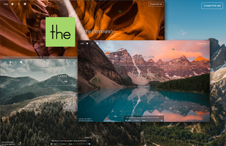
No more boring flashcards learning!
Learn languages, math, history, economics, chemistry and more with free StudyLib Extension!
- Distribute all flashcards reviewing into small sessions
- Get inspired with a daily photo
- Import sets from Anki, Quizlet, etc
- Add Active Recall to your learning and get higher grades!


Add this document to collection(s)
You can add this document to your study collection(s)
Sign in Available only to authorized usersAdd this document to saved
You can add this document to your saved list
Sign in Available only to authorized users