Creating Figures in Excel
advertisement
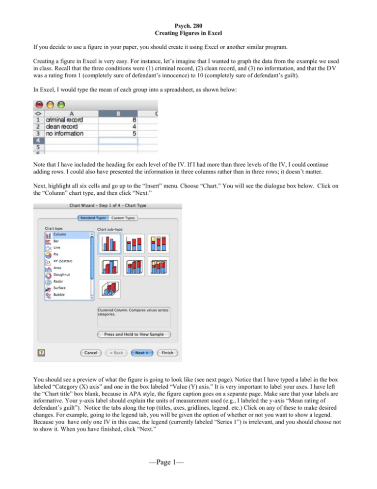
Psych. 280 Creating Figures in Excel If you decide to use a figure in your paper, you should create it using Excel or another similar program. Creating a figure in Excel is very easy. For instance, let’s imagine that I wanted to graph the data from the example we used in class. Recall that the three conditions were (1) criminal record, (2) clean record, and (3) no information, and that the DV was a rating from 1 (completely sure of defendant’s innocence) to 10 (completely sure of defendant’s guilt). In Excel, I would type the mean of each group into a spreadsheet, as shown below: Note that I have included the heading for each level of the IV. If I had more than three levels of the IV, I could continue adding rows. I could also have presented the information in three columns rather than in three rows; it doesn’t matter. Next, highlight all six cells and go up to the “Insert” menu. Choose “Chart.” You will see the dialogue box below. Click on the “Column” chart type, and then click “Next.” You should see a preview of what the figure is going to look like (see next page). Notice that I have typed a label in the box labeled “Category (X) axis” and one in the box labeled “Value (Y) axis.” It is very important to label your axes. I have left the “Chart title” box blank, because in APA style, the figure caption goes on a separate page. Make sure that your labels are informative. Your y-axis label should explain the units of measurement used (e.g., I labeled the y-axis “Mean rating of defendant’s guilt”). Notice the tabs along the top (titles, axes, gridlines, legend. etc.) Click on any of these to make desired changes. For example, going to the legend tab, you will be given the option of whether or not you want to show a legend. Because you have only one IV in this case, the legend (currently labeled “Series 1”) is irrelevant, and you should choose not to show it. When you have finished, click “Next.” —Page 1— You are next given the option to place the figure as a new sheet or as an object embedded in the spreadsheet. I find it easier to embed the object in the spreadsheet, but it doesn’t really matter. When you are done, click on “Finish.” You will now see your chart as a full page. If you have chosen to place the figure as a new sheet, you can go to the bottom of the screen to toggle back and forth between the chart and sheet 1 (where your data are). You can play around with the formatting of the figure. For the paper, your bars should be black and white or shades of grey (as per APA style). To change bar colors, simply double click on each bar. You will get the option to choose from an array of colors and patterns. If you would like to remove the background grey color, simply click in the background and change it to white. You can also get rid of the border this way. Similarly, you can remove the horizontal lines by clicking on them and changing them to white (which won’t show up against the white background). If you have a legend (as you would when you have more than one IV), you can move the legend wherever you want to by just dragging it. If you forgot to get rid of a meaningless legend earlier, you can get rid of it now by going under the “Chart” menu to “Chart options” and clicking on “Legend.” If a check appears in the “Show legend” box, simply click in the box to uncheck it. You should make sure that your y-axis begins at 1 for this example (because the DV ranges from 1 to 10); Excel doesn’t always automatically do this. To change the scale, double-click on the y-axis, choose the “Scale” tab, and make the minimum 1. In other cases, you might want the minimum to be zero. You can also play around with the font sizes. If you click in the upper left of the chart, you can select the entire chart, and then go to font to change the font and sizes of all text that appears in the chart. As a rule, you should use a sans serif font (such as Helvetica) for figures. The figure I created appears below. I typed a figure caption beneath it. Note that in APA style, you would put the figure caption on the previous page, which would be titled “Figure Caption.” 10 Mean Rating of Defendant's Guilt 9 8 7 6 5 4 3 2 1 criminal record clean record no information Experimental Condition Figure 1. Mean rating of defendant’s guilt as a function of information provided about defendant’s criminal record. —Page 2— Creating Figures When There is More Than One IV Imagine that I conducted an experiment very similar to the first, only now I was interested in whether an additional factor— gender of the defendant—also played a role in guilt ratings. My design would now be a 3 (prior information: criminal record, clean record, no information) x 2 (gender of defendant: male or female) factorial design. We will talk more about factorial designs later in the course. I have two independent variables, one with three levels and one with two levels. Imagine that my new means are as follows: Notice that I’ve typed headings in the second and third columns. I could also have put male and female down the left column and the levels of the other variable across the top row; it doesn’t matter. How can I represent these data in a bar graph? Again, highlight all the cells (including the headings) and go to “Insert” and “Chart.” Follow the same instructions as before. When you see a preview of your figure, you’ll notice that the different criminal record conditions are displayed along the xaxis, and that gender of defendant appears in the legend (one bar for male and one bar for female at each level of the other variable). I think this format makes sense for these data, but if you wanted to reverse the placement of these variables (e.g., have gender of defendant along the x-axis and the other variable in the legend), you could click next to where it says, “Series in Rows.” Now that you have two bars at each level of the criminal record IV, you should create bars of contrasting colors, still using shades of black and grey (as per APA style). Below is my completed figure: 10 male female Mean Rating of Defendant's Guilt 9 8 7 6 5 4 3 2 1 criminal record clean record no information Experimental Condition Figure 2. Mean rating of defendant’s guilt as a function of defendant’s gender and information about defendant’s prior criminal record. —Page 3— Adding Error Bars Often, it is useful to include in your figure error bars that indicate one standard error above and below the mean for each level of the IV. Doing so gives your viewer a sense of the variability of the data. To create the error bars, you simply type the standard errors into the spreadsheet, as I’ve done below for the first example (you can find the standard errors on the SPSS printout): Once you’ve created the bar graph in Excel, you can double-click on the bars as you did before when you changed their color. Next, click on the tab labeled “Y Error Bars.” You will get the dialog box you see below: Make sure that the “Both” error-bar type is selected (this is the default). This will give you error bars depicting one standard error above and one standard error below the mean. Now click on the button labeled “Custom.” Doing so will allow you to select a different standard error value for each mean (i.e., each level of the IV). Click in the white box next to the “+” sign (for one standard error above the mean). In the spreadsheet, select the three standard error values you inputted. They will automatically appear in the white box. Repeat this process in the white box next to the “-” sign (for one standard error below the mean), using the same standard error values as before. The new bar graph appears on the next page. Note that in order to make the error bars stand out, I changed the bar colors to light grey and removed the horizontal lines on the graph. By clicking on the error bars themselves, you can also adjust their thickness and the way the ends of the bars are depicted. As per APA style, you should note in the figure caption what the error bars represent. —Page 4— 10 Mean Rating of Defendant's Guilt 9 8 7 6 5 4 3 2 1 criminal record clean record no information Experimental Condition Figure 3. Mean rating of defendant’s guilt as a function of information provided about defendant’s criminal record. Error bars represent one standard error above and below the mean. If you can’t figure something out, use the Excel “Help” menu. Have fun! —Page 5—
