Excel Correlation & Regression Task
advertisement
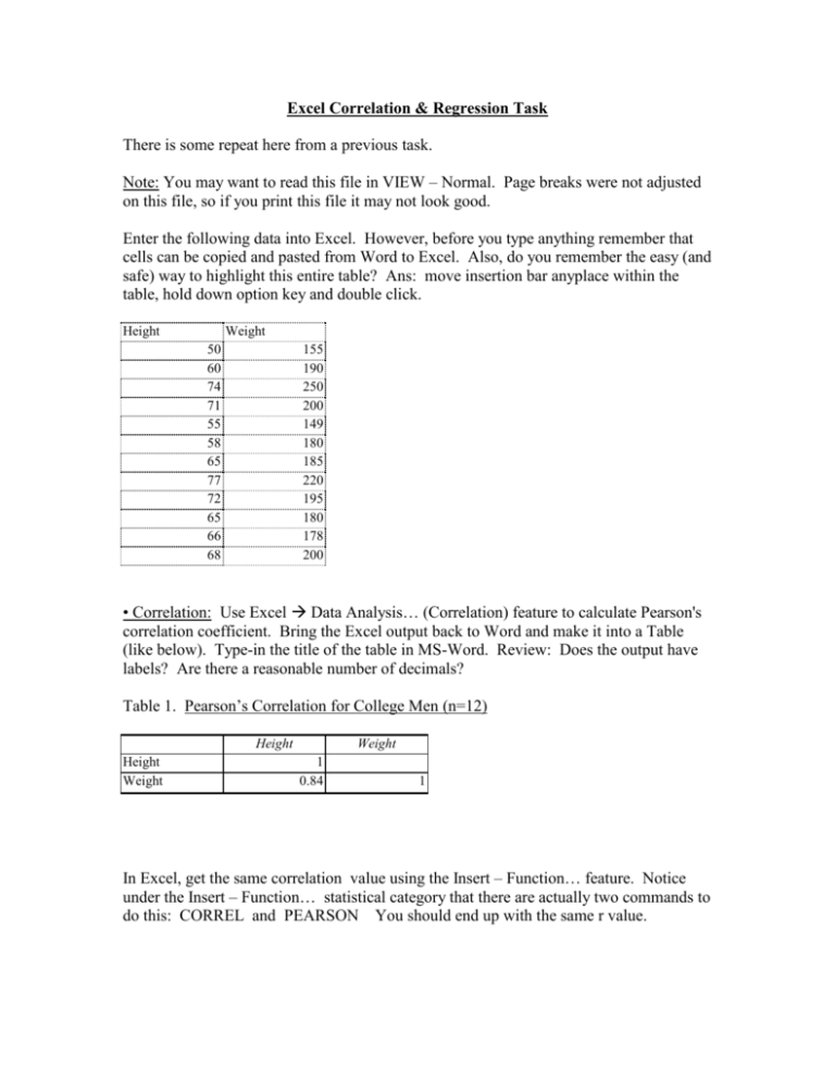
Excel Correlation & Regression Task There is some repeat here from a previous task. Note: You may want to read this file in VIEW – Normal. Page breaks were not adjusted on this file, so if you print this file it may not look good. Enter the following data into Excel. However, before you type anything remember that cells can be copied and pasted from Word to Excel. Also, do you remember the easy (and safe) way to highlight this entire table? Ans: move insertion bar anyplace within the table, hold down option key and double click. Height Weight 50 60 74 71 55 58 65 77 72 65 66 68 155 190 250 200 149 180 185 220 195 180 178 200 • Correlation: Use Excel Data Analysis… (Correlation) feature to calculate Pearson's correlation coefficient. Bring the Excel output back to Word and make it into a Table (like below). Type-in the title of the table in MS-Word. Review: Does the output have labels? Are there a reasonable number of decimals? Table 1. Pearson’s Correlation for College Men (n=12) Height Height Weight Weight 1 0.84 1 In Excel, get the same correlation value using the Insert – Function… feature. Notice under the Insert – Function… statistical category that there are actually two commands to do this: CORREL and PEARSON You should end up with the same r value. • Another Correlation in Excel: Start with the original height and weight data, and add two more columns of data (pull-ups and jump height). Insert phony data yourself. Use Data Analysis… Correlation for all 4 columns of data. Again, make a Table in Word. Notes: (1) The "1" in the table means that there is a perfect positive correlation between any variable and itself! (2) Although this table could be made using the Pearson Function in Excel, one would have to repeat the process 6 times; thus Data Analysis is much quicker to use. Table 2. Correlation Matrix for College Men (n=12) Height Height Weight Pullups Jump Ht. Weight 1 0.84 -0.01 0.53 Pullups 1 0.03 0.54 Jump Ht. 1 0.15 1 Repeat – make a scatter gram from the original two columns of data (height & weight) and then “clean-up” the chart so the figure looks like below. Bring the Excel Chart over to Word and add a title. See example below. 240 y = 2.8068x + 7.4928 220 2 R = 0.708 WEIGHT 200 180 160 140 120 100 40 50 60 70 80 HEIGHT Figure 1. Scatter gram between the height and weight of Cal Poly kinesiology majors N=12). * Read * • Clean-up Excel output for reports MS-Excel is just a "tool" to help a person write a final report and also to understand numerical data. In most cases a person will use the Excel output to help prepare a final report that is done in MS-Word. • Make sure that tables and figures in your final report represents what you want it to show. In other words, do not show worthless information and do not include information that you do not understand. • Make your tables and figures readable. Do not copy and paste Excel output directly to MS-Word. Clean things up! For example, let’s say that you used Data Analysis… Descriptive Statistics on the height and weight data – remember how much output is generated? Below is an example of a Table that would appear in a Word document showing the “important” descriptive statistics from the output. Notice that: • The Data Analysis Excel output was not copied and pasted into a table in Word. • Only "important" descriptive statistics was included. • Everything was typed in MS-Word using tabs. • Decimal tabs were used on all numbers. Table 1 Descriptive Statistics on Cal Poly Kinesiology Majors (n=12) ____________________________________________________________ Height Weight (inches) (pounds) Mean (+ sd) 65.08+2.33 190.16+7.78 Minimum 50 149 Maximum 77 250 Pearson's Correlation Coefficient (r) .84 ____________________________________________________________

