Weather Station Models & Isopleth Analysis Lab
advertisement
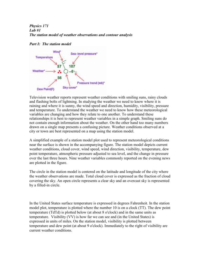
Physics 171 Lab #1 The station model of weather observations and contour analysis Part I: The station model Television weather reports represent weather conditions with smiling suns, rainy clouds and flashing bolts of lightning. In studying the weather we need to know where it is raining and where it is sunny, the wind speed and direction, humidity, visibility, pressure and temperature. To understand the weather we need to know how these meteorological variables are changing and how they relate to one another. To understand these relationships it is best to represent weather variables in a simple graph. Smiling suns do not contain enough information about the weather. On the other hand too many numbers drawn on a single map presents a confusing picture. Weather conditions observed at a city or town are best represented on a map using the station model. A simplified example of a station model plot used to represent meteorological conditions near the surface is shown in the accompanying figure. The station model depicts current weather conditions, cloud cover, wind speed, wind direction, visibility, temperature, dew point temperature, atmospheric pressure adjusted to sea level, and the change in pressure over the last three hours. Nine weather variables commonly reported on the evening news are plotted in the figure. The circle in the station model is centered on the latitude and longitude of the city where the weather observations are made. Total cloud cover is expressed as the fraction of cloud covering the sky. An open circle represents a clear sky and an overcast sky is represented by a filled-in circle. In the United States surface temperature is expressed in degrees Fahrenheit. In the station model plot, temperature is plotted where the number 10 is on a clock (TT). The dew point temperature (TdTd) is plotted below (at about 8 o'clock) and in the same units as temperature. Visibility (VV) is how far we can see and (in the United States) is expressed in units of miles. On the station model, visibility is plotted between temperature and dew point (at about 9 o'clock). Immediately to the right of visibility are current weather conditions. Wind speed and direction are represented in the station model plot by the position of the “flag pole.” The pole points in the direction that the wind is going. TT - Temperature: In the United States surface temperature is expressed in units of degrees Fahrenheit. In most other countries of the world it is expressed in degrees Celsius. TdTd - Dew point temperature: Expressed in the same units as temperature . N - Cloud cover: Total cloud amount represents the fraction of sky covered by cloud. VV - Visibility: How far we can see, expressed in units of miles. dd - Wind direction: The line drawn represents the direction from which the wind is blowing. ff - Wind speed: The barbs on the lines representing wind direction give us information on the wind speed. Wind speed is measured in knots (1 knot =1.15 miles per hour). One long barb equals 10 knots, a short barb 5 knots and a triangle represents a wind speed of 50 knots. ww - present weather conditions: Symbols are used to convey information on the type of weather that was observed when the observations were made. The following page and your book list the commonly encountered symbols. PPP - Surface Pressure adjusted to sea level. The units are coded in mb. The leading 9 or 10 are dropped as is the decimal. So 234 represents a pressure of 1023.4 mb while 834 represents a pressure of 983.4 mb. pp - Change in surface pressure over the last three hours. The change in pressure is represented by a value and a line that tells us how the pressure was changing. In the following station plot the temperature is 82F, the dew point 72F, the wind direction is north at about 25 knots. The pressure is 998.2 mb, and it has decreased and is now lower by 0.3 mb than three hours ago. It is mostly cloudy with no current precipitation. Here are 5 station models. Write out the complete weather conditions for each of the 5 stations. Go outside for a few minutes and try to estimate the temperature, wind speed, wind direction, and sky cover. Include these “guesses” in a station model plot for TCNJ. Whoever comes closest to the actual values at the observation time will receive +5% E.C. on this lab. Part II: ISOPLETH ANALYSIS At first glance, the array of data plotted on a weather map may appear unorganized and overwhelming. However, large scale organized weather systems can be discerned through careful map analysis. In meteorology, the term weather analysis usually refers to the sequence of operations leading to interpretation of a graphical portrayal of a weather map displaying the distribution of one or more weather elements. This process of weather map analysis entails the organization of the plotted information into a logical portrayal of the data. Typically, a major part of the analysis phase involves drawing of isopleths, a generic term referring to lines of equal value, to increase the visual communication value of the chart. For example, once isobars, or lines of equal barometric pressure, have been drawn upon a surface chart, one can immediately locate regions of high and low atmospheric pressure. The Analysis: Isopleths of Scalar Fields: While weather elements, such as temperature and pressure, are observed only at particular irregularly distributed locations, we can assume that these elements are continuously distributed in the horizontal direction in what is called a meteorological field; in other words, for any latitude and longitude, some value of that variable exists without any voids or discontinuities. Horizontal, two-dimensional scalar fields can be analyzed from the plot of observed data, using this assumption that the field is continuous in space and is well defined. Scalar field lines of equal value of a given weather element (isopleths) can be drawn upon the chart using the data points. The completed isopleth maps (sometimes identified as analyses to differentiate them from the prognostic charts) organize the displayed data by isolating the maximum and minimum values. Additionally, the spacing between consecutive values of the isopleths indicates the spatial gradient or the rate of change of the variable over a given horizontal distance, thus adding insight into the two dimensional spatial distribution of the scalar weather element. In a continuous field, these isopleths never cross or end abruptly. The analysis process represents only one step in the production of an analysis chart. The construction of isopleths can entail either subjective or objective analysis schemes. Subjective analysis refers to a hand-drawn product, where a meteorologist draws isopleths based upon visual interpolation between the irregularly distributed data points, coupled with continuity from previous charts, experience and intuition. Objective analysis typically refers to a computer generated product, where the isopleths are generated by numerical interpolation schemes involving an organized grid representation of the given field. Drawing isopleths is a relatively straight-forward procedure. The objective is to connect all points reporting the same value of the particular weather element. However, if the stations in the array do not contain the exact value of the desired isopleth, you will need to interpolate between the stations. In other words, you will have to assume that your desired isopleth value will lie someplace between a station having a slightly smaller observed value and one with a slightly higher value. Because the field is continuous, this spatial interpolation procedure used to produce uninterrupted isopleths is possible. Additionally, plotted data must exist on both sides of the isopleth. This bracketing procedure requires that the isopleth be drawn so that it is closer to the station which has a reading closer to the value of the value of the desired isopleth. When the isopleth is completed, the value of the weather element will be greater than the selected isopleth value on one side of an isopleth and less on the other side for the entire length of the isopleth. That is, a 70°F isotherm (an isopleth of constant temperature) will have 60's on its left side and 70°'s on its right. LIST OF ISOPLETH NAMES The word isopleth is derived from the Greek iso meaning equal and plethes meaning quantity. Specific isopleth names have been derived with the prefix iso and a suffix referring to the particular quantity; whenever possible, the suffix should have a Greek derivation. The following list of specific isopleth names are commonly used in meteorology and climatology. The most common isopleths on weather charts are in bold face. For additional information, consult the Glossary of Meteorology (Huschke, 1959). ISOPLETH NAME PROPERTY isoabnormal isobar isoceraunic anomaly barometric pressure thunderstorm day (also spelled isokeraunic) (also isobrunt for thunderstorm activity) isochasm observed aurora frequency (also isaurore) isochrone time or time of arrival isodrosotherm dewpoint temperature isogon angle or direction isohel sunshine duration (or other solar radiation variable) isohume humidity isohyet precipitation amount (rainfall) isohypse height or altitude (also contour, or isoheight) isoneph cloud cover isopach thickness isophene time of phenological occurrence isopycnic density isostere specific volume isotach speed (also isokinetic) isotherm temperature isentrope entropy or potential temperature Lines of equal change of a scalar meteorological element with time are called isallopleths, where allo refers to "change of". Positive change values are always given in blue, negative change values in red and the no-change line in purple. isallobar isallohypse isallotherm pressure tendency height change temperature change Huschke, R.E. (ed.) 1959: Glossary of Meteorology. American Meteorological Society, Boston. 638 pp. SUBJECTIVE ANALYSIS TECHNIQUES Much of the art of subjective analysis is achieved only by experience after having analyzed a large number of weather maps. Certain guidelines should be followed in the construction of an analysis which is easily read and which is as scientifically correct as possible for the particular situation. Some hints are helpful in all types of weather analysis. The specific example provided here is for surface pressure analysis. RULES for ISOPLETH ANALYSIS: 1. Never analyze in regions that do not have data, such as "data voids" and oceans. 2. Determine the isopleth interval to be used, and the value upon which the isopleths will be centered. Often these values have been set by tradition. Otherwise, check the range of values and select an interval which will not produce too many or too few isopleths. Isopleth values must be multiples of the selected interval spacing. 3. To aid in the analysis, use an erasable pencil initially and maintain a particular convention, such as starting with the lowest value and working outward, keeping lower values to the same side of the isopleth as you draw. Do not ignore data without good reason. 4. Draw isopleths using the technique of interpolation. This procedure requires data which bracket the isopleth being drawn. The isopleth should be drawn so that it is nearer the station which has a reading closer to the isopleth value. 5. Isopleths of a particular variable never cross. 6. Isopleths may form a closed loop. 7. Isopleths do not end abruptly (except at the edge of the map where they would continue) nor do they branch. 8. Following the initial analysis, smooth your isopleths; this analysis is not merely an exercise to "connect the dots", but it involves an effort to visualize the shape of the particular field and its gradients. 9. Complete your analysis by neatly labeling your isopleths with the appropriate numbers. Map Interpretation and Interpolation An analyzed map is useful for several reasons. First, the isopleths help to identify the regions in the field exhibiting the largest and smallest values. When the set of isopleths are completed, the isopleth with the lowest value will encircle the region with the lowest point in the field, while the closed isopleth with the largest value isolates the maximum value of the field. Secondly, the packing of the isopleths reveal how rapidly the particular weather element varies with distance. A tighter packing indicates a much more rapid horizontal variation of that particular weather element. Mathematically, the spacing between isopleths of a specified (and uniform) interval represents the strength of the gradient. The gradient is defined as the ratio of the change in the isopleth variable (the "rise") to the change in horizontal (the "run"), or mathematically: Q2 - Q1 GRADIENT = -------Distance where Q1 and Q1 define the isopleth variables at two points. Now, on vertical distance is equivalent to the numerical difference between the isopleths. By measuring the horizontal distance between consecutive isopleths, one can obtain the magnitude of the gradient. Hence, if the spacing between the 1000 hPa and the 1004 hPa isobars were 100 km, the horizontal pressure gradient is 4 hPa per 100 km, or 0.04 hPa/km. However, if the horizontal distance between these two isobars were only 50 km, the horizontal pressure gradient would be 4hPa/50 km or, 0.08 hPa/km. The tighter packing of the isobars in this latter example shows the increased gradient. In the next lab exercise we will consider the implications of horizontal pressure gradients further. Finally, a set of isopleths permits easy interpolation of representative data between weather stations. That is, given any point in the analyzed field, what is the expected value of the quantity at that point? For example, by visual interpolation using the gradient, one can determine that a point lying midway between the 30°F and 35°F isotherms should have a value of approximately 33°F. Frontal Analysis Many of the surface analyses covering extratropical latitudes include frontal analyses. Fronts are defined as the transition zones between air masses having dissimilar thermal and moisture properties. In the isopleth analysis we assume that the particular field is essentially continuous in space and does not have any voids or discontinuities. A front is not really a discontinuity, but a zone where a rapid transition in the particular weather takes place. Usually, these transition zones are only 50 to 100 km wide, a sufficiently small horizontal distance to permit their representation as lines on a large scale surface analysis chart. EXERCISES: 1. On the page of weather observations from the Midwest, draw contours of sea-level pressure. I would recommend isopleth intervals of 2 mb. 2. What was the local time when these measurements were made? 3. Where is the highest and lowest pressure? 4. Where is the largest pressure gradient on your map and what approximate value does it have? Hint: You will have to estimate a spatial scale to the map. 5. On the page of weather observations from the Northeast, draw contours of temperature. I’d recommend intervals of 5 degrees F. 6. Where is the highest and lowest temperature on your map? 7. Where is the largest temperature gradient on your map and what value does it have?

