The Aesthetiscope: Visualizing Aesthetic Readings of Text in Color Space
Hugo Liu and Pattie Maes
MIT Media Laboratory
20 Ames Street, Room 320D
Cambridge, MA, 02139, USA
{hugo, pattie}@media.mit.edu
Abstract
The traditional story understanding dogma in AI holds that
there exists a singular, objective meaning implied by text,
which can be uncovered by applying just the right logical
inferences. But according to research into the cognition of
reading, text can also be read, not objectively, but
aesthetically. An aesthetic reading of text engages not only
the agency of thought, but also intuition, sensation, and
sentiment, and cultural interpretation. We have developed
and implemented a basic computational model of aesthetic
reading, which employs Carl Jung’s Modes of Interpretation
idea to delegate the task of aesthetic interpretation out to
several different textual analysis engines, each computing a
different mode of interpreting text, such as generating
sentimental evocations of a text (Feeling modality), or
remembering visual imagery evoked by the text (Sensation
modality). The outputs of the various interpretive modalities
are merged and then their unification is achieved by
mapping them into color space using theories of color
psychology. We built the Aesthetiscope, an artwork whose
grid of colors are dynamically generated from aesthetic
readings of an inputted poem or song, to illustrate the power
and potential of going beyond literal understandings of text.
On Aesthetic Reading
Much of the AI narrative understanding literature
subscribes to the dogma that there exists a single rational
method of interpreting text, and that resultant
interpretations and inferences can always be reconciled into
a single consistent world model. One branch of research
notably departing from this dogma is concerned with
creative reading (Moorman & Ram, 1994). According to
the cognitively motivated theory of creative reading, textual
understanding involves imagination, the suspension of
disbelief, and the projection of inexact memories onto read
situations; in contrast, the dogma says that textual
understanding should be algorithmized simply as the rote
invocation of inference rules. Moorman & Ram’s revolt
against the grain of the classical AI narrative understanding
literature emboldens us in our task of aesthetic reading,
which is the topic of this paper.
Copyright © 2005, American Association for Artificial Intelligence
(www.aaai.org). All rights reserved.
Aesthetic reading is not reading purely for information.
It is an emotionalized and personal reading, whereby the
text’s primary purpose is to evoke aesthetic rumblings
within the reader. Reading theorist Louise Rosenblatt
states, “In aesthetic reading, the reader’s attention is
centered directly on what he is living through during his
relationship with that particular text” (Rosenblatt, 1978, p.
25); but this notion of “living through” can be quite a
complex amalgamate of perceptions and sensations.
In this work, we sought to develop a computational
model of aesthetic reading that could be sophisticated
enough to account for the diversity of the ingredients
constituting the complex reader-to-text aesthetic
relationship, while maintaining computational simplicity.
Thus we developed our model around the inspiration of
Carl Jung’s Modes of Interpretation (1921), a
psychological theory that he put forth to account for the
different possible ways that people interpret the world.
According to the theory, there are four fundamental modes
of interpreting reality: Thinking, Feeling, Sensation, and
Intuition. To these four modes, we added a not-sofundamental fifth, Culturalizing, which incorporates Roland
Barthes’ thesis (1964) that people also interpret the world
through the optics of our culture’s values system. Also, for
practical considerations, our work means the Sensation
mode to refer solely to the remembrance of visual images.
Whereas objective reading relies primarily on the
Thinking mode; aesthetic reading invites a reader to
employ many, or all, of the Modes of Interpretation to
engage with the text, each mode producing some
evocations; and we can think of the sum of all produced
evocations as the aesthetic interpretation of the text.
Based on this simple premise, we developed the
following computational model of aesthetic reading: The
aesthetic interpretation of a text can be computed by the
application of all five Modes of Interpretation to a text.
Each mode has its own logic for operation, but given some
input text, each is able to output a set of aesthetic
evocations, which in our work, is either a set of keywords,
or a palette of colors. Ultimately though, even these
keywords are translated into color space using some
psycho-physiological heuristics which we have developed
(more on this later). By combining the weighted outputs of
the five Modes of Interpretation into a final palette, an
abstract color mosaic is generated, and we say that this is a
visualization of the aesthetic reading of the input text; we
call this AI-based artwork the Aesthetiscope, as it is able to
visualize aesthetic readings of various text like song lyrics
and poems within the psychologically and emotionally
evocative universe of colors.
The rest of this paper is structured as follows. First, we
present an overview of the Aesthetiscope as an art
installation and explain its design rationale. Second, we
discuss the technical mechanisms for computing aesthetic
readings of text. Third, we reveal the mechanism for
mapping the aesthetic evocations outputted by each Mode
of Interpretation into color space. We conclude by
discussing some redesigns we have made to the
Aesthetiscope and reflecting upon the collected experiences
of those who have interacted with the installation.
Aesthetiscope as Art Installation
The Aesthetiscope is an interactive art installation whose
grid of colors visualizes the aesthetic character of some
text (a word, a poem, a song); moreover, by adjusting the
contribution of each of the five Modes of Interpretation to
the gestalt, the visualization can better suit the
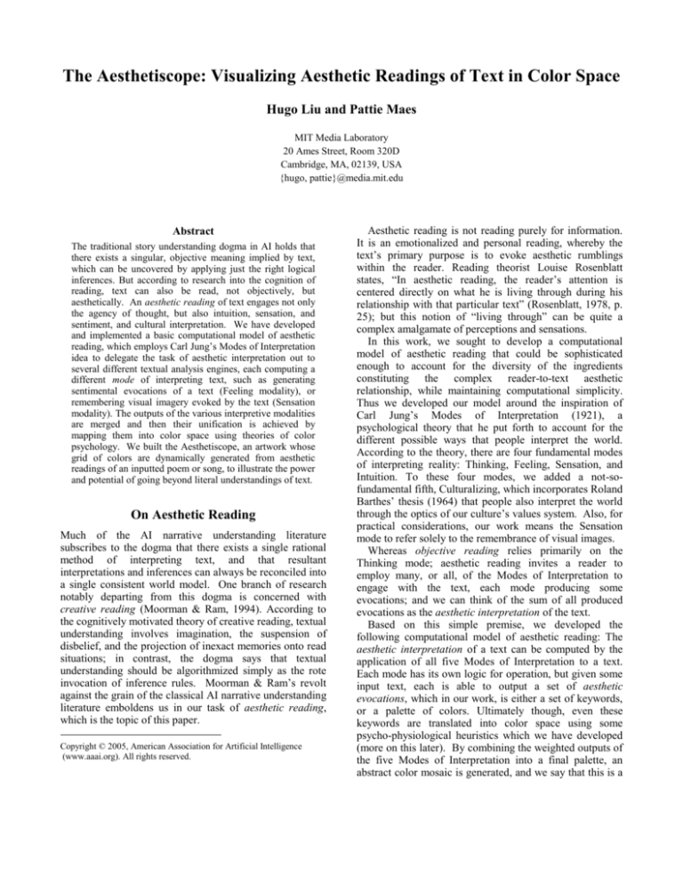
individualized taste of the perceiver. Figure 1 shows the
Reifying the Aesthetic in Color Space
The colors that constitute each color grid represent the
combined (and weighted) output of the five Modes of
Interpretation applied to the text. Colors are a superb
medium of portraiture for the aesthetic character of a text,
since color space is a complete micro-consciousness of
pathos, just like taste and smell. Mapping the outputs of
each Mode of Interpretation into color space is also a most
practical way of unifying the outputs of various
interpretations into a single undeconstructed gestalt. For
example, consider the problem of unifying the visual and
affective perceptions of the word “sunset.” In color space,
this unification is practical: remembered visual swatches of
past seen sunsets can be epitomized as a color palette, and
sentimental entailments, such as “warmth, fuzzy, beautiful,
serenity and relaxation,” can also be mapped into a color
palette, by applying psycho-physiological mapping
heuristics learned from the color surveys of Berlin & Kay
(1969) and Goethe (1840). When the color palettes
resulting from the various Modes of Interpretation are
merged to produce the color grid, our goal of conveying the
text’s singular, complex aesthetic character to the perceiver
is facilitated by the eventuality that the human eye will
blend these colors together, and attend to their
undeconstructed gestalt rather than to each square
individually; hence, the aesthetic character is not a simple
sum of individual color squares, but rather, it becomes that
Spirit which lives in-between the color squares. As we
have learned from our own prior work, the ambivalent and
perhaps mystifying nature of colors makes them powerful
vehicles for conveying the aesthetic precisely because the
aesthetic thrives in spaces of connotation, and is inhibited
in spaces of denotation (Liu, 2004).
Presentation Particulars
Figure 1: The Aesthetiscope, biased toward the Feeling
and Intuition modes, renders the above portraits of
(clockwise from upper left) “Fire and Ice” by Robert
Frost, “A Song of Despair” by Pablo Neruda, and the
words “God,” “mourning,” “fear,” and “envy.”
Aesthetiscope’s visualization of the aesthetic of six
different texts, from the point-of-view of a perceiver who
has biased the aesthetic interpretation toward the Intuition
and Feeling modes. In the remainder of this section, some
explanation is offered for the major design decisions of the
artwork.
The Aesthetiscope is currently installed in a “living room
of the future” at the MIT Media Laboratory, and is
projected onto one of the room’s walls. The grid of color
squares is 16 wide by 9 tall, flanked by black striping on
top and bottom. There is a “glimmer” effect added to the
colors in the grid, as their Values (i.e. Value, as in the
Munsellian Hue-Value-Chroma system for colors) wax and
wane according to various periodicities. Finally, the
glimmering of the color grid refreshes at 24 frames per
second, to complete the cinematic quality of the piece.
We intend for the Aesthetiscope not simply to stand
alone as a showpiece but also to play a supporting role for
other activities in the room. By visualizing the aesthetic
character of a poem being read (this activity can be
detected by our context-aware room), or of the lyrics to a
song being played over the room’s stereo system, we can
imagine how the pairing of the Aesthetiscope’s color grid
with the poem or song might enhance the bandwidth of an
aesthetic encounter, just as the tasteful pairing of food and
wine enhances the experience of both.
Having surveyed the major intentions and rationale
behind the Aesthetiscope as an art installation, the next two
sections examine the two components at the technical
nexus of the Aesthetiscope’s aesthetic visualization of text:
1) a novel computational model of aesthetic reading, and 2)
a mapping from the keyword evocations outputted by each
Mode of Perception into color space, informed by theories
of color psychology.
A Computational Model
of Aesthetic Reading
The computational model of aesthetic reading developed in
this work is of a basic and practical nature. The apparent
fundamental distinction between literal and aesthetic
readings, as noted by Rosenblatt (1978), is that literal
reading is quite rational in nature, while aesthetic reading
engages other ways of perception, including intuition and
feeling. To reflect the fact that aesthetic reading is not just
a monolithic rational process, but actually an amalgamation
of various ways of perceiving text, we adopted a
perspectival strategy to reading. Jung’s four fundamental
Modes of Interpretation – Thinking, Feeling, Sensation,
and Intuition – plus a fifth – Barthes’ Culturalizing mode –
are applied to a text. Each mode represents a distinct
textual analysis process over the text, and outputs a set of
reactions to the text known as aesthetic evocations, which
may take the form of a color palette or keywords (which, as
explained in the following section, are also mapped into
color space). The weighted sum of all aesthetic evocations
generated from a text constitutes a basic aesthetic
interpretation of text. While a produced visualization will
typically mix the interpretations of multiple modes, to
Figure 2: Visualizations of the four season keywords
(columns) through the optics of one interpretive mode
taken at a time (rows).
demonstrate the interpretational extremes of each mode,
Figure 2 shows the four season keywords interpreted
through each of the five modes individually.
While the five Modes of Interpretation are not exactly
orthogonal, the affordances of being able to divide up the
grand task of aesthetic reading into modular components is
practically quite useful, as each can be developed and
improved in modular fashion. To operationalize the five
modes, five distinct textual analysis engines were built,
each having a unique interpretive logic. Since this alone
entailed a rather goliath effort, we made the simplifying
assumption that each interpretive engine would only try to
understand the text at the textual level, rather than at the
narrative level; that is to say, a poem is treated roughly as a
bag of local conceptual features such as key phrases, rather
than attempting to compute an understanding of the
narrative as a globally integral entity.
Below, we briefly discuss the implementations of each of
the five Modes of Interpretation. To preface this
discussion, while the approaches taken by the textual
analysis engines for Sensation and Intuition were quite
straightforward, the approaches taken by Thinking,
Culturalizing, and Feeling are based upon our previous
research in methods for the rational and affective analysis
of text. Due to space constraints, we cannot judiciously
defend the design decisions behind each of these
approaches, but we do invite the interested reader to follow
the literature pointers to the related research.
Thinking. The rational entailments of a text are computed
using Liu and Singh’s ConceptNet commonsense reasoning
system (2004) – a framework which is well-suited to the
task of making rational inferences. ConceptNet 1) takes as
input a whole narrative, 2) parses the narrative into a linear
sequence of events, 3) maps those events into the nodal
ontology of its semantic network, which consists of
100,000 everyday world concepts and 1.6 million semantic
edges (causal, spatial, and social), and 4) uses spreading
activation to compute inferences about the narrative,
including spotting the main topics, and making temporal
projections about next events implied by the text.
ConceptNet is ideal for computing rational entailments
because its knowledge represents some form of common
consensus (between 15,000 web contributors to the project)
about how things and events affect each other in the
everyday world. For the interested reader, (Liu & Singh,
2004) contains examples of the types of common sense
inferences made by ConceptNet.
Culturalizing. Semiotician Roland Barthes’ structuralist
theory of culture is that each culture can be represented as a
sign system (1964), where each sign correlates to some set
of signifieds, and the nature of the correlations is dependent
upon the value system of each culture. For example, the
sign “sex” signifies something negative and taboo in a
religious culture, but not in a more socially progressive
culture. Using this simple representation of culture, we
have begun to compute cultural models for some broad
cultural groups like American pop culture, Catholic culture,
American feminist culture. We do so using the What
Would They Think? system (Liu & Maes, 2004), which is
capable of compiling together a model of a person or
group’s attitudes toward various subjects (in our case,
toward signs) by automated analysis of a corpus of texts
compiled on the person or group. What Would They
Think? works by detecting that certain topics are talked
about in a consistent tone of voice; for example, “movie
stars” in American pop culture, signifies “wealth,”
“glamour,” “good,” “popular” etc.
For the particular implementation in the Aesthetiscope,
we use only the cultural model for American pop culture.
The model is extracted from a text corpus we compiled
consisting broadly of news articles from a variety of
popular periodicals such as People Magazine, MTV News,
etc. In future work, we hope to detect the cultures
possessed by the perceiver and to dynamically load those
cultural models to drive cultural interpretation of a story.
Sensation. By sensorializing text, we mean that the
reading of a narrative triggers the remembrance of past
visual imagery, sounds, smells, etc. The current
implementation, however, addresses only visual imagery,
but there is no reason why other sensory modalities could
not be addressed in the future to produce a fully synesthetic
experience.
From keyword-annotated stock photography collections
totaling over 30,000 images, we have mined out the
essential color palettes of various objects and events in the
world, like “taxis” (they are yellow, at least in New York),
“weddings” (lots of black and white), etc. These constitute
a corpus of visual color memories. The outputs of the
Sensation Mode of Interpretation are keyword evocations
like “color of taxi,” and “color of wedding.” In the color
rendering phrase (discussed in the next section), these
phrases are resolved as their corresponding color palettes
which were mined from the stock photography corpus.
These palettes are merged with the palettes resulting from
the other Modes of Interpretation into the final palette that
is used to drive the Aesthetiscope visualization.
Intuition.
Intuition, unlike Thinking, or Sensation,
involves no remembrance or reasoning. As memory
researcher Tulving put it, intuition is reflexive and
instantaneous, it is simply “knowing” (1983). One way of
measuring the intuitions around concepts is by recording
free associations. Psychologists Nelson, McEvoy &
Schreiber have compiled together decades worth of
research into a corpus of free association norms (1998).
For example, in the corpus, the concept “traffic” triggers
“car,” “light,” “jam,” “sucks,” “stop,” “noise,” etc. Of
course, we must realize that this measurement of intuition
is specific to a certain population of people during a certain
temporal period; nonetheless, we believe this corpus of free
associations to be of high quality for our purposes.
We use this resource at face value in the Intuition
process. From a story, we extract out a weighted vector of
the nontrivial concepts contained in it and calculate all the
free associations to these concepts. We can interpret the
set of these free associations resulting from a text as
divergent thoughts provoked by the story.
Feeling. We compute both the surface and deep sentiment
of a narrative by combining the Emotus Ponens textual
affect sensing system (Liu et al., 2003), and Peter Roget’s
lexical sentiment classification system (1911). Emotus
Ponens parses a story into events and evaluates the
affective connotations of those events (thus it is sensing the
affect of the deep structure of text). For example, “getting
into an accident” connotes fear, anger and surprise.
Roget’s 1911 English Thesaurus features a 10,000 word
affective lexicon, grouping words under affective
headwords. We use this classification system to evaluate
the surface linguistic sentiment of a story. Combining the
affect sensing capabilities of Roget and Emotus Ponens, the
Feeling process projects an input narrative into the space of
affective keywords.
Psychological Color Space
Having completed an aesthetic analysis of the text, we are
still faced with the challenge of mapping keyword
evocations into the space of colors. Many theories have
been put forth regarding the psychological entailments of
colors, and the color entailments of psychological states,
including the cross-cultural color surveys of Berlin & Kay
(1969), and the psychological color mixing theory of
Goethe (1840). What we have done is to synthesize these
theoretical conclusions into a computational model of the
psychological color space.
A Psychological Color Model
Our color space is an extension of that proposed by
Munsell (1905), and has the following dimensions:
Hue (e.g. green, brown, blue, purple, red)
Temperature (e.g. hot, warm, cool, cold)
Chroma (e.g. colorless, off-primary, primary)
Saturation (e.g. low, medium, high)
Value (e.g. dimmest, dim, medium, bright)
Harmony (e.g. discordant, harmonious)
These dimensions are not orthogonal and so they overlap
each other in dominion, however, they provide a broad
descriptive vocabulary with which we can characterize
colors flexibly. We have manually annotated an affective
lexicon consisting of 100 frequent emotion keywords, and
180 Roger sentiment headwords (e.g. excitability, pleasure,
pain, vulgarity, cowardice) with the descriptive vocabulary
of Hue, Temperature, Chroma, Saturation, Value, and
Harmony, according to the prescriptive color psychology
theories of Berlin & Kay, and Goethe. A sample annotation
is given below:
Inexcitability = harmony-harmonious,
temperature-cool, hue-blue, chroma-colorless,
saturation-medium, value-dimmest
Using this model of color psychology, the concepts vector
outputted by the multi-modal aesthetic textual analysis are
mapped into color space. Of course, not all of the concepts
are affective keywords, e.g. traffic light, wealth etc. To
force these into color space, we use ConceptNet’s
PropertyOf and PartOf relations. For example, ConceptNet
knows that a “traffic light” has the properties: “red,”
“yellow,” and “green;” and that “wealth” has the property
“desirable” which we can in turn map into color space
using our psychological color model. Finally, the output of
the Sensation mode consists of phrases like “color of taxi,”
“color of wedding,” which are mapped into color space by
recalling the memories of the color epitomes of those
objects and events using the corpus we collected from
stock photography collections.
Gestalt Effects
Having collected together a palette of remembered colors
(from the Sensation mode) and color descriptions (using
the psychological color model we have developed), some
color descriptions will emerge as salient. The most salient
of these descriptions will affect the gestalt of the whole
palette. For example, Chroma-primary causes the whole
palette to shift to more primary colors, while Harmonydiscordant causes the color squares to be rendered into the
artwork using a jagged layout where similar colors are
scattered across the grid rather than clustered. Gestalt
Figure 3: Visualizations of the words “sunset” (toprow) and “war” (bottom-row), as interpreted by a
Thinking-Sensation dominated perceiver (left-column)
versus an Intuition-Feeling perceiver (right-column).
effects are visible in Figure 3, which depicts the aesthetic
visualizations of the words “sunset” (top-row) and “war”
(bottom-row), as interpreted by a Thinking-Sensation
dominated perceiver (left-column) versus an IntuitionFeeling dominated perceiver (right-column). The lowerleft panel renders imageries of war as discordant, whereas
the upper-left panel renders imageries of sunset as
harmoniously blended.
Discussion
After our initial installation piece, we received much
encouragement, and many poignant suggestions from those
who have experienced the Aesthetiscope, including
psychologists, designers, colorists, and hundreds of others.
Since then we have redesigned the presentation of the
Aesthetiscope to incorporate their suggestions. In this
section, we would like to briefly discuss some of our
redesigns and reflect upon the competencies and
incompetencies of the installation.
Tailoring the visualization to the perceiver. We have
thus far mentioned only in passing that the relative
contributions of the five Modes of Interpretation to the
generated color grid can be adjusted by the perceiver. The
adjustment of the weights for each of the five modes can be
made by moving five sliders along a scale from 0% to
100% in a special control panel governing the behavioral
settings of the Aesthetiscope. Our experience with the
Aesthetiscope suggests that the generated color grid
sometimes appears too busy and schizophrenic in what it
wants to communicate when all five modes are set to
contribute equally; however, the right balance between
sophistication of palette and communicative clarity seems
to be struck when any two Modes of Interpretation are set
to contribute disproportionately more than the rest, as in
Figures 1 and 3, where dominant modes are pairs like
Feeling-Intuition and Thinking-Sensation.
In the collected experiences of those who have interacted
with the Aesthetiscope, certain people tend to prefer to set
the visualization to Intuition and Feeling as dominant
modes, while others prefer Thinking and (Visual) Sensation
as the dominant modes. One hypothesis which might
explain why this is the case is the apparent predisposition
of certain people’s tastes to Realism, and others to
Romanticism. We might even go out on a limb to suggest
that a preference for certain Modes of Interpretation may
be a reflection of a person’s psychological type – this
suggestion would certainly be supported by the fact that
Jung’s Modes of Interpretation were themselves proposed
as a system to account for psychological types; and the now
famous and widely-used Meyers-Briggs Type Indicator
(MBTI) personality assessment system was derived from
Jung’s Modes of Interpretation theory.
Letting the eye blend the image. Initially, a two pixel
black border separated the color squares. We heard
multiple suggestions for removing this border so that colors
could sit right next to each other, allowing the eye to
properly blend the squares into a whole abstract image.
Upon doing so, we realized that it unleashed a Pandora’s
box of problems, because without the border, contiguous
blocks of similar colors seemed to form shapes! Initially,
we had not considered the gestalt effects of laying out the
color squares to either induce or prevent these emergent
shapes, but now it was clear that we had to incorporate the
layout into our model. In the current system, the nature of
the layout, be it jagged or smooth, is a key aspect of the
aesthetic being communicated.
Contextualizing the abstract. Some designers commented
that although the abstract color piece was beautiful, it was
not always clear how it is that the system was choosing
particular colors, and what those colors were supposed to
mean. Responding to this, we decided to expose what the
system was thinking, its perceptual process. Choosing
randomly from the vector of concepts outputted by the
aesthetic textual analysis, those concepts were made to pop
up within random color squares for short bursts of time. A
sort of “peek-a-boo” trace, if you will, with phrases for
“sunset” like “feel awe,” “think dark,” and “intuit
romance.” This design feature gives the perceiver a sense
of where the system is coming from, and was wellappreciated in the next iteration of the Aesthetiscope.
Breathing life into the image. Initially, the image was
static, but we heard comments that it became much more
engaging after we animated it. Each color square waxes
and wanes in Munsellian Value, controlled by a Gaussian
spring model with varying periodicities; the gestalt effect is
that the image glimmers and “breathes.” The engaging
effect of perturbation is also observed by Ken Perlin, who,
in adding some noise to a 3D model of a human face,
observed that people found the new image to be much more
lifelike (1997).
An attempt to introduce shapes.
Some designers
wondered about using different sized squares or shapes in
lieu of the homogenous grid of squares. We have been
experimenting with different shapes, but it has exposed us
to new design problematics. When a color splotch is
contained within a larger color splotch, a new
psychological effect is introduced. As demonstrated in the
work of artists experimenting with colors, such as Joseph
Albers and his ‘Homages to Squares’ series, a rich color
layered upon a thinner color can lead to a perception of
gravitating inward, and the inverse arrangement leads to an
even more psychological effect. If the inner splotch is
placed centrally on top of the outer splotch, that is a
different evocation than if it were placed on the periphery.
These are just two examples of the new complexities
introduced by heterogenizing the shapes. Until we can
develop a more complete grammar of color and shapes and
their psychological consequences, perhaps taking Albers’
theories of color interaction (1963) as a point of departure,
we will continue to use the form of a homogenous grid of
squares, which itself, let it be known, has a great heritage in
twentieth-century art, appearing as the subject of works of
artists like Sophie Taeuber, Jean Arp, Piet Mondriaan, Paul
Klee, and Ellsworth Kelly. Rosalind Krauss wrote this of
the aesthetic of color grids: “The grid’s mythic power is
that it makes us able to think we are dealing with
materialism while at the same time it provides us with a
release into belief” (Krauss, 1979, p. 12).
Where gestalt succeeds and fails. We are thrilled by the
apparent consensus from those who have visited the
installation that a gestalt aesthetic seems to emerge from
the abstract display. Even though the perceptions of the
five realms of analysis are summed up so naively into a
single color palette, the eye and mind seem able to pull out
a single aboutness from the palette that the system could
not have anticipated. Of course, the gestalt parameters of
the rendering process helped, but even when perception
was purely based on visual memories (so no gestalt
parameters were in play), the eye seemed still able to find
that singular Spirit of the abstract display.
In fact, the gestalt seemed to be weakest when Thinking
was the main perceptual modality. One possible
explanation is that visual imagery, intuitions, and feelings
just blend better and more intuitively than rational
thoughts. And people are not used to blurring thoughts; the
nature of rational thinking is that it is highly focused,
disciplined, and occurs in serial rather than in parallel
(hence, thought process, train of thought). Or maybe
Rationality is just not very aesthetic.
Acknowledgements
We thank Walter Bender for inspiring us with his and Jon
Orwant’s over-addictive color grid game, Color Deducto.
References
Joseph Albers: 1963, Interaction of Color. Yale UP.
Roland Barthes: 1964/1968, Elements of Semiology. publ. Hill
and Wang
Brent Berlin and Paul Kay: 1969, Basic Color Terms. Berkeley
and Los Angeles: University of California Press.
J.W.v. Goethe: 1840/1970. Theory of Colours, trans. C. L.
Eastlake. Cambridge, MA: MIT Press.
C. G. Jung: 1921/1971, Psychological Types, trans. by H. G.
Baynes, Princeton, NJ: Princeton University Press.
Rosalind Krauss: 1979/1985, The Originality of the Avant-Garde
and Other Modernist Myths. Cambridge, MA: MIT Press.
Hugo Liu: 2004, Articulation, the Letter, and the Spirit in the
Aesthetics of Narrative. Proc. of the 2004 ACM Workshop on
Story Representation, Mechanism, and Context.
Hugo Liu & Pattie Maes: 2004, What Would They Think? A
Computational Model of Attitudes. Proc. of the 2004 ACM
Conference on Intelligent User Interfaces, pp. 38-45
Hugo Liu & Push Singh: 2004, ConceptNet: A Practical
Commonsense Reasoning Toolkit. BT Technology Journal 22(4).
pp. 211-226. Kluwer Academic Publishers.
Hugo Liu, Henry Lieberman, Ted Selker: 2003, A Model of
Textual Affect Sensing using Real-World Knowledge.
Proceedings of ACM IUI’ 2003. pp. 125-132.
Kenneth Moorman & Ashwin Ram: 1994, A function theory of
creative reading. The Psycgrad Journal. Technical Report GITCC-94/01, Georgia Institute of Technology
A.H. Munsell: 1905, A Color Notation, Boston.
D.L. Nelson, C.L. McEvoy & T.A. Schreiber: 1998, The
University of South Florida word association, rhyme, and word
fragment norms. http://www.usf.edu/FreeAssociation/
Ken Perlin: 1997, Layered Compositing of Facial Expression.
ACM SIGGRAPH 97 Technical Sketch.
Peter Roget: 1911, Roget’s Thesaurus of English Words and
Phrases. Retrieved from gutenberg.net/etext/10681
Louise Rosenblatt: 1978, Efferent and Aesthetic Reading. The
Reader, The Text, The Poem: A Transactional Theory of the
Literary Work. Carbondale: Southern Illinois UP, 22-47.
E. Tulving: 1983, Elements of episodic memory, New York:
Oxford University Press.
