The Staging Walk-Thru Worksheet
advertisement
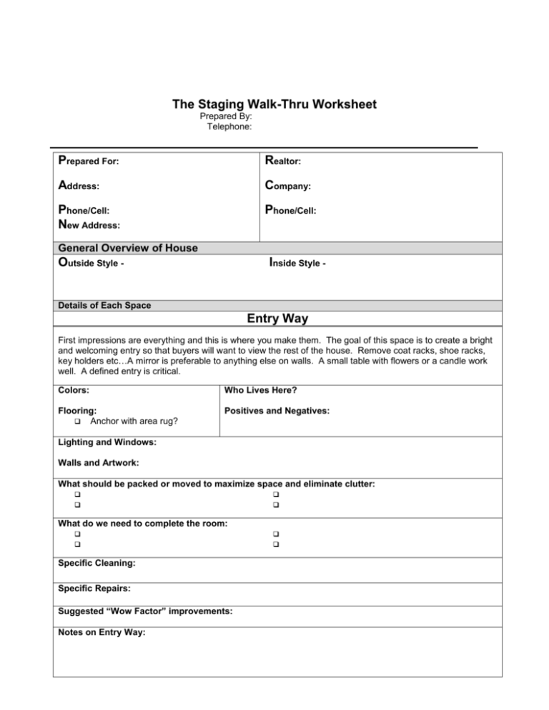
The Staging Walk-Thru Worksheet Prepared By:bb bbbbbbbbbbbbbbbb Telephone:bbbbb bbbbbbbbbbbbb Prepared For: Realtor: Address: Company: Phone/Cell: New Address: Phone/Cell: General Overview of House Outside Style - Inside Style - Details of Each Space Entry Way First impressions are everything and this is where you make them. The goal of this space is to create a bright and welcoming entry so that buyers will want to view the rest of the house. Remove coat racks, shoe racks, key holders etc…A mirror is preferable to anything else on walls. A small table with flowers or a candle work well. A defined entry is critical. Colors: Who Lives Here? Flooring: Anchor with area rug? Positives and Negatives: Lighting and Windows: Walls and Artwork: What should be packed or moved to maximize space and eliminate clutter: What do we need to complete the room: Specific Cleaning: Specific Repairs: Suggested “Wow Factor” improvements: Notes on Entry Way: The Living Room The living room is central to the buyer’s first impression. We will be looking at flow, balance, scale, cohesion and heights to create a room that makes you want to live here. Starting with a good conversation area and focal point, we will create warmth and comfort. Colors: Who Lives Here? Flooring: Positives and Negatives: Focal Point: Lighting and Windows: Matching table lamps or similar heights Check bulbs Walls and Artwork: Contemporary and non-profilable Most elegant pieces here Wallpaper removed and paint needed Triangular lighting pattern Up lights in corners Is maximum natural light coming through? Have some open wall space Large wall hangings rather than many small What furniture should be packed or moved to maximize space and eliminate clutter (50% Rule): What accessories should be packed or moved to maximize space and eliminate clutter: What furniture do we need to complete the room: What accessories do we need to complete the room: Specific Cleaning: Specific Repairs: Suggested “Wow Factor” improvements: The Living Room Continued… Is there a comfortable seating area? Sofa on the longest wall away from entrance OR looking at FP 2 chairs facing OR flanking sofa (U shape seating) Coffee table within easy reach of all Area rug defining conversation area if on hardwood or tile Remove extraneous furnishings and look at traffic pattern – no walk thru or wall flowers Is there balance and flow? How does the height, width, and depth of each major piece relate to the other furnishings Are the upholstered pieces of similar heights? Does the mix of styles fit or is it too bottom heavy or too leggy? Think dinner plate. End tables no more than 3” height difference than arms of sofa Have we balanced a lone vertical piece (armoire) w/ another tall piece, structure or art/accessory? Is the room leaning to one side because of heavier pieces? Balance the boat! Throw pillows points up or karate chopped to create vertical lines Add height to a low ceiling room and space to a small room: Lighten upward, use stripes and remove wall effects that give away the rooms scale ie chair railing Consider height of tops of doorways and windows, compensate w/ tall pieces/wall hangings Hang window hangings high and use tall accessories Paint walls similar to flooring (must be light) to give open effect to small space Use sheen, mirrors and glass to reflect plenty of light and maximize space Did we add cohesion and warmth? Isolate the walls to determine where pairs & like to like could be used to create symmetry Search home for pairs: chairs, tables, lamps, art, accessories Consider placing two pairs of pillows and matching throw on sofa for needed symmetry Don’t forget color cohesion throughout the house Focal Point Checklist Has it been reinforced by placing other furnishings around it for balance and emphasis? Is it dramatic enough? Accessories Checklist Large accessories only Gather like pieces in one place Tall accessory for hi ceilings? Updated only Plants in containers of same materials? All hardware of same finish? Neutralizing Checklist Pictures and personal items packed No bright or stylized colors or themes No personal odors Can we profile the seller? “I want to stay here” Checklist Tray with glasses and bottle of wine Cozy corner reading spot Review vases and discuss flowers Bar set up? Notes on Living Room: Kitchen/Nook Room The Kitchen is usually central to entertaining and family gathering. It is extremely important it appears spacious, clean, light and bright. We want our buyers to picture themselves cooking and entertaining in this space. This can easily be accomplished through color and accessorizing. Colors: Who Lives Here? Flooring: Replace linoleum? Positives and Negatives: Focal Point: Lighting and Windows: Check bulbs Window coverings/clean windows Walls and Artwork: Art free wall remove too much wall clutter? Kitchen Checklist: Remove magnets from fridge Hide trashcans Consider adding kitchen rug Consider adding knobs & pulls Clear off counters to start fresh No appliances, anchor accessories with trays and mats White paper products if visible Placemats and settings set up on bar What furniture and accessories should be packed or moved: What furniture do we need to complete the room: Must have a place to eat What accessories do we need to complete the room: Specific Cleaning: Specific Repairs: “I want to stay here” Checklist Tray with glasses/pitcher of lemonade Tray of glasses and plates for nook Cookbook set up Suggested “Wow Factor” improvements: Consider hardware changes? Declutter again Review vases and discuss flowers Island centerpiece, nook centerpiece anchored Nice place mats or napkins Main Bathroom This room is almost as important in a buyer’s eye as the kitchen and should be treated as such. It should be updated (no old wallpaper, light fixtures, toilets or vanities). Should be spa like and welcoming to guests and CLEAN as a whistle! Here are some easy tips to make dramatic transformations in this room: Consider framing the existing mirror or removing it and adding a wall mirror Consider pulling out the vanity and adding a pedestal sink for more space and updated look Update the lighting New jewelry in terms of towel racks, toilet hangers and door pulls Update the linoleum with easy peel and stick squares Accent high ceilings with curtain rod to the ceiling using fabric as shower curtain Think candles and lux soap and towels No colored toilets and sinks! No rugs on rug (consider removing rug altogether) If there is a downstairs room next to the bath, make it a corresponding guest room This should not be a children’s bathroom nor should it have pictures of people on walls Family Room This room should be treated like the living room but in a less formal manner. This is the place where the family “hangs out” for some quality family time and your buyers should be able to imagine this and picture themselves relaxing here. Follow the same rules of thumb in the living room and consider these quick tips… Here are some easy tips to make dramatic transformations in this room: TV time is still important in this room and although an eyesore, buyers should still be able to imagine where they will put their TV in terms of seating. A built in is bonus! Slip covered couches as updates with colorful pillows give buyers a “sink in” feel Update the lighting, think triangular and make sure there’s lots of natural light Sliding glass doors are popular in family rooms, get rid of vertical blinds and add panels that match your pillows Entertainment area should be clear of videos, DVDs etc.. Consider removing entertainment center and opt for simple TV shelf with closed cabinets Set a board game or chess game neatly on the table next to a bowl of M&M’s No kids toys, have one bin that the child may take out of the closet for day use. No rugs on rug Stage the bookcase with books both vertically and horizontally, consider removing jackets for a more sophisticated look and no paperbacks please. Notes on Main Bath and Family Room: Formal Dining Area The dining room tends to be the most crowded room in the house. The focal point, which should always be the centerpiece, is usually too small, not anchored or drowned out by big pieces in the room. Chandeliers can be “dead give a ways” as to the age of the home and are easy to update. The only pieces of furniture in this room should be the table/chairs, breakfront (if room) and a couple of corner plants (if room). Think “five star restaurant”, set the table up beautifully for entertaining and let buyers imagination do the rest… Is there a comfortable seating area? Do we need to remove chairs to entry? Are patterns and colors cohesive Should we remove the table leaf Is there balance and flow? How does the height, width, and depth of each major piece relate to the other furnishings Does the mix of styles fit or is it too bottom heavy or too leggy? Chair slip covers? Have we balanced a lone vertical piece (breakfront) w/ another tall piece or art/accessory on opposite wall? Should we remove the breakfront altogether? Does the arrangement make us feel calm and comfortable? Did we add cohesion and warmth? Isolate the walls to determine where pairs could be used to create symmetry Add a runner, bouquet of flowers, candlesticks to polished table Consider setting the table of a large dining area Focal Point Checklist Has it been reinforced by placing other furnishings around it for balance and emphasis? Is it dramatic enough? Is it overshadowed by too much furniture? Accessories Checklist Think large centerpiece Anchor with tray, fabric or throw Cover seat pads with fabric? No wall flowers! Plants in containers of same materials? Declutter cabinet! Nothing on top Colors of candles consistent Pauses between wall pieces Neutralizing Checklist Pictures and personal items packed No bright or stylized colors or themes Update the chandelier Can we profile the seller? “I want to stay here” Checklist Formally “set the table”. Stack china with cloth napkins and silverware Review vases and discuss flowers Tray table with bar? Notes on Dining Room: Master Bedroom & Master Bathroom The master bedroom should have the look and feel of a private retreat and sanctuary. It should feel calm and comfortable. The Master Bath should have a spa like feel that invites you to stay and take a bath. Removing key pieces of furniture and updating the linens and accessories can easily accomplish these goals. Colors: Positives and Negatives: Flooring: Focal Point: Lighting and Windows: Check bulbs Matching bed side table lamps Privacy window coverings? Walls and Artwork: Art free wall? No pictures of children. Sconces are particularly inviting What furniture should be packed or moved to maximize space and eliminate clutter: What accessories should be packed or moved to maximize space and eliminate clutter: What furniture do we need to complete the room: What accessories do we need to complete the room: Specific Cleaning: Specific Repairs: Suggested “Wow Factor” improvements: Master Bedroom and Bath Checklist Focal Point Checklist Is the bed on the longest wall preferably across from the doorway? Is it dramatic enough? Is the bed “made” correctly, Bed skirt, (3 rows of large, 2 of accessory pillows)? Are linens crisp, clean and attractive? Is there balance and flow? How does the height, width, and depth of each major piece relate to the other furnishings Does the mix of styles fit or is it too bottom heavy or too leggy? Have we balanced a lone vertical piece (armoire) w/ another tall piece or art/accessory? Bed pillows points up to create vertical lines Does the arrangement make us feel calm and comfortable? Look at artwork! Usually there is too much in a bedroom for calming effect Did we add cohesion and warmth? Matching bedside tables and lamps with only clock and 1 accessory (flowers or photo) and hard cover book? Towels match linens – cohesive feel Accessories Checklist Clear off bathroom counter Clear off tub surround Do we have a “free zone”? Plants in containers of same materials? All hardware of same finish? Colors of candles consistent Neutralizing Checklist Pictures and personal items packed No bright or stylized colors or themes No personal odors Can we profile the seller? Review vases and discuss flowers Spa effect around tub – plant with large candle holder, basket of towels Ottoman with tray of book & wineglass “I want to stay here” Checklist Tray with cup and saucer/coffee pot on bed w/ bud vase Cozy corner reading spot Bathroom Q-Tip clean! Is there a comfortable seating area if space allows? Sofa on the longest wall away from entrance OR looking at FP 2 chairs facing OR flanking sofa (U shape seating) Coffee table within easy reach of all Area rug defining conversation area if on hardwood or tile Remove extraneous furnishings Closet Checklist – Discuss the rule of the closet with the sellers Consider closet organizer (Target) Use boxes for accessories Pack all off season clothes/shoes Organize clothes by type, then by color Pack what you haven’t worn in 6 months Shoes on racks, organized by type Closet should have spacious, empty look Notes on Master Bedroom/Bath: Bedroom One – Other bedrooms in the house should be just as they are but themes should be accentuated, tailored and crisp. For children’s rooms, remove 75% of the toys and put the rest in clean bins in the closet. Work with your theme but do not make it too stylized (garish). Take a hard look at the bedding, furniture and wall hangings. For guest rooms, think hotel room style w/ welcoming touches. Less is more in these rooms… Colors: Positives and Negatives: Flooring: Focal Point: Lighting and Windows: Check bulbs Matching bed side table lamps Privacy window coverings? Walls and Artwork: Art free wall? Pieces are framed and matted? What furniture should be packed or moved to maximize space and eliminate clutter: What accessories should be packed or moved to maximize space and eliminate clutter: What furniture do we need to complete the room: What accessories do we need to complete the room: Specific Cleaning: Specific Repairs: Suggested “Wow Factor” improvements: Bedroom Two – Other bedrooms in the house should be just as they are but themes should be accentuated, tailored and crisp. For children’s rooms, remove 75% of the toys and put the rest in clean bins in the closet. Work with your theme but do not make it too stylized (garish). Take a hard look at the bedding, furniture and wall hangings. For guest rooms, think hotel room style w/ welcoming touches. Less is more in these rooms… Colors: Positives and Negatives: Flooring: Focal Point: Lighting and Windows: Check bulbs Matching bed side table lamps Privacy window coverings? Walls and Artwork: Art free wall? Pieces are framed and matted? What furniture should be packed or moved to maximize space and eliminate clutter: What accessories should be packed or moved to maximize space and eliminate clutter: What furniture do we need to complete the room: What accessories do we need to complete the room: Specific Cleaning: Specific Repairs: Suggested “Wow Factor” improvements: Bedroom Three – Other bedrooms in the house should be just as they are but themes should be accentuated, tailored and crisp. For children’s rooms, remove 75% of the toys and put the rest in clean bins in the closet. Work with your theme but do not make it too stylized (garish). Take a hard look at the bedding, furniture and wall hangings. For guest rooms, think hotel room style w/ welcoming touches. Less is more in these rooms… Colors: Positives and Negatives: Flooring: Focal Point: Lighting and Windows: Check bulbs Matching bed side table lamps Privacy window coverings? Walls and Artwork: Art free wall? Pieces are framed and matted? What furniture should be packed or moved to maximize space and eliminate clutter: What accessories should be packed or moved to maximize space and eliminate clutter: What furniture do we need to complete the room: What accessories do we need to complete the room: Specific Cleaning: Specific Repairs: Suggested “Wow Factor” improvements: Curb Appeal and Backyard Entertaining This first impression is all-important because it sets the tone for the way the buyer will view the rest of the house if they view it all. Within fifteen seconds the buyer will develop an attitude toward your house, either positive or negative that they will be looking to reinforce throughout the rest of the home tour. By making the first impression a positive one, the buyer will seek other positive aspects of the home to reinforce their initial impression. Your goal or the exterior of your home is the same as the interior: A clean, open, sunny and wellmanicured look that showcases a lifestyle of outdoor entertainment in the backyard/deck.To achieve this goal, look at the following checklist: Clearing the Clutter: Keep grass mowed and edges trimmed regularly (weekly) Remove and replace any dead or dying shrubs Pick up garden equipment, kids toys and empty clay pots Hide trash cans out of view Keep driveway clear of extra cars (park down the street) Trees should be trimmed so that the bottom 6 feet is visible Clear away bushes and trees to let some light in the house Remove mildew and cobwebs from eaves Power wash walkway and drive Neatly store children’s toys in bins in the garage or side of house Clean and scrub bbq, table, chairs and other outdoor pieces Consider these easy transformations Paint the front door Paint the garage door Add huge pot of color and new doormat Consider updating lighting or adding walk up lights Plant, plant, plant! Flowers work miracles the front yard If you have a larger doorway, consider a bench or rockers Fresh tan bark should be used to cover any bare areas in your planters for a clean, manicured look Consider adding shutters or window boxes to accent windows Create an outdoor entertainment room by adding pillows to chairs or setting the table with a stack of plates, wine glasses and bottle of wine Consider hanging flower pots and colorful pots on steps and around the deck/patio Specific Cleaning: Specific Repairs: Suggested “Wow Factor” improvements:
