Heuristic Evaluation of Milestone 5 Prototypes
advertisement
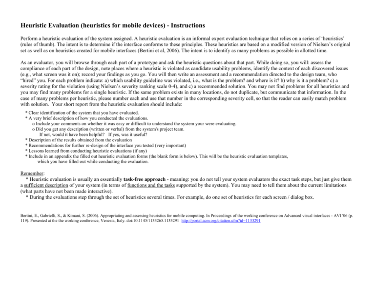
Heuristic Evaluation (heuristics for mobile devices) - Instructions Perform a heuristic evaluation of the system assigned. A heuristic evaluation is an informal expert evaluation technique that relies on a series of ‘heuristics’ (rules of thumb). The intent is to determine if the interface conforms to these principles. These heuristics are based on a modified version of Nielsen’s original set as well as on heuristics created for mobile interfaces (Bertini et al, 2006). The intent is to identify as many problems as possible in allotted time. As an evaluator, you will browse through each part of a prototype and ask the heuristic questions about that part. While doing so, you will: assess the compliance of each part of the design, note places where a heuristic is violated as candidate usability problems, identify the context of each discovered issues (e.g., what screen was it on); record your findings as you go. You will then write an assessment and a recommendation directed to the design team, who “hired” you. For each problem indicate: a) which usability guideline was violated, i.e., what is the problem? and where is it? b) why is it a problem? c) a severity rating for the violation (using Nielsen’s severity ranking scale 0-4), and c) a recommended solution. You may not find problems for all heuristics and you may find many problems for a single heuristic. If the same problem exists in many locations, do not duplicate, but communicate that information. In the case of many problems per heuristic, please number each and use that number in the corresponding severity cell, so that the reader can easily match problem with solution. Your short report from the heuristic evaluation should include: * Clear identification of the system that you have evaluated. * A very brief description of how you conducted the evaluations. o Include your comments on whether it was easy or difficult to understand the system your were evaluating. o Did you get any description (written or verbal) from the system's project team. If not, would it have been helpful? If yes, was it useful? * Description of the results obtained from the evaluation * Recommendations for further re-design of the interface you tested (very important) * Lessons learned from conducting heuristic evaluations (if any) * Include in an appendix the filled out heuristic evaluation forms (the blank form is below). This will be the heuristic evaluation templates, which you have filled out while conducting the evaluation. Remember: * Heuristic evaluation is usually an essentially task-free approach - meaning: you do not tell your system evaluators the exact task steps, but just give them a sufficient description of your system (in terms of functions and the tasks supported by the system). You may need to tell them about the current limitations (what parts have not been made interactive). * During the evaluations step through the set of heuristics several times. For example, do one set of heuristics for each screen / dialog box. Bertini, E., Gabrielli, S., & Kimani, S. (2006). Appropriating and assessing heuristics for mobile computing. In Proceedings of the working conference on Advanced visual interfaces - AVI '06 (p. 119). Presented at the the working conference, Venezia, Italy. doi:10.1145/1133265.1133291 http://portal.acm.org/citation.cfm?id=1133291 Evaluated system name: _____________________________________________________ Heuristic Visibility of system status and losability/findability of the mobile device (e.g., are users kept informed about what is going on?) Match between system & real world (e.g., is the language used at the interface appropriate for the user?) Consistency and mapping (are the ways of performing similar actions consistent? is mapping between user actions and performed tasks consistent and clear?) Good ergonomics and minimalist design (e.g., are objects, actions and options always visible?) Your assessment: What is the problem? Where is it? Why is it a problem Severity of the problem (Minor, Fix later, Fix now) & Recommendation (how should it be fixed) Heuristic Ease of input, screen readability and glancability (e.g., is info easy to enter; screens content easy to read and navigate?) Flexibility, efficiency of use and personalization (e.g., is interaction efficient? is personalization supported?) Aesthetic, privacy and social conventions (e.g., is any unnecessary and irrelevant information provided?) Realistic error management (e.g., is it easy to make errors? is it easy to recognize that an error has been made?) (use more pages if necessary) General advice to the designers: Your assessment: What is the problem? Where is it? Why is it a problem Severity of the problem (Minor, Fix later, Fix now) & Recommendation (how should it be fixed) For your reference: Nielsen’s severity ranking scale
