evaluating the cartographic design and quality of climate change maps
advertisement
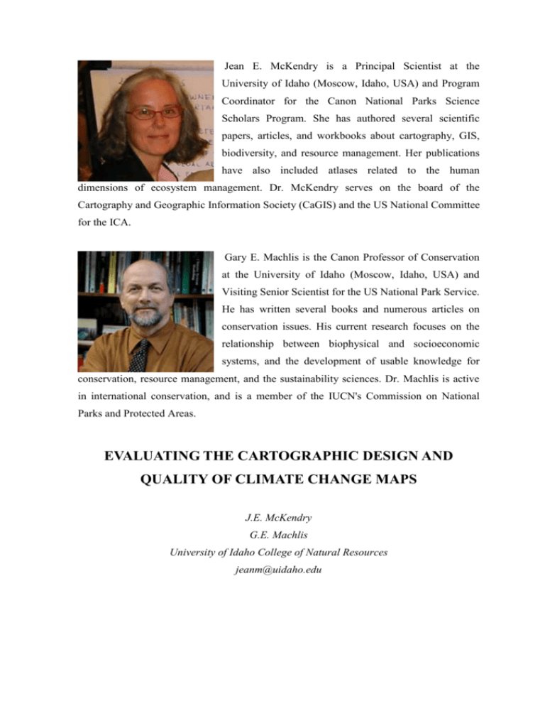
Jean E. McKendry is a Principal Scientist at the University of Idaho (Moscow, Idaho, USA) and Program Coordinator for the Canon National Parks Science Scholars Program. She has authored several scientific papers, articles, and workbooks about cartography, GIS, biodiversity, and resource management. Her publications have also included atlases related to the human dimensions of ecosystem management. Dr. McKendry serves on the board of the Cartography and Geographic Information Society (CaGIS) and the US National Committee for the ICA. Gary E. Machlis is the Canon Professor of Conservation at the University of Idaho (Moscow, Idaho, USA) and Visiting Senior Scientist for the US National Park Service. He has written several books and numerous articles on conservation issues. His current research focuses on the relationship between biophysical and socioeconomic systems, and the development of usable knowledge for conservation, resource management, and the sustainability sciences. Dr. Machlis is active in international conservation, and is a member of the IUCN's Commission on National Parks and Protected Areas. EVALUATING THE CARTOGRAPHIC DESIGN AND QUALITY OF CLIMATE CHANGE MAPS J.E. McKendry G.E. Machlis University of Idaho College of Natural Resources jeanm@uidaho.edu Introduction The Intergovernmental Panel on Climate Change (IPCC) is issuing in 2007 its fourth assessment (AR4) through several working group reports. The Working Group I report examines the physical science basis for climate change, and states that the “warming of the climate system is unequivocal, as is now evident from observations of increases in global average air and ocean temperatures, widespread melting of snow and ice, and rising global average sea level” (IPCC 2007a). The impacts of climate change are being documented through extreme weather events, melting glaciers and sea ice, altered ecosystems and species’ migrations and trajectories toward extinction, changing precipitation regimes, increased frequencies and intensities of wildfire, sea level rise and coastal flooding (IPCC 2007a, IPCC 2007b). Reports from the IPCC and others warn of disruptions in social, economic and environmental systems due to climate change. Examples include mass migrations of human populations, drought and floods, food and fresh water shortages, disease pandemics and political instability (IPCC 2007b, CNA 2007). Information from these reports is finding its way into the mass media, government and the private sector. For example, An Inconvenient Truth, the Academy award-winning slide show about climate change by former US Vice President Al Gore (Gore 2006) spent 29 weeks on the New York Times top ten bestseller list (New York Times 2007). In 2007 retired three- and four-star admirals and generals from the US military released a report that made specific links between climate change, national security and defense policies (CNA 2007). Citigroup Research recently released a report, Climatic Consequences, focusing on the implications of climate change for private investors (Kerschner and Geraghty 2007). In these and other communications about climate change, maps often play a key role. Climate change maps communicate scientific information, display the results of predictive general circulation models (GCMs), document change over time, contribute to policy decisions, integrate information, and can create urgency for action. Such maps can synthesize and interpret climate change information for the public and decision-makers. 2 The use of maps in critical public policy issues and decision-making raises concerns about the quality of the maps. “Quality” refers not to the accuracy or reliability of the underlying data (this is a separate issue, such as debates about GCMs), but to how the data are cartographically displayed. Maps have the power to inform or misinform, lead or mislead, clarify or confuse through the use or abuse of design principles (McKendry 2000, Buttenfield 1996, Monmonier 1995). As mapmaking tools become more available and easy for non-cartographers to use (due to advances in technology), the potential to produce maps of poor quality are ever-present. Monmonier (2006:373) states: “It’s a pity that so few practitioners on cartography’s margins know much about the elements of map design.” Poor map quality can lead to poor decision-making or interfere with the process of getting to a decision (see for example McKendry 2000). With climate change maps, the stakes are extraordinarily high. High quality climate change maps are essential for sound decision-making. The purpose of this paper is to illustrate how climate change maps can be evaluated and explain why such evaluation is important. First, selected cartographic principles are presented with which to evaluate climate change maps. Second, a map from the 2007 IPCC report is selected as an example of a “high visibility” climate change map that should be evaluated. Third, the IPCC map is evaluated using the selected cartographic principles. Finally, the implications of this type of evaluation for climate science and policy and for cartography are described. Principles of Cartography Research in cartography has produced a range of generally accepted principles for use in the design and layout of maps. Principles used to design maps can also be used to evaluate maps. Using individual criteria to evaluate maps remains controversial, as breaking a map into its parts to apply specific principles may ignore the overall impact of the map. (This can be addressed by criteria that focus on whether the map is serving its purpose(s).) There is general consensus about fundamental principles that are essential to good design and layout and to good quality maps (see for example Dent 1999, Muehrcke and Muehrcke 1998, Robinson et al. 1995, Monmonier 1993). Krygier and Wood (2005), 3 for example, provide a detailed map critique checklist in narrative form. They also provide guidance on how to evaluate the overall look and effectiveness of a map. Table 1 includes selected key cartographic principles primarily drawn and adapted from two recent books that focus on map design (Brewer 2005, Krygier and Wood 2005). These sources were selected because they focus on teaching contemporary GIS users how to make better maps. The selected principles focus on map layout and symbolization. The list of principles is not exhaustive, yet deals with design issues often encountered in mapping. Table 1. Selected Principles for Cartographic Design and Layout Cartographic Description of Cartographic Principle Principle Map Projection An equal-area map projection is a good selection for most small-scale maps and should be used for small-scale thematic maps. Generalization Small-scale maps should show more area, less detail, and more generalization of features. Large-scale maps should show less area, more detail, and less generalization of features. Data Classification Qualitative data show differences in kind (e.g., forest versus urban). Qualitative data should be grouped so that features in the same group are more similar than dissimilar and features in different groups are more dissimilar than similar. Quantitative data show differences in amount (e.g., population density). Quantitative data should be classed by specific external criteria (e.g., quantiles) or by the characteristics of the data (e.g., natural breaks). For most choropleth maps, the number of classes should be no more than seven. Map Layout1 4 Focus Map layout should guide readers through the map elements and help them focus on the most important parts of the map. Visual Variables2 Hue Hue (different colors) should be used to categorize features that are qualitatively different, such as a river and a road. Value Value (or lightness) should be used to represent quantitatively different data (either rank-ordered data or numerical amounts), such as population density. Saturation Saturation (or intensity) should be used to represent quantitatively different data (either rank-ordered data or numerical amounts). Size Size should be used to represent quantitatively different data (either rank-ordered data or numerical amounts). A larger square implies greater quantity than a smaller square. Shape Shape should be used to categorize features that are qualitatively different. A square is not more or less than a circle, but is different in kind. Visual Hierarchy Visual hierarchy should show the most important map elements first. Less important elements should be less noticeable. Visual hierarchy should clearly communicate the intellectual hierarchy and purpose(s) of the map. 1 For Krygier and Wood (2005) map layout includes map pieces, focus, balance, and the grid. “Focus” is used here. 2 Bertin (1981) initially described seven visual variables. Cartographers have since adapted and built upon this list. Five visual variables are presented. 5 The selected cartographic design guidelines outlined in Table 1 can be used to evaluate climate change maps. Selecting a Climate Change Map A climate change map from an IPCC report was selected to evaluate (see Figure 1). Figure 1 was published in Climate Change 2007: Impacts, Adaptation and Vulnerability, Working Group II Contribution to the Intergovernmental Panel on Climate Change Fourth Assessment Report, Summary for Policy Makers (IPCC 2007b:4). The title of the map is “Changes in physical and biological systems and surface temperature 1970-2004.” Figure 1 is the only map included in this summary report for policy makers. Selecting an IPCC map to evaluate is relevant to the issue of climate change map quality. Since 1988, the IPCC has released four comprehensive scientific assessments of climate change. The IPCC has significant influence and visibility. IPCC reports are considered by policy makers and the scientific community to be a definitive source of information on climate change and its impacts. The IPCC fourth assessment report (AR4) included “…more than 2500 expert reviewers, 800 authors, 450 lead authors, and 130 countries…” (Gutiérrez et al. 2007a). Working group reports contributing to AR4 are adopted at meetings of the respective groups. Press conferences are typically held to encourage media from around the world to disseminate information from the reports. The IPCC also prepares summary reports specifically for policy makers to synthesize and summarize findings from the full technical reports. Working Group II met in Brussels, Belgium from 2-6 April 2007 and approved the report that includes Figure 1. The meeting was attended by 366 participants, including scientists and representatives from governments, United Nations agencies and non-governmental organizations (Gutiérrez et al. 2007b). Graphics, maps, and figures for IPCC reports are created by the working group authors and the Technical Support Units attached to each group. A graphics specialist at the UNEP (United Nations Environment Programme) Collaborating Center at GRID6 Arendal, Norway was contracted to prepare general guidance and be available to assist in preparing and improving graphics, maps, and figures for the IPCC reports (http://www.ipcc.ch/ graphics_new.htm). The author(s) of the published map in the Working Group II summary report is not known. The map included in the summary report is in color. The size of the map (including its title and legend) is 6.5 inches by 6 inches. The map is accompanied by a caption that is 3 inches by 6 inches. The map was also made available as a separate graphic on the IPCC website at a larger size (without a title or caption) (http://www.ipcc.ch/spm0407.htm). The version of the map published in the summary report is evaluated below. Evaluating the IPCC Climate Change Map: An Example Approach Figure 1 from the IPCC Working Group II summary report for policy makers can be evaluated using the selected principles in Table 1. Each principle can be systematically applied to map with the result rated as good, satisfactory, or poor followed by a brief explanation. The results are included in Table 2. Table 2. Selected Principles for Cartographic Design and Layout Applied to Figure 1 (Map from IPCC Working Group II summary report for policy makers) Cartographic Principle Eva Explanation luation 7 Map Projection Poo r The map shows temperature and other statistical information. The projection should be equal-area. Instead, the projection is a cylindrical equidistant projection. Area is distorted as well as shape. Generalization Sati sfactory This world map shows coastlines and boundaries of nations. The level of generalization (nothing smaller than a country) is appropriate. Linework to symbolize these boundaries is too detailed for the scale and purpose of the map. Greenland, Argentina, Antarctica, and Southeast Asia are examples where the detail interferes with the area being depicted. Data Classification Sati sfactory The qualitative map displays data that are quantitative and classified. The observation locations for physical systems are combined into a single group. Observation locations for biological systems are combined into a single group. They are symbolized correctly as qualitatively different groups. The data on temperature range are classified into five groups, low to high. It is unknown how the class boundaries were established. It is unclear in the legend where class breaks begin and end. The legend should clearly specify the range in each data class. Map Layout 8 Focus Poo r The map lacks focus. The legend is the same size as the map. The legend is complex (including data not displayed on the map, i.e., the series of 4-celled tables). The legend and map visually compete with each other. The map is accompanied by a caption that requires as much room as the legend and map respectively. The reader must carefully read the caption to understand the legend and carefully read the legend to understand the map. Visual Variables Hue Sati sfactory Point observations for physical and biological systems are distinguished by different hues. This is appropriate for grouping qualitative features. It is unclear why the green circles have green borders, while blue circles have black borders. Value Poo r The temperature data are quantitative and displayed using a color sequence that varies too much by hue. The data should be displayed from low to high by varying value not hue. Saturation NA Saturation is not used to symbolize data on the map. Size Sati sfactory Circle symbols of different sizes are appropriately used (small to big) to represent quantitative data. It is unclear why the size varies in Europe only. Shape NA Shape is not used to symbolize data on the map. 9 Visual Hierarchy Poo r The visual hierarchy of the map is poor. The relationship between observation locations and temperature is difficult to understand. Blue point symbols completely cover green point symbols in some locations, while green symbols cover blue ones in others. Circles that change size in Europe only are confusing. Actual changes in physical and biological systems (emphasized in the map title) are not displayed on the map. This evaluation indicates that the map published in the summary report of Working Group II for policy makers ranges from poor to satisfactory in its use of selected cartographic principles. Overall, the map fails to clearly and effectively display information about “changes in physical and biological systems and surface temperatures”. Implications The example in this paper illustrates how climate change maps can be evaluated. Using the only map published in an IPCC summary report for policy makers, the evaluation reveals specific and troubling issues of quality with this important map. Poor quality climate change maps have implications for climate change policy, climate change science and for cartography. For public policy, poor quality maps may confuse or distort current climate change data and/or predictions, making it difficult to accurately understand the issues and make sound policy decisions. Poor quality maps may impact mass media, government and private sector decision-making. Confusion (due to poor quality maps) may be used to justify inaction when issues are viewed as too complex – a clear risk for climate change policy. For climate change science, cartography and maps are essential tools to display results, synthesize and classify large volumes of data, explore data relationships through visualization, and share results with the public, governments, and the scientific community. Climate change scientists who produce climate change maps without cartographic 10 expertise may not be aware of fundamental cartographic principles and how to use them and not realize that their maps may be poor quality. The result is an unnecessary limitation on advances in climate change science. For cartography, its role needs to be re-evaluated in view of climate change and other critical, contemporary high stakes issues (such as natural hazards, national security, and more). Cartographers need to become directly engaged with the climate change research effort. Cartographers should work with climate scientists and actively advocate the use of good quality layout and design. For example, cartographers could conduct “cartographic interventions” (see Monmonier 2006) with climate scientists. One example might be a specific effort by a panel of cartographers to evaluate climate change maps produced by the IPCC elaborating on the approach described here. Cartographers could also work with the IPCC and other organizations on training of climate research teams, regular map critiques, experimentation with methods and designs, and development of appropriate layout and design guides. Conclusion: The Consequences of Failure Climate change is perhaps the single most important environmental challenge facing contemporary societies. Its local, regional, and global impacts are (and will increasingly be) extraordinary in scope and consequence. The scientific community has turned its attention to climate change, and the emerging results increasingly depend on maps as tools of communication and instruments of decision-making. The failure of maps to follow cartographic principles will be significant. Good quality climate change maps have the potential to transform complex scientific data into accessible, understandable, and convincing information. Poor quality climate change maps map foster incoherent results from climate change research, contribute to an inactive and/or distorted policy agenda, make increasingly irrelevant and impotent the field of cartography, and ultimately, contribute to an ominous future. Figure 1. 11 Literature Cited Bertin, J. 1981. Graphics and Graphic Information Processing. Berlin: Walter de Gruyter and Company (translated by W. Bert and P. Scott). Brewer, C. 2005. Designing Better Maps: A Guide for GIS Users. Redlands, CA: ESRI Press. 12 Buttenfield, B.P. 1996. Scientific visualization for environmental modeling: interactive and proactive graphics. Pp. 463-467 in M.F. Goodchild, L.T. Steyaert, B.O. Parks, C. Johnston, D. Maidment, M. Crane and S. Glendinning, eds. GIS and Environmental Modeling: Progress and Research Issues. Fort Collins, CO: GIS World Books. Dent, B. 1999. Cartography: Thematic Map Design, 5th Edition. Boston, MA: WCB/McGraw-Hill. Gore, A. 2006. An Inconvenient Truth. Emmaus, PA: Rodale Press. Gutiérrez, M., K. Kulovesi and M Muñoz. 2007a. A brief history of the IPCC and AR4. Earth Negotiations Bulletin 12(30) [Retrieved May 2007 from http://www.iisd.ca/vol12/enb12320e.html]. __________. 2007b. Eighth session of Working Group II of the Intergovernmental Panel on climate change: 2-6 April 2007. Earth Negotiations Bulletin 12(30) [Retrieved May 2007 from http://www.iisd.ca/vol12/enb12320e.html]. CNA Corporation. 2007. National Security and the Threat of Climate Change. Retrieved April 2007 from http://securityandclimate.cna.org/report/. http://www.ipcc.ch/graphics_new.htm http://www.ipcc.ch/spm0407.htm IPCC. 2007a. Summary for Policy Makers in: Climate Change 2007: The Physical Science Basis. Contribution of Working Group I to the Fourth Assessment Report of the Intergovernmental Panel on Climate Change. Cambridge, United Kingdom and New York, NY: Cambridge University Press [Online version retrieved April 2007 from http://www.ipcc.ch]. IPCC. 2007b. Summary for Policy Makers in: Climate Change 2007: Impacts, Adaptation and Vulnerability. Contribution of Working Group II to the Fourth Assessment Report of the Intergovernmental Panel on Climate Change. Cambridge, United Kingdom and New York, NY: Cambridge University Press [Online version retrieved May 2007 from http://www.ipcc.ch]. Kerschner, E.M. and M. Geraghty. 2007. Climatic Consequences. Retrieved May 2007 from http://www.pewclimate.org/document.cfm?documentID=727. 13 Krygier, J. and D. Wood. 2005. Making Maps: A Visual Guide to Map Design for GIS. New York, NY: The Guilford Press. McKendry, J. 2000. The influence of map design on resource management decision making. Cartographica 37(2):13-25. Monmonier, M. 2006. Cartography: uncertainty, interventions, and dynamic display. Progress in Human Geography 30(3):373-381. __________. 1995. Drawing the Line: Tales of Maps and Cartocontroversy. New York, NY: Henry Holt and Company. __________. 1993. Mapping It Out: Expository Cartography for the Humanities and Social Sciences. Chicago, IL: The University of Chicago Press. Muehrcke, P.C. and J.O. Muehrcke. 1998. Map Use: Reading, Analysis, and Interpretation, 4th Edition. Madison, WI: JP Publications. New York Times. 2007. Paperback best sellers: January 28, 2007. Retrieved May 2007 from http://select.nytimes.com/search/restricted/article?res= F60D15F73A540C7B8EDDA80894DF404482. Robinson, A.H., J.L. Morrison, P.C. Muehrcke, A.J. Kimerling and S.C. Guptill. 1995. Elements of Cartography, 6th Edition. New York, NY: Wiley. 14
