Excel Worksheet
advertisement
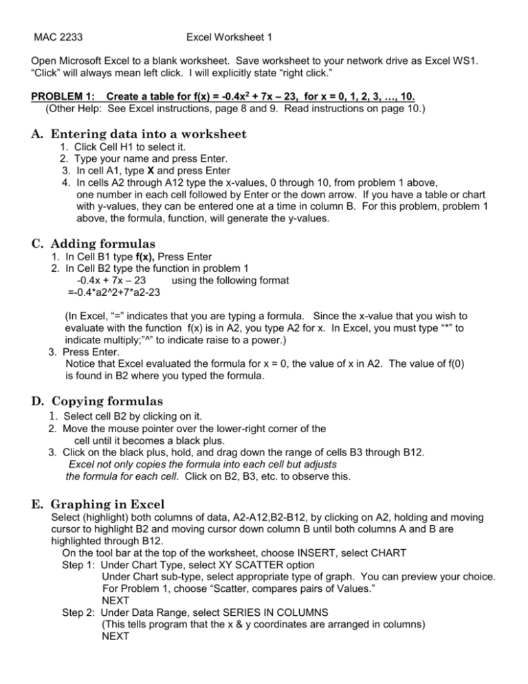
MAC 2233 Excel Worksheet 1 Open Microsoft Excel to a blank worksheet. Save worksheet to your network drive as Excel WS1. “Click” will always mean left click. I will explicitly state “right click.” PROBLEM 1: Create a table for f(x) = -0.4x2 + 7x – 23, for x = 0, 1, 2, 3, …, 10. (Other Help: See Excel instructions, page 8 and 9. Read instructions on page 10.) A. Entering data into a worksheet 1. 2. 3. 4. Click Cell H1 to select it. Type your name and press Enter. In cell A1, type X and press Enter In cells A2 through A12 type the x-values, 0 through 10, from problem 1 above, one number in each cell followed by Enter or the down arrow. If you have a table or chart with y-values, they can be entered one at a time in column B. For this problem, problem 1 above, the formula, function, will generate the y-values. C. Adding formulas 1. In Cell B1 type f(x), Press Enter 2. In Cell B2 type the function in problem 1 -0.4x + 7x – 23 using the following format =-0.4*a2^2+7*a2-23 (In Excel, “=” indicates that you are typing a formula. Since the x-value that you wish to evaluate with the function f(x) is in A2, you type A2 for x. In Excel, you must type “*” to indicate multiply;”^” to indicate raise to a power.) 3. Press Enter. Notice that Excel evaluated the formula for x = 0, the value of x in A2. The value of f(0) is found in B2 where you typed the formula. D. Copying formulas 1. Select cell B2 by clicking on it. 2. Move the mouse pointer over the lower-right corner of the cell until it becomes a black plus. 3. Click on the black plus, hold, and drag down the range of cells B3 through B12. Excel not only copies the formula into each cell but adjusts the formula for each cell. Click on B2, B3, etc. to observe this. E. Graphing in Excel Select (highlight) both columns of data, A2-A12,B2-B12, by clicking on A2, holding and moving cursor to highlight B2 and moving cursor down column B until both columns A and B are highlighted through B12. On the tool bar at the top of the worksheet, choose INSERT, select CHART Step 1: Under Chart Type, select XY SCATTER option Under Chart sub-type, select appropriate type of graph. You can preview your choice. For Problem 1, choose “Scatter, compares pairs of Values.” NEXT Step 2: Under Data Range, select SERIES IN COLUMNS (This tells program that the x & y coordinates are arranged in columns) NEXT Step 3: Under Chart Options select Titles and enter titles for chart and axes. Enter titles for EVERY GRAPH you do. For Problem 1, for x-axis, you can simply type “x- Values.” For y-axis, type “f(x).” For title of graph, type “Problem 1.” Select Legend and if “Show Legend” is checked, deselect it by clicking on the check. This should remove the check from the box. Explore the other options… NEXT Step 4: Under Chart Location, select as an object in your current sheet. FINISH While chart is selected (It is selected when the rectangle that contains it has black squares in the corners and on the sides of the rectangle.), click on a corner of the rectangle, hold and drag to make the chart larger if desired. If chart is not selected, left click on white part of chart to select it. If you right click on white part of the chart, you will see chart editing possibilities. F. Changing Scale on the Axes Step 1: Point cursor to x-axis until you see rectangle containing “Value(x)axis.” Then right click. Step 2: On the dialogue box that appears, select “Format Axis.” Step 3: Select Scale. For problem 1, enter 0 for min, 12 for max, 2 for major unit. Step 4: Click “OK.” You try: See example 2, page 19. Graph y = -5600x2 + 14000x, 0 x 2.5 A. Make a table using the 6 points in the table on page 19 (as we did for problem 1). B. Graph the points choosing under Chart Options, XY Scatter, subtype “Scatter with data points connected by smooth lines with no markers.” Remember to enter a title for the chart and axes. G. Adding a Trend line for Data Problem 2: See Chart on page 89. Enter word “Year” in A1; word “Population” in B1 Enter data in columns A and B as indicated in A. Entering Data, on front of this handout. Make a scatter-plot of data following directions in E. Graphing in Excel on front of handout. If you are adding a trend line, when you choose type of graph in step 1, always choose XY Scatter, with subtype “Scatter, Compares pairs of values.” 1. Left click on the white part of the chart. On the toolbar at the very top of the Excel worksheet, select Chart and then select Add Trend Line. 2. Under Type at top of the window, select Polynomial, Order 2 (Quadratic Regression) 3. Click on Options at top of this window, select Display Equation on Chart; Display R-squared Value on Chart. Click “OK.” 4. You can move the equation and R2 value by clicking on the equation to highlight the textbox containing the equation and R2 value. Put cursor on any of the black squares on the textbox, left click, hold and drag box to desired location. Homework: 1. Create a table for f(x) = -0.6x2 – 5x + 35, x = 0,1,2,3,…,10 as in problem 1 on front of sheet. Create a scatter-plot for the data as you did for problem 1 on front of this sheet. 2. R is the revenue for Ohagan Books. Novels sell at price of p dollars per novel: R = -60p2 +1850p with p = 0, 5, 10,15,20,25,30. Chose: XY Scatter, subtype “Scatter with data points connected by smooth lines with no markers.” Use graph to estimate price that produces the maximum revenue. 3. Use the data in problem 37, page 93. As you did in G. problem 2 above, do scatter-plot, Choose: “Scatter, compares pairs of Values.” Determine a trend line—polynomial, order 2 (quadratic regression) that models the data. Display the equation of the regression and the R-squared value.
