m110-coursepack-supplement-v6
advertisement

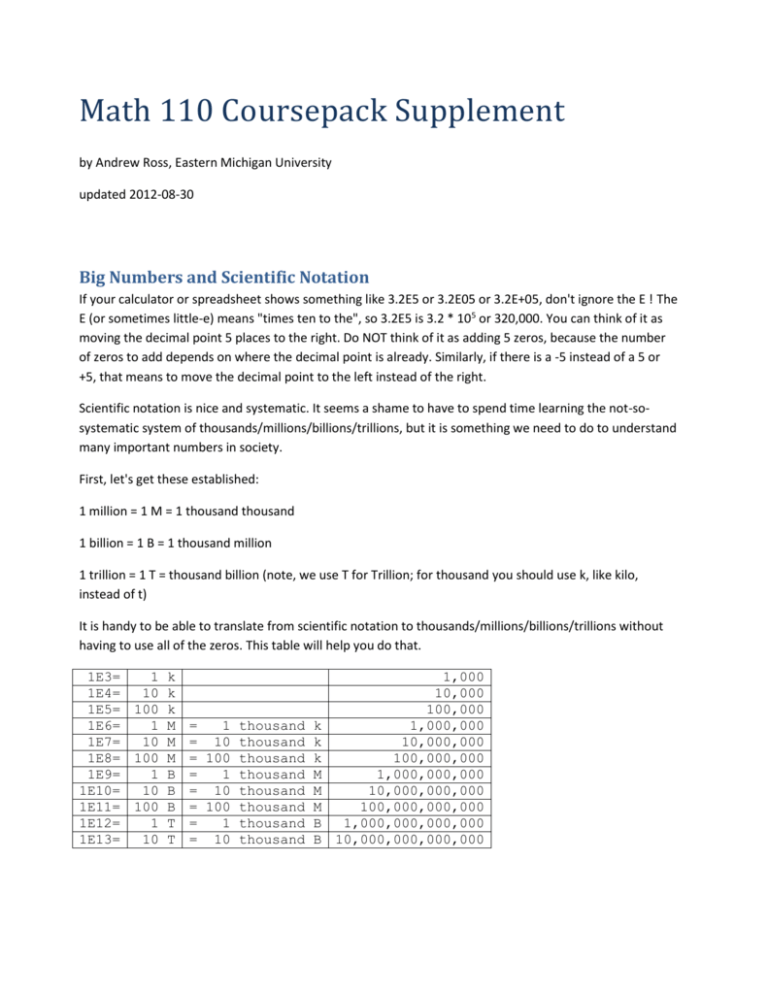
Math 110 Coursepack Supplement by Andrew Ross, Eastern Michigan University updated 2012-08-30 Big Numbers and Scientific Notation If your calculator or spreadsheet shows something like 3.2E5 or 3.2E05 or 3.2E+05, don't ignore the E ! The E (or sometimes little-e) means "times ten to the", so 3.2E5 is 3.2 * 105 or 320,000. You can think of it as moving the decimal point 5 places to the right. Do NOT think of it as adding 5 zeros, because the number of zeros to add depends on where the decimal point is already. Similarly, if there is a -5 instead of a 5 or +5, that means to move the decimal point to the left instead of the right. Scientific notation is nice and systematic. It seems a shame to have to spend time learning the not-sosystematic system of thousands/millions/billions/trillions, but it is something we need to do to understand many important numbers in society. First, let's get these established: 1 million = 1 M = 1 thousand thousand 1 billion = 1 B = 1 thousand million 1 trillion = 1 T = thousand billion (note, we use T for Trillion; for thousand you should use k, like kilo, instead of t) It is handy to be able to translate from scientific notation to thousands/millions/billions/trillions without having to use all of the zeros. This table will help you do that. 1E3= 1 k 1,000 1E4= 10 k 10,000 1E5= 100 k 100,000 1E6= 1 M = 1 thousand k 1,000,000 1E7= 10 M = 10 thousand k 10,000,000 1E8= 100 M = 100 thousand k 100,000,000 1E9= 1 B = 1 thousand M 1,000,000,000 1E10= 10 B = 10 thousand M 10,000,000,000 1E11= 100 B = 100 thousand M 100,000,000,000 1E12= 1 T = 1 thousand B 1,000,000,000,000 1E13= 10 T = 10 thousand B 10,000,000,000,000 Chapter 1.3: Estimation Here are the numbers you will often need to know. Memorize the first 3 in particular AND put them on your note sheet for all exams. US Population: 310 Million in August 2010, but let’s call it 300 Million World Population: 6,865,668,780 in August 2010, but let’s call it 7 Billion US Households: 114,825,000 in 2010, but let’s call it 100 Million World households: 1.9 Billion in 2009 (from http://www.timesonline.co.uk/tol/sport/olympics/article6256063.ece) Michigan population: 10 million Metro Detroit area population: 5 million You might try organizing that into a table. It would be good to put on your note sheet for exams. Chapter 1.5: Compared to What? When we say to compare one thing to another that includes it (e.g. Detroit to Michigan, or Michigan to the USA), there is a common mistake people make: if we are talking about the Michigan budget deficit, it is not included in the federal budget deficit. The federal budget deficit does not include any state budget deficits (many people think it is just the sum of all 50 state deficits). As an analogy, consider a set of parents who make $50k in a year but spend $52k that year; their deficit is $2k. If their 14-year-old made $200 by babysitting that year but spent $250, that $50 deficit is not included in the $2k of the parents. Also, be careful with the words “deficit” and “debt”. The deficit is the shortfall in this year’s budget alone, while the debt is, roughly speaking, the accumulated deficits from all previous years together. When coming up with things to compare to, it is best to change only one aspect of the situation at a time. For example, if you start with Michigan spending on prisons in 2009, you could compare to Ohio spending on prisons in 2009, or Michigan spending on education in 2009, or Michigan spending on prisons in 2008, but it would be a stretch to compare Michigan 2009 prison spending to Ohio 2008 education spending. Similarly, try to stay in the same general field as where you start. If Michigan spent hundreds of millions of dollars on prisons, it wouldn’t be helpful to say how many baseball players that could pay for. Saying how many teachers it could pay for would be better, but still not great, since it’s not as if all that money would be routed toward teachers even if it was sent toward education. If you are given a ranking (what is the #1 cause of something?) there are two good ways to make sense of it. First, ask: out of how many options? #1 out of 3 is a lot less important than #1 out of 100, for example. Also, ask if it is nearly tied with the items nearby it, or if there is a big gap. If you are trying to compare the US to other countries, you almost always have to adjust for population. There are no countries with a population close enough to the US that you can avoid the adjustment. In particular, the biggest countries are: (as of 2010-2012, depending on the country) China 1.347 B India 1.210 B (the European Union, or EU, is not a country, but if you treat it like one, it would fit here: population=500 M) US 313 M Indonesia 237 M Brazil 192 M Pakistan 179 M Nigeria 162 M Russia 143 M Chapter 2.1: Direct Proportions A typical test to see if something is a direct proportion is to take the data you have, divide each y value by its x value, and look at the ratios. For example, x y y/x 2 0.666667 0.333333 3 1 0.333333 4 1.333333 0.333333 5 1.666667 0.333333 6 2 0.333333 7 2.333333 0.333333 Since all of the y/x ratios are the same, we know this is an exact direct proportion (and, the constant of proportionality is 0.33333). This is nice when it happens, but real data is rarely that nice. What if you had this table? x y 2 3 4 5 6 7 0.62 0.87 1.47 1.83 1.83 2.54 y/x 0.310 0.290 0.368 0.366 0.305 0.363 3 2 1 0 0 5 10 x Here, the y/x values are all approximately equal to each other, so we might say that it’s an approximate direct proportion. After all, the graph does look approximately like it would be a straight line that would touch the origin. This is a good idea, but it turns out there is something we need to be careful of. Consider this data table, of income amounts and resulting income tax amounts (taken from Chapter 3.1, though that’s a bit of a leap forward in the textbook): Income Tax amt. Tax/Income $ 30,000 $ 640 0.021 $ 31,000 $ 679 0.022 $ 32,000 $ 718 0.022 $ 33,000 $ 757 0.023 $ 34,000 $ 796 0.023 $ 35,000 $ 835 0.024 Note that tax/income is essentially what overall fraction of your income you’re paying toward income tax, so we could have written that column as percents: 2.1%, 2.2%, 2.2%, 2.3%, etc. These numbers all look approximately equal to each other, but notice that they are steadily increasing, while in the previous example the y/x values had no clear increasing or decreasing trend. Are tax and income still approximately proportional? Let’s look at the graph: tax amount $1,000 $800 $600 $400 $200 $$- $20,000 $40,000 Income While the data do look like they fall on a line, that line wouldn’t touch the origin. This means that it’s not a good idea to call it an approximate direct proportion, because it deviates from a straight-line-thattouches-the-origin systematically rather than randomly, as the previous example did. To summarize: If the y/x ratios have a systematic trend (increasing or decreasing) as x increases, then the relationship is not even approximately directly proportional. Exercise: Generate a table of values for y=10x+50 for x=1,2,3,4,5, then calculate y/x for each data point. Is this an exact direct proportion, an approximate direct proportion, or neither? Also graph the results. Chapter 2.4: Inflation What sorts of prices tend to increase faster or slower than inflation? Here are some graphs to consider: Crude Oil http://inflationdata.com/inflation/images/charts/Oil/Inflation_Adj_Oil_Prices_Chart.htm (is this a reliable web site?) Health Care http://content.healthaffairs.org/cgi/content/full/hlthaff.w2.83v1/DC1 http://content.healthaffairs.org/content/vol0/issue2003/images/data/hlthaff.w2.83v1/DC1/Altman_Ex1.gif this a reliable web site?) (is Gold Prices http://en.wikipedia.org/wiki/File:Gold_price_in_USD.png (is this a reliable web site?) http://www.sharelynx.com/chartsfixed/600yeargold.gif (is this a reliable web site?) US Income http://en.wikipedia.org/wiki/Household_income_in_the_United_States http://en.wikipedia.org/wiki/Median_household_income Electricity prices http://www.solarbuzz.com/SolarpricesUSA.htm (is this a reliable web site?) Ch 2.7 Inverse Proportions A fundamental application of inverse proportions is in sharing. For example, if 10 friends go out to eat and the total bill is $70, then each person's share is $70/10=$7. What if the group had spent $70 but it was only 5 people? Half as many people to share the same bill means each has to pay twice as much. This is the opposite of the "doubling property" that we like so much for direct proportions in Chapter 2.1. We could calculate $70/5=$14, but perhaps it is better to say "double the per-person share from $7 to $14". Similarly, if the bill was still $70 but the group of 10 was instead a group of 20 (double its previous size), the perperson share would be half its previous size: $7/2 = $3.50 . This has bigger implications in society than just going out to eat. Systems like Social Security for retired people or disabled people are, in some sense, working households banding together to share the cost of running the retired or disabled household. For example, about 4 million households receive SSI benefits (this is Supplemental Income, also called welfare, not retirement pensions) of about $10,000/year each. If there are about 80 million households supporting those 4 million households, that is 20 per 1 SSI household. So the per-household share is $10,000/20 = $500 per household. If in the long run we changed to 10 households supporting each 1 SSI household, then the perhousehold share would be $1000 instead of $500. In equation form, we can write: Each share = total amount / #people or households This equation helps if the change isn't a nice one-half or one-third, for example. If the number of supporting households changed from 80M to 85M, we could say that each share is now $10k*4M/85M = $470 or so (the # of supporting households went up, so the per-household share went down). The same thing can work if we use percentages instead of dollar amounts as the total. For example, each non-retired household pays about 12% toward Social Security pensions, and there are about 4 such households per retired household. If that ratio changes from 4-to-1 to 2-to-1 in the long run, then there are half as many supporting households, so the per-household share doubles from 12% to 24%. If the ratio changes to 3-to-1, we might be tempted to think: 3 is the average of 2 and 4, so the per-person share should be the average of 12% and 24%, which is 18%. Here are two ways of seeing that is not the exact answer, though: We could switch from 4-to-1 at 12% to 1-to-1: cutting the ratio by a factor of 4 means we quadruple the perhouse share from 12% to 48%. Then go from 1-to-1 to 3-to-1: tripling the number of households changes the share from 48% to 48/3 = 16% We could say: 4 households at 12% of income each amounts to 4*12=48% of one household income. That is, the retired household is living on just under half of an ordinary income. If we divide that 48% across 3 households now, we get 48/3= 16% Of course these two ways of seeing it are pretty much the same. We could translate from percentages to money if we want. If the average household income is $60k, then 12% of that is $7.2k. If 4 households each pay $7.2k, the total is $28.8k , which is 48% of $60k. If we divide the $28.8k by 3 houses now instead of 4, we get $9.6k each, or $9.6k/60k=16%. Chapter 3.4: Piecewise Linear Models Formulas like this: are the typical way of writing a piecewise-linear model, but they are not very handy for use in Excel, especially if you get to 3 or more cases. Instead, it is easier to use the MAX() and MIN() functions in Excel. The MAX() function computes the MAXimum of its inputs. For example, if you type =MAX(3,7,2) it will give back the 7, since that is the largest value. Other examples: =MAX(5,-10,3,0.1) gives 5, and =MAX(0,8) gives 8, and =MAX(0,-8) gives 0. The MIN() function works in a similar way, but gives back the MINimum (smallest) of the numbers you give it: =MIN(3,7,2) gives 2, =MIN(5,-10,3,0.1) gives -10, =MIN(0,8) gives 0, and =MIN(0,-8) gives -8. It is helpful to think of the T formula above this way: for S values below E, the slope is 0; above E, the slope changes from 0 to r. This is, in some sense, an “extra” rate of r on top of the previous rate of 0. And S-E is the amount we are above E. In the above formula, suppose E=10000 and r=15% or 0.15. We can graph the two halves (top case for S<=E and bottom case for S > E) separately, and even include values that are outside the stated conditions of S<=E and S>E: S<=E case S 0 5000 10000 15000 20000 0 0 0 0 0 S>E case actual T -1500 0 -750 0 0 0 750 750 1500 1500 2000 1500 1000 500 S<=E case 0 S>E case 0 -500 -1000 -1500 -2000 5000 10000 15000 20000 actual T Notice that at any particular S value, the true T value (dashed blue line) is whichever of the other two lines (yellow, for S<=E, or red, for S>E) is higher—that is, the maximum. So, we could write this formula as MAX( 0 , r*(S-E) ) in math terms, or =MAX( 0 , 0.15*(A8-10000) ) in Excel if we started on row 8. And then we realize we can move the 0.15 outside the MAX and write =0.15*MAX(0,A8-10000). This means we don't have to remember that inner pair of parentheses. Note that we use MAX because the graph of the true T value is concave-up. That is, its slope increases as you move to the right. This is like the opposite of bulk-discounts, but it is typically for progressive taxation systems. If the tax is regressive, or if you do indeed get bulk discounts, then you would use MIN. For example, the current system for social security taxes is roughly: 6.2% of your yearly income up to $106,000 and after that, no incremental taxes. We could express this as: =0.062 *MIN( A8, 106000) if the yearly income was in cell A8. If there is a 2nd bend in the function, for example at an income of $20,000, we can include that in the following way: suppose the rate goes from 15% to 18% once you cross $20,000. This is a 3-percentagepoint additional rate. Below $20,000 though the 3% rate does not apply. So we can write a formula for the additional amount paid: =0.03*MAX(0, A8-20000 ) We would then add this to the amount paid above, for an overall formula of =0.15*MAX( 0 , A8-10000 ) + 0.03 * MAX(0, A8-20000 ) Chapter 3.6: Fitting Linear Models to Data Do not use best-fit lines to model piecewise-linear systems like those we saw in Chapter 3.4. Other words for correlation: link, relationship, association, correspondence, trend Pick your Axes When you have a data set, it’s often not clear what should be your “x” variable and what should be “y”. Here are some guidelines: Put it on the horizontal axis: If we directly controlled or could directly control it (e.g. price of something we’re selling) If we think it is the “cause”, and the other variable is the “result” If it is a date/time value, e.g. 2007 or 12:43pm (a “when”) o but “3 hours” or “78 years of age” (a “how long”) could be either x or y. If it is the first in a sequence of measurements (e.g. 5th grade test score vs. 8th grade test score) If neither variable is a clear choice to go on the horizontal axis, it might help to try the graph both ways and see if one interpretation makes more sense than another (“try it both ways”). If there is no clear preference for one variable vs. the other, then maybe “it doesn't matter” (# people at WMU, #people at CMU) There is a difference between "try it both ways" and "it doesn't matter". For “try it both ways”, we’re exploring the idea of one thing causing another or vice versa, but we aren’t sure which way the causation runs (and it might run both ways). For “it doesn’t matter”, we’re fairly sure that neither thing is causing the other. Size of Correlation Coefficient There are no hard-and-fast rules for how big an R value must be to be important. Here is a general guideline, appropriate for the social sciences (psychology, political science/public policy, etc.) Correlation Coefficient Descriptor 0.0-0.1 trivial, very small, insubstantial, tiny, practically zero 0.1-0.3 small, low, minor 0.3-0.5 moderate, medium 0.5-0.7 large, high, major 0.7-0.9 very large, very high, huge 0.9-1 nearly, practically, or almost perfect (from http://www.sportsci.org/resource/stats/effectmag.html ) The technical sciences (physics, engineering, etc.) typically have more strict requirements. Remember, even if there’s a large correlation, that doesn’t mean that one thing is causing the other. And, in particular, if you get a correlation of exactly 1.0, there’s a good chance you accidentally graphed some data against itself. Another similar scale is given in Cohen, Jacob: Statistical power analysis for the behavioral sciences (2nd ed.) 1988 Common Hidden Variables Often, some underlying condition that wasn’t part of a study will affect the variables that were studied. We call this underlying condition a “hidden variable”, or lurking variable. Here are some common hidden variables: socioeconomic status (SES) overall health overall attitude about health size of population inflation/flow of time weather local cost of living If you want to criticize a correlation argument, you should state what a plausible hidden variable would be, and say how it would plausibly affect the two variables in the study to produce what the study saw. Chapter 6.1: Histograms What, if anything, is wrong with this histogram? US Household Income, 2008 14% 12% 10% 8% 6% 4% 2% $0 $5,000 $10,000 $15,000 $20,000 $25,000 $30,000 $35,000 $40,000 $45,000 $50,000 $55,000 $60,000 $65,000 $70,000 $75,000 $80,000 $85,000 $90,000 $95,000 $100,000 $200,000 0% (data are from http://www.census.gov/hhes/www/cpstables/032009/hhinc/new06_000.htm And have not been altered at all) $68,424 mean $52,029 median US Household Income, 2008 % of households 12% 10% 8% 6% 4% 2% 0% Income (in thousand of $) And a zoom-in: US Household Income, 2008 12% % of households 10% 8% 6% 4% 2% 0% 0-10 50-60 100-110 150-160 200-210 Income (in thousand of $) (data from the same source, but Prof. Ross did some interpolation on the large bins) http://cameron.econ.ucdavis.edu/excel/ex11histogram.html S.F. Bay Area Real Estate sales, 2003 14000 12000 # of sales 10000 8000 6000 4000 2000 0 1 2 3 4 5 6 7 8 9 10 11 12 # of bedrooms The # of bedrooms has a mean of 3.03 and a median of 3 for this data set. Is the histogram skewed? S.F. Bay Area Real Estate Sales, 2003 12000 # of sales 10000 8000 6000 4000 2000 0 square footage The mean square footage is 1,976 and the median is 1,462. Is the histogram skewed? S.F. Bay Area Real Estate sales, 2003 1200 1000 Frequency 800 600 400 200 10000 200000 390000 580000 770000 960000 1150000 1340000 1530000 1720000 1910000 2100000 2290000 2480000 2670000 2860000 3050000 3240000 3430000 3620000 3810000 4000000 4190000 4380000 4570000 4760000 4950000 5140000 5330000 5520000 5710000 5900000 0 Selling Price The mean selling price is $497,320 and the median is $429,000. Is the histogram skewed? Here is some data that is skewed the other way: from a Math 110 midterm exam 14 12 # of people 10 8 6 4 2 0 50.1 to 60 60.1 to 70 70.1 to 80 80.1 to 90 90.1 to 100 Score on midterm test Score on midterm test 95.1 to 100 90.1 to 95 85.1 to 90 80.1 to 85 75.1 to 80 70.1 to 75 65.1 to 70 60.1 to 65 9 8 7 6 5 4 3 2 1 0 55.1 to 60 # of people And the same data, but with bins of width 5: Age distribution—Population Pyramid, http://en.wikipedia.org/wiki/Population_pyramid http://en.wikipedia.org/wiki/File:Travel_time_histogram_total_n_Stata.png Baseball Statistics http://www.hardballtimes.com/main/article/runs-per-game/ “all the game results from 2000 through 2004: a total of 12,142 games, or 24,284 different instances of runs scored. (God bless Retrosheet). I then added up the number of games in which teams scored a specific number of runs. Here's the result: There was an average of 4.82 runs per game scored during these five years, but you can see that the most frequent numbers of runs scored were three (13.4%), four (12.9%) and two (12.1%). In other words, the most common numbers of runs scored were all less than the overall average. There's a simple explanation for this: teams can't score fewer than zero runs, but they can score as many as the opposition will allow. In other words, there is a lower limit on runs scored, but no upper limit. “ The article then goes on to examine individual teams in individual years: One of the main points is that even though the overall histogram looks fairly smooth, the individual team histograms are a bit rougher, mostly because of the smaller sample size (fewer games played by one team than by the whole league) 30% Inflation, 1886-2009 Frequency 25% 20% 15% 10% 5% 0% Frequency mean = 2.67% 16% 14% 12% 10% 8% 6% 4% 2% 0% mean = 6.0% Yearly inflation DJIA (nominal), 1886-2009 Yearly return 14% Frequency 12% DJIA (real), 1886-2009 10% 8% 6% 4% 2% 0% mean = 3.40% Yearly return 100 tagged fish (each tagged fish is shown as a +) Math 110 Ch 3.5: Correlation, Etc. Name:______________ The book “Born to Buy” by Juliet B. Schor (2004) talks about how companies are marketing toys and foods to children. 1. On page 125 it says “In the 1970s, Marvin Goldberg studied differences between children who saw and did not see television advertising and found that sugared cereals were more likely to be present in the homes of the former.” Is this evidence that food marketing to children is effective? Explain. 2. On page 128, paraphrased the way a reporter might paraphrase it: “A two-year study of eleven and twelve year olds, discovered that each additional soft drink consumed per day increased the likelihood of a child's becoming obese by 60 percent.” What do you think of this study, the way it is summarized here? 3. Here is what it actually said on page 128: “A two-year study of eleven and twelve year olds, which controlled for exercise, other food intake, and media viewing, discovered that each additional soft drink consumed per day increased the likelihood of a child's becoming obese by 60 percent.” Now what do you think? 4. Newsweek reported on July 12, 2010: “Five experiments by Northwestern’s Adam Galinsky showed that those who have lived abroad outperform others on creativity tasks.” Does this mean that living abroad increases creativity? Explain. 5. Newsweek reported on July 12, 2010: “According to University of Texas professor Elizabeth Vandewater, for every hour a kid regularly watches television, his overall time in creative activities—from fantasy play to arts projects—drops as much as 11 percent.” Does this mean: a) The R^2 value in this study is 0.11? b) The slope in this study is 0.11? c) The slope in this study is -0.11? d) The intercept in this study is 0.11? e) something else? What?


