SGalaitsis Assignment 5
advertisement
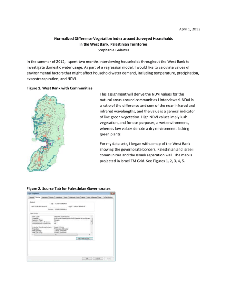
April 1, 2013 Normalized Difference Vegetation Index around Surveyed Households In the West Bank, Palestinian Territories Stephanie Galaitsis In the summer of 2012, I spent two months interviewing households throughout the West Bank to investigate domestic water usage. As part of a regression model, I would like to calculate values of environmental factors that might affect household water demand, including temperature, precipitation, evapotranspiration, and NDVI. Figure 1. West Bank with Communities This assignment will derive the NDVI values for the natural areas around communities I interviewed. NDVI is a ratio of the difference and sum of the near infrared and infrared wavelengths, and the value is a general indicator of live green vegetation. High NDVI values imply lush vegetation, and for our purposes, a wet environment, whereas low values denote a dry environment lacking green plants. For my data sets, I began with a map of the West Bank showing the governorate borders, Palestinian and Israeli communities and the Israeli separation wall. The map is projected in Israel TM Grid. See Figures 1, 2, 3, 4, 5. Figure 2. Source Tab for Palestinian Governorates Figure 3. Source Tab for Palestinian Communities Figure 4. Source Tab for Israeli Communities Figure 5. Source Tab for Wall Data Figure 6. Interviewed Communities I used the attribute table to find the communities where I conducted interviews. There was no option to select by attribute because the communities were chosen to represent many different factors in all eleven governorates. I conducted 73 interviews in 35 communities, shown in Figure 6. I located communities based on name, which can be challenging in an undeveloped environment using a nonEnglish language because names may not be standardized, and may sometimes include definite articles, as in the difference between Al-Shayouhk and Shayoukh. Figure 7. Buffered Communities Using the Buffer tool (System Toolbox/Analysis Tools/Proximity/Buffer) I created a buffer 1000 meters around the interviewed communities. An NDVI analysis is only useful to me when it concerns the natural environment that characterizes a community. The buffered areas should not be urbanized and thus the NDVI values should represent the natural landscape. See Figure 7. However, other communities might be within these buffers, so I returned to my original data set of Palestinian and Israeli communities to see where other human settlements break up the natural environment in the buffers. Figure 8. Erasing Communities from Buffers I used the Erase tool (System Toolbox/Analysis Tools/Overlay/Erase) to subtract the Palestinian and Israeli population areas. The resulting polygons have several holes in them. See Figure 8. Additionally, some of the buffers are located near the Israeli separation wall. Many environmental variables, like rainfall and elevation, are not affected by the wall, but NDVI can be affected because of widely disparate water availability between the Israeli and Palestinian communities, which results in much more irrigation in Israeli controlled land than Palestinian controlled land. At least one iteration of my data analysis would have to exclude the area separated from Palestinian communities by the wall. Figure 9 shows the path of the wall in the middle section of the West Bank. Figure 9. The Israeli Separation Wall Using the Editor tool, I highlighted each community that the wall intersects, and with the Cut Polygons Tool , I traced the path of the wall through each community. Sometimes the task was relatively straight forward, as in Figure 10, but the wall can also make it very difficult to determine which part of the historic Palestinian community is still accessible to the West Bank, as in Figure 11. Figure 10. Tracing the Wall through Kafr Sur, Tulkarem Figure 11. The Wall through Bir Nabala, Jerusalem I then created a layer of the area excluded by the wall. Because the layer was incomplete the first time I did this, I had to create a second layer and merge the two. Then I used the erase tool again to erase a small section of Bethlehem that accidentally got excluded. Figure 12 shows the final product of the polygon cuts. Figure 12. Areas Excluded from Interview Communities by the Wall Using the attributes table of the excluded polygons, in Figure 13, we perform statistics on the area column. We see that the area sum is 71455676.422 square meters or 71.4 square kilometers have been excluded from the buffers of the interviewed communities by the wall. I know the area unit was square meters because I looked at calculate geometry. Figure 13. Statistics of Excluded Areas I can subtract these excluded polygons from the remains of the buffer polygons, using the erase tool once more, to get the final area where NDVI values can be expected to be representative of the communities the polygons surround. Figure 14 shows the resulting map. Figure 13. Remaining Area for NDVI Analysis I added a field to the attribute table to show the square kilometers (=square meters/1,000,000) of the remaining polygon areas, since that is a much easier metric to use. Using statistics again, the remaining area is 136.2 square kilometers. Figure 14. Attribute Table with New Field and Area Statistics for Remaining Polygons Next I want to use incorporate NDVI data. I downloaded data from August 7, 1999 and January 14, 2000 from earthexplorer.usgs.gov. The images were picked for their time periods, which corresponded with the typical periods of maximum and minimum water use in the West Bank, and neither image had cloud cover which would skew the NDVI data. I processed the images in Envi Classic, by stacking the layers and then performing the NDVI transform on the images. See Figure 15. Figure 15. Landsat Imagery Transformed into NDVI The images were saved as GeoTif images and uploaded as rasters in GIS. Each had to be exported as a new layer file to ensure the data was using the Israel TM Grid projection. See Figures 16 and 17. Figure 16. Source Tab for 1999 NDVI Raster Figure 17. Source Tab for 2000 NDVI Raster Unfortunately, now that we have the satellite data, we can see the limitations of creating our buffers around the denoted boundaries of the various Palestinian and Israeli communities. Figure 18 shows Jericho with the transparent buffer overlaid, and it is immediately apparently that the buffer would capture agricultural areas in addition to natural vegetation. However, Salfit and Ramallah (Figure 19), areas without such extensive agriculture, show that the buffers successfully cropped the urban areas and left only the natural environment for analysis. Figure 18. Buffer around Jericho (2000) Figure 19. Buffer around Salfit and Ramallah (2000) As the last step, I use zonal statistics to find the values of the NDVI rasters within the buffers I have created. Figure 20 and Figure 21 show the tables generated by GIS to answer the question what is the NDVI value for the natural environment around each community? The answer is found in each communities’ displayed mean value. Figure 20. Zonal Statistics for 1999 NDVI Buffers Figure 21. Zonal Statistics for 2000 NDVI Buffers The mean values were intended to be inputs for my thesis model. However, something is amiss. NDVI values should not be negative, suggesting something may have gone wrong with the ENVI band math. Because I layered the bands myself, that might have confused the NDVI transform, and even though the image looks right (bright spots for agriculture) there are problems beyond the negative values – specifically some agriculture shows high values (bright) and other agriculture has low values (dark). See Figure 22 comparing basemap satellite imagery with this project’s 2000 NDVI raster. Figure 22. GIS Basemap Satellite Imagery and 2000 NDVI raster (Israel/West Bank Border near Jenin) This indicates the NDVI math was not performed correctly in ENVI. Interestingly, some elements of the NDVI analysis did turn out correctly – the community Al Maleh scored some of the lowest values in both summer and winter, and Tulkarem and Qalqilya scored the highest, which is as expected. It is possible there is a scaling problem, and the agricultural discrepancies stem from some of the land that used to be irrigated but is no longer, or vice versa, which would confound the comparisons between data imagery and the 1999-2000 NDVI rasters. Certainly differences can be seen through just observations. But even if the data were somehow correct, or able to be corrected, the ordering of the communities’ NDVI values is wrong – Jericho should be similar to Al Maleh, but it has considerably higher values, mostly likely a result of skewing from nearby agriculture. Thus the 1000m buffer has shown to be undependable overall, even if it works for some communities. There is still much work to be done to determine the best course for this research.
