RANDOM SAMPLING
advertisement
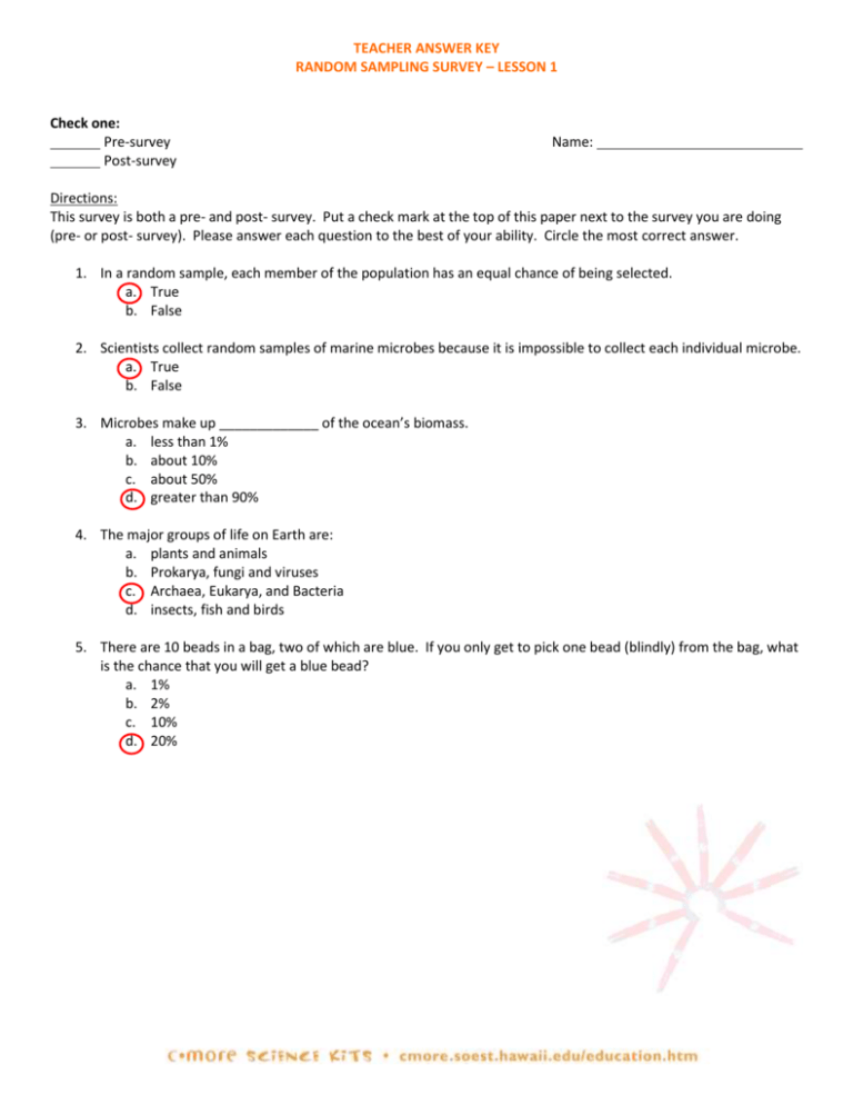
TEACHER ANSWER KEY RANDOM SAMPLING SURVEY – LESSON 1 Check one: Pre-survey Post-survey Name: Directions: This survey is both a pre- and post- survey. Put a check mark at the top of this paper next to the survey you are doing (pre- or post- survey). Please answer each question to the best of your ability. Circle the most correct answer. 1. In a random sample, each member of the population has an equal chance of being selected. a. True b. False 2. Scientists collect random samples of marine microbes because it is impossible to collect each individual microbe. a. True b. False 3. Microbes make up _____________ of the ocean’s biomass. a. less than 1% b. about 10% c. about 50% d. greater than 90% 4. The major groups of life on Earth are: a. plants and animals b. Prokarya, fungi and viruses c. Archaea, Eukarya, and Bacteria d. insects, fish and birds 5. There are 10 beads in a bag, two of which are blue. If you only get to pick one bead (blindly) from the bag, what is the chance that you will get a blue bead? a. 1% b. 2% c. 10% d. 20% TEACHER ANSWER KEY to STUDENT WORKSHEET Lesson 1: Which Microbe is the Most Abundant? HYPOTHESIS: The most abundant type of microbe (bead) in the ocean (bag) is bacteria (answers will vary). DATA COLLECTION: TABLE 1 (SAMPLE DATA) – Answers will vary Table 1. Microbe Abundance, Based on a Sample of 40 1 A Student B C Coccolithophore Cyanobacteria (Blue) (Green) 1 0 2 0 3 1 0 6 2 Joshua 3 Kyle 4 Joe 5 Malia 6 7 8 9 10 11 Group Total 6 7 12 Group % 15 % 18 % **Sum of percentages exceeds 100% due to rounding error D Archaea (Pink) 2 3 0 0 E Diatom (Purple) 0 1 0 0 F Bacteria (Red) 3 2 4 2 G Virus (White) 4 2 2 2 H Total 5 13 % 1 3% 11 28 % 10 25 % 40 102%** 10 10 10 10 DATA COLLECTION: TABLE 2 (POPULATION DATA) – All groups should have the same answers. Table 2. Microbe Abundance in the Ocean A 1 2 3 Population Total Population % B C Coccolithophore Cyanobacteria (Blue) (Green) 24 45 8% 15 % D Archaea (Pink) 45 15 % E Diatom (Purple) 6 2% F Bacteria (Red) 75 25 % G Virus (White) 105 35 % H Total 300 100 % 1. According to the data your group collected in Table 1, what are the two most abundant types of microbes? Answers will vary by group. Check for consistency within each group. Reach a consensus with the class on how to handle ties. For sample data shown in Table 1 above: Species #1: Bacteria Percentage = 28 % Species #2: Virus Percentage = 25 % 2. According to the sample data that you personally collected in Table 1, what are the two most abundant types of microbes? Answers will vary by student. Check that students calculated percentages correctly. (Hint: To calculate the percentage of each type of “microbe” (bead) that was collected individually by a student, have the student divide the number of microbes of each color that they personally collected by 10, then multiply by 100%. For Malia (in Table 1 above): Species #1: Cyanobacteria Percentage = 60 % Species #2: Bacteria & Virus (tie) Percentage = 20 % 3. What are the two most abundant types of microbes in the ocean (Table 2)? Answers should not vary by group, unless objects have been lost or miscounted. Species #1: Virus Percentage = 35 % Species #2: Bacteria Percentage = 25 % 4. Using the STUDENT READING—Lesson 1: Introduction to Marine Microbes, list one interesting fact about each of the two most common microbes found in the ocean (Table 2). Answers will vary. Microbe #1: Up to 10 billion viruses can be found in a single liter of seawater. Microbe #2: Bacteria are beneficial because they recycle nutrients. 5. How did the data from your individual sample (question 2) and your group’s sample (question 1) compare with the data for the total population (question 3)? Is this what you would expect? Why? Answers will vary. Generally (but not always!), the population will be more closely approximated by the larger group sample than by an individual student’s sample. 6. How did you ensure that your sampling was random and not biased toward collecting any one type of microbe? Main reasons are that students selected their samples without looking (so they didn’t choose their favorite colors) and the objects were identical in shape, size, and weight (so each was equally likely to be selected). Also, each student poured their samples back into the bag before collecting the next sample so the population remained constant*. Students also mixed the objects before randomly selecting their ten objects. *Note: The experimental design isn’t perfect! To improve the experiment, each student could replace each item before selecting the next item (rather than returning all 10 items at once). 7. How could scientists estimate the relative abundance of microbes in the ocean off Ala Moana Beach Park? They simply need to take a representative random sample. Since most microbes are invisible, a good way to do this would be to take a random sample of sea water, analyze it for microbial species (e.g., by using a powerful microscope), and then use that information to extrapolate the abundance of microbes in a particular environment. There are also more modern, “high-tech” techniques to identify microbes such as DNA analysis and flow cytometry. Remember, a liter of sea water contains billions of microbes. For more information on microbes, visit the C-MORE website (http://cmore.soest.hawaii.edu). TEACHER ANSWER KEY to STUDENT WORKSHEET Lesson 3: Testing Hypotheses with Statistics 1. Fill in Table 1 below with the observed frequency (O) for the actual sample of 100 M&M’s and the expected frequency (E) that Mars, Inc. claims to manufacture for each candy color. To help you get started, the observed frequency of the brown candies is 33, while the expected frequency is 30. Complete the data table below for all colors, and give a descriptive title to the table. Table 1. Expected vs. Observed Color Distribution for M&M’s Brown Yellow Red Observed frequency (O) 33 26 21 Expected frequency (E) 30 20 20 Orange 8 10 Green 7 10 Blue 5 10 2. In order to visualize these data, make a bar chart or histogram to compare the observed vs. expected frequencies. Use one color for the observed values and another color for the expected values. Label your axes and give the graph a title. If you have computer access, you may do this in Microsoft Excel. To create this graph in Excel, have students recreate Table 1 (above) in an Excel spreadsheet. Highlight all the columns in the table, and follow the steps under MAKING AN EXCEL GRAPH in STUDENT INSTRUCTIONS – Lesson 2: Introduction to Excel. Start with step #4 for Excel 2003 or step #3 for Excel 2007. Charts will vary (for an example, see below). Expected ColorDistribution Distributionfor for Expectedvs. vs.Observed Observed Color M&M's (based M&M’s (basedon onaasample sample of of 100) 100) Percentage 35 30 25 20 Observed 15 Expected 10 5 0 Brown Yellow Red Orange Green Blue Color ColorofofM&M’s M&M's 3. How similar are the observed and expected frequencies? Do you think the Goodness-of-Fit test will reveal that the observed sample data supports the company’s claim? Answers will vary. Once students gain experience conducting statistical tests, they will realize that these values are actually quite similar (considering the relatively small sample size of 100), which suggests the Goodness-of-Fit test will support the company’s claim. 4. Writing Statistical Hypotheses a. Write a null hypothesis to test the claim that Mars, Inc. is making for the color distribution of M&M’s. Remember the null hypothesis is what you are attempting to prove or disprove and that it must be expressed in terms of equality. The first part of the null hypothesis is written for you; complete the rest. Let P= the population proportion of a given color H0: Pbrown = 30% and Pyellow = 20% and Pred = 20% and Porange = 10% and Pgreen = 10% and Pblue= 10% b. Write the alternate hypothesis. This is the hypothesis that must be true whenever the null hypothesis is false. H1: At least one of the above proportions is different from the claimed value. 5. Write out the formula for the Chi-Square Test Statistic and define all terms. (O E ) E 2 2 where = the chi-squared test statistic ∑ = the symbol for taking a sum O = observed value E = expected value 6. Calculate and fill in the values in Table 2. Brown is already done, as an example. Table 2. Goodness-of-Fit Test Calculations for a Sample of 100 M&M’s Color Observed Expected Category Frequency (O) Frequency (E) O-E Brown 33 30 3 Yellow 26 20 6 Red 21 20 1 Orange 8 10 -2 Green 7 10 -3 Blue 5 10 -5 (O-E) 9 36 1 4 9 25 2 (O-E)2 E 0.30 1.80 0.05 0.40 0.90 2.50 7. Use your answers to Questions 5 & 6 above to calculate the 2 test statistic. 2 test statistic = 5.95 (which is the sum of all values in the far-right column of Table 2) 8. Now that we have determined the 2 test statistic, we want to compare this value to the critical 2 value. To do this, we will need to know the degrees of freedom. a. Degrees of Freedom = 5 b. How did you determine the number of degrees of freedom? The number of degrees of freedom is one less than the number of categories 9. Using the degrees of freedom determined above and the 0.05 significance level, look up the critical 2 value on a Table of Chi-Square Probabilities (an abbreviated version of this table, up to df=10, is given below). Table 3. Table of Chi-Square Probabilities df 1 2 3 4 5 6 7 8 9 10 0.10 2.706 4.605 6.251 7.779 9.236 10.645 12.017 13.362 14.684 15.987 0.05 3.841 5.991 7.815 9.488 11.070 12.592 14.067 15.507 16.919 18.307 0.025 5.024 7.378 9.348 11.143 12.833 14.449 16.013 17.535 19.023 20.483 0.01 6.635 9.210 11.345 13.277 15.086 16.812 18.475 20.090 21.666 23.209 significance levels Critical Value of 2 = 11.070 10. Compare the 2 test statistic to the critical value, and circle the correct answers below: The 2 test statistic is (larger, smaller) than the critical value, so we (reject, do not reject) the null hypothesis. 11. Interpret your results. The color distribution of our sample of M&M’s, although not exactly the same as that claimed by the manufacturer, is sufficiently close to support the manufacturer’s claim. The small differences are within the range of what is expected. (Note: these results are based on the 0.05 significance level).
