Supplementary Material Simulation of tropical cyclone impacts to the
advertisement
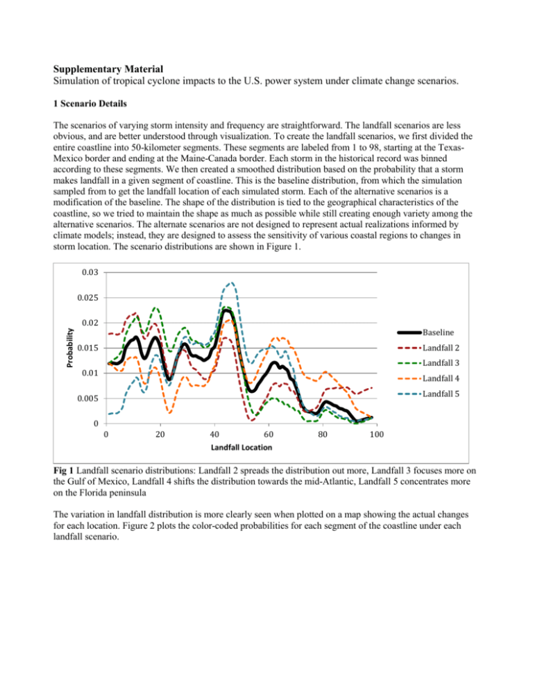
Supplementary Material Simulation of tropical cyclone impacts to the U.S. power system under climate change scenarios. 1 Scenario Details The scenarios of varying storm intensity and frequency are straightforward. The landfall scenarios are less obvious, and are better understood through visualization. To create the landfall scenarios, we first divided the entire coastline into 50-kilometer segments. These segments are labeled from 1 to 98, starting at the TexasMexico border and ending at the Maine-Canada border. Each storm in the historical record was binned according to these segments. We then created a smoothed distribution based on the probability that a storm makes landfall in a given segment of coastline. This is the baseline distribution, from which the simulation sampled from to get the landfall location of each simulated storm. Each of the alternative scenarios is a modification of the baseline. The shape of the distribution is tied to the geographical characteristics of the coastline, so we tried to maintain the shape as much as possible while still creating enough variety among the alternative scenarios. The alternate scenarios are not designed to represent actual realizations informed by climate models; instead, they are designed to assess the sensitivity of various coastal regions to changes in storm location. The scenario distributions are shown in Figure 1. 0.03 0.025 Probability 0.02 Baseline Landfall 2 0.015 Landfall 3 0.01 Landfall 4 Landfall 5 0.005 0 0 20 40 60 Landfall Location 80 100 Fig 1 Landfall scenario distributions: Landfall 2 spreads the distribution out more, Landfall 3 focuses more on the Gulf of Mexico, Landfall 4 shifts the distribution towards the mid-Atlantic, Landfall 5 concentrates more on the Florida peninsula The variation in landfall distribution is more clearly seen when plotted on a map showing the actual changes for each location. Figure 2 plots the color-coded probabilities for each segment of the coastline under each landfall scenario. Baseline Landfall 2 Landfall 4 Landfall 5 Landfall 3 0.030 0.027 0.024 0.021 0.018 0.015 0.012 0.009 0.006 0.003 0.000 Fig 2 Mapped landfall scenarios, with red showing the highest probabilities of a virtual storm making landfall in that stretch of coastline. Probabilities are annual probabilities of landfall in each segment. 2 Detailed Results The impacts of tropical cyclones in the U.S. are not felt equally in all areas. Some areas are more prone to damage than others, and, while the level of impact may change, the spatial trends remain consistent in the scenarios of varying storm intensity and frequency. Scenarios of varying intensity, as expected, strongly impact the maximum wind speeds and fraction of customers without power. In contrast, scenarios of varying frequency do not result in large changes in 100-year wind speed or fraction out, but they do have large impacts on the probability of outages. Scenarios of varying landfall distributions, in contrast to intensity and frequency, result in changes to the location of impacts. The changes in wind speed and fraction out are subtle, but the probability of outages shifts noticeably as the landfall probability distribution shifts. For the five metropolitan areas presented in the paper, the changes are not felt equally. Coastal areas in hurricane-prone areas are sensitive to changes in storm intensity and frequency. Inland areas and regions not typically prone to hurricanes are less sensitive to these changes, and the range of impact is not as high. The worst impacts in terms of both wind speeds and fraction of customers without power occurs for the scenarios with a 40% increase in storm intensity (the highest intensity evaluated). The annual probability of power outages, however, sees the greatest increase as storm frequency increases. For changes in landfall, the resulting impacts depend on the landfall scenario and the area of interest. Washington DC, for example, sees shifts in impacts as the probability of landfall in that region shifts. The outage probability changes significantly, but the changes in wind speed and fraction of customers out are still dominated by the storm intensity. Fig 3 Annual probability of at least 10% of customers without power for metropolitan areas for scenarios of varying storm frequency Fig 4 100-year wind speed plotted for metropolitan areas for scenarios of varying storm intensity Fig 5 100-year fraction of customers without power for metropolitan areas for scenarios of varying storm intensity 3 Overall Impacts We also examine the parameters that are most important when assessing the overall expected impact on the entire U.S., regardless of the local changes. Figures 6 and 7 plot the empirical cumulative distributions for both the 100-year wind speed and the 100-year fraction of customers without power. These are not strictly probability distributions. Rather, they are an exceedance plot – the fraction of census tracts that exceed a given wind speed or fraction without power. The estimated density is shown in the inset of each plot. These plots show how much the impacts change as we vary storm intensity, frequency, and landfall location. In the case of both 100-year wind speed and 100-year fraction of customers without power, changes in intensity cause the largest shifts in the empirical distributions. For wind speed in Figure 6(a), the distribution shifts to the right as storm intensity increases. This results in larger probabilities of seeing higher wind speeds. The shifts are significant; for example, the percentage of census tracts with the 100-year wind speed falling below 60 m/s is almost 100% in the baseline case. When the intensity is increased to a factor of 1.4, that percentage drops to 70%. The changes in frequency (lambda) and landfall do not result in such drastic shifts in the distributions; all scenarios are fairly tightly grouped, with only small deviations. Varying frequency and landfall location can result in large changes to some local areas, but the overall impact is not as large as it is for changes in intensity. Similar results appear in the plots of 100-year fraction of customers without power, shown in Figure 7. Again, changes in intensity result in substantial shifts in the distributions. Looking at the inset density plot in Figure 7(a), for example, the increasing intensity results in the appearance of an increasingly large spike for 100% of customers without power. This shows that for the 100-year storm, the probability of a given census tract losing power completely rises sharply as storm intensity increases. The empirical CDF’s show that for the baseline case, the percentage of census tracts with a fraction out of less than 0.6 is about 70%. This goes down to just under 50% when the intensity factor is increased to 1.4. The likelihood of having a large fraction of customers without power rises substantially as the storm intensity increases. (a) (b) (c) Fig 6 Empirical CDF’s and inset density plots for the 100-year wind speed for changes in (a) intensity, (b) frequency, and (c) landfall location. (a) (b) (c) Fig 7 Empirical CDF’s and inset density plots for the 100-year fraction of customers without power for changes in (a) intensity, (b) frequency, and (c) landfall location.
