AP Studio Art - Frisco ISD Schools
advertisement
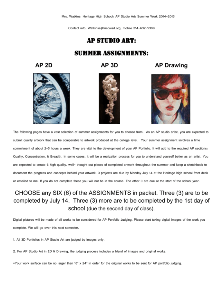
Mrs. Watkins: Heritage High School: AP Studio Art: Summer Work 2014-2015 Contact info; Watkinss@friscoisd.org, mobile 214-632-5399 AP STUDIO ART: SUMMER ASSIGNMENTS: AP 2D AP 3D AP Drawing The following pages have a vast selection of summer assignments for you to choose from. As an AP studio artist, you are expected to submit quality artwork that can be comparable to artwork produced at the college level. Your summer assignment involves a time commitment of about 2-5 hours a week. They are vital to the development of your AP Portfolio. It will add to the required AP sections: Quality, Concentration, & Breadth. In some cases, it will be a realization process for you to understand yourself better as an artist. You are expected to create 6 high quality, well- thought out pieces of completed artwork throughout the summer and keep a sketchbook to document the progress and concepts behind your artwork. 3 projects are due by Monday July 14 at the Heritage high school front desk or emailed to me. If you do not complete these you will not be in the course. The other 3 are due at the start of the school year. CHOOSE any SIX (6) of the ASSIGNMENTS in packet. Three (3) are to be completed by July 14. Three (3) more are to be completed by the 1st day of school (due the second day of class). Digital pictures will be made of all works to be considered for AP Portfolio Judging. Please start taking digital images of the work you complete. We will go over this next semester. 1. All 3D Portfolios in AP Studio Art are judged by images only. 2. For AP Studio Art in 2D & Drawing, the judging process includes a blend of images and original works. *Your work surface can be no larger than 18” x 24” in order for the original works to be sent for AP portfolio judging. For more details about AP Studio Art Requirements, please see: http://apcentral.collegeboard.com/apc/public/exam/exam_information/index.html http://apcentral.collegeboard.com/apc/members/exam/exam_information/2134.html 1. PORTRAIT / FIGURE CHOICES: A. PORTRAIT: METAMORPHASIS! Step 1. BRAINSTORM WITH LISTS: If you could be anything or anyone in the world, who or what would you be? List 10 things you would change into and the reasons for your choices. Step 2. PHOTOGRAPH YOURSELF & WHAT YOU’D CHANGE INTO. Get a total of 24 shots of yourself and the object/person you would like to change into. It can be any combination. You can use a tripod and/or get help from a friend to shoot self-portraits. Remember that you will need to get a signed release form from the photographer, if it is not yours, and that you are not to use copy written images from the internet or books (AP guidelines are strict.) Step 3. EXAMINE THE PHOTOGRAPHS FOR TRANSITION: Set aside 6 – 8 strong candidates that show transition without strong jumps. These will be the basis for a collage or sequence showing the transition. Step 4. CREATE SIX SMOOTH TRANSITIONAL STEPS TO SHOW FINAL METAMORPHASIS. *What media do you feel comfortable in making the changes to these shots? *(Will photoshop be an appropriate choice for you to blend some of the images, distort them or tweak the color? *Do you need to use the photocopier as a tool to lighten or darken them, shrink them, enlarge them, or blur them? *Do you need to touch them up with pencil to strengthen the sequence of change. *Do you need to tear and collage the images together add watercolor, oils, tempera, or acrylic. Step 5. FINAL WORK WILL BE EITHER A SEQUENCE OF IMAGES OR A COLLAGE IMAGE. Size will vary but likely include 3 to 5, 8x10 digital images, or a 14 x 17 or 18 x 24 mixed media work. B. PORTRAIT: IMAGE MAKEOVER! Step 1. BRAINSTORM WITH A CAMERA FOR IDEAS: In photography, you are always dealing with a defined format that you compose from within. Many times, it is not the subject that makes the photograph interesting, but the compositional choices the photographer has made. Choose a simple, neutral background/ backdrop (black, white, grey, or tan) for you to photograph someone’s head 24 times. You may include one hand. Take one boring shot that captures the whole face frontally as a “before” example. Then strive to make each of the 23 shots completely different and interesting. ? It may help to explore composition with a paper view finder first to examine the possibilities available, before you photograph the person. Vary the poses by changing the face’s position and scale. relationship to the edge, degree of cropping (near…far), vantage point (photographed from high… low), etc. How do these changes of scale, cropping, and vantage points affect how others perceive this portrait? Step 2. LOOK FOR A UNIFYING THEME: Print out the 24 photos as “source material”. These can be thumbnail size. Examine them and ask yourself… What relationships do I see by putting one next to the other? Where is the visual weight in each photo? What variations in scale do I see? Where is the viewer being positioned? What tone or mood is being set? You may manipulate the photos after developing them in any way that you want: crop them, scan them in, and duplicate them, photocopy them for repetition, add drawn elements to them. Remember that visual unity extends to material choice. That means that you can use pencil, oil paint, acrylic paint, water color, ink, colored pencils, chalk pastels, charcoal, collage materials, etc.. I would keep the number of media used to a minimum, not mixing too many elements. For surface unity, you may consider scanning in the final product and printing it (use thicker stock). You must use at least three photographs in your final piece. Step 3. CREATE the FINAL PORTRAIT. The presentation of the piece and the format is your design decision. Some options are: *PRESENTING AS PROGRESSION. (2D) You may approach your portraits as a progression, placing three or more in a sequence that either implied movement or takes advantage of contrast, various angles, or scale shifts. Or possibly arrange them in a grid instead of a line. Think about spacing. Should there be room between each piece or not? If so, how much? Also consider the size of you outside borders. *PRESENTING INDIVIDUALLY. (2D or 3D) Sometimes the pieces (like the shapes in your progression) improve significantly when combined with others. Other times a singular photo seems a complete composition or idea in itself; therefore, another option is to mount each photo (minimum of three) individually. Remember that they will still be perceived as a unit, and therefore must have some synergy between them. You may mount them, create a three-dimensional cube, make them into a book of some sort, create a playing card deck complete with a storage box. Be inventive, without letting the presentation itself overpower the images. You should strive for a mutually beneficial relationship between the image and the presentation. *PRESENTING AS A COLLAGE. (2D) You may approach the photos as source material for a collage. Think of the portrait as shape and investigate the same principles of design previously discussed: overall unity, areas of visual dominance, moments of contrast and tension, and shape relationships to each other and to the format edge. The format may be square, rectangular or anything you prefer. *PRESENTING AS A RELIEF. (3D) Use foam core and the portrait images to build up the surface up with at least three portraits interacting with one another. Faces can be applied to the foam core with rubber cement. Other material that breaks the surface can be added as well, such as jewelry, guitar strings, fabric. etc. C. PORTRAIT: CONCEPTS for 2D &/or DRAWING: All pencil, colored pencil, charcoal, or pastel drawings must use a 10 point value scale with a wide range of strong darks and lights. Strong lighting can be used to achieve this dramatic effect. *Self-portrait with at least 5 distinct changes in expression. (2Dor Draw.) *Draw the person using an arrangement of drawings on one page that range from the whole body to blow-ups of small details. (2D or Draw.) *Draw from unusual angles, so that significant changes in form take place due to foreshortening. (2D or Draw.) *Draw a face created by clumping together vegetables. See the work of the artist: Arcimbolo. (2D or Draw.) *Experiment with Lighting: hold a flashlight to create dramatic shading- great contrasts in light or dark. (2D or Draw.) *Integrate a particular person’s face into a pattern or design. (2D or Draw.) * Using markers, prismacolors, oil pastels or some other color drawing material, draw the same portrait twice, but use two different color schemes. (ie: warm, cool, monochromatic, analogous, primary or secondary.) (2D) *Graph sections of the portrait and color or shade only certain sections. (2D or Draw.) *Draw a portrait using only directional (all strokes going in the same direction.) or vertical strokes. See the work of Renaissance artists like Michelangelo or Leonardo DaVinci. (2D or Draw.) *Create a portrait starting with the background first. Use toned paper, newspaper or magazines, and gesso, then drybrush ink onto the surface to create details. (2D) *Draw a portrait with hands involved: brushing hair, reading a book, sitting on a chair backwards with the hands in front. (2D or Draw.) *Use the portrait to make a comment on society by including appropriate background or other figures. (2D or Draw.) *Portrait emerging from robes or wrapping. (2D or Draw.) D. 3D SELF-PORTRAIT: (3D) Using a styrofoam head, mask, or plastic doll or similar items as your base, embellish the form with found objects to make a statement about you. You can sand away painted details from the original form and/or spray paint them, add shoe polish, or nail polish. Add your own details with paint, paper, beads, zippers, your favorite old clothing (fabric scraps), buttons, bottle caps, human hair, wire, chicken or turkey bones, rubber bands, balloons, etc.. Consider themes such as dimensions of your character and personality or even your five senses. Build an appropriate environment or pedestal for it where your 3D self portrait would live or where it would be displayed. The use of a single word, quote, or journal entry may add to the display. E. CERAMIC MODEL FIGURE: (3D) The medium of clay can be used as a carving material. Use sculpture mix clay with a lot of grog to create a portrait. It can be built over newspapers to make it less dense. Take careful care of it. We can fire it when you bring it to school. 2. STILL LIFE CHOICES: A. SEE PORTRAIT CHOICES: A. Portrait: Metamorphosis! & B. Portrait: Image Makeover! With both of these assignments, still life objects can be substituted instead of a portrait. B. TOOLS & HARDWARE. (2D or Draw.) Make a rendering of tools and hardware. Arrange the objects to create an engaging composition. Stress the mechanical and artificial qualities of the objects. Augment the lighting to create maximum contrast and high shine areas. Explore the smallest detail of each object. Use white paper with permanent marker (scribble line, stippling, or cross hatching) C. LIQUID AS DESIGN. (2D or Draw.) Taking Motivation from any liquid form, create a composition, which demonstrates the scientific characteristics of liquid; flowing, dripping, puddles, pouring. Be sure to make the liquid element dominate the composition. Do not allow containers or other items to crowd the setting. Use dark color paper with any color media. D. SHINING STILL LIFE, with emphasis on REFLECTION.(2D or Draw.) Choose five to seven objects, of which at least two of them have a highly polished surface. The relationship among objects should be a serious consideration in this drawing. The surface treatment of each object will appear stronger if the objects chosen have different surface textures. Use grey and white paper with black and white medium. E. BOTTLE & CONTAINERS, with emphasis on Value. (2D or Draw.) Group several different sizes and heights of bottles and containers on a shelf or counter top. Draw them as a congregation of people. Give each one of them equal amounts of attention. Convey volume by using a complete range of tonal changes from deep-deep up to the pure whiteness of the paper. Place one or two of them in front of the others to give a sense of space. Ebony pencil with 10 point value scale. 3. LANDSCAPE/ VEGETATION/ NATURE CHOICES: A. DRAWING OF VEGETATION. (2D or Draw.) This drawing should make a close investigation of the structure of vegetation. Color variation is an important element to stress. Placement on the page and rendering are also principles to be employed. Use colored chalk pastels or colored pencils. Colored paper may enable a greater amount of success. B. LANDSCAPE COLLAGE. (2D) Make a collage of a landscape, which has a wooded scene, flowers, and foliage. Cut and tear papers of various textures and colors to create a sense of dimension. Use shadow areas. These papers could consist of magazine color swatches, sections of sample water paintings, wallpaper, or photographs you’ve taken. C. POTTED PLANT or GARDEN PLANT: (2D or Draw.) Make a detailed drawing of a plant (living or artificial). Grade the tonal differences between the leaves, which are above or on top of others. Make it obvious that some parts of the plant are in shadows created by those parts which are receiving more direct light. This drawing must touch three edges of the page. Medium: Ebony Pencil, Colored pencils, chalk pastels, permanent marker using stippling, scribble line, or cross hatching with watercolor accents. D. MECHANICAL IMITATION of NATURE. (3D) Create an item from nature using very constructive, manmade materials. Examples: flowers made of metal bolts, and nails, an animal constructed with computer parts, a human figure made of glass bottles. It may be your desire to combine several small items to create an ensemble of sculptures. Height: 10” minimum excluding the base. E. SALAD COLLAGE - Fruit or Vegetable. (2D or 3D) Slice some vegetables or fruit in half. Examine the layers and curves and seeds that a pepper, an onion, a mushroom, an orange, a pomegranate, or apple might have. Create a collage using cut colored paper, or photocopies/scanned images of the slide items. Distort them, shrink them using the computer or photocopier. They can be hand-colored using Berol Prism color markers. To create a three-dimensional relief or sculpture, layers can be built up using foam core board and toothpicks to achieve strength and height. *Close ups and sections of these can also serve as studies and inspirations for enameled jewelry. F. LANDSCAPE SERIES- Same Spot-Different Time. (2D or Draw) Check out Claude Monet’s haystacks at: http://www.puc-rio.br/wm/paint/auth/monet/haystacks/ Why did Monet literally paint the same haystacks over and over again? He even begged the farmer who badly wanted to use the hay, not to move them. To under understand the beauty of color, reflection, and light, get up early and examine the colors of one outdoor object. It can be a shed, a compost pile, some bushes, Examine that same thing three hours later, then three hours later. Something that appeared black in the morning then can look purple, then blue, then gold. These changes can occur all in the same day, depending upon weather and seasonal conditions. Create series of at least three paintings or drawings of the same scene at different times of the day depicting the actual colors that moment. 4. ARCHITECTURE/ INTERIOR & EXTERIOR DESIGN/ PERSPECTIVE: A. STREET SCENE of Santa Rosa, Healdsburg, Sebastopol or Sonoma. (2D or Draw.) This drawing should contain at least 8-10 buildings in a receding perspective. The illusion of moving back into space is the goal of this assignment. Use one or two point perspective variables as guidelines to realistically align the buildings on the page. This drawing must be done on site.. B. INTERIOR SPACE. (2D or Draw.) Place yourself in the corner of an interior space. Create a composition which is made up of the things you find within the limited area of a room or hallway. Demonstrate the principles of balance and spatial movement within this area. Medium suggestions- Berol Prisma color Markers, cut paper, oil pastels, oil paint, colored pencils. C. FENCES & GATES: (2D or Draw.) Drawing fences and gates will help you apply and understand linear perspective. Position yourself so that a strong exaggeration of the contour lines occurs. Draw the characteristics of the fence/ gate as realistically as possible. Pay attention to joint areas and attachments. Ebony Pencils or Permanent Marker using scribble line, cross hatching or stippling. D. ARCHITECTURALLY INSPIRED JEWELRY OR CLAY SCULPTURE: (2D, 3D, Draw.) Design a series of earrings or clay sculpture that is inspired by an architectural element such as a hinge, a door, door knob, window, window latch, chair, a street lamp, or a metal window grate. Abstract the form, repeat the motif or element to create a whole new idea. E. ARCHITECTURAL MODEL: (3D) Re-establish a new community of buildings on a site of nine square blocks. Make the entire area as a unified community of buildings, which relate to each other. Use a formula for continuity in the color shape texture, and style of the buildings. Construct with mat board and other materials. This is to be no larger than 18”. 5. VISIT GALLERIES AND MUSEUMS: Visit and record and create in response to what you see. style of the artist or artists you see. A. Visit the Dallas museum of art in Dallas, Dallas Museum of Art 1717 North Harwood Dallas TX 75201 http://www.dallasmuseumofart.org/ B. Visit the Amon Carter Museum in Fort Worth 3501 Camp Bowie Boulevard Fort Worth, TX 76107-2631 817.738.1933 C. Visit the Modern Art Museum in Fort Worth Modern Art Museum of Fort Worth 3200 Darnell Street Fort Worth, Texas 76107 817.738.9215 D. Visit the Kimbell Art Museum in Fort Worth 3333 Camp Bowie Boulevard Fort Worth, Texas 76107-2792 Main: 817-332-8451 Create a work in the 6. Also think about your concentration: (series of an idea, projects that mostly use the same median’s and are clearly connected!) Make a list of at least five different ideas’s to base your concentration on. (Online has a lot of references) list of project ideas and possible thumbnails And enjoy the break! Summer will be over before you know it! Email me if you have any questions Watkinss@friscoisd.org The calendar of projects and due date will be giving out the first day of class.
