Project 2 - Color
advertisement
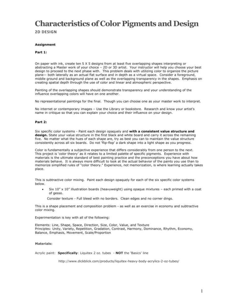
Characteristics of Color Pigments and Design 2D DESIGN Assignment Part 1: On paper with ink, create ten 5 X 5 designs from at least five overlapping shapes interpreting or abstracting a Master work of your choice – 2D or 3D artist. Your instructor will help you choose your best design to proceed to the next phase with. This problem deals with utilizing color to organize the picture plane— both laterally as an actual flat surface and in depth as a virtual space. Consider a foreground, middle ground and background plane as well as the overlapping transparency in the shapes. Emphasis on creating spatial depth through the use of color and linear and atmospheric perspective. Painting of the overlapping shapes should demonstrate transparency and your understanding of the influence overlapping colors will have on one another. No representational paintings for the final. Though you can choose one as your master work to interpret. No internet or contemporary images – Use the Library or bookstore. Research and know your artist’s name in critique so that you can explain your choice and their influence on your design. Part 2: Six specific color systems - Paint each design opaquely and with a consistent value structure and design. State your value structure in the first black and white board and carry it across the remaining five. No matter what the hues of each shape are, try as best you can to maintain the value structure consistently across all six boards. Do not ‘flip-flop’ a dark shape into a light shape as you progress. Color is fundamentally a subjective experience that differs considerably from one person to the next. This project is ‘color theory’ as it relates to a limited palette of specific pigments. Experience with materials is the ultimate standard of best painting practice and the preconceptions you have about how materials behave. It is always more difficult to look at the actual behavior of the paints you use than to memorize simplified rules of "color theory." Experience, not memorization, is where learning actually takes place. This is subtractive color mixing. Paint each design opaquely for each of the six specific color systems below. Six 10” x 10” illustration boards (heavyweight) using opaque mixtures – each primed with a coat of gesso. Consider texture - Full bleed with no borders. Clean edges and no corner dings. This is a shape placement and composition problem - as well as an exercise in economy and subtractive color mixing. Experimentation is key with all of the following: Elements: Line, Shape, Space, Direction, Size, Color, Value, and Texture Principles: Unity, Variety, Repetition, Gradation, Contrast, Harmony, Dominance, Rhythm, Economy, Balance, Emphasis, Movement, Scale/Proportion Materials: Acrylic paint: Specifically: Liquitex 2 oz. tubes - NOT the ‘Basics’ line http://www.dickblick.com/products/liquitex-heavy-body-acrylics-2-oz-tubes/ 1 Cadmium yellow light ACRA (or Quinacridone) magenta (PR 122) Pthalo blue – or the ‘green shade’ Titanium white Ivory black Acrylic Brushes – ½" - 1" flats and at least #8 rounds – bigger the better) Acrylic Gesso - at least 8 oz. http://www.dickblick.com/products/liquitex-acrylic-gessos/ Vocabulary + Reading: Chapters 4,5,6,7,8 Opacity, linear perspective, atmospheric perspective, transparency, overlap, proportion, emphasis, unity, balance, gestalt To describe a color - three basic properties have been designated to identify the qualities of color: 1) hue, the name of a color; (for example RED) 2) value, the degree of lightness or darkness in a color, can be expressed by shades, tints, and tones; 3) chroma (saturation or intensity), the degree of purity or strength of a color (hue) or how bright or muted the colors are. For example, an intense red is one that is a very strong, pure red color. When a lighter or darker color is added to a color, the intensity will be less bright. Tint - Hue + White (will lighten the color) Tone - Hue + small amount complement (tones lose chroma) Shade – Hue + Black Focus of Crit: Originality of concept, execution, and abstraction of the master work you selected Paint mixing/handling – No mud Understanding color fundamentals Design elements and principles Craftsmanship Avoid ‘paint by numbers’ Inspiration to scratch the surface: Joan Miró, Cubism, Futurism, Picasso, Tamara de Lempicka, Henri de Toulouse-Lautrec, Manet, Cezanne, Paul Gauguin, Vincent Van Gogh, Francis Bacon, Michelangelo, Johannes Itten 2 Student examples >>> 3 4 5
