World Census Population Comparison
advertisement
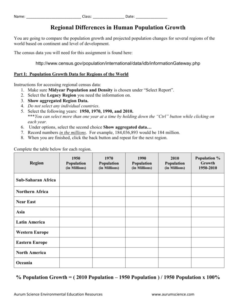
Name: __________________________ Class: _______________ Date: _______________ Regional Differences in Human Population Growth You are going to compare the population growth and projected population changes for several regions of the world based on continent and level of development. The census data you will need for this assignment is found here: http://www.census.gov/population/international/data/idb/informationGateway.php Part I: Population Growth Data for Regions of the World Instructions for accessing regional census data: 1. Make sure Midyear Population and Density is chosen under “Select Report”. 2. Select the Legacy Region you need the information on. 3. Show aggregated Region Data. 4. Do not select any individual countries. 5. Select the following years: 1950, 1970, 1990, and 2010. ***You can select more than one year at a time by holding down the “Ctrl” button while clicking on each year. 6. Under options, select the second choice Show aggregated data… 7. Record numbers in the millions. For example, 184,036,893 would be 184 million. 8. When you are finished, click the back button and repeat for the next region. Complete the table below for each region. Region 1950 Population 1970 Population 1990 Population 2010 Population (in Millions) (in Millions) (in Millions) (in Millions) Population % Growth 1950-2010 Sub-Saharan Africa Northern Africa Near East Asia Latin America Western Europe Eastern Europe North America Oceania % Population Growth = ( 2010 Population – 1950 Population ) / 1950 Population x 100% Aurum Science Environmental Education Resources www.aurumscience.com Part II: Defining Geographic Regions Each legacy region defined by the Census.gov website is composed of specific defined countries. Use this partial list of countries as a guide to define each region on the map on the following page. Sub-Saharan Africa Mauritania Mali Niger Chad Sudan Eritrea Somalia South Africa Madagascar Northern Africa Morocco Algeria Libya Egypt Tunisia Western Sahara Near East Turkey Cyprus Yemen Oman Iran Israel Jordan Kuwait Asia Afghanistan China Pakistan Mongolia Japan Indonesia Vietnam India North Korea Western Europe Portugal United Kingdom Germany Greece Finland Iceland Austria Italy Eastern Europe Bulgaria Romania Poland Czech Republic Hungary Slovakia Slovenia Croatia Albania North America Canada United States Mexico Greenland Latin America Guatemala Cuba Belize Brazil Argentina Chile Peru Venezuela Oceania Australia New Zealand The world was divided by the census data website into nine different regions: Sub-Saharan Africa, Northern Africa, Near East, Asia, Latin America, Western Europe, Eastern Europe, Oceania, and North America. Using the map below, label each of the regions. Using the key below, color code the map according to percentage growth from 1950-2010. Key: [ ] Less than 50% [ ] 50-100% [ ] 100-150% Aurum Science Environmental Education Resources [ ] 150-200% [ ] 200-250% www.aurumscience.com [ ] 250-300% [ ] 300% and higher Part III: Comparing Growth Rates of Each Region Using the grid below, create a line graph that shows how the population of each region changed from 1950 up through 2010. Put the year along the x-axis, and the population along the y-axis. Use a different color for each line. Include a key at the bottom of the page. Part IV: Conclusion and Analysis 1. Which region has the highest current population? 2. Which region has experienced the greatest population growth from 1950-2010? Would you consider this to be a developed or developing region? 3. Which region has experienced the lowest population growth from 1950-2010? Would you consider this to be a developed or developing region? 4. Use what you know about developed and developing regions to hypothesize why there is such a big difference in growth rate between the region from question #2 and question #3. 5. Do any of the regions show a decline in population growth rate from 1950-2010? (Look at the line graphs you made). Hypothesize what could be happening in this region that would slow down growth rates.
