Cartography Guidelines - International Geography Olympiad
advertisement

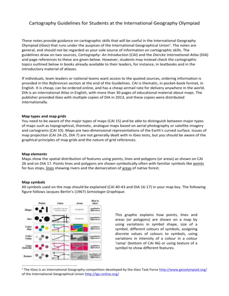
Cartography Guidelines for Students at the International Geography Olympiad These notes provide guidance on cartographic skills that will be useful in the International Geography Olympiad (iGeo) that runs under the auspices of the International Geographical Union1. The notes are general, and should not be regarded as your sole source of information on cartographic skills. The guidelines draw on two sources, Cartography: An Introduction (CAI) and the Diercke International Atlas (DIA) and page references to these are given below. However, students may instead check the cartographic topics outlined below in books already available to their leaders, for instance, in textbooks and in the introductory material of atlases. If individuals, team leaders or national teams want access to the quoted sources, ordering information is provided in the References section at the end of the Guidelines. CAI is thematic, in pocket-book format, in English. It is cheap, can be ordered online, and has a cheap airmail rate for delivery anywhere in the world. DIA is an international Atlas in English, with more than 30 pages of educational material about maps. The publisher provided iGeo with multiple copies of DIA in 2013, and these copies were distributed internationally. Map types and map grids You need to be aware of the major types of maps (CAI 15) and be able to distinguish between major types of maps such as topographical, thematic, analogue maps based on aerial photography or satellite imagery and cartograms (CAI 33). Maps are two-dimensional representations of the Earth’s curved surface. Issues of map projection (CAI 24-25, DIA 7) are not generally dealt with in iGeo tests, but you should be aware of the graphical principles of map grids and the nature of grid references. Map elements Maps show the spatial distribution of features using points, lines and polygons (or areas) as shown on CAI 26 and on DIA 17. Points lines and polygons are shown symbolically often with familiar symbols like points for bus stops, lines showing rivers and the demarcation of areas of native forest. Map symbols All symbols used on the map should be explained (CAI 40-43 and DIA 16-17) in your map key. The following figure follows Jacques Bertin’s (1967) Semiologie Graphique. This graphic explains how points, lines and areas (or polygons) are shown on a map by using variations in symbol shape, size of a symbol, different colours of symbols, assigning discrete values of colours to symbols, using variations in intensity of a colour in a colour ‘ramp’ (bottom of CAI 46) or using texture of a symbol to show different features. 1 The iGeo is an international Geography competition developed by the iGeo Task Force http://www.geoolympiad.org/ of the International Geographical Union http://igu-online.org/ Colour on Maps There are some ‘conventions’ around the use of colour on maps, as shown on the typical maps of CAI 16-17, 26 and 37 show. For example, water is generally shown as blue, and vegetated areas are often green. ‘Built up’ urban areas are often pink, brown or grey. The block diagrams on DIA 13 and 15 show the colours associated with variations in elevation on physical geography maps. In mapping for the iGeo it is useful to have a few coloured pencils in case you need to use colour shading to symbolise areas on the maps you make. Point data, where there are many (unnamed) locations shown, are generally black. Lines of transport are often red, grey or black, and the important consideration is the size of the symbol; where transport lines are too ‘heavy’, they can dominate the map unintentionally. Colour is an important part of maps in the iGeo; come to the tests with a few coloured pencils. Text on maps In the maps you will make at the iGeo, you will be expected to show the location of important features in the spaces you are mapping. Write legibly in black, with simple fonts and good judgement of font size; this is important in your mapping (CAI 48). You will be asked sometimes to ‘annotate’ your map. This means writing brief descriptive texts on parts of your map that show the distribution of features or activities you are mapping. For example, you could write “Most secondary infections of foot and mouth disease were sourced to this location”, “These are the primary routes of access to the market” or “Locations of multiple fumaroles”. Not all text needs to be written on the map itself; you may use text boxes in space adjacent to your map graphic and point to where the annotation applies. Map features and design The ability to select the features to be mapped is important, alongside the ability to generalise so that too much detail does not confuse the point of cartographic communication (CAI 22-23). The design needs to place the title, the map key and scale statement(s) appropriately (CAI 35) in relation to the map figure. Make the map graphic the focal point of the map, balance your map design by planning to leave no significant areas of ‘white space’ within the map border (CAI 53). Map key Map keys are sometimes called legends (CAI 56 – 57). The key should include all symbols shown on your map, grouping together symbols of particular classes of the distribution you are mapping. See the figure on the bottom of CAI 56. You may be asked to provide a ‘descriptive key’; this extends the purpose of the key to require not just the naming of the symbol shown but also a sentence that relates to the spatial distribution of the named feature. Map scale Map scale is an important concept to understand, from maps of small areas at a scale of 1:1,000 to about 1:10,000, to topographic maps sheets often at scales of 1:50,000, through to national mapping series at 1:6,000,000 for example (DIA 6,7). Ratio statements are explained on CAI 21, along with the type of scale used most frequently in student maps, the bar scale. Sketch maps often express scale through a statement like “Scale: 1:5,000 approximately”. Map conventions When making maps in the iGEO, you should follow map conventions (CAI 52) where possible. As a guide, you should include most of the following items in addition to the map graphic. A clear and descriptive title (see maps of the Tatra Mountains on DIA 12 and 13, for example). A key that shows and explains all the symbols used on the map (see the map of Stasbourg on DIA 9, for example) An orientation symbol, such as a North arrow; particularly important if North is not to the top of the page. See DIA, panel 2, on page 6. An acknowledgement of data sources. The date of data collection is often important. The sources of map information are given on CAI 62-63 and DIA 225. A scale statement such as a scale bar as shown on CAI 21 and DIA 8. A border or frame if this is appropriate. An explanatory statement about the map, if appropriate. See the four notes associated with the maps of the development of Strasbourg (DIA 10). Map templates In the iGeo, map templates are sometimes used to provide you with an indication of the area that you are asked to map. Generally, they show only key features. Map support Maps are often supported by a number of different types of geographical diagrams. You are expected to be familiar with block diagrams, cross sections, pie charts, bar graphs and histograms, (time) line graphs and population pyramids. Examples of some of these forms of graphic are illustrated on DIA 25. References Darkes, G and Spence, S. (2008) Cartography: An Introduction. The British Cartographical Society, London. (ISBN 978-0-904482-23-2) This text is available on order from http://www.cartography.org.uk/default.asp?contentID=989 Michael, T. (2010) Diercke international atlas: geography, history, economics, politics, sciences; for use in bilingual classes and in English lessons. Westermann, Germany. (ISBN 978-3-14-100790-9) Order from http://www.diercke.com/contact.xtp Customer service from olp@schulbuchzentrum-online.de


