Line of Best Fit Guided Practice
Lesson: Guided Practice for Line of Best Fit
Example One: STEM Connection-Biology
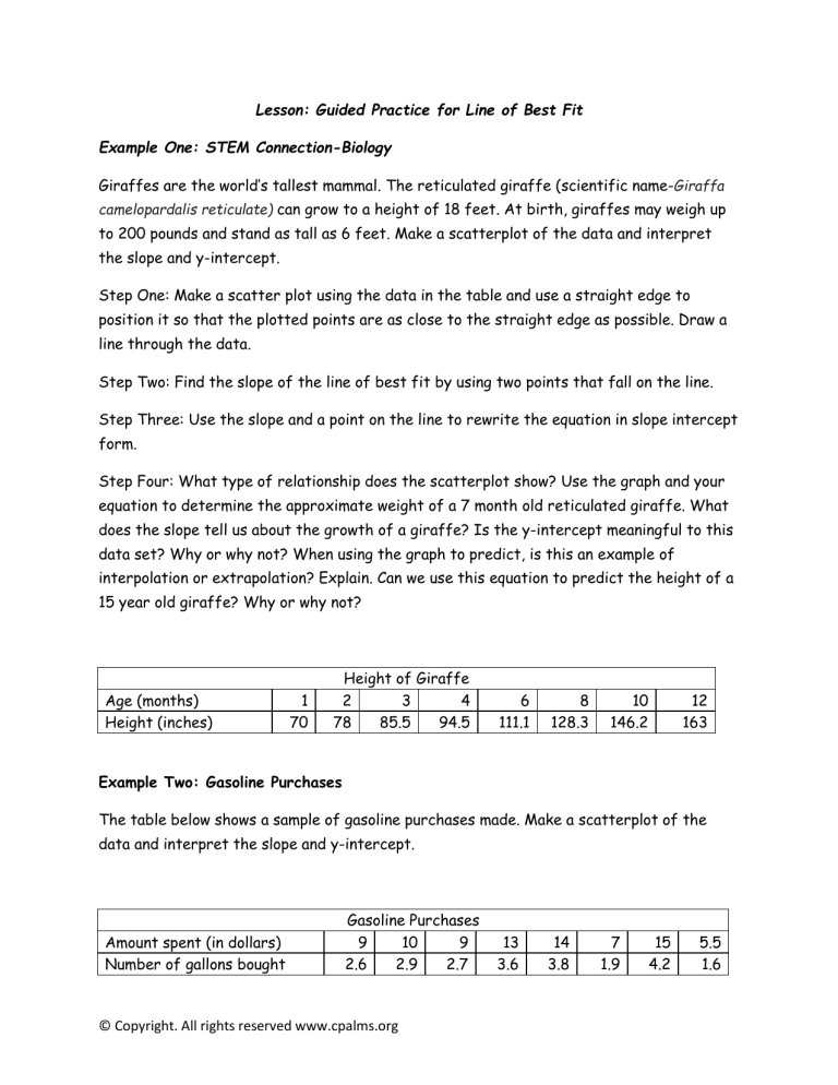
Giraffes are the world’s tallest mammal. The reticulated giraffe (scientific nameGiraffa camelopardalis reticulate) can grow to a height of 18 feet. At birth, giraffes may weigh up to 200 pounds and stand as tall as 6 feet. Make a scatterplot of the data and interpret the slope and y-intercept.
Step One: Make a scatter plot using the data in the table and use a straight edge to position it so that the plotted points are as close to the straight edge as possible. Draw a line through the data.
Step Two: Find the slope of the line of best fit by using two points that fall on the line.
Step Three: Use the slope and a point on the line to rewrite the equation in slope intercept form.
Step Four: What type of relationship does the scatterplot show? Use the graph and your equation to determine the approximate weight of a 7 month old reticulated giraffe. What does the slope tell us about the growth of a giraffe? Is the y-intercept meaningful to this data set? Why or why not? When using the graph to predict, is this an example of interpolation or extrapolation? Explain. Can we use this equation to predict the height of a
15 year old giraffe? Why or why not?
Age (months)
Height (inches)
1
Height of Giraffe
2 3 4 6 8 10
70 78 85.5 94.5 111.1 128.3 146.2
Example Two: Gasoline Purchases
12
163
The table below shows a sample of gasoline purchases made. Make a scatterplot of the data and interpret the slope and y-intercept.
Amount spent (in dollars)
Number of gallons bought
Gasoline Purchases
9 10 9 13 14 7 15 5.5
2.6 2.9 2.7 3.6 3.8 1.9 4.2 1.6
© Copyright. All rights reserved www.cpalms.org
Step One: Make a scatter plot using the data in the table and use a straight edge to position it so that the plotted points are as close to the straight edge as possible. Draw a line through the data.
Step Two: Find the slope of the line of best fit by using two points that fall on the line.
Step Three: Use the slope and a point on the line to rewrite the equation in slope intercept form.
Step Four: Use the graph to determine the approximate cost of 6 gallons of gasoline. Is this an example of interpolation or extrapolation? Explain.
See Teacher note on answer key.
Example Three: Altitude and Temperature (Gradual Release)
The table shows the altitude of an airplane and the temperature outside of the airplane.
Construct a scatter plot using the data in the table. Label the graph and axes.
Altitude (m) 0 500 1000 1500 2000 2500 3000 3500 4000 4500 5000
Temperature (degrees F) 58 58.4 64.3 57.5 38.6 30.9 28.9 18.5 25.8 11.5 0.7
What type of relationship does the scatterplot show? Will the temperature always show a decrease when the altitude decreases? If the temperature was plotted on the x-axis and the altitude was plotted on the y-axis would the correlation still be the same?
Draw a line of best fit and calculate the slope. Use the slope and a point to write an equation for the line. Will the temperature always show a decrease when the altitude decreases? Interpret the slope of the line with respect to this data set. What does the yintercept represent in this case?
© Copyright. All rights reserved www.cpalms.org
Guided Practice Answer Key
Giraffe Height
Age (months)
The linear regression equation is 8.5x + 60.68. The calculations for slope and the equation of the line are shown below. The slope tells us that the giraffe grows at approximately 8.5 inches per month during its first year. At 15 years, a giraffe would be 180 months old and substituting 180 would make the giraffe approximately 133 feet tall! This would certainly not a reasonable answer.
© Copyright. All rights reserved www.cpalms.org
Gasoline Purchases
Dollars Spent
The linear regression equation is 0.2674x + 0.1548. Calculations for slope and the equation are shown.
Teacher Note:
This is a trickier problem for most students, as they are used to working with dollars as the dependent variable. While students may be able to state that as the amount of money spent increases, the number of gallons also increases, they will likely need guidance to realize that the slope represents about a third of a gallon of gasoline. This would be an ideal problem to show that using graphing technology can be beneficial in real-world problems.
© Copyright. All rights reserved www.cpalms.org
Altitude and Temperature
Altitude
The linear regression model is -0.01x + 66.52. The slope and equation calculations are shown.
What type of relationship does the scatterplot show? (Negative correlation) Will the temperature always show a decrease when the altitude decreases? (No. However, for the most part, as the altitude increases, the temperature decreases.) If the temperature was plotted on the x-axis and the altitude was plotted on the y-axis would the correlation still be the same? (No. The scatterplot would show a positive correlation.)
Interpret the slope of the line with respect to this data set. (As the altitude increases the temperature decreases) What does the y-intercept represent in this case? (The temperature before the plane takes off is 58 degrees Farenheit).
© Copyright. All rights reserved www.cpalms.org

