Unit 3 Soft Drink Adverts
advertisement
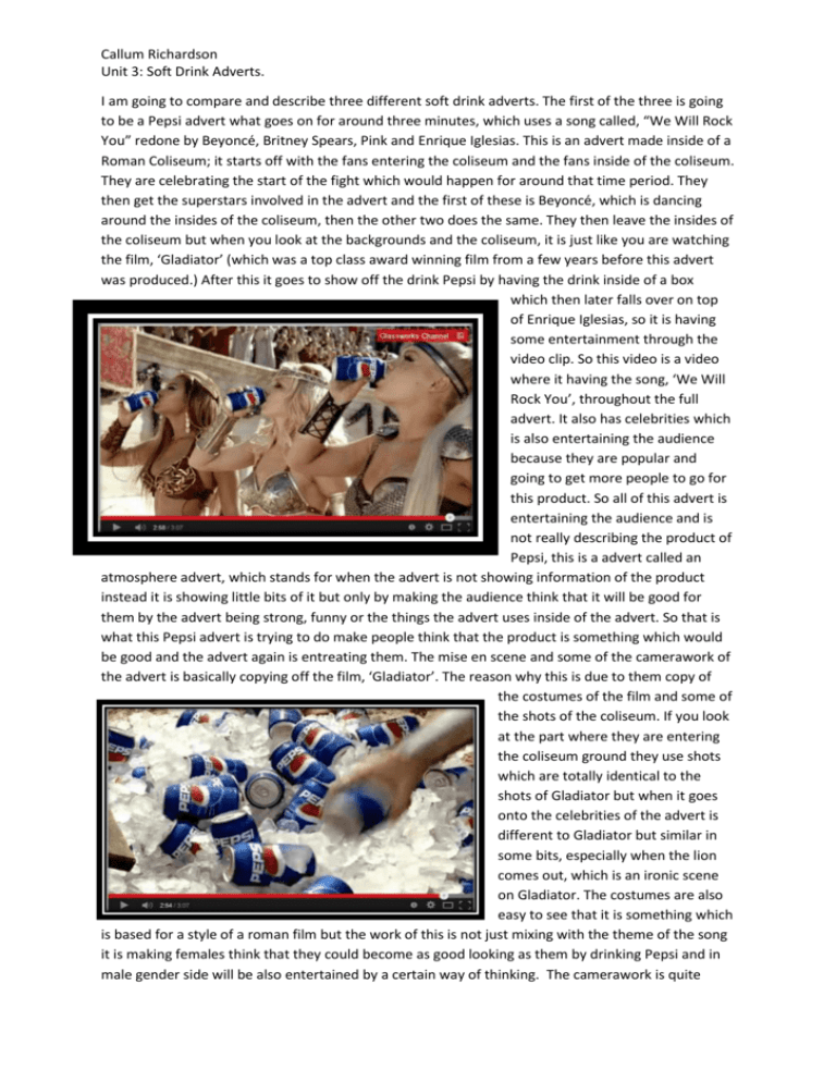
Callum Richardson Unit 3: Soft Drink Adverts. I am going to compare and describe three different soft drink adverts. The first of the three is going to be a Pepsi advert what goes on for around three minutes, which uses a song called, “We Will Rock You” redone by Beyoncé, Britney Spears, Pink and Enrique Iglesias. This is an advert made inside of a Roman Coliseum; it starts off with the fans entering the coliseum and the fans inside of the coliseum. They are celebrating the start of the fight which would happen for around that time period. They then get the superstars involved in the advert and the first of these is Beyoncé, which is dancing around the insides of the coliseum, then the other two does the same. They then leave the insides of the coliseum but when you look at the backgrounds and the coliseum, it is just like you are watching the film, ‘Gladiator’ (which was a top class award winning film from a few years before this advert was produced.) After this it goes to show off the drink Pepsi by having the drink inside of a box which then later falls over on top of Enrique Iglesias, so it is having some entertainment through the video clip. So this video is a video where it having the song, ‘We Will Rock You’, throughout the full advert. It also has celebrities which is also entertaining the audience because they are popular and going to get more people to go for this product. So all of this advert is entertaining the audience and is not really describing the product of Pepsi, this is a advert called an atmosphere advert, which stands for when the advert is not showing information of the product instead it is showing little bits of it but only by making the audience think that it will be good for them by the advert being strong, funny or the things the advert uses inside of the advert. So that is what this Pepsi advert is trying to do make people think that the product is something which would be good and the advert again is entreating them. The mise en scene and some of the camerawork of the advert is basically copying off the film, ‘Gladiator’. The reason why this is due to them copy of the costumes of the film and some of the shots of the coliseum. If you look at the part where they are entering the coliseum ground they use shots which are totally identical to the shots of Gladiator but when it goes onto the celebrities of the advert is different to Gladiator but similar in some bits, especially when the lion comes out, which is an ironic scene on Gladiator. The costumes are also easy to see that it is something which is based for a style of a roman film but the work of this is not just mixing with the theme of the song it is making females think that they could become as good looking as them by drinking Pepsi and in male gender side will be also entertained by a certain way of thinking. The camerawork is quite Callum Richardson Unit 3: Soft Drink Adverts. impressive, the work where when they are having the camera in the top parts of the coliseum, which is using an over-head establishing shot, what is just like watching a true Hollywood style film. It also is showing that it is spending tunes of money on all types of makings of this Pepsi advert. For the sound at the start of the video, it is the sound of an entertaining activity based for the roman period, which is load, yelling towards the roman emperor and looking forward to the event. When the celebrities get involved it changes and start to play the song, ‘We Will Rock You’. It then starts to get load, plays the music and the celebrities singing. The sound all in all is good but of cause a video which is just like a Hollywood film you would expect something like this for this. Finally the editing of the film, this is the most important part of making a film and they did it perfect, the shots where perfectly connected and felt like it was in real life, especially if you watched it in 3D. Here is the hyperlink for the Pepsi advert: https://www.youtube.com/watch?v=W7jkygJ_QNo The second of the videos is going to be an advert by a soft drink company called: ‘Mountain Dew’. This advert is an advert which is about the film actor called, Steven Seagal, is inside of a basic 24/7 shop and goes to buy a drink of this but has interrupted a burglary of these people. It is funny and entertaining. This clip is going on for around about one minute. He hits people by accident with a fridge door, a bottle of the brand, a tin on the floor (which he accidently nocked of a holder) and his head. When he hits the people by accident they are trying to knock him out but they are getting hit by him accendently. This is funny and entertaing because it is something which he would do inside of the films he has been apart of. The video is again an atmosphere video because it is just him buying the drink not showing what it has inside of it, what it can do to you or anything like this, so this is showing that it is a atmosphere video. The costumes of the video are basic and like anybody would wear anywhere in the world and inside of the this time. The style of the mise en scene in general is like it would happen in real life but has the feeling of a thriller, violente and a adult type of understanding advert. The reason why for this is because it is based at the time of night time, it has got him being violent towards the people trying to rob the shop and having the feeling of an adult advert because of it being violent, being in a shop at night and other things like this. The camera work is impressive it does shots at the right time and the right angles, like the one above, it is a perfect medium shot which is coming from when he goes inside of the refridgearter, I think that is perfect and cheap because there not going into the clouds unlike the Pepsi advert which is the air quite a large perporsion of the advert. I also think the speed of the shots changing is perfect mix because at the start of the advert it is going slow but when he is hitting Callum Richardson Unit 3: Soft Drink Adverts. the robbers by accdent it goes faster and goes more with the story (this is because of the editors). It also makes the watchers feel like we are inside the store and helping Steven Seagal hit the robbers which is entertaining and something which adults will take with wit. The sound is like we are in real life unlike the last one where it was like it was a dream. The sound level of it is not changing and is just staying the same which is making it feel realistic. All in all this advert is an advert for mostly adults but is entertaining them with some hummor and is a great advert for the work they have put into it to make it an advert. Like I have already said this advert is a typical type of movie you would see Steven Seagal inside of but it having some wit instead of action and the word would be topes. Here is a hyperlink for the video: https://www.youtube.com/watch?v=9VYLCP0JeIU . The third and final advert is going to be an Dr. Pepper advert. This advert is an advert which is witty and has got hummor. It is showing a boy get a Dr. Pepper from a drink machine and goes inside of the medics room do sort out a cut on his finger but they are communicating a rude tence and everybody hearing them speek around the place is thinking it something wrong with his mans priverts, so people come take the mick and the advert then finishes. The advert is quite quick like the last advert have dome; which was a Mountain Dew advert. It has a basic mise en scene because of it being based in a basic college it is what you would expect to be like real life. The visual effects on this shot is perfect because you can see that the light on the side of his face where his eye but on the other side you can notice a shadow which is perfect example of the use of visual effects and perfect camerawork. On the camerawork itself shots are perfect and all the work they have done on this is good enough to be perfect. The shots seem to feel like you there watching him do everthing, also with the other shots were the cheerleader falls down when they start hearing the story. These are perfect shots and they should be proud of these because of it making the watchers feel like it is real life. I also think the shots on this advert are again impressive they are doing back shot, medium shots, long shots, close ups, there is many of them and are perfect shots to have on a advert. The sound is like it is real life like the last one we did but later on has got music for around five seconds. This again makes me feel like it is real life and makes it more watchable for the viewers of the advert. When it becomes to have the music it is to take the mick out of him because everybody else is laughing at him and making him inbarressed, which is like a comedy and an entertainment sound of a introduction to the show. The editing is again well worked the cuts are mixed length because it is Callum Richardson Unit 3: Soft Drink Adverts. having some shots for only one or two seconds, this something which is good for a fourty second advert. All in all this advert is another funny one just like the Mountian Dew advert but it has music unlike this advert which makes it a little similar to the Pepsi advert and this advert is again atomspheric like the the last two adverts I have done. I have also noticed that all three adverts are similar and different at the same time. The similaraty is that the adverts are having some funny moments involved inside the advert which is one of the similaraties, there is also a shots which are perfect throughout the three adverts and you can see on Mountain Dew and Dr. Pepper advert that they are changing shots fast because of the time inside of both the videos are similar. The final simialrity is going to be that all three of the video are all atmospheric and is wanting the viewers to think that the will begin to be all the people on the adverts which is a common tecnique of making people buy there products. The parts which make it different from each other is that the first video (Pepsi advert) is costing a tone loud of money, where as the other two are more cheep priced and faster adverts. There is also another difference between them they are all aiming for different age groups, the first one is aiming for ages of three plus, where as the Mountain Dew is aiming for the age of eigteen and over because of it having Steven Seagel a action packed actor who is made for adults and the age group for the Dr. Pepper advert is around the age of fourteen to around twenty years of age which is truly in the middle of the other twos age group. After all these three adverts are good adverts of soft drinks and you do notice the moves of the three adverts such as the mise en scene, the camerwork, sound used on the adverts and finally the editing which in my own opinion is the main bit for all three of the adverts.

