Unit 4 Study Guide examples Josh and Richard each earn tips at
advertisement
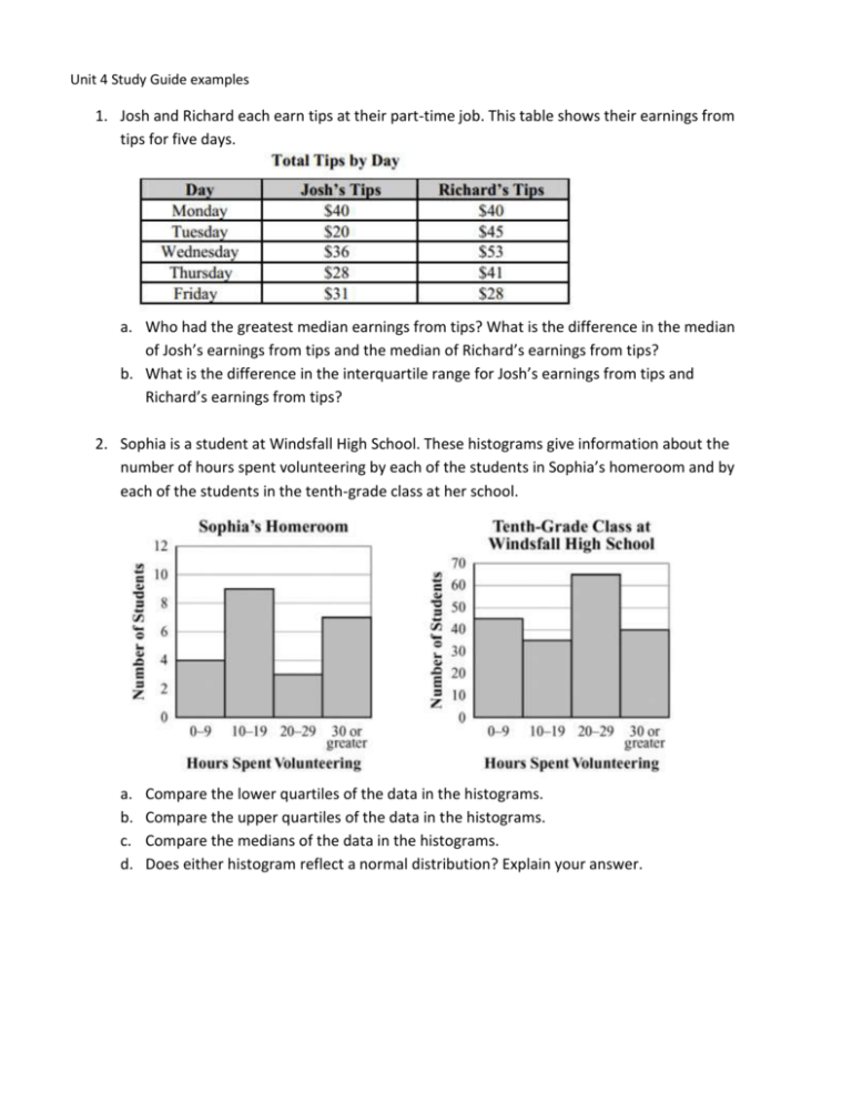
Unit 4 Study Guide examples 1. Josh and Richard each earn tips at their part-time job. This table shows their earnings from tips for five days. a. Who had the greatest median earnings from tips? What is the difference in the median of Josh’s earnings from tips and the median of Richard’s earnings from tips? b. What is the difference in the interquartile range for Josh’s earnings from tips and Richard’s earnings from tips? 2. Sophia is a student at Windsfall High School. These histograms give information about the number of hours spent volunteering by each of the students in Sophia’s homeroom and by each of the students in the tenth-grade class at her school. a. b. c. d. Compare the lower quartiles of the data in the histograms. Compare the upper quartiles of the data in the histograms. Compare the medians of the data in the histograms. Does either histogram reflect a normal distribution? Explain your answer. 3. Mr. Storer, the physical education teacher, measured the height of each student in his first period class. He organized his data in this chart. a. b. c. d. Make a dot plot for the data. Make a histogram for the data Make a box plot for the data Does the distribution of heights appear normal/bell shaped? 4. Old Faithful, a geyser in Yellowstone National park, is renowned for erupting fairly regularly. In more recent times, it has become less predictable. It was observed that the time interval between eruptions was related to the duration of the most recent eruption. The distribution of its interval times for 2011 is shown in the following graphs. a. Does the Year-to-Date distribution seem normal, skewed, or uniform? b. Compare Last Week’s distribution to Last Month’s distribution. c. What does the Year-to-Date distribution tell you about the interval of time between Old Faithful’s eruptions? 5. This table shows the average low temperature, in ºF, recorded in Macon, GA, and Charlotte, NC, over a six-day period. Which conclusion can be drawn from the data? a. The interquartile range of the temperatures is the same for both cities. b. The lower quartile for the temperatures in Macon is lower than the lower quartile for the temperatures in Charlotte. c. The mean and median temperatures of Macon were higher than the mean and median temperatures of Charlotte. d. The upper quartile for the temperatures in Charlotte was lower than the upper quartile for the temperatures in Macon. 6. A school was having a coat drive for a local shelter. A teacher determined the median number of coats collected per class and the interquartile ranges of the number of coats collected per class for the freshmen and for the sophomores. The freshmen collected a median number of coats per class of 10, and the interquartile range was 6. The sophomores collected a median number of coats per class of 10, and the interquartile range was 4. Which range of numbers includes the third quartile of coats collected for both classes? a. 4 to 14 b. 6 to 14 c. 10 to 16 d. 12 to 15 7. A reading teacher recorded the number of pages read in an hour by each of her students. The numbers are shown below. 44, 49, 39, 43, 50, 44, 45, 49, 51 For this data, which summary statistic is NOT correct? a. The minimum is 39. b. The lower quartile is 44. c. The median is 45. d. The maximum is 51. 8. A science teacher recorded the pulse rates for each of the students in her classes after the students had climbed a set of stairs. She displayed the results, by class, using the box plots shown. Which class generally had the highest pulse rates after climbing the stairs? a. Class 1 b. Class 2 c. Class 3 d. Class 4 9. Peter went bowling, Monday to Friday, two weeks in a row. He only bowled one game each time he went. He kept track of his scores below. Week 1: 70, 70, 70, 73, 75 Week 2: 72, 64, 73, 73, 75 What is the BEST explanation of why Peter’s Week 2 mean score was lower than his Week 1 mean score? a. Peter received the same score3 three times in week 1. b. Peter had one very low score in week 2. c. Peter did not beat his high score from week 1 in week 2. d. Peter had one very high score in week 1. 10. This histogram shows the frequency distribution of duration times for 107 consecutive eruptions of the Old Faithful geyser. The duration of an eruption is the length of time, in minutes, from the beginning of the spewing of water until it stops. What is the BEST description for the distribution? a. b. c. d. Bimodal Uniform Multiple outlier Skewed to the right 11. Barbara is considering visiting Yellowstone National Park. She has heard about Old Faithful, the geyser, and she wants to make sure she sees it erupt. At one time it erupted just about every hour. That is not the case today. The time between eruptions varies. Barbara went on the Web and found a scatter plot of how long an eruption lasted compared to the wait time between eruptions. She learned that, in general, the longer the wait time, the longer the eruption lasts. The eruptions take place anywhere from 45 minutes to 125 minutes apart. They currently average 90 minutes apart. a. For an eruption that lasts 4 minutes, about how long would the wait time be for the next eruption? b. What is the shortest duration time for an eruption? c. Do you think the scatter plot could be modeled with a linear function? 12. The environment club is interested in the relationship between the number of canned beverages sold in the cafeteria and the number of cans that are recycled. The data they collected are listed in this chart. Find the equation of a line of best fit for the data. 13. A fast food restaurant wants to determine if the season of the year affects the choice of soft drink size purchased. They surveyed 278 customers and the table below shows their results. The drink sizes were small, medium, large, and jumbo. The seasons of the year were spring, summer, and fall. In the body of the table, the cells list the number of customers that fit both row and column titles. On the bottom and in the right margin are the totals. a. b. c. d. In which season did the most customers prefer jumbo drinks? What percent of those surveyed purchased the small drinks? What percent of those surveyed purchased medium drinks in the summer? What do you think the fast-food restaurant learned from their survey? 14. Which graph MOST clearly displays a set of data for which a linear function is the model of best fit? 15. This graph plots the number of wins in the 2006 and 2007 seasons for a sample of professional football teams. Which equation BEST represents a line that matches the trend of this data? a. 𝑦 = 1 2 1 𝑥 b. 𝑦 = 2 𝑥 + 8 c. 𝑦 = 2𝑥 − 6 d. 𝑦 = 2𝑥 − 12 16. This scatter plot suggests a relationship between the variables age and income. a. What type of a relationship is suggested by the scatter plot (positive/negative, weak/strong)? b. What is the domain of ages considered by the researchers? c. What is the range of incomes? d. Do you think age causes income level to increase? Why or why not? 17. A group of researchers looked at income and age in Singapore. Their results are shown below. They used line graphs instead of scatter plots so they could consider the type of occupation of the wage earner. a. Does there appear to be a relationship between age and income? b. Do all three types of employees appear to share the same benefit of aging when it comes to income? c. Does a linear model appear to fit the data for any of the employee types? d. Does the relationship between age and income vary over a person’s lifetime? 18. Consider the residual plot below. Each vertical segment represents the difference between an observed weight and a predicted weight of a person, based on height. a. Do you think the regression line is a good predictor of weight? b. Why do the residuals appear to be getting longer for greater heights? 19. This graph plots the number of wins in the 2006 and 2007 seasons for a sample of professional football teams. Based on the regression model, what is the predicted number of 2007 wins for a team that won 5 games in 2006? a. 0 b. 3 c. 8 d. 10 20. Which BEST describges the correlation of the two variables in the scatter plot? a. b. c. d. Weak positive Strong positive Weak negative Strong negative
