Bar Graph Activity
advertisement
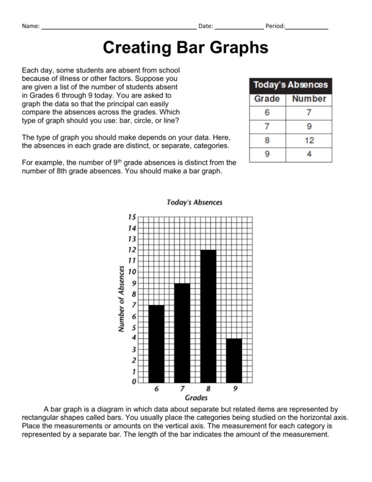
Name: Date: Period: Creating Bar Graphs Each day, some students are absent from school because of illness or other factors. Suppose you are given a list of the number of students absent in Grades 6 through 9 today. You are asked to graph the data so that the principal can easily compare the absences across the grades. Which type of graph should you use: bar, circle, or line? The type of graph you should make depends on your data. Here, the absences in each grade are distinct, or separate, categories. For example, the number of 9th grade absences is distinct from the number of 8th grade absences. You should make a bar graph. A bar graph is a diagram in which data about separate but related items are represented by rectangular shapes called bars. You usually place the categories being studied on the horizontal axis. Place the measurements or amounts on the vertical axis. The measurement for each category is represented by a separate bar. The length of the bar indicates the amount of the measurement. In science, bar graphs usually have simple rectangular shapes to indicate the measurements. Sometimes in newspaper and magazines, bar graphs use drawings that represent the measurements. For example, each absent student could be represented by the drawing of a person. For larger numbers, a drawing could stand for 10 students. But regardless of the way the measurement is represented, bar graphs make it easy to read and compare the separate but related data. Creating Bar Graphs: Skill Practice Answer the questions below in the space provided. Use the graph to make the graph. The table below shows the relative diameters of the planets in our solar system in Earth units. That means that Earth is represented as having a diameter of 1 Earth unit. The planet Uranus, which has a diameter that is four times the size of Earth’s diameter, is represented by 4 Earth units. The planets are listed in order of their distance from the sun. Mercury is the closest, and Pluto is the farthest away. (Use complete sentences to answer the questions) 1. On which axis will you place the names of the planets? (Hint: The planets are similar to a category being studied, or a manipulated variable. List the planets in the same order as in the table, starting with Mercury.) 2. Notice that the measurements you need to represent include some numbers between 0 and 1, with the largest number between 11 and 12.What scale will you use to represent the planet diameters? (Hint: You may need to estimate the height of certain bars.) 3. Use the graph to make a bar graph that displays the data in the table. 4. Think About It: Suppose you made a bar graph showing the planets’ distances from the sun, and you listed them in the same order as in this graph. How would the new graph be similar to the graph you just made? How would it be different? 5. Based on the graph you created what can you infer about the diameter of the planets and their distance from the sun?

