Frequency Distributions
advertisement
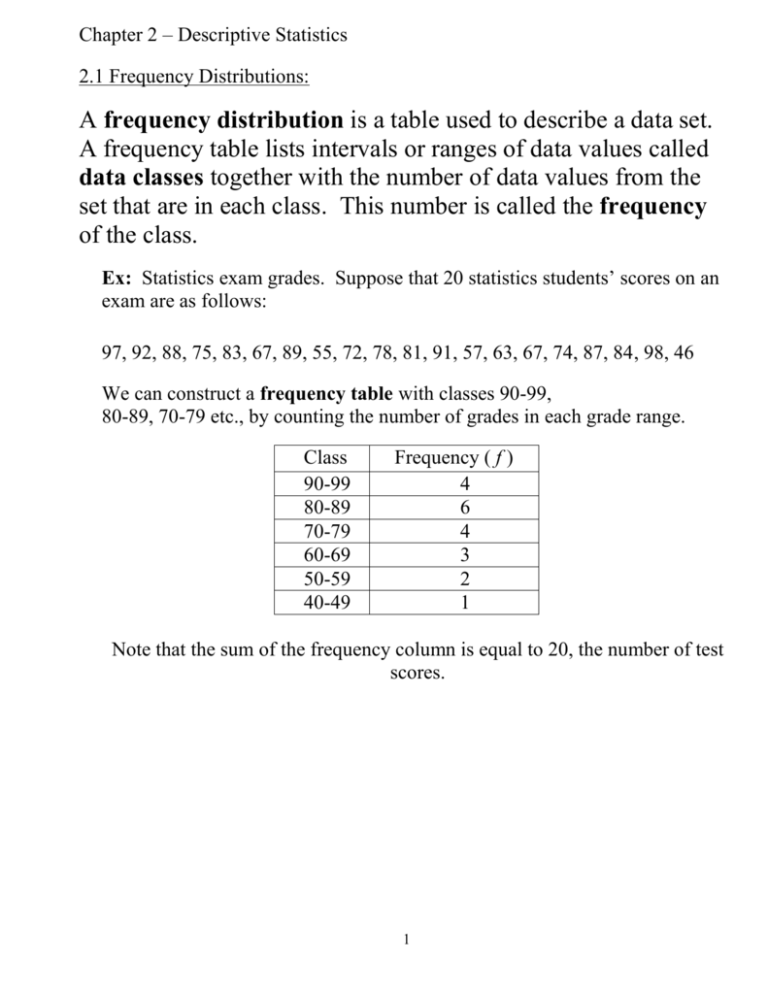
Chapter 2 – Descriptive Statistics 2.1 Frequency Distributions: A frequency distribution is a table used to describe a data set. A frequency table lists intervals or ranges of data values called data classes together with the number of data values from the set that are in each class. This number is called the frequency of the class. Ex: Statistics exam grades. Suppose that 20 statistics students’ scores on an exam are as follows: 97, 92, 88, 75, 83, 67, 89, 55, 72, 78, 81, 91, 57, 63, 67, 74, 87, 84, 98, 46 We can construct a frequency table with classes 90-99, 80-89, 70-79 etc., by counting the number of grades in each grade range. Class 90-99 80-89 70-79 60-69 50-59 40-49 Frequency ( f ) 4 6 4 3 2 1 Note that the sum of the frequency column is equal to 20, the number of test scores. 1 Additional Terminology: Lower Class Limit – The least value that can belong to a class. Upper Class Limit – The greatest value that can belong to a class. Class Width – The difference between the upper (or lower) class limits of consecutive classes. All classes should have the same class width. Class Midpoint – The middle value of each data class. To find the class midpoint, average the upper and lower class limits. class midpoint = upper lower 2 Class Boundaries – The numbers that separate classes without forming gaps between them. Range (of data) – The highest value – the lowest value Ex: From the frequency table of statistics grades on p1. The upper class limits are: The lower class limits are: The class midpoints are: The class boundaries are: The range is: The width of each class is: 2 Creating a Frequency Table: 1. Decide on the number of data classes you wish to use. 2. Divide the range of the data by the number of classes to get an estimate of class width. (Round up.) 3. Decide on class upper and lower limits. (Start with lowest data value if ascending, highest if descending.) NOTE: if the lower limit is 5 and the class width is 2, the class will be 5 – 6. 4. Construct the frequency table by counting the number of data values in each class. (Useful to make tally marks.) Class Exercise: Construct a frequency table (in ascending order) with 6 data classes from the following data set. (Leave space, we will be adding to this.) Amount of gasoline purchased by 28 drivers: 7, 4, 18, 4, 9, 8, 8, 7, 6, 2, 9, 5, 9, 12, 4, 14, 15, 7, 10, 2, 3, 11, 4, 4, 9, 12, 5, 3 3 Mathematical Notation: In this course, the following symbols and variables will have the meanings given below (unless otherwise specified.) Variables x = data value n = number of values in a sample data set N = number of values in a population data set f = frequency of a data class Symbol = the sum of all values for the following variable or expression. Ex: Using our notation, we can write the statement that the sum of the frequencies in a frequency table should equal the number of values in the sample data set as follows: 4 Cumulative Frequency: The cumulative frequency of a data class is the number of data elements in that class and all previous classes. (It can be ascending or descending.) Ex: Class Frequency ( f ) 90-99 80-89 70-79 60-69 50-59 40-49 4 6 4 3 2 1 Cumulative Frequency 4 10 14 17 19 20 Notice that the last entry in the cumulative frequency column is n = 20. Class Exercise: Add a cumulative frequency column to the table of gasoline purchases. 5 Relative Frequency: The relative frequency of a data class is the percentage of data elements in that class. We can calculate the relative frequency for each class as follows: relative frequency = f n Ex: Class Frequency ( f ) Cumulative Frequency 90-99 80-89 70-79 60-69 50-59 40-49 4 6 4 3 2 1 4 10 14 17 19 20 Relative Frequency (f / n) .20 .30 .20 .15 .10 .05 Note: The sum of the relative frequencies should be 1(or 100%.) f 1 n Class Exercise: Add a relative frequency column to table of gasoline purchases. 6 DESCRIBING DATA SETS: Once we have organized our data in a frequency distribution, we may want to display the data so as to be more descriptive. We will look at four ways to describe our data: Bar graphs: Vertical bars represent number or percentage of responses for each variable (also see p 59 Pareto Chart) Histograms: Like a bar graph, except the data is continuous, so bars touch Frequency Polygon: Connect the midpoints of each class to make a polygon (another name for this is a line graph) Stem and Leaf Plots: maintain the exact data (section 2.2) Box Plots: based on quartiles (section 2.5) A cumulative frequency graph or distribution is also called an ogive. 7 Histograms: A histogram is a graphical representation of the information in a frequency table using a bar graph with sides touching. The histogram should have the variable being measured in the data set as its horizontal axis, and the class frequency as the vertical axis. Each data class will be represented by a vertical bar whose height is the frequency of the class and whose width is the class width. Example: Created in Excel from the data used in the previous examples. 7 6 5 4 3 2 1 0 44.5 54.5 64.5 74.5 84.5 94.5 Notice that the bar for each class is centered at the class midpoint, and the bars for successive classes touch. Class Exercise: Construct a histogram for the frequency table of gasoline purchases. 8 Frequency Polygon: A frequency polygon is a line graph representation of the information in a frequency table. Like a histogram, the vertical axis represents frequency and the horizontal axis represents the variable being measured in the data set. To construct the graph, a point is plotted for each class at its midpoint and with height given by the frequency of the class. The points are then connected by straight lines. Ex: Created in Excel using the same data as in the previous examples. 7 6 5 4 3 2 1 0 44.5 54.5 64.5 74.5 84.5 94.5 Class Exercise: Construct a frequency polygon from the gasoline purchase frequency table. Now construct a cumulative frequency polygon (ogive) from the gasoline purchase frequency table. What does the slope of the line segments tell you in either case? What does a line segment with zero slope (“flat”) tell you in a cumulative frequency polygon? 9 2.2 More Graphs and Displays: Stem and Leaf Plot: A stem and leaf plot reports the exact data by the leftmost number(s) being part of the stem, and the rightmost number(s) being the leaves. Ex: Given the previous statistics exam grades for 20 statistics students, let us create a stem and leaf plot. 97, 92, 88, 75, 83, 67, 89, 55, 72, 78, 81, 91, 57, 63, 67, 74, 87, 84, 98, 46 10 2.3 Measures of Central Tendency: A measure of central tendency is a value used to represent the typical or “average” value in a data set. Three Common Measures of Central Tendency: Mean – (average) the sum of all data values divided by the number of values in the data set. The mean of a sample data set is denoted by x and the mean of a population data set by the Greek letter . Sample data set: Population data set: x x n x N Exercise: Find the mean of the following data set: Quiz Scores: 1, 5, 7, 7, 6, 8, 10, 9, 5, 10, 8 Median – the value which separates the largest 50% of data values from the lowest 50%. To calculate the median, place data values in number order. If n is odd, the middle value is the median. If n is even, the mean of the two middle values is the median. Exercise: Find the median value for the set of quiz scores. Find the median if the low score of 1 is dropped. Mode – the data value (or values) which appears the largest number of times in the set. If no data value is repeated, we say that there is no mode. Exercise: Find the mode(s) of the quiz score data set. Outlier – a data entry far removed from the other entries in the data set. 11 Properties of Mean, Median, and Mode: Mean is the most commonly used measure of central tendency. One drawback of the mean is that it is heavily influenced by a few very high or very low data values (outliers or skewedness). In these cases it is more common to use the median. Example: Median household income in the U.S. The mode has the advantage that it can be used to measure data sets even if they contain only qualitative data. A disadvantage is that a data set may not have a mode. Example: good use: Modal college major not such good use: modal height in millimeters. Weighted Means: A weighted mean is used when we want some data values in a set to factor more often into the calculation of the mean than others. In this case, we attach a numerical weight (w) to each value and calculate the mean as follows: x ( x w) w Note: This is equivalent to counting each data value the number of times given by its weight . Ex: Grade point average. We assign the letter grades the number values A=4, B=3, C=2, D=1, F=0, and then each grade value is counted into the GPA according to the number of credits earned (course’s weight) with that course grade. Course grade. The final grade in a course is calculated according to the following scale: Quizzes count for 15%, 3 exams whose average counts 60%, and the final exam is worth 25%. We can weigh the score for each component of the final grade with its percentage to calculate the final grade. 12 Exercises (use the previous page’s information): Calculate the GPA of a student who has earned 12 credits of A’s, 21 credits of B’s, 5 credits of C’s and 3 credits of D’s. Calculate the final score for a student who has scored 95 on quizzes, has exam scores of 83, 94, and 77, and a final exam score of 88. Now, suppose we had the following test scores in a class: 70, 80, 80, 80, 80, 80, 80, 80, 80, 80, 90, 100, 100 Create a frequency distribution with 4 (single value) classes. What is the mode and the median? How would you calculate the mean? 13 Estimating a Mean from a Frequency Table: Given the frequency distribution of a data set, we can make the best estimate of the mean for the data set by using a weighted mean. 1. Calculate the class midpoint for each data class. lower upper 2 (Our data values for calculating the weighted mean.) 2. Use the frequency of the data class as the weight for each data class. 3. Calculate the weighted mean by the weighted mean formula, or: x (x f ) f mid Exercise: Estimate the mean of the data set whose frequency distribution is given by: Class Frequency ( f ) 90-99 4 80-89 6 70-79 4 60-69 3 50-59 2 40-49 1 14 Shapes of Data Distributions: Symmetric – The data distribution is approximately the same shape on either side of a central dividing line. The mean and median (and mode if unimodal) are equal in a symmetric distribution. 14 12 10 8 6 4 2 0 1 2 3 4 5 6 7 8 9 Ex: Men’s Heights, SAT Math scores Left-Skewed – A few data values are much lower than the majority of values in the set. (Tail extends to the left) Generally the mean is less (to the left) than the median (and mode) in a leftskewed distribution. 14 12 10 8 6 4 2 0 1 2 3 4 5 6 7 8 Ex: Exam scores with a few students doing poorly 15 9 Right-Skewed – A few data values are much higher than the majority of values in the set. (Tail extends to the right) Generally the mean is greater (to the right) than the median (and mode) in a right-skewed distribution. 12 10 8 6 4 2 0 1 2 3 4 5 6 7 8 9 Examples: Personal Income in the U.S., Men’s weights Uniform – All data values are equally represented. 10 8 6 4 2 0 1 2 3 Example: Number rolled on a die 16 4 5 6 2.4 (MEASURES OF DISPERSION) Variation: Variation in a data set is the amount of difference between data values. In a data set with little variation, almost all data values would be close to one another. The histogram of such a data set would be narrow and tall. Example: Quiz Scores: 3, 3, 4, 4, 4, 4, 4, 4, 5, 5, 5 In a data set with a great deal of variation, the data values would be spread widely. The histogram of this data set would be low and wide. Example: Quiz Scores: 1, 3, 4, 5, 6, 6, 7, 8, 8, 9, 10 Common Measures of Variation: 1. Range – the difference between the largest and smallest data values in a data set. range highest value lowest value 2. Standard Deviation – The most commonly used measure of variation. A measure of the “average” distance of a data value from the mean for the data set. Standard deviation is calculated using two different formulae depending on whether the data set being considered is a population data set or a sample data set. Population standard deviation, sigma , is calculated using the following formula: ( x )2 N Sample standard deviation, s, is calculated using the following formula: s (x x ) 2 n 1 3. Variance – the square of the standard deviation. Population variance is 2 represented by 2 and sample variance by s 17 Calculating Standard Deviation Using the Formula: 1. Calculate the mean of the data set. 2. Subtract the mean from each data value in the set. These values are called the deviations of the data values. 3. Square each of the deviations calculated in Step 2. 4. Sum the squares calculated from Step 3. 5. Divide the sum from Step 4 by the population size for population standard deviation or the sample size minus 1 for sample standard deviation. 6. Take the square root of the result of Step 5. Exercise: Find the range and standard deviation of the data set of quiz scores used in the previous example: Quiz Scores: 1, 5, 7, 7, 6, 8, 10, 9, 5, 10, 8 18 Estimating Standard Deviation using a Frequency Table (“Grouped Data”): Given the frequency distribution of a data set, we can make the best estimate of the standard deviation for the data set by using the same technique as for mean. 1. Calculate the class midpoint for each data class. These will be our data values for calculating the standard deviation. 2. Use the frequency of the data class as the weight for each data class midpoint. (That is, multiply by the frequency rather than having to sum that many times.) 3. Calculate the standard deviation by using the formula: s (x mid x )2 f n 1 (sample) OR S (x mid )2 f N (population) Exercise: Estimate the standard deviation of the data set whose frequency distribution is given by: Class Frequency ( f ) 90-99 80-89 70-79 60-69 50-59 40-49 4 6 4 3 2 1 19 Using the TI-83 for Mean, Median & Standard Deviation: Step 1: Enter the Data Values Press [STAT]. A menu will appear in which EDIT is selected, choose EDIT by pressing [ENTER] Enter the data values into one of the lists L1, L2, etc. Use the arrow keys or press enter to enter the next value in the list. Press [2nd][MODE] (Chooses QUIT) to save the entries Step 2: Calculate Press [STAT]. Use the arrow keys to highlight the CALC menu. Select the first entry 1-Var Stats from the CALC menu by pressing [ENTER] On your screen 1-Var Stats will appear. If the data values are in L1, press enter to calculate. If they are in another list, say L3, then you will need to select L3 first by pressing [2nd][3] and then press [ENTER] to calculate. Step 3: Read Values On your screen will be a list of values calculated by the TI-83: x Sx x n Med is the mean of the data set is the standard deviation if the set is a sample is the standard deviation if the set is a population is the number of data values is the median of the data set. Using the TI-83 with a Frequency Table: The estimated mean, median, and standard deviation for data in a frequency table can be calculated using the TI-83 as follows: Step 1: Enter the Midpoints and Frequencies Enter the class midpoints in L1 and the corresponding frequencies in L2. Step 2: Calculate Choose 1-Var Stats from the CALC menu as before and when it appears on the screen choose L1 comma L2: 1-Var Stats L1, L2 Press [ENTER] to calculate. Step 3: Read Values The same calculations as before will be displayed. 20 Theorems Involving Standard Deviation: The standard deviation of a data set is an important quantity because it limits the number of data values that can be very far (high or low) from average. The Empirical Rule (68-95-99.7 Rule) Applies only to bell-shaped distributions. Approximately 68% of data values must be within 1 standard deviation of the mean. Approximately 95% of data values must be within 2 standard deviation of the mean. Approximately 99.7% of data values must be within 3 standard deviation of the mean. Ex: Men’s Heights have a bell-shaped distribution with a mean of 69.2 inches and a standard deviation of 2.9 inches. Between what heights does 95% of the male population lie? Chebychev’s Theorem Applies to any data set. The portion (%) of data values that must be within k ( for k>1) standard deviations of the mean is at minimum: 1 12 k Ex: Lets try k=2, 3, 4, 5. What happens as k increases? (See p83 ex8.) Ex: A class of 30 statistics students has a mean exam score of 73 with a standard deviation of 7 points. At minimum, 88.9% of the students scored between what scores? Approximately how many students, at minimum, scored within 2 standard deviations of 73? Note: Chebychev’s Theorem gives only cautious lower bounds for the proportion of data values, whereas the Empirical Rule gives approximations. If a data distribution is known to be bell-shaped, the Empirical Rule should be used. 21 2.5 Measures of Position: Fractiles divide a data set into consecutive intervals so that each interval has (at least approximately) the same number of data values. The most common fractiles are: Percentiles – divide a data set into 100 parts. Quartiles – divide a data set into fourths. Deciles – divide a data set into 10 parts. For example, the 36th percentile is the value which separates the lowest 36% of data values from the highest 64% of data values and is denoted by P36. For example, the first quartile Q1 divides the lowest quarter of a data set from the upper three quarters. For example, the 7th decile is the value which separates the lowest 7/10 of data values from the highest 3/10 of data values and is denoted D7. Note: There are 99 percentiles P1-P99, 3 quartiles Q1-Q3, and 9 deciles D1-D9. Note: P50 = Q2 = D5 = Median Ex: Using the quiz scores from before put them in order, then find and interpret Q1-Q3. Quiz Scores: 1, 5, 7, 7, 6, 8, 10, 9, 5, 10, 8 A Box (and Whisker) Plot illustrates the range, Q1, Q2 (median) and Q3. Lets draw one and discuss it. (We can also do all of this in our calculators, anyone interested?) (p 125) Ex: If your doctor tells you your 3 year old is in the 50th percentile for height and the 35th percentile for weight, what does that mean? 22 The Standard Score: The standard score (or z-score) of a data value is the number of standard deviations that the value lies above or below the mean for a bell-shaped distribution. Think about it. The larger the z-score, the ____________________the mean. The ______________________the mean, the ___________ the percentage of data between the mean and that z-score. Standard Scores can be calculated using the formula: z x Exercise: Men have a mean height of 69.2 inches with a standard deviation of 2.9 inches. Find the standard (z-)score of a man who is: 6 feet tall 5’1/2’’ 6’3’’ Now find the percentile for the last two men above. Note: The z-score of a value is positive if the value is above the mean and negative if it is below the mean. The mean itself always has a z-score of _____. A data value is considered to be unusual if it is more than two standard deviations from the mean. A data value is unusually high if it has a z-score larger than 2 and unusually low if it has a z-score of less than -2. Think about the Empirical Rule and Chebychev’s Theorem. Why does this make sense? Ex: p112 #32, 36 (look at “uses & abuses” charts p 115) 23

