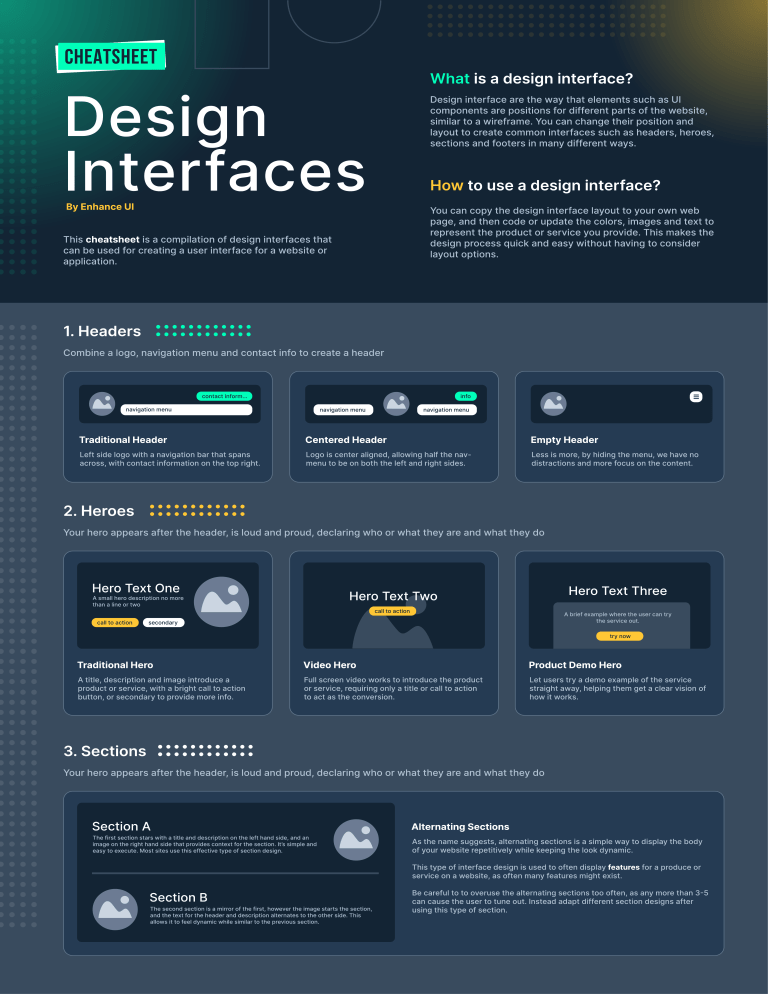
CheAtsheet What is a design interface? Design interface are the way that elements such as UI Design Interfaces components are positions for different parts of the website, similar to a wireframe. You can change their position and layout to create common interfaces such as headers, heroes, sections and footers in many different ways. How to use a design interface? By Enhance UI You can copy the design interface layout to your own web page, and then code or update the colors, images and text to represent the product or service you provide. This makes the This cheatsheet is a compilation of design interfaces that design process quick and easy without having to consider can be used for creating a user interface for a website or layout options. application. 1. Headers Combine a logo, navigation menu and contact info to create a header contact inform... info navigation menu navigation menu navigation menu Traditional Header Centered Header Empty Header Left side logo with a navigation bar that spans Logo is center aligned, allowing half the nav- Less is more, by hiding the menu, we have no across, with contact information on the top right. menu to be on both the left and right sides. distractions and more focus on the content. 2. Heroes Your hero appears after the header, is loud and proud, declaring who or what they are and what they do Hero Text One Hero Text Three Hero Text Two A small hero description no more than a line or two call to action A brief example where the user can try the service out. secondary call to action try now Traditional Hero Video Hero Product Demo Hero A title, description and image introduce a Full screen video works to introduce the product Let users try a demo example of the service product or service, with a bright call to action or service, requiring only a title or call to action straight away, helping them get a clear vision of button, or secondary to provide more info. to act as the conversion. how it works. 3. Sections Your hero appears after the header, is loud and proud, declaring who or what they are and what they do Section A The first section stars with a title and description on the left hand side, and an image on the right hand side that provides context for the section. It ’s simple and easy to execute. Most sites use this effective type of section design. Alternating Sections As the name suggests, alternating sections is a simple way to display the body of your website repetitively while keeping the look dynamic. This type of interface design is used to often display features for a produce or service on a website, as often many features might exist. Section B Be careful to to overuse the alternating sections too often, as any more than 3-5 The second section is a mirror of the first, however the image starts the section, using this type of section. and the text for the header and description alternates to the other side. This allows it to feel dynamic while similar to the previous section. can cause the user to tune out. Instead adapt different section designs after Mobile Example Desktop Example Column Sections Section A Section B Section C Sections can be seperated by columns that help to quickly showcase more features on a single screen viewing. Each section should have a A column section is useful to be placed near the start of the page, or near the bottom before a footer. A good image and title is used to showcase the feature, with a short description. Having varied sizes such as Create a column section showcasing features, services or products for your site. single line for the title, and a similar length for it’s short description. two lines for the title may cause it to look aloof. When trying to showcase many sevices, it’s useful to break them down into smaller form, where you have sub-sections with images and short descriptions of what they are. This is a small subsection that has a brief about a service or feature. Sub-Section 3 This is a small subsection that has a brief about a service or feature. Section A Mobiles should have less text that is straight to the point. Features are a good place to use column sections, where the image could be a preview of the feature or an icon that represents it. For a mobile view, this section can collapse and be easily scrollable. Section B Text can be left align but sometimes also centered. Grid Sections Section A Sub-Section 1 The column section interface shows 3-6 items in a single row. It can be used with an image, title and description. Sub-Section 2 This is a small subsection that has a brief about a service or feature. Sub-Section 4 A grid section allows you to showcase many services and features. It can be a grid of 2x2, o 4x4, or 2x4 etc. Such a grid is useful however it will mean less information is showcased. Ideally a small image, title and one line description is enough. Similar to column sections, these grids can collapse for the mobile version to a single column making for easier reading. This is a small subsection that has a brief about a service or feature. 4. Footers Your hero appears after the header, is loud and proud, declaring who or what they are and what they do Company Name A small company description no more than a line or two contact button Sub-menu 1 Sub-menu 2 Home About Support Services 1 Address Street 12345 Features 1300 300 300 Phone Team email@address.com Contact Us Documentation Guides Blog Terms Privacy Company Name A small company description no more than a line or two Home Support Line About Services Features Team Contact Us Copyright Information Copyright Information Traditional Footer Centered Footer Simple footers include company details on the left, with contact information, and a repeat of the menu on the right two columns to help in case a user missed the information they were looking for. When dealing with a smaller website, a centered footer which has less menu items can be used. It offers the basic menu from the navigation once more but without all the extra information such as contact details. Newsletter Signup Sign up to the newsletter, we promise not to spam you email address submit Contact Form full name email address submit Did you not find your answer, submit this form message... Bonus: Contact Form & Newsletter Add a contact form and newsletter in the footer sections to help users better navigate. Often fif someone reaches the end of the pages, they will be likely to want more information. Enhance UI Design for Developers Learn the fundementals of web design, which will help you create better looking websites, user interfaces and experiences. Doing so has an impact on your work, freelancing, which leads to earning more money and a better job. Website: https://enhanceui.com Twitter: https://twitter.com/adrian_twarog Youtube: https://youtube.com/adriantwarog I hope you enjoyed this cheatsheet, check out the full edition of Enhance UI book, Design for Developers which will go into detail about design, ui, ux and much more! 5. Cards Containers that hold information Heading Three A small description about the content no more than a line or two Heading One Description. Lorem ipsum dolor sit amet, consectetuer adipiscing elit. Aenean commodo ligula eget dolor. Aenean massa. Cum sociis natoque penatibu call to action Label Heading Two A small description about the content no more than a line or two call to action Traditional Card A title, description and image to introduce a product or a service, with a bright call to action button, usually left align. Clickable Card Button can be omitted, and the whole card can be clickable instead. Mobile Card Layout of the card can be adjusted to fit different viewport sizes. On mobile or list view this format is the most common. 6. Sidebars Vertical navigation menu Company Logo Home User Name Projects Home Calendar Projects Settings Calendar Settings User Name Traditional Sidebar Vertical navigation menu with company logo and user information. Usually sitting on the left side of the viewport. User Sidebar Usually used on social media. You can add the user photo and name instead of the company logo to make the sidebar hold the user information. Collapsed sidebar This layout is usually used to allow the user to get more space on the viewport for he main content, useful on smaller screens. 7. Carousel Show collections of items Traditional Carousel Items, navigation controls and dot indicators that display the number of items in the carousel, with the current item highlighted. The dots can also be used to navigate. Scaled Carousel Another option, without the dot indicators, and fade in/out effect that highlights the selected item. This makes use of visual hirerchy to create a focal point on the main, selected image. 8. Navigation Bar Links to sections or pages in the website Home Home About Store About Store Traditional navigation bar Link with the name of the different sections/pages. The name of the selected section is highlighted with color to indicate the user’s location at the moment. U nderlined navigation bar Similar to the traditional navigation bar, with another type of highlighting. In this case the current section is accentuated with a color line. on navigation bar Ic Commonly used in mobile layouts, but it can be used in web design as well. You can add the name of the section below if you want too. 9. Testimonials People’s opinion about experience with the product Full Name ho is this person W Lorem ipsum dolor sit amet, consectetuer adipiscing elit. Aenean commodo ligula eget dolor. Aenean massa. Cum sociis natoque penatibu Traditional testimonial layout Card with photo and user’s information. Full name is mandatory, and if you have additional information abou how this person is (like his job) you can add it too. Comments, opinions and everything the user wrtote goes below. Full Name Lorem ipsum dolor sit amet, consectetuer adipiscing elit. Aenean commodo ligula eget dolor. Aenean massa. Cum sociis natoque penatibu Overlapping image testimonial Similar to the traditional testimonial but there is an overlap between the user image and the testimonial card. Lorem ipsum dolor sit amet, consectetuer adipiscing elit. Aenean commodo ligula eget dolor. Aenean massa. Cum sociis natoque penatibus et magnis dis parturient montes, nascetur ridiculus mus. Donec quam felis, ultricies nec, pellentesque eu, pretium quis, sem. Nulla consequat massa quis enim. Donec pede justo, fringilla vel, aliquet nec, vulputate eget, arcu. In enim justo, rhoncus ut, imperdiet a, venenatis vitae, justo. Nullam dictum felis eu pede mollis pretium. Integer tincidunt. Cras dapibus. -- Uho ser Name is this person W Testimonial without image and with watermark quote You can ommit the image if you want. A good alternative to this is adding a watermark image like a quote, so the card does not look too plain. Don’t forget to add the name of the user below, so it can be identified somehow. 10. Login Credentials required to authenticate a user Welcome! Welcome! Username Username example@mail.com example@mail.com Password Password ******** ******** Sign In Sign In Login with image Login without image Login form with user and password inputs, and a link to restore password in case the user’s forgot it. You can add an image related to the application or the company to have a more personalized look, this can be next to the form or as a background image. If you don’t want to add an image to the login, consider to wrap it inside a container and adding some contrast between the wrapper and the background, so that it won’t look so plain. 11. Stats Display the statistics you want the user to know Delivering our services around the world Delivering our services around the world Lorem ipsum dolor sit amet, consectetuer adipiscing 20k Something 95% Something Lorem ipsum dolor sit amet, consectetuer adipiscing elit. Aenean commodo ligula eget dolor. Aenean massa. Cum sociis natoque penatibu 24/7 Something 95% Something 24/7 Something 20k Something Simple stats Stats with image If you don’t want to add an image to the login, consider to wrap it inside a container and adding some contrast between the wrapper and the background, so that it won’t look so plain. Login form with user and password inputs, and a link to restore password in case the user’s forgot it. You can add an image related to the application or the company to have a more personalized look, this can be next to the form or as a background image. 12. FAQs A section with the most frequently asked questions Frequently Asked Questions Is cereal soup? Lorem ipsum dolor sit amet, consectetuer adipiscing elit. Aenean commodo ligula eget dolor. Aenean massa. Cum sociis natoque penatibu Frequently Asked Questions Is cereal soup? If you can't find the answers you're looking for, contact us! Is a hotdog a sandwich? Lorem ipsum dolor sit amet, consectetuer adipiscing elit. What's the best type of cheese? If you don’t want to add an image to the login, consider to wrap it inside a container and adding some contrast between the wrapper and the background, so that it won’t look so plain. Lorem ipsum dolor sit amet, consectetuer adipiscing elit. What's the best type of cheese? Is a hotdog a sandwich? Accordion FAQs Lorem ipsum dolor sit amet, consectetuer adipiscing elit. FAQs with supporting text Login form with user and password inputs, and a link to restore password in case the user’s forgot it. You can add an image related to the application or the company to have a more personalized look, this can be next to the form or as a background image.
