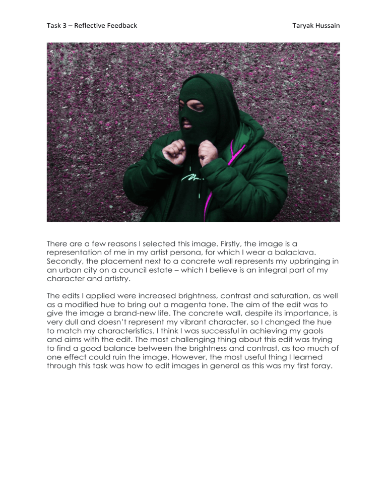
Task 3 – Reflective Feedback Taryak Hussain There are a few reasons I selected this image. Firstly, the image is a representation of me in my artist persona, for which I wear a balaclava. Secondly, the placement next to a concrete wall represents my upbringing in an urban city on a council estate – which I believe is an integral part of my character and artistry. The edits I applied were increased brightness, contrast and saturation, as well as a modified hue to bring out a magenta tone. The aim of the edit was to give the image a brand-new life. The concrete wall, despite its importance, is very dull and doesn’t represent my vibrant character, so I changed the hue to match my characteristics. I think I was successful in achieving my gaols and aims with the edit. The most challenging thing about this edit was trying to find a good balance between the brightness and contrast, as too much of one effect could ruin the image. However, the most useful thing I learned through this task was how to edit images in general as this was my first foray.

