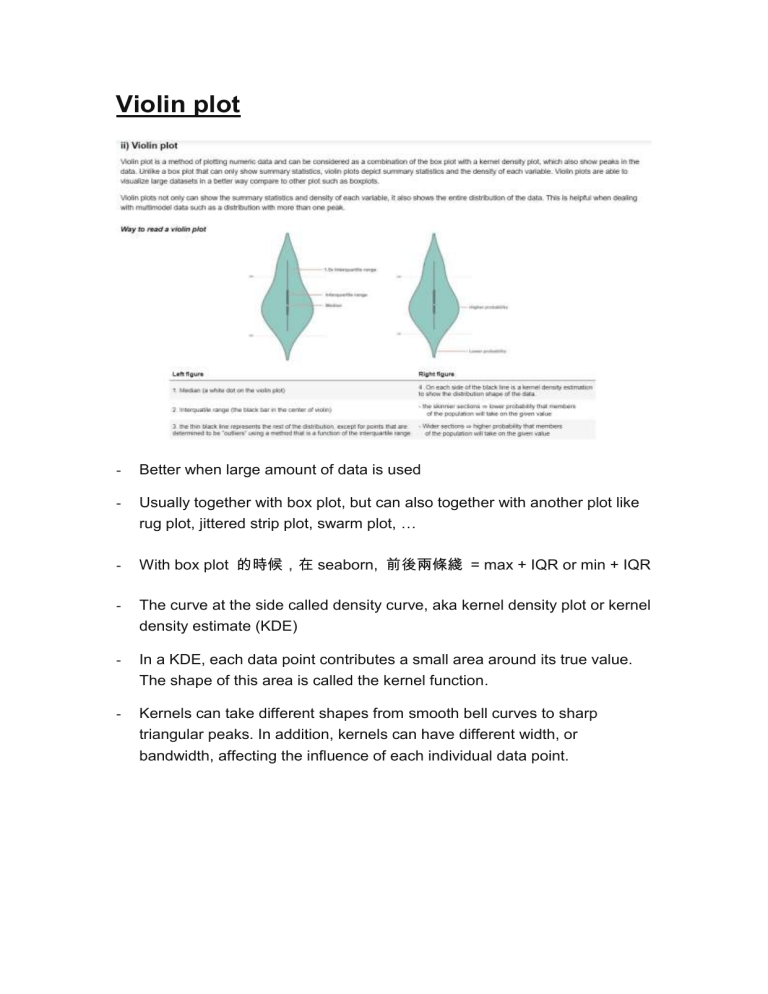
Violin plot - Better when large amount of data is used - Usually together with box plot, but can also together with another plot like rug plot, jittered strip plot, swarm plot, … - With box plot 的時候,在 seaborn, 前後兩條綫 = max + IQR or min + IQR - The curve at the side called density curve, aka kernel density plot or kernel density estimate (KDE) - In a KDE, each data point contributes a small area around its true value. The shape of this area is called the kernel function. - Kernels can take different shapes from smooth bell curves to sharp triangular peaks. In addition, kernels can have different width, or bandwidth, affecting the influence of each individual data point. - To build the final density curve, the areas for all data points are stacked up into a complete whole. Each data point has an equivalent influence on the final distribution. As there are more data points in a region, the height of the density curve in that area will increase.


