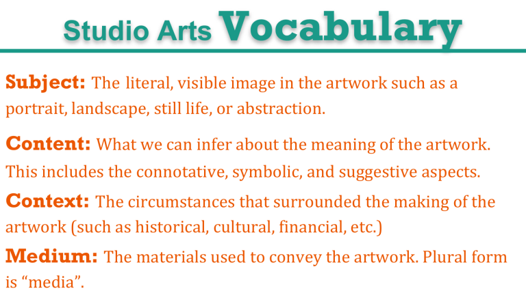
Studio Arts Vocabulary Subject: The literal, visible image in the artwork such as a portrait, landscape, still life, or abstraction. Content: What we can infer about the meaning of the artwork. This includes the connotative, symbolic, and suggestive aspects. Context: The circumstances that surrounded the making of the artwork (such as historical, cultural, financial, etc.) Medium: The materials used to convey the artwork. Plural form is “media”. The “ingredients” or components used by artists to create a work of art. A line is a continuous mark made on a surface by a moving point. “ A line is a dot that went for a walk. “ Characteristics of Line: Width- thick, thin, tapering, uneven Length - long, short, continuous, broken Direction- horizontal, vertical, diagonal, curving, perpendicular, oblique, parallel, radial, zigzag Character- sharp, blurry, fuzzy, choppy, sharp, jagged, graceful, smooth Keith Haring -Paul Klee Colors are light reflecting off of a surface being perceived by an eye. The 3 main components of color: Hue- pure color Intensity- saturation or dullness. A tone is a color + grey Value- lightness or darkness Wassily Kandinsky “Color Study” Value describes the lightness or darkness of a subject. Tint is a hue + white Shade is a hue + black “Migrant Mother” Dorothea Lange “Rouge Triomphant” Circles, squares, rectangles and triangles, etc. These shapes are often seen in architecture and manufactured items. Organic Shapes- Leaves, flowers “blobs,” etc. These shapes are seen in nature and with characteristics that are free flowing, informal and irregular. “La Gerbe” Henri Matisse “Composition with Red, Yellow, and Blue” Shapes are when lines intersect to enclose a space. Shapes are twodimensional and have height and width, but no depth. Geometric Shapes- Piet Mondrian “Alexander Calder Salvador Dali Barbara Hepworth “Bird in Space” “Lobster Telephone” Constantin Brancusi A form is 3-dimensional with length, height, and width. Marcel Duchamp Space is distance or area between, around, above, below, or within things. Positive Space- the object itself (the “donut”). “Nighthawks” Edward Hopper Negative Space- the space around an object or holes within the object (the “donut hole”). Picture Plane- the area within the “window frame” through which viewers see your work (usually defined by the actual paper or canvas). Composition- the organization and placement of the elements on your picture plane. Texture is the surface quality or “feel” of an object.
