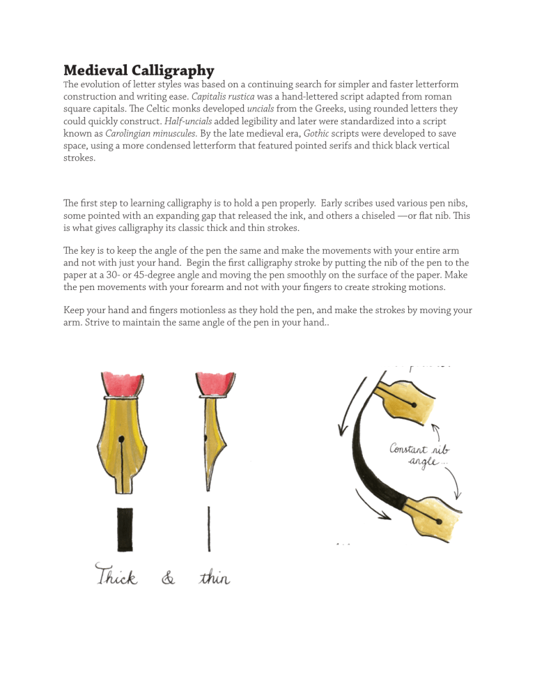
Medieval Calligraphy The evolution of letter styles was based on a continuing search for simpler and faster letterform construction and writing ease. Capitalis rustica was a hand-lettered script adapted from roman square capitals. The Celtic monks developed uncials from the Greeks, using rounded letters they could quickly construct. Half-uncials added legibility and later were standardized into a script known as Carolingian minuscules. By the late medieval era, Gothic scripts were developed to save space, using a more condensed letterform that featured pointed serifs and thick black vertical strokes. The first step to learning calligraphy is to hold a pen properly. Early scribes used various pen nibs, some pointed with an expanding gap that released the ink, and others a chiseled —or flat­nib. This is what gives calligraphy its classic thick and thin strokes. The key is to keep the angle of the pen the same and make the movements with your entire arm and not with just your hand. Begin the first calligraphy stroke by putting the nib of the pen to the paper at a 30- or 45-degree angle and moving the pen smoothly on the surface of the paper. Make the pen movements with your forearm and not with your fingers to create stroking motions. Keep your hand and fingers motionless as they hold the pen, and make the strokes by moving your arm. Strive to maintain the same angle of the pen in your hand.. CAPITALI S RUSTICA Condensed to save space and curved letterforms made capitalis rustica easier to letter than the square capitalis monumentalis inscribed on Roman monuments. A flat-nibbed pen was used held at an angle to produce the characteristic thick and thick strokes and serifs. Words had no spacing between them and ran together. This script was used in the Classic Roman Style. abcdefghijklmn opqrstuvwxyz abcdefghijklmn opqrstuvwxyz friends romans and countrymen lend me your ears CELTIC half unicials Uncials, originated by the Greeks, were named for the one-inch (Roman “uncia”) guidelines used to space the lines of text. The Celtic scribes adapted the Greek and Latin letterforms by rounding characters to reduce the number of strokes needed to write them. Half-uncials were a variation of uncials but used four guidelines with strokes that would rise above and fall below the two principal lines creating ascenders and descenders. The Uncial Script (also called Gaelic Script) is the national typeface of Ireland. abcdefghij klmnopqr stvuwxyz abcdefghij klmnopqr stvuwxyz celtic script Textura Textura (from the Latin texturum, meaning woven fabric or texture) is a style of German Gothic lettering also known as blackletter, Old English, and lettre de forme (French). The name used for it during its time was littera moderna (Latin for “modern lettering”). All its vertical strokes in a word were drawn first, then serifs and other strokes were added. This saved time and space. Fancy initial letters were often added only at the start of a page or sentence. ABCDEFGHIJ KLMNOPQRS TUVWXYZ Aabcdefghijklmn opqrstuvwxyz Once upon a time there lived a magic


