Flight Booking App Flow Redesign
Travel tech is one of the fastest growing industry in current world. From visiting local travel agent to booking tour
online, everything has changed drastically. One of the best thing made easier with tech is booking your flight online.
While there are so many airlines providing so many features and competitive prices, There are few who have stood
ahead of all and are providing best services to their customers.
The challenge
As a travel enthusiast and a UX designer, My challenge is to redefine the user experience of well known airline
mobile app.
My Design Process:
- Analyze current UX flow and information architecture
- Redesign user flow and IA
- Develop wireframe and UI design
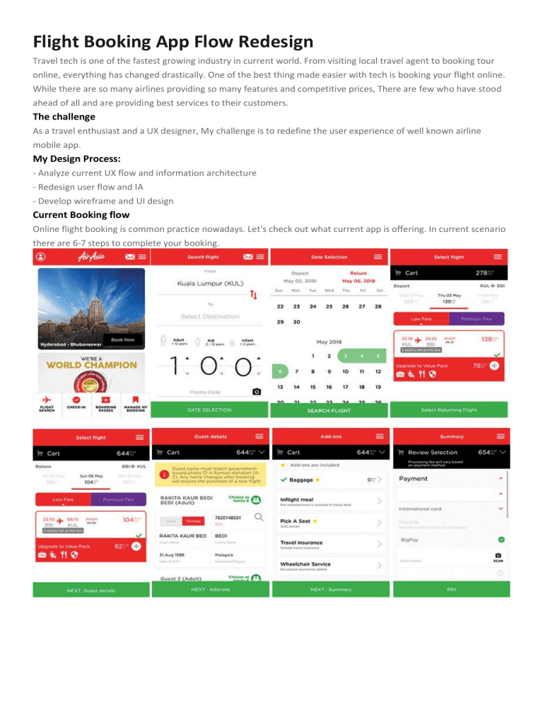
Current Booking flow
Online flight booking is common practice nowadays. Let's check out what current app is offering. In current scenario
there are 6-7 steps to complete your booking.
Road Map
Analyze & Define
Primarily purpose of any flight booking app is get more conversion and provide user best possible features. So, what
kind of user land on your application. There are two types of user who are going to use app.
1. The users who know where to go.
2. The users looking for best deal.
Understanding requirements
Talking about some current design glitches:
Overall experience while using app is really not that bad. But after analyzing the whole booking design process,
Some points are there that need to be taken care.
1.Home page: It seems like it is offering less to it's user. Airline is well know for providing low cost tickets but there
are limited option for a user, who is looking for some great deal.
2. Search Flight: No. of person is given high priority and a separate page for date selection. It may appear for user an
extra effort in filling search form.
3. Date selection: Very nicely designed, It seems appealing to me as a user. On few occasion, No flights available
page appeared and again you have to enter details or browse through every single day on listing page.
4. Search Listing page: Information is not clear. Cart & price and Depart & destination are way apart. Proximity law
(according to Gestalt principles) is seems to be clearly broken. Sorting is missing, as flights are sorted according to
flight timing and sometime lowest price flight is not visible in single scroll.
5. Flights details: Not asking class details upfront is a good idea to showcase user with all options for destination. But
when you want to compare price of class section, User want them at same place not in tabs.
6. Upgrade to Value pack: A better approach in providing services on low cost without upgrading class. But when you
click on to check what features are there in value pack, It just add price to your bag and sometime user is not aware
of it.
7. Flight Summary: After flight selection, A glimpse of summery is shown for fraction of second and disappear. It is
available when you click on cart section. But again it is not prominent for user, it's like you have to find out and it's
not good idea to make user keep guessing.
8. Guest Details: After filling guest details, There is again a link of contact details having same details already filled.
9. Add-ons: Flight selection is inside links. If user wants to plus add-ons on return flight only, It makes him to go for
extra clicks.
10. Payment Details: There are only 3 payment mode then why to give a dropdown for selection.
High Fidelity Prototype
The goal of whole exercise was to understand the target audience requirements and pain points.
Providing a much cleaner and fresh look was priority as well as keeping it simple, minimalist and adaptable.
Lets discuss about design decisions
Redesign is not just implementing new colors and design elements. Design must be clear and loud to validate your
inputs. As it is said,
Design to Express, Not to Impress
1. Home page: New Home page is designed to provide user with more option other than flight booking. Now user
can view more destinations along with popular ones. All links (Flight search, Check-in,...) are given in more
prominent view.
2. Search Flight: All details(Destinations, persons, date) are now on single screen. Earlier user need to select trip
through date selection but now he is able to select one way or round trip on single page.
Destination: Apart from scrolling and searching, now destination can also be selected through right hand side
alphabets.
Date selection: In calendar user can view dates with red dots as flights not available and green dots as low fare. So
now no more not available page and also beneficial for those planning their trip and looking for low fares.
3 Select Flight: Flight listing page is now available with filter to sort to listing by Price or Time. All types of class (Low
fare, Premium Flex..) are on same listing to compare price. Click to check what extra feature will be added .
As money is always crucial thing while we do bookings online. While selecting flight, price is available at left bottom
of screen with next step button so that user is aware of how much amount he need to pay.
4. Guest details: Proceeding to next step i.e Guest details, a summary screen will appear and user can check about
destination, flight and price details. After that he can proceed to guest detail page. While total amount is appearing
at bottom, a flight summary link is now available on top right. With flight summary user can any time check his trip
detail. Also on top left user can see no. of person he has selected while looking for flight.
For guest details, Contact details and emergency contact are merged into single card.
5. Add-ons: Small change in Add-ons, Now user is able to select add-ons for particular destination flight. Price and
flight summary are still available for review.
6. Payment details: Next step payment is made much cleaner and accessible. Now user is presented with all 3
payment modes upfront. Selection dropdown is removed to alter confusion.
7. Confirmation: Last but not least confirmation page. Confirmation page is designed to give user all details of his
flight with options to share and download.
Check the whole flow in one go ->


