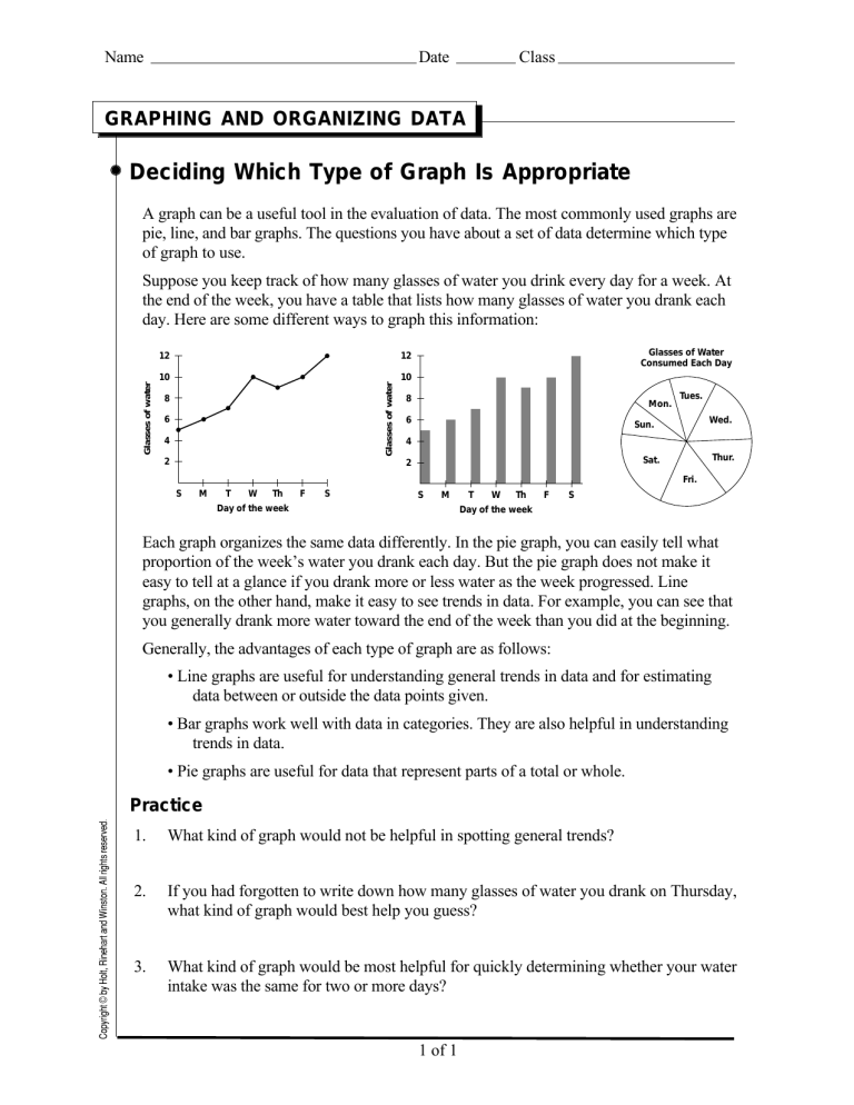
Name Date Class GRAPHING AND ORGANIZING DATA Deciding Which Type of Graph Is Appropriate A graph can be a useful tool in the evaluation of data. The most commonly used graphs are pie, line, and bar graphs. The questions you have about a set of data determine which type of graph to use. 12 12 10 10 Glasses of water Glasses of water Suppose you keep track of how many glasses of water you drink every day for a week. At the end of the week, you have a table that lists how many glasses of water you drank each day. Here are some different ways to graph this information: 8 6 4 2 Glasses of Water Consumed Each Day 8 Mon. 6 Tues. Wed. Sun. 4 Thur. Sat. 2 Fri. S M T W Th F S S M Day of the week T W Th F S Day of the week Each graph organizes the same data differently. In the pie graph, you can easily tell what proportion of the week’s water you drank each day. But the pie graph does not make it easy to tell at a glance if you drank more or less water as the week progressed. Line graphs, on the other hand, make it easy to see trends in data. For example, you can see that you generally drank more water toward the end of the week than you did at the beginning. Generally, the advantages of each type of graph are as follows: • Line graphs are useful for understanding general trends in data and for estimating data between or outside the data points given. • Bar graphs work well with data in categories. They are also helpful in understanding trends in data. • Pie graphs are useful for data that represent parts of a total or whole. Practice 1. What kind of graph would not be helpful in spotting general trends? 2. If you had forgotten to write down how many glasses of water you drank on Thursday, what kind of graph would best help you guess? 3. What kind of graph would be most helpful for quickly determining whether your water intake was the same for two or more days? 1 of 1