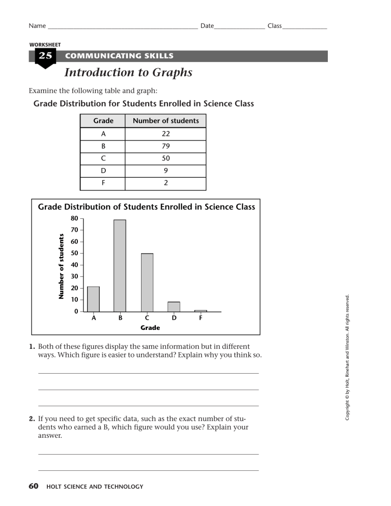
Name _______________________________________________ Date________________ Class ______________ WORKSHEET 25 COMMUNICATING SKILLS Introduction to Graphs Examine the following table and graph: Grade Distribution for Students Enrolled in Science Class Grade Number of students A 22 B 79 C 50 D 9 F 2 80 _ 70 _ 60 _ 50 _ _ _ _ 0_ _ 20 _ 10 _ A B C D F Grade 1. Both of these figures display the same information but in different ways. Which figure is easier to understand? Explain why you think so. 2. If you need to get specific data, such as the exact number of students who earned a B, which figure would you use? Explain your answer. 60 HOLT SCIENCE AND TECHNOLOGY Copyright © by Holt, Rinehart and Winston. All rights reserved. 40 _ 30 _ _ Number of students Grade Distribution of Students Enrolled in Science Class Name _______________________________________________ Date________________ Class ______________ Introduction to Graphs, continued Choosing the Right Graph Data tables provide an organized way of viewing information, and graphs are pictures of the information in a data table. Sometimes it is faster and easier to interpret data by looking at a graph. It is important to choose the type of graph that best illustrates your data. The following table summarizes the best uses for three of the most common graphs: Best use for this graph Type of graph Bar graph 70 _ 60 _ 50 _ 40 _ _ B _ A _ 10 _ 0_ _ 30 _ 20 _ _ Number of students Grade Distribution of Students Enrolled in Science Class 80 _ A bar graph is best used for comparing data quickly and easily, such as the grade distribution of students enrolled in science class or the growth of plants in different pots. C D F Grade Pie graph yy ;; ;; yy Percentage of Students Picking Various Lunch Entrees Beef stuff 4% Corn chip pie 15% Line graph Number of Bathing Suits Sold Each Month • 200 _ • A line graph is best used for looking at changes over time, such as the number of bathing suits sold each month during the year or the change in your sister’s height throughout the year. • 150 _ • 100 _ 50 _ • • • S • O N • D _ A _ _ J _ _ J _ _ A M _ F M _ _ 0 _• J _ • • _ Number of bathing suits sold 250 _ COMMUNICATING SKILLS Cosmic pizza 63% ▼ ▼ ▼ Copyright © by Holt, Rinehart and Winston. All rights reserved. Chicken Kiev 18% A pie graph is best used for showing percentages, such as the percentage of the student body who picked certain entrees for lunch or the percentage of your allowance that will go toward purchasing various things. Month SCIENCE SKILLS WORKSHEETS 61 Name _______________________________________________ Date________________ Class ______________ Introduction to Graphs, continued Choose the Graph What graph type do you think best presents each set of data? Explain. 1. The percentage of rabbits preferring various foods Food Percentage preferring that food Skippy’s Rabbit Chow 32 Homemade rabbit food 13 Happy Rabbit 10 Joe’s Special Food for Rabbits 44 Premium Rabbit Nutrition Diet 1 2. Albert’s grades for each month of the school year Month September 98 February 83 October 94 March 86 November 88 April 81 December 78 May 97 January 82 3. The pH of solutions in experimental test tubes 62 Grade in science class Test-tube number pH 1 6.7 2 7.1 3 7.4 4 7.1 5 7.0 HOLT SCIENCE AND TECHNOLOGY Copyright © by Holt, Rinehart and Winston. All rights reserved. Grade in science class Month
